Published Date : November 15, 2016
Have you ever thought does your Power Query Transformations happens in the data source side (server side), or on the local memory (client side)? When you use a relational data source, query can be run on the data source, but it depends on transformations. Some transformations can be translated to query language of the data source, some not. as an example; recently (I believe from last few releases) Power BI Desktop added a feature called Merge Columns. Merge Columns concatenate columns to each other to either create a new column, or replace them with the new concatenated result. Previously you could do the concatenation with adding concatenation simply with & character, what you’ve done was adding a new custom column, and writing M expression to concatenate columns. Now with the new Merge Column this are much easier, you select columns and apply Merge Columns. This easiness does come with a price, a high price I’d say, price of reducing the performance of Power Query and as a result Power BI! Merge Columns doesn’t support query folding and it means it will affect performance badly. In this post I’ll show you how this cause the performance issue, and how it can be solved. Note that Merge Columns is an example here ,this situation might happens with some other transformations as well. If you like to learn more about Power BI; read the Power BI online book from Rookie to Rock Star.
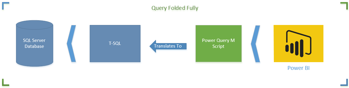
I can’t start talking about the issue without explaining what Query Folding is, so let’s start with that. Query Folding means translating Power Query (M) transformations into native query language of the data source (for example T-SQL). In other words; when you run Power Query script on top of a SQL Server database, query folding will translate the M script into T-SQL statements, and fetch the final results.
Here is an example of M Script:
let
    Source = Sql.Databases("."),
    AdventureWorks2012 = Source{[Name="AdventureWorks2012"]}[Data],
    Sales_SalesOrderHeader = AdventureWorks2012{[Schema="Sales",Item="SalesOrderHeader"]}[Data],
    #"Added Conditional Column" = Table.AddColumn(Sales_SalesOrderHeader, "Custom", each if [SubTotal] >= 100 then "0" else "1" )
in
    #"Added Conditional Column"
And here is the folded version of that translated to native T-SQL query:
select [_].[SalesOrderID] as [SalesOrderID],
    [_].[RevisionNumber] as [RevisionNumber],
    [_].[OrderDate] as [OrderDate],
    [_].[DueDate] as [DueDate],
    [_].[ShipDate] as [ShipDate],
    [_].[Status] as [Status],
    [_].[OnlineOrderFlag] as [OnlineOrderFlag],
    [_].[SalesOrderNumber] as [SalesOrderNumber],
    [_].[PurchaseOrderNumber] as [PurchaseOrderNumber],
    [_].[AccountNumber] as [AccountNumber],
    [_].[CustomerID] as [CustomerID],
    [_].[SalesPersonID] as [SalesPersonID],
    [_].[TerritoryID] as [TerritoryID],
    [_].[BillToAddressID] as [BillToAddressID],
    [_].[ShipToAddressID] as [ShipToAddressID],
    [_].[ShipMethodID] as [ShipMethodID],
    [_].[CreditCardID] as [CreditCardID],
    [_].[CreditCardApprovalCode] as [CreditCardApprovalCode],
    [_].[CurrencyRateID] as [CurrencyRateID],
    [_].[SubTotal] as [SubTotal],
    [_].[TaxAmt] as [TaxAmt],
    [_].[Freight] as [Freight],
    [_].[TotalDue] as [TotalDue],
    [_].[Comment] as [Comment],
    [_].[rowguid] as [rowguid],
    [_].[ModifiedDate] as [ModifiedDate],
    case
        when [_].[SubTotal] >= 100
        then '0'
        else '1'
    end as [Custom]
from
(
    select [$Table].[SalesOrderID] as [SalesOrderID],
        [$Table].[RevisionNumber] as [RevisionNumber],
        [$Table].[OrderDate] as [OrderDate],
        [$Table].[DueDate] as [DueDate],
        [$Table].[ShipDate] as [ShipDate],
        [$Table].[Status] as [Status],
        [$Table].[OnlineOrderFlag] as [OnlineOrderFlag],
        [$Table].[SalesOrderNumber] as [SalesOrderNumber],
        [$Table].[PurchaseOrderNumber] as [PurchaseOrderNumber],
        [$Table].[AccountNumber] as [AccountNumber],
        [$Table].[CustomerID] as [CustomerID],
        [$Table].[SalesPersonID] as [SalesPersonID],
        [$Table].[TerritoryID] as [TerritoryID],
        [$Table].[BillToAddressID] as [BillToAddressID],
        [$Table].[ShipToAddressID] as [ShipToAddressID],
        [$Table].[ShipMethodID] as [ShipMethodID],
        [$Table].[CreditCardID] as [CreditCardID],
        [$Table].[CreditCardApprovalCode] as [CreditCardApprovalCode],
        [$Table].[CurrencyRateID] as [CurrencyRateID],
        [$Table].[SubTotal] as [SubTotal],
        [$Table].[TaxAmt] as [TaxAmt],
        [$Table].[Freight] as [Freight],
        [$Table].[TotalDue] as [TotalDue],
        [$Table].[Comment] as [Comment],
        convert(nvarchar(max), [$Table].[rowguid]) as [rowguid],
        [$Table].[ModifiedDate] as [ModifiedDate]
    from [Sales].[SalesOrderHeader] as [$Table]
) as [_]
You can see as an example how the conditional column script in M translated to Case statement in T-SQL.
Good obviously. Why? because performance is much higher to run transformations on billions of records in the data source, rather than bringing millions of records into cache and applying some transformations on it.
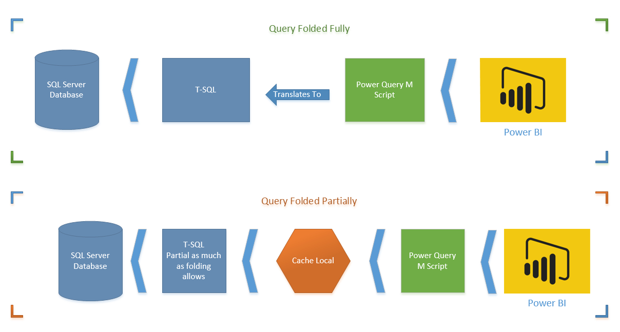
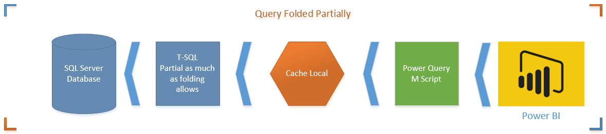
The first diagram shows a M script fully folded (translated to T-SQL). This is the best situation. Server side operation apply all transformations on the data set and returns only desired result set.
The second diagram shows Query Folding partially supported (only up to specific step). In this case T-SQL brings the data before that step. and data will be loaded in the local cache, and rest of transformations happens on M engine side. You have to avoid this option as much as possible.
The question that might comes into your mind right now is that; Can I see the Native Query that M script translates to it? The answer is Yes. If Query Folding is supported on a step, you can right click on that step and click on View Native Query.

Query Folding is enabled by default. However in some cases it is not supported. For example if you are doing some transformations on a SQL Server table in Power Query and then join it with a web query query folding stops from the time you bring the external data source. That means transformations will happen on the data of SQL Server table. then before joining to web query it will be fetched into cache and then rest of steps happens by M engine. You would need to bring data from different data sources in Power BI, and this is the ability that Power Query gives to you. So sometimes you have to step beyond query folding, and there might be no better way of doing that.
There are also some Transformations in Power Query that Query Folding doesn’t support them. Example? Merge Columns! Fortunately there are workarounds for this situation. Let’s dig into this more in details.
Merge Columns concatenates columns to each other in the order of selection of columns. You can also specify the delimiter character(s). So simply if you want to create a full name from first name and last name, you can select them in right order, and from either Transform tab, or Add Column tab choose Merge Columns. Let’s see this through an example;
You need to have AdvanetureWorksDW database installed on SQL Server. or alternatively you can use any table in SQL Server that has two string columns which can be concatenated.
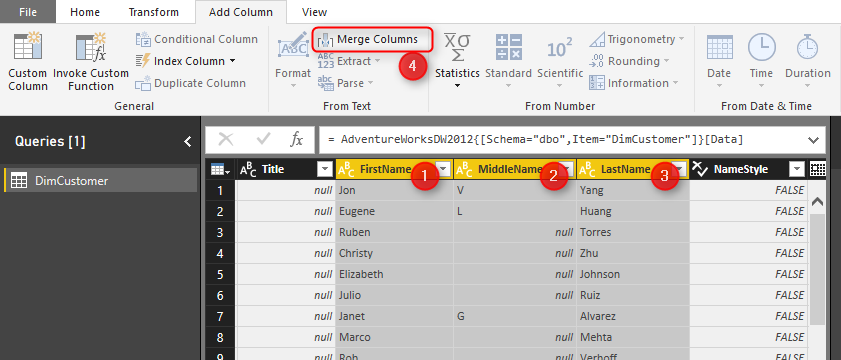
Create a new Power BI file in Power BI Desktop, and Get Data from SQL Server with Import Data Mode. Get Data from DimCustomer table only, and click on Edit. When in Query Editor. Select First Name, Middle Name, and Last Name in the correct order, and then from Add Column Select Merge Columns.
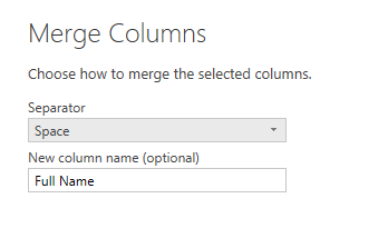
In the Merge Columns Specify the Separator to be space, and name the new column to be Full Name.
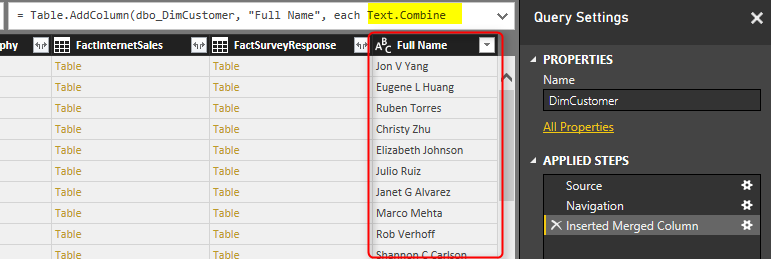
You will see the new column generates simply and adds to the end of all columns. You also may notice that Merge Columns uses Text.Combine Power Query function to concatenate columns to each other.
Now to see the problem with Query Folding, right click on Inserted Merge Column step in Applied Steps section. You will see that View Native Query is disabled.
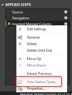
Rule of thumb is that: When View Native Query is not enabled, that step won’t be folded! that means the data will be loaded into cache up the step before this step. and then rest of the operation will happen locally. To understand how it works, right click on the step before which was Navigation. You will see the View Native Query. Click on that, and you can see the T-SQL query for that which is as below;
select [$Table].[CustomerKey] as [CustomerKey],
    [$Table].[GeographyKey] as [GeographyKey],
    [$Table].[CustomerAlternateKey] as [CustomerAlternateKey],
    [$Table].[Title] as [Title],
    [$Table].[FirstName] as [FirstName],
    [$Table].[MiddleName] as [MiddleName],
    [$Table].[LastName] as [LastName],
    [$Table].[NameStyle] as [NameStyle],
    [$Table].[BirthDate] as [BirthDate],
    [$Table].[MaritalStatus] as [MaritalStatus],
    [$Table].[Suffix] as [Suffix],
    [$Table].[Gender] as [Gender],
    [$Table].[EmailAddress] as [EmailAddress],
    [$Table].[YearlyIncome] as [YearlyIncome],
    [$Table].[TotalChildren] as [TotalChildren],
    [$Table].[NumberChildrenAtHome] as [NumberChildrenAtHome],
    [$Table].[EnglishEducation] as [EnglishEducation],
    [$Table].[SpanishEducation] as [SpanishEducation],
    [$Table].[FrenchEducation] as [FrenchEducation],
    [$Table].[EnglishOccupation] as [EnglishOccupation],
    [$Table].[SpanishOccupation] as [SpanishOccupation],
    [$Table].[FrenchOccupation] as [FrenchOccupation],
    [$Table].[HouseOwnerFlag] as [HouseOwnerFlag],
    [$Table].[NumberCarsOwned] as [NumberCarsOwned],
    [$Table].[AddressLine1] as [AddressLine1],
    [$Table].[AddressLine2] as [AddressLine2],
    [$Table].[Phone] as [Phone],
    [$Table].[DateFirstPurchase] as [DateFirstPurchase],
    [$Table].[CommuteDistance] as [CommuteDistance],
    [$Table].[FullName] as [FullName]
from [dbo].[DimCustomer] as [$Table]
You can see that this is simple query from DimCustomer Table. What will happen here in this scenario is that Power Query cannot translate Text.Combine to T-SQL Query. So data up to step before will be loaded into the cache. It means the query for step before (which is above query) will run on the database server, the result will come to the cache, and then Text.Combine will happen on the local memory in cache. Here is a diagram of how it works;
In this example the data set is so small, but if data set be big, then not folding cause performance issues. It is taking much longer to load the whole data set into cache and then apply transformations, rather than doing transformations in the data source, and just loading the result into Power BI.
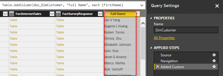
Now remove the step for Inserted Merged Column, and go to Add Column Tab, and select Custom Column

In the Add Custom Column write below expression to generate Full Name;
=
[FirstName]
&
" "
&
(if [MiddleName]=null then "" else [MiddleName])
&
" "
&[LastName]

This expression used the concatenation character which is &. and also checked if Middle Name is null or not. Result in Power Query side is the same, and it generates the Full Name column like the previous example;
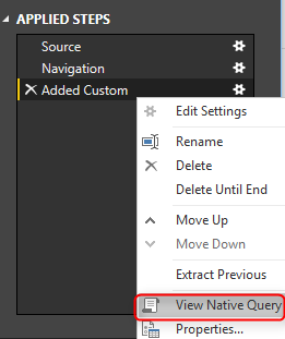
However it is different for Query Folding. Right Click on the Added Custom step, and you will see the Native Query this time.
Query is simply the same with a new concatenated column added.
select [_].[CustomerKey] as [CustomerKey],
    [_].[GeographyKey] as [GeographyKey],
    [_].[CustomerAlternateKey] as [CustomerAlternateKey],
    [_].[Title] as [Title],
    [_].[FirstName] as [FirstName],
    [_].[MiddleName] as [MiddleName],
    [_].[LastName] as [LastName],
    [_].[NameStyle] as [NameStyle],
    [_].[BirthDate] as [BirthDate],
    [_].[MaritalStatus] as [MaritalStatus],
    [_].[Suffix] as [Suffix],
    [_].[Gender] as [Gender],
    [_].[EmailAddress] as [EmailAddress],
    [_].[YearlyIncome] as [YearlyIncome],
    [_].[TotalChildren] as [TotalChildren],
    [_].[NumberChildrenAtHome] as [NumberChildrenAtHome],
    [_].[EnglishEducation] as [EnglishEducation],
    [_].[SpanishEducation] as [SpanishEducation],
    [_].[FrenchEducation] as [FrenchEducation],
    [_].[EnglishOccupation] as [EnglishOccupation],
    [_].[SpanishOccupation] as [SpanishOccupation],
    [_].[FrenchOccupation] as [FrenchOccupation],
    [_].[HouseOwnerFlag] as [HouseOwnerFlag],
    [_].[NumberCarsOwned] as [NumberCarsOwned],
    [_].[AddressLine1] as [AddressLine1],
    [_].[AddressLine2] as [AddressLine2],
    [_].[Phone] as [Phone],
    [_].[DateFirstPurchase] as [DateFirstPurchase],
    [_].[CommuteDistance] as [CommuteDistance],
    [_].[FullName] as [FullName],
    ((([_].[FirstName] + ' ') + (case
        when [_].[MiddleName] is null
        then ''
        else [_].[MiddleName]
    end)) + ' ') + [_].[LastName] as [Full Name]
from [dbo].[DimCustomer] as [_]
This time there won’t be an intermediate cache. transformation happens in the data source with the T-SQL query, and result will be loaded into Power BI.
Great Question. It is important to understand which step/transformation folds and which doesn’t. To understand that simply right click on every step and see if the View Native Query is enabled or not. If it is enabled Query Folding is supported for that step, otherwise not. Also Note that Query Folding is not supported for data sources such as web query, or CSV or things like that. Query Folding at the moment is only supported for data stores that supports a native query language. For Web, Folder, CSV… there is no native query language, so you don’t need to be worry about Query Folding.
*Important Note: At the time of writing this post Merge Columns doesn’t support Query Folding. I have reported this to Power Query Team, and they are working on it, to solve the issue. The Merge Columns is very likely to support query folding very soon as the result of bug fix. However there are always some other transformations that doesn’t support query folding. This post is written to give you an understanding what kind of issue might happen, and how to resolve it.
My advise to you as a performance best practice is that when working with a relational data source (such as SQL Server). always check the query folding. Sometimes it is not supported, so use another approach for the transformation. Don’t fall into the black hole of not folding, otherwise your query might take ages to run.
Published Date : November 14, 2016

In the area of performance tuning a Power BI model many things has to be considered, most of them around consumption of the CPU and RAM. One of the most basic but important consideration is minimizing the usage of memory. By default all queries from Query Editor will be loaded into the memory of Power BI Model. In this post I’ll show you an example to disable the load for some queries, especially queries that used as intermediate transformation to produce the final query for the model. This is a very basic tip but very important when your model grows big. If you want to learn more about Power BI read the Power BI online book from Rookie to Rock Star.
For running examples of this book you need to download the ZIP file here;
By Default all queries in Power Query will be loaded into the Power BI model. This behavior might be a desired behavior if you are connecting to a proper star schema modeled data warehouse, because normally you don’t need to make many changes in the structure of queries. However this brings some issues if you are connected to a transactional data store, some files, web source, and many other non-star schema modeled data sources. Normally when you get data from a data source, you apply transformations for rows and columns, and merge queries or append them, and you might end up to have 5 tables out of 10 queries as final queries. By default when you close and apply your query editor window all queries will be loaded into the model no matter if you want to use them in your final model or not.
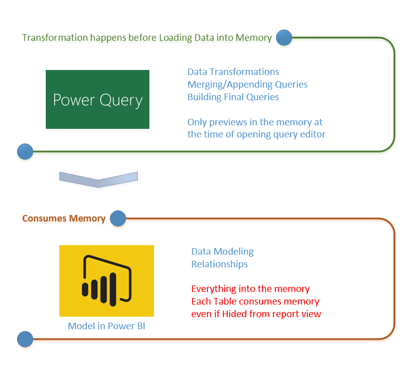
For every query that loads into model memory will be consumed. and Memory is our asset in the Model, less memory consumption leads to better performance in most of the cases. I have seen lots of models that people Hide the unwanted query from the model, This approach doesn’t help to the performance because hided query will still consume the memory. The best approach is to disable loading before closing query editor. Disabling Load doesn’t mean the query won’t be refreshed, it only means the query won’t be loaded into the memory. When you click on Refresh model in Power BI, or when a scheduled refresh happens even queries marked as Disable Load will be refreshed, but their data will be used as intermediate source for other queries instead of loading directly into the model. This is a very basic performance tuning tip, but very important when your Power BI model grows bigger and bigger. Let’s look at this through an example.
In this example Scenario I want to get list of all files from a directory. There are two types of CSV files in the directory, some Students files, and some course files, both are CSV files, but different structured. Also there might be some other files in the directory, such as Word files or HTML files which I don’t want to process.

Aim is to load data rows of all students and courses as two separate tables into the model. Instead of fetching files from the folder twice, we use one query to fetch the files, and then use it as a reference for other queries. The referenced query itself doesn’t needs to be loaded into the model. Let’s build the solution and see how it works in action.
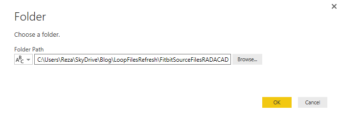
Open a new Power BI file, and stat by Getting Data from Folder
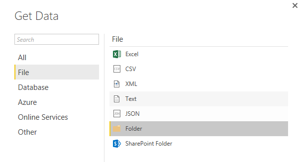
Enter the path of folder that contains all files (Files in this folder can be downloaded from ZIP file up in the prerequisite section of this post)

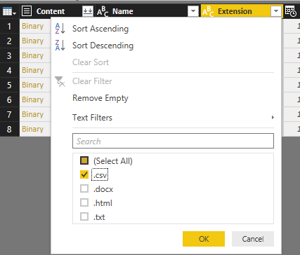
Click on Edit in the preview showed in the navigator window to open the folder content in Query Editor. As you see there are number of different files in the folder.
Filter the Extension to only .csv. Note that both Course and Student files are .CSV files which is what we need.
Now the subset includes Course files and Students files which are different in the structure. We have to apply transformations on each set individually. 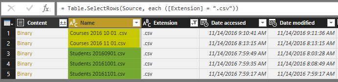
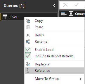
Because I don’t want to repeat the process of getting all files from a folder, and I want to split the data into two data sets; one for Students and another one for Courses. I’ll generate a REFERENCE from the main query. Right click on the query (which called CSVs in my example), and select Reference.
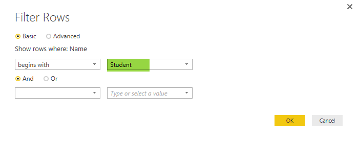
This will generate a new query named as CSVs (2). This new query is NOT A COPY of first query. This is only a reference from first query. which means if the first query changes, the source for this query will also change. Rename this new query to be Student. Filter the Name column to everything starting (or begins with) “Student”.
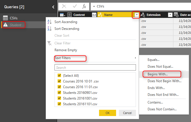
The reason that I don’t type in in the search box and use Text Filters specifically is that the search box will filter the data statistically based on values that exists in the current data set. If in the future new values (file names) comes in the folder this won’t consider that. However the Text Filter will apply on any data set because it will be filtered dynamically. (I’ll write a post later to explain that in details). In the Filter Rows window type in Student as filter for begins with.
Now you will see only Students files.
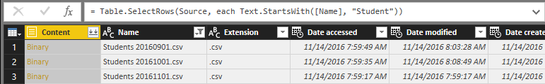
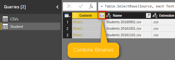
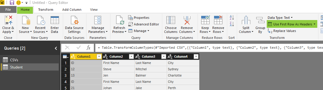
Click on the Combine Binaries icon on the header of Content column to combine all CSV files into one.
After combining binaries, Power Query will also import the CSV into the table and do automatic data type conversion. You can see all three steps in the Query Editor.
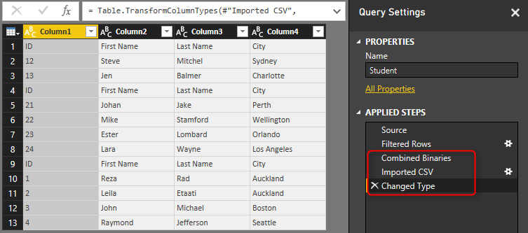
The data table needs couple of changes before be ready. First; set the column names. The first row has column names. so use the menu option of “Use First Row As Headers” to promote the first row to be column headers.
This simply brings column headers;
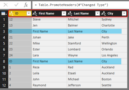
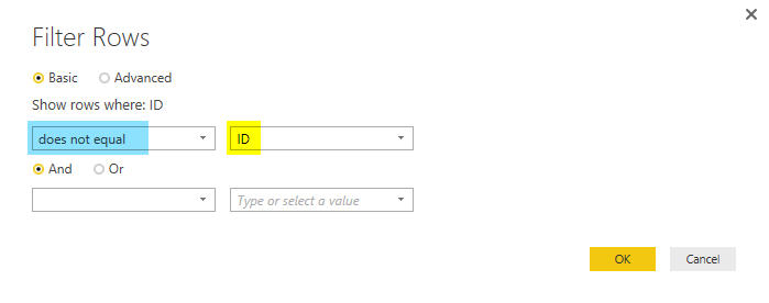
Also you need to remove all extra header rows from the combined data set. There are some rows with “ID,First Name, Last Name, and City” as their values which should be removed from the data set. You can simply remove them with a Text Filter of Does Not Equal to on the ID column. values should not be equal to “ID” because every row with “ID” in the first column’s value is a header row and should be removed.
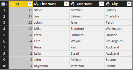
Now you have you cleaned data set for Students. Note that I have also applied a data type conversion for column ID to type whole number;
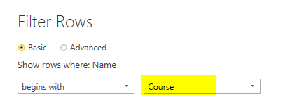
The other entity is Course which we need to create as a reference from the CSVs query. Create another reference from CSVs, and name it Course. 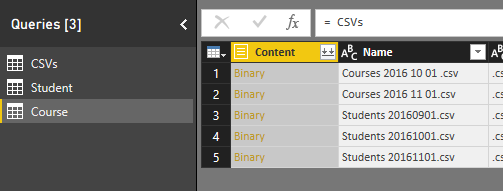
Create a Text Filter for Begins with on the Name Column with the value of: “Course”
And the you’ll have only Course files. Combine Binaries on that.
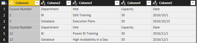
Same as Student query, apply transformations in this order;
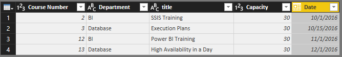
Here is the final data set for course;
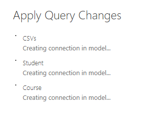
Now to see the problem, without any changes in the default load behavior, Close the Query Editor and Apply changes.
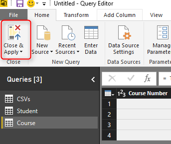
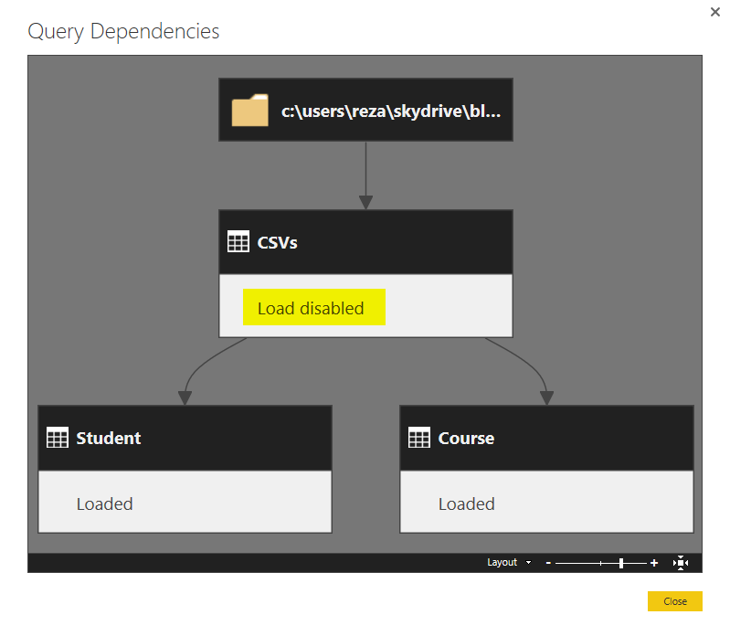
You will see that after the refresh, three queries loads in the model; Student, Course, and CSVs.
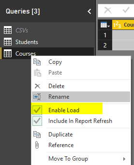
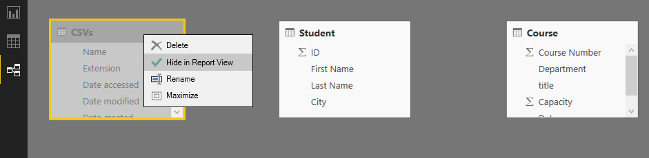
Student and Course are expected tables in the model. However CSVs is not useful. we already fetched everything we wanted from the query, and this is used as an intermediate query for loading Student and Course. Having CSVs as a separate table in our model has two problems;

The main issue is the memory consumption for this extra table. and normally memory consumption will reduce the performance and brings heavier load to the model. In this example CSVs table only has few rows. but this is just a sample data, in real world examples you might have intermediate tables with millions of rows. You need to remove every unused table from the Power BI model to enhance the memory consumption.
The first issue “Confusion for users” can be solved by hiding the table from report view. You can do that in Relationship tab of the model, right click on the CSVs table, and click on Hide from report view. This method HIDEs the table from report view. However the table still exists, and it consumes memory! It is just hidden. Hiding a table from report view is good for tables that you need for the modeling. For example a relationship table (that creates many to many relationship) should be kept in the model but be hidden. because it creates the relationship, but it is not useful for the report viewer. Any other tables that is not used for relationship and is not used for reporting should be removed before loading into the model.
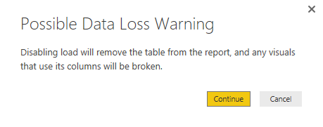
Go back to Query Editor, and right click on CSVs query. You will see that by default every query is checked as Enable Load.

Click on the Enable Load to disable it. You will see a message saying that any visuals attached to this query will not work after this change. Which is totally fine, because this query is not used (and won’t be) for any visualization. The message is: “Disabling load will remove the table from the report, and any visuals that use its columns will be broken.”
Click on Continue, and you will see the load is disabled for the query now. the query name will be also in Italic font illustrating that it won’t be loaded into the model. Note that query will be refreshed and if new files comes to the directory it will pass it on to Course and Student queries. It just won’t be loaded into the model itself.
You can also see in the View tab of Query Editor, on the Query Dependencies that this query is the source of the other two queries. and in that view it also shows which query is load disabled.
Now close and apply the Query Editor. This time you see that CSVs query won’t be loaded into the model. Your relationship tab and the report tab only contains two tables; Course, and Student.
In summary you’ve seen how an easy tip can save the memory and enhance the performance of Power BI model. Always remember that Query Editor is your ETL (Extract, Transform, Load) engine. It will apply all transformations before loading the data into the model, but once it finished the transformation all queries will be loaded into the model and they take memory. By default all queries are Enabled to Load into the model. Simply change that for queries that is not required in the model.
Published Date : November 3, 2016
The latest update of Power BI Desktop (October 2016) has many features. Two of these features are grouping and binning. These features used to create groups of items and visualize them better in the report. Previously you could do that by Power Query or DAX calculated columns, now it is all possible simply through the graphical user interface of report editor. In this post I’ll show you how to create banding (binning) and grouping simply with these features. If you like to learn more about Power BI; read the Power BI online book from Rookie to Rock Star.
For running examples of this post you need to have AdvantureWorksDW SQL Server database sample installed. Or you can get the excel version of it.
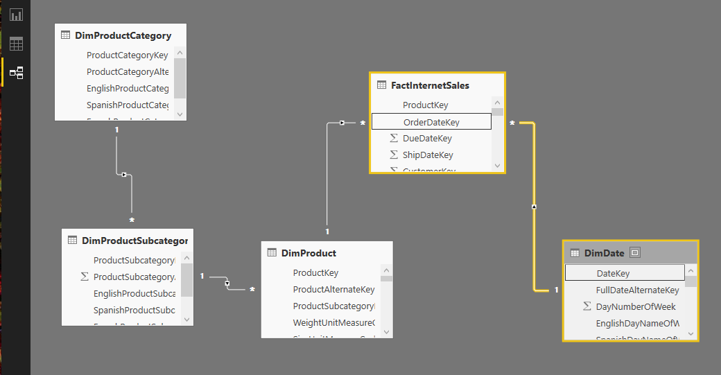
Get Data; Start with Get Data from AdventureWorksDW, and choose tables: FactInternetSales, DimDate, and DimCustomer.
Set the relationship between DimDate and FactInternetSales to be only based on OrderDateKey as Active relationship, remove inactive relationships between these two tables.
Binning is grouping a numeric field based on a division. This type of grouping is called Banding as well. For example you might have customers with different yearlyIncome range from $10,000 to $100,000 and you want to create a banding by $25,000. This will generate 4 groups of yearly income for you. This is exactly what Binning in Power BI does. Let’s look at the example.
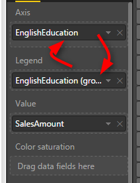
Create a Table in Power BI Report and visualize YearlyIncome (from DimCustomer), and SalesAmount (from FactInternetSales) in it. Change the aggregation of YearlyIncome from Sum to Do Not Summarize as below

This will visualize each yearlyIncome value with the sales amount associated to it.

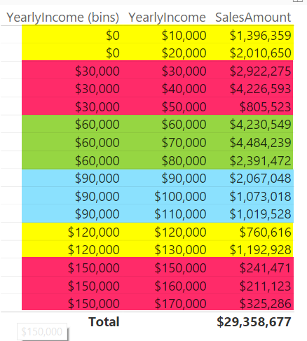
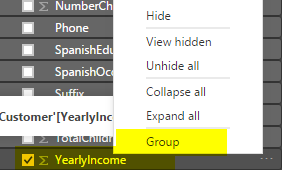
Now let’s create groups of people based on their yearly income categorized in buckets of $30,000. Right click on the YearlyIncome column in the fields section and select Group.
In the Groups window make sure Bin is selected as the group type (by default for numeric or date/time columns this will be the default). and set the size to 30000. This is the size that values of YearlyIncome will be split based on it.
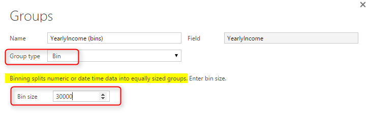
Press OK in the Group Window, and bring this new generated field (named YearlyIncome (bins)) to the table.
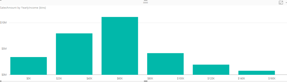
Color coding above shows that YearlyIncome values grouped by the division result of the value of yearly income by group size which is $30,000. If you want less groups you can increase the group size, or if you want more detailed groups you can decrease the group size.
Now you can remove the YearlyIncome from table view, change the table to be Column Chart to see which group generates the most revenue.
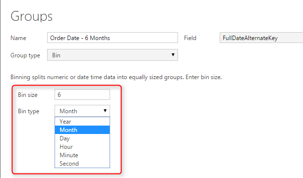
This binning can be applied to datetime values as well. For example if you want to see revenue based on half year’s banding, you can simply create a group with Bin size of 6 by Month. Let’s see the example; Right click on FullDateAlterneteKey column (from DimDate), and create the group;
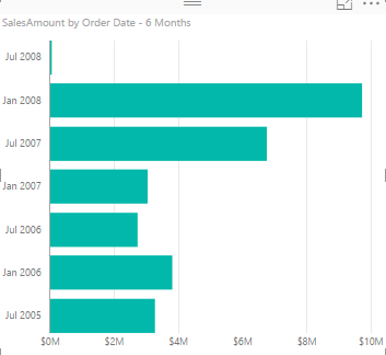
Now create a Bar chart with this new column (named Oder Date – 6 Months), and Sales Amount.
You can simply create other banding or binning for Years, Months, Days, Hours, and Minutes as well.
You Can Create a group of multiple items in a visualization. This group can be simply created by Ctrl+Click and selecting items, then grouping them. As an example; create a Column Chart with English Education (from DimCustomer), and SalesAmount (from FactInternetSales).

Now Ctrl Click and select High School and Partial High School, then right click and select Group.

You will see now them grouped together with a legend on the top of chart showing this group, and an “other” group.

Now create another group for Bachelors and Graduate Degree in the same way.
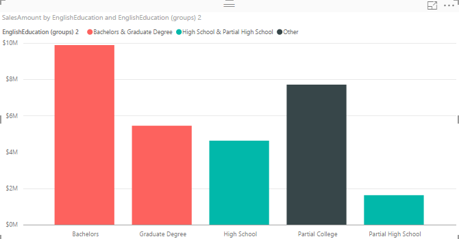
You have now three groups; higher education (Bachelors and Graduate Degree), College (Others), and High School (High School and Partial High School).
Once you have the grouping you can do many nice visualizations with that, an example can be creating a Stacked Column Chart with These Groups as the Axis, and the English Education as the Legend. To do so; Change these two in the chart and change it to be Stacked Column Chart.
Now the chart will look like this;
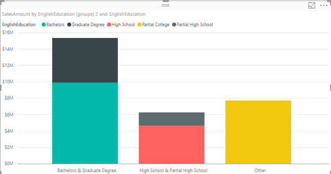
This shows simply how much revenue each category generates in total, and also inside the category which sub category (English education) generates the most or least revenue.
What is happening behind the scene is that there is a DAX calculated column (calculation is not visible in Power BI) created for each binning. This was exactly the method of implementing such thing previously. There is also another method which is creating the banding through Power Query.
Grouping and Binning is part of your model. That means if you create another report or chart you can use the Group there. Even if you create calculated tables or any DAX calculations you can use these new Group columns there.
There are heaps of possibilities that these new grouping features bring to your visualization. Having these grouping as part of you model also is great to have unique experience in your reporting solution. However There are always complex grouping conditions that still need to write a bit of DAX code or Power Query M script.
Published Date : October 10, 2016

This question is one of the main questions that people ask when they are at the preliminary stages of building a Power BI solutions. There is a misconception that Report is a detailed tabular report, and dashboard is interactive visualizations with chart. However this definition isn’t what Power BI reports and dashboards stands for. There are differences in these two main components of a Power BI solution, Understanding differences will help you to leverage their power in a best way. In this post I’ll explain what are differences between these two and Where, When, Why, Which is best to use? If you are interested to learn more about Power BI; read Power BI online book from Rookie to Rock Star.
Dashboard: General
Stephen Few‘s definition of Dashboard: A dashboard is a visual display of the most important information needed to achieve one or more objectives; consolidated and arranged on a single screen so the information can be monitored at a glance.
Report: General
A Report on the other hand is any informational work. This information can be at any format. Table, Chart, text, number or anything else.
Power BI Report
Power BI Report is combination of multiple visual elements (charts, texts, values…) on a page that can be inter-related with each other. Data visualized in the report can be sliced and diced with slicers. Power BI report is fully interactive from user. and It can be filtered based on some criteria.
Power BI Dashboard
Power BI Dashboard is a high level view of some of key KPIs of one or more reports. Dashboard is a day-to-day view of KPIs, and provide the navigation point to the detailed reports. Power BI Dashboard isn’t built for slicing and dicing.
You can see that definition of Power BI Dashboard and Report fits into the general definition of these two component we’ve had earlier. Now let’s look closer at these two.
Reports in Power BI can have multiple pages. In each page there might be multiple visualization elements. Slicing and dicing, hovering and highlighting is possible in the Report. We can drill down through a hierarchical data structure, or select a particular column in a column chart and see the related data to it in other visualization elements. All of these means Report in Power BI is for slicing and dicing. Report built for end users to play with different handles (slicers or visuals or filters), and achieve what they want. For example they might want to understand why Sales Amount in month August is lower than other month? or Which product is selling best, and how it is distributed through branches. Here is an example of Power BI report;
If you like to know how to create this report, please read this post.
Unique Features of a Power BI Report
A Dashboard in Power BI is a navigation point to reports, and a very high level day-to-day view of main KPIs of business. For example for a particular business need some KPIs might be required from multiple reports. For example year to date revenue from sales report, stock in hand from inventory report, and something from production report. With a Dashboard visualization elements from multiple reports and pages can be pinned to one main place. This place then will work as a navigation point. with clicking on each of these visuals user will be redirected to the report and page that has this element. Here is an example of a dashboard;
Unique Features of a Power BI Dashboard
You can simply slice and dice the data in the report with slicers. This is unique to reports, In dashboard there is no way of using slicers (Except using “Pin Live Page” option which will pin the whole page in the dashboard)
You can have multiple pages in a report. Navigation between pages is simply possible through the navigation pane at the bottom of report. In dashboard you can have as many as tiles you want. But there is no concept of pages. everything is in one page, If content doesn’t fit into one page scroll bars will appear (Which is not recommended)
In addition to slicers, you can select a particular element in a chart and it will highlight other elements. User can simply interact with report elements and get more insight from it. In dashboard with clicking on a tile you will be redirected to the report/page that built the element.

In Power BI you can have hierarchies; such as Product Group, or Calendar. And you can drill down or up in different levels of hierarchy through some of visualization elements. However in Dashboard drill down/up is not possible, and with a click on the visual you will be redirected to the report/page that built the element.

Publish to Web is a specific feature for a report. With Publish to web report can be published as a public web page, or can be embedded in a publicly available web page. Dashbarods at the time of writing this post, cannot be published publicly on the web. To read more about Publish to Web, read this blog post.

Users can explore the data of a particular visual element in the report with options in Explore Data or See Records. These options will help users to drill even down to the record level and see roots of a particular value in a chart. In dashboard only the data of dashboard (not data records) can be exported.
Automatic refresh is one of the main benefits of dashboards vs reports. A dashboard can be designed in this way that it be open for many hours and it will refresh automatically (depends on elements explained later). On the other hand if you open a report, and if data set of that report get refreshed, you need to manually refresh your report otherwise your report won’t be refreshed automatically.
Well when I get to this point, many students in my courses asks why this behaves like that?! Why it is not getting refreshed automatically like the dashboard. I believe the main reason for this is scenarios like this: Consider that an analyst has opened an inventory report, and is checking number of that with a static report that he/she has in Excel or even on paper. His/Her excel or paper report is static, and he/she is doing a sanity check to see if numbers match or not. if the report be dynamic then nothing can be checked. There might be other reasons as well, but this is I believe the main reason for it.
Power BI Dashboards refreshes whenever the data set refreshes. This is for when we import the data into Power BI. If the data set is scheduled to refresh, or if we refresh that manually, the dashboard will be refreshed automatically.
Power BI Dashboards for DirectQuery data sets refreshes every 15 minutes.
Dashboards, Reports, and Data Sets in Power BI can be shared through different methods; such as Content Packs, and Power BI Work Groups. However Dashboards can be shared through a basic sharing method as well. This is an addition to the other methods of sharing. With this method person/people that this dashboard will be shared with them will receive an email with the dashboard link.

It is easy to change size of dashboard tiles, and change order of them, also to add new tiles (Image, Text, Web, and Video) in dashboard. That said it is also possible to make changes to a report as well. But that required clicking on Edit report, going to edit mode, applying changes, and saving. Dashboard is like user’s view of the world, so simply can be adjusted to what he/she wants to see.
A dashboard can be set as a landing page with setting that as Featured Dashboard. There can be only one featured Dashboard. If you set another dashboard to be featured, the previous featured dashboard will be replaced with this new one.

If you haven’t heard about Q&A I encourage you to read this blog post. Q&A is an engine of top of Power BI model which will respond to your natural English language questions. Q&A box is only available on top of dashboards (Not all types of dashboards, at the time of writing this post, Q&A on dashboards that has Row Level Security enabled, or data sets used DirectQuery is not possible).
I’ve mentioned that dashboards refreshes automatically. However this doesn’t mean real-time monitoring. Real-time monitoring means using PUSH approach. That means anytime a new data in the source is available it should be monitored. It is possible to have real-time monitoring of events with Power BI Dashboards. The data set at the moment can be sourced from PubNub, Azure Stream Analytics, or REST API. To learn more about real-time monitoring with REST API read this post, and Azure stream Analytics read this post.

You can define alerts for each data driven tile in the report. Alerts can be as simple as if number goes above or below something send an email to me.

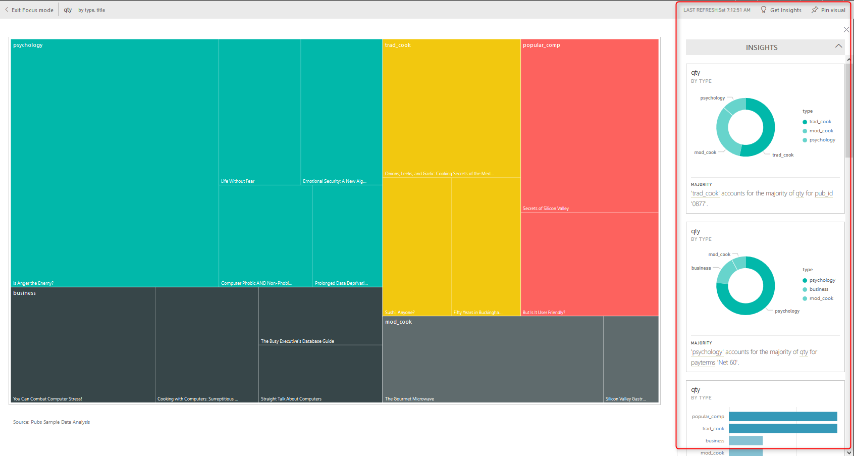
In dashboards you can get some more insight with selecting the Related Insights feature of the tile. This option will search through patterns in the data set and visualize them automatically.
As you see dashboards and reports are not exactly the same. there are many major differences between these two. majority of the difference is that; Dashboard is day-to-day single page view of main KPIs, which can be refreshed automatically and can visualize real-time events. Dashboard can be used to navigate to reports. Reports are interactive data visualization elements that can be used by users to slice and dice, highlight and interact with to investigate numbers and insight more in details. For a great visualization solution with Power BI you would need both, these are complements of each other, not replacements.
Published Date : October 7, 2016
Previously I’ve explained a method of looping through number of files in a folder which used Custom Functions. This method is preferred method buy not always working with Schedule Refresh and gateway setup, because scheduled refresh doesn’t always support custom functions in the code. So I this post I show you a second method that loops through the files dynamically, and it doesn’t use custom function, and you will see at the end of this post that schedule refresh works with this method. For better clarification of the scenario I will first do custom function approach, show you the problem with scheduled refresh, and then I’ll explain about the second method. If you would like to learn more about Power BI, read Power BI online book; from Rookie to Rock Star.
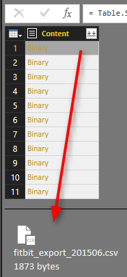
For running example of this post you need to download set of CSV files from here: fitbitsourcefilesradacad
In this example we have number of CSV files which has list of my Fitbit activities, one file for each month. All under the same folder, all same structure. We want to apply number of similar steps to each files and loop through them and fetch the data all into single data set. After building a report on top of that we want to publish it to Power BI service, and get that refreshed through a gateway configuration. As files has similar structure we are looking for a mechanism to apply same steps on all files.
You will see two approaches with this, first one is preferred approach because it uses custom functions, however because scheduled refresh doesn’t support custom functions always, so there is a second approach which will work with automatic refresh. If you are visiting this page at the time that problem of scheduled refresh and custom function resolved, then use the first approach, otherwise use the second.
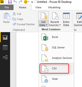
Open a New Power BI Desktop, Start by Get Data, and Select CSV as a source.
Choose of the files in Fitbit Source folder and continue;
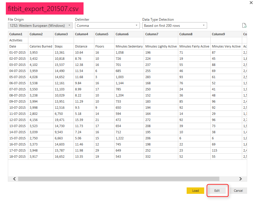
Go to Edit Queries Window with clicking on Edit button, and You will see data previewed there.
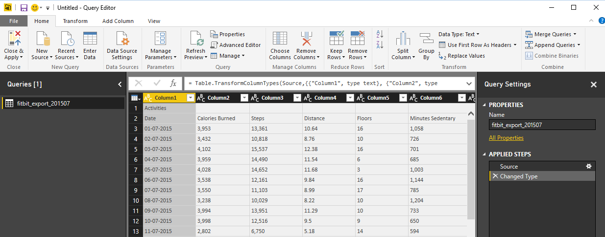
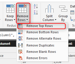
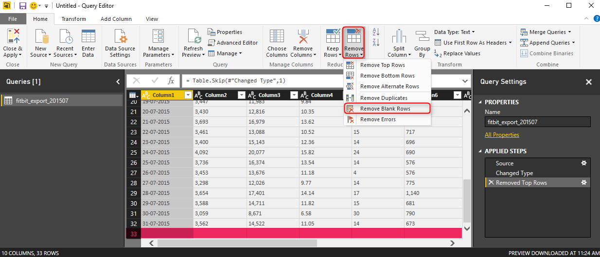
As you can see in the preview the first record isn’t useful. it has just a title “Acitivities”, so let’s remove it with going to Remove Rows, Remove Top Rows. and enter 1 in the dialog box;
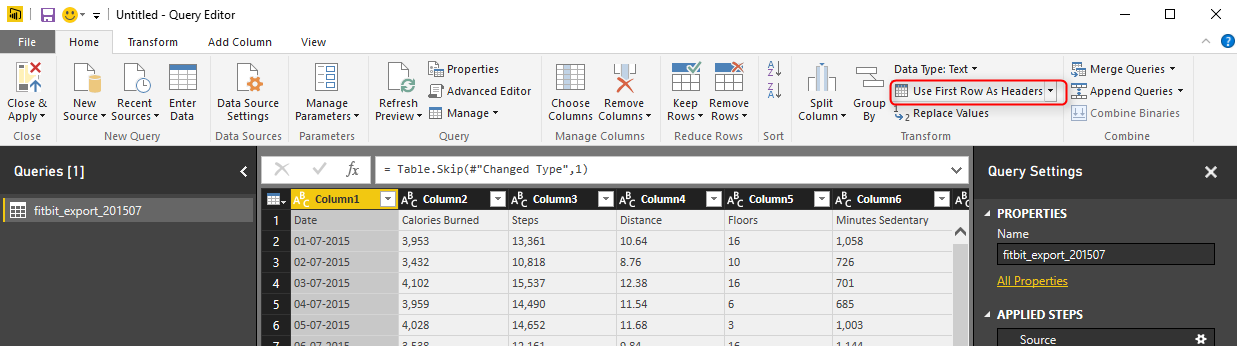
Now the first row only contains column headers. So let’s promote it to column headers with clicking on Use First Row As Headers.
There are also some blank rows, so let’s remove them with Remove Rows -> Remove Blank Rows.
Now we’ve done all clean up work for this file. We have one row per each day with details of activities in that day. Next step is to loop through all files in the source folder, and apply same number of steps on them. Fortunately we can use Custom functions for this. Previously I’ve explained how Custom Functions are helpful in code re-usability, better maintenance, and consistency. Instead of repeating same steps for each file is it much wiser to create a function from these steps, and call the function for each file. So let’s do it;
For creating the function through GUI, the first step is to create a parameter. You can create Parameter from Menu option or with right click on the blank area in Queries section.
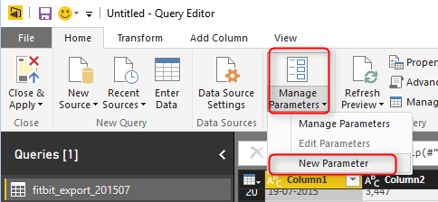
Create the Parameter with name of FullPath, of type Text, and set a default value to be full path (including file name, and extension) of one of CSV files in your folder;

After creating the function you should be able to see that with Parameter icon in Queries pane;
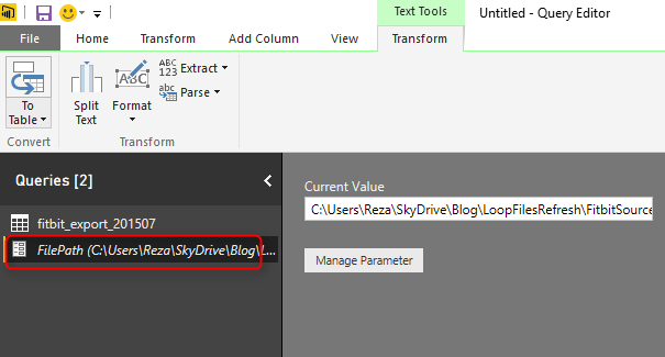
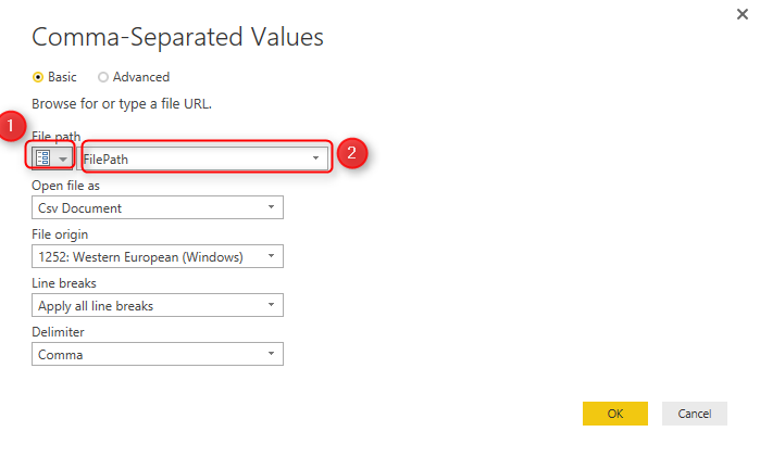
Next step is to get the current query (in the screenshot named as fitbit_export_201507) sourced from the FilePath parameter instead of static path. Click on the query, and choose settings from steps in right hand side pane;
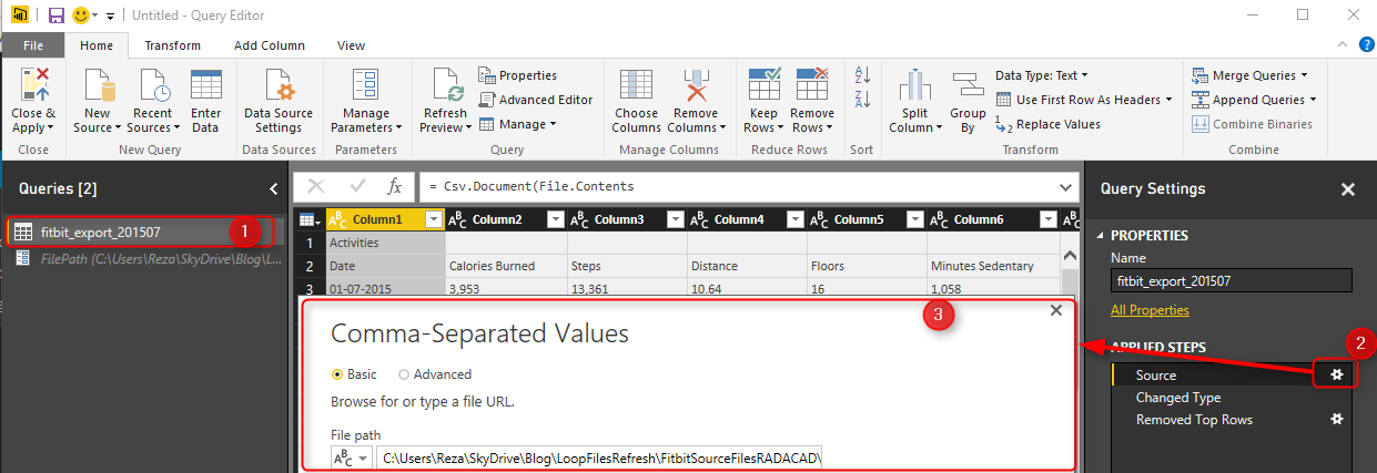
Change the File path in the setting window to be sourced from Parameter, and because you have only one parameter FilePath parameter will be selected automatically.
After clicking on OK, you will see result of first step before applying your changes, so simply click on the last step to see the final result. if the file path you have provided as the default value of parameter be wrong you will see an error, otherwise you will see the data of that particular file. Now let’s create the function;
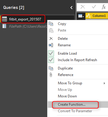
Right click on the query that we just changed the source of it (fitbit_export_201705), and select Create Function.
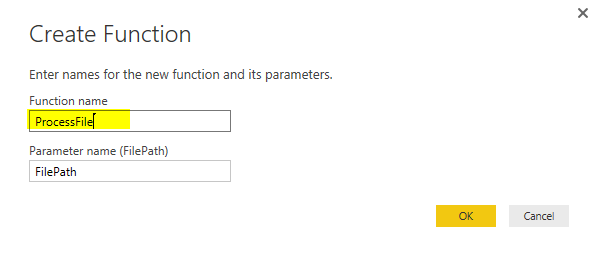
Set the function name as ProcessFile, and leave the parameter as is.
Because the query used parameter as a source so it can be simply used to create a function. Now You will see a function listed in Queries pane as well.
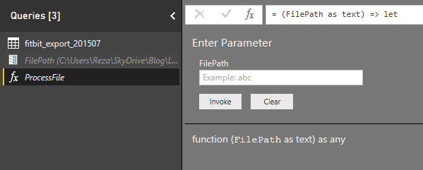
Note that the function uses M (Power Query Formula language) with Lambda syntax. But we have created it all just with graphical user interface option. If you are interested to learn more about code side of it, read this post. This function now has all the steps generated in the first query. To see the steps you can simply click on Advanced Editor while you have ProcessFile function selected in Queries pane.
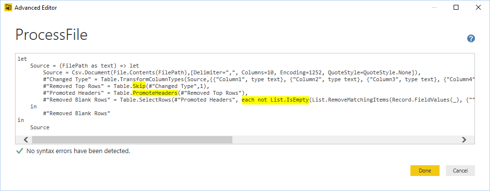
Don’t be afraid of this code! you don’t need to change anything here. It was just for letting you know that we have same steps copied into the function.
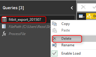
Now you can remove the first query, we don’t need that anymore, steps are already in the custom function.
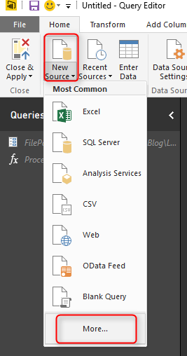
Now that we have the function ready, let’s get list of files and apply it on all files. Get Data from a New Source, and More.
Choose Folder this time;
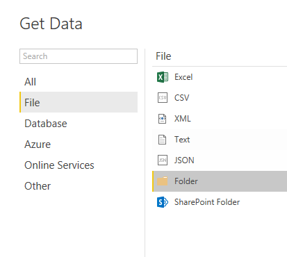
And select the folder which contains all CSV files;
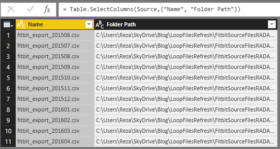
After clicking OK here and also on the preview, you will see list of all files in this folder with their details such as file name, extension, date created…. and folder path. You also see a column as Content, which is the Binary format of this files (the actual data in each file), I will talk about this column more in second approach.

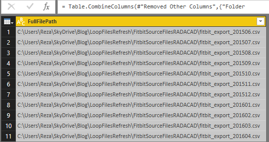
For this approach we just need a full file path which we can generate from Folder Path and Name , so only select these two columns and remove everything else.
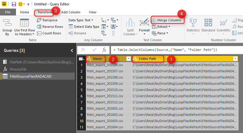
Now let’s concatenate these two and create a full file path, Select Folder Path first, and then hold ctrl key and select Name column then. Go to Transform Tab and Choose Merge Columns
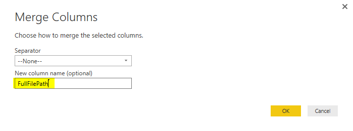
Name the new concatenated column as FullFilePath, You don’t need to put a separator for it, because Folder path already has an ending backslash in the string.
This will replace existing two columns with the new FullFilePath concatenated column;
Now we have everything ready for the custom function to be called for every record of this table. Go to Add Column tab, and click on Invoke Custom Function;
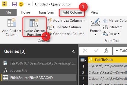
In the Invoke Custom function dialog box, select the function as ProcessFile, and the input parameter this time comes from the FullFilePath column that we created few minutes ago. Name this column as Content.

After clicking on OK, in an instant, you will see the new column appears which has a Table in each cell. This is the data table processed for each file. If you click on a blank area of one of table’s cells you will see the data preview of that in a details view pane underneath preview pane.
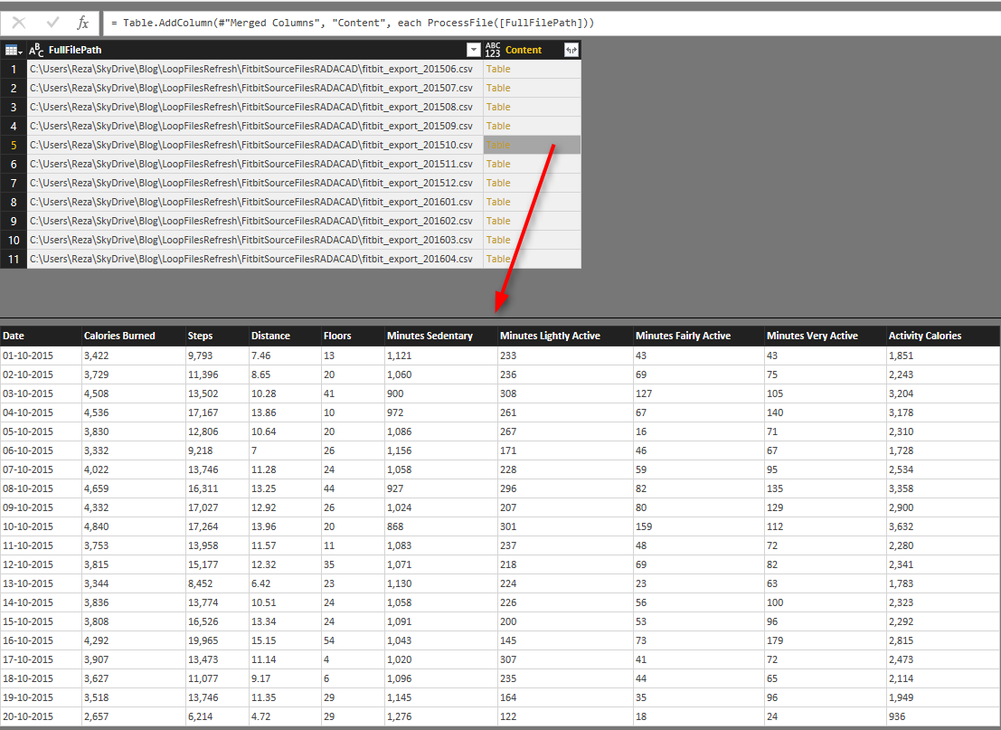
We don’t need FullFilePath column anymore, so Remove that column. Now in the table we have just one column, which is a structured column. Means it has a structured value in each cell (in this case a table in each cell). We can now expand this structured column to all underlying columns with clicking on Expand button. Also remember to uncheck the box for Use Original Column Name as prefix.
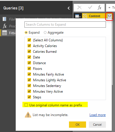
This expand button (or you might call it Magic button now, as it reveals the magic!) combines all data tables into a single big data table, including data rows from all CSV files.
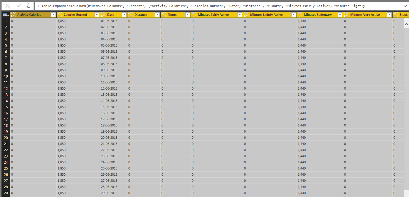
All we need to do now is some data type changing;
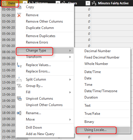
Change data type of all columns except Date and Distance to Whole Number. Change data type of Distance column to Decimal. and Finally change data type Date field to Date. For the data type of Date field to be changed you need to choose locale. because the exported files has date values in New Zealand Date format, and if you change it with normal data type conversion, Power Query try to convert their data type based on your local system date format, which might not be New Zealand’s format. So right click on Date Column. under Data Type choose Using Locale.
In the new dialog box, choose the data type to convert to as Date, and set locale as English New Zealand
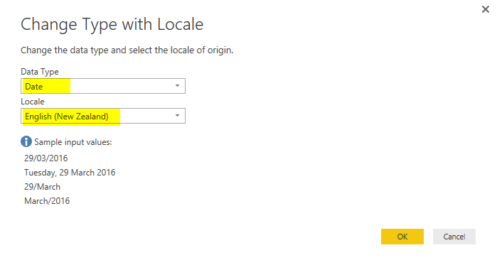
After clicking on OK you will see data types converted correctly without any error. As the final step now change the query name to Tracking Data;
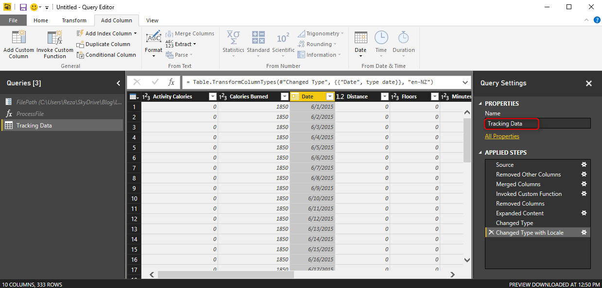
Notice that Date column showed in above screenshot is converted to a Date format (you can see the date format icon in the column header), but it shows in this window to me in my computer locale format which is English (United States). The way that it shows doesn’t matter. All matters is that this is of Date format.
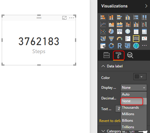
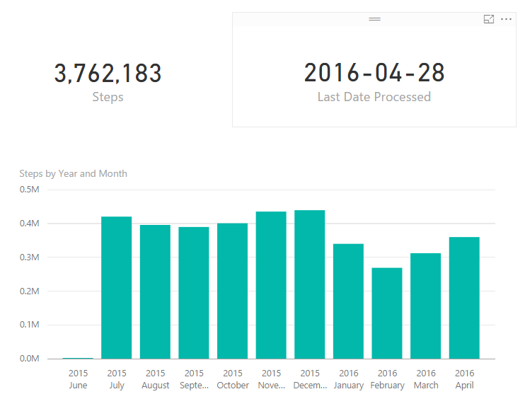
Now let’s build a very simple Report with the data. Close and Apply Power Query window, and in the Report pane, add Steps as Total value in a Card Visualization. Also in the formatting section set the Format of data label to display as None (means without any millions, or K, or anything like that).
The other visualization to add is a Column Chart, which Steps as Value, Date as Axis. It it will automatically brings Date Hierarchy, So remove Quarter and Day from the hierarchy.
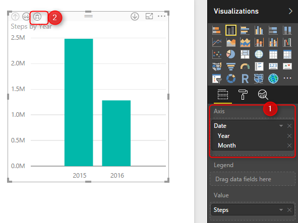
After removing Quarter and Day, click on Expand all down one level in the hierarchy in the top left corner of the column chart (screenshot above numbered 2);
Also create a measure to show the last date. Go to Modeling tab, New Measure, and use LastDate function to get the latest date of the date field in the Tracking Data table;

Last Date Processed = FORMAT( LASTDATE('Tracking Data'[Date]) , "YYYY-MM-DD")
Show this new measure as a Card visual in the report.
We can make this report much richer with adding more insights and visualizations, but let’s keep that simple for now. Save the report and Publish. You can save it with a name like Fitbit Custom Function Method.
Because we want the report to be refreshed from on-premises folder we need to set up a gateway. Both Personal and On-Premises gateways can do this. Explanation of how to install and configure gateway is out of scope of this post, If I want to explain that I will make this post VERY LONG! If you want to learn more about gateways read this post about Personal gateway, or this one about On-Premises Gateway. I explain everything from after successful setup of gateway here, where we need to add a new data source.
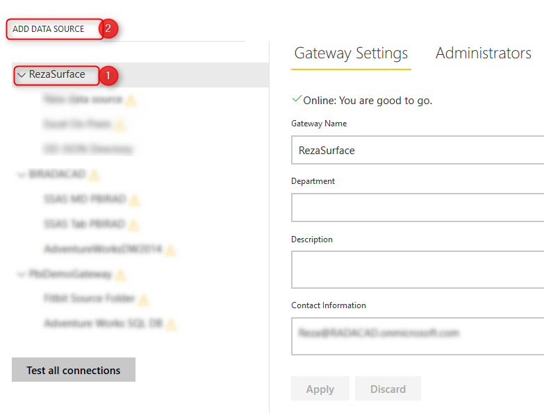
We have to create a data source under the gateway for our local folder containing CSV files. Go to Manage Gateways in Power BI Service
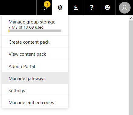
Now select your gateway, and add a new data source under it.
Set up the new data source for Folder and set the local folder path there;
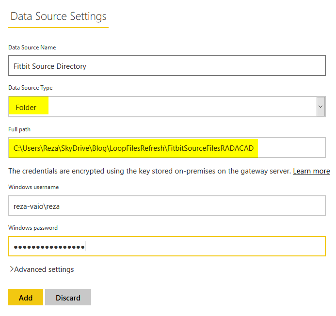
Note that the local path should be accessible from the machine that has gateway installed on it. otherwise it should be a shared path. The windows username used here also should be for an account that has read access on the folder we are trying to access.
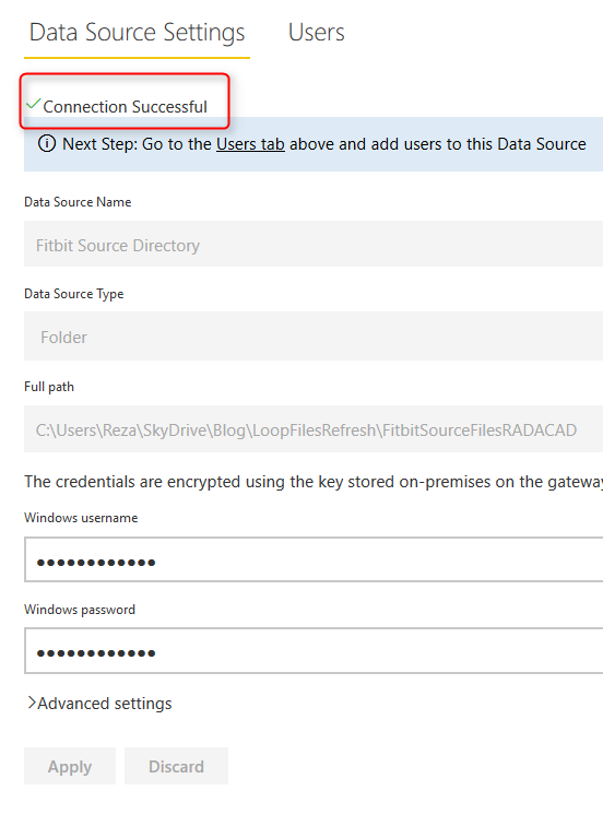
After successful setup you will see a message clarifying that;
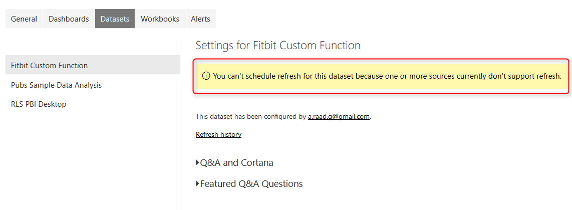
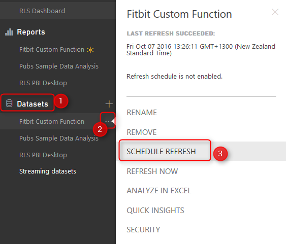
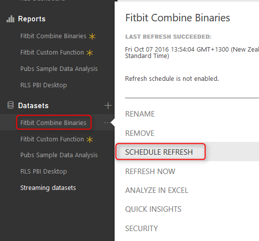
We’ve published the report earlier. Now it’s the time to Schedule it for refresh, and configure it to get its data from gateway. Under Datasets find the Fitbit Custom Function dataset, and click on ellipsis button and choose Schedule Refresh.
In the Schedule Refresh Setting section, You will see an error message that says you can not configure gateway for this data set. That’s because of custom function used here. (Note that this happens at the time of writing this blog post, It might be resolved by the time that you are reading this post)
The error message is: You can’t schedule refresh for this dataset because one or more sources currently don’t support refresh.
Now you see the problem, It was a long way to show you the issue! but you need to know it before using many custom functions in your code. Let’s go through the second approach to resolve it.
This approach has some limitations and difficulties involved, However at the time of writing this post, this is the only way of getting the scheduled refresh working.
With this method we start with getting data from Folder. Open a new Power BI Desktop solution, and Get Data From Folder, exactly as you’ve seen in the Get Data From Folder section earlier in this post.
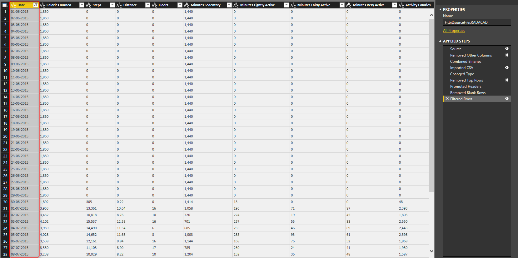
This time however we don’t use custom functions, we want to use binary data of the file content. Content column includes the Binary Data. Content column is all we need, so remove all other columns.

If you click on a blank area in any Binary cell in the content column, you will see the CSV file in preview pane under it.
This Content column is a structured column, and any structured column can be expanded. Expanding a structured column with Binary values Will combine them together. Click on Combine Binaries button on the top right hand side of the column.

Combine Binaries will combine content of all files together, and will generate a big list of all data rows. You can also see automatic steps applied after combining binaries in the steps pane.

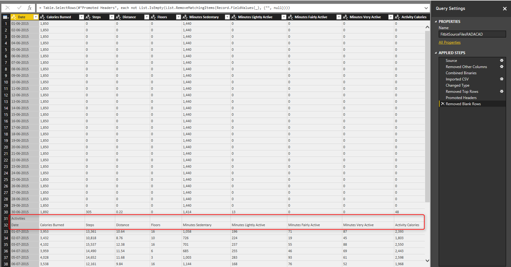
Now that we have all data rows. Let’s do some cleanup;
As you can see in the preview the first record isn’t useful. it has just a title “Acitivities”, so let’s remove it with going to Remove Rows, Remove Top Rows. and enter 1 in the dialog box;
Now the first row only contains column headers. So let’s promote it to column headers with clicking on Use First Row As Headers. There are also some blank rows, so let’s remove them with Remove Rows -> Remove Blank Rows.
There are still some additional rows with “Activities” or “Date” labels in their first column. These are heading rows in each CSV file. After combining content of all files these appears in the middle of the data set.
We can remove them by applying a filter on Date column. Click on Filter icon for Date column and from Text Filters choose Does Not Equal.
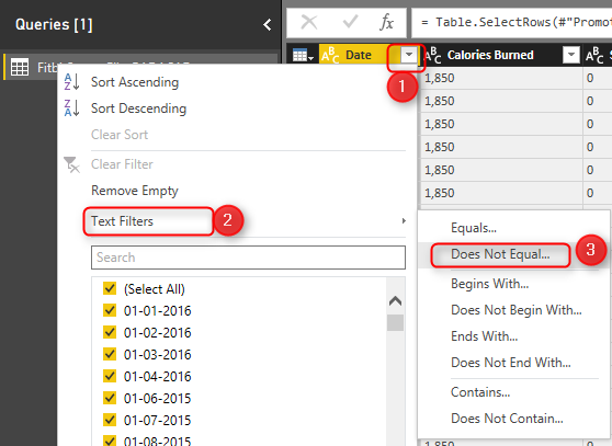
Choose Does Not Equal, and with an AND condition type in both Activities and Date there.
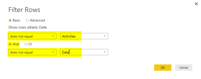
This will filter all extra labeled rows, and you will only see actual data rows.
Now Apply Same data type conversion steps and build the same report as we’ve done earlier. So continue again from Step Data Type Conversion.
Apply the same steps from Step Data Type Conversion, and Build the Sample Report till saving the report.
Save this Power BI file as Fitbit Combine Binaries. and Publish.
If you have already set up the Data Source for this folder, you don’t need to do it again. Just go directly to Schedule Refresh under Fitbit Combine Binaries dataset.
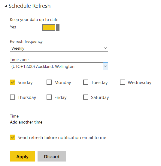
This time in Schedule Refresh setting you won’t see any error, and you can simply choose the Gateway and apply. Because we haven’t used any custom functions here, so no error message anymore. All good to go.

Under this section there is another section that you can Schedule report to be refreshed, daily or weekly depends on how you want it.
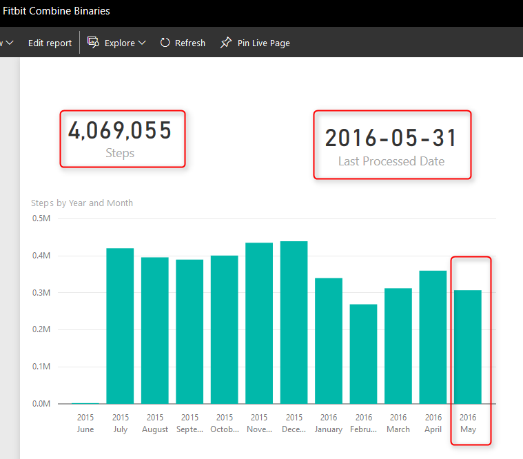
Now let’s test the refresh. Download this new CSV file and paste it in the same folder of other CSV files (the folder that you’ve set up for gateway as a data source); fitbit_export_201605
Refresh the dataset with Refresh Now (Or wait untill schedule refresh happens! I’m not that patient, so I’ll do refresh now ![]() )
)
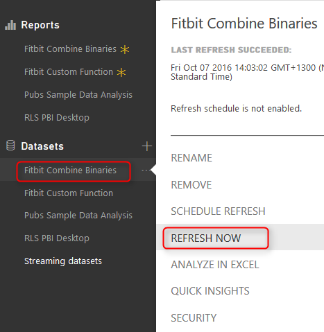
If there be no errors in connection and gateway setup and access to the source folder, then refresh finish successfully. Go to report and refresh the report to see the new data.
You will notice that Data of month May is added. Total number of steps is now over 4 million, and last processed Date is 31st of May 2016.
Congratulations, You have done the example successfully, and much harder; You have finished this very long post ![]()
If the Gateway issue with custom functions resolves, I’d say first method with custom function is definitely the best method. Because you have vast flexibility with custom function. Combine Binaries doesn’t always produce an easy output, with some excel files it might generate some data rows which needs many more steps for cleansing the final data. But for now that gateway has this issue with custom functions, the only possible way is Combine Binaries.
Published Date : September 26, 2016
You can filter all visuals in Power BI except Slicer! In fact slicer itself is a type of filter, however there are some times that number of items in slicer is too many. So this is normal that we want to filter the items in the slicer itself. Unfortunately current version of Power BI Desktop doesn’t support visual level filter on slicer, and I’m sure this feature will come soon. However in the meantime here is a work around for filtering slicers using calculated tables. If you want to learn more about Power BI, read Power BI online book; from Rookie to Rock Star.
The idea of this blog post came from a question that one of students in my Power BI course asked to me, and I’ve found this as a high demand in internet as well. So I’ve decided to write about it.
You might have too many items to show in a slicer. a slicer for customer name when you have 10,000 customers isn’t meaningful! You might be only interested in top 20 customers. Or you might want to pick few items to show in the slicer. With all other visual types (Such as Bar chart, Column chart, line chart….) you can simply define a visual level filter on the chart itself. Unfortunately this feature isn’t supported at the time of writing this post for Slicers. However the demand for this feature is already high! you can see the idea published here in Power BI user voice, so feel free to vote for such feature ![]()
The work around in this post might get dated very soon because I expect Power BI team to fix this soon, however in the meantime this workaround will help some people I believe.
There are number of workarounds for this challenge;
I have written a blog post about what Calculated tables are and how to use them for features such as role playing dimensions in Power BI, and fetching filtered views such as top 20 customers. I strongly encourage you to read that post to learn about usages of calculated tables. In summary calculated tables are DAX generated tables, these tables will be part of the model, and can have relationship with other tables in the model.
For filtering data in a slicer I thought using calculated tables for such filtering. I know it won’t be that easy filtering. and I would need to write a bit of DAX instead of picking items from a list, but at least I have full DAX features to use and create whatever filter I want. Once we create the filtered view as a calculated table, then we can create relationship between that table and other tables, and use it in the slicer. Let’s go through that with an example.
For running this example you need to download and install AdventureWorksDW database from here.
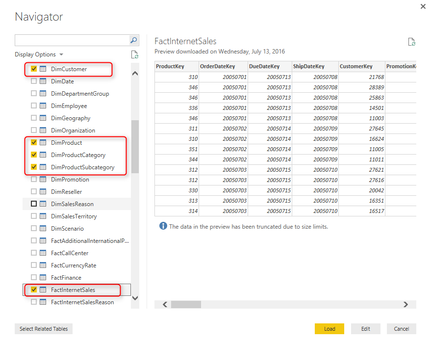
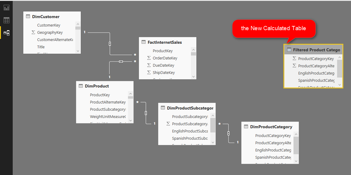
Start with Get Data from AdventureWorksDW database, and choose these tables to import: FactInternetSales, DimProduct, DimProductSubCategory, DimProductCategory, and DimCustomer.
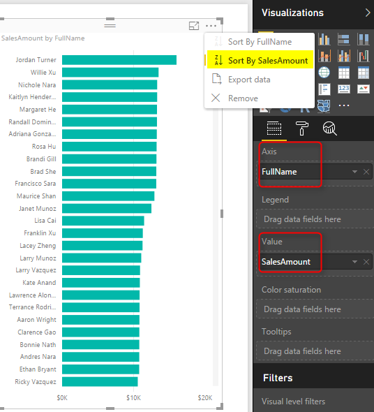
Click on Load, and then build a bar chart with Full Name from DimCustomer as Axis, and SalesAmount from FactInternetSales as Value. Also sort the chart by SalesAmount in descending order.
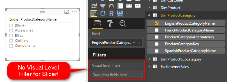
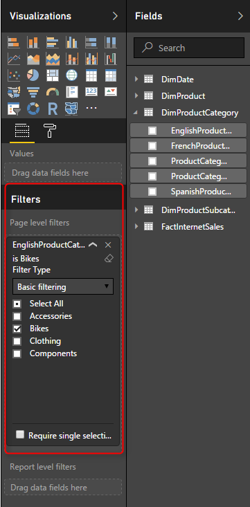
Then Create a Slicer with EnglishProducctCategoryName from DimProductCategory. Note that if you drag and drop something into visual level filter it won’t be placed there! in this version of Power BI Desktop Visual Level Filters are not supported for slicer! But don’t worry we will solve it with calculated tables.
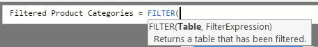
Go to Data Tab, and from Modeling tab, choose Create Calculated Table

Let’s create a table for filtered list of product categories. As a simple example, let’s show everything except Bikes. I use FILTER function of DAX which gets a table to filter as the first parameter, and the expression as the second parameter.
Now set DimProductCategory as the table, and everything except Bikes as the expression as below;
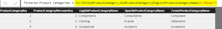
Here is the DAX code;
Filtered Product Categories = FILTER(DimProductCategory,DimProductCategory[EnglishProductCategoryName]<>"Bikes")
As you can see the filter simply selects everything but Bikes. After creating the table, go to Relationship tab
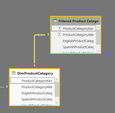
Create a relationship between DimProductCategory, and Filtered Product Category based on ProductCategoryKey.
Now go back to the Report tab, and in the slicer use EnglishProductCategoryName from Filtered Product Category.
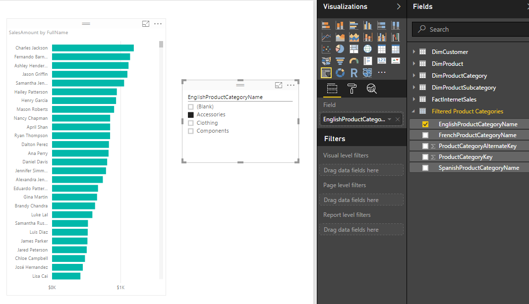
You can see that the slicer is now showing everything but Bikes. Other elements in the report will show everything if slicer hasn’t filtered them yet. If slicer filter their data then they will show only filtered data.
The example I’ve showed you here was a very basic example of filter. DAX is fully featured language. you can define a very complex filter as well. Think about all possible filters you can create with calculated tables. things like top 10 customers, or any other filters that you cannot simply achieve with visual level filters are possible here.
Calculated tables can be created only if you use Import Data into Power BI. these are generated based on DAX functions, and are not available as DirectQuery.
Calculated tables consumes memory, but you can reduce it with selecting minimum number of columns in calculated tables, and some DAX performance tuning considerations.
In summary I explained to you how to create a visual level filter on a slicer using calculated tables. This method might not be as easy as picking some items from a list in a visual level filter section of the report, but it is very powerful because it uses DAX filtering for generating calculated tables. creating filters such as top 10 customers are possible here with DAX expressions. There are some limitation though, DAX is only supported if you import data into Power BI. the DirectQuery don’t support calculated tables.
Published Date : September 12, 2016
Few weeks ago, I’ve written how REST API can be used for real-time dashboard in Power BI. Another method for real-time dashboard is using Azure Stream Analytics. This can be combined with Azure IOT and Event Hub to get data from IOT devices. In this post I’ll explain to you all steps necessary to push output from a .NET application through Azure Event Hub, and Azure Stream Analytics to Power BI. You will see how to create a real-time dashboard with this method. If you want to learn more about Power BI; read Power BI online book; from Rookie to Rock Star.
You need an Azure account for running sample of this post. Azure account can be created with a free trial 1 month of credit. To create an Azure Account go to Portal.Azure.com.
You also need Visual Studio 2015 professional or Community, because a .NET application will be used as the source of the data.
Diagram below shows the architecture of this sample.
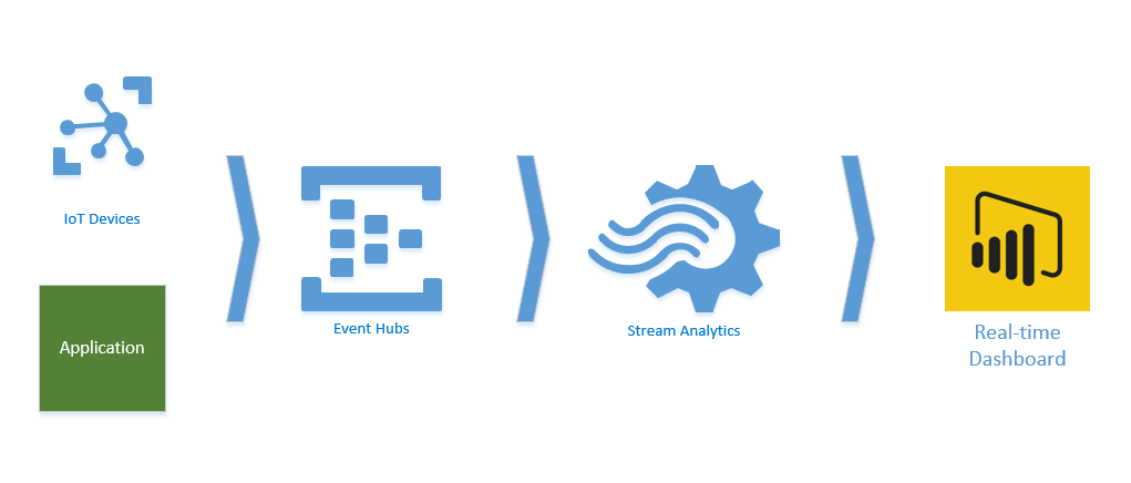
IoT Devices or Applications can pass their data to Azure Event Hub, and Azure Event hub can be used as an input to Azure Stream Analytics (which is a data streaming Azure service). Then Azure stream analytics can pass the data from input based on queries to outputs. If Power BI be used as an output then a dataset in Power BI will be generated that can be used for real-time dashboard.
As a result anytime a new data point from application or IoT device comes through Event hubs, and then Stream Analytics, Power BI dashboard will automatically update with new information.
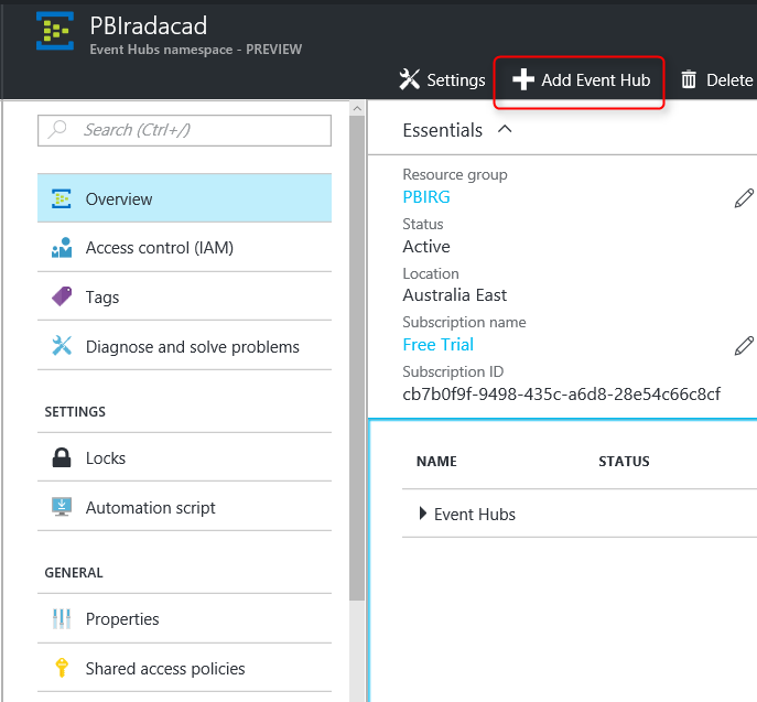
Azure Event Hub is the entry point of the data from applications. Start by creating an Event Hub by going to Portal.Azure.com
In Azure portal, create a New Event Hub from New, and then Data + Analytics

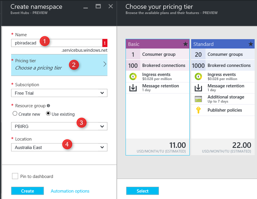
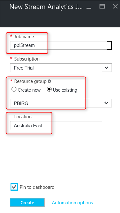
Event Hub needs a Service Bus, this first step here creates the namespace for service bus. Set a namespace in the new blade. for example PBIRadacad. choose a pricing tier. for this example you can choose Basic. Select a resource group (or create if you don’t have one), and set a location.
 After creating you will be redirected to Event Hubs Namespace Blade. Your Event Hubs namespace can include multiple Event Hubs. Create your first Event Hub here, by Adding an Event Hub.
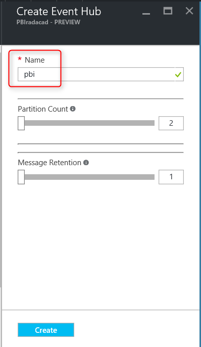
For the new Event Hub just set a name. like pbi for example. and leave other settings as is. You can change these settings if you want to change partitions, and number of days to retention.
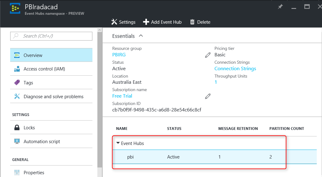
After creation the Event Hub should be listed under PBIRadacad Event Hubs (or whatever name you set for the namespace).
For simplicity we keep all configuration and setting as is. So far, you have created the Event Hub which can be used as the data entry input point. Now Let’s create an Azure Stream Analytics Job.
Stream Analytics is a data streaming technology under Azure list of services. With this technology you can pass data from input (such as Event Hub) to one or more outputs. Note that Stream Analytics is not a data storage. If you want the data to be stored you have to pass that to an storage output, such as Azure Blob Storage, or Azure SQL Database or Azure SQL Data Warehouse.
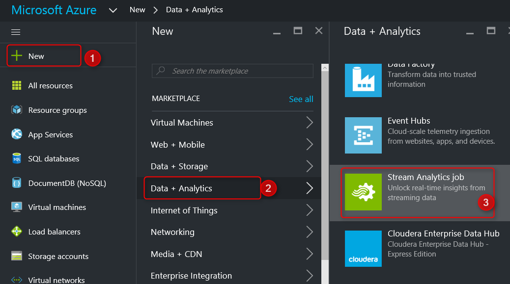
Create an Azure Stream Analytics Job from Azure portal under New, and Data + Analytics.
Set a Name, Resource Group, and Location for Stream Analytics Job.
After creating the job, you will be redirected to the job’s blade.
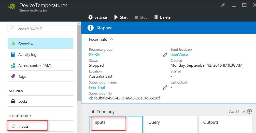
Job above named as DeviceTempratures, yours might be named something else.
From Job Topology click on Inputs, and then Add an Input in the new blade. In the New Input blade, set a name. set Source to Event Hub, and choose the service bus namespace as the namespace you entered earlier in this post (PBIRadacad). and select the event hub as pbi.
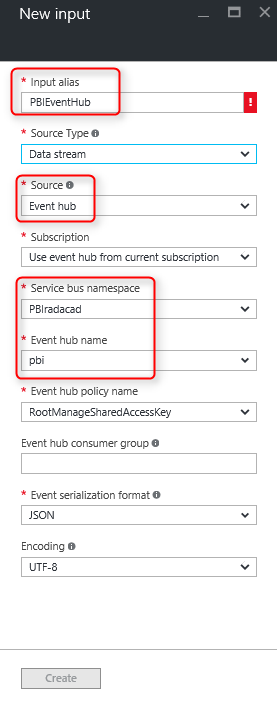
Leave event serialization format as JSON and encoding as UTF-8. With setting above, now Stream Analytics reads the input from Event Hub.
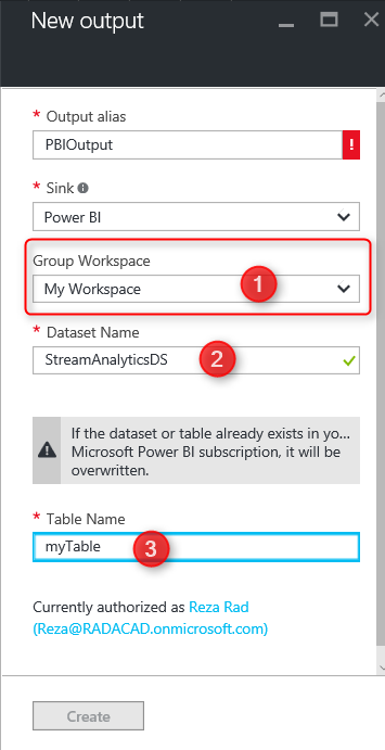
Go to Stream Analytics main blade and create an Output this time. Set a name such as PBIOutput, and set Sink to Power BI. This means Stream Analytics will output to Power BI as a data set.
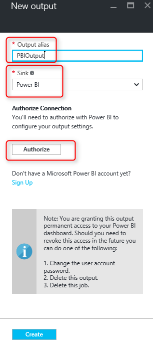
Then Click on Authorize to map the Power BI account that you want to use here. You will be prompted to login with your Power BI username and password. This account can be different from your Azure account.
After authorization, you will see list of all groups in the Power BI account, and you can choose where the data set will be published to. (by default it goes to My Workspace, but you can change it to other groups). If you want to learn more about groups in Power BI, read this post. Set a name for data set, for example StreamAnalyticsDS. Notice that if a data set with this name exists, data set will be overwritten. set a name for table, for example myTable. and then create the output.
After creating output and input you will see them both under Stream Analytics blade. but you can’t start the job yet. there is one step more.
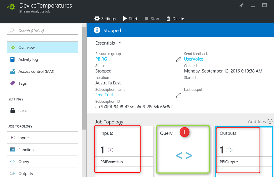
Stream Analytics passes the data from input to output through query. Without a query you cannot start Stream Analytics job. For this example we use a very simple query which select everything from input and pass that to output. Click on Query item in the Stream Analytics main blade (as numbered 1 in above screenshot).
Change the default query to;
SELECT
    *
INTO
    [PBIOutput]
FROM
    [PBIEventHub]
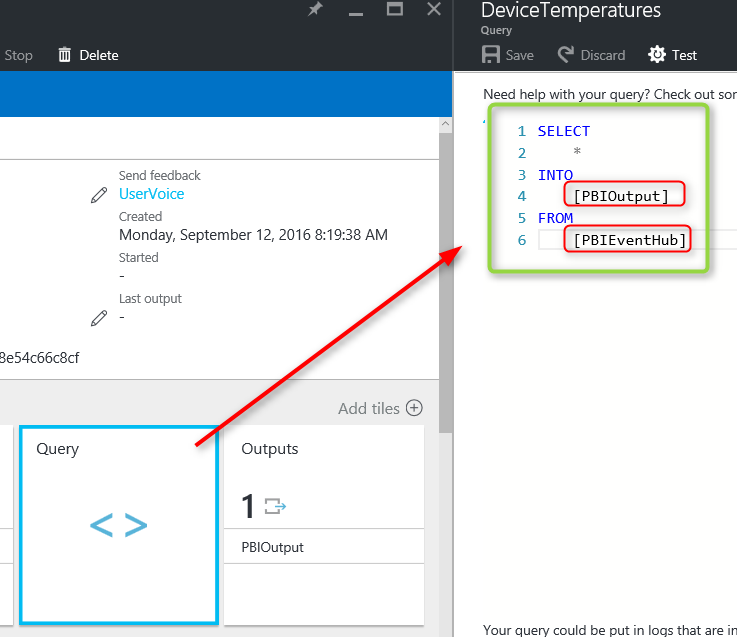
Notice that the query select everything from the input. so you have to put your input name after FROM clause. and it will insert result into output. So you need to put your output name after INTO clause. if names doesn’t match you get failure error message at the time of starting the job.
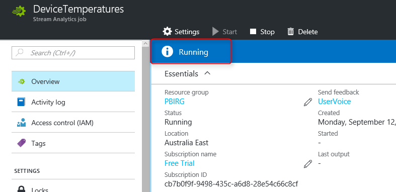
Don’t test the query. Just Save it and Start the job. It will take few minutes for job to start. Wait and check if the job started successfully. Otherwise failure might be related to input, output, or the query. You have to see job in RUNNING state as below.
As I mentioned earlier in this post, I’ll be using a .NET C# console application to pass the data to Event Hub. Let’s create the sample application by opening Visual Studio 2015 Professional. Create a New C# Console Application.
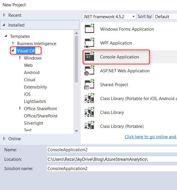
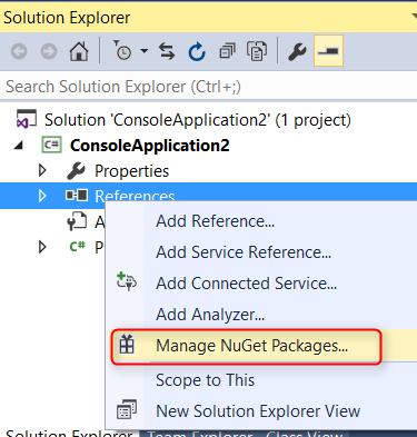
Name the application something, and when it is opened in Solution Explorer, go to Referencces, right click and select Manage NuGet Packages
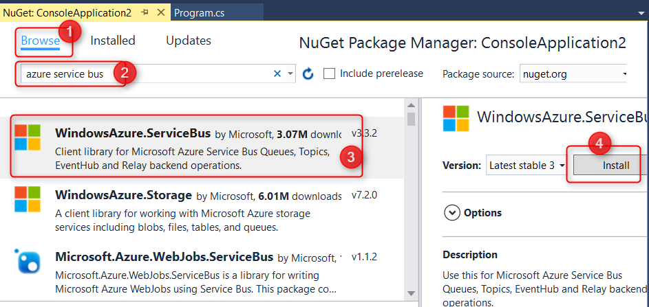
Click on Browse, Search for Azure Service Bus, and install it.
After installation, open App.Config file and at the end of the file search for appSettings. The connection string to Azure Service Bus is in the value beneath this section.
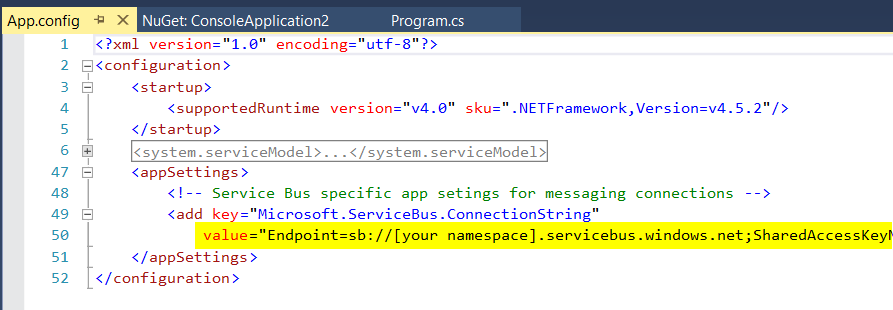
The highlighted line should be changed to your service bus connection string. To find your service bus connection string go to Azure Portal, find the service bus (we’ve created it in Event Hub section) under All Resources.
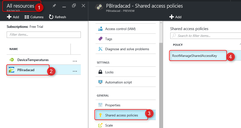
Under RootManageSharedAccessKey you’ll find Primary Key;
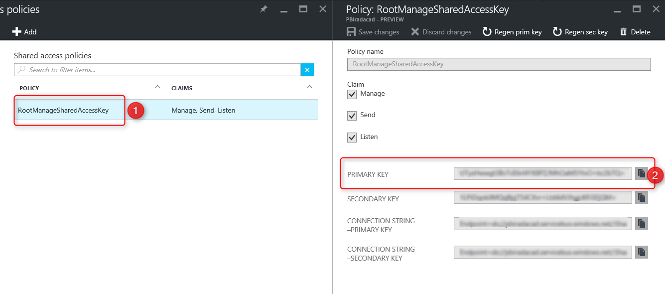
Copy the value of primary key here and replace the value in app.Config file with it. Save the App.Config after change and close it.

Then right click on the references folder in solution explorer and add System.Configuration reference.

Now open Program.CS file and add these two namespaces using;
using System.Configuration;
using Microsoft.ServiceBus.Messaging;
Also add code below under Main method;
string ConnectionString = ConfigurationManager.AppSettings["Microsoft.ServiceBus.ConnectionString"];
EventHubClient client = EventHubClient.CreateFromConnectionString(ConnectionString, "pbi");
// Declare values that we're about to send
Int32 unixTimestamp = (Int32)(DateTime.UtcNow.Subtract(new DateTime(1970, 1, 1))).TotalSeconds;
Random r = new Random();
int currentValue = r.Next(0, 100);
// Generate string in JSON format
string postData = String.Format("[{{ \"ts\": {0}, \"value\":{1} }}]", unixTimestamp, currentValue);
// Send the Message
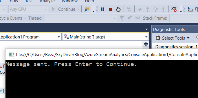
client.Send(new EventData(Encoding.UTF8.GetBytes(postData)));
Console.WriteLine("Message sent. Press Enter to Continue.");
Console.ReadLine();
First Line in the code reads the connection string from app.config. Second line create an instance of EventHubClient with the connection string. Note that in this line connection created to Event Hub with name “pbi”. if you named your Event Hub differently enter your own name.
Next three lines are creating random integer value with time stamp. and line with String.Format will generate a JSON formatted string. and Client.Send send the string in UTF-8 encoding to Service Bus (Event Hub).
Execution of this application will pass only one data point to Event Hub. For adding another entry you have to run it again. Now the application is ready to run. Let’s run it for the first time.
After the execution we expect Power BI to show something. Let’s see.
Login to Power BI service with the account you have used in the Stream Analytics Authorization section. In My Workspace (or any other group you’ve selected in Stream Analyitcs Output section) you’ll find the new data set. if you followed the naming I suggested it should be named StreamAnalyticsDS.

Open the data set and you’ll see the table under data set with two fields we’ve passed (ts, and value) plus other fields from Event Hub (EventEnqueuedUtcTime, EventProcessedUtcTime, and PartitionId).
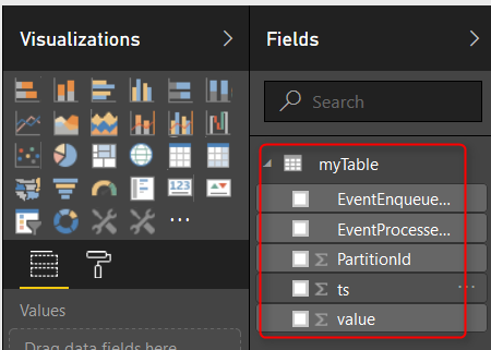
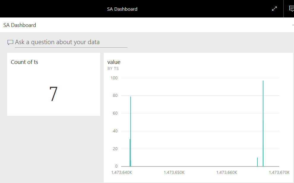
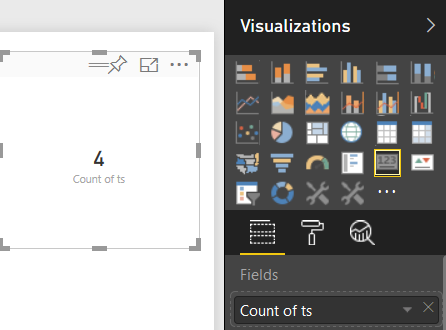
As you can see the structure can be anything sent from Event Hub and Stream Analytics. Now create two simple visualizations. One Card Visualization with distinct count of ts. This will show number of times we send data point (execute the console application) to Event Hub.
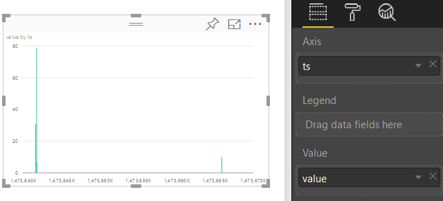
Also a Column chart with TS at Axis, and Value as the Value of chart.
Save this report, and Pin these two visualizations into a new dashboard.

Now go to the dashboard. While dashboard is open execute the console application. after few seconds of execution and sending message you will see the dashboard shows result. Fantastic, You’ve build your first Azure Stream Analytics and Power BI real-time dashboard now.
Real-time dashboard with Power BI, Azure Stream Analytics, and Event Hub open the path to many possible solutions. You can analyze Twitter data real-time. Or you can pass data from an IoT device with IoT Hub into a real-time dashboard. Come with ideas of what real-time dashboard with Stream Analytics can do? I like to hear your ideas.
Published Date : September 5, 2016
This is not story of Power BI in Power Point slides. This post is about how to use Power Point integration with Power BI for story telling of Power BI reports and dashboards through slides, and also give some users features such as commentary. This features is not a new feature, it has been released almost a year ago! but because many people still are not aware of such feature, I intended to write about it in a post. In this post you will learn;
If you want to learn Power BI, read Power BI online book; from Rookie to Rock Star.
Dashboard and reports used in this example are sourced from Power BI Desktop; The First Experience.
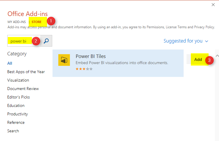
Power BI Tiles is an add-in for Excel, Power Point and few other Microsoft Office products version 2013 SP 1 or later. This component is developed by DevScope. Please note that this is not Microsoft built-in feature. However it can be used easily with Microsoft Power BI and Power Point. This component enables Power BI reports and dashboard elements to be pinned in Power Point slides. Download this component and install it from there, or from your office project.
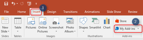
Open Power Point, create a blank slide deck, then insert a BLANK slide, and from Insert menu option, click on My Add-ins
From My Add-ins you might see Power BI Tiles if you have installed that before. otherwise go to Store tab, and search for Power BI
After adding this add-in you will be ask to enter Power BI account related to this, and also authorizing Power BI tiles to access reports and dashboards in your Power BI cloud storage. After authorization you will see a box including list of dashboards in your work space will appear.
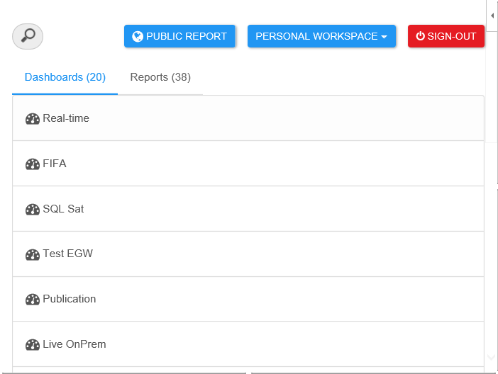
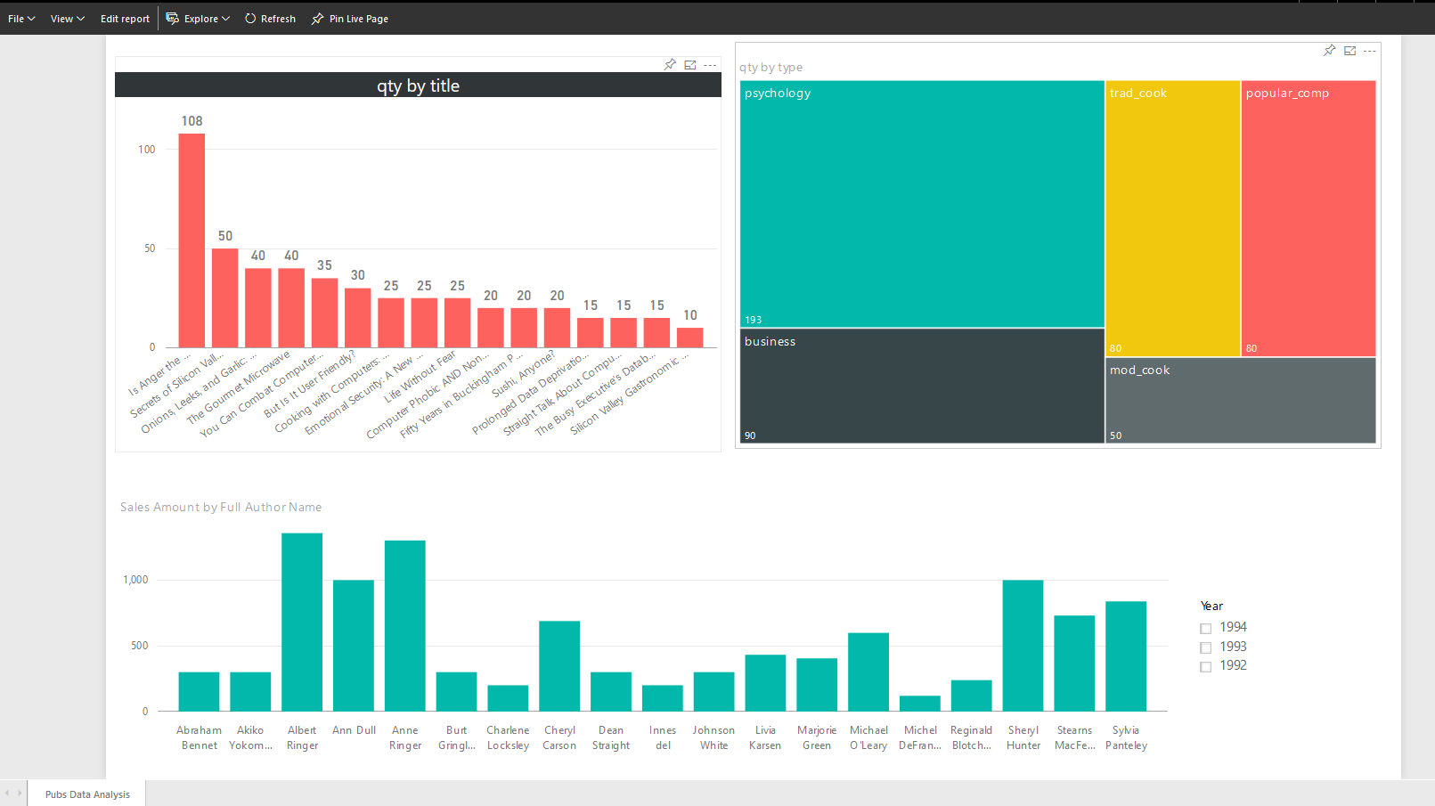
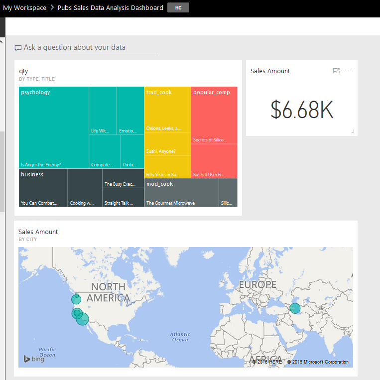
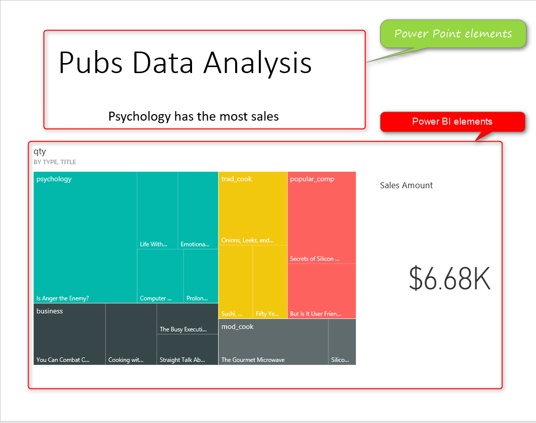
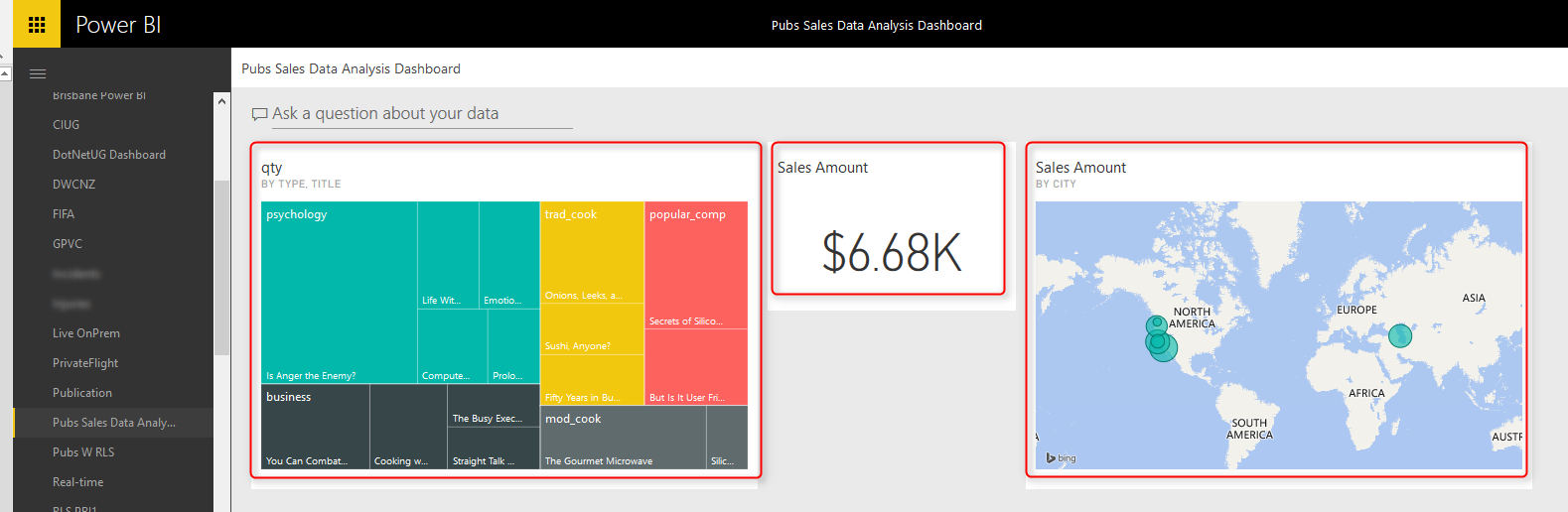
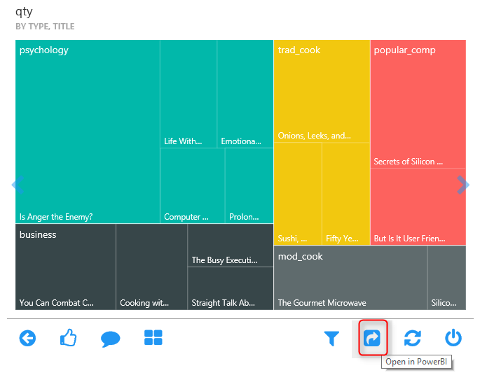
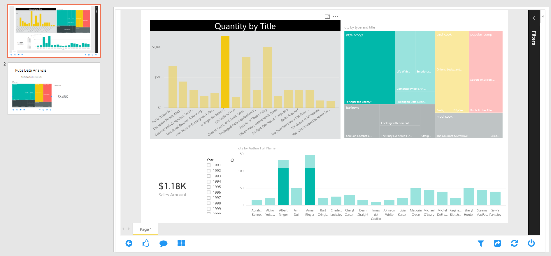
This box is Power BI Tile added to your slide. You can select any of dashboards you want. for this example I use the dashboard which is related to Pubs Data Analysis Demo I’ve done before. After choosing a dashboard you will see one of its tiles appear here.
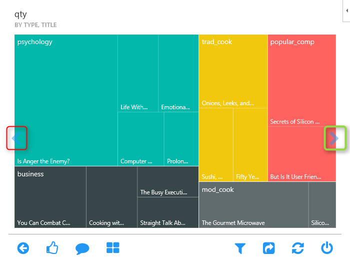
This is only one of the tiles in the existing dashboard, You can navigate between tiles by two navigator arrow buttons highlighted above.
Here is the dashboard in full view in Power BI service. as you can see in Power BI Tiles add-in we can navigate between tiles individually.
Once you chose the tile, you can leave it there. It is already embedded into your Power BI slide. You can now add another Power BI Tile, again from My Add-ins and this time Power BI Tiles is there. Note that you can build similar dashboard here in Power Point with adding each item as a tile.
You can see here that I’ve added a title for this slide in Power Point, and also a Textbox with text “Psychology has the most sales”. Yes, with this method you can add commentary to Power BI reports and dashboards, you can tell the story behind the data with integration of Power BI and Power Point. very simple feature but really useful.
Under each Power BI tile in Power Point there will be a link to Power BI
When you click on this link, it will open that Power BI dashboard or report in a browser. This provides you the navigation from a high level story point to the detailed report in Power BI service.
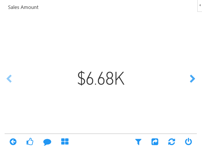
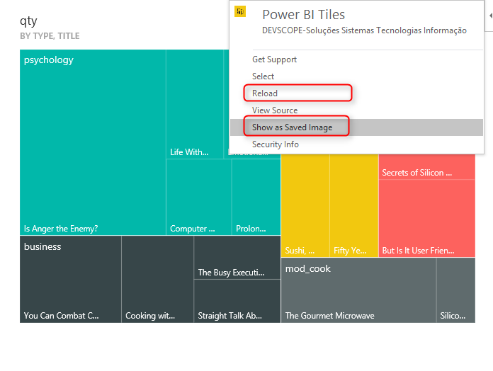
By default Power BI Tiles are interactive tiles that can be refreshed and clicked, highlighted, and interactive. However if you want them as an image only tile, you can choose it from top right hand side of Power BI tile.
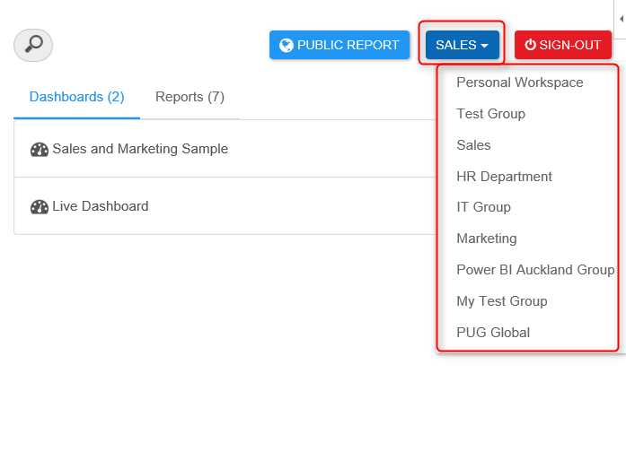
You can navigate to all other work spaces that you are part of, and see all reports and dashboards under it. by default Power BI Tiles will look into “My Workspace” (named as Personal Workspace), but you can change it from the top side of Power BI Tile.
You can also bring a Power BI public report ( a report that is published to web) into a tile
If you choose dashboard, then you can pick one element of dashboard in each tile. but if you choose a report. For example “Pubs Analysis” report we’ve built in another example, then you will see the whole report in tile, with all report pages, and filter pane.
The view of report is fully interactive here. For example if you hover on something or click on something you will see it responds like any other Power BI reports (but in Power Point slide)
Power BI and Power Point integration helps to tell story behind the data much easier. You have presentation and story telling features of Power Point, plus interactive visual, refresh-able from cloud features of Power BI. Good news is that Microsoft team is working on another integration feature named “Export to Power Point” which will be released very soon I believe. I’ll put together another post when that feature comes live.
Published Date : August 28, 2016
Line chart is one of the most basic charts that you can see in every visualization tool. Power BI like other visualization tools has the line chart visualization which is good for showing one or two measure’s value across an axis which can be a category, time period and etc. Recently Power BI line chart added the feature to create dynamic reference lines and the Analytics pane which brings more power into this useful chart. In this post I’ll show you an example of using these features in Power BI line chart. If you are new to Power BI or you want to learn more make sure to read Power BI; from Rookie to Rock Star.
For running the sample in this post you will need to download and install AdventureWorksDW sample Microsoft SQL Server database.
Line chart can show one or more measures as measures, such as Sales Amount, Total Costs, Quantity of the goods sold and etc.
Depends on the variety of values across a time period, Line chart can illustrate a straight line as a trend. This trend is good to understand how in overall products are selling, is revenue going up or down for example.
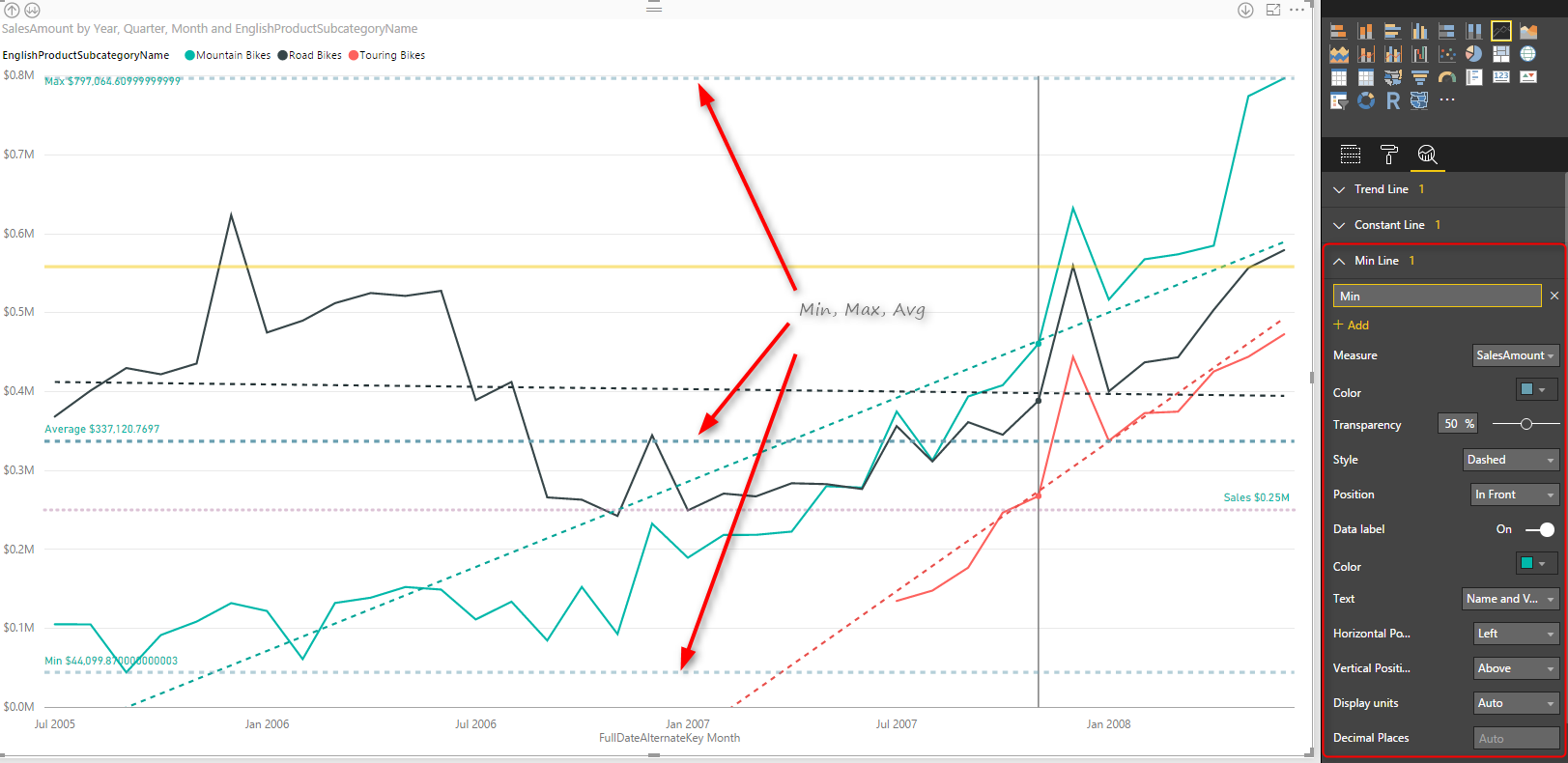
You might want to define minimum, maximum, average, or median values for your line chart as separate lines, and compare values lines with these lines. These are reference lines which can be dynamically created based on value of measures in the chart.
Create a new Power BI solution with Get Data from AdventureWorksDW SQL Server database, and choose tables as DimDate, DimProductCategory, DimProductSubCategory, DimProduct, and FactInternetSales. Click on Load, and in the relationship tab. remove extra relationships between FactInternetSales and DimDate to be only one active relationship based on OrderDateKey.
Go to Report tab, and add EnglishProductCategory to the Page Level Filters. Filter data to be only Bikes.
Page level filter will filter all visualizations in this page to only show Bikes information. Now add a Line Chart from visualization pane. Set the value to be SalesAmount (from FactInternetSales), Axis to be FullDateAlternateKey (from DimDate), and EnglishProductSubCategory (from DimProductSubCategory).
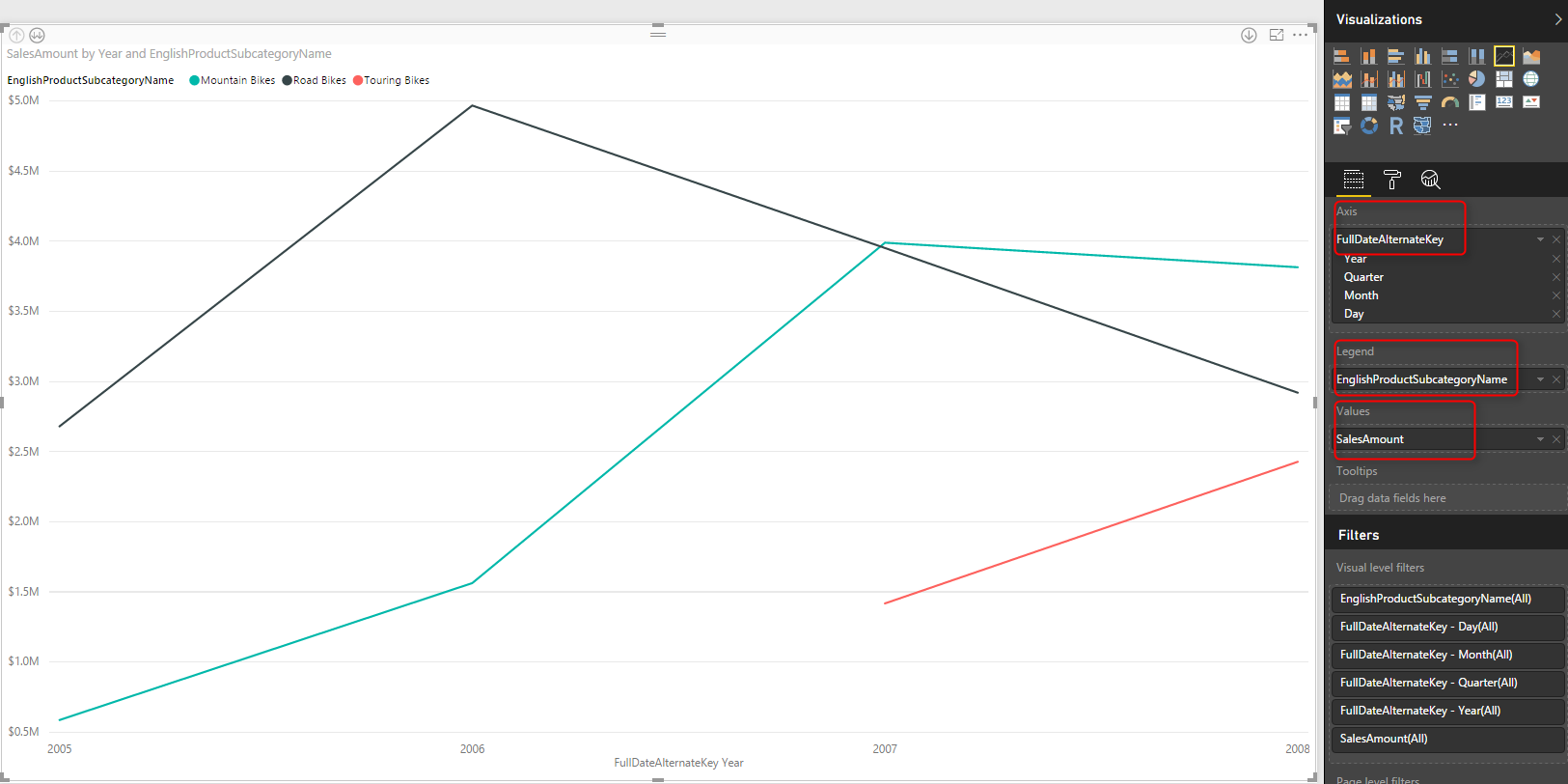
This line chart now simply shows three product sub categories of Bike; Mountain Bikes, Touring Bikes, and Road Bikes. FullDateAlternateKey is a full date column which in this view showed as a Year level. This behavior is because Power BI automatically add Date Hierarchy to date fields. If you want to change this behavior you can go to options and do so.
Let’s now drill down into Quarter by clicking on the Drill Down button on the top left hand side corner of the line chart. You can see after drill down in the button center of the chart it shows the level of drill down is on Quarter now.

Drill down into Month Level afterwards.
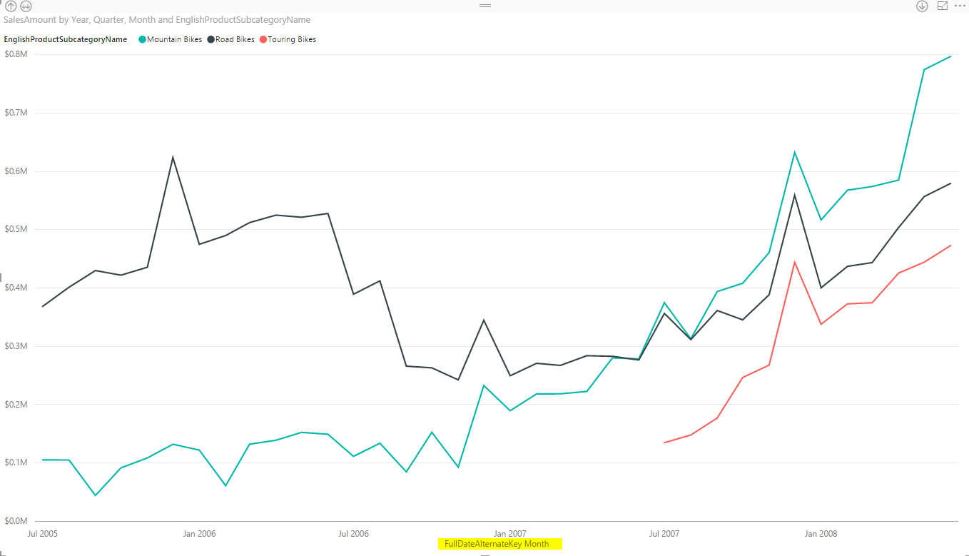
Month level view shows better visualization as a detailed view, and not as messy as Day view (you can drill down to day to see what I mean by messy).
As I explained earlier, Line chart can simply show a trend line to investigate overall behavior of the value over the period of time. For adding this trend line, simply go to Analytics Tab (when you have line chart selected), and under Trend Lines click on Add.
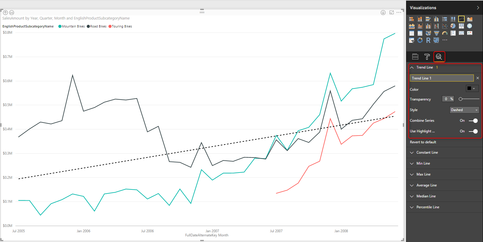
As you see in the screenshot above, this trend line simply show the trend of Total Sales Amount over the period, which is increasing. You can have this trend as total as is, or have a separate trend line per each product subcategory.
Change the Combine Series option in the Trend Line setting to Off. You will see now a trend line per each subcategory. This is very useful visualization to see how each subcategory works. For example you can now simply see the sales amount for black solid line (road bikes) increased in last few months of the data, however it is still trending down (black dashed line). and the trend for other two subcategories is going upwards.
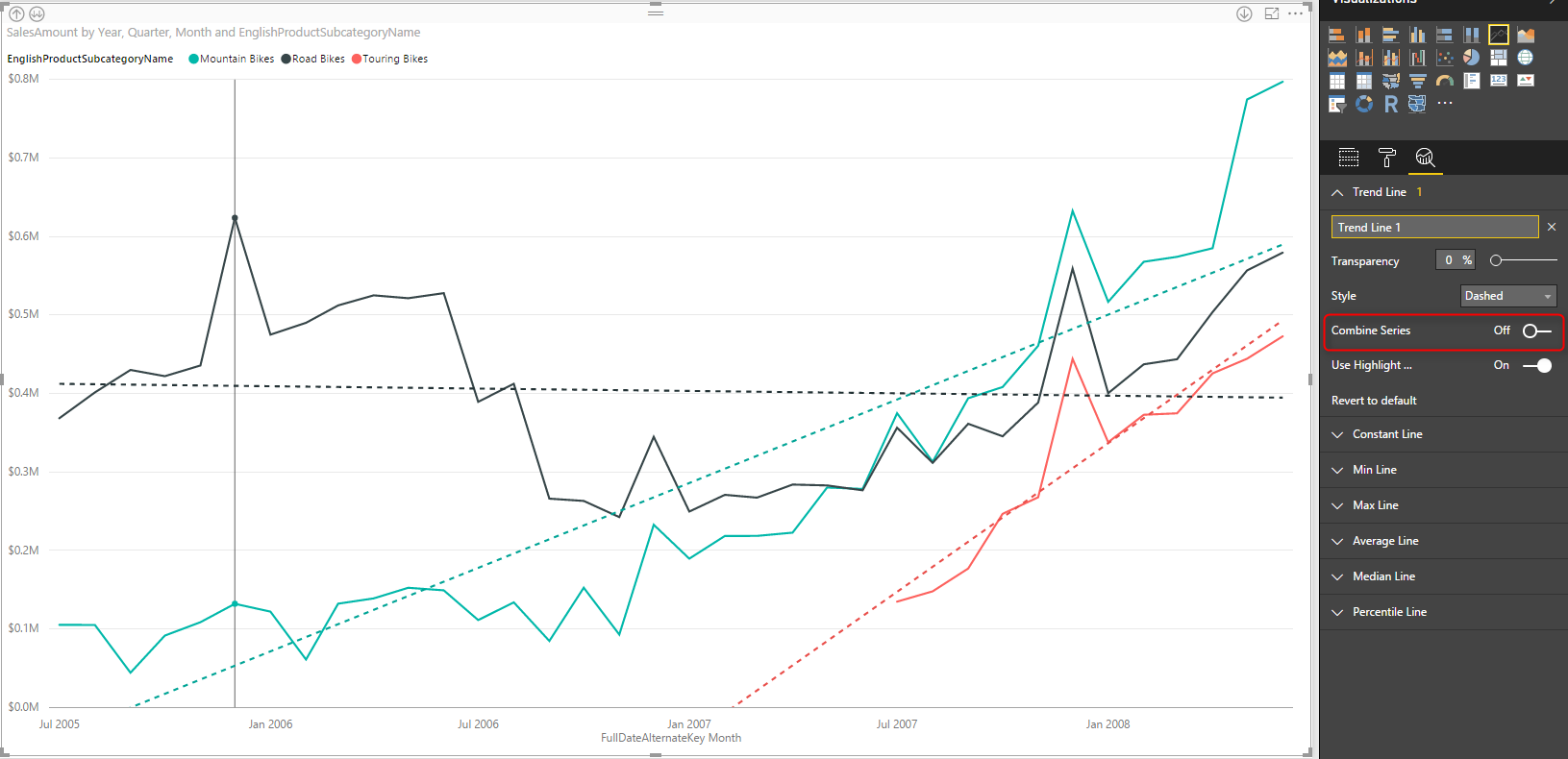
In Line chart (and few other charts) there is an Analytics tab that brings the power of adding extra insight, named Analytics Tab. In line chart we can have the extra insight as Trend Line, Constant Line(s), and Dynamic Reference Line(s). You have seen already how helpful a trend line is. next other lines are reference lines which can be useful to measure values in line chart and compare them to a reference value. Let’s dig more into it now.
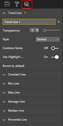
A constant line is a constant value showed as a line. It is good for comparing the value line to a constant line. Here I have created a constant line for value $250000. and did some formatting for that and made it dotted.
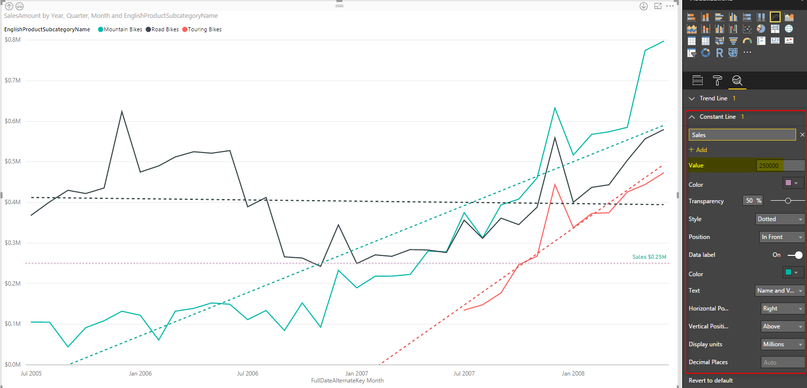
This is good to compare values with especially when we DO NOT want to drill down or up. The reason for that is that If I drill up one level, then because I am in quarter level most of values goes above this constant value. So normally constant line used when you have the main value as the Average, rather than sum or count.
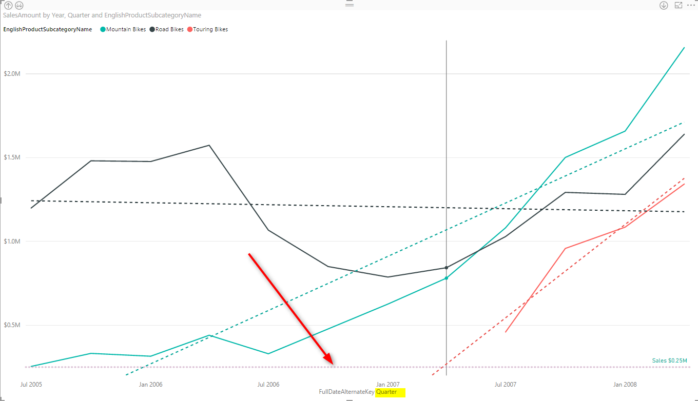
Constant line as you see above are not good when we drill down or up, because their value might not be close to compare with the value lines in that level. So dynamic reference lines are the substitute for such case. For example you can create an An average reference line, minimum, or maximum which works based on the level you are in, or filter applied, or what other slicers selected. This would be based on what data is showed in the value line. There are number of dynamic reference lines that you can create; Min, Max, Average, Median, and Percentile.
You can simply add a percentage line, based on the percentage number you want. This can be percentage of one of measures viewed in the line chart.
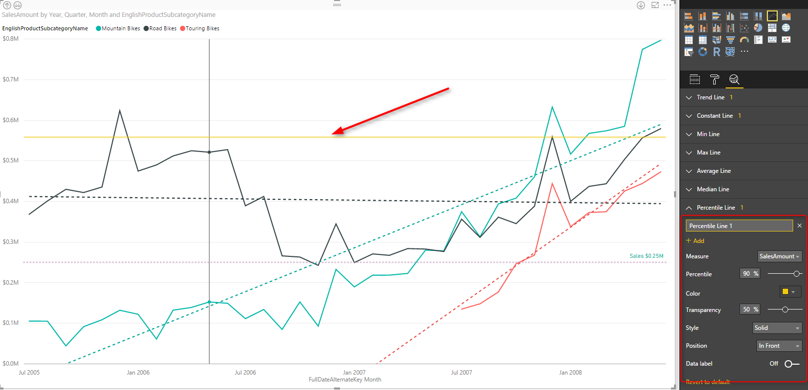
For adding any of these lines, just click add, set the formatting, name the line as something and then choose to show data labels with name and values or without it.
Line Chart is a simple chart and there is a reason for this simplicity, to figure out values, trends, and analyze it with a quick glance. Adding more lines to it will add more insight obviously, but overusing it with adding all possible reference lines, trend lines, and multiple constant lines will make it a very busy line chart which then doesn’t convey the message as it should. Consider using this visualization in the best way, get benefit of reference and trend lines, but only when it adds value.
Published Date : August 22, 2016
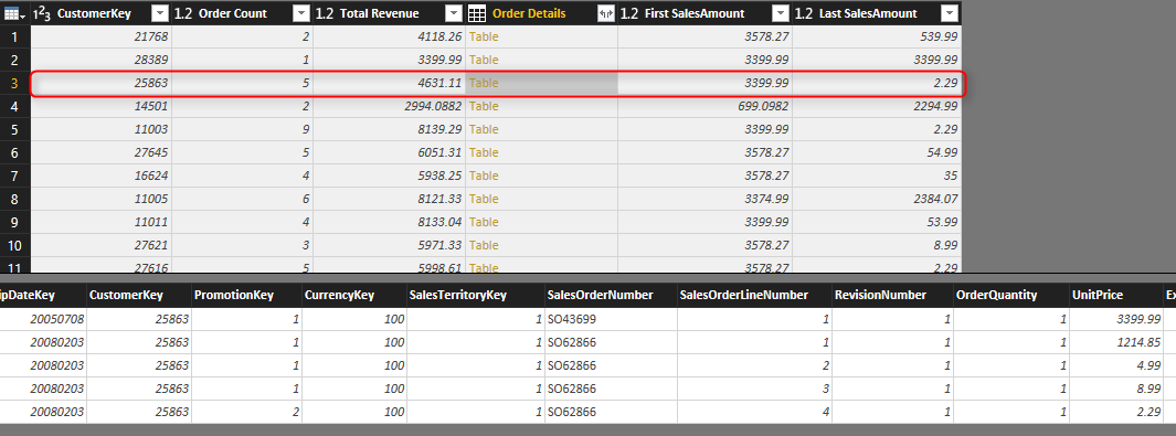
Power BI or Power Query in Excel (or Get Data and Transform as the new name of it) can do many data transformations. One of these transformations is grouping rows by number of fields. If you use the graphical user interface in Power Query for Power BI or Excel you have number of options to get some aggregated results such as count of rows, maximum or minimum, average of each group, or sum… But there are still heaps of operations that you cannot do through GUI, such as getting the last item in each group, or first item. Fortunately with M (Power Query Formula Language) you can apply any of these operations you want. In this post I’ll show you how to get benefit of both; start with GUI to write the Group by command for you, and then customize it in M script to achieve what you want. If you like to learn more about Power BI read Power BI online book; from Rookie to Rock Star. If you like to learn more about Power Query, start with Introduction to Power Query.
By completing example of this post you will learn;
For this example I will be using AdventureWorksDW sample Microsoft SQL Server database. You can download it from here.
Scenario that I want to solve as an example is this:
FactInternetSales has sales transaction information for each customer, by each product, each order date and some other information. We want to have a grouped table by customer, which has the number of sales transaction by each customer, total sales amount for that customer, the first and the last sales amount for that customer. First and last defined by the first and last order date for the transaction.
Let’s start by getting data from SQL Server, Choose AdventureWorksDW as the source database, and select DimCustomer and FactInternetSales as the only tables for this example. Click on Edit to move into Power Query window.
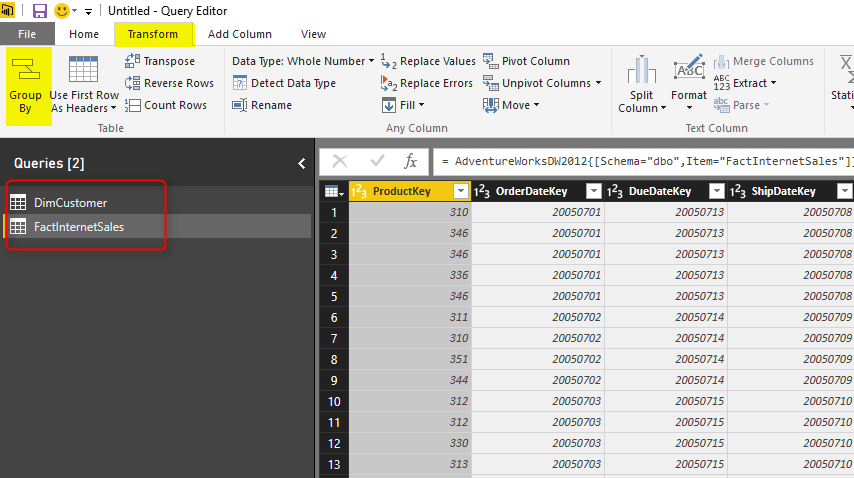
FactIntenetSales table is the one we want to apply all transformations in. So Click on FactInternetSales first, then from Transform Tab, select Group By option as the first menu option.
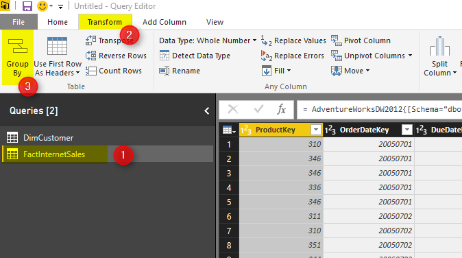
This will open the Group By dialog window with some configuration options
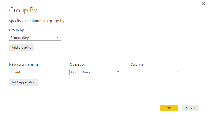
By default Group By happens on the selected columns. because usually the first column is the selected column (in our table ProductKey), then the column mentioned under group by section is also ProductKey. You can change this to another column and add or remove columns in this section.
Based on your final grain of the output table the group by field will be defined. In this example we want the final table to have one record per Customer, so CustomerKey (which is the identifier for each customer) should be our Group By Column.
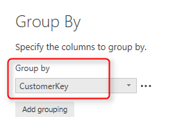
Note that you can add as many fields as you want in the Group By section. the result would be one record per combination of unique values from all these fields.
Group by result would be one record per each unique combination of all fields set in the “group by ” section. In addition you can also have some aggregated columns. Here are list of operations you can have by default:
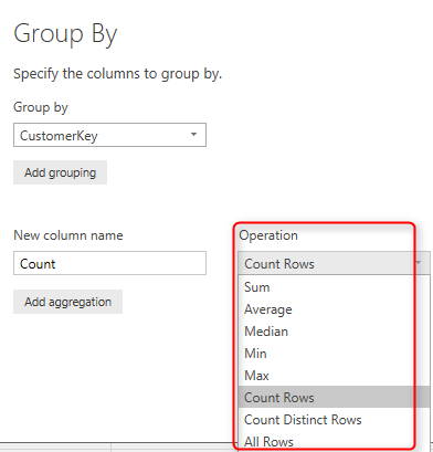
Most of items above are self explanatory. For example; when you want to count number of sales transaction. you can use Count Rows. If you want total Sales amount for each group you can choose Sum, and then in the Column section choose the column as SalesAmount. All Rows will generate a sub table in each element of the aggregated table that contains all rows in that group.
Columns that I want to create in this section are:
Order Count (Count Rows), Total Revenue (Sum of Sales Amount), Order Details (All Rows)
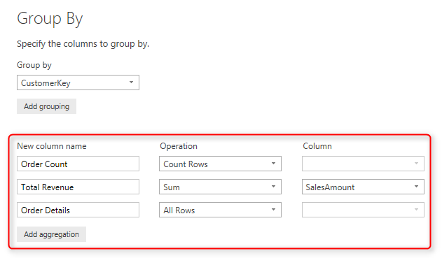
Adding aggregated columns is as easy as that. Now If you click on OK, you will see the result;
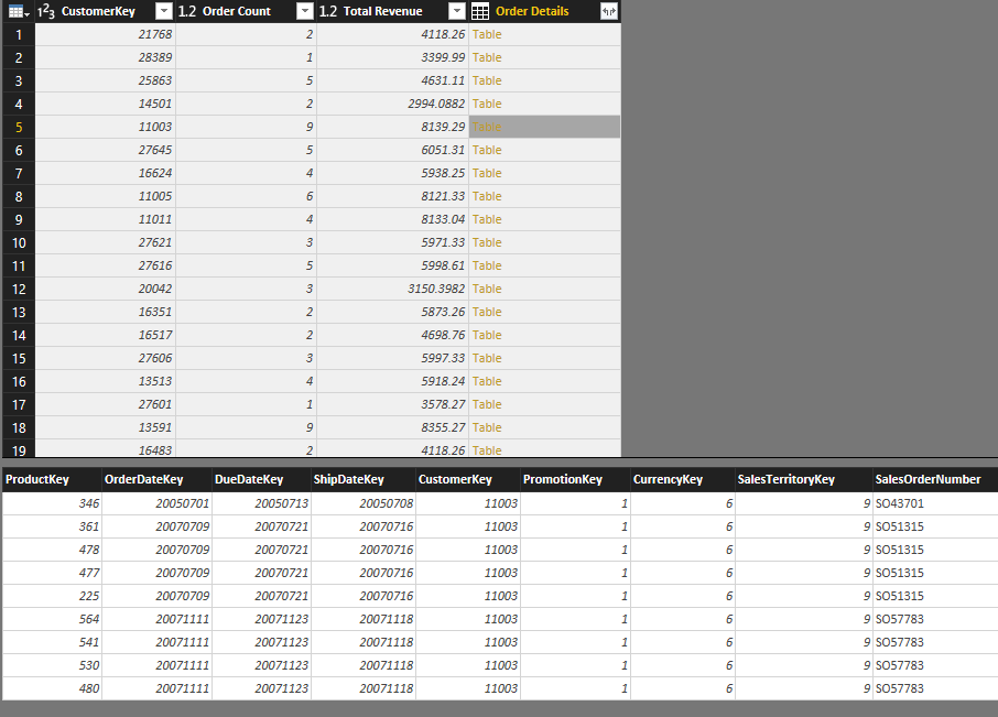
As you can see Order Count and Total Revenue show the aggregated result of each group, and Order Details (if you click not on the “Table” itself, but on a blank area on that cell) contains the actual rows in each group. This detailed view can be used for many other calculations or transformations later on. In many cases you will find the All rows option useful.
Getting some default aggregation was as easy as selecting them in Group By window. However not all types of operations are listed there. For example in detailed table above you can see that customer 11003 had 9 sales transaction,, and they happened in different Order dates, getting the first and last order date is easy with Max and Min operations. However getting the sales amount or product key associated with that record, or in the other words getting the first and last item in each group isn’t possible through GUI. Fortunately we can use M (Power Query formula language) to achieve this easily.
To get the first or last item in each group I have to order the table based on that date column. Sorting is possible simply through GUI. and I have to apply that to the step before group by operation. So from the right hand side applied steps list I’ll select Navigation (which is the step before Grouped Rows);
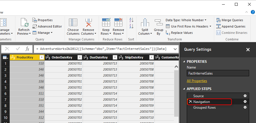
Now in this view you can order simply by clicking on OrderDateKey and Choose Sort Ascending.
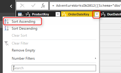
This will create another step, and asks you do you want to INSERT this step here?
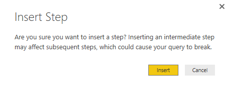
Click on Insert to confirm you want to insert it here before the Grouped Rows. and then you will see a Sorted Rows step added before Grouped Rows. This means Grouped Rows will use the output of Sorted Rows step as the input for grouping (which is exactly what we want).
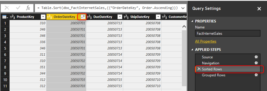
Now you can go to the Grouped Rows step to see the result hasn’t changed but the sub tables are sorted now. All we need from here is to get the first and last item in the sub table.
** If you want to sort based on multiple column simply go to the Advanced Editor and add as many as sections you want to Table.Sort input parameters.
Fortunately Power Query has a bunch of operations on List that we can use. List.First will return the first item in the list (based on the order defined in the list), and List.Last will return the last item. So let’s use them in the Group By operation to fetch first and last sales amount.
To make changes here you need to go to script editor in Power Query which can be achieve via Advanced Editor option in Home tab. You have to make sure that you are in the FactInternetSales Query first.
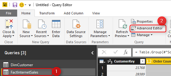
Advanced Editor will show you M script that build the output and the group by command as well.
let
    Source = Sql.Databases("."),
    AdventureWorksDW2012 = Source{[Name="AdventureWorksDW2012"]}[Data],
    dbo_FactInternetSales = AdventureWorksDW2012{[Schema="dbo",Item="FactInternetSales"]}[Data],
    #"Sorted Rows" = Table.Sort(dbo_FactInternetSales,{{"OrderDateKey", Order.Ascending}}),
    #"Grouped Rows" = Table.Group(#"Sorted Rows", {"CustomerKey"}, {{"Order Count", each Table.RowCount(_), type number}, {"Total Revenue", each List.Sum([SalesAmount]), type number}, {"Order Details", each _, type table}})
in
    #"Grouped Rows"
The script in above code section created automatically when you did transformations through GUI. The line with Table.Group is the line that does all the grouping and aggregation. It is a long line, so let me format it better for easier understanding;
let
    Source = Sql.Databases("."),
    AdventureWorksDW2012 = Source{[Name="AdventureWorksDW2012"]}[Data],
    dbo_FactInternetSales = AdventureWorksDW2012{[Schema="dbo",Item="FactInternetSales"]}[Data],
    #"Sorted Rows" = Table.Sort(dbo_FactInternetSales,{{"OrderDateKey", Order.Ascending}}),
    #"Grouped Rows" = Table.Group(#"Sorted Rows",
                                            {"CustomerKey"},
                                            {
                                                {"Order Count", each Table.RowCount(_), type number},
                                                {"Total Revenue", each List.Sum([SalesAmount]), type number},
                                                {"Order Details", each _, type table}
                                            }
                                    )
in
    #"Grouped Rows"
Script below is the same script. I just put some enters and tabs to format it better for reading. The above section shows Table.Group section of the script. As you can see Table.Group gets a table as input, which is the #”Sorted Rows” table from the previous step. The group by field is “CustomerKey”. and then a set of aggregated columns one after each other (which is highlighted in code above). Each column has name of the column, type of transformation (or aggregation), and the data type of the column. for example:
let
    Source = Sql.Databases("."),
    AdventureWorksDW2012 = Source{[Name="AdventureWorksDW2012"]}[Data],
    dbo_FactInternetSales = AdventureWorksDW2012{[Schema="dbo",Item="FactInternetSales"]}[Data],
    #"Sorted Rows" = Table.Sort(dbo_FactInternetSales,{{"OrderDateKey", Order.Ascending}}),
    #"Grouped Rows" = Table.Group(#"Sorted Rows",
                                            {"CustomerKey"},
                                            {
                                                {"Order Count", each Table.RowCount(_), type number},
                                                {"Total Revenue", each List.Sum([SalesAmount]), type number},
                                                {"Order Details", each _, type table}
                                            }
                                    )
in
    #"Grouped Rows"
Total Revenue is the name of column. calculation for this column is Sum of [SalesAmount] which is one of the fields in the table, and the output is of type number.
So by now you should thinking of how each is to create a new aggregated column here; by adding similar column in the script. I add the new column after Order Details column, so I need an extra comma (,) after that line, and the new lines would be;
let
    Source = Sql.Databases("."),
    AdventureWorksDW2012 = Source{[Name="AdventureWorksDW2012"]}[Data],
    dbo_FactInternetSales = AdventureWorksDW2012{[Schema="dbo",Item="FactInternetSales"]}[Data],
    #"Sorted Rows" = Table.Sort(dbo_FactInternetSales,{{"OrderDateKey", Order.Ascending}}),
    #"Grouped Rows" = Table.Group(#"Sorted Rows",
                                            {"CustomerKey"},
                                            {
                                                {"Order Count", each Table.RowCount(_), type number},
                                                {"Total Revenue", each List.Sum([SalesAmount]), type number},
                                                {"Order Details", each _, type table},
                                                {"First SalesAmount", each List.First([SalesAmount]), type number},
                                                {"Last SalesAmount", each List.Last([SalesAmount]), type number}
                                            }
                                    )
in
    #"Grouped Rows"
Marked lines above uses List.First and List.Last on the exact same structure that List.Sum worked. because we have already sorted the table based on OrderDate so the first item would be the first sales transaction, and the last item would be the last.
Here is the output of this change:
You can see that the first and the last SalesAmount picked correctly from each group as two new columns.
** Note that with adding some changes in script editor that are not supported through GUI, you will loose the GUI configuration window section. As a result of the change here you cannot change Grouping configuration in GUI anymore, if you want to change it, you have to go to Advanced Editor for this section. So if you are a GUI fan, better to apply all required configuration first, and then add extra logic in the code.
Published Date : August 11, 2016
I’ve hear this a lot in my presentations that “Does Power BI support real-time data?”, And I answer yes. In fact this feature was available long time ago with Azure Stream Analytics and Power BI, however recently some new changes happened in this area which allows Power BI dashboards to monitor real-time data changes on the dashboard from a data coming from API, and also PubNub. In this post I’ll show you how easy is to create a dashboard that shows real-time data coming from API. If you want to learn more about Power BI, read Power BI online book; from Rookie to Rock Star.
One of the key features of monitoring tools is the ability to monitor the real-time data instantly when the data refreshes. That means as a user you don’t need to click on refresh button to see the latest data. This single key feature brings heaps of value to Power BI as a monitoring tool. This ability isn’t new, in fact Amir NetZ showed an awesome demo of an IoT device working with Azure Stream Analytics and Power BI as a real-time monitoring. So what is new is that we can now have this feature in the new generation of Power BI with a dashboard tile connected to streaming data. Streaming data sets can be now either API, Azure Stream Analytics (coming soon), and PubNub. More streaming services will come very soon I believe.
In this post I want to show you only streaming data through API, and showing that in a dashboard tile in Power BI. This single streaming option by itself opens many gates to Power BI as a real-time data monitoring tool. So let’s start.
For this example I will be using Microsoft sample .NET application named PBIRealTimeStreaming. You can download it from here.
You need Visual Studio (Not SSDT) for running this example solution.
Start with logging in to Power BI service, create a new dashboard (or open an existing dashboard). And create a New Tile.

In the New Tile pane you now can see an option to add a tile for real-time data.

Select this option and click Next. if this is the first time you are using this service, then you probably don’t have any streaming data set existing there. So go to Manage Data to create one;

Now you are in streaming data sets window. you can see list of existing data sets, or create a new one with click on Add Streaming Dataset option on top right hand side.

As I’ve mentioned before at the time of writing this post only these three options for streaming data is available: API, Azure Stream Analytics, and PubNub (which is a data streaming service).

Because for this example we are using API as a streaming option, choose API and continue. Now create a new data set with a name such as mySampleRTDS or any other names you like. You have to create two columns as below;
These are columns that will be created and passed through a .NET application through Power BI API to this data set.

Now click on create. This will create the data set with a Push URL that can be used in the application through API. copy this URL. We will be using that in the application next step.

As I mentioned before, download the sample project. and then select the project under this path:
samples/consoleapp/getting-started-for-dotnet-real-time/PBIRealTimeStreaming
And open the PBIRealTimeStreaming solution in Visual Studio. This project creates a data set including a datetime value and a numeric value and will pass that through Power BI API (which will be discussed later in another post) to Power BI service.
Open Program.cs file and in line 33 change the value of realTimePushURL to the URL which we’ve copied from above step.

Run the application with pressing F5, or right click on project, Debug, Start New instance. The application will generate a data point in each second and send it through API.

Now, let’s create the dashboard tile for this streaming data set. Follow the steps and choose the mySampleRTDS as the data streaming source for the tile.
There are number of charts/visualizations that you can use with streaming data set. Choose Card for the first example. and set the value of that to “value” data field

Add another dashboard tile for the same data set, and set this to be a Line chart with ts field in Axis, and value field in Values.

After adding each chart you will immediately see the real-time dashboard working and changes every second (because streaming data from application updates every second);
The sample used here had only one datetime field and a value field. However you can create your own data stream from any event, notifications, or data set that you want to be monitored real time. With a simple application the stream of data can be generated. Or it can come from Azure Stream Analytics or PubNub. Don’t limit your options, think about where you can use this feature to solve a real-time monitoring challenge.
Published Date : August 5, 2016

Power BI which released at July 2015 targeted business analysts and power users. From that time Power BI team made massive enhancements, and with each enhancement the user market of Power BI expanded. Recently Power BI take a big step forward with bringing developers as users. Power BI Embedded is the Power BI reporting solution for application developers. In this post I’ll explain how to get started with Power BI Embedded. If you want to learn more about Power BI read Power BI online book; from Rookie to Rock Star.
Power BI Embedded is the reporting and analysis solution for mobile and web applications. Power BI Embedded is an Azure service that integrates Power BI solution into mobile and web applications. The report still has to be authored and created in Power BI Desktop. After creating the report it can be published into Power BI workspace in Azure, and using API Keys of Power BI workspace and embedding Power BI report frame into the web/mobile application it will be integrated into the application.
There are other advantages of using Power BI embedded, but these three are the major two reasons why people will use Power BI embedded. one of them brings the Power of reporting and analysis of Power BI into an application. On the other hand if your application has some users, then they will be able to view Power BI reports without having Power BI account. Security then can be applied easily through workspaces in Power BI Embedded.
Power BI embedded is an Azure service, so the very first thing you need in Azure subscription. If you don’t have it you can apply for free trial version.
Also for this example I will show you a Power BI solution with connection to sample Azure SQL Database AdventureWorksLT. If you don’t know how to set it up, follow the instructions in this post to set up AdventureWorksLT Azure SQL DB.
For this example I will use a Live/DirectQuery connection to Azure SQL DB AdventureWorksLT. The main reason is that Power BI embedded right now at the time of writing this post doesn’t support scheduled refresh, I believe this feature will be available very soon. So let’s create a sample Power BI report in Power BI Desktop. If you don’t know what Power BI Desktop is; read this blog post: Get Started with Power BI Desktop.
Open Power BI Desktop, Start with Get Data, and Choose SQL Server. Make sure you have checked Live Connection;

After entering credentials for connecting to Azure SQL DB you should be able to see list of tables. Note that you might need to set up firewall in Azure SQL server to allow your computer IP to pass, if you don’t know how to set it up. read my blog post about connecting to Azure SQL DB from Power BI. You only need to read the set up firewall section of it.
From list of tables, choose these: Customer, Product, ProductCategory, ProductModel, SalesOrderDetail, and SalesOrderHeader. and click on Load.
After load you will notice that there is no Data tab in Power BI, and the reason is that we’ve used DirectQuery/Live connection. with this option we won’t be able to use DAX or calculations from it in Data tab.

Now let’s create a very simple chart, the chart is a clustered column chart with Color (from Product table) as Axis, and SalesPerson (from Customer) as Legend, and OrderQty (from SalesOderDetail) as Value. 
Now save the report as SampleReport, or any other names you like. We will publish this report into a Power BI workspace in next few steps.
Power BI reports can not be published from Power BI Desktop for using with Power BI Embedded. In fact for using Power BI Embedded, reports should be published through the application itself. and it would be published to a container or folder under your Azure subscription. This container or folder is Power BI Workspace Collection.
To create the workspace collection, go to Azure portal (https://portal.azure.com), and create a New Power BI Embedded under Data and Analytics section.
Now set a name for the Power BI workspace collection, and either use an existing resource group, or create a new one for it.

As you can see creating the workspace collection itself is simple and easy. After creation of Power BI embedded workspace collection, you will see the workspace collection blade opening as below;

Under each workspace collection there can be one or more workspaces. like folders that has sub folders. Power BI reports will be published to workspaces. I will explain in future posts how you can leverage using multiple workspaces, for now let’s keep it simple and work with only one workspace.
At this moment there is no graphical user interface option in Azure portal to create a workspace, so it needs to be created through an application. because this is the getting started sample and I don’t want to dive into coding here, I’ll be using sample Microsoft .NET projects from here.
Download the code above. Note that you need Visual Studio installed to open this project. There are two projects under Github all under same solution.

For creating a workspace use ProvisionSample project, and right click on it, and from Debug, choose start new instance

This project has the code for creating workspace, and also publishing the report.

** Note that this project is not a utility for deploying Power BI reports, this part can be embedded into your .NET application. This is just an example code for doing the deployment.
For creating a workspace choose option 5. it will asks some information about your existing Azure subscription key, and work space collection and will create the workspace for you. It will also asks for your Power BI workspace collection Access Keys, which you can find them under Power BI embedded workspace collection blade. Be careful that don’t share these keys to others. this would be the access to Power BI embedded.

After creating the workspace successfully you should be able to see it under workspace collections in Azure Power BI embedded blade.
To publish report again there is no graphical interface. and you can use same ProvisionSample projecct for publishing. (Number 6 in the list of options to choose);

For publishing the report you need to provide the access key and name of workspace collection, the id for workspace, then name for data set (the name that you want this to be stored), the full path of *.pbix file. Now you see that Power BI report is published.
Because we used an Azure SQL DB as the source of connection, we have to update the connection string after deployment. Again you can use same ProvisionSample project with option 7 this time.

After updating the connection information, now we can test the report. There is another project under this solution named EmbedSample. This project is an ASP.NET MVC solution which already has the Power BI embedded code in the application (I will discuss about details of that code in future posts). All you need to do is to set up the Web.Config of this project to use your workspace collection. Open Web.config and configure lines below;

After entering the information for Access Key and workspace collection and workspace id, then you can run this project and in the web application opened, under reports you will see the AdventureWorks Report which will show you the live data as result of DirectQuery connection.

As you can see the Power BI visualization here is exactly same as the visualization in Power BI service itself, and it supports the custom visuals as well. However users can’t edit the report at this stage. they can change the filtering if they want.
One of the big advantages of Power BI Embedded over Power BI publish to web is that you can set up a security in embedded, while the publish to web is available for everyone. Workspaces can be a way to set up the security. I will allocate a separate post to this, because this post is already more than long enough. You can choose which users of your application can access which report pages. right now in the sample application the user who logged in is an application user which doesn’t have any Power BI account. However the security for this user can be set specifically.

Because with Power BI Embedded users won’t have the Power BI account, so the pricing plan changed from user based to session based. there is a current pricing plan up to 1st of September based on renders, which will be changed to Per Session. free option allows up to 100 sessions per month, and with standard option each session costs only 5 cents. Each session will be the user/browser that has report opened in the application.
Power BI Embedded is a new feature, and as expected has some limitations for now. but most of these limitations will be removed in near future I believe. here are biggest limitations so far;
Stay tuned for next posts about Power BI embedded where I will explain more about code behind of Power BI embedded, Row Level Security with Embedded, and using workspaces more in details.
Published Date : July 30, 2016

Column or Bar chart can be easily used for showing a single measure’s insight across a category. Mixed charts such as Line and Column chart can be used for showing two measure and comparing their values across a set of categories. However there are some charts that can be used to show values of three measures, such as Scatter Chart. Scatter chart not only shows values of three measure across different categories, it also has a special Play axis that helps you to tell the story behind the data. In this post you’ll learn how easy is to visualize something with Scatter chart and tell a story with that. If you like to learn more about Power BI, read Power BI online book; from Rookie to Rock Star.
For this example like many other examples in this Power BI book, I’ll be using AdventureWorksDW SQL Server database. If you don’t have this installed, you can easily download it from here and install it.
Scatter chart is a built-in chart in Power BI that you can show up to three measure with a categorization in it. Three measures can be visualized in position of X axis, Y axis, and size of bubbles for scatter chart. You can also set up a date field in play axis, and then scatter chart will animate how measure values are compared to each other in each point of a time. Let’s start building something simple with this chart and see how it is working in action. At the end of example you will see a summary chart as below;
| Visualization Item | Scatter Chart | Comments |
|---|---|---|
| Measure 1 | X Axis | |
| Measure 2 | Y Axis | |
| Measure 3 | Size of bubbles | |
| Category | Yes | As Legend |
| Detailed Category | Yes | As Details |
| Play Axis | Yes | |
| Color Formatting | Needs Improvement | Data Colors can’t be set |
| Text Formatting | Needs Improvement | Title for X/Y axis can’t be set |
| General Formatting | Needs Improvement | No Formatting option for Play Axis |
| Custom/Builtin | Builtin Chart |
Open Power BI Desktop, and start by Get Data from SQL Server AdventureWorksDW database. For this example you need to import data for 6 tables; FactInternetSales, FactResellerSales, DimDate, DimProduct, DimProductCategory, and DimProductSubCategory.

Just Load the data, don’t edit. Then go to Relationship tab to verify relationship. remove inactive relationships between DimDate and FactInternetSales/FactResellerSales. Only keep one relationship active based on ORDER DATE. to change a relationship to active double click on the relationship line and change it to active. You can only have one active relationship between two tables.

Your final relationship diagram should look like this;

You might notice that this is not a best practice start schema model to work with, but let’s make this example simple for now, and focus on the visualization side. Go to the Report, and create a Scatter Chart. expand it to cover the whole report page.

Add Sales Amount from FactInternetSales to X Axis, and then Sales Amount from FactResellerSales to Y Axis. Also bring TotalProductCost from FactInternetSales into Size. These are three measures that we want to visualize here;

Now Let’s see how each product sub category of Bike is for these measure. For that add a Visual Level Filter for EnglishProductCategoryName from DimProductCategory, and set it to be Bike.

Now bring the EnglishProductSubCategoryName from DimProductSubCategory into the Legend.

This simply shows the difference of categories for each measure. For example you can see that the total internet sales and reseller sales of road bikes (black) is greater than other two; Mountain bikes, and Touring bikes. Let’s see was this the case all the time? or just the total is different? Fortunately with this chart we can do that with Play Axis.
Drag and drop FullDateAlternateKey from DimDate to Play Axis. and you will see values in both axis change immediately. the reason is that now this chart will show value of one year at a time. and you can see the year title in the top right hand corner of scatter chart.

If you click on Play axis you can see that this the sub categories are moving around because their sales for each year is different. and easily you can see how their sales was during the period of these years. You can even move the player’s bar navigator to a year like 2007 and see values at that point of the time. Screenshot below for year 2007 simply shows that mountain bikes and road bikes at that year had almost same internet sales amount, however the reseller sales of road bikes was more.

And if you go a year before you can see that there was no Touring Bikes even exists at that time, and sales of Road bikes was much more than mountain bikes in both internet sales and reseller sales.

Also you will see that at the year 2008 the internet sales of road bikes is less that two other types of bike.

It is easy to compare year to year changes in this way. You can even click on each individual category and see how it worked through the time. Scatter chart shows you a line of all states for that category.
Even you can take one step further and select multiple items and simply compare them through the years. Click on Ctrl and choose Road and Mountain Bikes.

Now you can easily see that road bikes had better sales in years 2006 and 2007, but in 2008 it sold even less that mountain bikes for internet sales. the reseller sales of road bikes still is higher in year 2008. It is easy to compare all three measures through the time and based on different categories with Scatter chart. Scatter chart helps you to tell story behind the data easily.
You can also add more details to it. As an example let’s add Class from DimProduct to Details of this chart. Now you will see more bubbles, for each sub category we have bubbles with same color, but different bubbles based on each product class.

Scatter chart also has a field for Color saturation and Tooltips which I haven’t demonstrated here, feel free to play with it and enhance your visualization. Scatter chart is a powerful visualization that helps you to tell a story about a data of multiple measure and categories with their values through changes of time.
Unfortunately will all power in this visualization, there isn’t enough formatting options for it at this time. You can apply general formatting like a title for the whole chart, but you cannot change the title for X or Y Axis, which seems necessary. In this example the field name we’ve used was Sales Amount identical name but from two different tables. It is a basic need that I can change the title of axis, but I can’t. The only work around for this is to change name of column in data tap of Power BI, or in Power Query.
Data colors can’t be set as well. This option exists in many other charts such as column/bar chart and I believe it will be available soon here for this chart.
There is no control on the speed of Play axis or any formatting on this axis at this stage.
In Summary Scatter chart is one of the most useful charts in Power BI which helps for storytelling with multiple measures, categories, and changes of values through the time. However this visualization item, still needs some improvements for formatting, which I believe with great efforts of Power BI team will be applied in the very near future. Here is a summary of features for this visualization item;
| Visualization Item | Scatter Chart | Comments |
|---|---|---|
| Measure 1 | X Axis | |
| Measure 2 | Y Axis | |
| Measure 3 | Size of bubbles | |
| Category | Yes | As Legend |
| Detailed Category | Yes | As Details |
| Play Axis | Yes | |
| Color Formatting | Needs Improvement | Data Colors can’t be set |
| Text Formatting | Needs Improvement | Title for X/Y axis can’t be set |
| General Formatting | Needs Improvement | No Formatting option for Play Axis |
| Custom/Builtin | Builtin Chart |
Published Date : July 22, 2016

Publish to Web feature of Power BI is not a very new or hot topic, However I still get questions about what this feature is, and how it is difference with Power BI Embedded. It would be a very long discussion if I want to both explain these two features, and compare them here. So in this post I’ll explain Publish to Web, and in next posts I’ll explain about Power BI embedded, and their differences. In this post you will learn how easy is to share your report with public through a web page which can be your blog post, and HTML page, or any other web pages. Some questions also about this feature answered through the content of this post. If you like to learn more about Power BI, read Power BI online book; from Rookie to Rock Star.
Once you published your Power BI report into Power BI Service (or website), then you can share it with others through creating a dashboard, or groups in Power BI. What if you want to share it with public through the web? Let’s say you want everyone to see the report and play with it (with all interactive features that you have in Power BI). The answer is; use Publish to Web. Publish to web allows you to create an embedded code for Power BI report, and use that code in a web page. This simple feature will enable everyone to access the report. They won’t be able to edit the report, but they will see the report and the report will be fully interactive for them so they can highlight items, select slicers, and drill down.
Using this feature is very simple. All you need to do is first deploy or publish the report into Power BI website or service. and there click on the report (not dashboard). Once you opened the report click on File menu option and choose Publish to Web.

Then you will be informed about this feature in a message box that mentions this step will create a link and embed code for you to share with the world through a website or even email. Click on Create embed code below.

Again because this is all about sharing a report and obviously the data in the report, you will be informed again to check confidentiality of the data and report, and make sure you are sharing the content that is not harmful for an organization or someone when it is view-able for public.

After clicking on Publish above you will see the embed code plus a link to share through email if you want. You can also choose the size of screen for embed code.

You can browse the link right now to see the report in browser

For browsing the report you don’t need to login to Power BI service. In fact people for viewing this report won’t need anything. And as you see report is fully interactive and users can highlight, select or deselect items.
You can also use the embed code and add it to your HTML page, or blog post or wherever you want them to see the report. Here is I embedded my code;

and after adding the embed code full interactive report will be visible in my page like this:
The first thing you might think is usually security. How you can manage security on this? The short answer is there is no security here. The report is shared through the web, or email, with EVERYONE. so everyone who has the link or embed code can access the report. They cannot edit it. but the can view it with no restriction.
If you have a report with 10+ pages, all of them would be visible to browsers. You can not limit which pages you want to show and which you don’t. as an example the report you see above has more than one page, and you can view all of them. I recommend creating different reports if you want to restrict some pages, and share them separately.
If you make any changes to the report, all changes will be synchronized, because link or embed code are just references to this report. So People will see always the latest version of your report. If you also want to keep the report up-to-date you can schedule it for data refresh.
If for some reasons, you want to revoke the access for everyone to the report you can do it easily. Just go to power bi website or service, and under Setting, click on Manage Embed Codes
Here you will see the embed code created, and you can delete it.

Please note that once you delete the embed code, no-one would be able to access this report from public web. You will see a notification message about it.

If you go ahead, and delete the embed code. all links and embed codes will show a message to public web users that this content is not available.

If you played with Power BI before, you know that you can share your dashboards with people in your organization. This feature is totally different from embed code. Here are some differences between sharing dashboard and embed code;
If you click on the ellipsis button beside a dashboard you can share it with others in your organizations with their Power BI accounts.

Once you share a report, you can choose who has access to see it based on their Power BI accounts. You can give them Edit access if you want as well.

You can set access to Owner, Edit, or View for each user or group. and you can revoke this access anytime you want from the Access tab in sharing pane.

In Spite of having the dashboard link available in the Access tab of sharing pane; Only authorized users can see the content when browse the link. Otherwise they will see a message that says they don’t have permission to view this dashboard.

You can share dashboards, reports, and data sets with a group which is an Office 365 group in your organization. And users of this group will have access to all content shared under the group. Anyone outside of the group won’t be able to see anything. To learn more about Groups in Power BI read this post.

Last but not least; the difference between Publish to web, and Sharing is all about difference between giving public access or sharing a content in the organization.
With Sharing dashboards or using Power BI groups you can share content with other users. These users SHOULD BE Power BI users, they cannot access content anonymously. They need to LOGIN to Power BI service to access the content.
With Publish to Web EVERYONE access the report even if they don’t have Power BI account. They don’t need to login. they can browse the page that contains Power BI embed code with no restriction on viewing the report.
Now that you know about Publish to web, I can explain how Power BI embedded works in a nutshell. Power BI Embedded brings Power BI into applications. Yes you can share your Power BI report through an application with API Keys. And you share the report with application users, even if they don’t have Power BI accounts. However you are much more flexible here. You can choose which reports you want to share with which users in the application. Power BI Embedded is the way to bring Power BI experience into an application with security configuration enabled for users. I will explain in a separate post how to use Power BI Embedded. Stay tuned.