
Published Date : July 18, 2016
In this blog post of Mobile friendly Power BI report development series I would explain how to design dashboards for mobile devices. Fortunately this has come right at the time of the recent update on Power BI service with ability to design dashboard page specifically for mobile device. The dashboard design for mobile does work with all mobile sizes and shapes as long as it is one of the supporting mobile operating systems; IOS, Windows Phone, and Android. If you have worked with Mobile report publisher of SSRS 2016 you will see very similar experience here. If you are interested to learn more about Power BI, read Power BI online book; from Rookie to Rock Star.
With the latest update of Power BI service, you can now change the view of Dashboard for mobile device. For using this feature you should login to Power BI, and then on a selected dashboard click on ellipsis button on the top right hand side of the dashboard (below your account’s profile photo), then choose Phone under Edit View.

The default view is Web view, and when you change it to Phone view you will see a message about switching to phone version.

Don’t worry about this message, you won’t loose any configuration on your web version of dashboard. In fact your dashboard would have two different views; Web view, and Phone view. After entering to Phone view you will see a phone view with tiles of dashboard added to it automatically.

As you can see this is a view of smart phone, and the good thing about it is that this is size independent. so works with all phone sizes. You can change size or order of a tile as you want with drag and drop or moving their borders to resize it.

This feature is a great step forward for mobile dashboards, because previously dashboards only designed for web, and they automatically set for phone view. Now we have the ability to design exactly what we want to show. We can event unpin some of tiles from phone view’s dashboard. unpinned tiles will stay in the Tiles pane in the right hand side, and you can add them to the dashboard whenever you like.
As you can see in above screenshot now you can arrange the view to have two or more (if you can fit in the screen of phone) tiles in same horizontal position. This is great view specially when you have only numbers to show, and uses whole width of the phone rather than having blank spaces around.
You can reset the view anytime you want and design a new dashboard from the beginning

The reports view on mobile devices still needs some more tips and tricks to work with. If you like to learn more how to design reports which are mobile friendly read my blog post here.
For those of you who are using mobile/phone reports for Power BI the great news is that many awesome new features are coming. Thanks to efforts of Microsoft Power BI team, you will have much better view for mobile reports. Stay tuned for updates.
As you probably noticed, there is no Power Q&A for Phone dashboard. I personally think this would be great to have such feature even on a phone device. However Microsoft team would like to have a feedback from users about this. So your turn now, would you like to have Q&A for mobile dashboard? if yes, please comment below, and also mention possible use case for your mobile/phone users to use Q&A feature.
Published Date : July 4, 2016

There are different methods to use row level security in Power BI; You can set up Row Level Security in Power BI itself, or through a live connection from a data source such as SSAS Tabular. However row level security defined in ways mentioned in blog posts above isn’t dynamic. By dynamic row level security I mean definition of security be besides the user account information in the data source. For example when John log in to the system, based on data tables that shows John is sales manager for specific branch he should be able to see only those branch’s data. This method is possible in Power BI using DAX USERNAME() function. In this blog post I’ll show you an example of dynamic row level security with DAX USERNAME() function in Power BI. If you like to learn more about Power BI, read Power BI online book; from Rookie to Rock Star.
For this example I will use a data entered in Power BI itself. There won’t be any external data sources. This doesn’t mean that dynamic security has an issue with external data sources. Dynamic security works with any data sources as long as we have related data rows in the tables. However if I use on-premises data sources then half of this example should be explaining installation and configuration gateways, or if I use Azure data sources, then again I have to explain how to set up that example. So just for simplicity of this example I’ll be using data source inside Power BI.
For this example let’s create two simple tables; Sales Rep, and Transactions. Sales Rep has information of sales representatives, and transaction data is sales transactions, obviously each sales transaction handled by a sales rep. So let’s create sample tables in Power BI. Open Power BI Desktop and from External Data section choose Enter Data.

Create a table as above with three columns, and data in it. You have to use usernames similar to Power BI accounts that you want to set up security for it. Name this table as Sales Rep.
Create another table for Transactions with structure below, and name it Transactions:

As you can see each sales transaction is handled by a sales rep. Again I mention that these tables are added inside Power BI just for simplicity of this example. Tables can come from everywhere.
load tables into Power BI, we don’t need to do anything with Power Query at this stage. Go to Relationship tab and verify the relationship between Sales Rep (ID) and Transactions (Sales Rep) to be as below;

For this example I will be using basic table visualization. The table visualization will show Date, Sales Amount (from Transactions), and Name (from Sales Rep). I also added another table visualization under that to show username, and Name (both from Sales Rep);

The main reason for this visualization is to simply shows that each user will see only their own data rows from all tables. I also will add a measure for USERNAME() in DAX to see the user logged in from my report. So in Data Tab, create a new measure, and name it User, with value of USERNAME();

I also like to add date/time of refreshing the report with DAX NOW() function (note that NOW() function will return server’s current time, not your local. if you are interested to learn to how fetch local’s current time read here). So let’s create new measure and name it Now;

Now let’s add two other table visualizations to the report. one for User, and another for Now. Here is the report’s final view;

USERNAME() function in DAX returns the username of logged in user. However there is a small trick for it. If we don’t set a row level security for our report. USERNAME() function will return user id which would be a unique identifier. To have an understanding of what I mean, publish your report to Power BI and browse it to see what you will see.

Without a security configuration on your report you will see unique identifier for username which isn’t useful. Now let’s set up row level security and assign users to it to see how it works.
Row Level Security in Power BI Desktop
I have explained in another post how row level security in Power BI Desktop works, so if you like to learn it more in details read this blog post. Here I will only use that technique to filter each role based on their username with DAX username() function. To create security go to Modeling tab (you need Power BI at least June 2016 update for this example), Manage Roles. Create a role and name it Sales Rep. and define a filter on Sales Rep table as below;
[Username] = USERNAME()

This filter simply means that logged in user will only see his/her own records in the whole data set. As you remember the username field in Sales Rep table defined exactly as usernames of Power BI accounts. and transactions table is also related to this table based on Sales Rep ID. so filtering one table will effect others. As a result this single line filter will enable dynamic row level security in the whole Power BI solution here.
Now Save, and publish your solution to Power BI. In Power BI service go to security setting of the data set you just published (I named this as Dynamic RLS).

And in Security tab, add all users to the Sales Rep role.

Note that adding a user here doesn’t mean that they will see data in the report. Remember that this security is dynamic, means that they will see their data rows ONLY if the underlying data set has a record for their username, and they will only see data rows related to their own username, not others.
Now if you refresh the report in Power BI you will see actual usernames. because we already set up security for it, so it doesn’t show unique identifiers anymore.

Other users should have access to the dashboard and report first to see it, so create a dashboard from main table in the report, name the dashboard as RLS (or whatever you would like to call it);

Now share the dashboard with other users

Test the Security
Now if other users open the report, and if their usernames matches one of the entries in Sales Rep table, they would see their own names, and data rows related to that in the report;
As you can see John Martin only see the transaction that he handled, and his own record in Sales Rep table. This is John’s view of the Power BI report. While my view of this report would be totally different, I will see my two transactions and my own name under Sales Rep.
You have seen how easy is to use Dynamic row level security in Power BI using DAX USERNAME() function. With this method users will see their own view of the world. However you need to make sure that your Power BI model has relationship set up properly, otherwise people might see other table’s data when there is no relationship between their profile table to those tables. Dynamic row level security is highly dependent to your data model, so keep your data model right.
Published Date : July 4, 2016

You can define Row Level Security in Power BI itself, However sometimes you do use SQL Server Analysis Services Tabular as the source for Power BI through Live or DirectQuery connection. SSAS Tabular allows you to create same type of Row Level Security. So it would be much better to use Row Level Security defined in Tabular from Power BI, rather than duplicating that in Power BI. In this post I’ll show you an end-to-end solution which contains elements below;
Note that this method is different from defining Row Level Security in Power BI Desktop. In fact we won’t use that method. If you like to learn more about that method read this blog post. If you are interested to learn more about Power BI, read Power BI online book; from Rookie to Rock Star.
For this demo I will be using my demo machine which has SSAS Tabular and Enterprise Gateway. In a separate post I’ll explain how to create such demo VM. You also need to have SSAS Tabular database example AW Internet Sales Tabular Model 2014 from here.
Purpose of gateways in Power BI is to create connection from Power BI cloud service to on-premises data sources. There are two types of gateways; Enterprise, and Personal. Naming of these gateways are a bit misleading. Personal doesn’t mean you have to install gateway on your laptop only, and Enterprise doesn’t mean only for organizations. There are more differences which I will talk in different post. In general Enterprise is built for more live connections specially to Analysis Services, and Personal is more for importing data from many data sources. Let’s leave details of that for now. For this example we will be using Enterprise Gateway because we want to connect to SSAS Tabular on-premises through a Live/DirectQuery connection.
You can download latest version of Enterprise Gateway from PowerBI.Microsoft.Com website under downloads

Then from gateways download page, choose Enterprise gateway, and download it.

Installation of Enterprise Gateway is just following a wizard, so continue that till end of the wizard where it asks for Power BI login. Sign in to your Power BI account;

After sign in, configure the Power BI Gateway with a name, and key, and then you should be good to go. If you see green checkbox and Connected means your configuration was successful.

As you can see after successful configuration, you can close the gateway (don’t worry it is running behind the scene as a service), and add a data source to this gateway in Power BI Service.
Or alternatively you can directly go to Power BI website, after login go to setting menu option and choose Manage Gateways

In Gateway management window, you can see all gateways you have set up. My gateway here is named BIRADACAD, and I can see that it is successfully connected.

Now Let’s create Data Sources. You might think that one gateway is enough for connecting to all data sources in a domain. That is absolutely right, however you still need to add a data source under that gateway per each source. each source can be a SQL Server database, Analysis Services database and etc. For this example we are building a data source for SQL Server Analysis Tabular on premises. Before going through this step; I have installed AW Internet Sales Tabular Model 2014 on my SSAS Tabular, and want to connect to it. If you don’t have this database, follow instruction in prerequisite section.
For creating a data source, click on Add Data Source in manage gateways window (you have to select the right gateway first)

Then enter details for the data source. I named this data source as AW Internet Sales Tabular Model 2014, I enter my server name, and database name. then I use Windows authentication with my domain user <domain>\username and the password. You should see a successful message after clicking on Apply. The domain name that I use is BIRADACAD (my SSAS Tabular domain), and the user is PBIgateway, which is a user of BIRADACAD domain (username: BIRADACAD\PBIgateway), and is an administrator for SSAS Tabular (explained in next few paragraphs).

Note that the user account that you are using here should meet these conditions:
You can set administrator for SSAS Tabular with right clicking on SSAS Tabular instance in SSMS, and in Properties window,

in the Security setting add the user to administrators list.

Gateway account used for accessing Power BI cloud service to on-premises SSAS Tabular. However this account by itself isn’t enough for the data retrieval. gateway then passes the EffectiveUserName from Power BI to on-premises SSAS Tabular, and result of query will be returned based on the access of EffectiveUserName account to SSAS Tabular database and model.
By default EffectiveUserName is the username of logged in user to Power BI, or in other words EffectiveUserName is the Power BI account. This means your Power BI account should have enough access to SSAS Tabular database to fetch required data. If Power BI account is the account from same domain as SSAS Tabular then there is no problem, and security configuration can be set in SSAS Tabular (explained later in this post). However if domains are different, then you have to do UPN mapping.

Your SSAS Tabular is part of a domain (it should be actually, because that’s how Live connection works), and that domain might be the domain that your Power BI user account is. If you are using same domain user for Power BI account then you can skip this step. If you have separate Power BI user account than the domain account for SSAS Tabular, then you have to set the UPN Mapping.
UPN Mapping in simple definition will map Power BI accounts to your local on-premises SSAS Tabular domain accounts. Because in my example I don’t use same domain account for my Power BI account, so I set up UPN as below.

Then in Mapping pane, I create a new mapping that map my Power BI user account to reza@biradacad.com, which is my local domain for SSAS Tabular server.

Now with this user name mapping, reza@biradacad.com will be passed as EffectiveUserName to the SSAS Tabular. If you want to learn more about UPN mapping, you can watch Adam Saxton’s great video about it.
In SSAS Tabular opened in SSMS, expand AW Internet Sales Tabular Model 2014, and create a New Role

We want to create a role for users who don’t have access to Bike sales across the database. so let’s name the role as No Bike Sales Manager, this role has Read access to the database.

In the membership section you can add users to this role. Users should be domain users that you get through EffectiveUserName from Power BI (if Power BI accounts aren’t domain users, then create UPN mapping for them as explained above in UPN mapping section). I add user BIRADACAD\Reza here. (Note that I’ve created a UPN mapping for this user. so each time Power BI user associated with this logs in, this domain account will be passed through EffectiveUserName to SSAS Tabular).

Now let’s define Row Filters with a basic filter on Product Category as below;
='Product Category'[Product Category Name]<>'Bikes'

Now that we defined row level security in SSAS Tabular, let’s build a simple report to test it.
Our sample report here would only show a Pie chart of Product Categories Sales. So create a Live connection to SSAS Tabular from Power BI Desktop.

Then choose the model

After creating the connection you should see the Live Connection: Connected status in Power BI Desktop down right hand side corner.
Create a simple Pie chart with Product Category Name (from Product Category table) as Legend, and Sales Amount (from Internet Sales table) as Values.

Save the Power BI file, for example as SSAS Tab Live Ent DB.pbix, and publish it. Remember that you shouldn’t set up Row Level Security in Power BI itself. Because we will be using RLS configuration from Live Tabular connection.
In Power BI website or service, when you login, and refresh the SSAS Tab Live Ent DB report. you won’t see any sales from Bikes. you will only see sales of Clothing and Accessories.

What happened here is that my Power BI account mapped to reza@biradacad.com domain user, and this domain user passed through enterprise gateway as the EffectiveUserName to the SSAS Tabular on-premises. SSAS Tabular identified that this user has only one role which is No Bike Sales Manager, and this role has a restricted view of sales for everything but Bike. So the data returned from SSAS Tabular to Power BI report doesn’t contain Bike’s sales.
SSAS Tabular as a Live connection source for Power BI used in many enterprise solutions for Power BI. There are different reasons for that, for example;
In this post you’ve seen how Row Level Security defined in SSAS Tabular will be passed through EffectiveUserName to Power BI accounts. This method will authorize users to only view part of the data that they are authorized to see.
Published Date : July 2, 2016

Power BI team released the feature for creating Row Level Security in Power BI website in March, and I’ve written a blog post about how to use it. In June’s update for Power BI Desktop, this feature took an step further, and is available in the Power BI Desktop. Yes, Row level security configuration is now part of your Power BI model, and will be deployed with your model. It won’t be over-write with every publish from Power BI Desktop. In this post I’ll show you this feature in details. If you like to learn more about Power BI, read Power BI online book; from Rookie to Rock Star.
Row Level security is about applying security on a data row level. For example sales manager of united states, should only see data for United States and not for the Europe. Sales Manager of Europe won’t be able to see sales of Australia or United States. And someone from board of directors can see everything. Row Level Security is a feature that is still in preview mode, and it was available in Power BI service, here I mentioned how to use it in the service. However big limitation that I mentioned in that post was that with every update of the report or data set from Power BI Desktop, or in other words with every publish from Power BI Desktop, the whole row level security will be wiped out. The reason was that Row Level Security wasn’t part of Power BI model. Now in the new version of Power BI Desktop, the security configuration is part of the model, and will be deployed with the model.
For this example I will use AdventureWorksDW2014 sample database. You can download it from here and install it. Also download June edition of Power BI Desktop.
Let’s start with creating a sample report in Power BI Desktop from AdventureWorksDW2014 database. I only select DimSalesTerritory, and FactResellerSales for this example;

without any changes in Power Query editor, let’s load it in the report, and build a simple column chart with Sales Amount (from FactResellerSales), and Country (from DimSalesTerritory).

The chart shows sales amount by countries, which can be used for creating row level security on Geo-location information easily. Now let’s add one card visualization for total Sales Amount. and two slicers (one for Sales Territory Group, and the other one for Sales Territory Region). This is the shape of this sample report now;

Our grand total Reseller sales amount in this view is $80M, and we have sales values for Australia, Canada, France, Germany, UK, and USA. Now let’s create roles.
Now that we’ve build a visualization sample, let’s create roles for that. our goal here is to build roles for sales manager of USA, and Europe. they should each only see their own group or country in the data set. For creating roles go to Modeling tab in Power BI Desktop. You will see a section named Security there (This is just added in June’s update of this product);
Click on Manage Roles to create a new role. You will see Manage Roles window which has three panes as below

You can create or delete roles in numbered 1 pane, You can see tables in your model in numbered 2 pane (for this example you will see two tables only, but not now, after creating the first role), and then you can write your DAX filtering expression in numbered 3 pane. Yes, you have to write DAX code to filter data for each role, but this can be very simple DAX expressions.
Now Create a Role, and name it as “USA Sales Manager”, you will see two tables in the Tables section: FactResellerSales, and DimSalesTerritory. with click on ellipsis button of each table you can create DAX filters for each column. from DimSalesTerritory create a filter for Country.

Now in the DAX Filter expression you will see an expression created automatically as [SalesTerritoryCountry] = “Value”, change the value to United States, and apply.

Now create another role, name it as Europe Sales Manager, put filter on SelesTerritoryGroup this time, and change Value to “Europe” as below;

Great, we have created our two sample roles. now let’s test them here. Yes, we can test them in Power BI Desktop with View As Roles menu option. This option allows us to view the report exactly as the user with this role will see. we can even combine multiple roles to see consolidated view of a person who has multiple roles. Go to Modeling tab, and choose View As Role option.

Choose Europe Sales Manager, and click on OK. You will see sales for Europe only showing with grand total of $11M, and showing only countries Germany, UK, and France.

You can also see in the top of report there is an information line highlighted showing that the view is Europe Sales Manager. If you click stop viewing you will see the report as normal view (grand total view).
Roles should be assigned to Power BI users (or accounts in the other words), and this part should be done in Power BI Service. Save and publish the report into Power BI. I named this report as RLS PBI Desktop. You can name it whatever you want. After publish click on Security for the data set.

Here you can see roles and assign them to Power BI accounts in your organization.

You can each user to more than one role, and the user then will have consolidated view of both roles. For example a user with both roles for USA and Europe sales manager will see data from All Europe and USA.
You can also test each role here, just click on ellipsis button beside each role, and click on Test as Role.

This will show you the report in view mode for that role. As you see the blue bar shows that the report showed as the role of Europe Sales Manager. You can change it there if you like.

With setting users for each role, now your role level security is ready to work. If the user login with their account, they will only see data for their roles.
As I mentioned in the very first paragraph of this post, the great thing about this new feature is that RLS is part of Power BI model. and if you publish your Power BI model again and again with changes, you won’t lose configuration in the web. You also won’t lose users assigned to each role, as long as you keep role names unchanged.
Don’t forget that this feature is still in preview mode, and we will see more updates for this in the future.
Published Date : July 1, 2016

I have mentioned previously that one of the ways to step beyond Power BI 10GB limitation is to use Power BI with Live Connection. In this post I will explain in a full step by step walk through how to use SQL Server as a DirectQuery or Live source for Power BI, and how to set up Enterprise Gateway to work with that. If you like to learn more about Power BI, read Power BI online book; Power BI from Rookie to Rock Star. There are many resources explaining Power BI live connection, or how to use Enterprise Gateway. In this post I’ll explain all in one; set up Enterprise Gateway and create a live Power BI report from On-premises SQL Server.
For this example I will be using AdventureWorksDW2014 sample database. You can download this sample database from URL here. and restore the database backup. here is the link to backup file.
Purpose of gateways in Power BI is to create connection from Power BI cloud service to on-premises data sources. There are two types of gateways; Enterprise, and Personal. Naming of these gateways are a bit misleading. Personal doesn’t mean you have to install gateway on your laptop only, and Enterprise doesn’t mean only for organizations. There are more differences which I will talk in different post. In general Enterprise is built for more live connections specially to Analysis Services, and Personal is more for importing data from many data sources. Let’s leave details of that for now. For this example we will be using Enterprise Gateway.
You can download latest version of Enterprise Gateway from PowerBI.Microsoft.Com website under downloads
Then from gateways download page, choose Enterprise gateway, and download it.
Installation of Enterprise Gateway is just following a wizard, so continue that till end of the wizard where it asks for Power BI login. Sign in to your Power BI account;
After sign in, configure the Power BI Gateway with a name, and key, and then you should be good to go. If you see green checkbox and Connected means your configuration was successful.
As you can see after successful configuration, you can close the gateway (don’t worry it is running behind the scene as a service), and add a data source to this gateway in Power BI Service.
Or alternatively you can directly go to Power BI website, after login go to setting menu option and choose Manage Gateways
In Gateway management window, you can see all gateways you have set up. My gateway here is named BIRADACAD, and I can see that it is successfully connected.
Now Let’s create Data Sources. You might think that one gateway is enough for connecting to all data sources in a domain. That is absolutely right, however you still need to add a data source under that gateway per each source. each source can be a SQL Server database, Analysis Services database and etc. For this example we are building a data source for SQL Server on premises. Before going through this step; I have installed AdventureWorksDW2014 on my SQL Server, and want to connect to it. If you don’t have this database, follow instruction in prerequisite section.
For creating a data source, click on Add Data Source in manage gateways window (you have to select the right gateway first)
Then enter details for the data source. I named this data source as AdventureWorksDW2014, I enter my server name, and database name. then I use Windows authentication with my domain user <domain>\username and the password. You should see a successful message after clicking on Apply.

Now that we have data source ready, let’s build a very simple Power BI report and publish it to the service.
Open Power BI Desktop, and Get Data from SQL Server Database

Enter server name, and database name, and choose the connection type as DirectQuery. DirectQuery connection is a live connection to the source. this type of connection is not available for all data sources. Fortunately it is available for SQL Server. Live Connection won’t import data into Power BI. It will only bring metadata, and the report every time for refreshing the content will query the data source directly.

You will be then asked for credentials to connect to the database if it is for the first time. use your windows authentication there, and then you will be redirected to Navigator window. For this example let’s only select DimDate, and FactInternetSales. Click on Load.

As you can see Live connection will be created instead of importing data

You can also see in the down right hand side of the Power BI that it mentioned the connection is DirectQuery: Enabled

Now go to Relationship tab. Here you can see DimDate and FactInternetSales are connected to each other with three relations. Because there are three date fields in FactInternetSales; DueDate, OrderDate, and ShipDate. For this example remove relationship for DueDate and ShipDate, and only keep the relationship for OrderDate, and change it to be Active Relationship.

Now build a very simple report with a column chart, that has Sales Amount (from FactInternetSales) as the Value, and CalendarYear (from DimDate) as Axis.

This is all we want to build for this example. One chart is enough to show the functionality. Save the report as something, for example; SQL DB Live Example, and Publish it. When you publish the report you will see a message saying that publishing succeeded, The Published report has been configured to use an enterprise gateway. This is good message showing that report’s data source, and enterprise gateway data source are able to find each other ![]() Nothing more is required then.
Nothing more is required then.
To check the Enterprise gateway connection to on-premises SQL Server, the last step is to browse the report from Power BI website. You should be able to see the column chart. If you get any message regarding configuration issues, check enterprise gateway, and data source configurations to be set up correctly. Here is the report refreshed successfully;

This report is live which means you don’t need to schedule a refresh for the data set. report directly connected to the data source, and with every change in data source there will be a change in the report. Let’s do a small change by adding a record in fact table which increase sales amount of year 2014 about $3M. here is the script for the change:
USE [AdventureWorksDW2014]
GO

INSERT INTO [dbo].[FactInternetSales]
           ([ProductKey]
           ,[OrderDateKey]
           ,[DueDateKey]
           ,[ShipDateKey]
           ,[CustomerKey]
           ,[PromotionKey]
           ,[CurrencyKey]
           ,[SalesTerritoryKey]
           ,[SalesOrderNumber]
           ,[SalesOrderLineNumber]
           ,[RevisionNumber]
           ,[OrderQuantity]
           ,[UnitPrice]
           ,[ExtendedAmount]
           ,[UnitPriceDiscountPct]
           ,[DiscountAmount]
           ,[ProductStandardCost]
           ,[TotalProductCost]
           ,[SalesAmount]
           ,[TaxAmt]
           ,[Freight]
           ,[CarrierTrackingNumber]
           ,[CustomerPONumber]
           ,[OrderDate]
           ,[DueDate]
           ,[ShipDate])
     VALUES
           (314,    20140208,    20110220,    20110215,    16657,    1,    6,    9,    'SO4397133',    1,    1,    1,    3578.2700,    3578.2700,    0,    0,    2171.2942,    2171.2942,    3578000.2700,    286.2616,    89.4568,    NULL,    NULL,    '2011-02-08 00:00:00.000',    '2011-02-20 00:00:00.000',    '2011-02-15 00:00:00.000')
GO
Right after adding the record, without any delay, go and refresh the report (Not even the data set, just refresh the report in Power BI website),

And you will see the change there.

As you can see the column height for year 2014 changed now. Fantastic live report, isn’t it?
As I’ve mentioned previously, one of the biggest advantages of live connection is that you step beyond limitation of Power BI file size which is 10GB. You can have databases with Terabytes of data, and create live connection for it. That said, you have to take care of performance of your database, because live queries are expensive (performance-wise I mean). As an example have a look here at two queries on same size of data, but different response time (one of them only performance tuned a bit with clustered column-store index).
With live connection you won’t have the Modeling (or Data) tab in Power BI, you can’t create DAX calculated columns or measures, You cannot do formatting for columns. However you have Power Query, and all transformations in Power Query will be translated into T-SQL when queries sent to database.
You cannot have multiple data sources in your Power BI report. Live connection only works with one database.
Published Date : June 20, 2016

When you work with data it is normal that you apply numeric calculations. Numeric calculations in Power Query depends on the nature of data returns different results. One of the most error prone calculations is division. Power Query behave differently when you divide a number by zero, zero by zero, number by null, and non-numeric values. One of the most frustrating facts is that not all of these calculations ends up to an error. So you can’t just remove error rows simply. In this post I’ll explain some examples of output for division and a method to find these rows.
For this post I’ll use a sample excel file which has most of possible combinations that I might face in a division calculation. The table below is some records with Sales Amount and Quantity. and as a simple calculation I want to find out Revenue Per Item which would be result of [Sales]/[Quantity].

In table above there are nulls, texts, zeros, negative, and positive values. Now let’s bring the table into Power Query (Excel or Power BI) and apply the division
Here is the data set loaded into Power Query. As you can see Quantity column shows the data type as numeric and text.

Now If I apply a simple division calculation as a new custom column

The result would be as below;

As you see the result set has different outputs depends on the inputs. if number is divided by a zero value result would be positive or negative infinity (depends on the number). if one of the values be null, then result set would be null. if zero divided by zero then result would be NaN! and in case of dividing a number by string or reverse there will be an error raised. Now Let’s look at each output separately.
Error in sample above happened when one of the values is not number. Fortunately errors can be simply found by TRY keyword. Here is how I change the calculation of Revenue Per Item:
= try [Sales]/[Qty]

Result set this time would be a Record for each calculation.
The record has two columns: HasError (which says does this record contains error or not), and Error Record (which would be the error happened in details). So I can add a custom column with a condition on HasError to see if record contains error or not. In expression below if I find an error I will return zero as the result.
= if [Revenue Per Item][HasError] then 0 else [Revenue Per Item][Value]

The result set this time would be:

In this example I just returned zero if I find error. but you can return error message if you like with [Revenue Per Item][ErrorMessage]. This method is great error handling method when an error out of blue happens in your data set. I always recommend using TRY method to get rid of errors that might stop the whole solution to work properly.
I have to mention that steps above are separated to show you how the output of try expression looks like. In fact you can combine both steps above in single step with TRY OTHERWISE as below (Thanks to Maxim Zelensky for pointing this out);
= try [Sales]/[Qty] otherwise 0
Error output can be handled with TRY. However Infinity and -Infinity are not errors! These are number values in Power Query, named Number.PositiveInfinity and Number.NegativeInfinity.

You can’t find these with error handling because as I mentioned earlier these are not error values! You can however check these values to see if a value is NegativeInfinity or PositiveInfinity with sample code below:
Pinfinity=(if x=Number.PositiveInfinity then false else true),
Ninfinity=(if x=Number.NegativeInfinity then false else true)
NaN is another output which happens when zero is divided by zero. NaN is a number value like positive and negative infinity. So you can’t use error handling to spot them out of millions of records.

You can find it with Number.IsNaN function which works as below;
Nan=(if Number.IsNaN(x) then false else true)
Null values always happens in the data, and best practice is always replace them with default values. In numeric calculations if a null value appears in one of the values the result of the calculation will be null.

You can simply find nulls with if condition such as below;
Null=(if x=null then false else true)
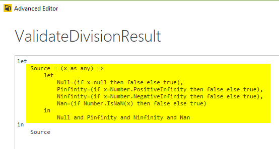
Anomalies in outputs such as above examples happens in most of the cases, and I found it useful to have a function to check all these options. The function below checks Null, NaN, PositiveInfinity, and NegativeInfinity. It doesn’t check errors however. Error handling is best to be applied on the calculation level as we’ve done earlier in this post. Here is the code for the function:
let
    Source = (x as any) =>
        let
            Null=(if x=null then false else true),
            Pinfinity=(if x=Number.PositiveInfinity then false else true),
            Ninfinity=(if x=Number.NegativeInfinity then false else true),
            Nan=(if Number.IsNaN(x) then false else true)
        in
            Null and Pinfinity and Ninfinity and Nan
in
    Source
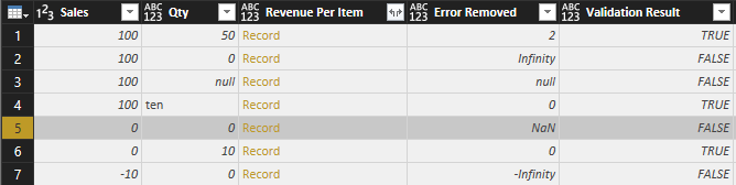
With function above, now I can add a custom column to my data set, and validate rows;

Final result set shows me which record is validated and which one is not. Note that the row containing error has been handled previously so it is validating as true here.
Divide by zero is not the only error that happens in Power Query. Power Query returns different results such as Error, NaN, Positive Infinity, Negative Infinity, and Null. For a proper faultless calculation you have to consider all these exceptions. In this post You’ve learned how to spot these exceptions easily and make your calculation faultless with small amount of effort. If you like to learn more about Power Query and Power BI read Power BI online book; from Rookie to Rock Star.
Published Date : June 20, 2016

As I mentioned earlier in Power BI online book, Power Query is a functional language. Knowing functions is your best helper when you work with a functional language. Fortunately Power Query both in Excel and Power BI can use shared keyword to reveal a document library of all functions. I’ve written about shared keyword almost 2.5 years ago, when it was only an add-in for excel. However I still see people in my webinars who are new with #shared keyword functionality and amazed how helpful this little keyword is. So I decided to explain it with the new Power BI. With the method in this post you can find any function you want easily in Power Query, and you won’t need an internet connection to search in functions.
Shared is a keyword that loads all functions, and enumerators in the result set. You can simply create a blank query in Power BI (or Excel)

After opening a blank query, go to Advanced Editor

Here in the script editor is where you usually write or modify power query script. Now delete all script here and only type in: #shared

After clicking on Done, you will see list of all functions, and enumerators in power query. You will also see other queries in your Power BI solution or workbook plus other custom functions.
Result set here is a Record structure that has functions, enumerators, and queries in each item of the record. Now let’s explore the record more in details.
Result above is loaded in Power Query and that is the greatest feature of Power Query itself that can turn this result into a table.

This will convert result set record to a table. and table is really easy to search in as you know.

I can now simply search in the function list. Let’s see for example what function I can find for working with WEEK;

This will filter the table to a sub set that I can see only functions with WEEK in the name of it.

Now for example if I want to see the Date.AddWeeks function I can click on the “function” link of it in value column and this will redirect me to the documentation of this function, and will bring a dialog box to invoke the function!

You can see the documentation in grey that also includes examples of how to call this function. for invoking the function I can simply provide parameters, and click OK or Invoke;

And it calls the function and show me the result as below;

Finding enumerators is also easy with help of #shared keyword. Here I can see enumerators for JoinKind and JoinAlgorithm;

You’ve learned how #shared keyword can be helpful for getting list of all functions and enumerators in Power Query. You learned you can convert the result set into a table and filter that to find particular function you are looking for. This is superb, especially for people like myself who can’t remember things well. You know how I look for functions? this post explained my method! I use #shared keyword to find the function I want and start working on that. for me #shared is the keyword that I use more than any other queries in Power query side of Power BI.
Published Date : June 13, 2016

You can share dashboards with other Power BI user accounts in your organizations, however you can leverage Power BI groups for creating a work group in your organization, and it works with Office 365 groups, contents will be shared with Power BI groups, and managing members are easily possible through Power BI service or Office 365 admin panel. In this post I get you through some features and basics about Power BI groups. If you like to learn more about Power BI, read Power BI online book; from Rookie to Rock Star.
You may have shared a dashboard with couple of your colleagues in your organization, after few weeks a need for new dashboard comes up, and you share that dashboard with them. couple of months later another member of your team asks for access to data set in Power BI to be able to create his own report and share with some others. Power BI groups enables you to share content (dashboard, report, and data set) with all members of a group. You don’t need to share each individual dashboard to each individual users, groups made it easy for you.
It is really hectic environment when you are part of multiple teams and each team have their own set of dashboards, reports, and data sets. Your work space in Power BI will be hundreds of items and finding something there would be a problem. Power BI groups creates separate work spaces for all members in the group. You can easily switch between work spaces in Power BI.
When you share a content with an individual in the organization, if that person leave the company, or be replaced by someone else from another team, then you have to remove sharing from previous user account, and assign it to the new user account. Best practice is to share content with groups. and members of Groups then easily can be managed by an administrator. Power BI groups are fully synchronized with Office 365 groups. once you used a group in Power BI, then it is only an admin’s task to add/remove members from it.
By default you see your own work space named as “My Workspace” in Power BI. all of your dashboards, reports, and data sets are listed there.

You can easily create a Power BI group with expanding My Workspace, and click on Create Group
you need to set up a name, and privacy settings for the group. Once you set up the name the group ID would be automatically assigned based on that, you can edit that if you want.

You can also choose if group is private for members only, or for everyone. Or you can choose if you want members to be able to edit Power BI content in the group, or just view it.

Adding members in the group is also as easy as adding their email addresses. You can then decide if you want that user to be admin of the group or not.

After creating the group, you will be redirected to a new workspace for that group with no dashboards, reports, and data sets.

Every content in group is shared between all members of the group. Let’s create the very first content in this group.
When you publish reports from Power BI Desktop, you will see all groups that you are member of, and you can choose where you want to publish. If you don’t see any groups or options for Publish that means you are not part of a Power BI group.

After publish your report and data set will be visible to all group members in Power BI services. A group can have multiple reports, dashboards, and data sets (such as screenshot below for Sales Group)

You can have a featured dashboard for your group, which is like a landing page in Power BI group. everyone from group would see this dashboard when they log in to the services. Featured dashboard can be easily set from each dashboard.

You can then see the featured dashboard anytime you login to Power BI services. Only one dashboard can be set as featured dashboard.

Power BI groups are fully synchronized with Office 365 groups. If you go to O365 admin panel, you will see groups that you have created in Power BI. and you can manage groups and their members in this admin panel;

This functionality is very helpful in enterprise solutions, where you share contents with a group in Power BI, and then members of group will be managed by an Office 365 admin.
Groups also can be created from Office 365 admin panel. for example creating a group such as below;

Will be visible in Power BI service of all members (who have Power BI subscription added to their Office 365 subscription options);

That means if you already have Office 365 groups created for your organization, then you don’t need to create Power BI groups for them again, they will be visible for users who have Power BI subscription.
You can also navigate to other group pages such as Calendar, Members, and Conversations (based on your permission level in the group)

If a group be deleted from Office 365, all of its content in Power BI with the workspace itself will be deleted.
At the time of writing this blog post, Power BI groups are a Pro option and are not part of Power BI free user account.

Published Date : June 8, 2016

I get this question asked in webinars, speakings, and comments on my blog posts that Is it possible to use a local file as a source in Power BI and schedule that to be refreshed? The answer is Yes, of Course. You can host your files locally or on a server on premises, and then use gateways to create the connection from Power BI website to the local file. And it will be able to schedule automatically. In this post I will show a full walk through of using an Excel file on my local machine as a source, and scheduling that to be refreshed from Power BI service (or website). I won’t go into details of what is gateway, or how to build a sample report in Power BI, if you are interested to learn more on those subjects read posts on Power BI online book; From Rookie to Rock Star.
There are two gateways that allows us to connect from Power BI service or web site (which is a cloud service) to on-premises data sources; Personal and Enterprise gateway. There are some differences in these two gateways which I will explain in separate post. In this example I will be using Enterprise Gateway to connect to on-premises Excel file. You can download the gateway from the Power BI website after you logged in, through options mentioned in screenshot below;

Then choose Enterprise Gateway for this example

After downloading follow the setup wizard with few steps and you will have Enterprise gateway installed with few clicks. There are some limitations though; You cannot have Enterprise and Personal Gateway on the same machine. I won’t talk about their differences, that would be a whole separate post which I will write later. In this post we only go through an example of using this gateway.
After installation, you can configure your gateway. All you have to do is to sign in to your Power BI account from gateway, set a name for your gateway and a code or recovery key. then you will be good to go. I’ve already setup my gateway and named it as RezaSurface. Now I can manage my gateway through Power BI website, through Setting icon, and then Manage Gateways.

In the Manage Gateways page I can see the gateway I’ve configured named RezaSurface. And I can also see that it is online with a green checkbox close to it. which means everything works correctly.

Now I can create a Data Source for the file that I want to use as a source. Click on Add Data Source (numbered 2 in screenshot above). as you can see in screenshot below I name the new data source as Excel On Prem, and choose data source type as File, and set full path of file. This should be the local path of file in the computer that has gateway installed on it. Also I enter Windows username and password for the computer that has enterprise gateway installed on it. This username and password will be used to access the local file.

Note that for this example I will be using sample Cashflow Data.xlsx file which I previously built a Waterfall chart with it. If you want to learn more about building a waterfall Power BI chart, read this post. After adding data source above I can see the connection is successful to my local excel file.

Power BI solution that I have is a simple waterfall chart on a cash flow data table in an Excel source. Here is my sample excel source table:

and here is the waterfall chart I’ve built for the data set above in Power BI Desktop

If you need more details information about how to build report above read Waterfall Chart blog post here.
I named this Power BI file as Excel On Prem, and publish it to my workspace in Power BI

Now I can see my report in Power BI website;

Now that I have my report and data set published in Power BI service, and gateway configured with the data source, I can connect these two together and schedule refresh.
Click on ellipsis button besides the Excel On Prem data set and choose Schedule Refresh.

Then I will be redirected to Settings page where I can configure settings for this data set. As you see in screenshot below, I expand Gateway connection, and I choose using an enterprise gateway which I’ve already created a data source for this file there before. and then I apply changes.
The connection between the data set in my Power BI report and the data source in gateway is now created. and I can Schedule Refresh based on the schedule I would like daily or weekly…

Now If I change the Excel file in my local folder as below; start of my cash flow now changed to 8000$ instead of 5000$;

After schedule refresh run (or even after manual refresh of the data set on Power BI site), I can see the report refreshed as below;

You can see that the waterfall chart starts with $8K which is the new value from local Excel file.
In this post you’ve learned how to use gateway to create connection between on-premises source file and Power BI website, this functionality will expand your Power BI solution to use on-premises source files as source and schedule automatic refresh on those. Note that you can apply this on any files, it shouldn’t be only Excel files. There are also options for using a folder as source which is useful when you have multiple files with same structure in a folder on-premises. Think about ways that this functionality can help your solutions.
Published Date : June 2, 2016

There are many SaaS (Software as a Service) data sources for Power BI, such as Mailchimp, SalesForce, and etc. However I haven’t found anything for Meetup. Meetup on the other hand is a data source that event organizers such as myself use mostly. In this post I will be using Meetup API to connect from Power BI Desktop and read the JSON output of Meetup API to build some nice visualizations in Power BI. You can read more about Power Query in Power BI online book from Rookie to Rock Star.
If you haven’t heard about Meetup so far; it is a platform for scheduling in-person events. As an organizer I announce meetings for my Meetup group (such as New Zealand BI user group), and Meetup helps with the registration for the event. As an audience I can join to groups in my area of interest and be informed about their upcoming meetings and RSVP those to attend or not attend. Meetup website itself gives some useful information to organizers, however as a Power BI geek I would love to dig into its data with a better tool.

Fortunately Meetup has a set of API restful services which returns output as JSON format.
Restful service means there are some URLs that I can browse and it gives me a response in JSON format. First of all I need to use my API key. API key would be different for anyone, and sorry I cannot share my API key with you, that’s why it is blurred in screenshot below. You can access your API key from here.

Now I can call each service with this key. Fortunately there is a good documentation on each service, input parameters, and output result set here. As an example if I want to get list of all meetup events in the past for my group, I can use V2 Events service with input parameters such as URL name of the group, and status to be “past” (means only fetch past meetings);
https://api.meetup.com/2/events?status=past&group_urlname=New-Zealand-Business-Intelligence-User-Group&key=XYZ
Note that group_urlname of my Meetup group can be easily found on my group web url:

as per screenshot above my group url name is: New-Zealand-Business-Intelligence-User-Group
and you have to use your own API Key instead of XYZ in URL above.
So if I browse URL above it gives me a JSON result. JSON is a format for data which usually doesn’t have enter or space between fields, so as a result I would see a big text result like this:

Now let’s browse URL above in Power BI and Power Query to see what can I do with it. I open a Power BI Desktop file, and Get Data from Web. and I enter URL above there (with my own API key obviously);

Result of this will show me a record in Power Query editor window with results and meta columns. You can also see in screenshot below that Power Query uses JSON.Document and Web.Contents to get JSON result from a web URL.

Now click on the results section List to expand that. This will drill down into the list and you will see a list with multiple items in the next step. This list is result set in our JSON data. the result set of the URL we run returns list of events. That means this list is list of events, and each row in this list is an event. As you can see I have a record in each row. I can convert the main list to table with first highlighting the whole column, and then click on To Table option from Transform menu in Power Query.

When I click on To Table, I will see To Table dialog box that asks for two configuration options, first one for delimiter, and second one for handling extra columns.

I don’t do any changes, and click on OK with default values. Result now would be a table with single column, which has a record in each row. I can see the Expand button on my column1 header.

Click on expand button as mentioned in screenshot above, and it will list all columns in records and asks me to choose those I want.

Well let’s bring them all to see what we have, so I leave it with select all and click on OK. Here is my result set loaded in Power Query now:

Now I have event information such as Name, Description, venue and other fields. Some values are a record by themselves, such as Venue and Rating. I can expand them if I want to. Let’s leave it as is for now. I’ve loaded my first service result into Power Query. Now one important thing before any other step is to check time value. Because I want to do date/time analysis for my events, so it is important to see if I have my time value fetched. in screenshot below it shows my Time column as a numeric value.

In the documentation of this service in Meetup mentioned that Time column is:
time = UTC start time of the event, in milliseconds since the epoch
That means it is timestamp formatted. Timestamp value is number of seconds from epoch which is 1970-01-01 00:00:00. I have previously written about how to change timestamp value to date time and it is fairly easy with adding seconds to it. However for this case our value is not seconds, it is milliseconds so I have to first divide it by 1000.

This makes my number smaller now, and I can now feed it into adding a custom column as Event Time as below;
#datetime(1970,1,1,0,0,0)+#duration(0,0,0,[Column1.time])

If you want more information about this conversion read my blog post here. Now this will give me a date time value as below:

Please note that times are UTC times, We never have meetings 4 AM! I won’t be changing UTC time for now, because I want more Month analysis and this is fine for that analysis.
Let’s visualize what we’ve got so far. First step I have to make sure the data type of my column in Power BI model loaded as Date Time. I can go to Data Tab, click on my Event Time column and under Modeling tab check the data type, and if it is text or anything else, change it to Date/Time

a warning message will be displayed for reports that already using this field, as I don’t have any report elements yet, I’ll confirm and continue.
I also have to make sure that yes_rsvp_count column (which is showing number of audience for each session) set as data type whole number. If it is not the case, then I change it to be whole number as below.

Let’s build charts now. I start by an Area Chart showing Event Time as Axis (without hierarchy), and yes_rsvp_count as values

I also apply some formatting and build a chart like this:

Well, it shows our group is performing well, number of audience raised from 10 to 99! and trend line shows that we are progressing better and better. I can build some other visualizations such as bar chart with name of events and number of RSVP yes as below;

I can see the very first event that had more than 50 audience was the event that my friend Ken Puls Excel MVP from Canada came here to speak in our user group, which was kind of a start into our popular events afterwards.
I can add more data to build more meaningful insight out of it. For example I can fetch Members information to show their locations (city and country) on the map. For this I use Members API service which I can call as below;
https://api.meetup.com/members?group_urlname=New-Zealand-Business-Intelligence-User-Group&key=XYZ

This time I haven’t explained step by step, but process is similar to what we’ve done for Events, so I skip this part. Now I want to create a custom column concatenated of city and country as below;

I then will be using this new City Full column because it gives me more reliable map location than the city itself (because a city with same name might be part of two different countries).
RSVP data for each event is really useful for me, because I can understand who attend in most of events, and then contact them and thanks them for their commitment to the group. RSVP data can be fetched for each event. So I have to check it for each event ID that what is the RSVP for it. Here is RSVP service URL:
https://api.meetup.com/2/rsvps?event_id=230678189&key=XYZ
Note that you have to use your own event_id for the URL above.
I start by fetching result of above URL into Power Query; and here is what I get after expanding the JSON list and records;

Note that I’ve also expanded Members column to get Member ID, this is what I would use later to join to Members query. I also have a column for response which says if this member responded yes to the RSVP or not. I name this query as RSVP.
Query above is only for one event, but I am looking for data for every event. So I have to create a function for getting RSVP result and apply that on every row in Events query. I create a duplicate version of Events, and remove everything and keep only column1.id (which is event id).

Now I create a parameter to make my RSVP query parametric. Click on Manage Parameters, and choose New Parameter.

I create a parameter with name EventID and default value as one of my event ids;

Now I go to advanced editor tab of my RSVP query, and change the script to use EventID variable as below;
let
    event=EventID,
    Source = Json.Document(Web.Contents("https://api.meetup.com/2/rsvps?event_id="&Text.From(event)&"&key=295356c2d668094694760525e119")),
    results = Source[results],
    #"Converted to Table" = Table.FromList(results, Splitter.SplitByNothing(), null, null, ExtraValues.Error),
    #"Expanded Column1" = Table.ExpandRecordColumn(#"Converted to Table", "Column1", {"venue", "created", "member_photo", "answers", "rsvp_id", "mtime", "response", "tallies", "guests", "member", "event", "group"}, {"Column1.venue", "Column1.created", "Column1.member_photo", "Column1.answers", "Column1.rsvp_id", "Column1.mtime", "Column1.response", "Column1.tallies", "Column1.guests", "Column1.member", "Column1.event", "Column1.group"}),
    #"Expanded Column1.member" = Table.ExpandRecordColumn(#"Expanded Column1", "Column1.member", {"member_id"}, {"Column1.member.member_id"})
in
    #"Expanded Column1.member"
Now that my query works with parameter, I can simply right click on it, and Create Function.

I name the function as GetRSVP and it get EventID as input parameter

Now I can go to my copy of Events query which named Events(2), and add a custom function that calls GetRSVP as below

Result set would be a column with tables in each row, which I can expand to get RSVP columns there

Note that you may hit the privacy configuration warning and errors at this step; because this is just for test. I went to Files -> Options and Settings -> Option, and change privacy setting to ignore ![]() This is not best practice obviously, you have to set it up appropriate for production environment, but here is just a demo and test, so let’s have fun.
This is not best practice obviously, you have to set it up appropriate for production environment, but here is just a demo and test, so let’s have fun.

I rename this query as RSVPs, and Close and Load data into Power BI. I’ll create relationship as below;
Events and RSVPs= column1.id from Events, Custom.Column1.event.id from RSVPs
RSVPs and Members= Custom.Column1.member.member_id from RSVPs, Column1.id from Members

I can now visualize members by their geo location city information in a map

It is interesting that we have some members in our user group in other continents ![]() However the majority are in Auckland, New Zealand as expected. I can also build another bar chart for members who RSVPd yes mostly. Here is my final visualization with some formatting:
However the majority are in Auckland, New Zealand as expected. I can also build another bar chart for members who RSVPd yes mostly. Here is my final visualization with some formatting:

I can still dig into more details with adding more data into my Power BI model and visualization, but I leave it to you now from here to see how far you can go with it. Have fun with Power BI and Meetup API.
Published Date : May 31, 2016

Power Query has number of Date and Time functions that convert values to date and time. However I haven’t found a function that converts a timestamp value. Fortunately it is easy to calculate a date time from a timestamp value. In this post I’ll explain an easy way of converting timestamp to date time. To Learn more about Power Query read Power BI online book; from Rookie to Rock Star.
Timestamp is a whole number value, which is number of seconds from date 1970-01-01 00:00:00. For example; timestamp 100 means 1970-01-01 00:01:40, or timestamp 86400 means 1970-01-02 00:00:00. So the calculation is easy; We have to add timestamp as seconds to the date/time 1970-01-01 00:00:00.
Once we know what is definition of timestamp, and how to calculate date/time from it; easily we can use #duration(0,0,0,<timestamp value>) to show duration in seconds, and add it to the #datetime(1970,1,1,0,0,0) which is date time 1970-01-01 00:00:00.
So as a result, here is the code to convert timestamp to date time;
DateTimedValue=#datetime(1970,1,1,0,0,0)+#duration(0,0,0,1415697165)
above query will respond 11/11/2014 9:12:45 AM.
Please note that you have to replace the 1415697165 number with the field name containing timestamp values, or with your static timestamp value in the query.