Published Date : March 20, 2017
DAX has many functions to write conditional expressions. For example you might want to calculate sum of sales amount for all “Red” products. you can achieve it by using SUMX or Calculate, and functions such as IF or Filter to write a conditional expression for product color to be equal to “Red”. At the first you might think these functions will be have same in the result set, but there is a difference that should not be overlooked. In this post I’ll explain what type of problem might happen if you don’t use these functions wisely. If you want to learn more about Power BI; read Power BI book from Rookie to Rock Star.
For running this example you would need to have a copy of AdventureWorksDW database in SQL Server, or you can download Excel version of it from here:
“IF” is a conditional filtering expression function for DAX. You can simply write a conditional expression including Then and Else part of it. It simply works with this syntax;
IF(<conditional expression>, <what happens if true>, <what happens if false>)
“Filter” is a function that filters data set based on a custom filter. For example you can filter only products with “Red” color. Here is an example Filter expression;
FILTER( <table>, <filter condition>)
For this example, you need to bring FactInternetSales, and DimProduct into your Power BI Model. Relationship between these tables automatically should be detected by Power BI. It should be based on ProductKey between two tables. Here is how the relationship looks like;

There are multiple ways of calculating conditional sum in DAX. you can use SUMX or CALCULATE. both of these functions calculate an expression (In this case it would be sum of sales amount from FactInternetSales), based on a filter (which would be our conditional expression to find “Red” products). I will use SUMX in this example, but same concept applies on Calculate function as well. Here is how you can use SUMX for calculating sum of “Red” products;
In the first method, I can use SUMX expression and filter the data set to be only “Red” products. Create a new Measure in FactInternetSales with this expression;
Sum of Red Products - With Filter = SUMX(
	                                    FILTER(FactInternetSales,
											   RELATED(DimProduct[Color])="Red")
										,FactInternetSales[SalesAmount]
										)
As you can see in the above expression, I have used a simple FILTER function to filter everything in FactInternetSales when Color or product is “Red”. I have used RELATED function because Color is a column in DimProduct and Related Function goes through the relationship from Many (FactInternetSales) to One (DimProduct) and allow us to do the filtering based on a column in a related table.
We can achieve same result with SUMX and IF condition together. In this case the condition comes as IF statement in the expression part of SUMX. Here is the new measure’s code;
Sum of Red Products - With IF = SUMX(
	                                FactInternetSales,
									IF(RELATED(DimProduct[Color])="Red",
										FactInternetSales[SalesAmount],
										0)
                                    )
In this expression, instead of filtering data with FILTER function, I have used a conditional expression to identify if the color of product is “Red” or not, if it is “Red”, then I use SalesAmount for sum calculation, otherwise I use zero (means don’t summarize for other product colors).
There are many other methods of calculating the conditional sum, but just adding this one because it looks different; If I use Calculate Function with simple expression for checking the color of product as a new measure;
Sum of Red Products - Calculate Simple Expression = CALCULATE(
	                                                      SUM(FactInternetSales[SalesAmount]),
														  DimProduct[Color]="Red"
														)
Writing DimProduct[Color]=”Red” in this way is similar to writing a condition for every result set. The final result will be sum of Red Products.
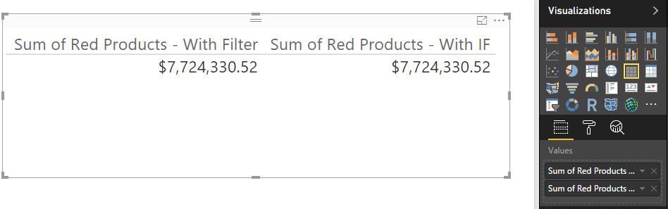
If you bring both measures in Power BI as a Table Visual you will see the result of both are identical, and it will show you total sales amount for products with “Red” Color correctly;
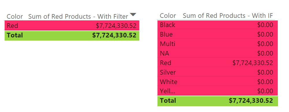
The result for measure is perfectly similar, however if you use one of these measures for a data set you will see the result of data set is different, and it changes the result significantly. For example if you use “Sum of Red Products – With Filter” only in a table with “Color” from DimProduct, here is what you will see:

If you use “Sum of Red Products – With IF” only in a table with “Color” from DimProduct, you will see different result;
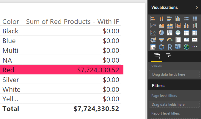
In both cases, the grand total is similar. However the table with a FILTER measure will automatically filter the data set, and only shows result set for RED products, where the second table with IF measure, will show all products with zero in front of all colors, except Red. These two are VERY different in user point of view, while the final total value is similar. The reason is that IF just apply a conditional expression on the result set, where FILTER works differently and filters the data set to the custom filter expression. Notice that we don’t have any Visual, Report, or Page Level filter applied in this example. Filtering happened automatically because of FILTER function.
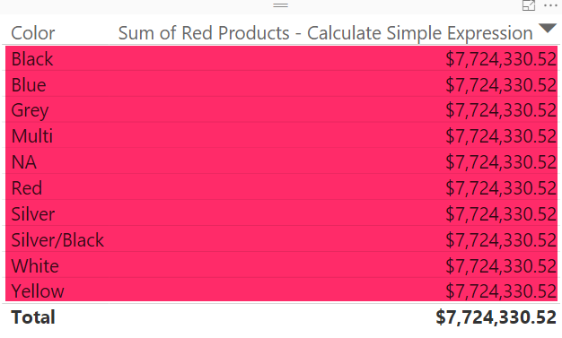
If you bring the last method’s result into a table (Sum of Red Products – Calculate Simple Expression), you will see the calculation happens on every row in the result set. It won’t filter the data set, but the filter applies on calculating the final result for every row.
Like many other situations; It Depends! Are you only interested in final result (sum of sales amount for “Red” products in this example)? if yes, then FILTER gives you faster result, because it first filters the data set, and then apply SUM on it. However, it you want to show a detailed view of records, then FILTER function will also filter the data set, which might not be something you want, in those cases IF would give you the correct response. If you want to calculate percentage for each row, the Calculate method might generate more reliable result. Notice that there is nothing wrong about these functions, they are working exactly as they should. However, Not knowing their actual behavior might cause some confusion for you and your users. So use them wisely and don’t overlook their differences.
You can download Power BI Demo file from here:
Published Date : March 7, 2017
I have previously written some blog posts about Map visuals in Power BI. One of them was specifically about Filled Map, titled as Filled Map; the Good, the Bad, the Ugly! Why? you need to read that post to find the reason. In this post I want to explain the power of Shape Map which is one of the visuals Power BI team published recently. This visual is still at preview mode at the time of writing this post. This visual is much more powerful than what it looks. The actual power behind it is that you can have your own map added to it. Let’s take a closer look at this visual with an example. If you want to learn more about Power BI; read Power BI from Rookie to Rock Star.
There are many ways to visualize something on Map in Power BI, some of it are as below;
I have written about them all expect last two. This post focus is on Shape Map, and in another post I’ll explain ArcGIS visual. Hopefully at the end I will write a post about comparison.
Shape Map is a visual first introduced few months ago with the ability to highlight regions (similar to Filled Map), and the power of adding your own map file to it. This feature makes it different from Filled Map, because the normal filled map visualize anything on a Bing map layer, and if for some reason it can’t find that geo location information result won’t be great with that. If you want to see an example of that, read this post; Filled Map, the good, the bad, the ugly! Don’t get me wrong; Filled Map is good at some stage, but there are better ways some other times.
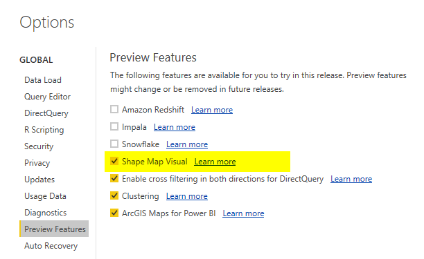
Because Shape Map is still in preview mode (at least at the time of writing this post), you need to enable it in Options section of Power BI Desktop; From File Menu -> Options and Settings -> Options.
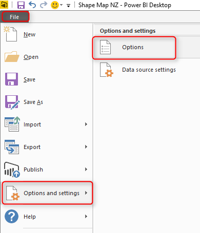
You need to select Shape Map in the list of Preview Features tab;
After clicking OK. you need to close your Power BI Desktop and re-open it again. You should be able to see Shape Map visual in list of your visuals now.

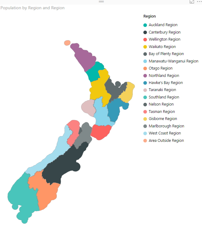
For this example I will be using an Excel file including all New Zealand regions and population of each region. Why New Zealand? Regions of New Zealand can’t fit great into filled map (I’ve explained it here), so it can be a very good example for Shape Map then. You can download all files for this demo here;
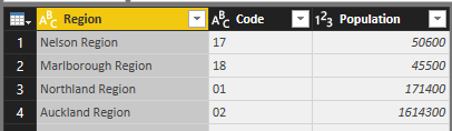
After enabling the preview feature of Shape Map, get the data from Regions Excel file, which includes data set as below;
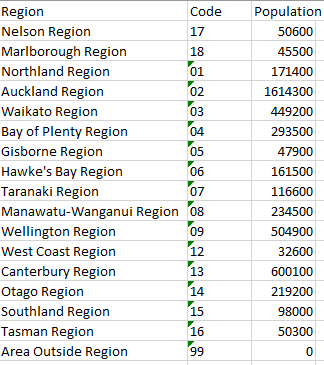
When you get data from Power BI Desktop from above data set, Power BI automatically change the data types to preferred data types. Make sure that you get correct data types; Region and Code should be Text, and Population should be Whole number;
Close and Apply query editor, and drag and drop a Shape Map visual in the report page. To get the first view of this visual, you need to drag and drop a field into it. Start with using Region as the Location, and Use Population as Color Saturation.

As you can see in above image, the first view would be States in USA, which is not exactly what we are looking for. The reason is that Shape Map works based on a predefined map. To select to map, go to Format of this visual, and expand Shape section.
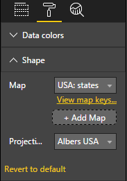
Now you can see that the default Map view is USA: States. You can simply change it to other maps in the list;
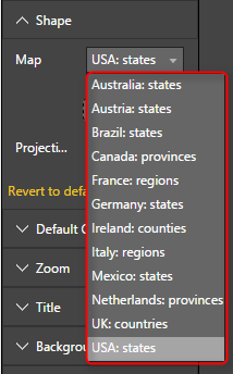
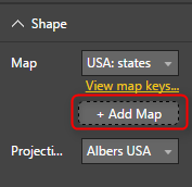
There are few maps/shapes in this list, but obviously there are many options missing. For example; New Zealand regional map is missing. Even if you want to use USA Cities Map, or Cities of a specific state in USA you can’t find it here. Don’t turn around with seeing that, Shape Map allows you to add your own Map. If your data set is dealing with any of existing maps, then you don’t need to add a custom map for it. Just use the related map, and you are good to go. If your map is not there, here is the guide to add it;
Shape Map allows you add your own custom map! For using this option you need to simply click on Add Map in Shape section of Format of this visual.
The map should be a TOPO JSON file. TOPO JSON is a standard for defining geo location information. in this type of file, information such as boundaries of each region and name/id can be stored. Here is an example TOPO JSON content;

As you can see in the above screenshot, information such as boundaries of each region plus region information listed in the file with JSON format. Don’t panic! You don’t need to write JSON to create this file, there are much easier ways;
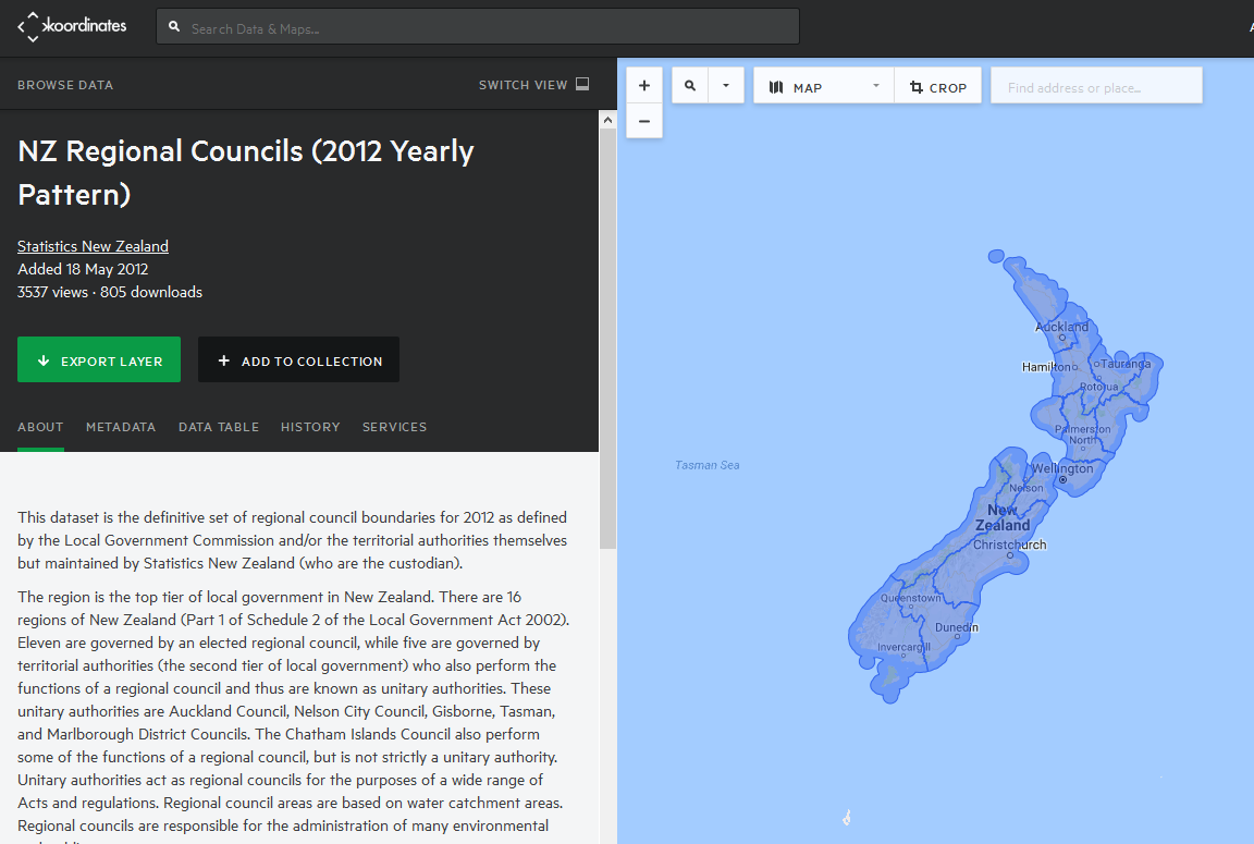
Normally you can easily find Shape files of every map over internet. For example, here is where I have found Shape files for New Zealand Region map;
https://koordinates.com/layer/4240-nz-regional-councils-2012-yearly-pattern/download/
In the Koordinates.com website, you can find many other maps, and there are also heaps of other websites that give you Shape file for the map. Shape files cannot be used directly with Shape Map. Shape files are normally a zip file including a bunch of files;
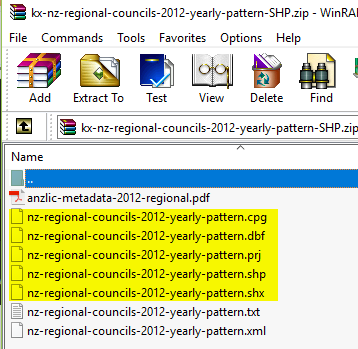
Not all files above are normally part of Shape file zipped directory, but normally .shp, .shx, and .dbf are. Once you have the shape file, you can easily convert it to TOPO JSON. there are heaps of converters for it. Here is one of them which one of students in my courses found it and works perfectly;
There are many websites that does the conversion of Shape File to TOPO JSON. as an example ShapeEscape does that perfectly;
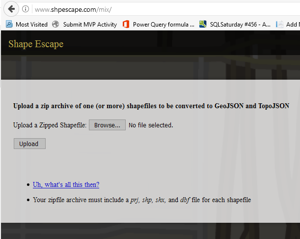
All you need to do is to upload shape file (the zip file including everything) into the website, and it will simply show you the map. make sure that you have selected TopoJSON map WITH attributes. To verify it; when you click on a region you should see a pop up text section showing name and id of that region (like screenshot below).

Maps can have variation of details, and depends on that the file size changes, you can select whatever details level you want. for this example, I took the most basic one with precision of 10,000. When you click on download, you can copy the entire JSON code into a text file, and put a .JSON extension for it.
Now you can simply add the custom map to Shape Map visual;

It will take few seconds for map to load, and then you will see your regional map visualized:
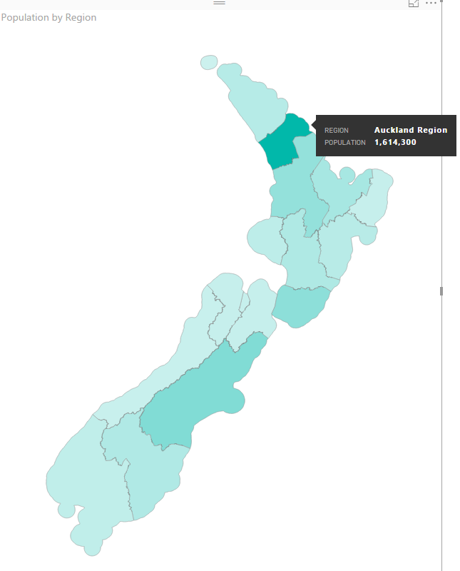
If you cannot see regions color coded, probably the attributes part of map file is missing. Verify that in Format -> Shape section with clicking on “View Map Keys”. You should see region names and their keys. If you see nothing, or names are not correctly populated, then try to convert shape file again (make sure that you get the converted file WITH attributes);

Shape Map despite its simplicity, is very powerful. Think about ability to add your own map, and that means no limit! All you need is just some tools to build your map, and convert it to Topo JSON format. There are many free or paid tools for it. There are however some limitations for this visual, which I hope get fixed before the general availability ![]() Here are pros and cons in nutshell;
Here are pros and cons in nutshell;
It is not common feature in Power BI map visuals, that you can add your own map. I have previously explained about SynopticPanel visual by OKviz which allows you to do that. However that is a custom visual, and this one is a built-in visual. and this one works with the Topo JSON standard of geo location.
This visual is still in preview mode, and it lacks of many features that can be available for map visuals. for example, you can specify different colors for every region through Legend. However drill down/up is not possible. You cannot add other layers of map to it (for example if you want to add heatmap, or bubbles to it).
In summary Shape map in my point of view is a powerful map visual for Power BI especially because of the feature to add your own map. Finding a map isn’t easy with help of Google and websites that does the conversion (such as ShapeEscape). This visual still has some limitations due to preview mode of it, which I believe will be sorted in next few months.
For this example I will be using an Excel file including all New Zealand regions and population of each region. Why New Zealand? Regions of New Zealand can’t fit great into filled map (I’ve explained it here), so it can be a very good example for Shape Map then. You can download all files for this demo here;
Published Date : March 6, 2017
There are many ways to share Power BI content with others. I have previously written about some of these methods, including Workspaces (or groups) in Power BI, Publish to Web, and Power BI Embedded. In this post, you will learn about organizational content pack which is another method of sharing. This method is a recommended approach for sharing your Power BI content with users. You will have full governance around your Power BI content, and users will be able to use self-service features of Power BI. This is the best method to share your content with others. Let’s take a closer look at this method and see how does it work. If you are interested to learn more about Power BI, read the Power BI book from Rookie to Rock Star.
Content Packs is a self explanatory name, and it means a package of Power BI content (which can be Dashboard, Report, and Data set). There are two types of content packs; Organizational, and Service Content Packs. Service Content Packs are a set of Power BI content built by normally someone from a company who provided that service (such as Google Analytics, MailChimp, and etc) and you get access to it with your account information. We won’t talk about service content pack in this post. Organizational Content Pack is a way to share your Power BI content with others easily. an organizational content pack can be shared with your entire organization, or specific group of people.

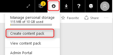
Creating content packs are easy, all you need to do is to go to Setting Icon in your Power BI account, and click on Create Content Pack.
** Content Packs are Power BI Pro features. Your account needs to be Power BI Pro account to use this feature. and everyone using this content also should have Power BI Pro account.
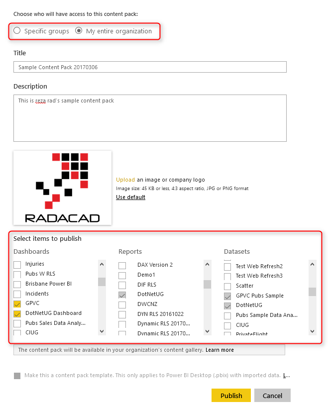
The create content pack dialog box is easy to use. Firstly, set the people whom this content pack will be shared with (Specific Groups, based on their O365 groups or Power BI accounts, or entire organization. Set a title, and description, and a logo. Then select contents that you want to be part of this package. you can always change this selection later on. If you select a higher level item, sub items will be automatically selected. For example, if you select a Dashboard, Report and Data set under that will be automatically selected. in picture below I have selected few items to share.
After Publish, your content pack will be ready to use.
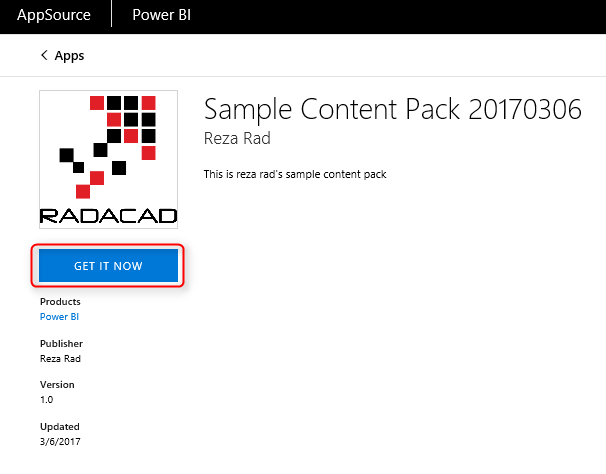
Now if someone from your organization (or the group of people that this content pack is published for them) logs into Power BI, and go through Get Data section;

Users will see content packs shared with them, and they can select the one that they want to install. and then click on Get It Now.
After getting the content pack, all of its content (dashboards, reports, data sets) will be loaded in the Power BI account of the user.

User will be able to view dashboards, reports, and data sets with full interactive reporting features of Power BI;

Content Packs are easy way of sharing content, but their benefits isn’t just this easiness. It is more because of other great features. In brief explanation, features are;
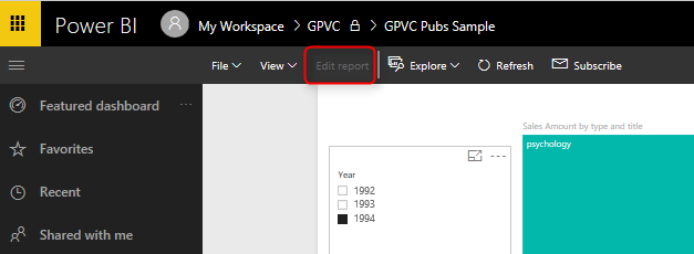
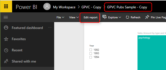
None of users will be able to change the original contents in the content pack. In fact, users will have “Read-Only” access to the Power BI content shared with them. They cannot modify dashboard, Report, or data set. You can see in the screenshot below that Edit Report item is disabled for them;
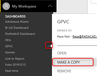
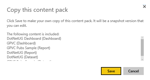
Although that users cannot edit the content and they have read only access. However they can create COPY of the content, and make their own changes in their copy (which is for themselves only). This is a very important feature, because greatness of Power BI is the ability to build things self-service. And you never want to take that power from your users of course. To create copies, users just click on the content and create copies of that;
This action will generate copy version of all dashboards, reports, and data sets for the user.
Everything will be post-fixed with – Copy.
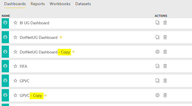
And in the “* – Copy” version, user will have Edit rights;
As the owner of content pack, you can always to to manage content pack, and configure the content you want to be shared. You can change the content, or even delete the content pack. Changes will effect immediately on user’s side.
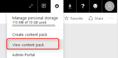
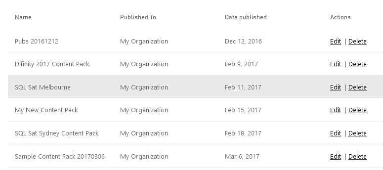
List of all content packs will be available for your in View Content Pack.
Any changes will be possible, and will affect immediately on those who are using this content.
One of the main questions I get when I reach to this part of my course, is that; Would users get refreshed data in their copy of content pack? the answer is: Yes. With using content packs, you manage the refresh on the main data set(s), and everyone using this content pack will get the refreshed data based on whatever schedule you have defined. There is no need to schedule data to be refreshed again for users.
The last but not least advantage of this method, is that you can simply share 100s of reports, dashboards, and data sets with others with a single content pack.
In Summary; Organizational Content packs are best way to share Power BI content with users. You will have full governance for your content; you will set up refresh once, and no one would be able to change your original content. Users on the other hand will have access to all content as read-only, and they can make their own copy of the content, if they want to play with self-service features of Power BI. You can always control and change contents of the content pack from View Content Packs section in your Power BI account. This method is highly recommended for sharing content with end users.
Published Date : March 3, 2017

What is the main difference between M and DAX? Why we can do a calculated column in two different places? What are pros and cons of each? Which one should I use for creating a profit column? Why I cannot do all of it in only one; DAX or M! Why two different languages?! Why structure of these two are so different? … If any of these are your questions, then you need to read this post. In this post I’ll go through differences of these two languages, and explain why, when, where of it. Normally I don’t get this question asked from students of my Power BI course, because I elaborate the difference in details. However, if you have this question, this is a post for you. If you would like to learn more about Power BI; read Power BI book; from Rookie to Rook Star.
M is the scripting language behind the scene for Power Query. M is the informal name of this language. the formal name is: Power Query Formula Language! Which is really long, and even Microsoft refer it to M. M stands for many things, but one of the most common words of it is Mashup. Which means this language is capable of data mashup, and transformation. M is a functional language. and structure of M script can be similar to this:
Source: Day Number of Year Function in Power Query
M is a step by step language structure. Usually (Not always), every line in M script is a data transformation step. and the step after that will use the result of previous step. It is usually easy to follow the structure of M language for a programmer. because it is understandable with programming blocks of Let and In, and some other programming language features alike.
DAX is Data Analysis eXpression Language. This is the common language between SQL Server Analysis Services Tabular, Power BI, and Power Pivot in Excel. DAX is an expression language, and unlike M, it is very similar to Excel functions. In fact, DAX has many common functions with Excel. However DAX is much more powerful than Excel formula in many ways. Here is an example DAX expression:
Source: Secret of Time Intelligence Functions in Power BI
DAX calculations are built in a way that makes sense mostly for Excel users. Normally Excel users are very comfortable with this language. Everything goes through functions. DAX doesn’t have programming blocks in it, and is combination of function uses, filters, and expressions.
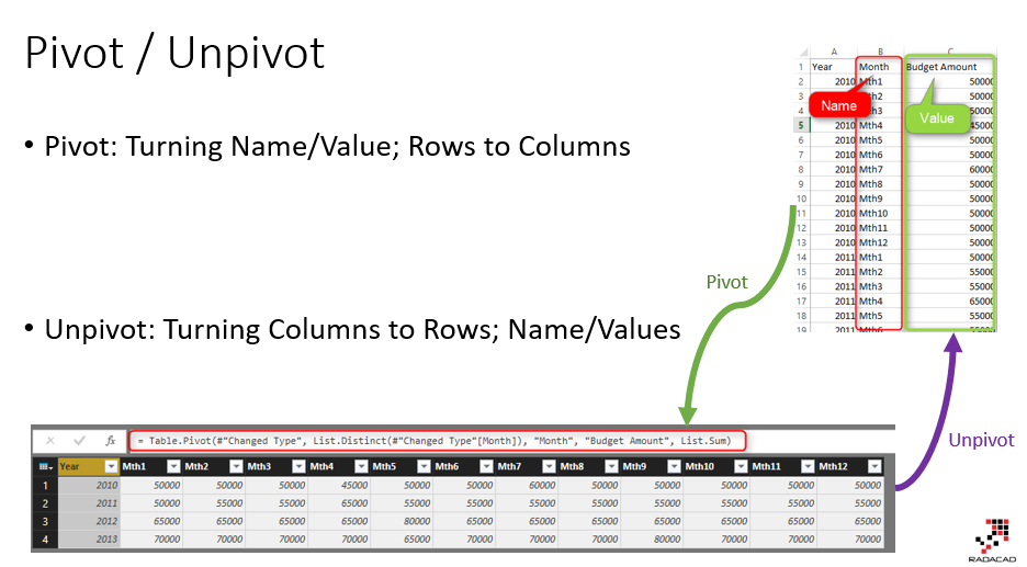
M can be used in many data transformation scenarios. As an example, it can be used to Pivot or Unpivot Data, To Group it based on a number of columns. Here is how a Pivot/Unpivot can work in Power Query;
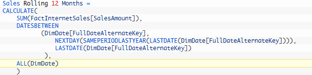
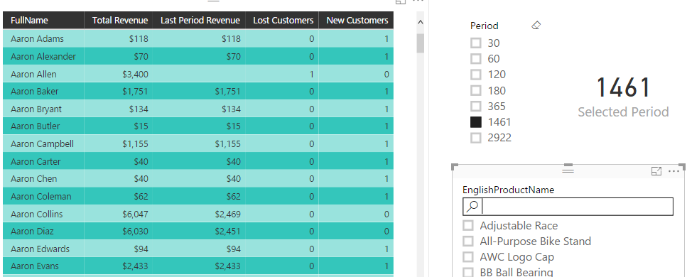
DAX can be used for many calculation for analyzing data. For example, calculating Year To Date, Calculating Rolling 12 Months Average, or anything like that. Here is an example which based on a selection criteria in the report and few simple DAX expressions we can do a customer retention case with DAX;
The main question of choosing between DAX and M comes from calculated column dilemma in my opinion. You can create many calculated columns in both M or DAX, and it is confusing where is the best place to do it, or why there are two different places to do it?! As an example; you can create a full name which is concatenated of FirstName and LastName column. You can do that in M, and also in DAX. So this question comes up that: Why two different places? Which one is best to use? can we always use one language?
To answer this question, I would like to use another example; There are many types of knives, and you can use almost all of them to cut cheese!

reference: http://forkitchen.blogspot.co.nz/2008/10/what-are-different-types-of-kitchen.html
Almost every knife in above picture can be used for cutting cheese except one of them! So why there are so many knives for cutting cheese?! The answer is that; these are not knives for cutting cheese! each knife is good for doing one special case. for cutting bread, bread knife gives you the best result. for cutting a fillet you normally need another type of knife. but as you agree, for some cases (such as cutting cheese!) you can use many of these knifes. Let’s know go back to the original question;
These two languages built independently. They built in a way that they can handle most of business related solutions. So as a result there are some use cases that both languages are capable of doing it. As an example both of these languages can easily be used to create a concatenated column of two other columns.
Quick answer is Depends! Depends on type of usage. If you want to create a concatenated column; Power Query (M) is better option in my view, because that is normally like the ETL part of your BI solution, you can simply build your model and data sets in a way you like it to be. But if you want to create something like Year To Date; Obviously you can do that in Power Query or M, but it will be lots of code, and you have to consider many combinations of possibilities to create a correct result, while in DAX you can simply create that with usage of TotalYTD function. So the answer is; there is no best language between these two. The type of usage identifies which one is best. Normally any changes to prepare the data for the model is best to be done in M, and any analysis calculation on top of the model is best to be done in DAX.
There are many programming languages in the world, each language has its own pros and cons. JavaScript is a language of web scripting, which is very different from ASP.NET or PHP. Same thing happens here. When M born, it meant to be a language for data transformation, and it is still that language. DAX was created to answer business analysis questions.
DAX is the analytical engine in Power BI. It is best language to answer analytical questions which their responses will be different based on the selection criteria in the report. For example; You might want to calculate Rolling 12 Months Average of Sales. It is really hard if you want to calculated that in M, because you have to consider all different types of possibilities; Rolling 12 months for each product, for every customer, for every combinations and etc. However if you use a DAX calculation for it, the analytical engine of DAX take care of all different combinations selected through Filter Context in the report.
M is Data Transformation engine in Power BI. You can use M for doing any data preparation and data transformation before loading that into your model. Instead of bringing three tables of DimProduct, DimProductSubcategory, and DimProductCategory, you can merge them all together in Power Query, and create a single DimProduct including all columns from these tables, and load that into the model. Loading all of these into the model and using DAX to relate these with each other means consuming extra memory for something that is not required to be in the model. M can simply combine those three tables with each other and based on “Step Based” operational structure of M, they can be simply used to create a final data set.
Both! With no hesitation! M is your ETL language, and DAX is the analytical language. You cannot live with only one. If you want to be an expert in Power BI, you should be an expert in both of these languages. There are some cases, that one of the languages will be used more than the other one. However, you will need very good understanding of both languages to understand which one is best for which purpose, and easily can use it in real-world scenarios.