Published Date : May 5, 2017
I have previously written about some of the methods of sharing content in Power BI, such as Work spaces, Publish To Web, and Content Pack. Latest update of Power BI includes stunning update for sharing mechanism which is the best of all for sharing. In this post I’ll explain everything about new Power BI Apps; a mechanism to share the content in Power BI in a way that has security and governance together. If you want to learn more about Power BI; Read Power BI book from Rookie to Rock Star.
Till now there were about 6 methods of sharing content in Power BI, including:
I have written about some of these already (follow links above), and will write about the rest soon. Yesterday, Microsoft announced preview version of Power BI Apps, which is a new method of sharing. This is an enhancement version of two methods previously: Work spaces, and Content Packs together!
A Power BI app is a grouped content of Power BI (including Dashboards, Reports, Work books, and Data Sets), which is shared with organization or a group of people within organization. Let’s go through creating and consuming an App to see how it works in action.
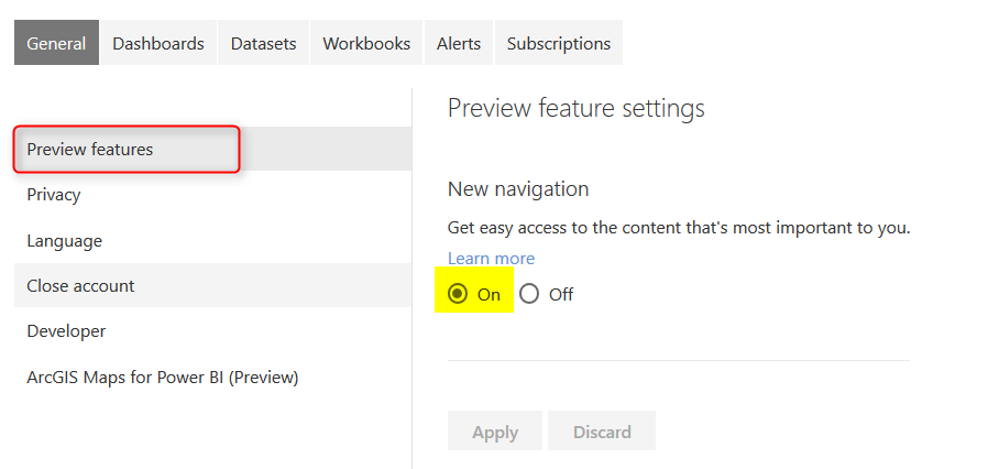
At the time of writing this blog post, Power BI App is just released as preview and is not yet available as general available. You need to turn on the Preview mode of Power BI service to be able to work with it. To turn Power BI in the preview mode, Go to Setting in Power BI website;
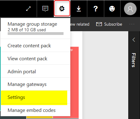
In Setting page, Go to Preview features section, and turn this feature on.
To start creating an app, you’ll need an App Work Space. This is a new generation of work spaces in Power BI. content that you will have in this work space will be the entire App for the work space. If you already have a work space, you can use that as an App Work Space.
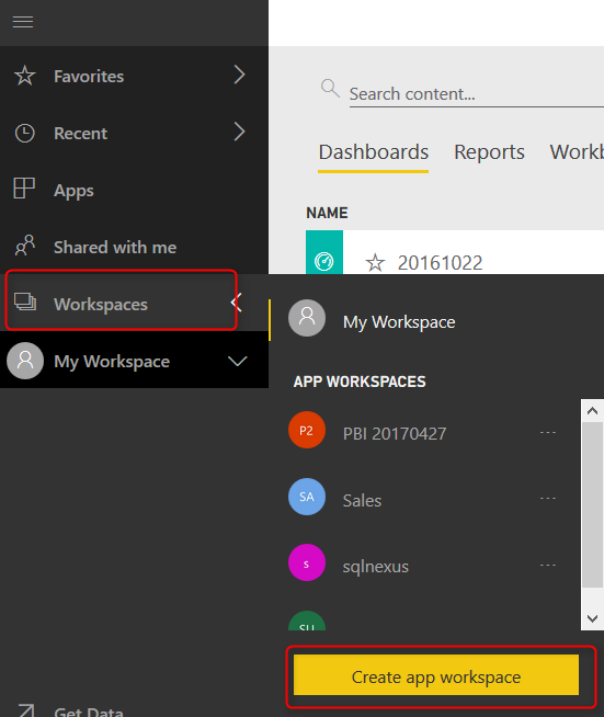
app work space is like a folder that is shared with a group of people. Set a name for the app work space. You can specify if users has access to this work space via edit or read only. Please note that this way of access is only for people that you add them in the group directly, not for users of this App.
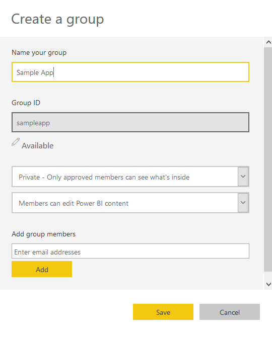
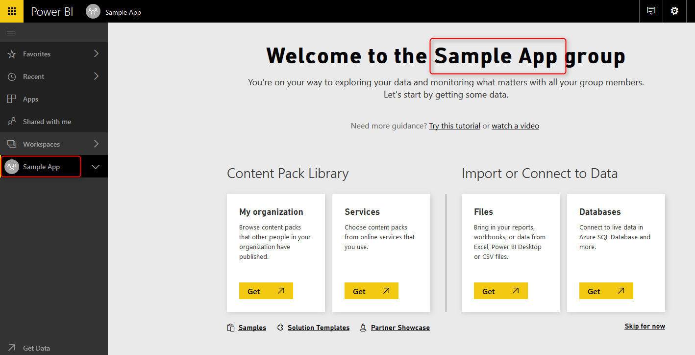
After creating the app work space, you should see a new work space (folder) which is blank at first
For publishing content to app, just simply publish it to the app work space. Open Power BI Desktop, go through Publish, and select the app work space created.
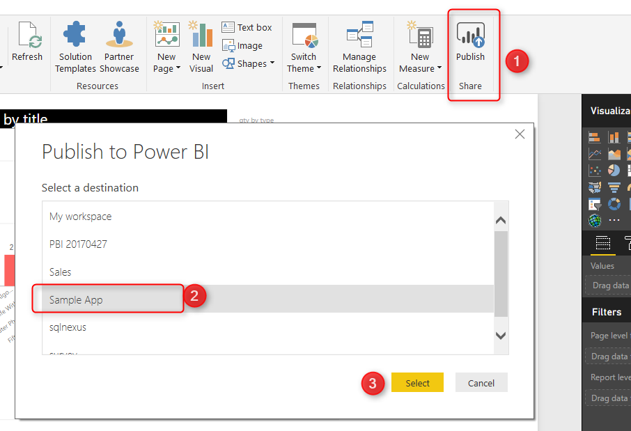
After publishing content into the new app work space, you should be able to publish App from there.
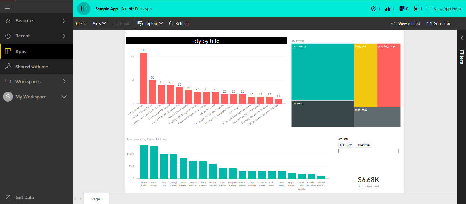
You can easily publish an app from the app work space. Just click on the work space, and then from top right hand side, select Publish App. Set a description and color for the app. You can also see how many reports, dashboards, work books, and data sets are part of this app.
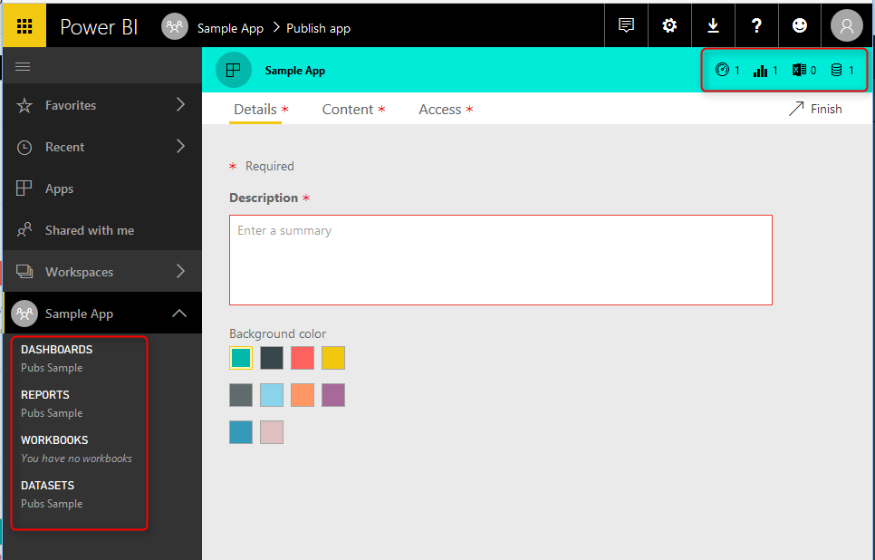
In the next tab, you will see the content. and you are also able to select the landing page for the content pack! This is a very good feature, that we haven’t had before. Now with Power BI Apps you can set a landing page for people in the group.
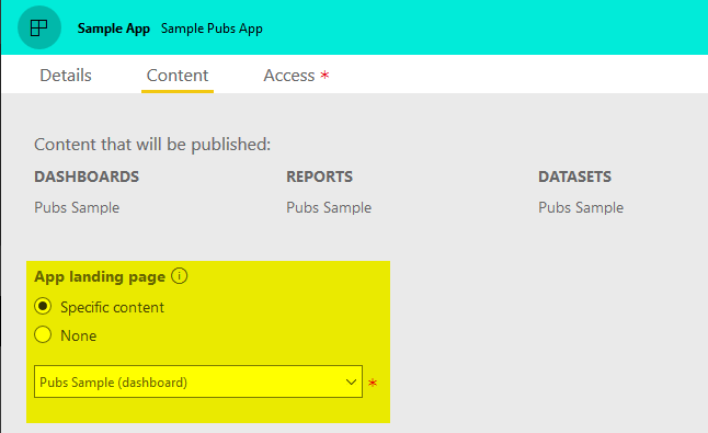
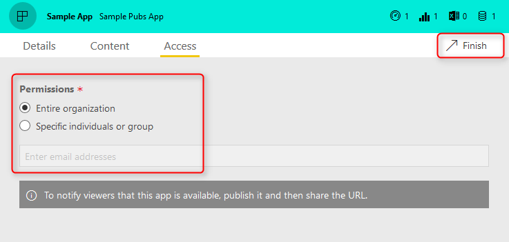
You can also set group of people that you want the app to be shared with (entire organization or specific groups), and then click on Finish.
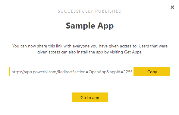
After publishing the app, users will be able to access it immediately. However, you can share the link with them to make it easier for them to access;
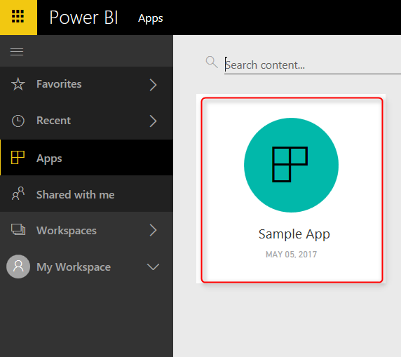
Users can go to their Power BI account page, and click on Apps, and then Get Apps. They will be able to see all apps shared with them.
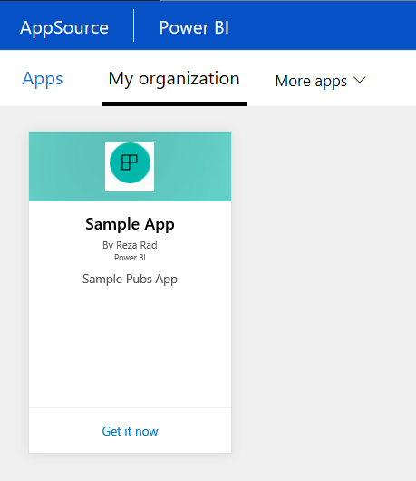
Users can simply Get the app, and use it right away.
with clicking on the app, users simply will be redirected to the landing page (if specified), and can explore the content in the app.
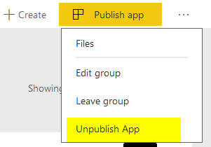
You can apply any changes you want on the content in the app work space. This will NOT affect users, until you “update app”. With the new update they will get the updated content. You can also “Unpublish” the app.
Power BI Apps comes to replace content pack and work spaces with one better solution, and it is very promising. With this new combination you will have power of both; You can use work spaces to group the content together, and give edit access to your power users. and you can also use content pack to share the content to the end users.
Power BI App is a very new feature, and many updates will come for this in the near future, including;
Above list is based on what Power BI team’s blog post mentioned as the road map for Power BI apps. However, I have some thoughts that I think would be great features for Power BI apps, and users will get lots of benefits from it. Here is my list:
These are critical needs for Power BI Apps in my opinion. And I believe Microsoft Power BI Team will consider them and implement them quickly (as they’ve done already with many other suggestions of the community). What is your opinion about it? Do you think Apps would have been much better with some other features? name it in the comments area.
Published Date : April 13, 2017
I have written about 4 other types of map visual with Power BI before. In this post I want to explain how ArcGIS visual work as a map visual. There are some specific features in this visual which is simple to use, but will give you a lot of insight. With this type of map visual, you can add multiple layers of data, and use even some of existing geo location information from ArcGIS map directory. Let’s go through an example and see what are features with this visual. To learn more about Power BI, read Power BI book from Rookie to Rock Star.
There are many ways to visualize something on Map in Power BI, some of it are as below;
I have written about them all expect last one. This post focus is on ArcGIS Map visual. Hopefully at the end I will write a post about comparison.
For this example I will be using a sample data set which includes earthquakes in New Zealand in 2015! Not all of them, but part of earthquakes. Guess how many earthquakes listed in this file? 20,000! But don’t worry, it has listing of everything even earthquakes with magnitude of less than 1. To download the CSV data set file, use link below;
This visual is still preview at the time of writing this post, and for using it, you need to enable this preview feature. To enable it go through:
File Menu -> Options and Settings -> Options.
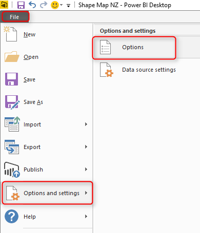
In preview features tab, select ArcGIS Maps for Power BI.
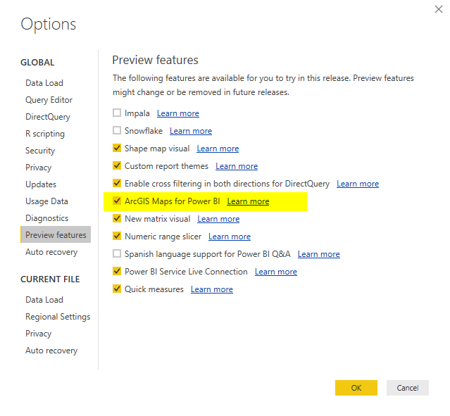
After clicking OK. you need to close your Power BI Desktop and re-open it again. You should be able to see ArcGIS Map visual in list of your visuals now.
Get Data
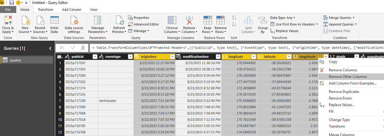
To start with the sample data set, Get Data from Text/CSV, and select the quakes.csv file (link above in this post), Click on Edit in Navigator window, and you will see the whole data set. Only keep these columns and remove the rest: Longitude, Latitude, Magnitude, and Origintime. That means; just select these columns, an from right click menu click on Remove Other Columns.
Close and Apply the Query Editor window. Drag and Drop a new ArcGIS map visual in the report, and assign values from latitude to latitude, longitude to longitude, and magnitude from fields list to the Size section of the visual.
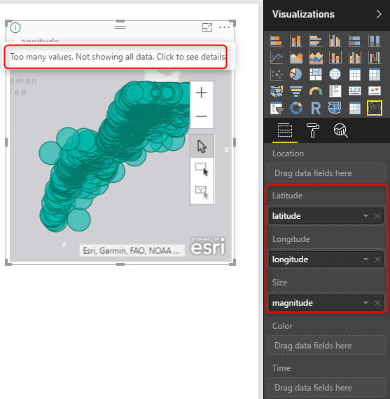
This visual, like the basic map visual in Power BI, has a limitation on the number of data points to show. because we have 20K data points it cannot visualize them all. Let’s filter the data set, and only focus on everything with magnitude greater or equal to 6. For doing this in visual level filter expand the Magnitude filter and apply filtering. Remember to click on Apply Filter, otherwise nothing happens.

After applying filter, you would simply see only few numbers.

All of these earthquakes with magnitude more than 6 happened in 2015! can you imagine?!!!! anyway, let’s go back to ArcGIS map;
So far, the map is very similar to normal Power BI basic map visual with bubbles. Now let’s see what other options we have with ArcGIS visual;
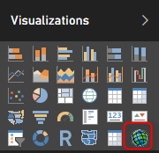
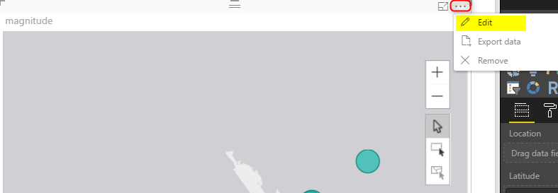
To go through features of this visual, you need to click on three dots icon on the top right corner of visual and click on Edit.
You will be redirected to an Edit mode, where you will see the map full screen, and number of menu options at the top;
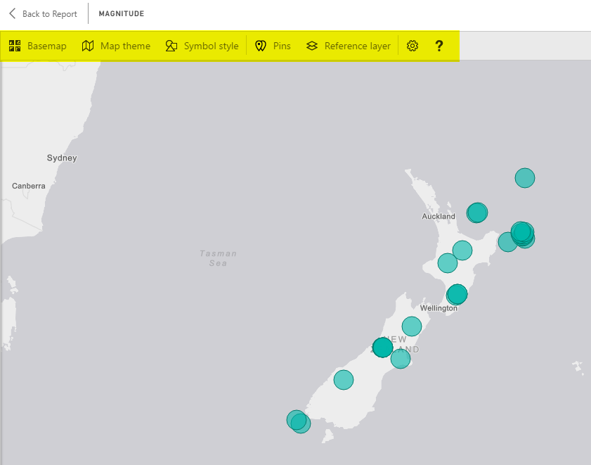
The first change you can make, it so change the base map, to be something different. You can choose from Dark Gray Canvas, Light Gray Canvas (Default), or Streets.

This feature is good to match the map with theme of your report, or even get some street information.
One of the interesting features of this visual, is to change theme of Map. This type of map can give you four themes;
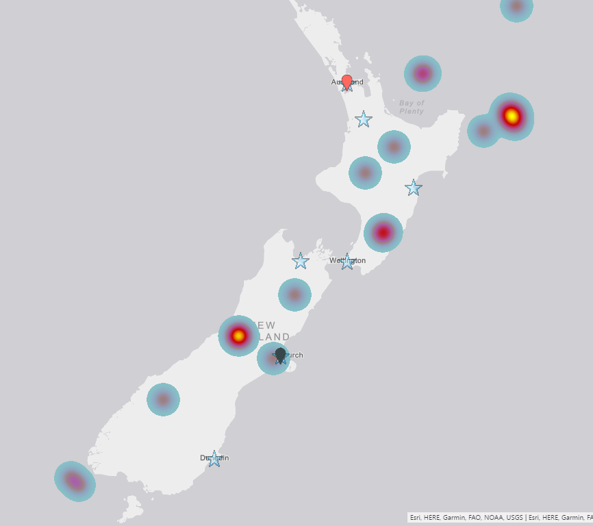
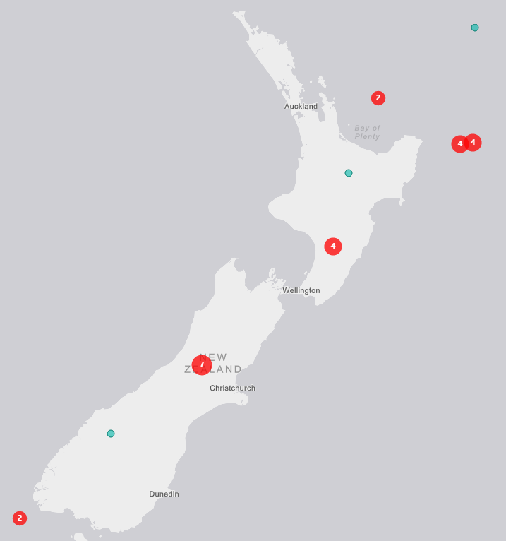
Clustering is good if you want to have high level view, and then ability to drill down into each region. Here is a view of clustering;

Each bubble shows you the total count of data point in that region (more you zoom out, bigger your region will be). and if you double click on a bubble you will drill down into that region;
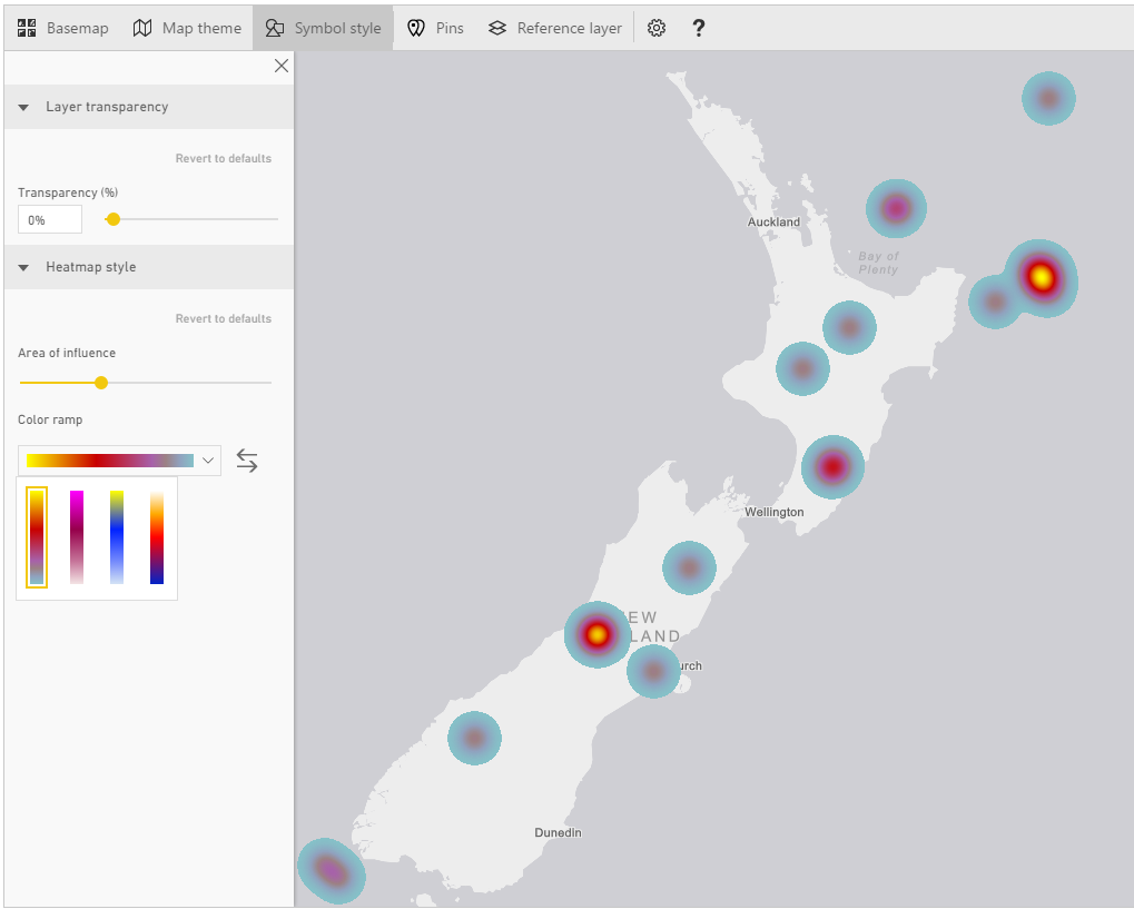
Heat map is a good visualization for showing the severity of earthquake in each area more graphically;
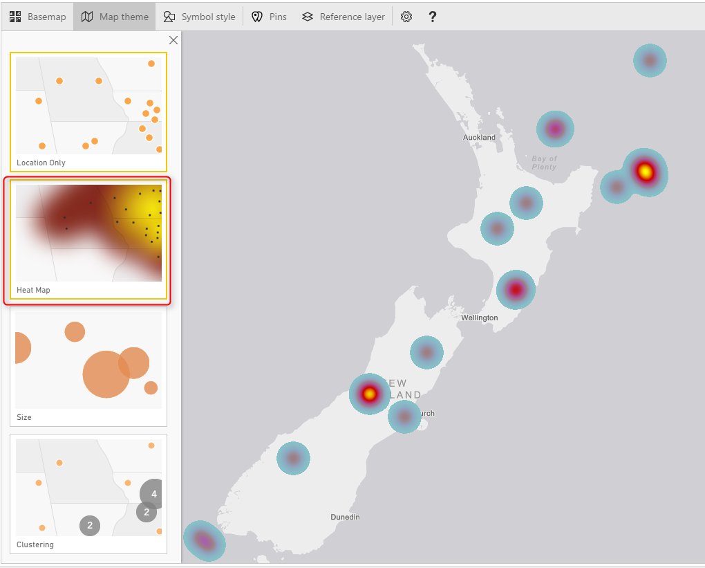
You can also use Location only or Size, which are simple to use.
Depends on what Map Theme, you’ve selected, you can do the details configuration of that in Symbol Style section. For example, if you have selected heat map, you can change the color. If you have selected size, you can change the bubble sizes and etc.
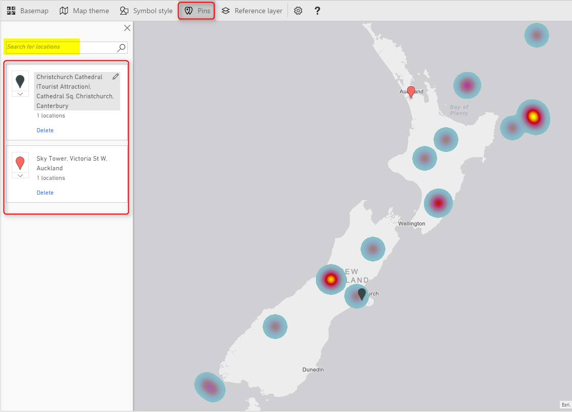
You can add your own pins. These pins can be locations of branches, hospitals, schools, or whatever else you want to use as a pin on the map.
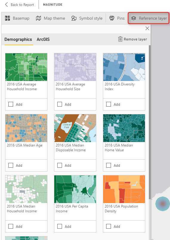
Reference Layer
The last feature, but not least is adding reference layer. In my opinion this is one of the best features of this visual. You can add another layer of visualization based on a map in directory of ArcGIS maps. ArcGIS has many maps that you can use, almost map of everything! if you click on Reference Layer menu option, you can see some of existing maps for USA.
To access more maps, click on ArcGIS at the top, and there you can search for maps. For example below are some maps in New Zealand area;
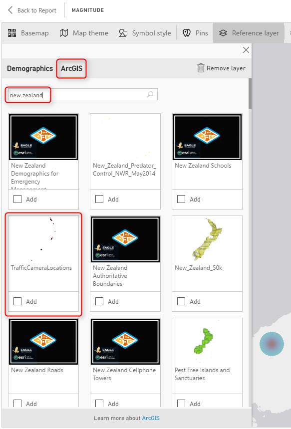
There are maps for schools, pipelines, gas stations, almost everything. Even there is a map for Traffic Camera Locations, Very useful map!
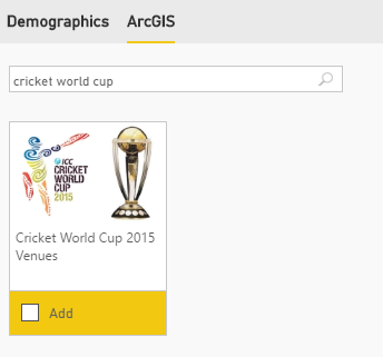
Because the current data set is for New Zealand 2015, and there was a cricket world cup in New Zealand and Australia at that time, so it might be good to bring a map of venues for that and realize are those cricket world cup venues close to the earthquake centers or not. Simply you can search for cricket world cup, and you will get the map very easily. Click on Add to add the layer to map;
It will take few seconds for the layer to load, and now you will see locations with star mark on it. Wonderful, isn’t it?
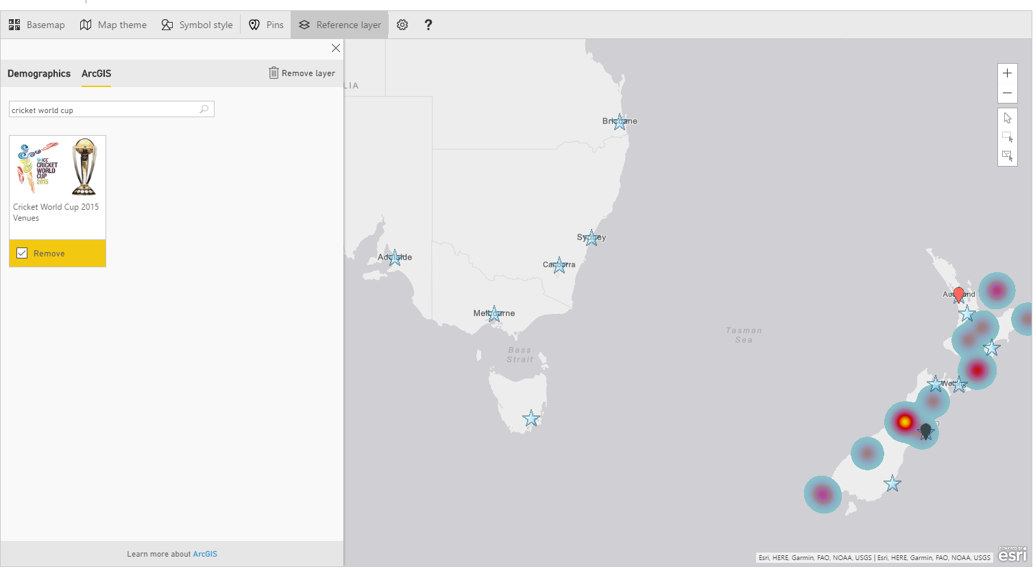
Now if you zoom in more to the New Zealand part of the map, you will see how close are venues. The venue in Christchurch was pretty close to one of earthquakes actually.
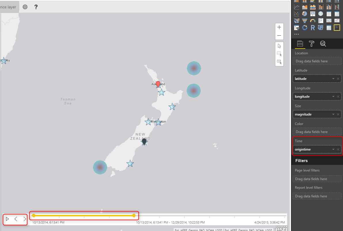
All of above features can be much more insightful with adding a time dimension, and understanding how measure values (in our case earthquakes) happened through the time. If you bring Origintime to the Time section of this visual you will see a new time bar under the map, which you can select the time range for it, and click on play to see how earthquakes happened through the time. Similar to the Play Axis feature in Scatter Chart, Very insightful dimension to add.
I hope demos of this post has been motivate enough to show you the power of this visual. ArcGIS map visual is not like other map visuals, it is the best of all I would say. There are obviously pros and cons (which I will cover in another post later). However this visual gives you many things; using different themes, adding reference layers from ArcGIS map directory, and adding time dimension. These features are not easy features to use with other types of maps. There is just one part which is not 100% clear, and that is the licensing part of this visual. This visual at the moment is preview and free. However, I’m not sure how long it will be available for free. Because this visual is still in preview mode, expect to see some errors and bugs in it. sometimes you get an error. and you need to close Power BI Desktop and open it, which will be fixed I believe in the general availability version.
Published Date : April 10, 2017
You can use an existing data set with LiveQuery or DirectQuery connection as the shared data source for multiple Power BI reports. You can also create multiple reports from Power BI Service (website) connecting to the same data set. However, this new feature in Power BI Desktop version April 2017 is a big step forward; You can now create reports in Power BI Desktop pointing to a central data set. This is a great step towards making your data sets centralized and using it consistently from many reports. In this post I’ll show you how this feature works. If you want to learn more about Power BI; read Power BI book from Rookie to Rock Star.
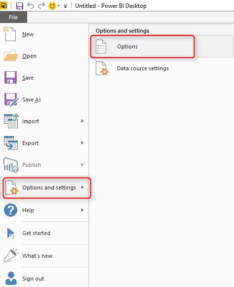
You need to install Power BI Desktop version April 2017 or later versions to have this feature. At the time of writing this post this feature is still preview, and you need to enable it through going to path below:
File -> Options and Settings -> Options
In the Options window go to Preview Features, and enable this option;

You will need to close Power BI Desktop and Open it. after re-opening Power BI Desktop, in Get Data section you will see the new option: from Power BI Service
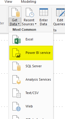
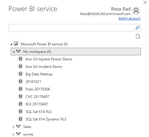
For accessing to Power BI service you need to login to your Power BI account from Power BI Desktop, and then you will see list of work spaces under your account and data sets under each.
After selecting a data set, a LIVE QUERY connection will be created to that data set, and your Power BI Desktop will turn into a mere data visualization tool (exactly similar to having a LiveQuery connection to SSAS). You cannot edit the data source, you cannot change relationships, you cannot create new measures or calculations. However, you can create all visualizations you want based on this model.
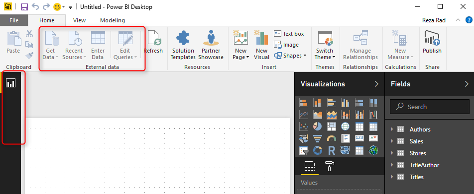
As you can see in screenshot above Get Data from other data sources will be disabled, and you will have only report tab available in Power BI Desktop.
If you want to make any changes in the model, you need to open the Power BI Desktop file that contains the model, and make changes from there.
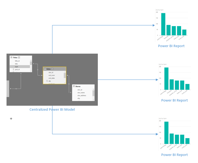
At first you might think; what is the big benefit of having this feature? the short answer is to have reports based on a centralized data set. the long answer is here;
Previously if you could use Power BI for getting data from multiple data sources, combining them, data mashup and transformation, building a great model with hierarchies and calculations, and build visualizations based on it, all in one file. If you wanted to create another file with the same model, you should copy the existing one, and make changes in it, and for maintaining you would have a headache of maintaining multiple models to be exactly similar! Now you can simply build a model once, and re-use it multiple times.
Developing everything in one Power BI file is good for one developer. However, when multiple developers want to work on the same file, then multiple files are needed. With this new feature the visualization layer can be easily separated from the model. Multiple Power BI files can be pointed to the same model, and multiple developers can work on it.
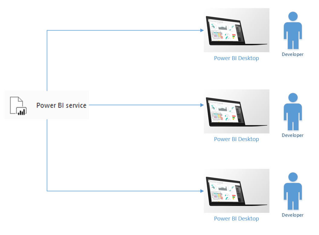
You can share reports in multiple ways, but all of those methods share the whole report not particular pages. If you want to share some pages with some users, and others with other users, you will need to create multiple reports, or in other words; multiple Power BI files. With the new change you can easily switch to this method, it will not cost you anything. with the old method you had to copy everything, and redundancy problem will happen again with big maintenance task overhead.
You’ve realized how good is this feature, and how the next generation of Power BI reports will shape in the future. You might think what is the limitation of this feature? This feature is still preview, and there will be lots of updates for it in the future, however at the time of writing this post, here are limitations:
In summary this features is a game changer in the architecture of Power BI solutions. You can now use a centralized model, which is isolated from visualization layer. For very large data sets, and enterprise solutions, still SSAS live connection might be the best because of the size of data. However, if the size is not issue, then Power BI can be easily used as a centralized data model approach. Because of this big change I give 5-star rank to this month update of Power BI, well done team ![]()