Published Date : September 24, 2015
You may have seen many videos or blog posts so far that Power BI Desktop showed the data on the map visualization based on address, suburb, city, state, and country. Fortunately Bing Map helps a lot to search the point on the map based on address fields. However sometimes you don’t have address fields, actually in some types of the data there is no address field. As an example an earth quake most of the time happens somewhere deep in the ocean where there is no street address! All you have is latitude and longitude as the Geo graphical data. However latitude and longitude is precise enough for any GPS device to point out the exact location. Unfortunately to your surprise, at this point of the time Power BI Desktop map doesn’t support visualization only based on latitude and longitude! So this post is about how to visualize it with Power BI Desktop map easily.
As I’ve mentioned there are sometimes that you have no address information but only latitude and longitude, an earth quake data is one of the most common examples of that. Here is example earth quake data that I’ve fetched from Quake Search service of GeoNet website. This website search through all earth quakes happened in New Zealand. It can also export the data as CSV file, which is the file that I’ve used. Screenshot below shows part of the data set as an example;

As you see in the screenshot there are two highlighted columns for latitude and longitude and also a column for magnitude. The file is for a year earth quake data (from September 2014 to September 2015), and it has 19K records. Wow, that’s a lot of earth quakes isn’t it? but don’t worry most of them are on minor magnitude, this file contains records with even 0.7 as magnitude! such an awesome recording of events.
Now I want to visualize this data on the Power BI Desktop Map to see whereabouts most of earth quakes are happening! If I fetch that data into Power BI through Get Data and then from CSV experience, and load it without any change in the Power BI Desktop I’ll see then in the fields section like this:

As you see Power BI considered these fields as numeric fields and summarized them in the view (you can see sigma icon besides them in screenshot above). This can be easily changed in the data tab. Select the Column and then change the Data Category under the Modeling menu to respective field (latitude or longitude).

Now go back to Report tab. This time you will see these two fields with map icons besides them.

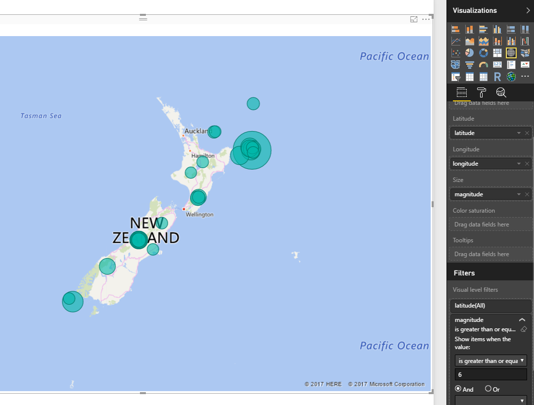
Now let’s create a Map. Map works with Latitude and Longitude (which we have fortunately), I also add magnitude as values. For chart below I’ve also showed magnitude in values, and color saturated it based on depth of the earth quake. as the data rows were too many (19K quakes), I’ve filtered to show only those that has magnitude greater than 6. Here is the result;
Map still might seems scary for you to see that many earth quakes with more than 6 magnitude in only one year, But if you wanna live in a magnificent country you should take some risk ![]()