Published Date : September 27, 2017
Earlier this month (September 2017), in the new version of Power BI Desktop, a new type of chart announced; Ribbon Chart. The very first look and feel of this chart are similar to Stacked Column Chart. The question that might come into your mind is that; why another way of showing the same thing? The fact is that this chart is more powerful than the stacked column chart. In other words, I have to say this chart gives you much more interesting insight than the stacked column chart. Let’s look at this chart through an example and see what this new chart is capable of. To learn more about Power BI, read Power BI book from Rookie to Rock Star.
To run the example for this part, you need to download the AdventureWorksDW Excel sample file from here:
Ribbon Chart is a stacked chart similar to stacked column chart with one big difference. In stacked column chart values shown in the order of items in legend. However, in Ribbon chart items ordered based on which item has the majority of that measure in that particular axis value. To learn more that feature in details, let’s look at the example below.
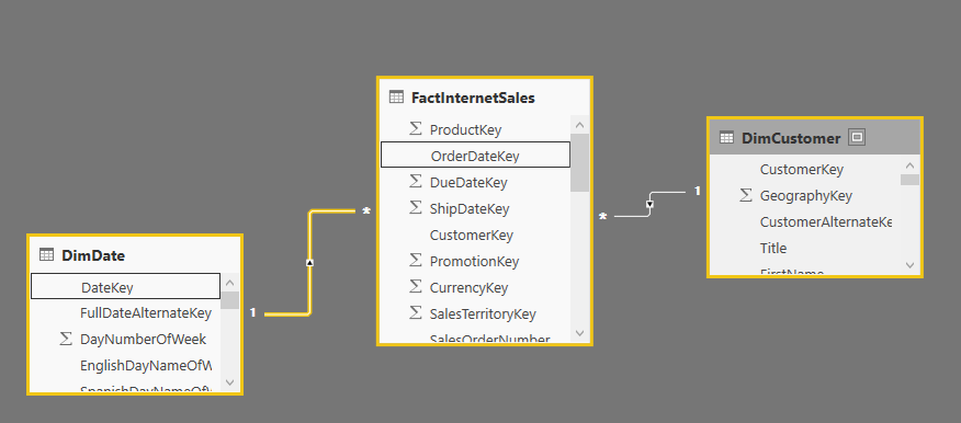
Create a sample report with getting data from AdventureWorksDW Excel file, and select these three tables; FactInternetSales, DimCustomer, DimDate. After selecting these tables. then create a relationship between DateKey (in DimDate table), and OrderDateKey (in FactInternetSales table).
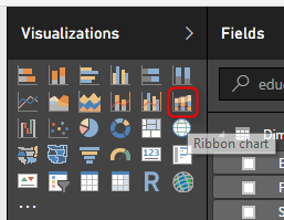
Then in the report tab, create a report with a Ribbon Chart;
Set the Value to be SalesAmount (from FactInternetSales table), Axis to be CalendarYear (from DimDate table), and Legend to be Gender (from DimCustomer table);
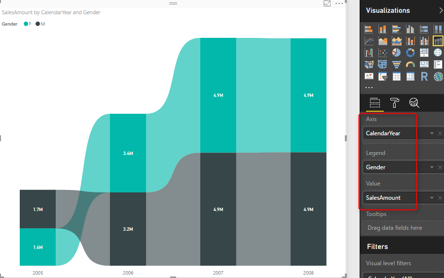
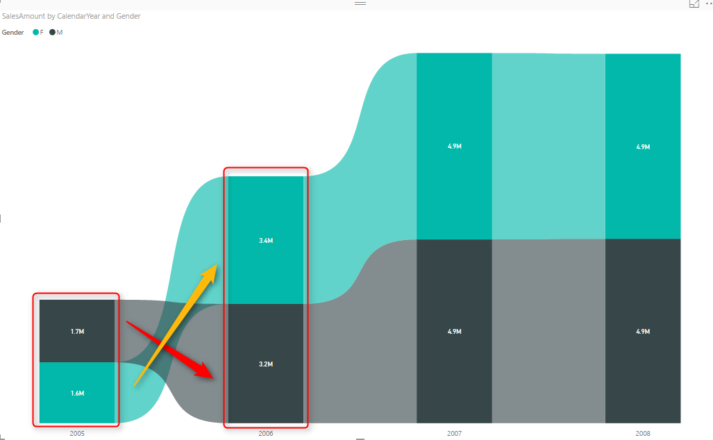
You would see the Ribbon chart visualizes the data in a very similar way to the stacked column chart. However, there is a difference!
Ribbon Chart shows bigger value in each column at the top, then the next value comes after. Look at the sales amount value for female and male in 2005 and 2006. In 2005, Female (Black) had more sales than Male. However, in 2006, Male (Green) generated more revenue than the female, so it is on the top for the 2006 column.
This means that the Ribbon Chart is similar to combining Line Chart and Stacked Column Chart together. This chart has the ability to show the trend over time (similar to the line chart), and also the ability to show values stacked on top of each other and show the total value (similar to the stacked column chart). Let’s look at this chart compared to other charts in this category.
Ribbon Chart vs Stacked Column Chart
The screenshot below shows these two charts besides each other. The Ribbon chart is on the left-hand side. Please note that Ribbon chart customized in this view. I’ll explain the customization in a second.
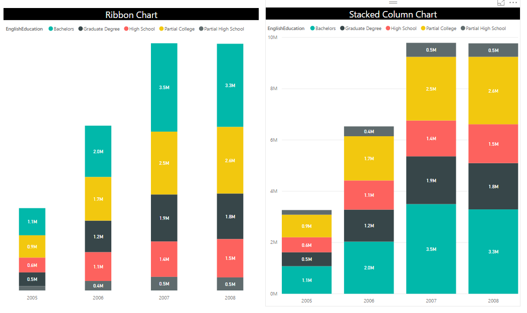
You can remove ribbons from the Ribbon chart, and change their color to be 100% transparent. then it will be similar to a stacked column chart.

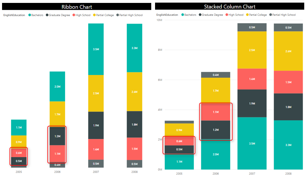
As you can see in the below screenshot; Stacked Column Chart is unable to show the difference from 2005 to 2006 between the High School and Graduate Degree Category. However, Ribbon chart shows that beautifully.
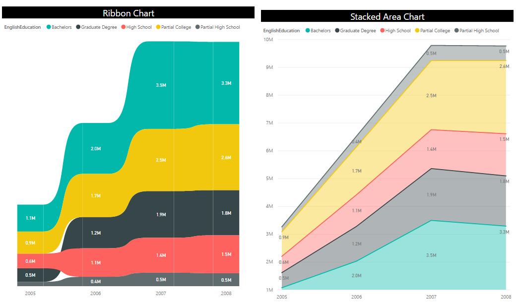
If we compare Ribbon chart with Stacked Area chart, we can see the trend over time in Stacked Area Chart, but it doesn’t tell us that the data of which category is higher or lower. Still, Ribbon Chart is the winner in this storytelling scenario.
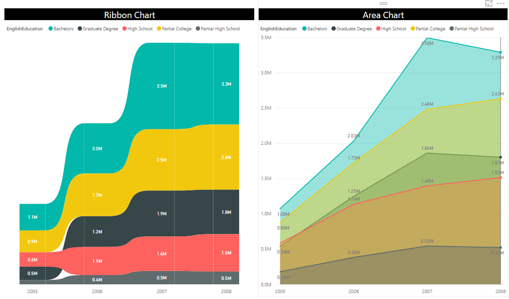
Area or Line chart is good for showing the trend. and they can show if the value of a specific category is higher or lower through the time. However, they cannot stack values up on top of each other. Ribbon chart shows the trend as well as stacking values.
Ribbon chart is a powerful addition to the set of visualizations in Power BI. This visual is still in its first version, and I believe lots of features will be added to this by Power BI team in the next few months. However, These are features that I think would be good to have for this chart;
Ribbon chart is NOT another version of the stacked column chart. It is much more powerful than stacked column chart. If you want to see the trend as well as the stacked values, then I highly recommend Ribbon chart. In this post, you’ve seen examples of comparing the result of this chart with others, and you can see there are stories that only this visual can tell. Please let me know how do you use Ribbon chart in your scenarios of data storytelling.