Published Date : November 29, 2016
Power BI reports are highly interactive, If you select a column in a column chart other charts will be highlighted. Selecting a slicer value will filter all other visuals in the report. This interactivity can be controlled easily. Despite the fact that this feature has been released in early phases of Power BI, there are still many clients who don’t know how to control the interaction of visuals in Power BI report. In this post you will learn how easy and useful is controlling the interaction between Power BI visual elements. If you want to learn more about Power BI; read Power BI online book from Rookie to Rock Star.
Power BI visuals are interacting with each other. Selecting an item in a visual will effect on the display of another chart. sometimes this effect is highlighting items in another chart, and sometimes filtering values in the other visual. By default all visuals in a report page are interactive with each other, however this interactivity can be controlled and modified. This functionality is very easy to change, but because there are still many people not aware of it, I ended up writing this post about it.
Let’s start by building a very simple report from AdventureWorksDW database with few visuals. For this example bring these tables into your model: FactInternetSales, DimCustomer, DimProductCategory, DimProductSubcategory, DimProduct.
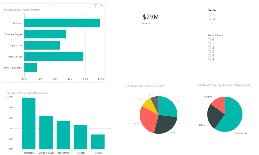
Build a sample report with a Bar Chart on EnglishEducation (from DimCustomer) as Axis, and SalesAmount (from FactInternetSales) as Values. Build a Column Chart with EnglishOccupation (from DimCustomer) as Axis, and SalesAmount (from FactInternetSales) as Values. Build a Card visual with total of SalesAmount. Build a Pie Chart with NumberCarsOwned (from DimCustomer) as Legend and SalesAmount as the value. Another Pie Chart with EnglishProductCategoryName (from DimProductCategory) as Legend, and OrderQuantity (from FactInternetSales) as Value. Also create two filters; one with Gender (from DimCustomer), and another with TotalChildren (from DimCustomer). here is a view of the report;
As I mentioned earlier, All visuals in Power BI report page are interactive with each other. If you click on a chart other charts will be highlighted:

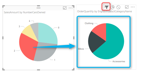
In the sample report above NumberCarsOwned 2 is selected in the Pie Chart, and related values to it highlighted in column chart and bar chart respectively. Also the total Sales Amount in the card visual changed from $29 million to $8 million. However if you look at the other Pie Chart (mentioned with red area in screenshot above) the Pie chart for product category and quantities are highlighted, but it is not easy to find out exactly which one is bigger (is Clothing bigger or Bikes?). Despite the nature of Pie Chart which makes things hard to visualize. There are still more things we can do here to make it more readable. If instead of highlighting this pie chart it was filtered (like the card visual) we would have better insight out of this visual.
To change the interaction of a chart with other charts, simply select the main chart (the chart that you want to control effect of that on other charts), and then from Visual Tools menu, under Format, click on Edit Interactions.

You will now see all other visuals in the page with two or three buttons on the top right hand side corner of each. These are controls of interaction.
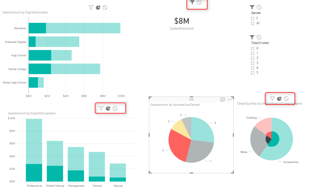
The darker color in this icon set shows which interaction will apply. For example for the interaction from NumberCarsOwned Pie Chart and the SalesAmount Card Visual the selection is Filter. but for the ProductCategory Pie Chart is highlighting (the middle option). Now change this option to be Filter. and you will see immediately that second pie chart (product category) shows a filtered view of the selected item in NumberCarsOwned pie chart. Actually the first pie chart is acting as a filter for the second pie chart.
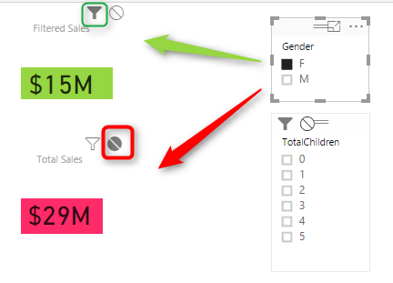
This behavior also can be set to None. For example let’s say you want to have a total of sales amount regardless of gender selection, and then a total of sales amount for the selected gender in slicer. To do this copy the SalesAmount Card Visual, and then click on Gender Slicer. click on Edit Interaction, and set one of the card visuals to None, the other one as default with Filter.
As you can see you can set interaction between each two individual elements in a page. This is extremely helpful when you are expecting selecting an item to have different impact on different visualization. Hope this simple tip helps to make your visualization better with Power BI.