
Published Date : May 15, 2018
In the previous post, I explained a usage of bookmarks and buttons in Power BI, which was for clearing all slicers. Buttons and bookmarks are the gold combination in Power BI. You can do wide range of creative activities with this combination. In this post, I will show you some other usages of buttons and bookmarks which is related to visual’s interactions. we are going to learn about;
There are heaps of more examples can be done with buttons and bookmarks, but these few will take the entire full blog post here. If you want to learn more about Power BI, read the Power BI book; from Rookie to Rock Star.
The key components of designing examples below, are three settings; Bookmarks, Buttons, and Selection Pane.
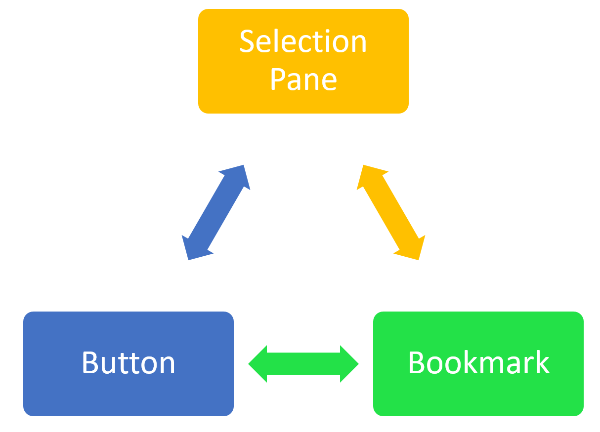
Bookmark saves the state of the page, exactly as it is at the time of saving a bookmark. This means you can then select the bookmark and see the page with the state that you have saved it. Bookmark is not a screenshot, it will be an interactive Power BI report page, with a state saved as is.
You can hide or unhide visuals in a Power BI report through the selection pane. there is an eye icon besides every visual, which gives you the control over visibility of that visual on the report page.
Buttons are action objects in Power BI. You can create a button (or even an image or shape), and then set the action of that to be; back, Q&A, or bookmark. In this post, we are only talking about the bookmark action feature.
when you combine the three features above, you can make the magic happens! You can put visuals on top of each other, and then hide or unhide them, add a bookmark, and connect the action of button to that bookmark. examples below are just very few examples of the thousands of possibilities with this magic combination!
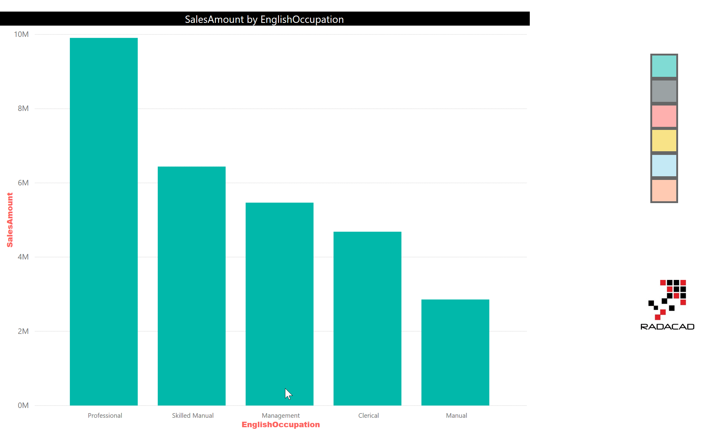
Consider the report below;
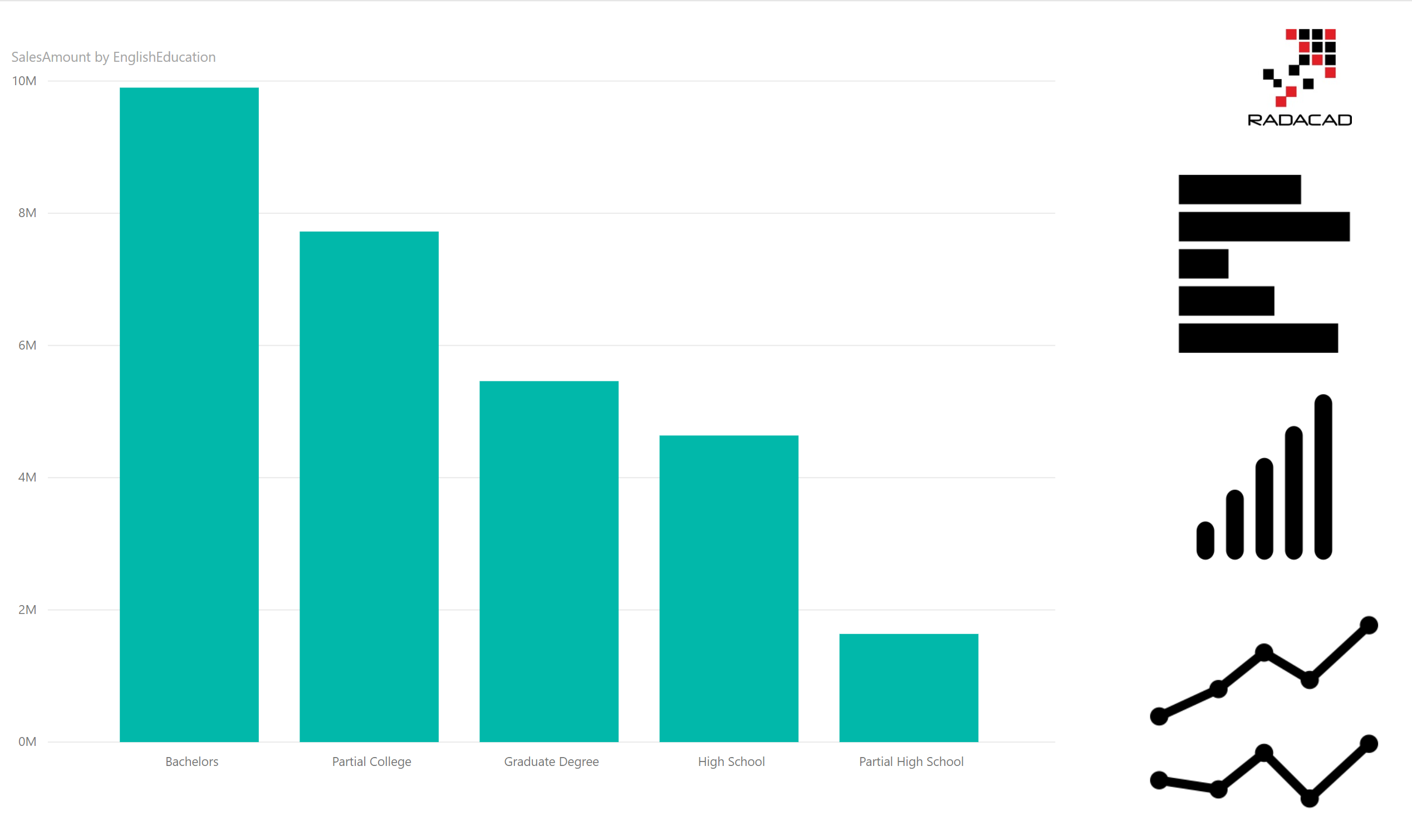
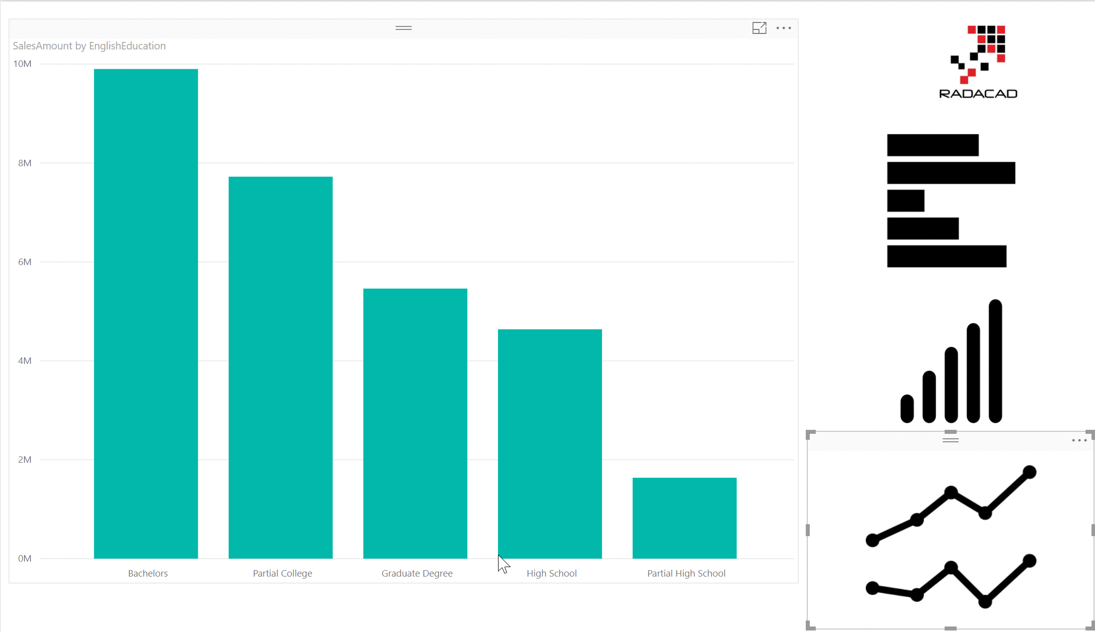
The chart in the left-hand side is a column chart. the three charts in the right-hand, are however, images (or logos). I want to select the image in the right-hand side and then change the chart type in the main section (left-hand) with that. let’s see how we can do that.
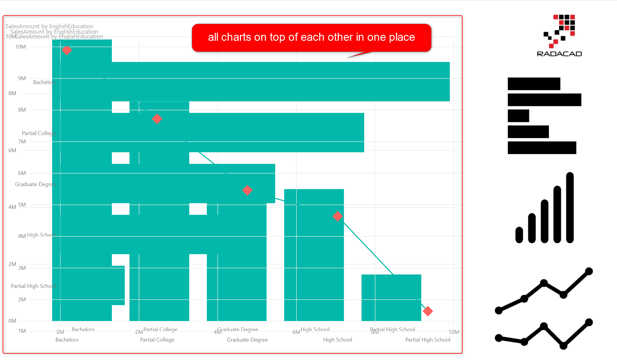
First step is to create multiple visuals on top of each other. create a copy of this chart, and convert it to Bar chart, then create another copy of this, and convert it to line chart. here are all charts on top of each other.
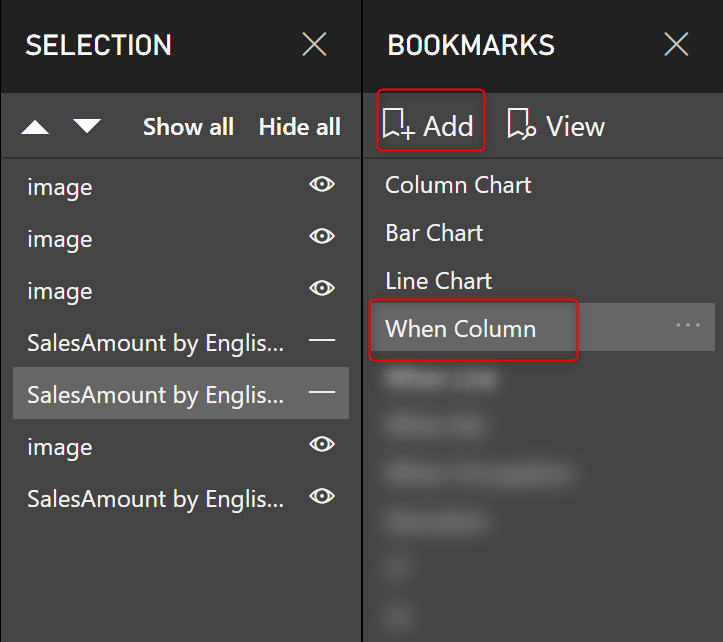
Now click on the selection Pane in the View tab.
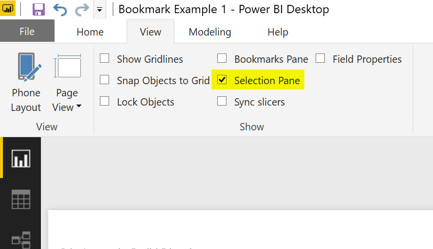
After selecting this item, you will see the selection pane, with list of all visuals. Notice that there is an eye icon besides every visual. that is the setting for hide/unhide the visual in the page.
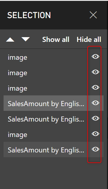
From the list of three charts on the page, unhide two of those. in the screenshot below, then one which is not hided, is the column chart.

Now to save the state of the page as is, create a bookmark (you have to select the bookmark pane in the View tab first). I called this new bookmark as “When Column”
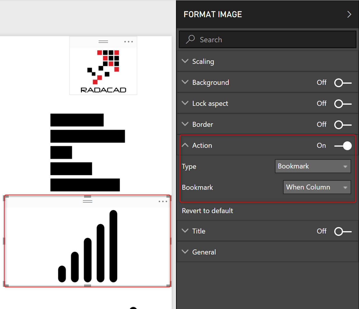
Now that you have created the bookmark. Click on the button (in this case image boxes of charts in the right-hand side), and set the action of those to bookmark, and choose the right bookmark for it.
Create two other bookmarks when you have selected the other two charts individually, and then assign their buttons to those bookmarks.
Now is the time to test the result, here you go; you can change the chart type dynamically in a Power BI report page.
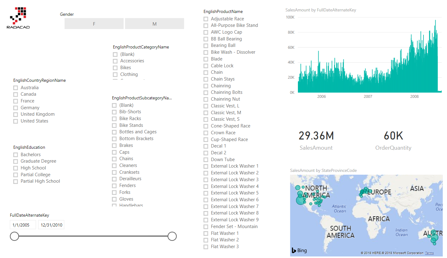
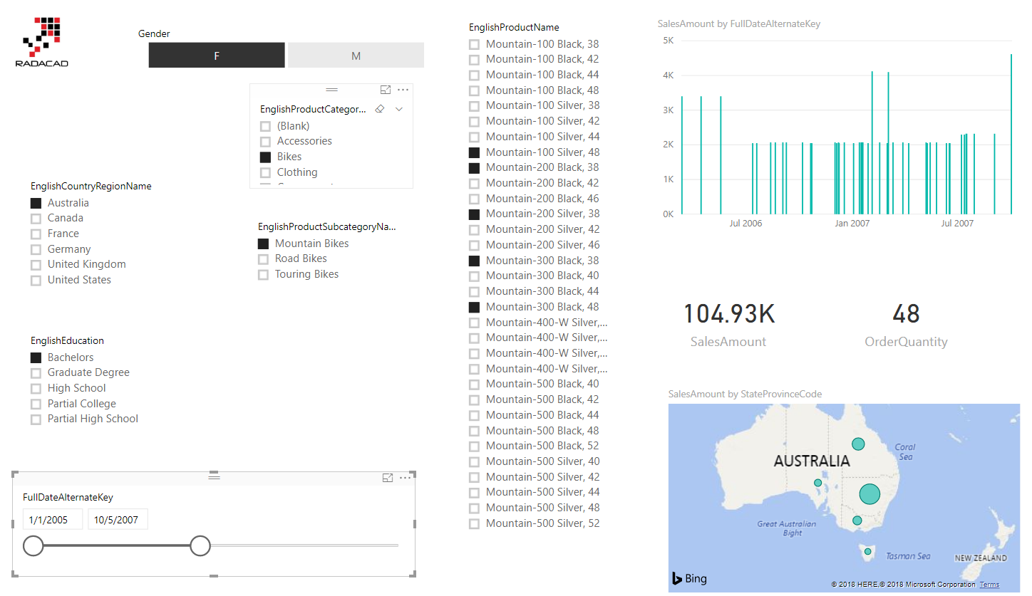
Another example of the magic combination (bookmarks, buttons, and selection pane); is to change the axis of chart dynamically. Here is the report below;
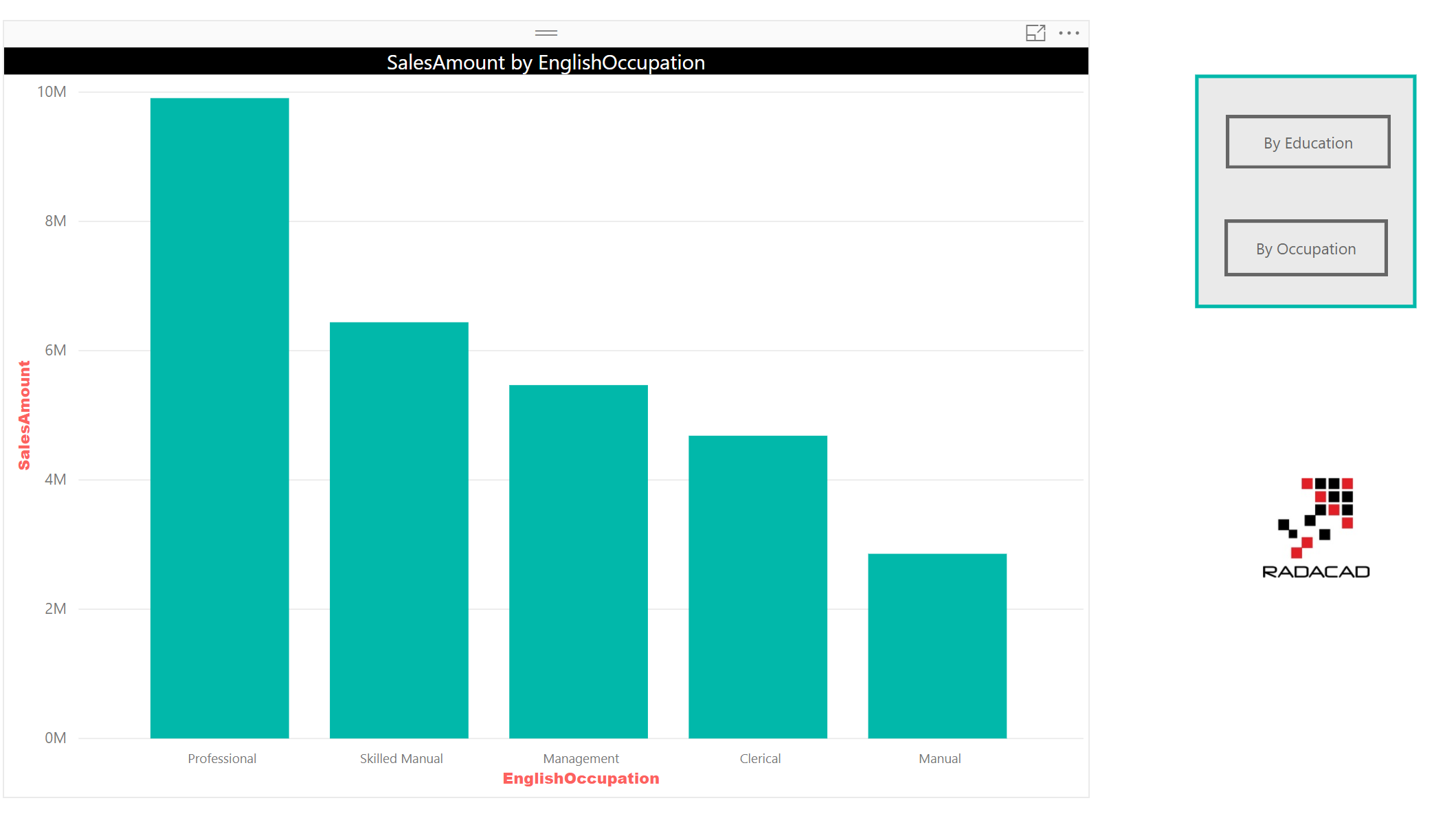
As you can see in the screenshot above, the buttons provided are for two fields; By Education, and By Occupation. I want to change the X Axis of the chart to the Education or Occupation field with choosing the buttons respectively.
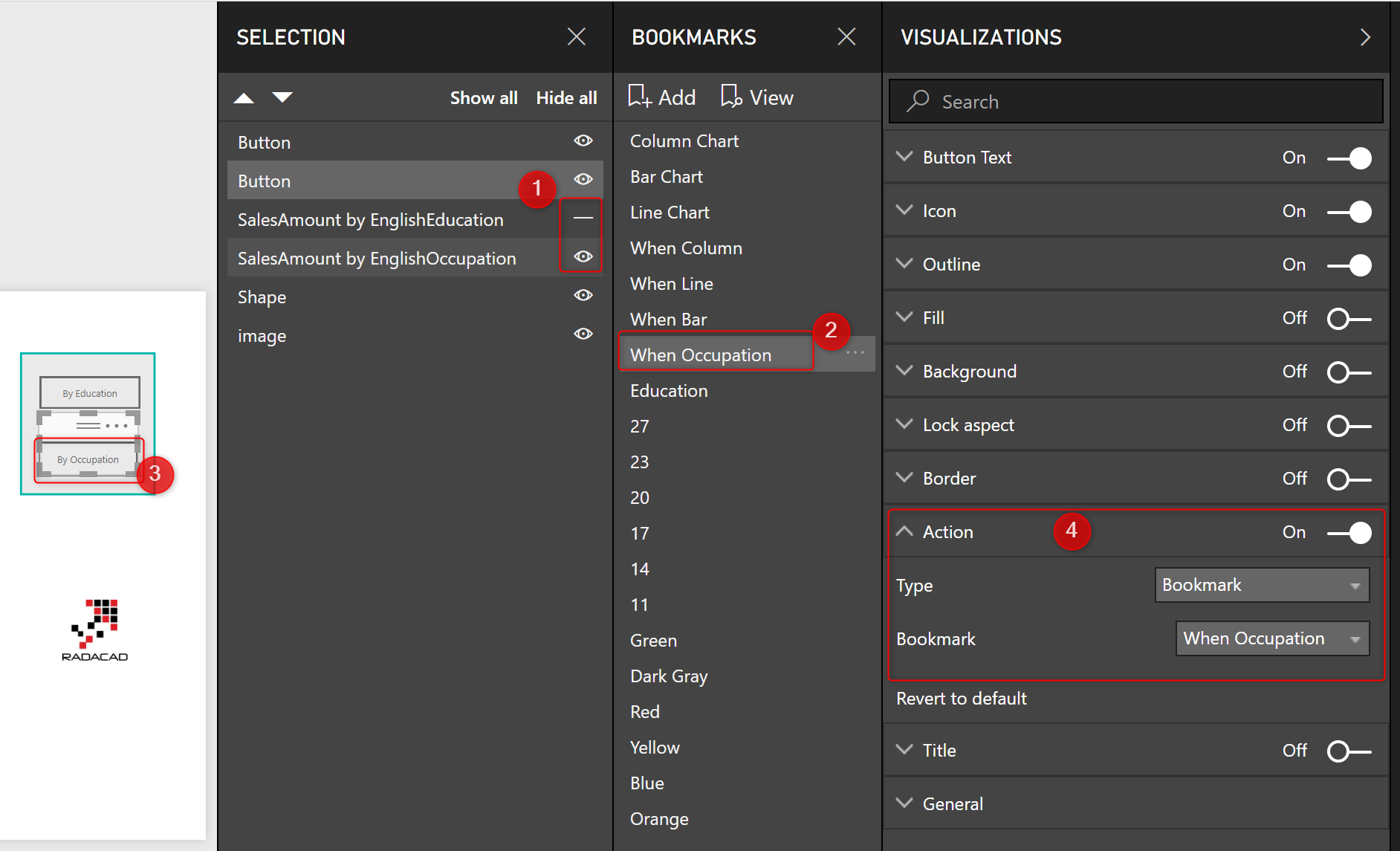
The way I implemented this feature, is by creating two charts overlayed on top of each other; first chart by Eduction, second chart by Occupation. then hiding one, creating bookmark, and doing the same for the other one. then mapping the action of buttons to these bookmarks. screenshot below shows how these steps are done.
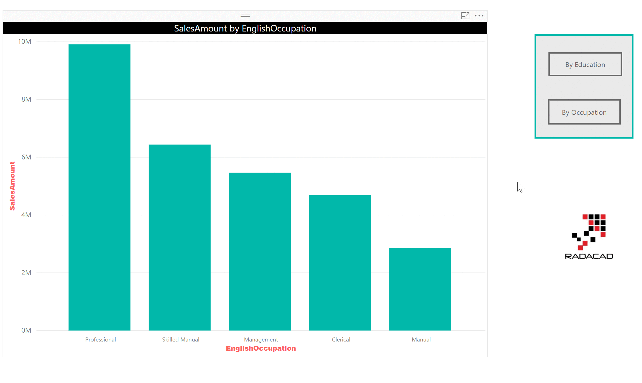
And here is the result;
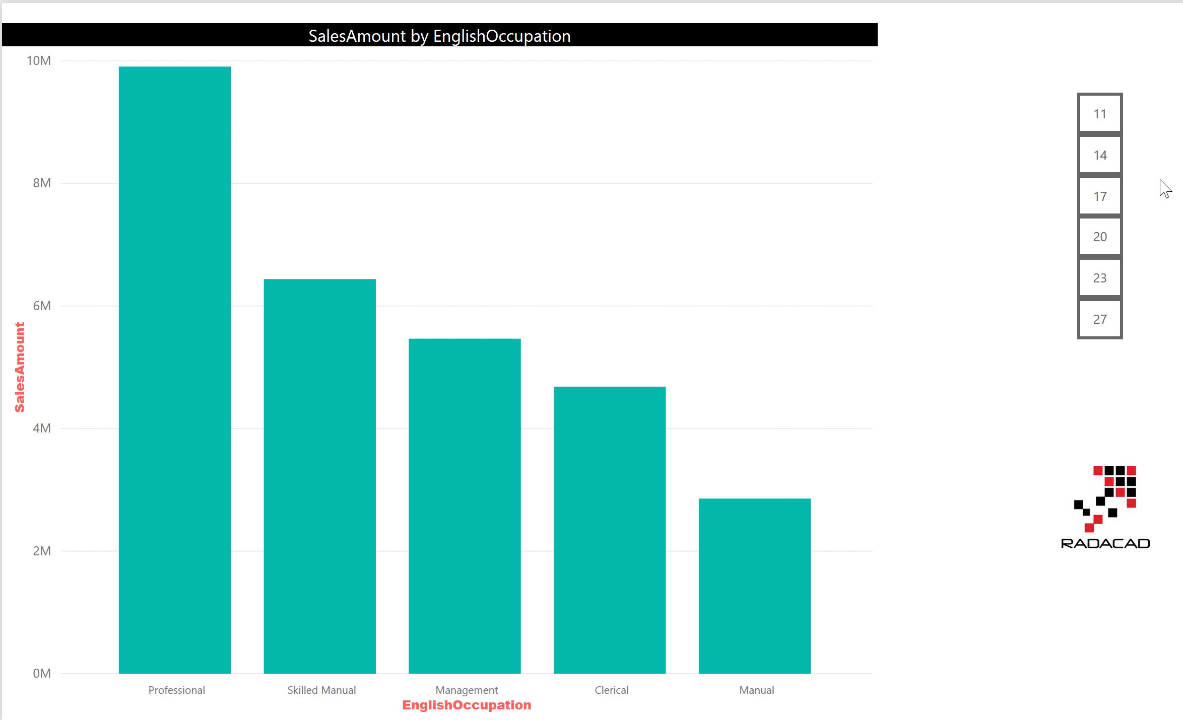
We can use the same approach to change the font size. This time you have to create one chart with each different font size you want, and create buttons and bookmarks repective to that. Here is an example video:
Another example is to change the data color in a chart dynamically. This time, buttons represent different colors, and you have the chart copied but with different color. each bookmark save the state of the chart when that color is selected in the button. result would be similar to below;
With the magic triangle of bookmarks, buttons, and the selection pane, you are only limited to your creativity. You can do many things that looks impossible in Power BI dynamically and give the power of extra features to the users. I have written another post, that explains how you can clear all slicers with bookmarks and buttons. There are heaps of other examples you can do with this magic triangle. Do you have a scenario that you have used these or want to use these? feel free to share it in the comments below.
Published Date : May 11, 2018

Using bookmarks for clearing all slicers in Power BI is not a a new function, I have been using it for many months, and advising many people to do it that way. However, I still get a lot of questions in my presentations about how to do that. That is why I ended up writing this post. This post shows you a very quick trick of having a button to clear all slicers, and the magic is all happening with bookmarks. Bookmarks store the state of a Power BI page, and can be used in many scenarios, in this post, I only show you the ability to clear all slicers in a page. To learn more about Power BI; read Power BI book from Rookie to Rock Star.
Here is a sample Power BI report page with a number of slicers:
Screenshot below shows a selected state of items;
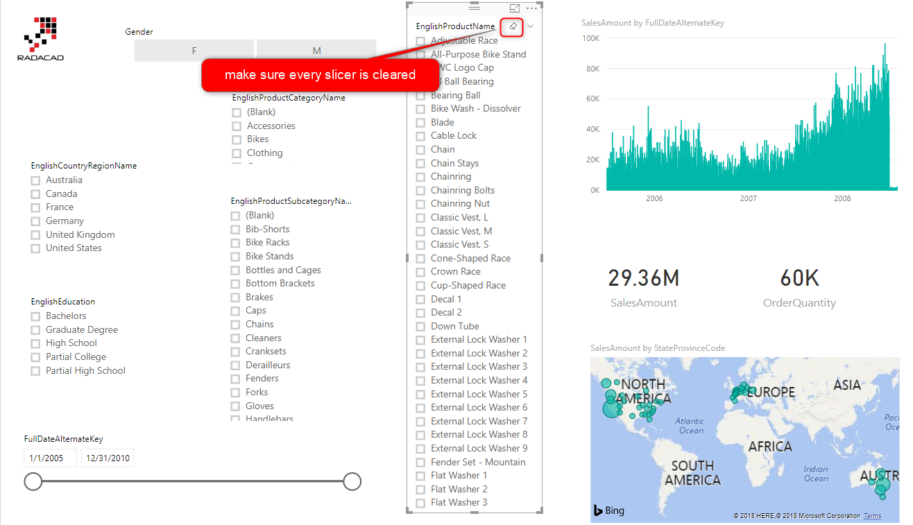
If you want to clear every slicer; usually, there is a clear button on the slicer header. Or you can even enable Select All in the sclier format options. However, there is no Clear All for all the scliers in the page.
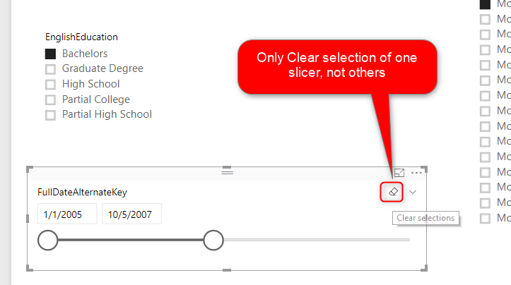
Solution is to use bookmarks. Here are steps:
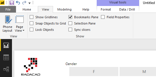
Step 1: Open Bookmarks pane;
Step 2: Use the clear button on the header of every slicer. Do this for all slicers.
Step 3: Create a bookmark of the page, when none of slicers are selected.
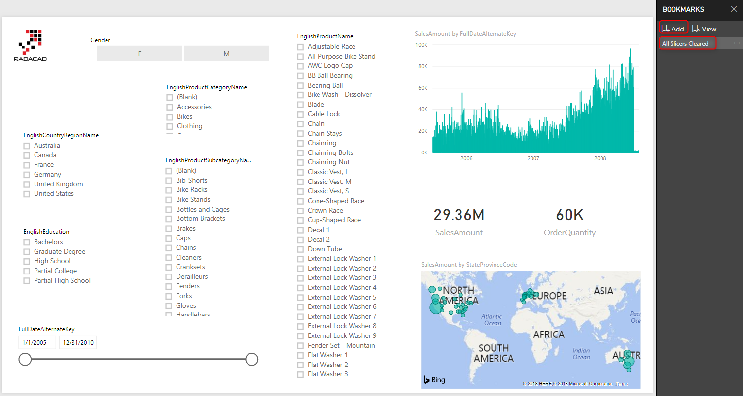
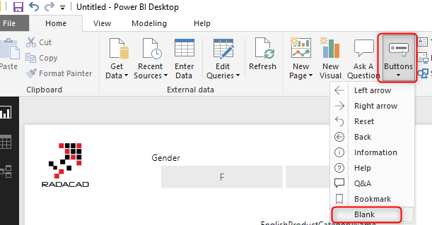
Step 4: Create a Button for user interation; This button would be clear all button. You can even use Images with logos if you want to.
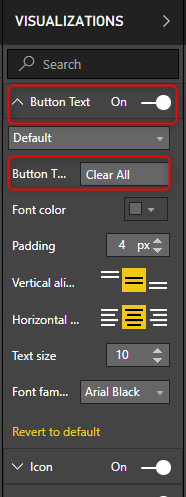
You can then configure the button to show a different text, with some formattings
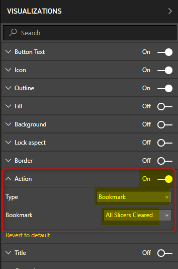
Step 5: Bind the button to bookmark
Now that you have the clear all button, the last step is to set the Action property of that to bookmark, and select the “clear all slicers” bookmark for it.
To test the solution, use Ctrl+Click on the desktop, or just click on it in the website;

Using buttons and bookmarks for clearing all slicers is only one of the multiple creative ways you can use bookmarks. I will write more about other usages of buttons and bookmarks together. Do you have some use cases yourself; don’t hesistae to write in the comment below.