Download
Download the Power BI file of demo from here:
Published Date : January 24, 2017
I have written a blog post while ago about using Edit Interaction to control the interaction of visuals. There are however sometimes that you want to have some of filters to be applied on (some measures) of a single visual, but others not. In this post I’ll explain one method of writing DAX expressions in a way that overwrite the way that Power BI visuals interact. You will learn how to write a DAX expression that some filters affect on that, some not. Let’s see how the method works. If you want to learn more about Power BI; read Power BI online book from Rookie to Rock Star.
For running example of this post you will need AdventureWorksDW sample database, or you can download Excel version of it from here:
It is impossible to start explaining this method without talking about filter context. Filter context is everything you used for filtering and slicing and dicing in the report. As an example; create a Power BI model based on DimDate, DimCustomer, DimProduct, and FactInternetSales. Make sure that you have only one active relationship between FactInternetSales (OrderDateKey) and DimDate (DateKey). Create a Measure with DAX code below:
Sum of Sales Amount = SUM(FactInternetSales[SalesAmount])
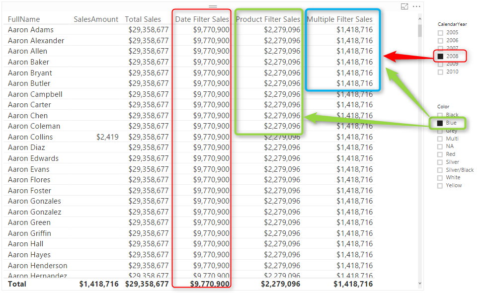
Now Create a report with a Table of Full Name (from DimCustomer), Sum of Sales Amount. also create two slicers; one for Calendar Year, and another for Product Color.
In above screenshot you can see that result of Sum of Sales Amount is not always same value. IT DEPENDS! Depends on what filter you have selected, or what values you have sliced and diced based on. For example Highlight numbered 1, shows sum of Sales Amount for product Color Blue, Calendar Year 2008, and Customer Full Name “Aaron Collins”. While the highlight numbered 2, shows sum of Sales Amount for Year 2008, and color Blue, but for all Customers. What you see here is Filter Context.
Filter Context is all filters, slicers, highlight, and slicing and dicing applied to a report or visual. Filter Context for number 1 in above image is: product Color Blue, Calendar Year 2008, and Customer Full Name “Aaron Collins”.
Everything in DAX resolves based on Filter Context and Row Context. However there are some ways to control the context. Controlling the context means controlling interaction of visuals. In above example, with any change in the slicer, filter context changes, and result of Sum(SalesAmount) also changes. However if we write a DAX expression that doesn’t change with selecting a slicer, that means we have controlled the context. Let’s look at some examples.
As an example; you can create a measure that returns total sales amount regardless of what is selected in slicers or filters, regardless of what the filter context is. For this you can use either Iterators (SumX, MinX, MaxX,….) or Calculate function. Create measure below;
Total Sales = SUMX(ALL(FactInternetSales),FactInternetSales[SalesAmount])
In above DAX expression ALL function will act regardless of filter context. No matter what Filter context is ALL will return everything, and as a result SUMX will calculate sum of SalesAmount for all rows. Here is a screenshot of report;
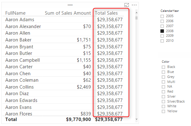
Doesn’t matter what filter you select, or what slicer you click, result for measure is always total value. Now let’s control the context a bit different.
Let’s take one step forward with bringing one selection criteria in the measure. For this measure we want to create a Total Sales that can be only changed when a date selection happens (Year in our example), but nothing else.
Because we need multiple filters now, I’ll do it this time with CALCUALTE function where I can specify multiple filters. Here is the code:
Date Filter Sales = CALCULATE( SUM(FactInternetSales[SalesAmount]),
	DATESBETWEEN(DimDate[FullDateAlternateKey],
		FIRSTDATE(DimDate[FullDateAlternateKey]),
		LASTDATE(DimDate[FullDateAlternateKey])
	),
	ALL(FactInternetSales)
)
In measure above we have two filters; ALL(FactInternetSales), and DatesBetween(). DatesBetween brings everything from the FirstDate to the LastDate. FirstDate and LastDate will be depends on the date selection in slicer. as a result DatesBetween will return the filter context of date selection, however everything else will be ignored by ALL(FactInternetSales). Result will be a filter which is junction of these two filter. Here is the result;
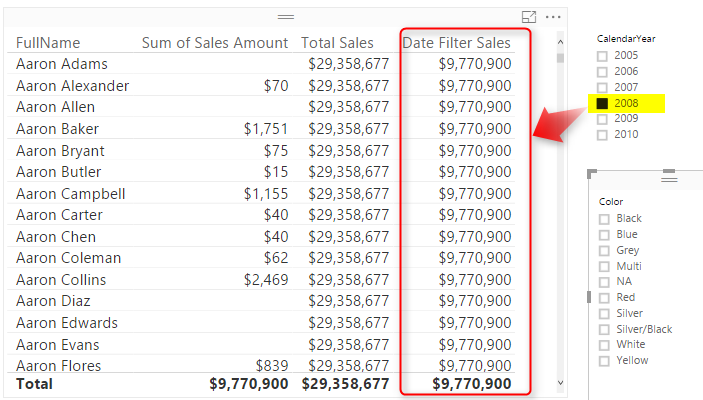
You can see that the value in this new measure (Date Filter Sales) changes by any selection in Calendar Year slicer, but nothing else. Result of this measure will be always sum of sales amount for all transactions in the selected year. If nothing is selected in Year slicer, then this column’s value will be similar to Total Sales Measure.
How if we want to enable multiple filters then? let’s look at another measure.
Let’s go even one step further and add a measure that can be only affected by selecting values in date and product slicer, but nothing else. You know the answer already I believe. You just need to add one more filter to the list of filters. I’ll do it this time with a RelatedTable function, but you can do it with other methods as well. Here is the new measure;
Multiple Filter Sales = CALCULATE( SUM(FactInternetSales[SalesAmount]),
	ALL(FactInternetSales),
	RELATEDTABLE(DimProduct),
	DATESBETWEEN(DimDate[FullDateAlternateKey],FIRSTDATE(DimDate[FullDateAlternateKey]),LASTDATE(DimDate[FullDateAlternateKey]))
)
Above measure is similar to the previous measure with only one more filter: RelatedTable(DimProduct). This filter will return only sub set of select products. As a result for this measure Product and Date selection will be effective;
As you can see simply with DAX expressions you can control the filter context, or in other words you can control the interaction in Power BI. Note that you can write DAX expressions in many different ways, the expression above are not the only way of controlling filter context. Iterators and Calculate function can be very helpful in changing this interaction.
You can download Power BI Demo file from here:
Published Date : January 18, 2017
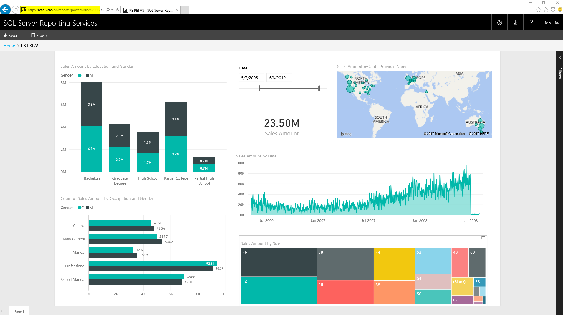
It has been a very long time request from users around the world to make Power BI available for on-premises, not for using on-premises data sources (this is available from long time ago with gateways), but for publishing reports into on-premises server. With the fast pace of development of Power BI this feature was looking so impossible to achieve, however the great news is that Power BI can be published to on-premises now. This feature is still preview at the time of writing this post, but I believe it will be soon generally available. So the wait is over, you can now host Power BI reports in your on-premises SSRS Server. In this quick post I’ll show you how easy is to set up this with Technical Preview of Reporting Services for Power BI. If you would like to learn more about Power BI, read Power BI online book; from Rookie to Rock Star.
For using this preview version, you need to download and install Technical Preview of SQL Server Reporting Services (SSRS) from here:
https://www.microsoft.com/en-us/download/details.aspx?id=54610
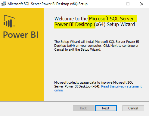
This download includes the SSRS Technical Preview version where you can publish your Power BI Desktop files to it, and also specific version of Power BI Desktop, which you can build your Power BI reports with it (Yes, for this preview version, you need to create reports with this specific version of Power BI Desktop named as SQL Server Reporting Service Power BI Desktop);

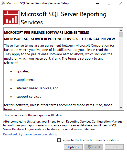
Installation of SSRS Technical Preview is easy, just continue the setup which is only for SSRS (You don’t need to install whole SQL Server package for it);
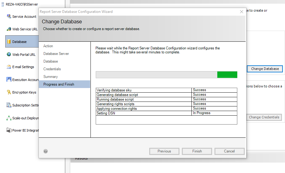
After installing SSRS, you need to set up Report Server in Configuration Manager (Mainly you need to set up a database for report server);
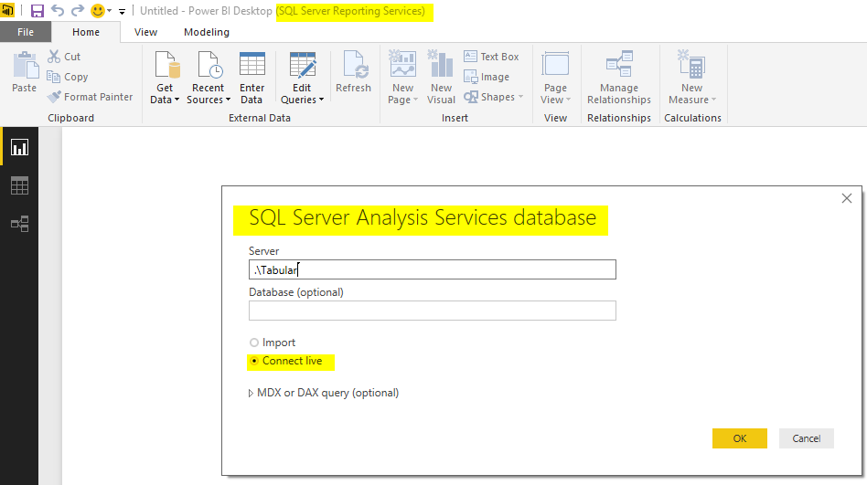
Next step is to install Power BI Desktop version for SSRS;
Now you are ready to build the report;
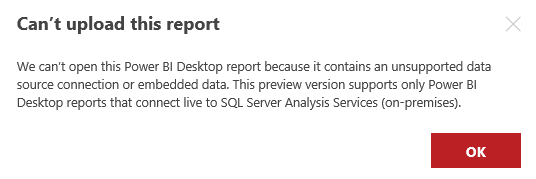
Note that with this preview version you can only use SQL Server Analysis Services (SSAS) Live connection as the source, nothing else. If you use other sources, you will get this error:
So simply select a SSAS Live query and build a report;
After building the report, just save it, and then in SSRS Report Manager, upload the file;
Your Power BI report will appear in report manager then as a Power BI Report object

Click on the Power BI report to open, and Yaaay! You’ve got Power BI on-premises! Fully interactive.
We are in a world that rapidly running towards cloud. Your files are in Dropbox, or OneDrive these days, Your photos uploaded to a cloud storage, your emails are all backed up in a cloud backup media, and I’m in this thinking that in next few years, we might eat our food from a cloud kitchen! However there are still businesses and companies who require some on-premises solutions, and as long as a requirement exists, there should be an answer for it. Power BI for On-Premises bring the power of self-service, interactive reports of Power BI to these businesses. Power BI for On-premises is a great big step towards utilizing better data insight in all environments.
To be honest, I don’t know yet. This is not yet fully released! However the costing and licensing would be definitely different from Power BI in cloud. Probably instead of per user, it might be through Enterprise or licensing editions like that. We need to wait to see that.
I don’t think so. Power BI on cloud (or Power BI Service), has so many features in it; Dashboards, Power Q&A, Security, Sharing, Administration, data streaming input, and many other great features. These features will take time to implement in SSRS, and by the time that these be implemented in SSRS, some new features will be implemented in Power BI Service. My gut feeling is that Power BI Service would be the full experience of Power BI.
In overall I believe this is a great step towards better world, using data insight in every environment. Thanks Microsoft team for this great enhancement.
Let me know what do you think of this change? I’d love to hear your thinking ![]()
Published Date : January 16, 2017
Power Query is the component of getting data in Power BI. But have you used Power Query to get metadata of the Power BI queries itself? In this post I’ll show you a quick and simple way of using Power Query to get metadata (name of queries and the data in queries) from all queries in Power BI. I have previously explained how to use #shared keyword to get list of all functions in Power Query, this post shows how to use #shared or #sections to get all queries (and parameters, and functions, and lists… ) from Power BI. If you want to learn more about Power BI; read Power BI online book from Rookie to Rock Star.
* Thanks to Alex Arvidsson who brought this question, and was the cause of writing this blog post.
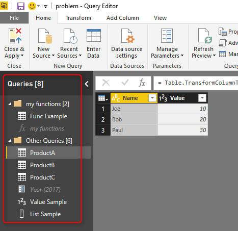
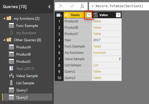
Consider below Power BI file, that has functions, parameters, and queries. Queries also returns tables, values, and lists;
The question is how I can get list of all these queries and their values as a new query? Let’s see the answer
I have previously explained what #shared keyword does; it is a keyword that returns list of all functions, and enumerators in Power Query. It can be used as a document library in the Power Query itself. It will also fetch all queries in the existing Power BI file. Here is how you can use it:
Create a New Source, from Blank Query.

Then go to Advanced Editor of that query (from Home tab or View tab)

write only one keyword in the Advanced Editor: #shared

And Click on Done. Result will comes up quickly;
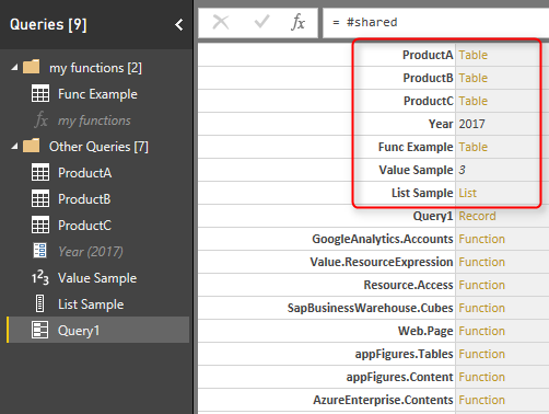
You can see in the result that #shared fetch all existing queries, plus all built-in functions in Power Query. the section which is marked in above result set in where you can find queries from the current file. Note that the Query1 itself (which includes the #shared keyword) is listed there. the limitation of this method is that it won’t return your custom function; “my function” in this example. the next method however would pick that as well.
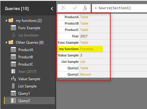
The other way of fetching list of queries is using #sections keyword. #sections keyword will give you list of all sections in Power Query (This post isn’t right place to explain what sections are, but for now, just consider every query here as a section). so same method this time using #sections will return result below;

Result is a record, that you can simply click on the Record to see what are columns in there. Columns are queries in the current file:
This method also returns functions in the current file, which previous method with #shared didn’t. So this is a better method if you are interested to fetch function’s names as well.
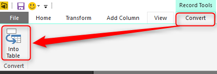
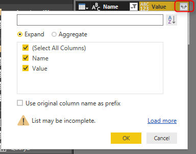
The result is a record which can be converted to a table (this gives you better filtering options in the GUI). You can fine the Convert Into Table under Record Tools Convert Section menu.
After having this as a table, then you can apply any filters you want;
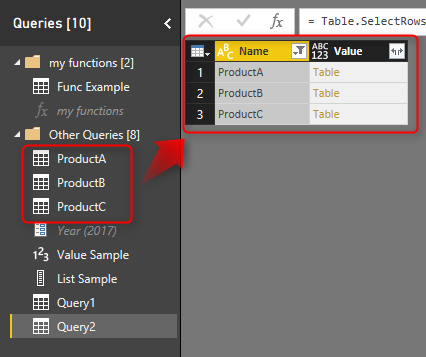
There are many usages of getting name of queries in another query. One sample usage of that can be getting different queries coming from different places, and the only way to identify the source is query name. In this case instead of manually adding a column to each query and then combining them together, you can use this method to get the query name dynamically. In screenshot below ProductA, ProductB, and ProductC are coming as source queries, and you can simply do a filtering to get them all with their product names.
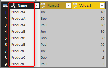
And you can expand it to tables underneath if you want to (this would work if they all have same data structure);
and as a result you have combined result of all queries, with the query name as another column;
Download the Power BI file of demo from here:
Published Date : January 13, 2017
I’ve hear this question many times; “Do you think we need a date dimension?”. some years ago, date dimension has been used more, but nowadays less! The main reason is that there are some tools that are using their own built-in date hierarchy. As an example Power BI has a built-in date hierarchy that is enabled by default on top of all date fields which gives you a simple hierarchy of year, quarter, month, and day. Having this hierarchy brings the question most of the time that do I need to have a date dimension still? of I can simply use this date hierarchy? In this post I’ll answer this question and explain it with reasons. Majority of this post is conceptual and can be used across all BI tools, however part of it is Power BI focused. If you like to learn more about Power BI, read Power BI online book from Rookie to Rock Star.
Date Dimension is a table that has one record per each day, no more, no less! Depends on the period used in the business you can define start and end of the date dimension. For example your date dimension can start from 1st of Jan 1980 to 31st of December of 2030. For every year normally you will have 365 records (one record per year), except leap years with 366 records. here is an example screenshot of a date dimension records;
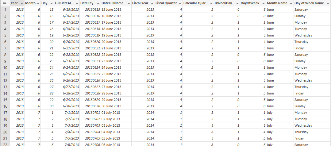
Date Dimension is not a big dimension as it would be only ~3650 records for 10 years, or even ~36500 rows for 100 years (and you might never want to go beyond that). Columns will be normally all descriptive information about date, such as Date itself, year, month, quarter, half year, day of month, day of year….
Date Dimension will be normally loaded once, and used many times after it. So it shouldn’t be part of your every night ETL or data load process.
Date Dimension is useful for scenarios mentioned below;
Let’s look at reasons one by one;
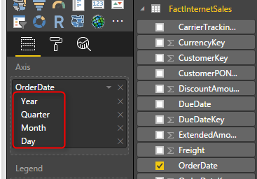
If you have worked with Power BI you know that there is a date hierarchy built-in which gives you fields such as Year, Quarter, Month, and Day. This hierarchy normally adds automatically to date fields. here is an example of how it looks like;
This built-in hierarchy is very good help, but what about times that you want to slice and dice date fields based on something other than these 4 fields? for example questions that you cannot answer with this hierarchy are;
The fact is; when you use the simple hierarchy of Year, Quarter, Month, and Day, you are limited to only slice and dice by these fields. If you want to step beyond that, then you have to create additional fields to do it. That’s when a date dimension with all of these fields is handy. Here are some fields that you can slice and dice based on that in Date Dimension (and this is just a very short list, a real date dimension might have twice, three times, or 4 times more fields than this! Yes more fields means more power in slicing and dicing)

You can answer questions above without a date dimension of course, for example; to answer the first question above, you will need to add Weekday Name, because you would need to sort it based on Weekday number, so you have to bring that as well. To answer second question you need to bring Week number of year. For third question you need to bring fiscal columns, and after a while you will have heaps of date related columns in your fact table!
And worst part is that this is only this fact table (let’s say Sales fact table). Next month you’ll bring Inventory fact table, and the story begins with date fields in Inventory fact table. This simply leads us to the second reason for date dimension; Consistency.
You don’t want to be able to slice and dice your Sales data by week number of year, but not having this feature in Inventory data! If you repeat these columns in all fact tables you will have big fact tables which are not consistent though, if you add a new column somewhere you have to add it in all other tables. What about a change in calculation? Believe me you never want to do it.
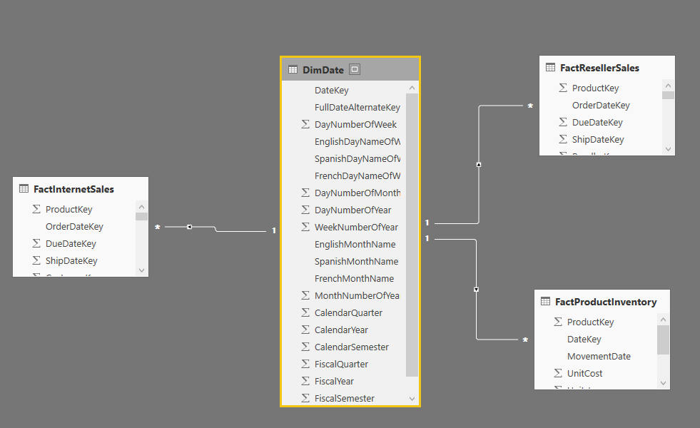
Date Dimension on the other hand is a dimension that is shared between all fact tables. You add all fields and calculations here, and fact tables are only related to this. This is a consistent approach. Here is a simple view of a data warehouse schema with a date dimension shared between two fact tables.
In most of businesses nowadays public holidays or special event’s insight is an important aspect of reporting and analysis. some of analysis are like;
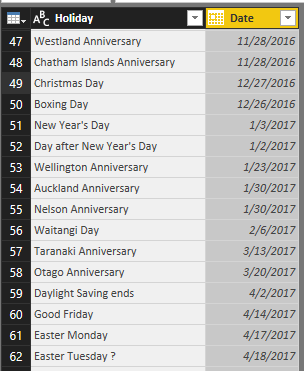
One of the best use cases of date dimension is public holidays and special events. I have shown previously in another post how to fetch public holidays live in Power BI. Calculating some of public holidays are time consuming and not easy. Easter for example changes every year. You can also have some fields in date dimension that mention what the special day is (opening, closing, massive sale….). Your date dimension can be enhanced a lot with insight from these fields. Here is an example of public holidays information in a date dimension;
BI Tools in the market has some extended functions that gives you insight related to date, named as time intelligence functions. For examples, talking about Power BI, you can leverage heaps of DAX functions, such as TotalYTD to calculate year to date, ParallelPeriod to find the period parallel to the current period in previous year or quarter, and many other functions. These functions sometimes need to work with a date dimension, otherwise they won’t return correct result!
Yes, you’ve read it correctly, DAX time intelligence functions won’t work properly if you don’t have a proper date dimension. proper date dimension is a table that has a full date column in one of the fields, and has no gaps in dates. This means that if you are using Sales transaction table which has an OrderDate field as an input to DAX time intelligence functions, and if there is no sales transaction for 1st of January, then the result of time intelligence functions won’t be correct! It won’t give you an error, but it won’t show you the correct result as well, this is the worst type of error might happen. So having a Date Dimension can be helpful in this kind of scenarios as well.

In this post I’ve explained how to use some of DAX time intelligence functions in Power BI.
Now is the time to answer the question; “Do I need a date dimension”? the answer is: Yes, IMHO. Let me answer that in this way: Obviously I can do a BI solution without date dimension, but would you build a table without hammer?! Would you build a BI solution that has some date columns in each fact table, and they are not consistent with each other? would you overlook having special event or public holidays dates insight in your solution? would you only stick to year, quarter, month, and date slicing and dicing? would you like to write all your time intelligence functions yourself? Obviously you don’t. Everyone has the same answer when I explain it all.
I have been working with countless of BI solutions in my work experience, and there is always requirement for a Date Dimension. Sooner or later you get to a point that you need to add it. In my opinion add it at the very beginning so you don’t get into the hassle of some rework.
Now that you want to build a date dimension, there are many ways to build it. Date Dimension is a dimension table that you normally load once and use it always. because 1st of Jan 2017 is always 1st of Jan 2017! data won’t change, except bringing new holiday or special event dates. I mention some of ways to build a date dimension as below (there are many more ways to do it if you do a bit of search in Google);
You can use a written T-SQL Script and load date dimension into a relational database such as SQL Server, Oracle, MySQL, and etc. Here is a T_SQL example I have written few years ago.
I have written a blog post explaining how you can do the whole date dimension in Power Query. the blog post is a bit old, I will write a new one in near future and will show an easier way of doing this in Power BI.
I have written another blog post that mentioned how to fetch public holidays from internet and attach it to a date dimension in Power BI.
You can use Calendar() function in DAX to generate a date dimension very quickly as well.
Using a dimension multiple times in a data warehouse called Role Playing dimension. I have explained how to do role playing dimension for DimDate in this blog post.
Published Date : January 12, 2017
Parallel Period is a function that help you fetching previous period of a Month, Quarter, or Year. However if you have a dynamic range of date, and you want to find the previous period of that dynamic selection, then Parallel Period can’t give you the answer. As an example; if user selected a date range from 1st of May 2008 to 25th of November 2008, the previous period should be calculated based on number of days between these two dates which is 208 days, and based on that previous period will be from 5th of October 2007 to 30th of April 2008. The ability to do such calculation is useful for reports that user want to compare the value of current period with whatever period it was before this. In this post I’ll show you an easy method for doing this calculation, I will be using one measure for each step to help you understand the process easier. If you like to learn more about DAX and Power BI, read Power BI online book from Rookie to Rock Star.
For running example of this post you will need AdventureWorksDW sample database, or you can download Excel version of it from here:
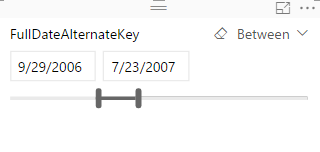
I will go through this with an example; Create a new Power BI Desktop file and choose DimDate, and FactInternetSales from AdventureWorksDW. Make sure that there is only one Active relationship between these two tables based on OrderDateKey in the FactInternetSales table and DateKey in the DimDate table. Now add a slicer for FullDateAlternateKey in the page
Also add a Card visual which shows SalesAmount from FactInternetSales table.
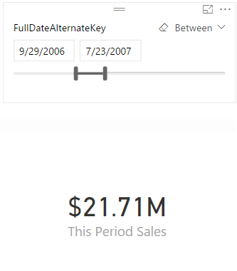
I normally prefer to create an explicit measure for this type of calculations, that’s why I have create a measure named “This Period Sales” with DAX code below; (the measure for This Period Sales is not necessary, because Power BI does the same calculation automatically for you)
This Period Sales = SUM(FactResellerSales[SalesAmount])
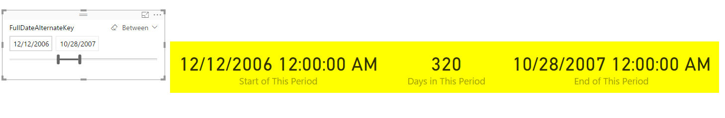
To understand the current period, an easy way can be calculating start, end of period and number of days between these two. Start of Period is simple. I just create a measure under DimDate, as below:
Start of This Period = FIRSTDATE(DimDate[FullDateAlternateKey])
FirstDate() DAX function returns the first available date in the current evaluation context, which will be whatever filtered in the date range.
Same as start of period, for end of period I will use a simple calculation, but this time with LastDate() to find the latest date in the current selection.
End of This Period = LASTDATE(DimDate[FullDateAlternateKey])
Next easy step is understanding number of days between start and end of period, which is simply by using DateDiff() DAX function as below;
Days in This Period = DATEDIFF([Start of This Period],[End of This Period],DAY)
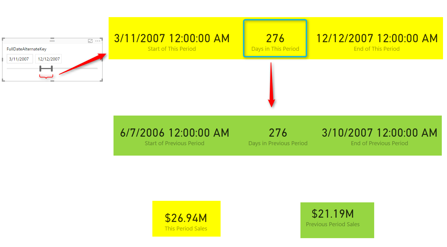
I add them all in the report as Card Visuals (one for each measure), and here is the result so far;
 Previous Period
After finding number of days in this period, start, and end of current period, it is a simple calculation to find the previous period. Previous period calculation should be number of days in this period minus start of current period. to exclude the start of period to calculate twice, I’ll move one more day back. Here is the calculation step by step, I’ll start with Start of Previous Period;
DATEADD(DimDate[FullDateAlternateKey],-1*[Days in This Period],DAY)
DateAdd() DAX function adds a number of intervals to a date set. In this example interval is DAY, and date set is all dates in DimDate[FullDateAlternateKey] field (because DateAdd doesn’t work with single date), and the number of intervals is Days in This Period multiplied by -1 (to move dates backwards rather than forward).
FIRSTDATE(DATEADD(DimDate[FullDateAlternateKey],-1*[Days in This Period],DAY))
FirstDate() used here to fetch first value only.
PREVIOUSDAY(FIRSTDATE(DATEADD(DimDate[FullDateAlternateKey],-1*[Days in This Period],DAY)))
To exclude current date from the selection we always move one day back, that’s what PreviousDay() DAX function does. it always returns a day before the input date.
These are not three separate DAX expressions or measure, this is only one measure which I explained step by step. here is the full expression:
Start of Previous Period = PREVIOUSDAY(FIRSTDATE(DATEADD(DimDate[FullDateAlternateKey],-1*[Days in This Period],DAY)))
Similar to the Start of Previous Period calculation, this calculation is exactly the same the only difference is using LastDate();
End of Previous Period = PREVIOUSDAY(LASTDATE(DATEADD(DimDate[FullDateAlternateKey],-1*[Days in This Period],DAY)))
You don’t need to create this measure, I have only created this to do a sanity check to see do I have same number of days in this period compared with previous period or not;
Days in Previous Period = DATEDIFF([Start of Previous Period],[End of Previous Period],DAY)
Now if I add all of these measure to the report with card visuals again I can see previous period calculation works correctly;
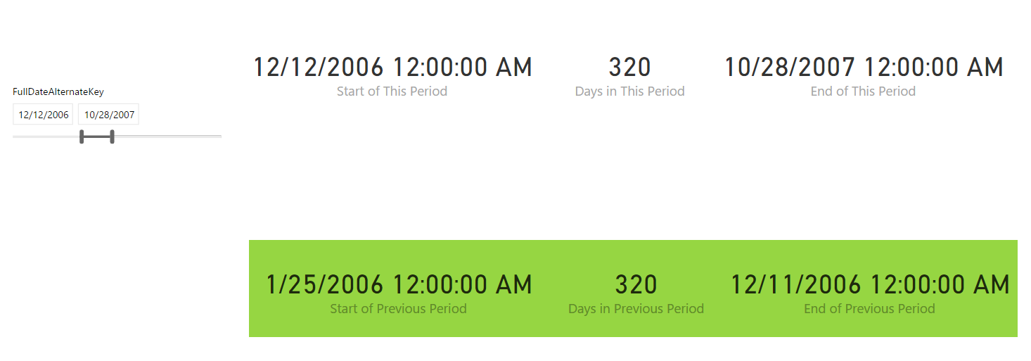 With every change you apply in date range slicer you can see the previous period calculates the range again, it will be always same number of days as the current period, but same number of days BEFORE. in the screenshot above you can see that start of previous period is 321 days before start of this period (1 more days because the end of previous period is not exactly start of this period, it is one day before. we don’t want to duplicate values of date in current and previous calculations).
Now as an example I have created another measure to show you the sum of SalesAmount for the previous period. the calculation here uses DatesBetween() DAX function to fetch all the dates between start of previous period and end of previous period;
Previous Period Sales = CALCULATE(SUM(FactResellerSales[SalesAmount])
	                             ,DATESBETWEEN(
									 DimDate[FullDateAlternateKey],
									 [Start of Previous Period],
									 [End of Previous Period]),
									 ALL(DimDate) )
Showing all of these in a page now;
This was a very quick and simple post to show you a useful DAX calculation to find Dynamic Previous Period based on the selection of date range in Power BI report page. I have used number of DAX functions such as FirstDate(), LastDate(), DateAdd(), DateDiff(), and PreviousDate() to do calculations. Calculation logic is just counting number of days in the current period and reducing it from the start and end of the current period to find previous period.
Download the Power BI file of demo from here:
Published Date : January 11, 2017
Column chart and Bar chart are two of the most basic charts used in every report and dashboard. There are normally two types of these charts: Stacked, and Clustered. At the first glance they seems to do same action; showing values by categories ans sub categories. However, they are different. Your storytelling of data would be totally different when you use one of these charts. The difference is simple, but knowing it and considering it in your visualization will take your visualization simply one level up. In this post I’ll show you the difference and when to use which. I will use Power BI for this example, but this is a conceptual post and works with any other BI tool. If you like to learn more about Power BI; read Power BI online book, from Rookie to Rock Star.
For running example of this post you will need AdventureWorksDW sample database, or you can download Excel version of it from here:
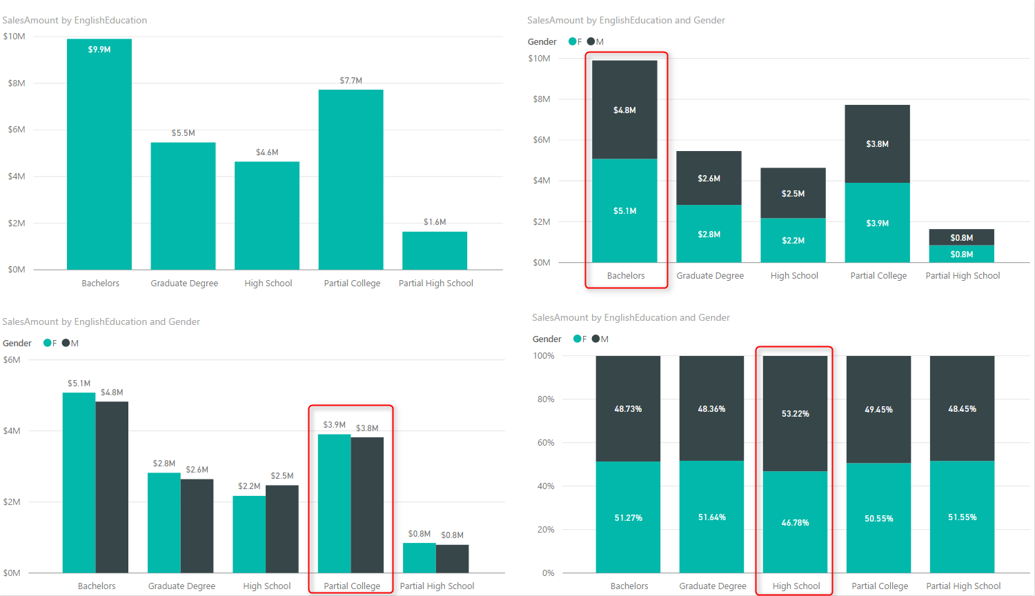
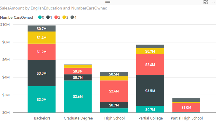
One of the best options to visualize difference between quantitative values across multiple items is column chart or bar chart. I have created a Power BI Desktop file connected to AdventureWorksDW, and loaded DimCustomer and FactInternetSales into the model. The chart below is a Column chart with EnglishEducation from DimCustomer as Axis, and SalesAmount from FactInternetSales as Value;
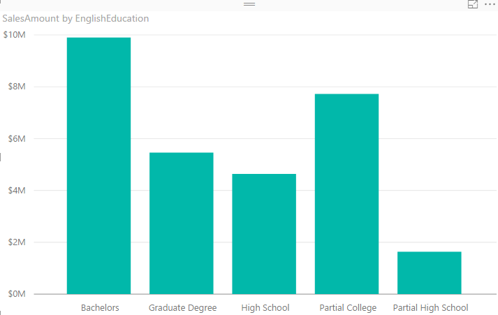
You can see with a single glance that Bachelors are producing the most revenue in this data set, and then Partial College after that. You can also simply understand Partial High School type of customers are lowest revenue generating customers. Column Chart and Bar chart are best for comparing a quantitative value (SalesAmount) based on categories/items (EnglishEducation). Now let’s bring another dimension here.
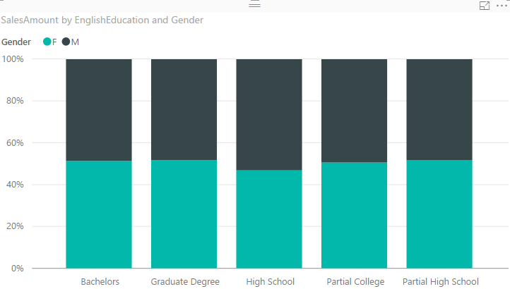
Clustered charts are best for comparing all categories and their sub categories as part of a whole. If you add Gender from DimCustomer as Legend, and choose the Clustered Column Chart type for your visual, this is what you will see;

Similar to normal column chart you can easily figure out which sub category producing the most revenue: Bachelors Female. and Partial High School Male is the least revenue generation sub category. You can also very easily realize that in each category which sub category has higher value than the other one;
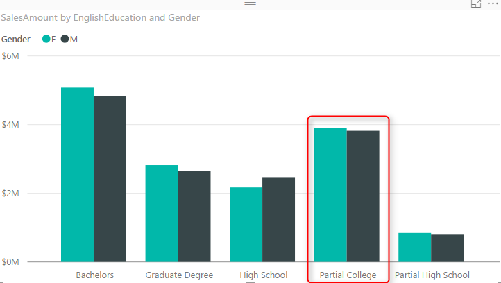
You can simply say that Males are producing less revenue than females in the Partial College category. Even though in Partial College values of Male and Female sub categories are very close to each other. These are questions that you can answer with this chart easily:
How about this question: Which category produces most total revenue? You would say Bachelors probably fairly quickly because both Female and Males has highest values of females and males across all categories. However if I ask you between High School and Graduate Degree, which one has the most total revenue based on only Clustered Chart above, that might be challenging to answer. The point is:
Clustered Chart are not good for comparing totals of categories
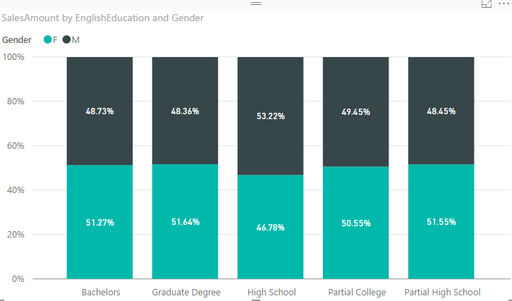
Point above leads us to Stacked Chart which is good for comparing totals and also values of sub categories. Change type of visual to Stacked Column Chart;
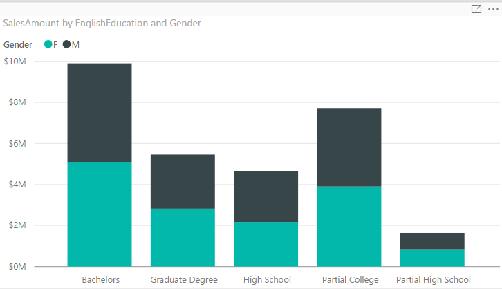
With this chart you can simply say which Education category provide most revenue, because the total is showed. between Graduate Degree and High School, it is obviously Graduate Degree. in Stacked chart however isn’t easy to compare values of a category. For example finding out is Male or Female producing more revenue in High School category is almost impossible through this. Stacked Chart is good when value difference is high between sub categories in each category.
Stacked Chart are not good for comparing values in each category
There is another type of stacked chart, named as 100% Stacked Chart. This chart is good for comparing percentages normally. To find out how sub categories of each category are doing compared with other sub categories. If you change the type of chart to 100% Stacked Column Chart, here is what you will see:
You can realize very quickly that portion of Males in all Education categories are less than High School’s Males. However You can never use 100% stacked chart for comparing actual values. This chart is only good for percentages. When you use this chart in Power BI, it will automatically uses percentages calculation for it.
100% Stacked Charts are not good for comparing actual values.
Regardless of what type of chart (Stacked, 100% Stacked, or Clustered) you are using, Data Labels are always helpful. Here is how charts can be powered with labels;
Deciding which chart is the best is all depends on what you want to tell as the story of the data;
There is no one single chart telling the whole story. You need to use combination of these, but use them wisely. For example don’t use Stacked Chart if you want to understand which sub category of a single category performs better or worst, or don’t use Clustered chart if you want to compare totals of categories together.
All of these charts works perfectly when you have few number of items. if you want to spread these across many sub category these charts would be hard to understand. Best would be splitting that variety in multiple charts.
Download the Power BI file of demo from here:
Published Date : January 10, 2017
Power BI users Sorting in most of the visualizations, you can choose to sort ascending or descending based on specified data fields. However the field itself can be sorted based on another column. This feature called as Sort By Column in Power BI. This is not a new or advanced feature in Power BI. This is very basic feature that enhance your visualization significantly. Let’s look at this simple feature with an example. If you like to learn more about Power BI; read Power BI online book from Rookie to Rock Star.
For running example of this post you will need AdventureWorksDW sample database, or you can download Excel version of it from here:
By Default a field’s data is sorted by that field it self. It means if the field is numeric it will be ordered based on the number, if it is text it will be ordered alphabetically. Let’s look at it through an example;
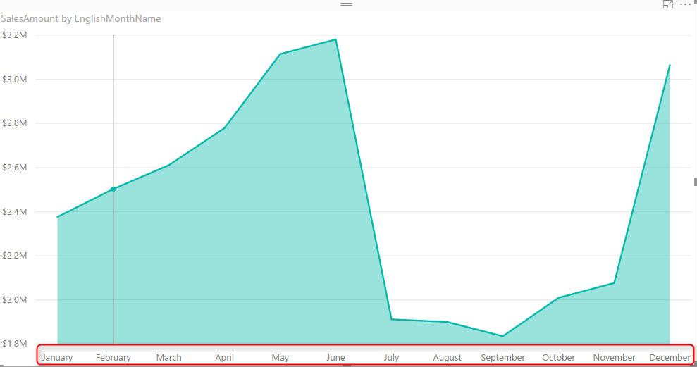
Create a New Power BI Desktop file, and Get Data from AdventureWorksDW, from DimDate, and FactInternetSales Tables. Check the relationship between these tables to be only based on an active relationship between OrderDateKey in the FactInternetSales and DateKey in the DimDate. remove any extra relationships. Create a visualization (Area Chart for example) with SalesAmount as Values, and EnglishMonthName as Axis.
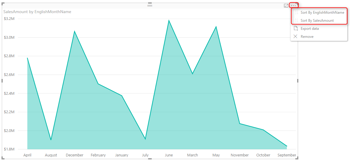
If you click on the three dot button on top right hand side of the chart you can see the sorting option for this visual. You can choose to sort based on fields that used in this visual, which can be either SalesAmount, or EnglishMonthName. If you sort it based on Sales Amount it is obviously showing you from biggest value to the lowest or reverse. This is the normal behaviour, a field will be ordered by values in the field itself.
Problem happens when you want a Text field to be ordered based on something different than the value of the field. For example if you look at above chart you can see that months ordered from April to September. This is not order of months, this is alphabetical order. If you change the sorting of visual, it will only change it from A to Z, or Z to A. To make it in the order of month numbers you have to do it differently.
If you wish a column to be sorted by values of another column you can simply do that in the Data tab of Power BI Desktop. First go to Data Tab, Select the field that you want to be sorted (EnglishMonthName in this example), and then from the menu option under Modeling choose Sort Column By, and select the field that contains numeric values of months (1, 2, 3, …12). This field in our example is MonthNumberOfYear.
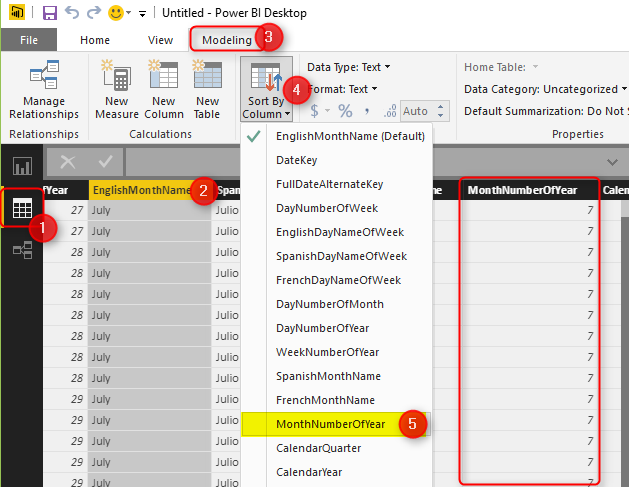
You can see in the screenshot above that MonthNumberOfYear is showing the numeric value of each month. After applying this change, simply go back to the report, and you will see the correct ordering of EnglishMonthName now.
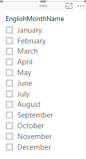
When you use this type of sorting, all visuals will be working based on this ordering. If you have a slicer, items in the slicer will be sorted and ordered based on this. This would be the way of filtering for that column from now onward. You can also think about many other possibilities and usages of this feature, here are few;
The column used for sorting (in this example MonthNumberOfYear) is not normally used for visualization itself. So you can simply Hide it from Report View.
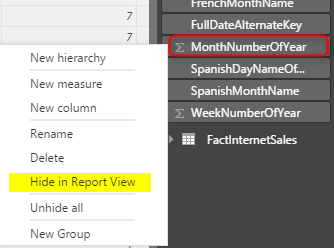
This is a recommended approach because having too many fields in the report view is confusing for end users.
Download the Power BI file of demo from here:
Published Date : January 6, 2017
Date Conversion is one of the simplest conversions in Power Query, however depends on locale on the system that you are working with Date Conversion might return different result. In this post I’ll show you an example of issue with date conversion and how to resolve it with Locale. In this post you’ll learn that Power Query date conversion is dependent on the system that this conversion happens on, and can be fixed to a specific format. If you want to learn more about Power BI; Read Power BI online book; from Rookie to Rock Star.
The sample data set for this post is here: book1
Most of the countries uses YMD format, however some of them use MDY or DMY more frequently. This wikipedia page explains different formats of date in each country. Data set below have different formats in it;

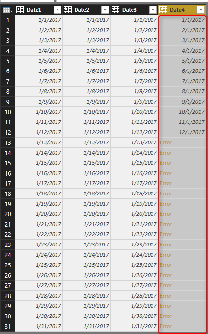
In above table, first two columns (Date1, and Date2) are in YYYY-MM-DD and YYYY/MM/DD format, which is the most common format of date. Date3 is MM-DD-YYYY format (very common in USA and some other countries), and Date4 is DD-MM-YYYY format, which is mostly common in New Zealand, Australia, and some other countries. Now let’s see what happens if we load this data into Power BI.
Power BI leverages automatic data type conversion. This automatic action sometimes is useful, sometimes not! If you open a Power BI Desktop file and get data from specified data set. in Query Editor you will see the data types converted automatically at some level. Here is the data loaded into Query Editor window with automatic data type conversion;
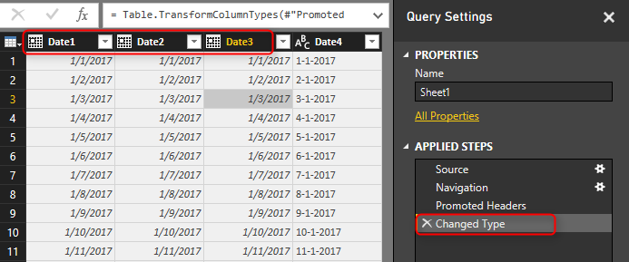
You can see the Changed Type step that applied automatically and converted first three columns in the data set to data type of Date, and left the Date4 as data type Text. Automatic Date type conversion understand characters like / or -, and apply conversion correctly in both cases (Date1, and Date2)
* If you are running this example on your machine you might see different result, because Power Query uses the locale of machine to do data type conversion. Locale of my machine is US format, so it understand format of USA and convert it automatically. If you have different locale the conversion might result differently. We will go through that in a second.
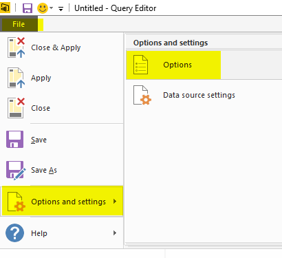
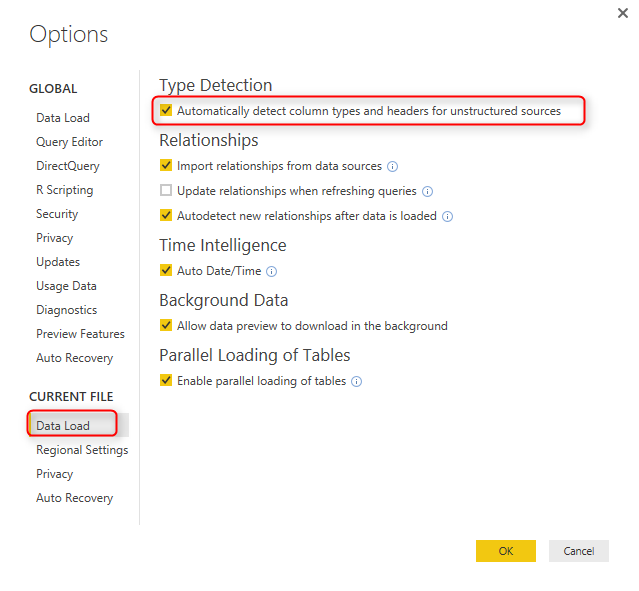
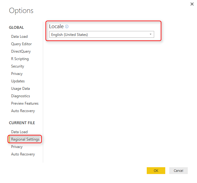
If the automatic data type conversion is not something you want, you can remove that step simply. Or if you want to disable the automatic type conversion, Go to File, Options and Settings, then Options.
In the Options window, under Current File, Data Load section. you can enable or disable the automatic data type detection if you wish to. (In this example I’ll keep it enabled)
You can also check the Locale of your current machine in the Regional Settings section of Options Window;
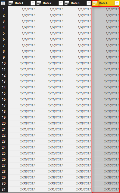
Date4 in the data set isn’t converted properly, and that’s because the Locale of current system (my machine) is English (United States). I can change the locale to English (New Zealand) in the Options window, and Refresh the data, but this will corrupt the existing Date Conversion of Date3 column. If I try to change the data type of Date4 column myself, the result will not be correct and I’ll see some errors;
You can see that conversion didn’t happened correctly, and also it returned Error in some cells, because my machine is expecting MM/DD/YYYY, but the date format in the column is DD/MM/YYYY which is not that format. So it can convert first 12 records, because it places the day as month in the result! and the rest it can’t because there is no month 13 or more.
Fortunately you can do date conversion using specific Locale. All you need to do is to go through right click and data type conversion using Locale;
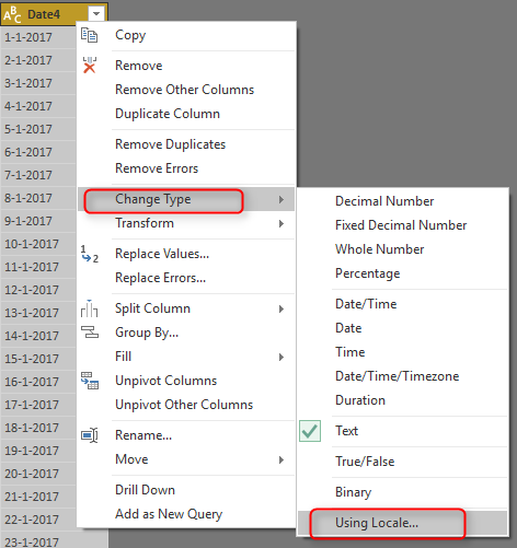
In the Change Type with Locale, choose the Data Type to be Date (Normally Locale is for Date, Time, and Numbers). and then set Locale to be English (New Zealand). You can also see some sample input values for this locale there.
With this simple change, you can now see the Date4 column converted correctly. You still see that in MM/DD/YYYY format in Query Editor window, and that’s because my machine’s date format is this. The actual column data type is Date however, which is the correct format to work with.
A look at formula bar and Power Query script shows that the locale used for this conversion is “en-NZ”, while other data type conversion are not using that.
let
    Source = Excel.Workbook(File.Contents("C:\Users\Reza\SkyDrive\Blog\DateConversion\Book1.xlsx"), null, true),
    Sheet1_Sheet = Source{[Item="Sheet1",Kind="Sheet"]}[Data],
    #"Promoted Headers" = Table.PromoteHeaders(Sheet1_Sheet),
    #"Changed Type" = Table.TransformColumnTypes(#"Promoted Headers",{
                                                                     {"Date1", type date},
                                                                     {"Date2", type date},
                                                                     {"Date3", type date},
                                                                     {"Date4", type text}
                                                                     }
                                                 ),
    #"Changed Type with Locale" = Table.TransformColumnTypes(#"Changed Type", {{"Date4", type date}}, "en-NZ")
in
    #"Changed Type with Locale"
In the script you can see the different of data type change using Locale which uses locale as the last parameter, instead of without locale. This brings a very important topic in mind; correct date type conversion is locale dependent, and you can get it always working if you mention Locale in date type conversion.
Date Type conversion can be tricky depends on the locale of system you are working on. To get the correct Date Type conversion recommendation is to use Locale for type conversion. some of formats might work even without using Locale. For example I have seen YYYYMMDD is working fine in all locales I worked with so far, but DDMMYYYY or MMDDYYYY might work differently.
Published Date : January 5, 2017

Combining two queries in Power Query or in Power BI is one of the most basic and also essential tasks that you would need to do in most of data preparation scenarios. There are two types of combining queries; Merge, and Append. Database developers easily understand the difference, but majority of Power BI users are not developers. In this post I’ll explain the difference between Merge and Append, and situations that you should use each. If you want to learn more about Power BI, read Power BI online book, from Rookie to Rock Star.
This might be the first question comes into your mind; Why should I combine queries? The answer is that; You can do most of the things you want in a single query, however it will be very complicated with hundreds of steps very quickly. On the other hand your queries might be used in different places. For example one of them might be used as a table in Power BI model, and also playing part of data preparation for another query. Combining queries is a big help in writing better and simpler queries. I’ll show you some examples of combining queries.
Result of a combine operation on one or more queries will be only one query. You can find Append or Merge in the Combine Queries section of the Query Editor in Power BI or in Excel.
Append means results of two (or more) queries (which are tables themselves) will be combined into one query in this way:
There is an exception for number of columns which I’ll talk about it later. Let’s first look at what Append looks like in action;
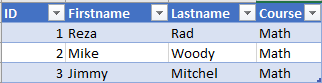
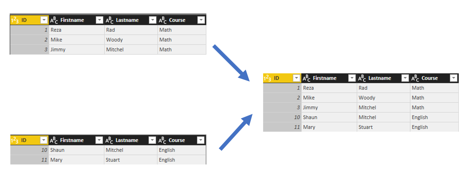
Consider two sample data sets; one for students of each course, Students of course 1:
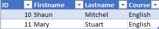
and Students of course 2:
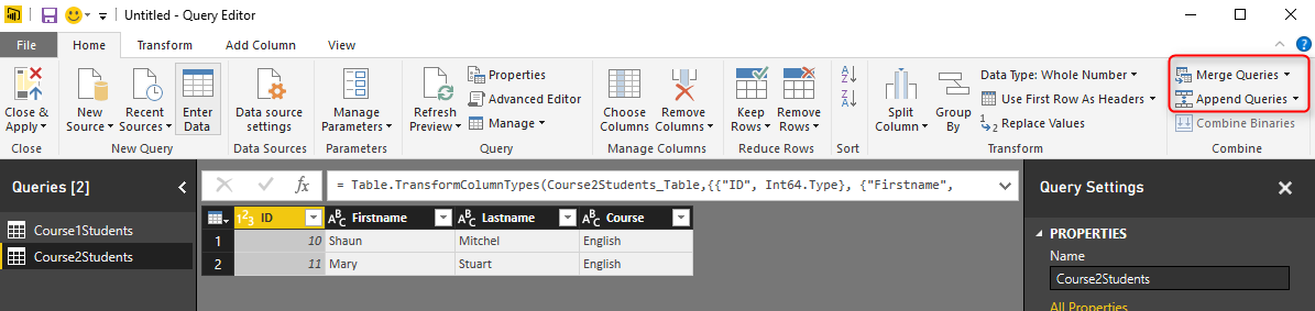
To append these queries, Click on one of them and select Append Queries from the Combine section of Home tab in Query Editor
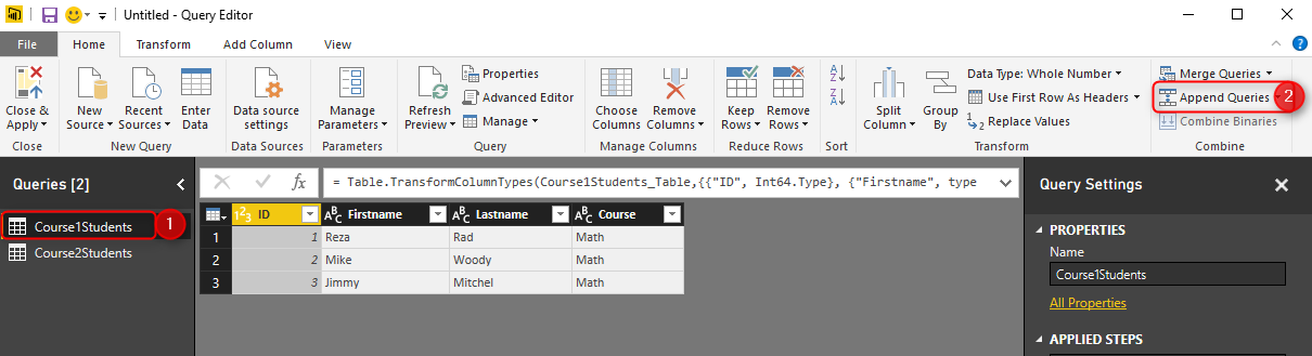
If you want to keep the existing query result as it is, and create a new query with the appended result choose Append Queries as New, otherwise just select Append Queries. In this example I’ll do Append Queries as New, because I want to keep existing queries intact.

You can choose what is the primary table (normally this is the query that you have selected before clicking on Append Queries), and the table to append.
You can also choose to append Three or more tables and add tables to the list as you wish. For this example I have only two tables, so I’ll continue with above configuration. Append Queries simply append rows after each other, and because column names are exactly similar in both queries, the result set will have same columns.
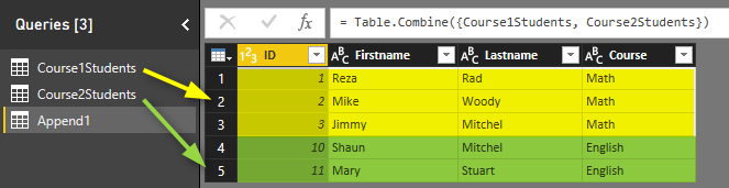
Result of Append as simple as that
Append is similar to UNION ALL in T-SQL.
Append Queries will NOT remove duplicates. You have to use Group By or Remove Duplicate Rows to get rid of duplicates.
Append requires columns to be exactly similar to work in best condition. if columns in source queries are different, append still works, but will create one column in the output per each new column, if one of the sources doesn’t have that column the cell value of that column for those rows will be null.
Merge is another type of combining queries which is based on matching rows, rather than columns. The output of Merge will be single query with;
Understanding how Merge works might look a bit more complicated, but it will be very easy with example, let’s have a look at that in action;
In addition to tables in first example, consider that there is another table for Course’s details as below:
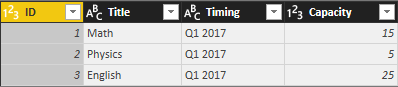
Now if I want to combine Course query with the Appended result of CourseXStudents to see which students are part of which course with all details in each row, I need to use Merge Queries. Here is the appended result again;
Select Course Query first, and then Select Merge Queries (as New)
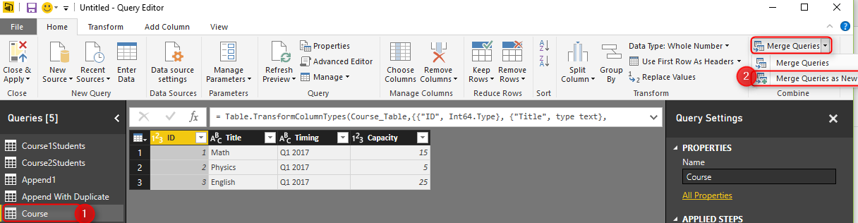
Merging Queries require joining criteria. Joining criteria is field(s) in each source query that should be matched with each other to build the result query. In this example, I want to Merge Course query with Append1, based on Title of the course.

I’ll talk about types of join later. For now continue the selection, and you will see these two queries match with each other based on Course title, result query will be same as the first query (Course in this example), plus one additional column named as NewColumn with a table in each cell. This is a structured column which can be expanded into underlying tables. if you click on an empty area of the cell containing one of these tables, you will see the sub table underneath.

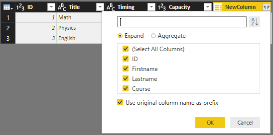
Now click on Expand column icon, and expand the New Column to all underneath table structure
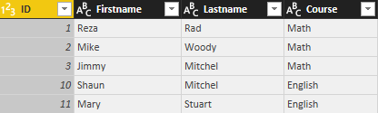
Result will be a table including columns from both tables, and rows matching with each other.
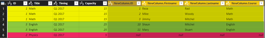
Columns in the left hand side are coming from Course table, columns in the right hand side are coming from Students table. Values in the rows only appears in matching criteria. First three rows are students of Math course, then two students for English course, and because there is no student for Physics course you will see null values for students columns.
Merge is similar to JOIN in T-SQL
There are 6 types of joins supported in Power BI as below, depends on the effect on the result set based on matching rows, each of these types works differently.
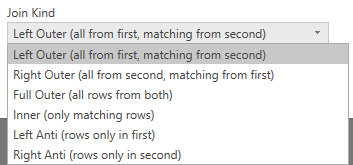
Explaining what each join type will do is totally different post which I will write later. For now this picture explains it very well:

Picture referenced from: http://www.udel.edu/evelyn/SQL-Class2/SQLclass2_Join.html
Download the Power BI file of demo from here:
Published Date : December 21, 2016

I’ve talked about Data Preparation many times in conferences such as PASS Summit, BA Conference, and many other conferences. Every time I talk about this I realize how much more I need to explain this. Data Preparation tips are basic, but very important. In my opinion as someone who worked with BI systems more than 15 years, this is the most important task in building in BI system. In this post I’ll explain why data preparation is necessary and what are five basic steps you need to be aware of when building a data model with Power BI (or any other BI tools). This post is totally conceptual, and you can apply these rules on any tools.
All of us have seen many data models like screenshot below. Transactional databases has the nature of many tables and relationship between tables. Transactional databases are build for CRUD operations (Create, Retrieve, Update, Delete rows). Because of this single purpose, transactional databases are build in Normalized way, to reduce redundancy and increase consistency of the data. For example there should be one table for Product Category with a Key related to a Product Table, because then whenever a product category name changes there is only one record to update and all products related to that will be updated automatically because they are just using the key. There are books to read if you are interested in how database normalization works.

I’m not going to talk about how to build these databases. In fact for building a data model for BI system you need to avoid this type of modeling! This model works perfectly for transactional database (when there are systems and operators do data entry and modifications). However this model is not good for a BI system. There are several reasons for that, here are two most important reasons;
You never want to wait for hours for a report to respond. Response time of reports should be fast. You also never wants your report users (of self-service report users) to understand schema above. It is sometimes even hard for a database developer to understand how this works in first few hours! You need to make your model simpler, with few tables and relationships. Your first and the most important job as a BI developer should be transforming above schema to something like below;
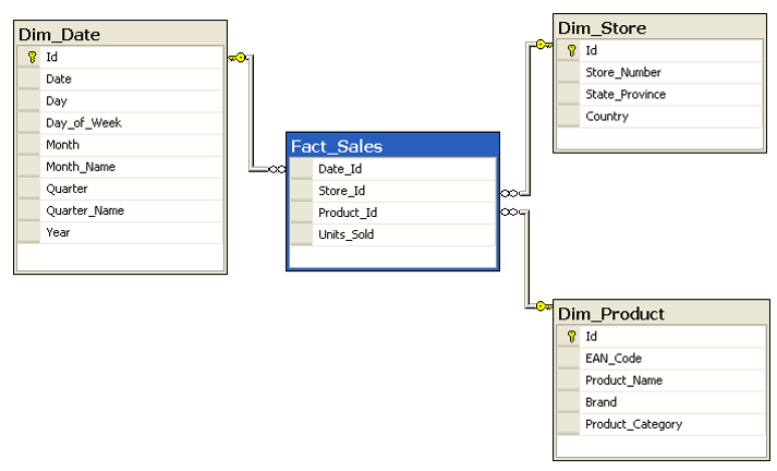
This model is far simpler and faster. There is one table that keeps sales information (Fact_Sales), and few other tables which keep descriptions (such as Product description, name, brand, and category). There is one one relationship that connects the table in the middle (Fact) to tables around (Dimensions). This is the best model to work with in a BI system. This model is called Star Schema. Building a star schema or dimensional modeling is your most important task as a BI developer.
To build a star schema for your data model I strongly suggest you to take one step at a time. What I mean by that is choosing one or few use cases and start building the model for that. For example; instead of building a data model for the whole Dynamics AX or CRM which might have more than thousands of tables, just choose Sales side of it, or Purchasing, or GL. After choosing one subject area (for example Sales), then start building the model for it considering what is required for the analysis.
Fact tables are tables that are holding numeric and additive data normally. For example quantity sold, or sales amount, or discount, or cost, or things like that. These values are numeric and can be aggregated. Here is an example of fact table for sales;

Any descriptive information will be kept in Dimension tables. For example; customer name, customer age, customer geo information, customer contact information, customer job, customer id, and any other customer related information will be kept in a table named Customer Dimension.
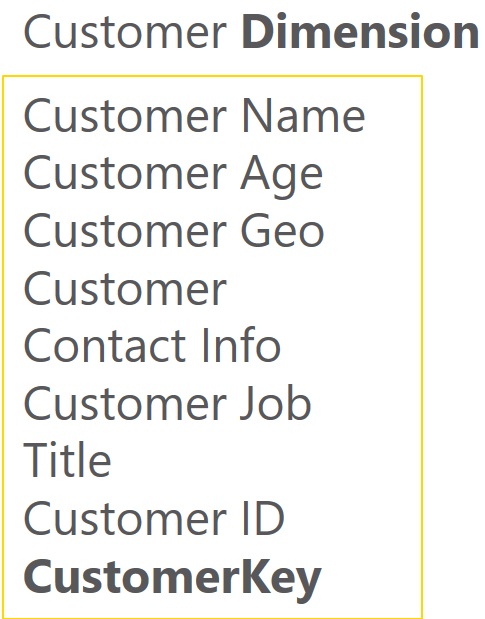
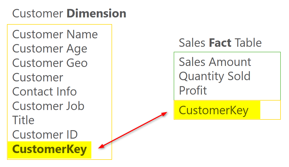
each dimension table should contain a key column. this column should be numeric (integer or big integer depends on the size of dimension) which is auto increment (Identity in SQL Server terminology). This column should be unique per each row in the dimension table. This column will be primary key of this table and will be used in fact table as a relationship. This column SHOULDN’T be ID of the source system. There are several reasons for why. This column is called Surrogate Key. Here are few reasons why you need to have surrogate key:
Surrogate key of the dimension should be used in the fact table as foreign key. Here is an example;
Other dimensions should be also added in the same way. in example below a Date Dimension and Product Dimension is also created. You can easily see in the screenshot below that why it is called star schema; Fact table is in the middle and all other dimensions are around with one relationship from fact table to other dimensions.
Building star schema or dimensional modeling is something that you have to read books about it to get it right, I will write some more blog posts and explain these principles more in details. however it would be great to leave some tips here for you to get things started towards better modeling. These tips are simple, but easy to overlook. Number of BI solutions that I have seen suffer from not obeying these rules are countless. These are rules that if you do not follow, you will be soon far away from proper data modeling, and you have to spend ten times more to build your model proper from the beginning. Here are tips:
Why?
Tables can be joined together to create more flatten and simpler structure.
Solution: DO create flatten structure for tables (specially dimensions)
Why?
Fact table are the largest entities in your model. Flattening them will make them even larger!
Solution: DO create relationships to dimension tables
Why?
names such as std_id, or dimStudent are confusing for users.
Solution: DO set naming of your tables and columns for the end user
Why?
Some data types are spending memory (and CPU) like decimals. Appropriate data types are also helpful for engines such as Q&A in Power BI which are working based on the data model.
Solution: DO set proper data types based on the data in each field
Why?
Filtering part of the data before loading it into memory is cost and performance effective.
Solution: DO Filter part of the data that is not required.
This was just a very quick introduction to data preparation with some tips. This is beginning of blog post series I will write in the future about principles of dimensional modeling and how to use them in Power BI or any other BI tools. You can definitely build a BI solution without using these concepts and principles, but your BI system will slow down and users will suffer from using it after few months, I’ll give you my word on it. Stay tuned for future posts on this subject.
Published Date : December 15, 2016
Filtering in Power Query component of Power BI is easy, however it can be misleading very easily as well. I have seen the usage of this filtering inappropriately in many cases. Many people simply believe in what they see, rather than seeing behind the scenes. Power Query filtering is totally different when you do basic filtering or advanced filtering, and the result of filtering will be different too. In this post I’ll show you through a very simple example how misleading it can be and what it the correct way to do filtering in Power Query. This post is a must read for everyone who use filtering in Power Query. If you like to learn more about Power BI, read the Power BI online book from Rookie to Rock Star.
For this example I’ll use AdventureWorksDW SQL Server database example. only one table which is DimCustomer.
Filtering rows is one of the most basic requirements in a data preparation tool such as Power Query, and Power Query do it strongly with an Excel like behavior for filtering. To see what it looks like open Power BI Desktop (or Excel), and Get Data from the database and table above; DimCustomer, Click on Edit to open Query Editor window.
In the Query Editor window there is a button on top right hand side of every column that gives you access to filtering rows
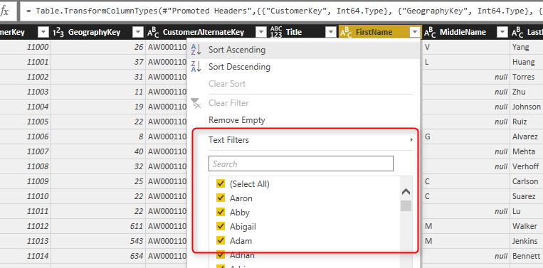
You can simply filter values in the search box provided.
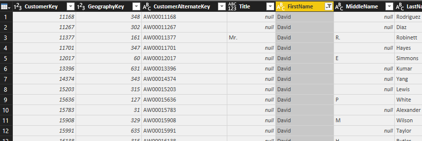
For basic filtering all you need to do is typing in the text, number, or date you want in the search box and find values to select from the list. For example if you want to filter all data rows to be only for the FirstName of David, you can simply type it and select and click on OK.

Result then will be only records with David as first name.
Exactly as you expect. Now let’s see when it is misleading.
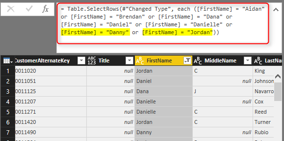
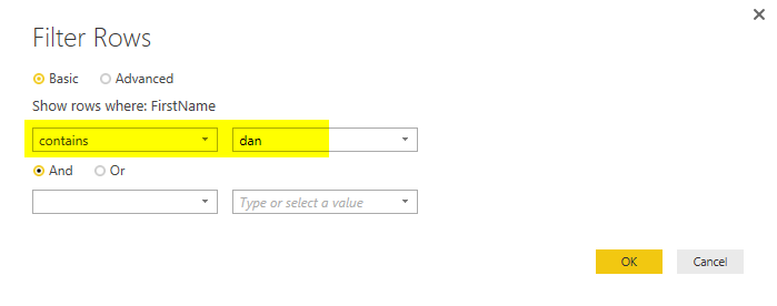
If you want to do equity filtering, basic filtering is great. For example you only want to pick David, and that’s what we’ve done in above example. However what if you want to do similarity filtering? For example, let’s say you are interested in FirstNames that has three characters of “Dan” in it. You can do it in the same search box of basic filtering, and this will give you list of all first names that has “Dan” in it.
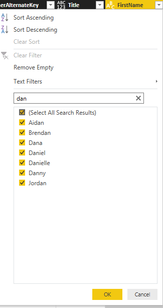
And then you can click on OK. the result will be showing you all first names with “Dan” characters in it. So everything looks exactly as expected, right?

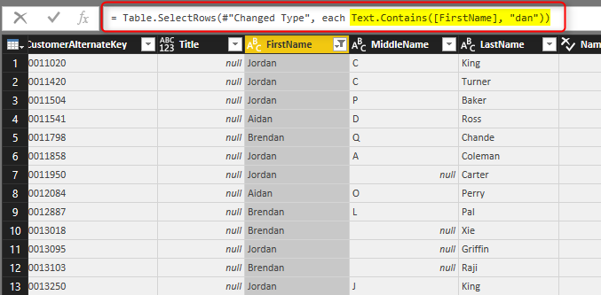
However as a Power Query geek I always look at the M script of each step to see what is happening behind the scene. For this case, here is the Power Query M script;
The script tells the whole story. Despite the fact that you typed in “Dan” and Power Query showed you all FirstNames that has “Dan” in it. the script still use equity filters for every individual FirstName. For this data set there won’t be any issue obviously, because all FirstNames with “Dan” is already selected. However if new data rows coming in to this table in the future, and they have records with FirstNames that are not one of these values, for example Dandy, it won’t be picked! As a result the filter won’t work exactly as you expect. That’s why I say this is misleading.
Basic filtering is very handy with that search box and suggestions of items while you typing, but it is misleading easily as you have seen above, and can’t give you what you expect in many real-world scenarios. Advanced Filtering is simply what you can see on top of the Search box, which depends on the data type of column can be Text Filters, Number Filters, Date Filters and etc. If we want to do the same “Dan” filter here, I can go to Text Filtering and select Contains.
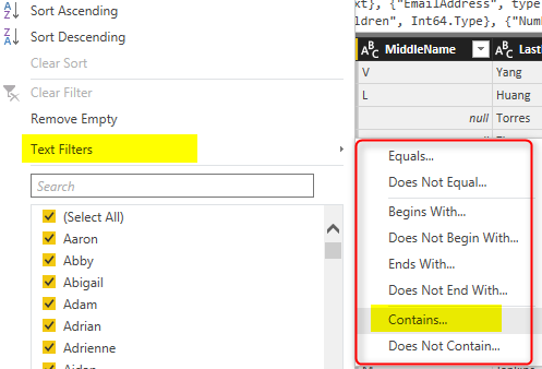
You can even choose filters such as Begins With or Ends With or many other choices. For this example I’ll select Contains, and type in Dan in the text box of Contains.
After clicking on OK, you will see same result set (like the time that you did basic filtering with “Dan”), however the M script this time is different;
You can see the big different now, This time M script used Text.Contains function. This function will pick every new values with “Dan” in the FirstName. There will be no values missing in this way. You will be amazed how many Power Query scenarios are not working correctly because of this very simple reason. There are advanced filters for all types of data types.
Basic Filtering is good only if you want to do equity filtering for values that exists in the current data set, however it won’t work correctly if you want to check ranges, or contains or things that is not an exact equity filter. Advanced Filtering is the correct way of filtering in Power Query, and there are advanced filters for all types of data types; Numbers, Text, Date…. This is very simple fact, but not considering that will bring lots of unwanted behavior and incorrect insight to your Power BI solution.
Published Date : December 6, 2016
I have written a lot about Power Query M scripting language, and how to create custom functions with that. With recent updates of Power BI Desktop, creating custom functions made easier and easier every month. This started with bringing Parameters few months ago, and adding source query for the function in November update of Power BI Desktop. In this blog post you will learn how easy is to create a custom function now, what are benefits of doing it in this way, and limitations of it. If you like to learn more about Power BI; read Power BI online book from Rookie to Rock Star.
Custom Function in simple definition is a query that run by other queries. The main benefit of having a query to run by other queries is that you can repeat a number of steps on the same data structure. Let’s see that as an example: Website below listed public holidays in New Zealand:
For every year, there is a page, and pages are similar to each other, each page contains a table of dates and descriptions of holidays. here is for example public holidays of 2016:
http://publicholiday.co.nz/nz-public-holidays-2016.html

You can simply use Power BI Get Data from Web menu option of Power Query to get the public holidays of this page. You can also make some changes in the date format to make it proper Date data type. Then you probably want to apply same steps on all other pages for other years (2015, 2017, 2018…), So instead of repeating the process you can reuse an existing query. Here is where Custom Function comes to help.
With a Custom function you are able to re-use a query multiple times. If you want to change part of it, there is only one place to make that change, instead of multiple copies of that. You can call this function from everywhere in your code. and you are reducing redundant steps which normally causes extra maintenance of the code.
Well, that’s the question I want to answer in this post. Previously (about a year ago), creating custom functions was only possible through M scripting, with lambda expressions, that method still works, but you need to be comfortable with writing M script to use that method (To be honest I am still fan of that method ![]() ). Recently Power BI Desktop changed a lot, you can now create a function without writing any single line of code.
). Recently Power BI Desktop changed a lot, you can now create a function without writing any single line of code.
Through an example I’ll show you how to create a custom function. This example is fetching all public holidays from the website above, and appending them all in a single table in Power Query. We want the process to be dynamic, so if a new year’s data appear in that page, that will be included as well. Let’s see how it works.
For creating a custom function you always need to build a main query and then convert that to a function. Our main query is a query that will be repeated later on by calling from other queries. In this example our main query is the query that process the holidays table in every page, and return that in proper format of Date data type and Text for description of holiday. We can do that for one of the years (doesn’t matter which one). I start with year 2016 which has this url:
http://publicholiday.co.nz/nz-public-holidays-2016.html
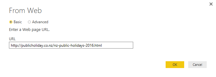
Open a Power BI Desktop and start by Get Data from Web
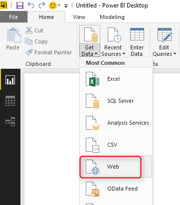
Use the 2016’s web address in the From Web page;
In the Navigator you can see that Table 0 is the table containing the data we are after. Select this table and click Edit.
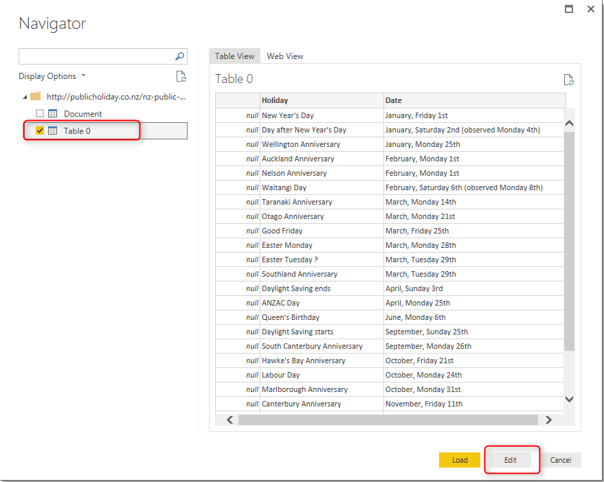
This will open Query Editor Window for you, You can now make some changes in the query, For example remove the first column.
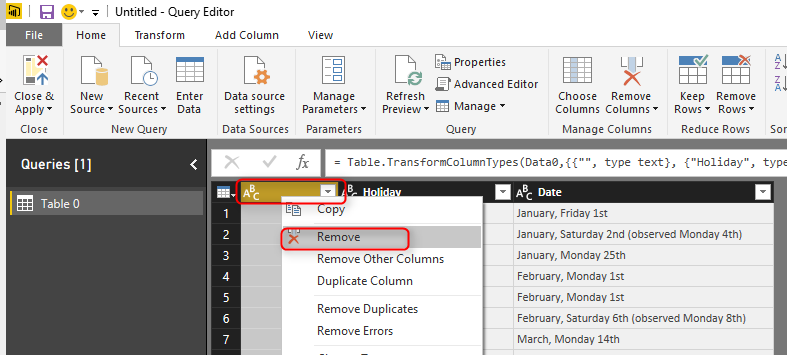
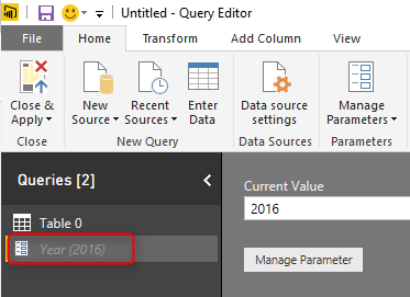
First column was an empty column which we removed. Now you can see two columns; Holiday (which is description of holiday), and Date. Date column is Text data type, and it doesn’t have year part in it. If you try to convert it to Date data type you will either get an error in each cell or incorrect date as a result (depends on locale setting of you computer). To convert this text to a date format we need to bring a Year value in the query. The year value for this query can be statistically set to 2016. But because we want to make it dynamic so let’s use a Parameter. This Parameter later will be used as input of the query.
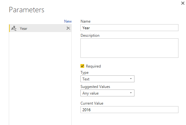
Parameters are ways to pass values to other queries. Normally for custom functions you need to use parameters. Click on Manage Parameters menu option in Query Editor, and select New Parameter.

There are different types of parameters you can use, but to keep it simple, create a parameter of type Text, with all default selections. set the Current Value to be 2016. and name it as Year.
After creating the Parameter you can see that in Queries pane with specific icon for parameter.
Now we can add a column in Table 0 with the value from this parameter. Click on Table 0, and from Add Column menu option, click on Add Custom Column.
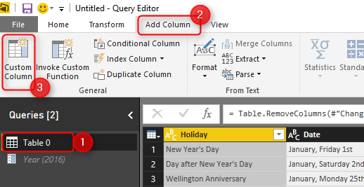
Name the Custom column as Year, and write the expression to be equal Year (remember names in Power Query are case sensitive)

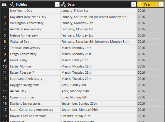
Now you can see year value added to the table. I have also changed its data type to be Text
Now that we have created Parameter we can use that parameter as an input to the query’s source URL as well.
One of the main benefits of Parameters is that you can use that in a URL. In our case, the URL which contains 2016 as the year, can be dynamic using this parameter. Also for converting a query to a custom function using parameters is one of the main steps. Let’s add Parameter in the source of this query then;
While Table 0 query is selected, in the list of Steps, click on Setting icon for Source step
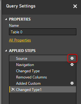
This will bring the very first step of the query where we get data from web and provided the URL. Not in the top section change the From Web window to Advanced.
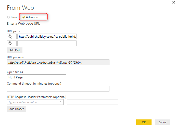
Advanced option gives you the ability to split the URL into portions. What we want to do is to put Text portions for beginning and end of string, and make the year part of it dynamic coming from URL. So Add another part, and put setting as below;
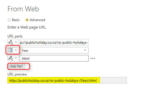
Configuration above means that in the first part of URL we put everything before 2016 which is:
http://publicholiday.co.nz/nz-public-holidays-
Second part of URL is coming from parameter, and we use Year parameter for that
third part of URL is the remaining part after the year which is:
.html
altogether these will make the URL highlighted above which instead of {Year} it will have 2016, or 2015 or other values.
Click on OK. You won’t see any changes yet, even if you click on the last step of this query, because we have used same year code as the parameter value. If you change the parameter value and refresh the query you will see changes, but we don’t want to do it in this way.
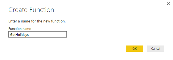
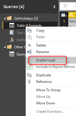
After using parameter in the source of query we can convert it to function. Right click on the Table 0 query and select Create Function.
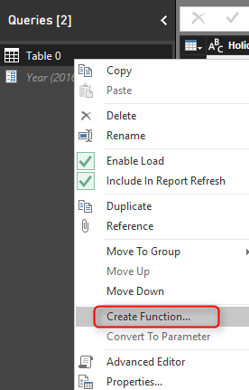
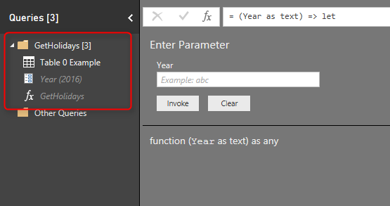
Name the function as GetHolidays and click on OK.
You will now see a group (folder) created with name of GetHolidays including 3 objects; main query (Table 0), Parameter (year), and function (GetHolidays).
The function itself marked with fx icon and that is the function we will use to call from other queries. However the main query and parameter are still necessary for making changes in the function. I will explain this part later.
All happened here is that there is a copy of the Table 0 query created as a function. and every time you call this function with an input parameter (which will be year value) this will give you the result (which is public holidays table for that year). Let’s now consume this table from another query, but before that let’s create a query that includes list of years.
Generators are a topic of its own and can’t be discussed in this post. All I can tell you for now is that Generators are functions that generate a list. This can be used for creating loop structure in Power Query. I’ll write about that in another post. For this example I want to create a list of numbers from 2015 for 5 years. So I’ll use List.Numbers generator function for that. In your Query Editor Window, create a New Source from Home tab, and choose Blank Query.
This will create a Query1 for you. Click on Query1 in Queries pane, and in the Formula bar type in below script:
= List.Numbers(2015,5)
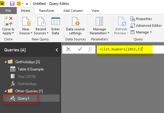
After entering the expression press Enter and you will see a list generated from 2015 for 5 numbers. That’s the work done by a generator function.
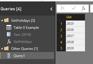
This is a List, and can be converted to Table simple from List Tools menu option.
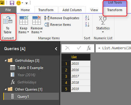
Convert this to Table with all default settings, and now you can a table with Column1 which is year value. Because the value is whole number I have changed it to Text as well (to match the data type of parameter).
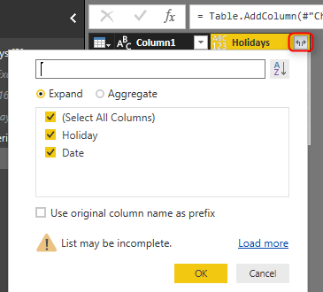
It is easy to consume a function in Query Editor from a table. Go to Add Columns, and click on Invoke Custom Function option.
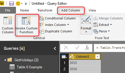
In the Invoke Custom Function window, choose the function (named GetHolidays), the input parameter is from the table column name Column1, and name the output column as Holidays.
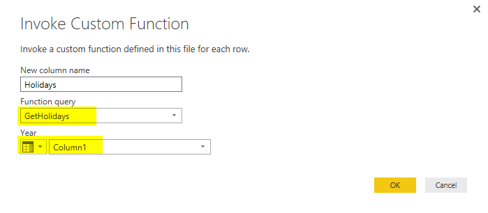
Now when you click on OK, you will see a new column added with a table in each cell. These tables are results of calling that function with the input parameter which is value of Column1 in each row. If you click on a blank area of a cell with Table hyperlink, you will see the table structure below it.
Interesting, isn’t it? It was so easy. All done from GUI, not a single line of code to run this function or pass parameters, things made easy with custom functions.
If you want to make modifications in function, you can simply modify the main query (which is Table 0 Example). For example let’s create a full date format from that query in this way;
Click on Table 0 Example query and split the Date column with delimiter Comma, you will end up having a column now for Month values and another for Day (Note that I have renamed this columns respectively);

Now if you go back to Query1, you will see changes in the results table immediately.
Changes are fine as long as you don’t want to edit the M script of the function, if you want to do so, then the function definition and the query definition split apart. and you will get below message:
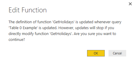
It is alright to make changes in the advanced Editor of the source query, and then the function will be updated based on that, but if you want to change the function itself, then the query will be separated.
If you have read my blog post about Enable Load in Power Query, you already know that queries that is not used in the model should not be loaded. By Default the source query (in this example named as Table 0 Example) will be loaded into the model. This means one extra table, and consuming more memory. So remember to uncheck the Enable Load for this query;
Custom Functions that uses parameterized URLs (like this example) cannot be scheduled to refresh in Power BI. That’s a big limitation which I hope be lifted very quickly.
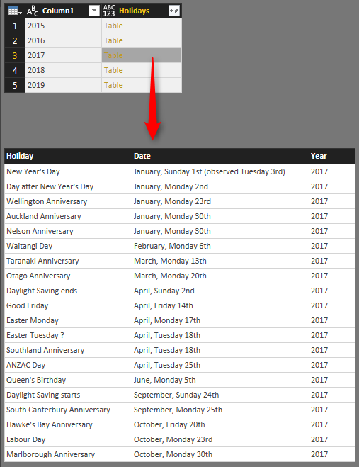
I have done some other changes, and changed the data type to Date format. Now the final query which is expanded table from all underlying queries include all public holidays. I’ll leave that part to you to continue and build rest of the example. For that functionality you need to use Expand;
and here is the final result;
In this post you have learned how easy is to create a custom function from a query, all from graphical interface. You have seen that I haven’t wrote any single line of code to do it. and all happened through GUI. You have seen that you can change definition of function simply by changing the source query. and you also have seen how easy is to call/consume a function from another query. This method can be used a lot in real world Power Query scenarios.
Published Date : November 29, 2016
Power BI reports are highly interactive, If you select a column in a column chart other charts will be highlighted. Selecting a slicer value will filter all other visuals in the report. This interactivity can be controlled easily. Despite the fact that this feature has been released in early phases of Power BI, there are still many clients who don’t know how to control the interaction of visuals in Power BI report. In this post you will learn how easy and useful is controlling the interaction between Power BI visual elements. If you want to learn more about Power BI; read Power BI online book from Rookie to Rock Star.
Power BI visuals are interacting with each other. Selecting an item in a visual will effect on the display of another chart. sometimes this effect is highlighting items in another chart, and sometimes filtering values in the other visual. By default all visuals in a report page are interactive with each other, however this interactivity can be controlled and modified. This functionality is very easy to change, but because there are still many people not aware of it, I ended up writing this post about it.
Let’s start by building a very simple report from AdventureWorksDW database with few visuals. For this example bring these tables into your model: FactInternetSales, DimCustomer, DimProductCategory, DimProductSubcategory, DimProduct.
Build a sample report with a Bar Chart on EnglishEducation (from DimCustomer) as Axis, and SalesAmount (from FactInternetSales) as Values. Build a Column Chart with EnglishOccupation (from DimCustomer) as Axis, and SalesAmount (from FactInternetSales) as Values. Build a Card visual with total of SalesAmount. Build a Pie Chart with NumberCarsOwned (from DimCustomer) as Legend and SalesAmount as the value. Another Pie Chart with EnglishProductCategoryName (from DimProductCategory) as Legend, and OrderQuantity (from FactInternetSales) as Value. Also create two filters; one with Gender (from DimCustomer), and another with TotalChildren (from DimCustomer). here is a view of the report;
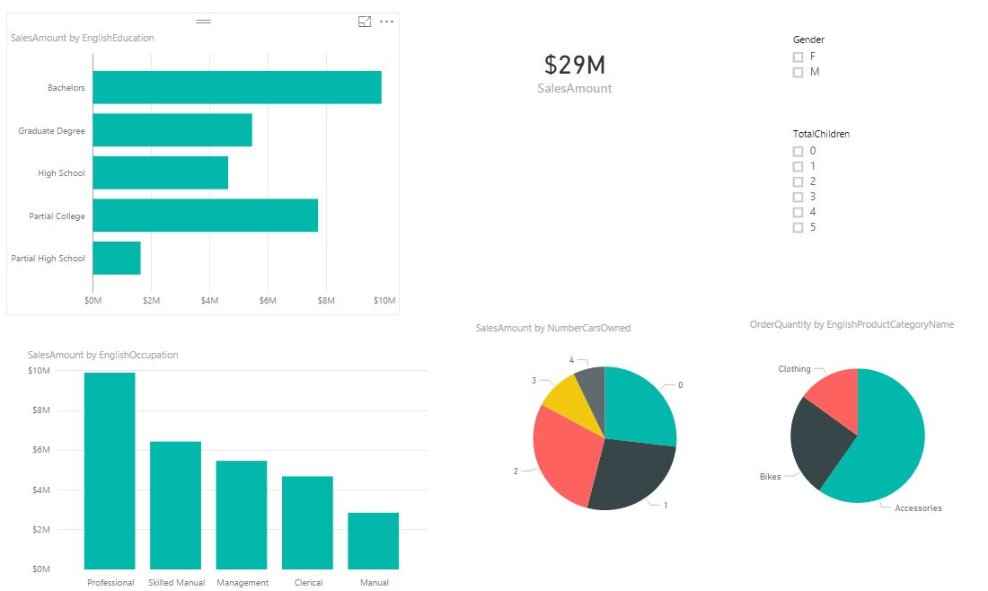
As I mentioned earlier, All visuals in Power BI report page are interactive with each other. If you click on a chart other charts will be highlighted:

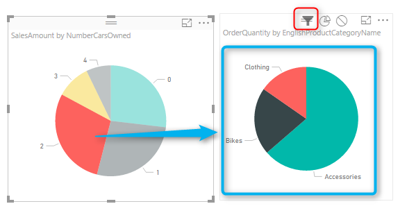
In the sample report above NumberCarsOwned 2 is selected in the Pie Chart, and related values to it highlighted in column chart and bar chart respectively. Also the total Sales Amount in the card visual changed from $29 million to $8 million. However if you look at the other Pie Chart (mentioned with red area in screenshot above) the Pie chart for product category and quantities are highlighted, but it is not easy to find out exactly which one is bigger (is Clothing bigger or Bikes?). Despite the nature of Pie Chart which makes things hard to visualize. There are still more things we can do here to make it more readable. If instead of highlighting this pie chart it was filtered (like the card visual) we would have better insight out of this visual.
To change the interaction of a chart with other charts, simply select the main chart (the chart that you want to control effect of that on other charts), and then from Visual Tools menu, under Format, click on Edit Interactions.

You will now see all other visuals in the page with two or three buttons on the top right hand side corner of each. These are controls of interaction.
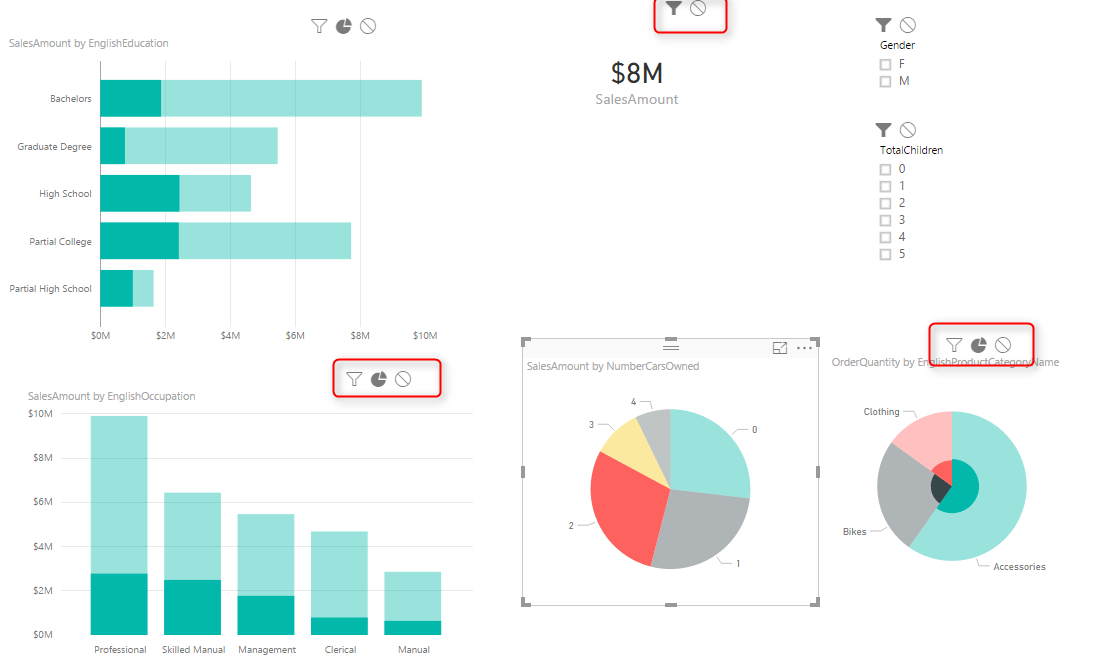
The darker color in this icon set shows which interaction will apply. For example for the interaction from NumberCarsOwned Pie Chart and the SalesAmount Card Visual the selection is Filter. but for the ProductCategory Pie Chart is highlighting (the middle option). Now change this option to be Filter. and you will see immediately that second pie chart (product category) shows a filtered view of the selected item in NumberCarsOwned pie chart. Actually the first pie chart is acting as a filter for the second pie chart.
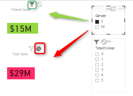
This behavior also can be set to None. For example let’s say you want to have a total of sales amount regardless of gender selection, and then a total of sales amount for the selected gender in slicer. To do this copy the SalesAmount Card Visual, and then click on Gender Slicer. click on Edit Interaction, and set one of the card visuals to None, the other one as default with Filter.
As you can see you can set interaction between each two individual elements in a page. This is extremely helpful when you are expecting selecting an item to have different impact on different visualization. Hope this simple tip helps to make your visualization better with Power BI.
Published Date : November 22, 2016
One of the sample scenarios that DAX can be used as a calculation engine is customer retention. In the area of customer retention businesses might be interested to see who there lost customers or new customers are in the specific period. Obviously this can be calculated in the Power Query or in the data source level, however if we want to keep the period dynamic then DAX is the great asset to do it. In this post I’ll explain how you can write a simple DAX calculation to find new customers and lost customers over a dynamic period of time in Power BI. If you are interested to learn more about Power BI read the Power BI online book; from Rookie to Rock Star.
Before start let’s define terms that we use here. There might be different definitions for Lost or New Customers, the definition that I use is the very simple definition that I have seen some business use to easily measure their customer retention.
New Customer(s): Any customer who purchased any product in the last specified period of time considering the fact that the customer didn’t purchased anything from this business before this period.
Lost Customer(s): Any customer who haven’t purchased any product in the last specified period of time considering the fact that he/she previously purchased from this business.
The method explained below through an example.
For running this example you need to have AdventureWorksDW database or the Excel version of it.
In the AdventureWorksDW, we want to find out who our new customers and also lost customers are. We want to have the flexibility to select the period (that determines if customer is lost or new) in the slicer. We need these tables in AdventureWorksDW; FactInternetSales, DimDate, DimCustomer, and DimProduct.
Let’s start by getting data from AdventureWorksDW SQL Server database. Tables that we need for this model are: FactInternetSales, DimDate, DimCustomer, and DimProduct. You don’t need to apply any Power Query transformation. Just load the tables in the Power BI. and check the relationship to be as below. Note that relationship between DimDate and FactInternetSales is only one active relationship based on OrderDateKey (remove other relationships between these two tables).
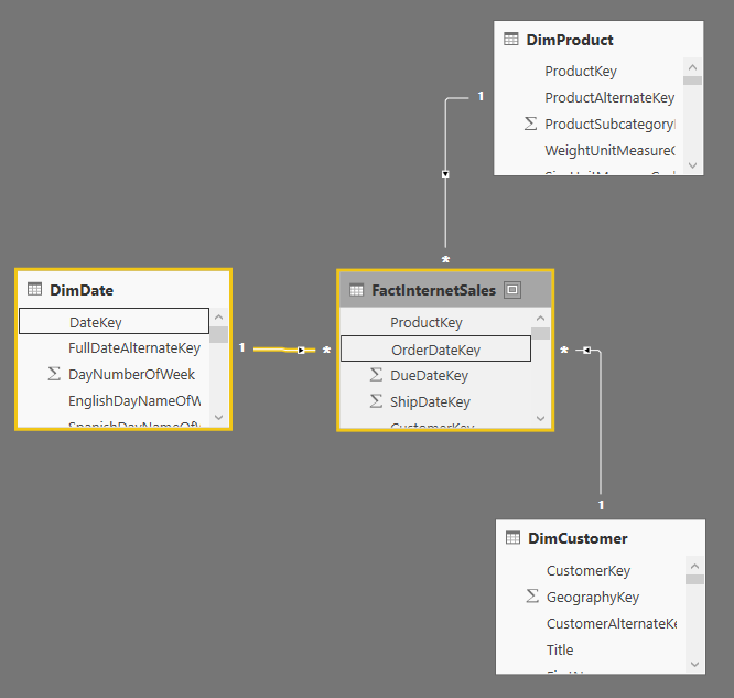
Also we need to have a Period Slicer. This is for being able to dynamically select the period (for example last 30 days, or last 365 days). You can create this table any where, in SQL Server db. in Power Query, in Excel…. I have created that in my model itself through Enter Data. Here is how the table looks like;
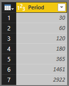
Table Name is Period, and the column name is also Period.
What I do for the calculation is to calculate the total revenue from each customer first. This is the total revenue regardless of period. Means sum of SalesAmount for everything that this customer bought for all times (I call this Total Revenue). Then I create another measure to calculate sum of SalesAmount only for the selected period (in Days), Let’s call this Last Period Revenue. Once we have these calculations finding new or lost costumers are easy as below;
Lost Customer(s): Customers that their Total Revenue is greater than zero, but their Last Period Revenue is not.
New Customer(s): Customers that their Total Revenue is equal to their Last Period Revenue, and greater than zero.
The reason for greater than zero condition is that in the database we might have some customer records that haven’t purchased anything at all (seems odd, but we have to consider it, as there might be some exceptions in some business). I do all of steps one by one in a separate measure, this is just to give you an understanding of the process. Obviously these all can be done in one measure.
To start the very first thing is to identify the selected value in the slicer through measure.
First things first is to identify what item is selected in the Period slicer. DAX doesn’t understand the SELECTED item, however it understand the CONTEXT in which the DAX expression evaluates. This means; if I select one or more values in the slicer, DAX expression will execute on top of that selection. This selection is the filter context of DAX expression. That’s simple. Now for this particular slicer we want user to always select one item, so it is also good to check if multiple items is selected or not. So let’s create the measure (You can create a measure in the Data Tab, under Modeling, New Measure), named Selected Period under Period table with calculation below (Note that this should be a measure, not calculated column);
Selected Period = IF(COUNTROWS(Period)=1,
                                       MAX(Period[Period]),
									   BLANK()
					)
Expression above simply just check if number of records under the selected context (which will be selected slicer items) is one, then it will fetch the MAX of period. Why maximum when it is only one row? because DAX always works with a set of rows. even though we know it will be one row after passing this condition, DAX still works with a set of rows. the set of rows might have one or more rows. when it has only one row, we can use MIN or MAX or things like that to fetch it as a single value from the set of rows. And finally when multiple items are selected it will return blank.
Let’s see how the measure works in action;
Create a sample report with going to Report tab, and create a slicer with Period. Also add a Card visualization with Selected Period measure (created above) as the value. Now if you select items in the slicer you will see what item is selected in the card visualization.
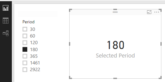
This Selected Period measure in the calculation of Sales Amount for selected period. Which we will do it in next steps.
There are multiple ways of calculating the total revenue for each customer. I use a method that use a new Measure. create a new measure in Data tab, under DimCustomer and name it Total Revenue. write DAX expression below for it;
Total Revenue = SUMX(RELATEDTABLE(FactInternetSales),FactInternetSales[SalesAmount])
This DAX expression uses SumX function which will calculate sum of an expression (FactInternetSales[SalesAmount]) on a filtered table. The filtered table in this example is RelatedTable(FactInternetSales). RelatedTable will go through each Customer record in DimCustomer, and considering the existing relationship between DimCustomer and FactInternetSales in the model (As showed in the diagram earlier in this post), it will generate a sub set of FactInternetSales for each customer, which is only the subset that has this customerKey in it. So the result of sum of SalesAmount for this subset will be total revenue for each customer.
Let’s see how this works in action;
Go back to the Report page, and create a Table with Full Name from DimCustomer, and also the new measure Total Revenue
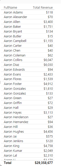
In front of each customer you can see the total revenue for that customer. Now let’s calculate selected period’s revenue.
Let’s call this Last Period Revenue. In this last period revenue all we want to calculate is the total sales for each customer in the period of last X days, where X is coming from the selection of period slicer. We can use few functions to help along the way. Here is the measure with full DAX expression. I’ll explain details after;
Last Period Revenue = CALCULATE(
                               SUM(FactInternetSales[SalesAmount]),
							   DATESBETWEEN(
							                DimDate[FullDateAlternateKey],
							                DATEADD(LASTDATE(DimDate[FullDateAlternateKey]),-1*[Selected Period],DAY),
							                LASTDATE(DimDate[FullDateAlternateKey])
							                )
							   )
Let’s Start from Calculate; Calculation function is a simple function in terms of the basics of how it works, and it is also the motherhood of all functions in DAX, there are heaps of calculations you can do with this function. How this works? Calculate simply calculates an expression (first parameter) on a set of filters (second parameter, third parameter….). In the example above the expression is Sum(FactInternetSales[SalesAmount]), and the filter is all the parameters after that. In above expression you can see that we have only one filter which is DatesBetween. So calculate simply resolve sum of SalesAmount for the subset of data that comes out of DatesBetween function. Let’s see what DatesBetween Does;
DatesBetween is self explanatory function. It will return a subset of data for the dates between start date and end date! It has three parameters; date field, start date, and end date;
DATESBETWEEN(
							                DimDate[FullDateAlternateKey],
							                DATEADD(LASTDATE(DimDate[FullDateAlternateKey]),-1*[Selected Period],DAY),
							                LASTDATE(DimDate[FullDateAlternateKey])
							                )
In example above end date is LASTDATE(DimDate[FullDateAlternateKey]). This means the maximum date that we have considering what filter context we are in. The main important thing is calculating the start date. Start date is the last date minus selected period. For doing this calculation I used DATEADD function which reduce number of days with (-1*[Selected Period]) in the highlighted line above in the expression.
As a result this whole DAX expression returns total sales amount only for the selected period. let’s see how it works in the report;
Go back to the report and add the new measure to table.
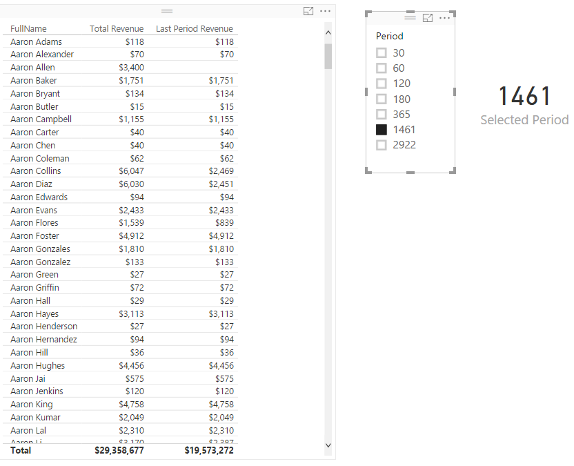
Last Period Revenue by default when no period is selected in the slicer will be blank. When you select values, this will bring total revenue for that number of days from the last date in DimDate. In my sample data set I can only start something if I select last 1461 days which is last 4 years. In different version of AdventureWorksDW you might get different results because their data is different. Now let’s find what customers are lost.
What table above says is that for a selected period, some customers have not purchased anything. For example Aaron Allen has the total revenue of #3,400 but in the last 1461 days he didn’t purchased anything. So what this says is that this customer is lost in the selected period! So Lost Customer(s) calculation is as simple as this:
Lost Customers = IF([Total Revenue]>0 && [Last Period Revenue]<=0
                     ,1
					 ,0)
This is a simple IF expression which says if customer has a Total Revenue greater than zero, and did not purchased anything in the last period (Last Period Revenue is less than or equal to zero), then this customer is lost.
New customers on the other hand are customers who only purchased in the last period. This means their Total Revenue is equal to Last Period Revenue, and greater than zero. Here is the calculation;
New Customers = IF([Total Revenue]>0 && [Last Period Revenue]=[Total Revenue]
                     ,1
					 ,0)
Let’s see the final result in the report; Add Lost Customers and New Customers to the table and you will see the result;
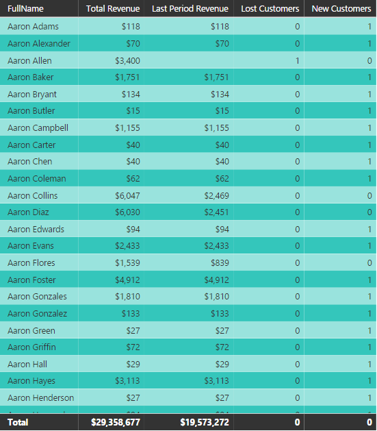
As you can see our formula successfully determined that Aaron Allen is lost in the last 1461 days period (if you increase or decrease the period you will see different result). Also those customers which their total revenue is equal to last period revenue are considered as New Customers (that’s why you see so many new customers in above table). Note that a customer might not fall in any of these categories. for example;
Aaron Li and Aaron Nelson are neither lost or new customers. They are customers who purchased before this period, and still purchased in the last period as well.
Bringing Other Dimensions
These measures also works if you bring another table which is related to other tables in the model as a new dimension. For example you can bring Product as another slicer and then you will see product by product which customers are lost and which are new customers. Hope this calculations helps you to expand customer retention in your Power BI Model.