Published Date : July 3, 2017
I am so excited about using Plotly packages in Power BI.
So What is Plotly: is an R package for creating interactive web-based graphs via the open source JavaScript graphing library :https://plot.ly/r/getting-started/
this feature has been added recently and had been announce by Christian Christian Berg in Data insight summit 2017.
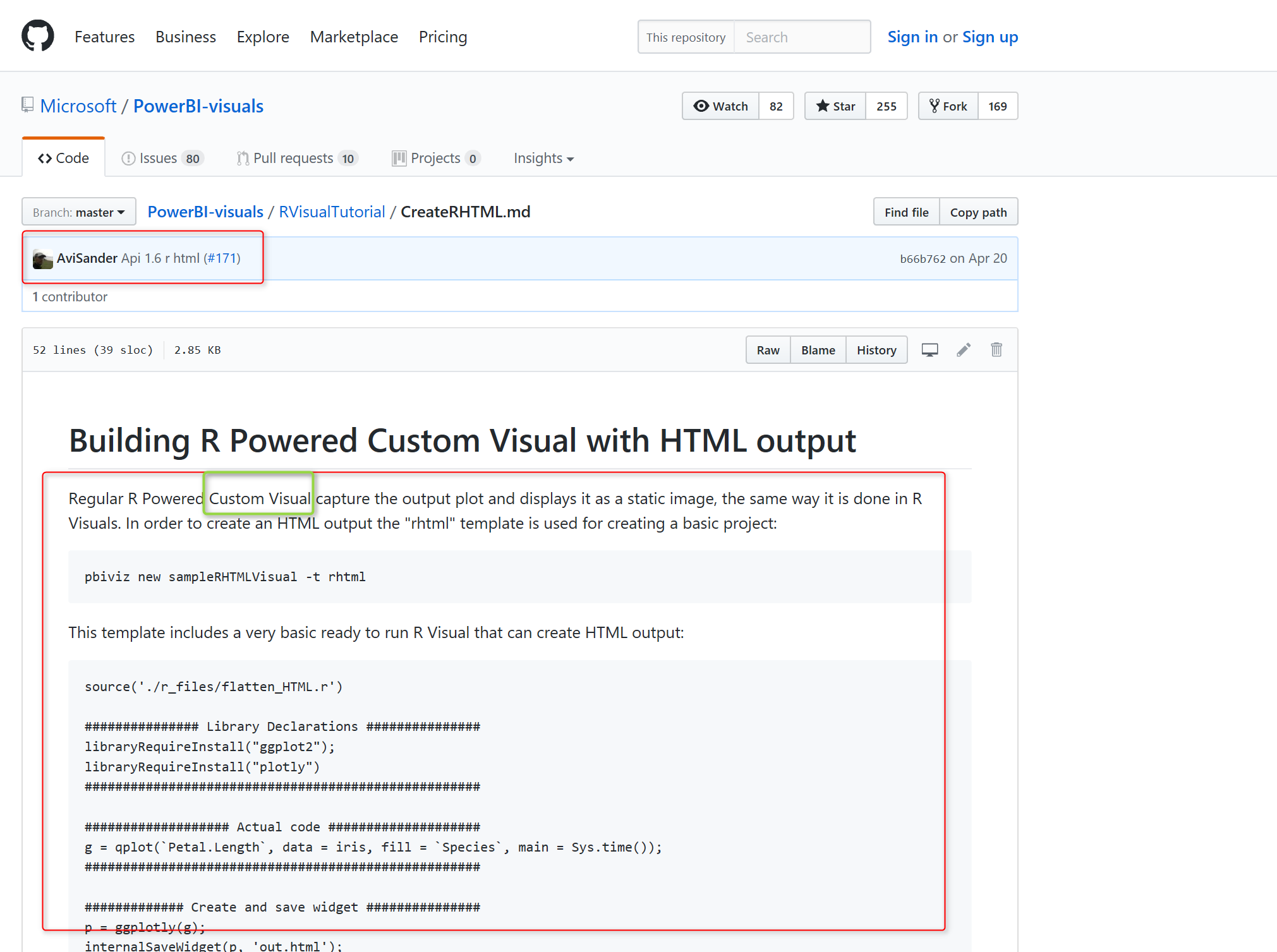
I started to search about it and I found an article by Avi Sander (https://github.com/Microsoft/PowerBI-visuals/blob/master/RVisualTutorial/CreateRHTML.md) in GitHub.
from the article I understand that I should create a custom Visual with R packages but How?. I asked My dear friends Rudiger Hein about it, and He sent me a nice video created by Stephanie Locke and Now I am going to have some series of posts on how to have more nice charts using Plotly in Power BI!
To have Plotly inside Power BI you should create a custom visual from your R codes.
in this post I am going to show how to set up and create custom R visual inside Power BI, and in the next posts I will show some other nice charts!
first you should download NodeJS 4.0+ Required (5.0 recommended) from https://nodejs.org/
Then in command Prompt write the below codes to install it
npm install -g powerbi-visuals-tools
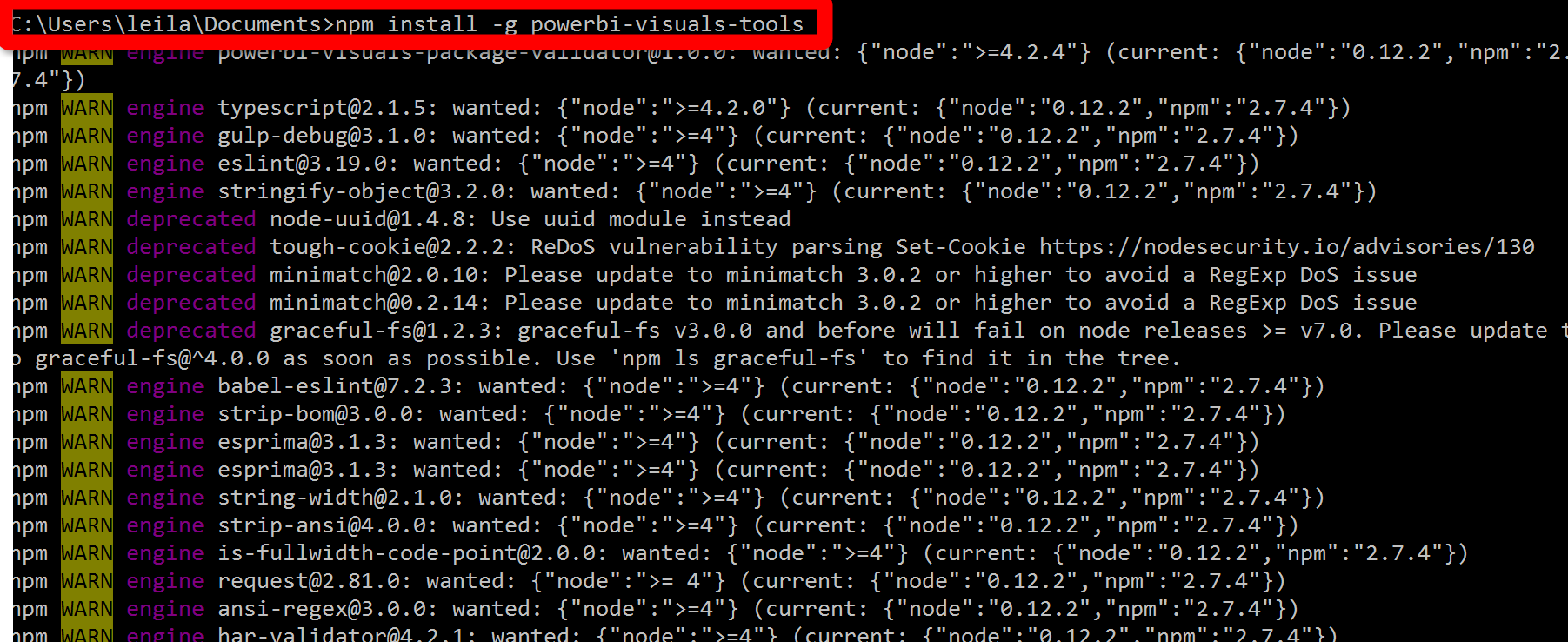
you should see above message after writing “npm install -g powerbi-visuals-tools” in command prompt.
To confirm it was installed correctly you can run the command without any parameters which should display the help screen.
pbiviz
then you should see the information about Power BI Custom Visual Tools
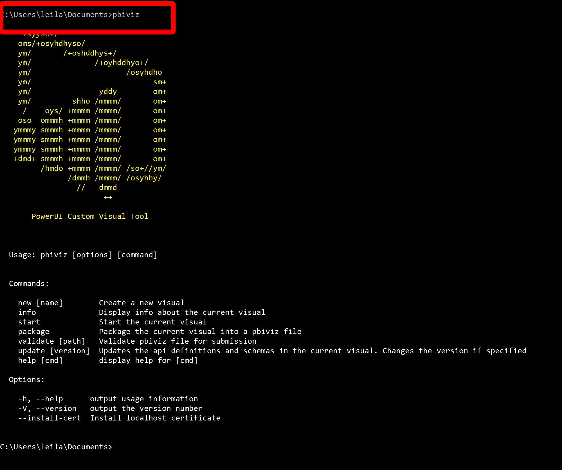
Yes, now you have the pbiviz in your machine
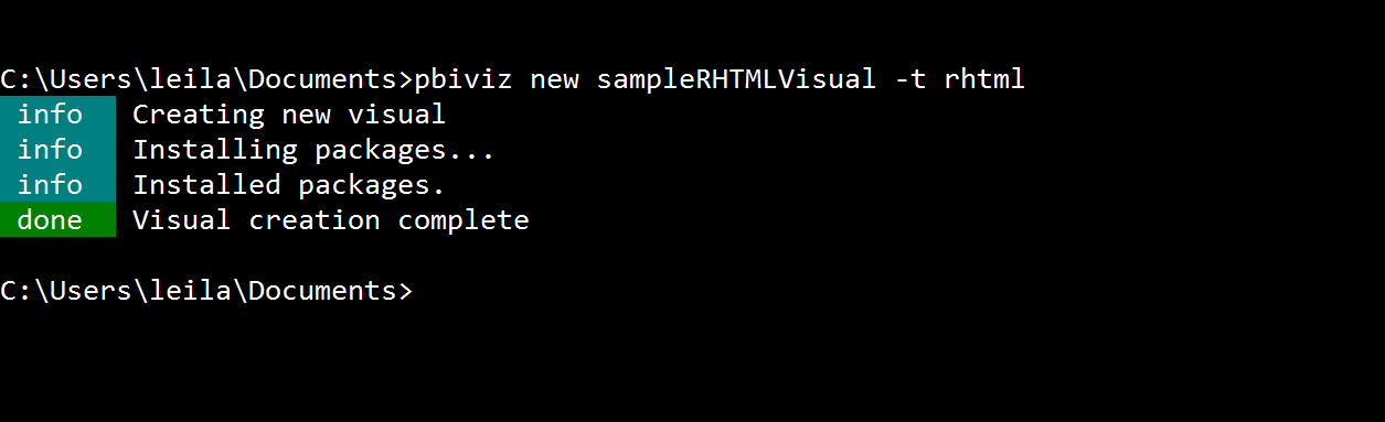
Now I am going to follow the steps proposed by Avi Sander. we are going to create a “rhtml” template.
So in command prompt please type
pbiviz new sampleRHTMLVisual -t rhtml
Then now you should see that a new custom visual is installing and a new package has been created, but what is inside the packages
I check the folder that this packages has been create

this is a folder that provides a templatefor me to create other R custom visuals, please check the file “script.r” inside the folder.
source('./r_files/flatten_HTML.r')

############### Library Declarations ###############
libraryRequireInstall("ggplot2");
libraryRequireInstall("plotly")
####################################################

################### Actual code ####################
g = qplot(`Petal.Length`, data = iris, fill = `Species`, main = Sys.time());
####################################################

############# Create and save widget ###############
p = ggplotly(g);
internalSaveWidget(p, 'out.html');
####################################################
Now as you can see in above code, we need library “Plotly and ggplot2 to draw a simple ggplot2 chart with interactive of Plotly.
the data set has been hard coded here for “iris” that is an open source dataset in R. the plot get the data from iris data set and shows the Petal.Lengh and the Species there. then we use the ggplotly function to show the data.
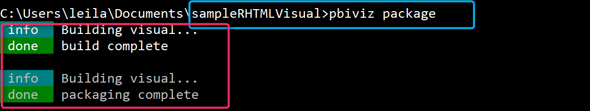
so we have a r scripts, now I am going to create a package from this first, and then I will write my own codes to create different charts.
so I back to command prompt and I type just “pbiviz package” in the folder.
now I open a new Power BI project and as youcan see in the below video, you able to work with it now!
https://www.youtube.com/watch?v=uLikWluqg54&feature=youtu.be
So exciting!
Now I am going to change the code to have my own R scripts that able to work with the code
I just change the code a bit as below:
source('./r_files/flatten_HTML.r')

############### Library Declarations ###############
libraryRequireInstall("ggplot2");
libraryRequireInstall("plotly")
####################################################

################### Actual code ####################
g = qplot(Values$Data, data = Values, fill = Values$Type, main = Sys.time());
####################################################

############# Create and save widget ###############
p = ggplotly(g);
internalSaveWidget(p, 'out.html');
as you can see I change the data field as value, and also thefill with Type, so in any code if I have a Data and type column (can be created via custom column in Power bi) Icna show the below codes
g = qplot(Values$Data, data = Values, fill = Values$Type, main = Sys.time());
so I just save the r script file, then I run the package again via
“pbiviz package” in command prompt, then I add the chart to power bi and now I have the chart in my power bi visual!
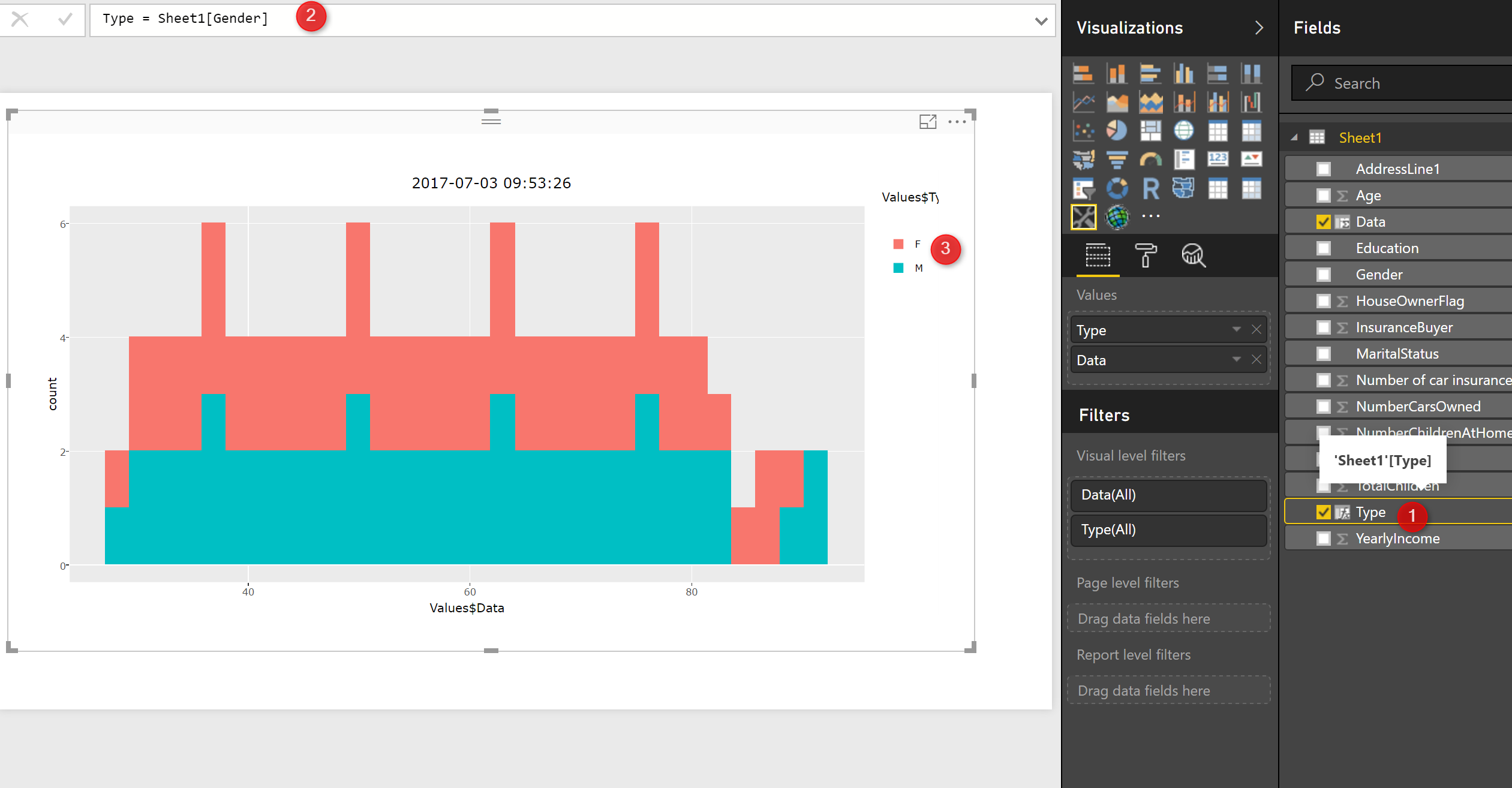
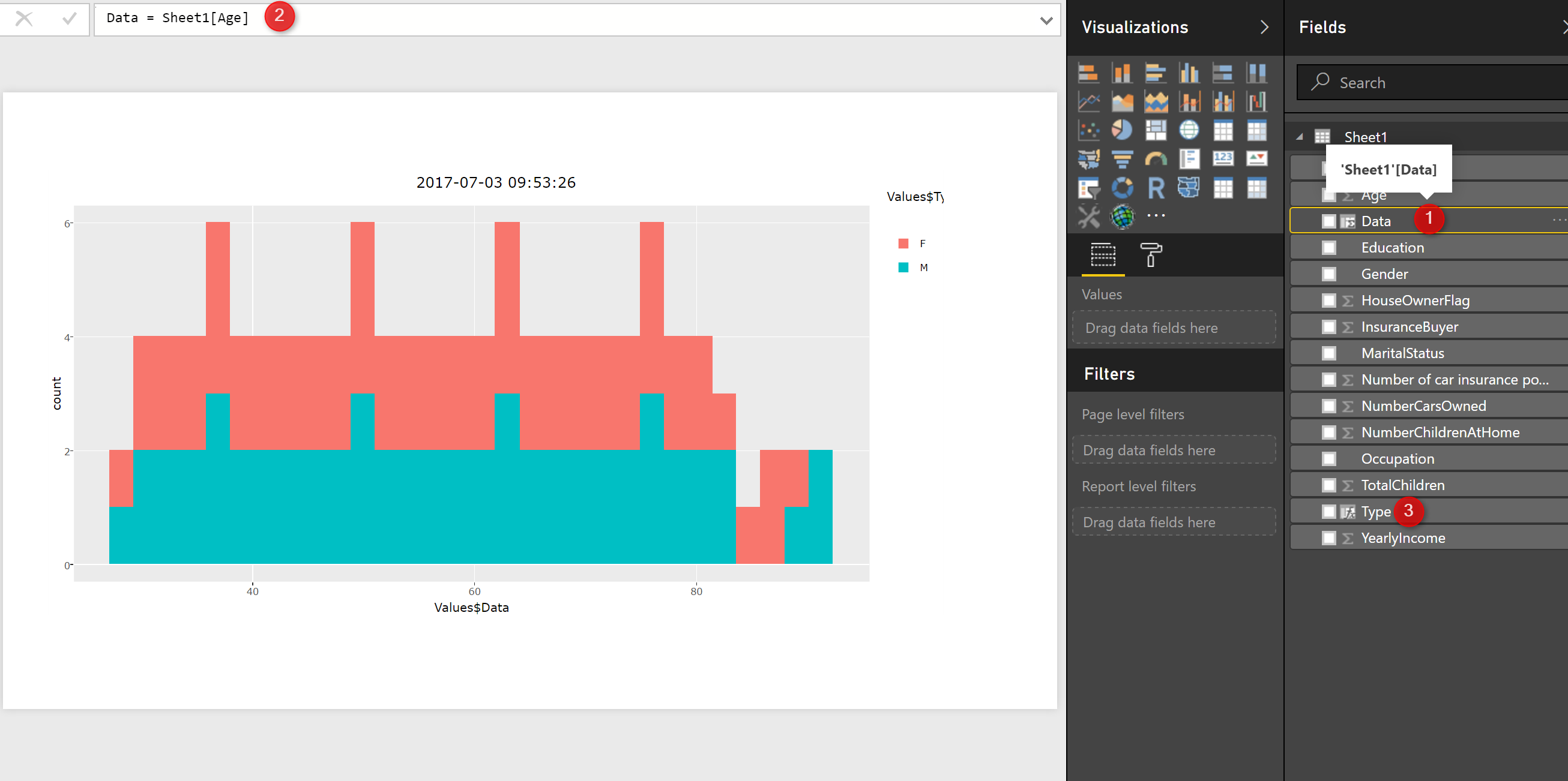
after importing the custom visual, now I am going to show the gender and age of people from my insurance data.
so I have to create a custom column with the name Data for age of people and another custom column with name Type for people age. as you can see in the below picture I created a column name Type that I put the gender for it, then I created another custom column for Age of people and I name it Data (in next picture)
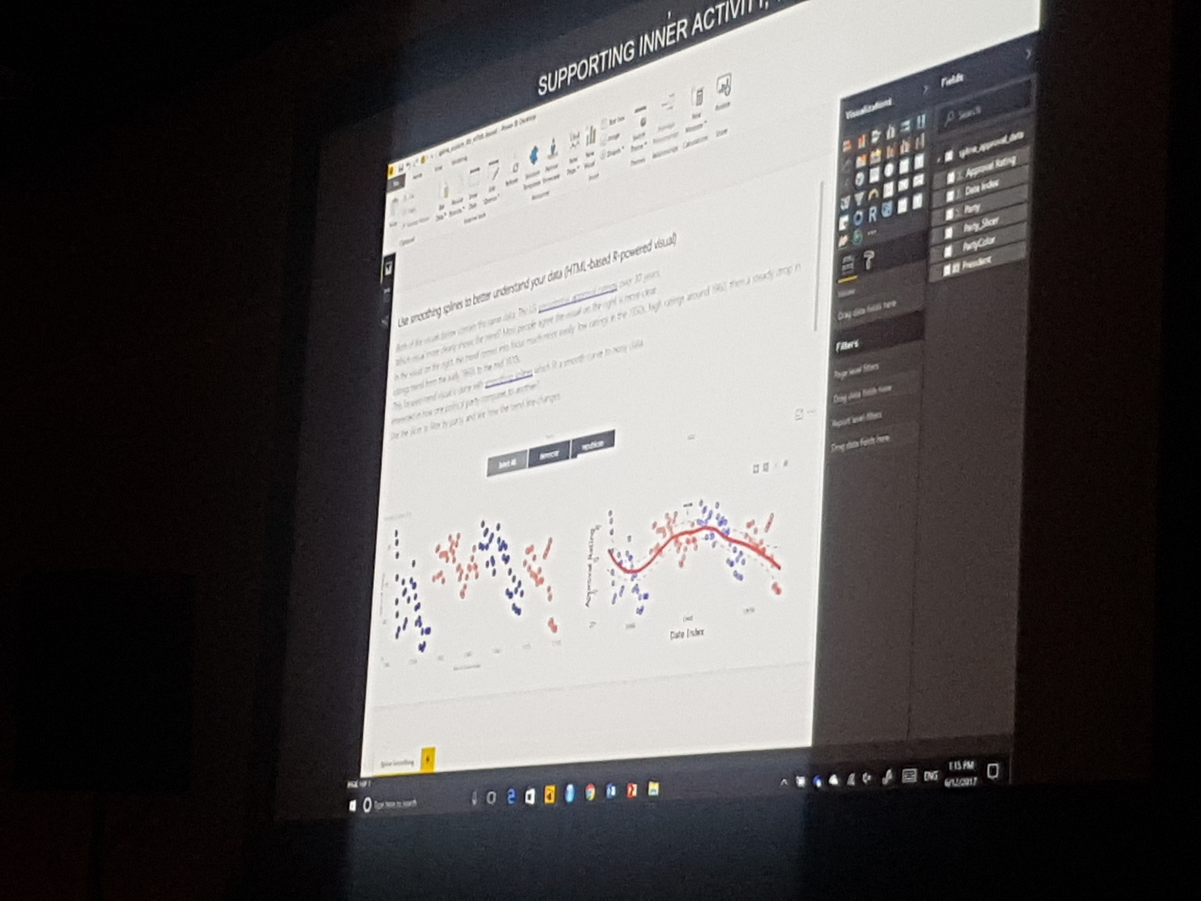
Now I have a chart that it is interactive and you able to see the details (see below video)
https://www.youtube.com/watch?v=wkRq6NiCf1g&feature=youtu.be
in next posts I will show some exciting chart using Plotly in Power BI
References:
https://www.npmjs.com/package/powerbi-visuals-tools
https://github.com/Microsoft/PowerBI-visuals/blob/master/RVisualTutorial/CreateRHTML.md
https://www.youtube.com/watch?v=_zd-UGfD2Os
Published Date : June 27, 2017
In the last post, I have explained the main concepts behind the neural network,
In this post I will show how to apply neural network in a scenario in R and how to see the results and hidden layers in a plot.
For this post I got some great example from [1].
Concert has been use in many different structure such as bridge, apartment, roadways and so on.
For the safety the strength of the concrete is matter. the concrete strength depends on the material that have been used to create it such as :Cement, Slag, Ash, water, and so forth.

imaging that we have a dataset as below, which shows the ingredient of concrete.

we are going to predict the concrete strength using neural network. neural network can be used for predict a value or class, or it can be used for predicting multiple items. In this example, we are going to predict a value, that is concrete strength.
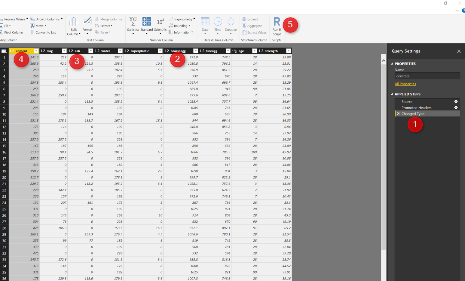
I have loaded the data in power bi first, and in “Query Editor” I am going to write some R codes. First we need to do some data transformations. As you can see in the below picture number 2,3 and 4,data is not in a same scale, we need to do some data normalization before applying any machine learning. I am going to write a code for that (Already explained the normalization in post KNN). So to write some R codes, I just click on the R transformation component (number 5).
I have used the below codes to normalized the dataset.
normalize <- function(x) {
    return((x - min(x)) / (max(x) - min(x)))
}

concrete_norm <- as.data.frame(lapply(dataset, normalize))
The same as any predictive model first we should provide some set of data for training and the other for testing as below.
concrete_train <- concrete_norm[1:773,]
concrete_test <- concrete_norm[774:1030,]
Next, I am going to call a package for Neural network that has been used a lot, name as “neuralnet”. There are other packages for this purpose. I first install it using intall.packages command in my Rstudio.
library("neuralnet")
	concrete_model <- neuralnet(strength ~ cement + slag
	+ ash + water + superplastic + coarseagg + fineagg + age,
	data = concrete_train)
This package has a function name (neuralnet) that create a model.
next, I am going to run the model against the training dataset for all 8 attributes as below
model_results <- compute(concrete_model, concrete_test[1:8])
predicted_strength <- model_results$net.result
finally I create an output data frame dataset to show the result in Power BI
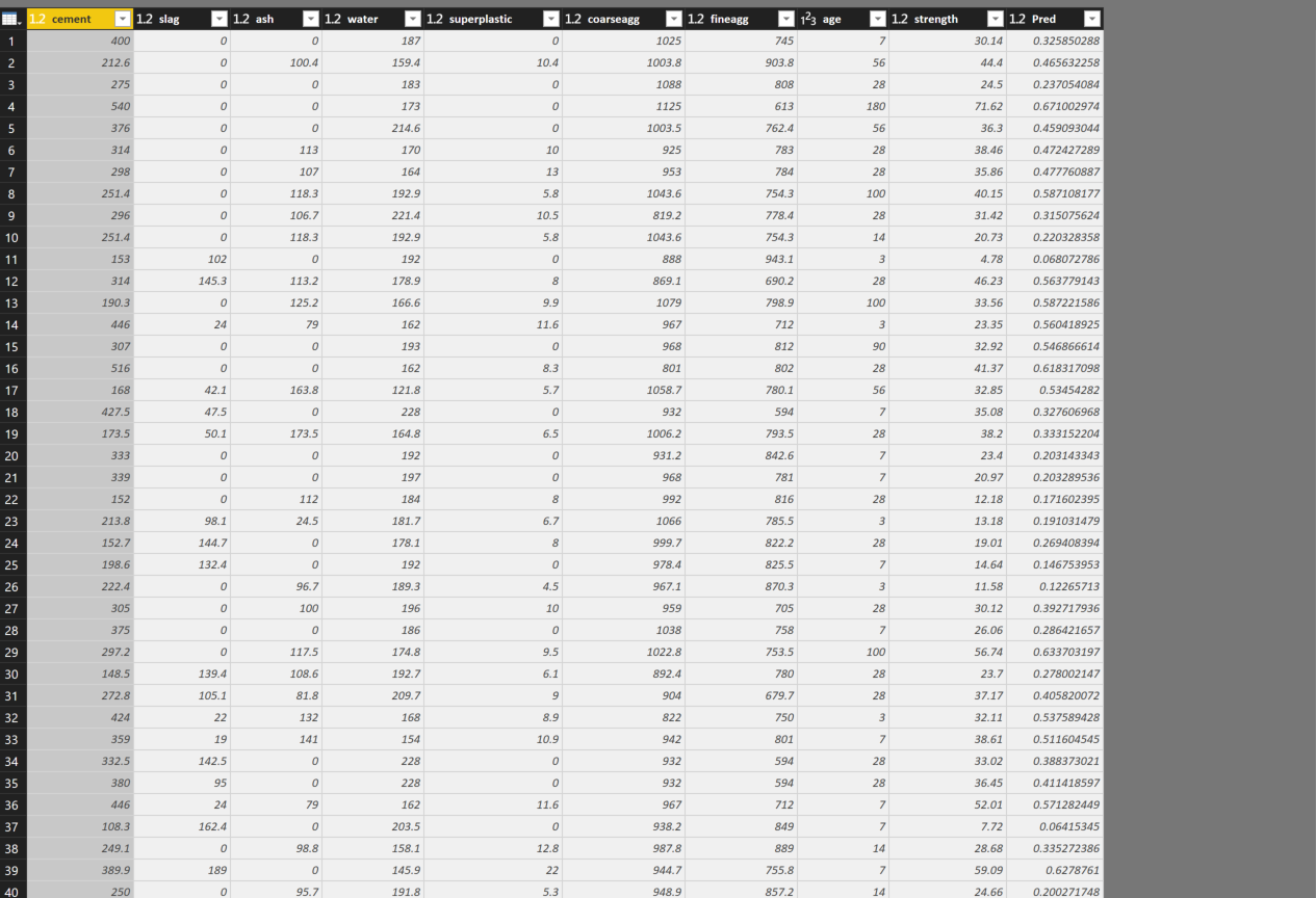
output<-dataset[774:1030,]
output$Pred<-predicted_strength
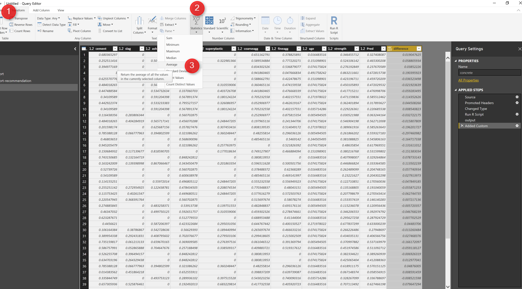
The output has been shown in the below picture. column 9 (strength) shows the real concrete strength, while the column 10 (pred) shows the prediction from neural net.
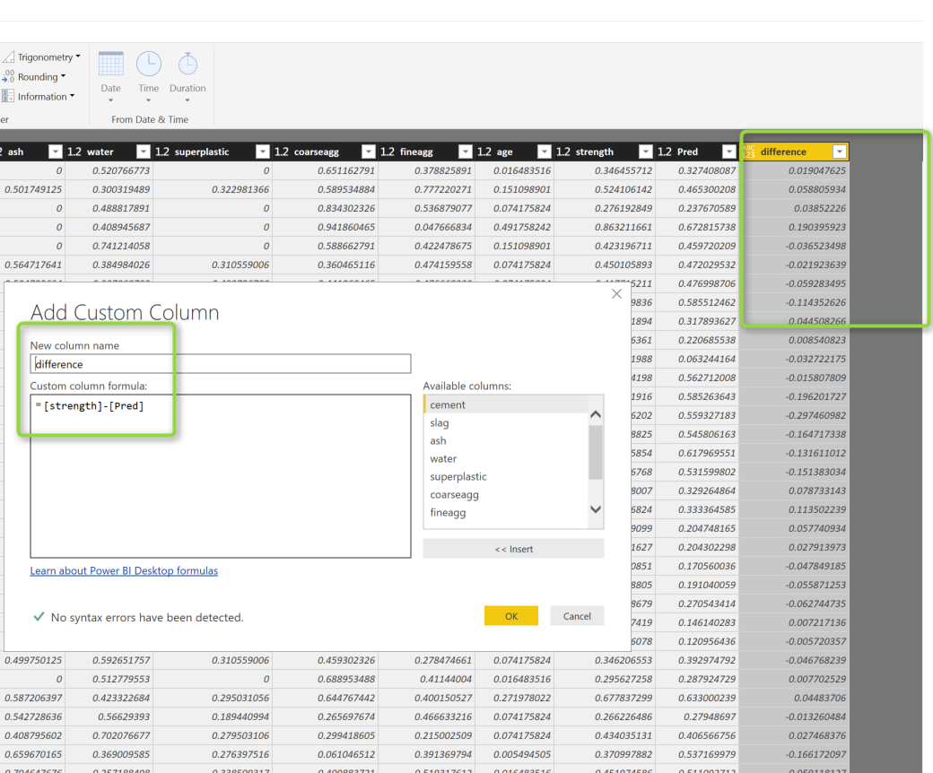
I created a custom column to see the differences between predicted and the orinal value
as you see in below picture:
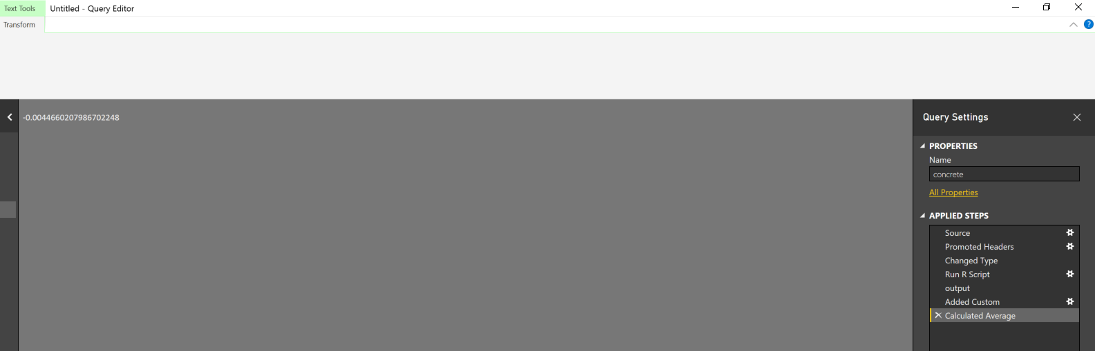
the differences are not that much, and if you just go to transform (number 1 in the below picture) and then choose the Average (number 2 and 3)
you will see the difference is not that much in average=-0.0044
which shows the prediction is good
However, you may interested to see the plot in visualization and see the hidden nodes and other information like weights.
so I am going to report area and just copy and paste the code I run for the neural network
normalize <- function(x) {
    return((x - min(x)) / (max(x) - min(x)))
}

concrete_norm <- as.data.frame(lapply(dataset, normalize))
summary(concrete_norm$strength)
concrete_train <- concrete_norm[1:773,]
concrete_test <- concrete_norm[774:1030,]
library("neuralnet")
	concrete_model <- neuralnet(strength ~ cement + slag
	+ ash + water + superplastic + coarseagg + fineagg + age,
	data = concrete_train)
just I add plot to show the model
plot(concrete_model)
the output will be like :
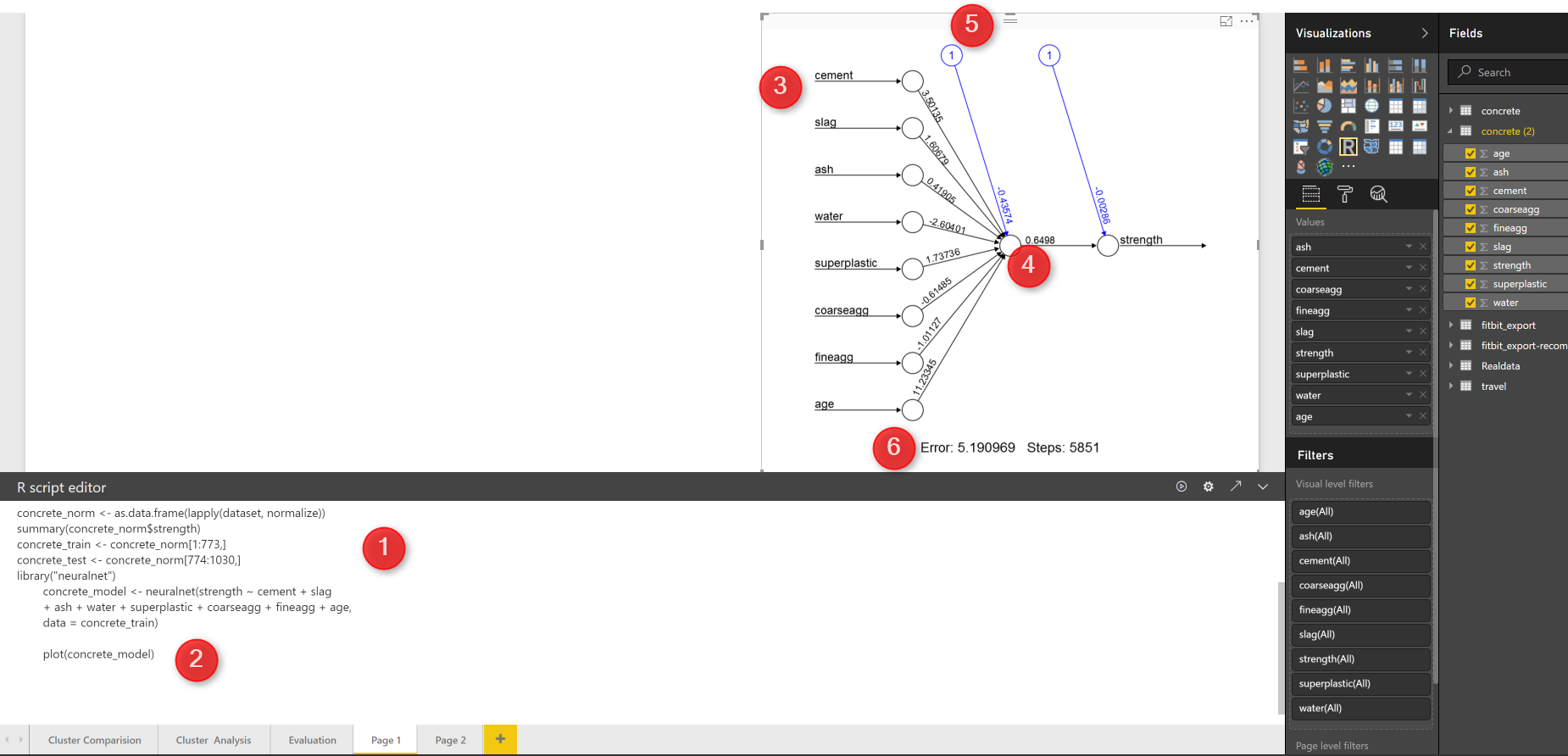
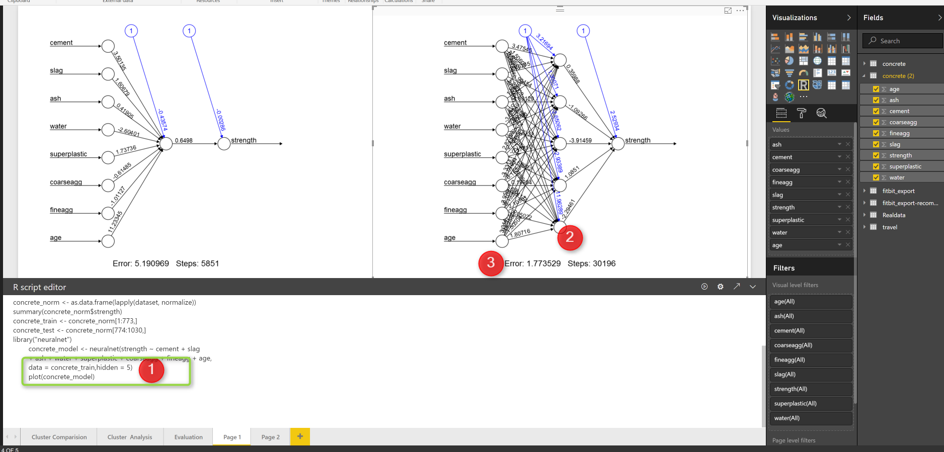
as you can see in the above picture, in number 1, I just copy and past the code (I change the dataset name). then I simply use the plot (number 2) to show the neural network.
you see the net work structure in visualization section. The number 3 show the input that we consider to predict the strength of the concrete. number 5 is a intercept or biased number. number 4 is the strength weight. and in number 6 at the bottom of the page you will the error and how many steps has gone to reach. this is a very simple network, just one hidden node, lets add some hidden node to this model just by changing the code as below :
concrete_model <- neuralnet(strength ~ cement + slag
	+ ash + water + superplastic + coarseagg + fineagg + age,
	data = concrete_train,hidden = 5)
The only changes is to add parameter “Hidden” to the neural net function (number 1). then just run the code and you will see another network that has 5 different hidden node. and if you look at the error, you will see it decrease so much! so always having some more hidden layer can be helpful but not that much, I could not find a rule to identify number of hidden node, but if you have any hidden node then we have the problem of over fitting see related post about over fitting
[1]Machine Learning with R,Brett Lantz, Packt Publishing,2015
Published Date : June 26, 2017
In this and next one, I will share my understanding on Neural Network and how to write the related R code inside the Power BI.
First, in this post I am going to explain what is main concept behind the Neural Network and How it works .The video https://www.youtube.com/watch?v=DG5-UyRBQD4&spfreload=10 helped me a lot to get better understand the main concept behind the neural network also the book that I put in reference was also a good source for it.
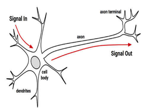
What we expect from a computer is that we provides some inputs and then we received outputs that match our needs. Scientist try to mimic the human brain for creating any intelligence machine. A machine that do the reasoning same as human.
So the main important element of human brain is neurons. human brains consist of 75 million neurons. each neurons is connected to other via a synapses.So what we have in Neural network is some nodes that are connected to each other. In human body if a neuron trigger by some external elements, it will pass the message from the receiver node to other nodes via synapsis.
Neural network mimic the same concepts from human brain. One node gets some inputs from the environment and then Neural Network model creates outputs that produce the result the same as computer system.
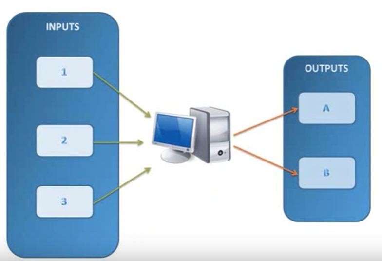
so in Neural Network we have
1- Set of inputs nodes
2- Set of output node/s
3-Some processing in middle to achieve a good results
4- The flow of information
5- The connection between nodes
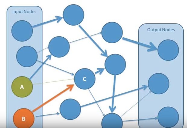
Some of the connections are more important than the other. That means they able to have more impact on the result than the others. In Neural Network we call them Weights.
so what is a weight there is a really good example in video ( https://www.youtube.com/watch?v=BR9h47Jtqyw)
imagine we want to back from a climbing journey, we are in top and weather is foggy, so we only able to see the 1 meter ahead, so we can decide which direction we should go just for one meter ahead.

we put the first step now based on the location again we decided which direction we should go and tale the other steps, so in each steps we evaluate the way and choose the best way till we come down the mountain.

all of these decision place can be seen as a node of decision that lead us to a better and closer point.
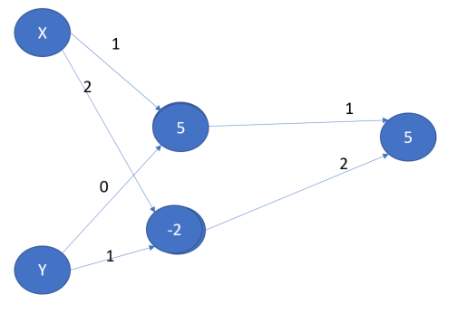
in Neural Network, we have some hidden Nodes that do the main job ! they found the best value for the output, they are using some function that we call that functions as “Activation function” for instance in below picture, Node C is a hidden node that take the values from node A and B. as you can see the weight (the better path) related to Node B as shown in tick line that means Node B may lead to get better results so Node C get input values from Node B not Node A.
the neural network has different layout :
single-layer network: the first layout is about that all input connected to one output via some link and specific weight with out applying any function. this is a very simple and can be so similar to linear regression.
the other layout of the multilayer network that may have some hidden nodes. and most of the time they are fully connected. which means that every node in one layer is connected to every node in the next layer,
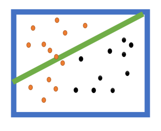
why we need hidden nodes? to answer this question look at the below example:
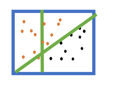
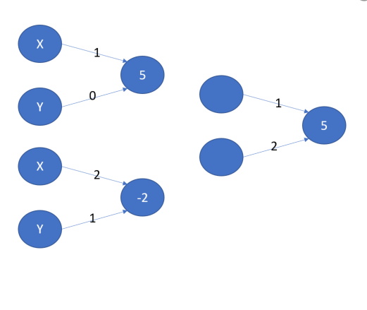
imagine that we have a data like below picture. we have an aim to classify the data into two groups as black and orange group. first we apply formula 2x+y=-2 to separate them, as you see this formal able to cover 60% of the classification, so still some orange dot are in black area, so the line is not that much accurate and able to fully classify the data.

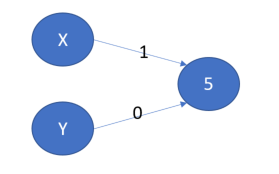
In the other linear formula we have this formula to classify the black and orange groups : x=5 so we have 1*x+0*y=5, this line also not that much able to classify the nodes, it able partially to do it.
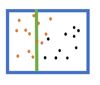
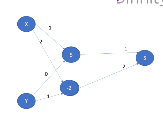
we have another formula that is combination of these two and are more effective in classifying the black nods from orange one, see below picture. So I can sum formula1 and formula 2 to be able to classify better the black and orange nodes.
with formula : -8*x+y=-6
with this example we first apply two function on our input values (X and Y). Then, we merge them to find a better formula that able to classify the data. So we use some activation function to join this two formula to reach a better result.
so we have below network
we connect the nodes and we have below fully structure Neural Network network
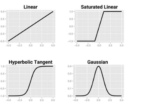
so what function we can use for activation and merging the nodes? there are many of these activation function such as linear, Saturated Linear, Hyperbolic Tangent, and Gaussian. I am not going to explain them as for this post and Next one we just want to use them, will discuss them later in a post.
This is a main concepts behind the neural network, In the next post I will show how to write code in R and Power BI in next posts. I found the blow videos really good for understanding the main concepts.
https://www.youtube.com/watch?v=DG5-UyRBQD4&spfreload=10
https://www.youtube.com/watch?v=BR9h47Jtqyw