Published Date : April 10, 2017
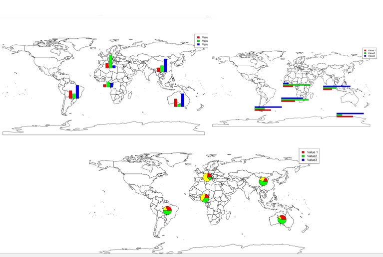
In the previous parts (Part 1 and Part 2) , I have shown how to draw a chart in the power BI (Part 1) visualization. Also, in Part 2 I have shown how to present 5 different variables in just one single chart. In this post, I will show how to shows some sub plots in a map chart. showing pie chart already is possible in power BI map. In this post I am going to show how to show bar chart, pie chart and so other chart type in a map.
For this post, I have used the information and codes available in [1] and [2], which was so helpful!.
This may happen that we want to have some subplots in a map, in R you able to show different types of chart in a map as a subplot.
To start, first setup your power BI as part 1. We need below library first to be installed in R software. Then you should use them in Power BI by referring to them as below.
library(rworldmap)
library(sp)
library(methods)
library(TeachingDemos)
require(sp)
Next we need data to show on the map. I have a dataset about different countries as below :

I have 3 different random columns for each countries,as you can see in above picture (I just pick that data from reference number[1]). I am going to create a chart to show these 3 values (value1, value2, and value3) in map for each country.
in Power BI visualization, first select the dataset (country, value1, value2, and value3). This data will store in variable “Dataset” in R script editor as you can see in below image.


I put the “Dataset” content into new variable name “ddf” (see below)
ddf =dataset
The second step is about finding the latitude and longitude of each country using function “joincountrydata2map“. this function gets the dataset “ddf” in our case as first argument, then based on the name of the country “joincode=”NAME” and in ddf dataset “country column” (third argument) will find the country location specification (lat and lon)for showing in the map. We store the result of the function in the variable “sPDF”
sPDF <- joinCountryData2Map(ddf , joinCode = "NAME" , nameJoinColumn = "country" , verbose = TRUE)
Hence, I am going to draw an empty map first by below code
plot(getMap())

Now I have to merg the data to get the location information from “sPDF” into “ddf”. To do that I am going to use” merge” function. As you can see in below code, first argument is our first dataset “ddf” and the second one is the data on Lat and Lon of location (sPDF). the third and forth columns show the main variables for joining these two dataset as “ddf” (x) is “country” and in the second one “sPDF” is “Admin”. the result will be stored in “df” dataset
df <- merge(x=ddf, y=sPDF@data[sPDF@data$ADMIN, c("ADMIN", "LON", "LAT")], by.x="country", by.y="ADMIN", all.x=TRUE)
Also, we need the “TeachingDemos” library as well.
require(TeachingDemos)
I am going to draw a simple bar chart that show the value1, Value2, and Value 3 for each country. So I need a loop structure to draw barchart for each country as below. I wrote “for(I in 1:nrwo(df)) that means draw barchart for all countries we have in “df” then I called a subplot as main function that inside I defined the barplot().
for (i in 1:nrow(df))
  subplot(barplot(height=as.numeric(as.character(unlist(df[i, 2:4], use.names=F)
                                                 )
                                    ),
                    axes=F,
                  col=rainbow(3),
                   ylim=range(df[,2:4])
                  ),
          x=df[i, 'LON'], y=df[i, 'LAT'], size=c(.6, .6)
           )
barplot() get values for height of each bar chart as a number (as.number). also I fetch the data related to “df” dataset from row number “i”, for columns from 2 to 4 (value 1 to value 3). To stet the colouring of the bar chart we use (col=rainbow(3)). “Y” axis should range values from “df” dataset for dataset df[,2:4]. the “x” axis get the latitude and longitude. The size of the bar chart can be changed by function “size=c(,)”.
then we have below picture:
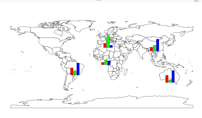
To have better map, we need a legend on beside of the map. To do that I am using a function named “legend” that the first argument is the name of the legend as “top right”. the legend values comes from “df” dataset. we using the same colouring we have for bar chart.
legend("topright", legend=names(df[, 2:4]), fill=rainbow(3))
so at the end we have below chart

Now imagine that we want to have another type of chart in map as pie char or horizontal bar chart.
to do this, I need just changed the chart in Subplot as below
subplot(pie(as.numeric(as.character(unlist(df[i, 2:4], use.names=F))),
just replaces the bar chart with pie chart (use above codes).
so we will have below char

Or if we want to have a horizontal bar chart we need to just add a filed to our code for bar chart as below
subplot(barplot(height=as.numeric(as.character(unlist(df[i, 2:4], use.names=F))), horiz = TRUE,
as”horiz=true”
and we have below chart

there are possibility to add other types of charts in the map as well!
[1] http://stackoverflow.com/questions/24231569/bars-to-be-plotted-over-map
[2]https://www.stat.auckland.ac.nz/~ihaka/120/Lectures/lecture16.pdf
Published Date : April 8, 2017
In the previous post (Part 1) I have explained how to write a simple scatter chart in the Power BI. Now in this post I am going to show how to present 5 different values in just one chart via writing R scripts.
I will continue the codes that I wrote in the previous post as below :
library(ggplot2)
t<-ggplot(dataset, aes(x=cty, y=hwy,size=cyl,fill="Red")) + geom_point(pch=24)+scale_size_continuous(range=c(1,5))
t
In previous post we just shown 3 variables : speed in city, speed in highway, and number of cylinder.
In this post, I am going to show variable “year” and type of “Drive” of each car plus what we have.
first, I have to change the above code as below:
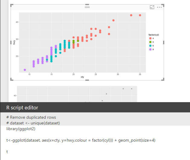
t<-ggplot(dataset, aes(x=cty, y=hwy,colour = factor(cyl))) + geom_point(size=4)
Before that, I want to do some changes in the chart first. Hence, I changed the “aes” function argument. I replaced the “Size” argument with “Colour”. that means, I want to differentiate car’s cylinder values not just by Cycle size, but I am going to show them by allocating them different colours. so I changes the “aes” function as above.
so by changing the codes as below
library(ggplot2)

t<-ggplot(dataset, aes(x=cty, y=hwy,colour = factor(cyl))) + geom_point(size=4)

t
we will have below chart:
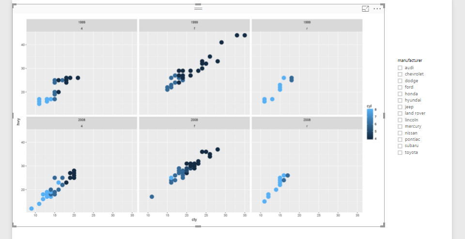
now I want to add other layer to this chart. by adding year and car drive option to the chart. To do that first choose year and drv from data field in power BI. As I have mentioned before, now the dataset variable will hold data about speed in city, speed in highway, number of cylinder, years of cars and type of drive.
I am going to use another function in the ggplot packages name “facet_grid” that helps me to show the different facet in my scatter chart. in this function, year and drv (driver) will be shown against each other.
facet_grid(year ~ drv)
To do that, I am going to use above code to add another layer to my previous chart.
t<-ggplot(dataset, aes(x=cty, y=hwy,colour = factor(cyl))) + geom_point(size=4)

t<-t + facet_grid(year ~ drv)
t
so I add another layer to variable “t” as above.
now the visualization will be look like as below: as you can see the car’s speed in the highway and city in y and x axis. Also, we have cylinder as colour and drive and year as facet.
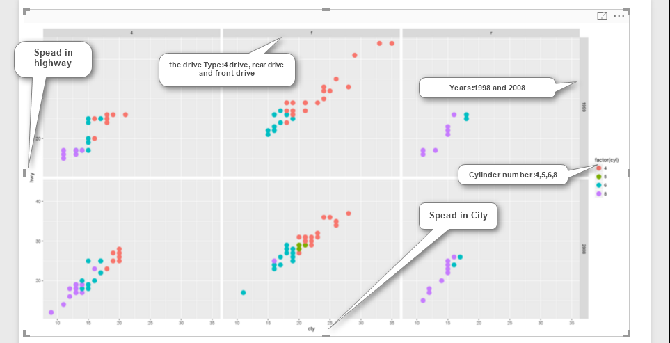
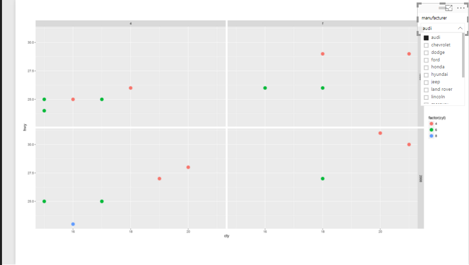
Now imagine, I am going to add a slicer to filter “car brands”, and also to see these five variables against each other in one chart.
So, we will have below chart:
I am going to have some more fun with chart, I need to show the drive type in all region not just the three above (see below image)
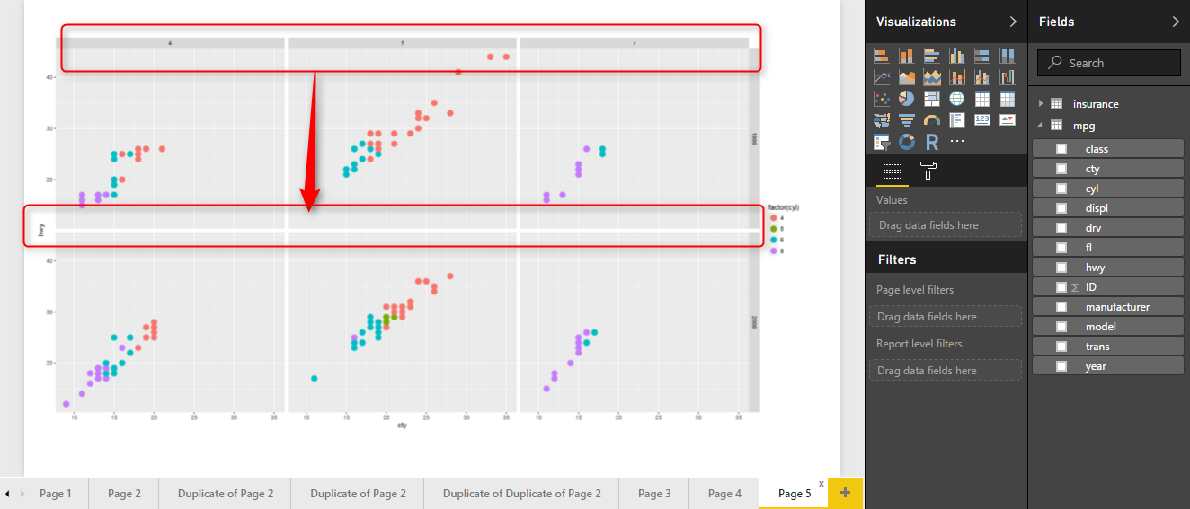
In this case I am able to use the another facet function instead of facet_grid(year ~ drv) I am going to use other function name facet_wrap(year~ drv) which help me to do that.
Hence, I change the codes as below:
t<-t + facet_wrap(year~ drv)
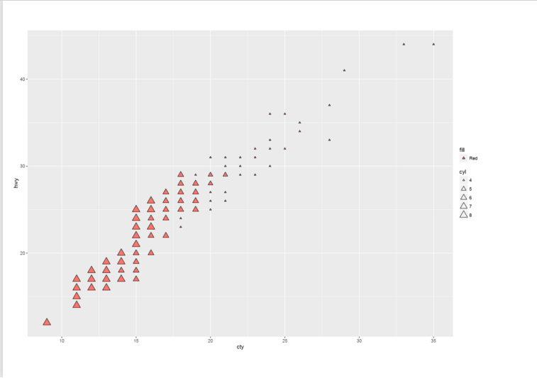
Moreover, I want to show the car’s cylinder type not just by different colour, but also with same colour just different shading. so I will replace the argument inside the aes function as below
aes(x=cty, y=hwy,color=cyl))
instead of aes(x=cty, y=hwy,colour = factor(cyl))
so finally the code will be look like as below
library(ggplot2)

t<-ggplot(dataset, aes(x=cty, y=hwy,color=cyl)) + geom_point(size=5)

t<-t + facet_wrap(year~ drv)
t
Finally,I will have below picture, as you can see in the below image, we have title for each group as for the top left 1999 and 4drive, for top and middle we have 1999, and r drive and so forth.
In future posts, I will show some other visuals that we have in ggplot2 package, which help us to have more fun in power BI.
Published Date : April 7, 2017
Power BI recently able users to embedded the R graphs in Power BI. There are some R visuals that it would be very nice to have them in Power BI.
What is R ? Based on Wikipedia, R is an open source programming language and software environment for statistical computing and graphics that is supported by the R Foundation for Statistical Computing. The R language is widely used among statisticians and data miners for developing statistical software and data analysis. Polls, surveys of data miners, and studies of scholarly literature databases show that R’s popularity has increased substantially in recent years.
R consists of different packages to perform tasks, now it has 1000 packages. there is a main package for draw visuals named “ggplot2″. This package consists of various functions to draw different types of charts.
How to start?
first download one version of the R in your machine, I have download “Microsoft R open” in my machine from here.
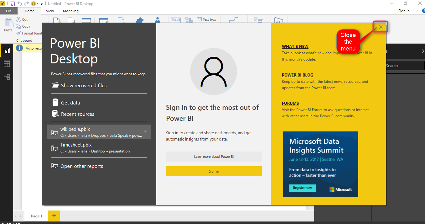
then open power bi desktop or download it from here
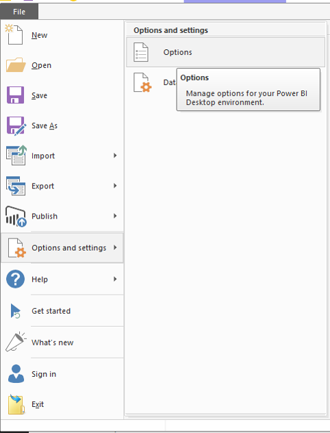
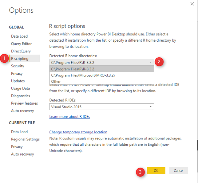
in power bi click on the File menue, then click on the “Options and Settings” then on ” Options”. under the “Global” option click n the “R Scripting” specify the R version.
There is a need to install the packages you need to work first in R version that you used first. in this example I am going to use “ggplot2″ in power bi so first I have to open Microsoft R open and type
install.packages("ggplot2")
ggplot2 will install some other packages itself.
now I can start with power BI.
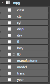
In power BI I have a dataset, that show specifications of cars such as : speed in city and highway, cylinder and so forth. if you interested to download this dataset, it is free name “mpg” from here.
then just click on the R visual in Power BI “R” visual and put in the white space as below.
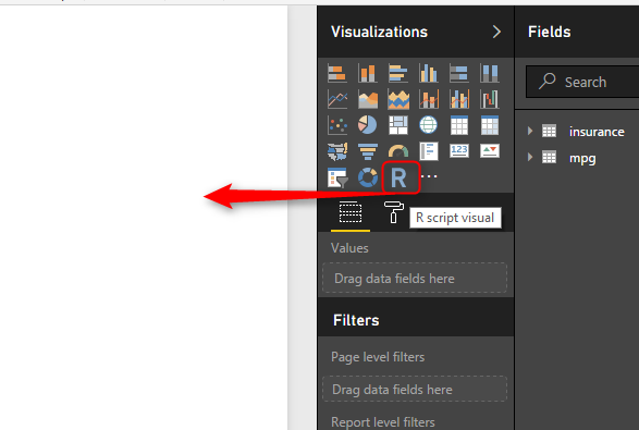
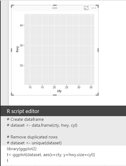
After bringing R visual in the report area. and by selecting “cty” (speed in city), “hwy” (speed in highway), and “cyl” (cylinder”). then in the “R script editor” you will see R codes there!
“#” is a symbol for comments in R language which you can see in R scripts Editor. Power BI automatically puts the selected fields in a variable name “dataset” so all fields (cty,hwy, and cyl) will store in a dataset variable by “<-” sign. also it automatically remove the duplicated rows. all of these has been explain in R script editor area.

next we are going to put our R code for drawing a two dimensional graph in power BI. In power BI, to use any R scripts, after installing in R version that we have, we have to call the packages using “library” as below
library(ggplot2)
so always, what ever library you use in power bi call it by library function first. there are some cases that you have to install some other packages to make them work, based on my experience and I think this part is a bit challenging!.
to draw a chart I first use “ggplot” function to draw a two dimensional chart. the first argument is “dataset” which holds our three fields. then we have another function inside the ggplot, named “aes” that identify which filed should be in x axis or in y axis. finally I also interested to shows the car cylinder in chart. This can be done by adding another layer in aes function as “Size”. so bigger cylinder cars will have bigger dots in picture.
t<-ggplot(dataset, aes(x=cty, y=hwy,size=cyl))
However, this just show the graphs with out any things! we need a dot chart here to create that we need to add other layer with a function name
geom_point, which able to draw a scatter charts, this function has a value as pch=21 which the shape of the dot in chart, for instance if I put this value as 20 it become a filled cycle or 23 become a diamond shape.
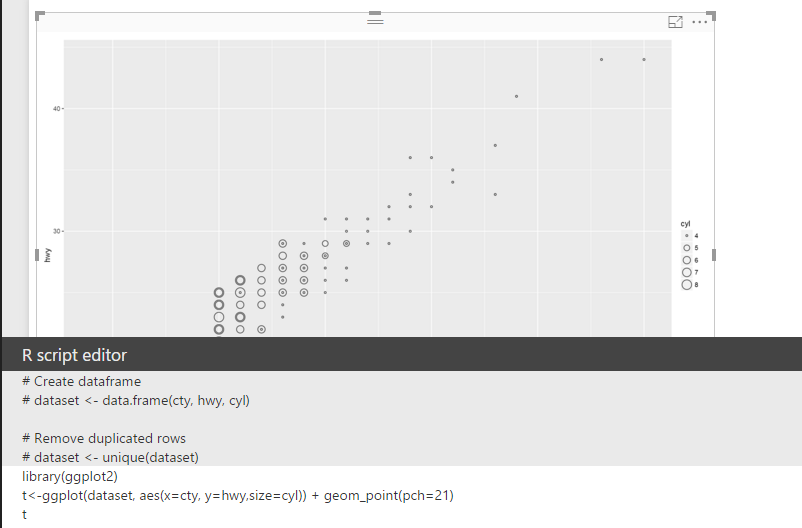
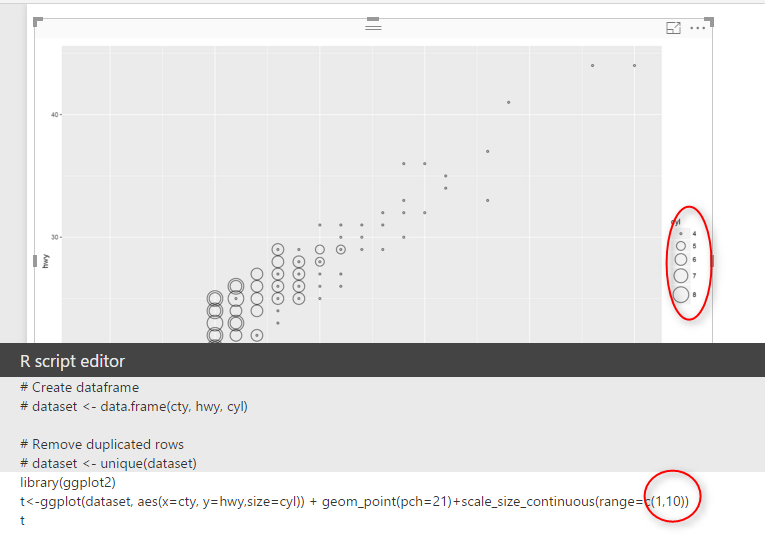
so in the above picture we can see that we have 3 different fields that has been shown in the chart :highway and city speed in y and x axis. while the car’s cylinder varibale has been shown as different cycle size. However may be you need a bigger cycle to differentiate cylinder with 8 to 4 so we able to do that with add another layer by adding a function name
scale_size_continuous(range=c(1,5))
and whole code will be as below :
t<-ggplot(dataset, aes(x=cty, y=hwy,size=cyl)) + geom_point(pch=23)+scale_size_continuous(range=c(1,5))
in the scale_size_continues(range=c(1,5)) we specify the difference between lowest value and highest one is 5, I am going to make this difference bigger by change it from 5 to 10
so the result will be as below picture:
sonow in picture the difference is much. and finally we have below picture
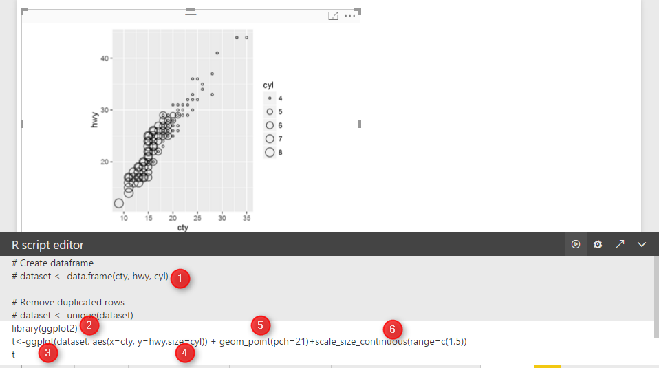
in the other example I have changed the “pch” value to 24 and I add another code inside of ” aes” function name “fill=Red” that means I want rectangle filled in red colour instead
t<-ggplot(dataset, aes(x=cty, y=hwy,size=cyl,fill="Red")) + geom_point(pch=24)+scale_size_continuous(range=c(1,5))
then I have below chart:
It is possible to show 5 different variables in just one chart, using facet command in R. This will help us to have more dimension in our chart, This will be explained in the next post (Part 2).
Published Date : March 24, 2017

K Nearest Neighbour (KNN ) is one of those algorithms that are very easy to understand and it has a good level of accuracy in practice. In Part One of this series, I have explained the KNN concepts. In Part 2 I have explained the R code for KNN, how to write R code and how to evaluate the KNN model. In this post, I want to show how to do KNN in Power BI.
If you do not have the Power BI Desktop, install it from https://powerbi.microsoft.com/en-us/
In power BI, Click on “Get Data” to import the data into Power BI, the data set . we have used the same dataset as in Part Two. The dataset contains the patient data such as : their diagnosis and laboratory results (31 columns).
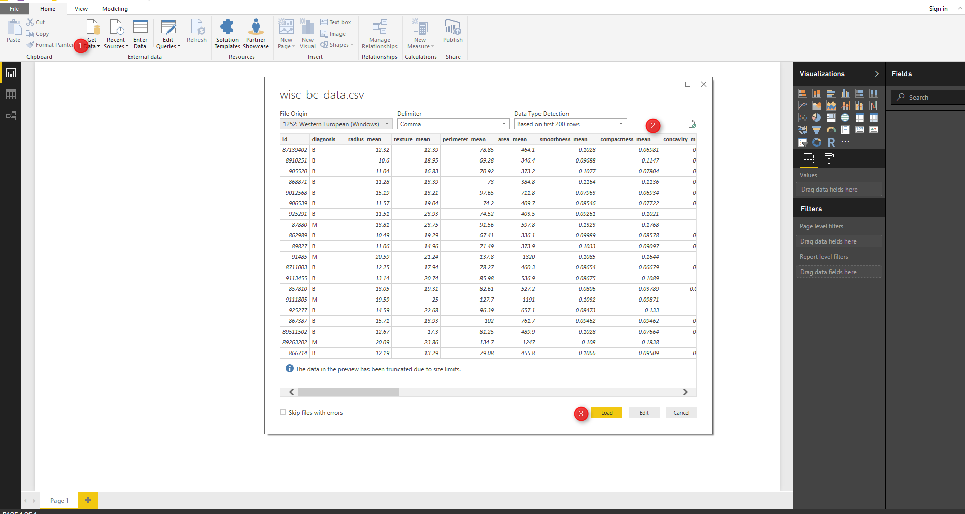
You will see (number 3) data in right side of the Power BI.
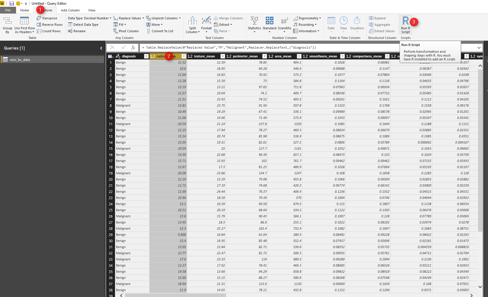
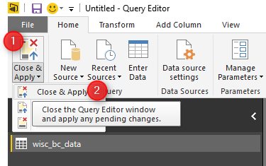
We want to clean the data first, hence we click on the “Edit Queries” in Power BI to do some data cleaning and also apply R scripts for KNN Model creation (Number 1 and 2).
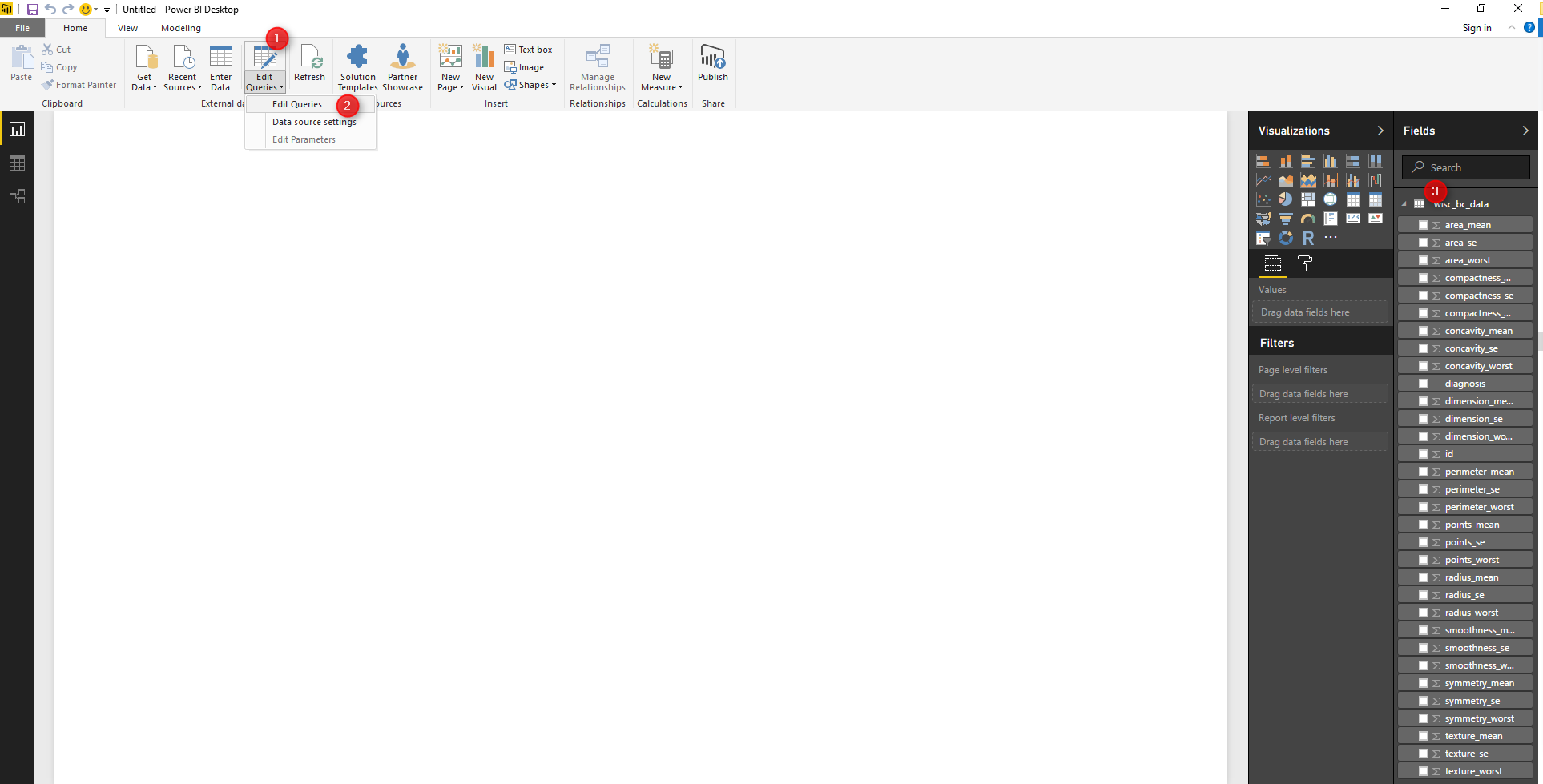
By clicking on the “Edit Query”, we will see the “Query Editor” windows.
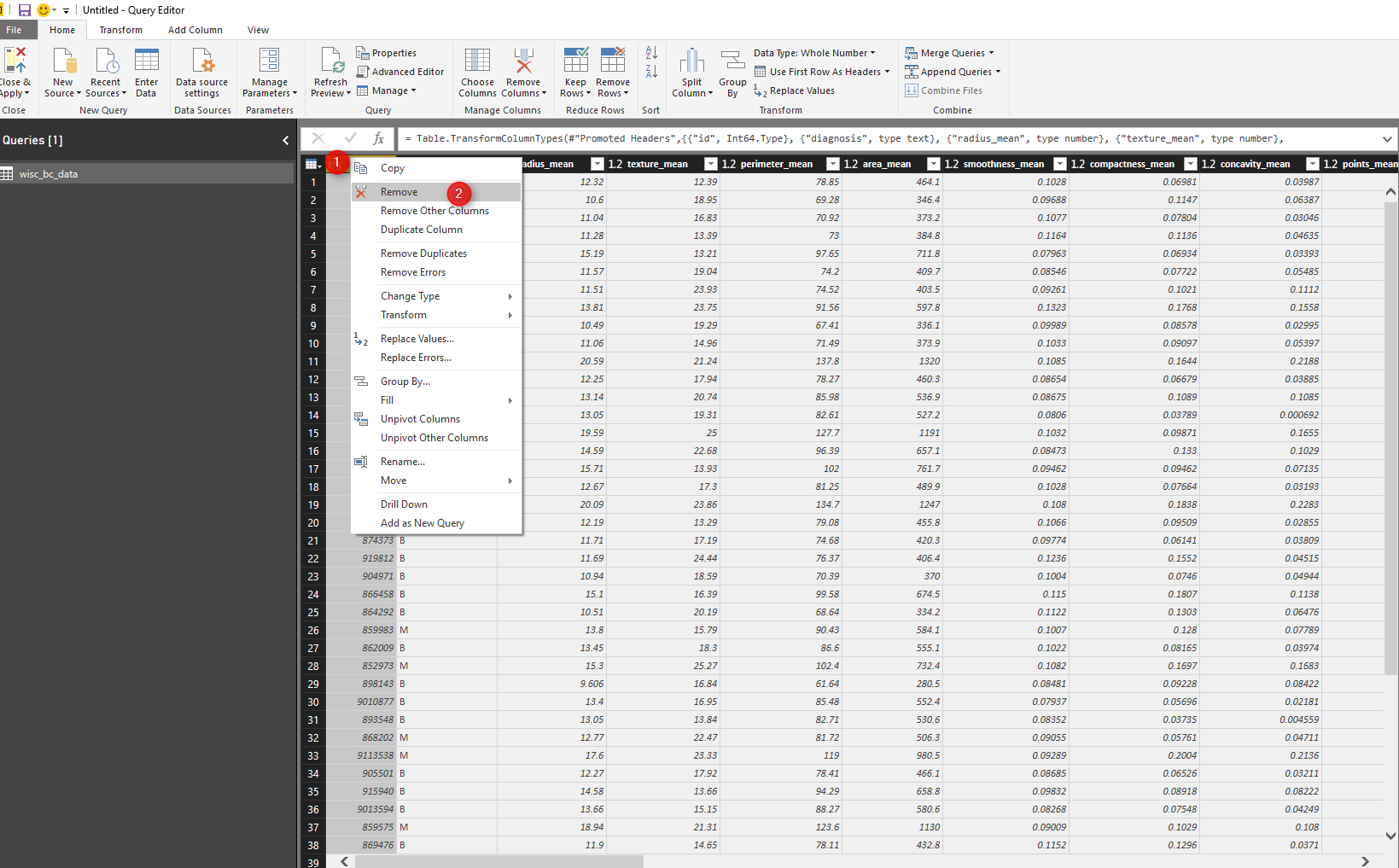
First of all, we want to remove the “ID” column. ID attributes does not have impact on prediction results. Hence, we right click on the “ID” column in power bi (number 1 and 2). and remove the ID column from data set.
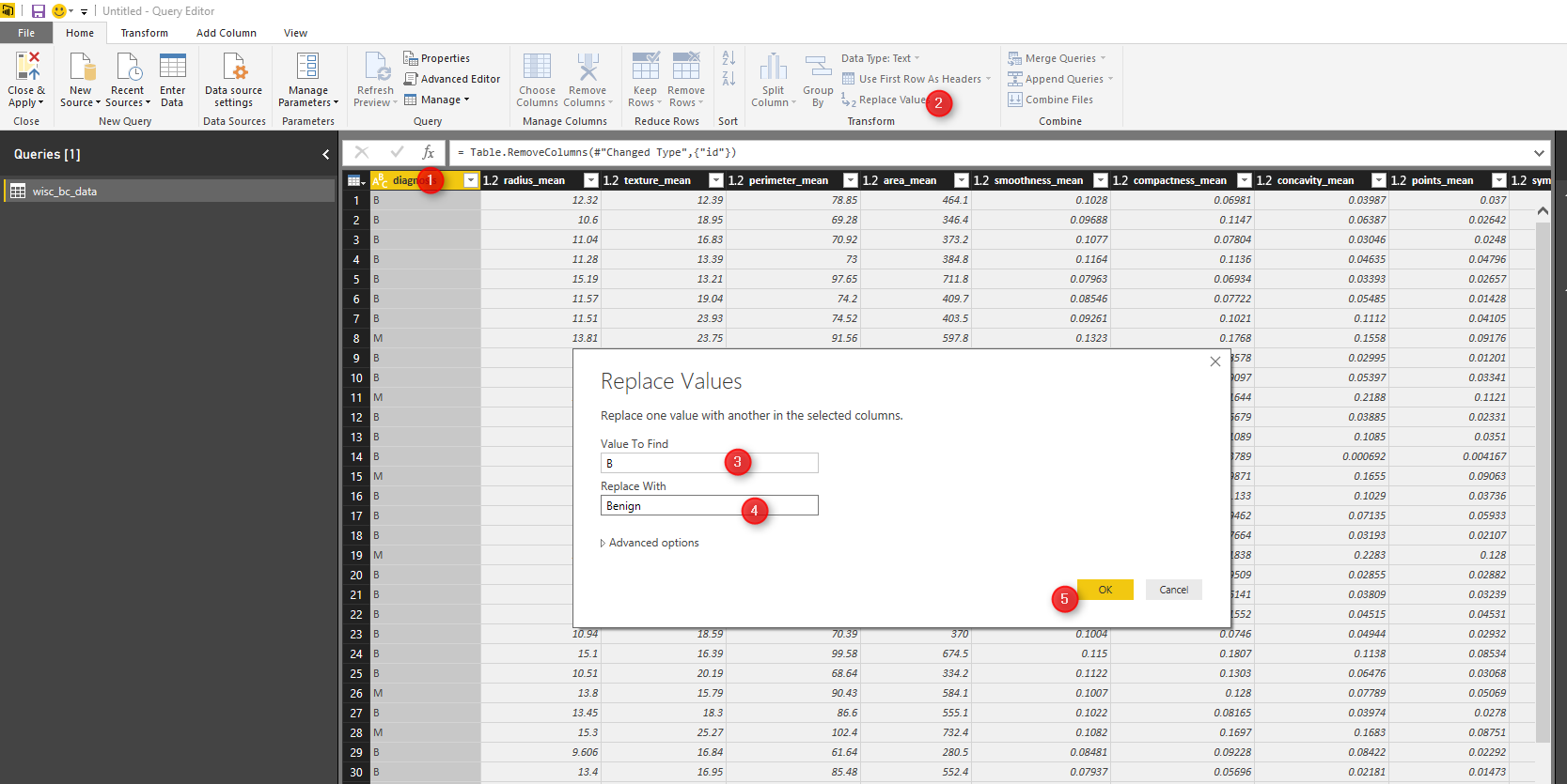
Another data cleaning approach is about replacing “B” value with “Benign ” and “M” with “Malignant” in Diagnosis column. To do that, we right click on the diagnosis column (number 1). Then click on the “Replace Value” (number 2) in Transform tabe. In replace values place, for “Value To Find” type “B” (number 3) then “Replace With” the “Benign”. Do the same for Malignant.
The result of the applied query will be look like below picture:

Another data cleaning is about data normalization. normalization has been explained in Part Two. We want to convert all the measurement value in same scale. hence we click on “Transform” tab, then in transform tab click on the data set (any numeric column). In this step we are using R scripts to normalize data. So, we click on the R scripts to perform normalization.
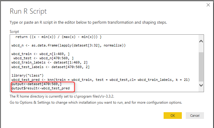
we write the same code we have in Part 2. the whole data (wis_bc_data) will be hold in “dataset”. for doing normalization, we first write a function (number 1) and the function will be store in”normalize” variable. Then we apply normalize function on dataset. (number 3). we want to apply the function on numeric data not text (diagnosis column) hence, we refer to dataset[2:31] that means apply function on column 2 to column 31. the result of the function is data frame that will be sored in “wbcd_n” variable.
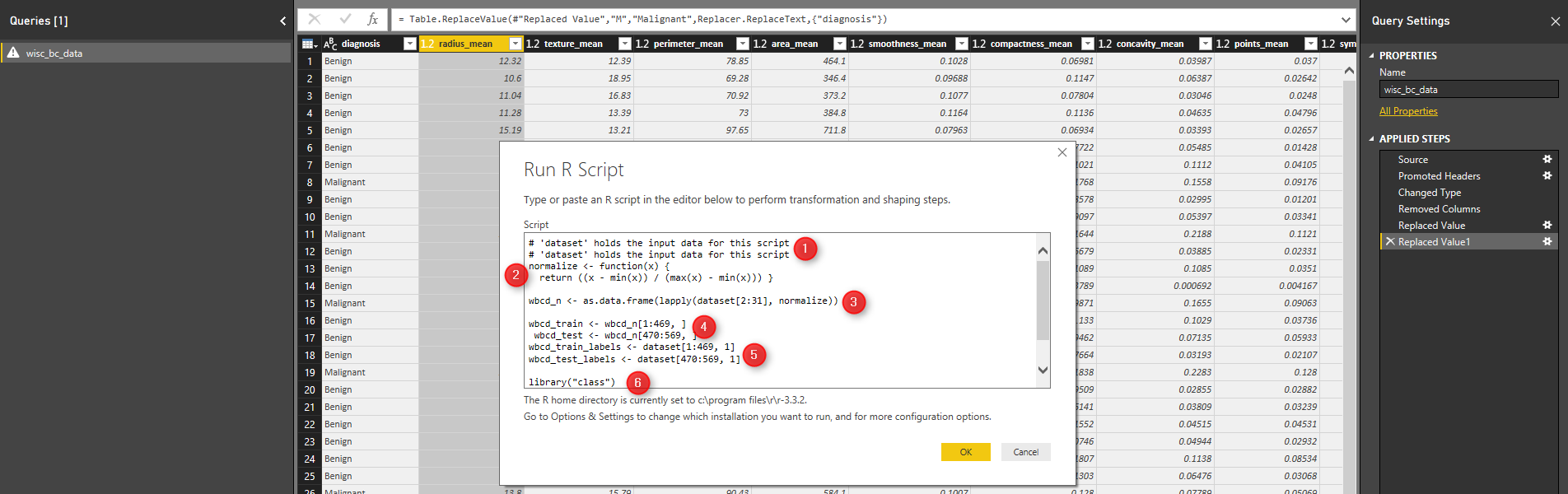
In next step, we are going to create test and train data set (Part 2). in this example, we going to put aside row number 1 to 469 for training and creating model and from row number 470 to 569 for testing the model. Finally, data is ready, now we able to train model and create KNN algorithm.
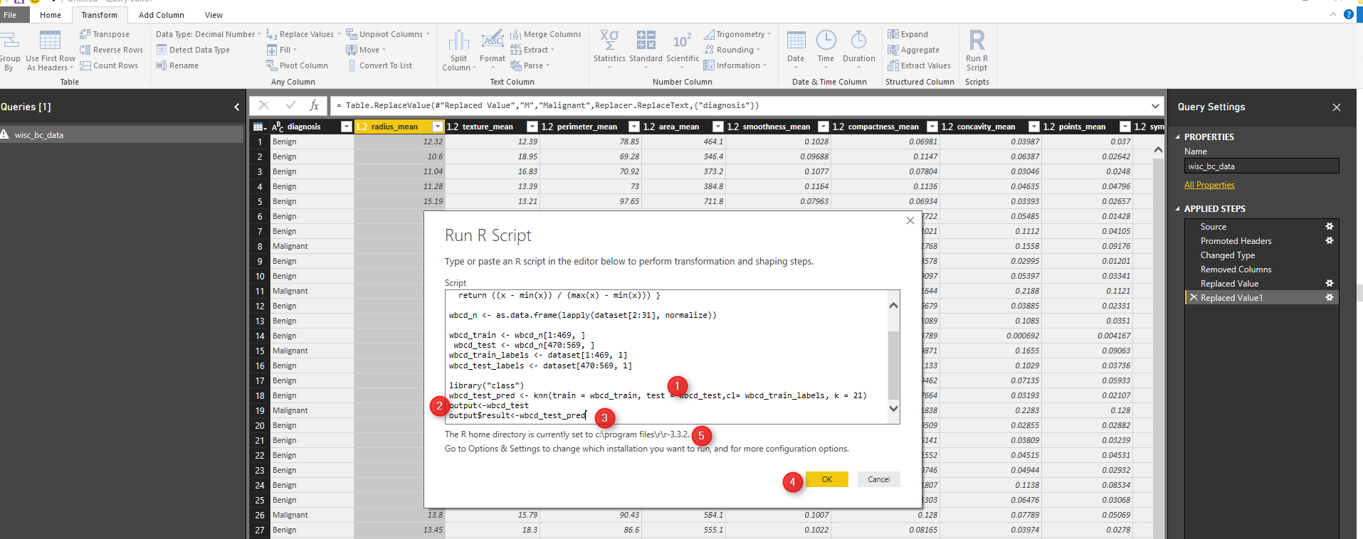
We already installed package “Class” in R studio. Now we able to call function KNN to predict the patient diagnosis. KNN function accept the training data set and test data set as second arguments. moreover the prediction label also need for result. we want to use KNN based on the discussion on Part 1, to identify the number K (K nearest Neighbor), we should calculate the square root of observation. here for 469 observation the K is 21. the result is “wbcd_test_pred” holds the result of the KNN prediction. however, we want to have the result beside the real data so we store the test data set in “output” variable, then add the separate column to store the prediction result (number 3). Then click on “OK” to apply the R scripts on data.
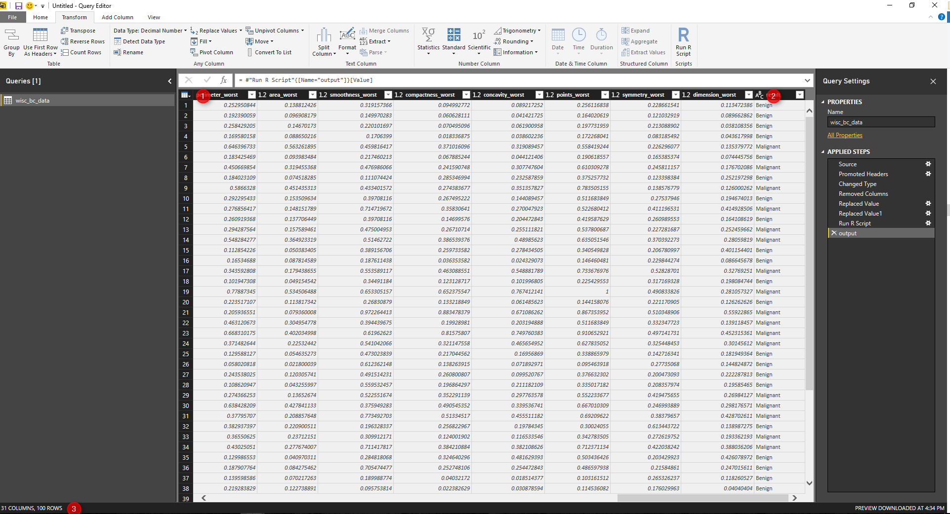
We will see below output:

for each output (Data frame in R scripts), we will have a table value. we store the final result in “output” in our R scripts, so we click on the Value (table) in front of the “output” name (see above picture). The result will be look like below picture. In output, we will have the “Test” dataset and in the last column, we will have the prediction results. If you look at the left bottom side, you will see 100 rows that are the number of test case we have.
After R transformation, just click on the “Close&Apply” to see the result in visualization.
However, sometimes you want also see the patient ID in result data set. So what we do is to change the R code, as below :
output<-dataset[470:569]
That means, we just get the whole data set from row 470 to 569. This data set is original one that contains the patient ID.
Hence, just close and apply the query.
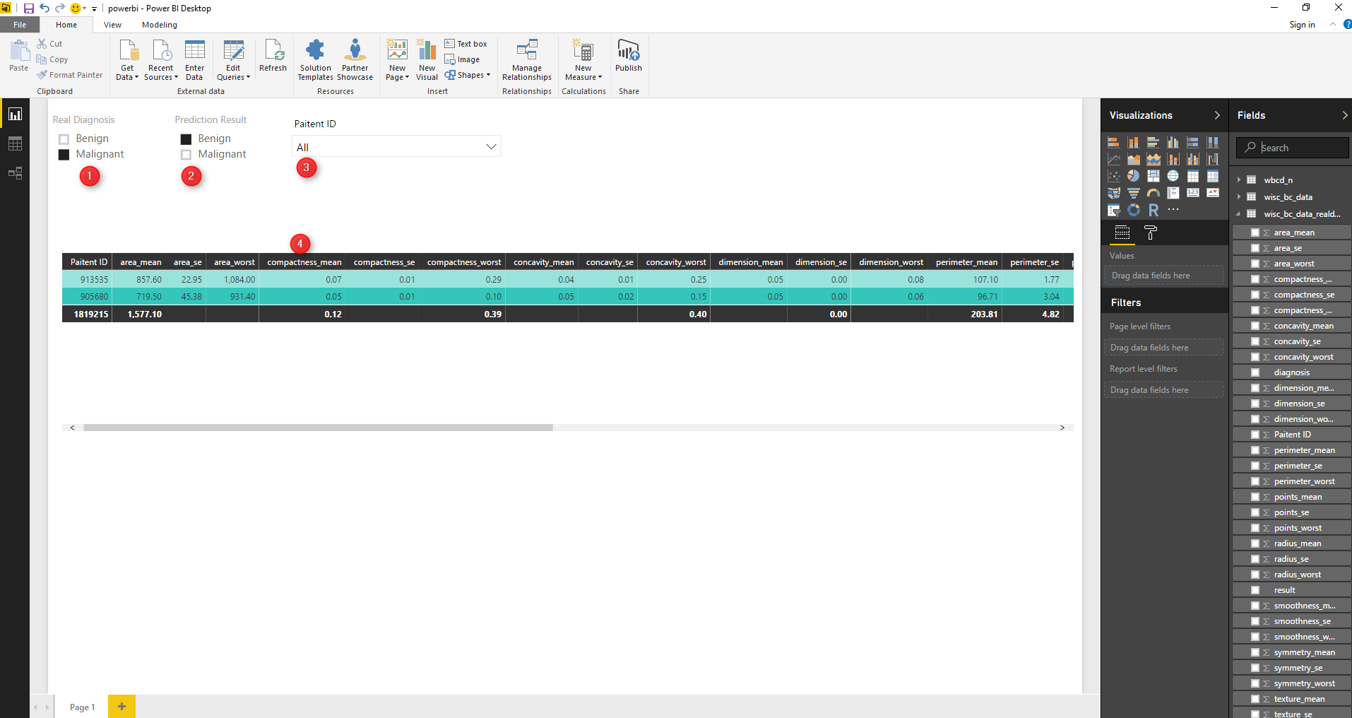
In the below visualization, I have shown the result of the prediction and the real data. In current dataset we have patient ID, real data about the doctor’s diagnosis and the predicted diagnosis by KNN. in Real Diagnosis filter (picture:number 1) we able to select patient that “Malignant” and in second filter we able to choose the prediction result “Benign”. this will show us the cases that prediction could not work properly.
we have 2 cases that the KNN predict in wrong way. as you see in below picture.
In the next series, I will talk about the other algorithms such as Neural Network (Deep Learning), Time series, and Decision Tree.
Moreover, there is an upcoming series on Azure ML which will be start soon.
Published Date : March 23, 2017
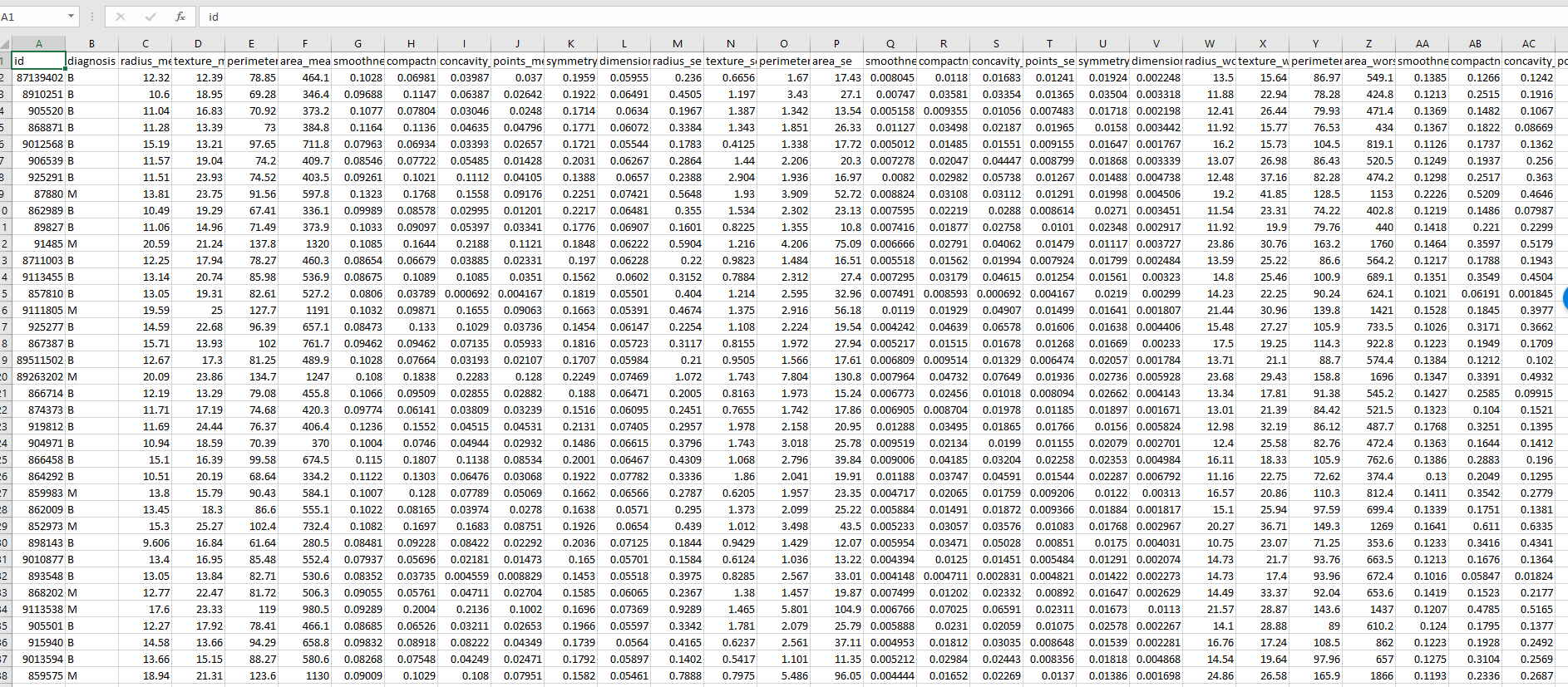
In the previous post (Part 1), I have explained the concepts of KNN and how it works. In this post, I will explain how to use KNN for predict whether a patient with Cancer will be Benign or Malignant. This example is get from Brett book[1]. Imagine that we have a dataset on laboratory results of some patients that some of them already Benign or Malignant. See below picture.
the first column is patient ID, the second one is the diagnosis for each patient: B stand for Benign and M stand for Malignant. the other columns are the laboratory results (I am not good on understanding them!)
We want to create a prediction models for a new patient with specific laboratory results, we want to predict whether this patient will be Benign or Malignant.
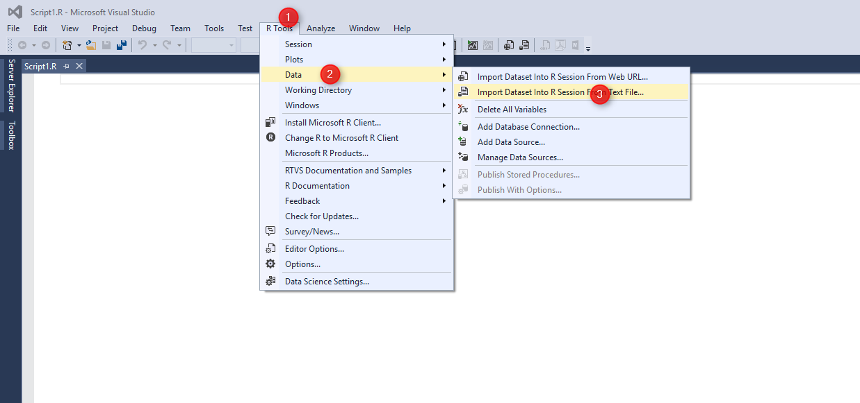
For this demo, I will use R environment in Visual Studio. Hence, after opening Visual Studio 2015, select File, New file and then under the General tab find “R”. I am going to write R codes in R scripts (Number 4) and then create a R scripts there.

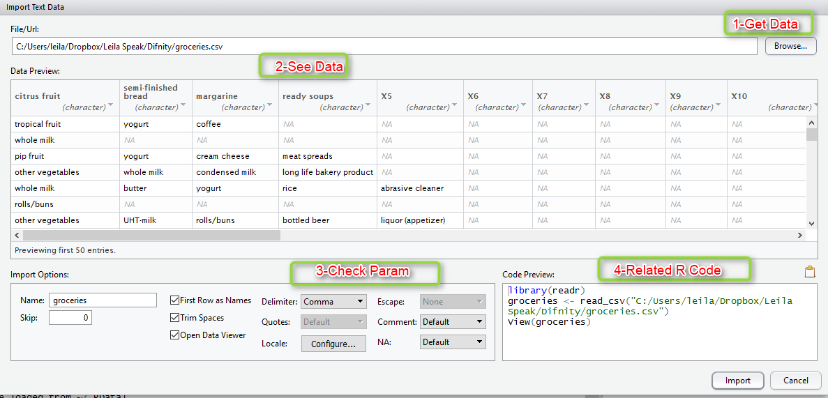
After creating an empty R scripts. Now I am going to import data. choose “R Tools”, then in Data menu, then click on the “Import Dataset into R session”.
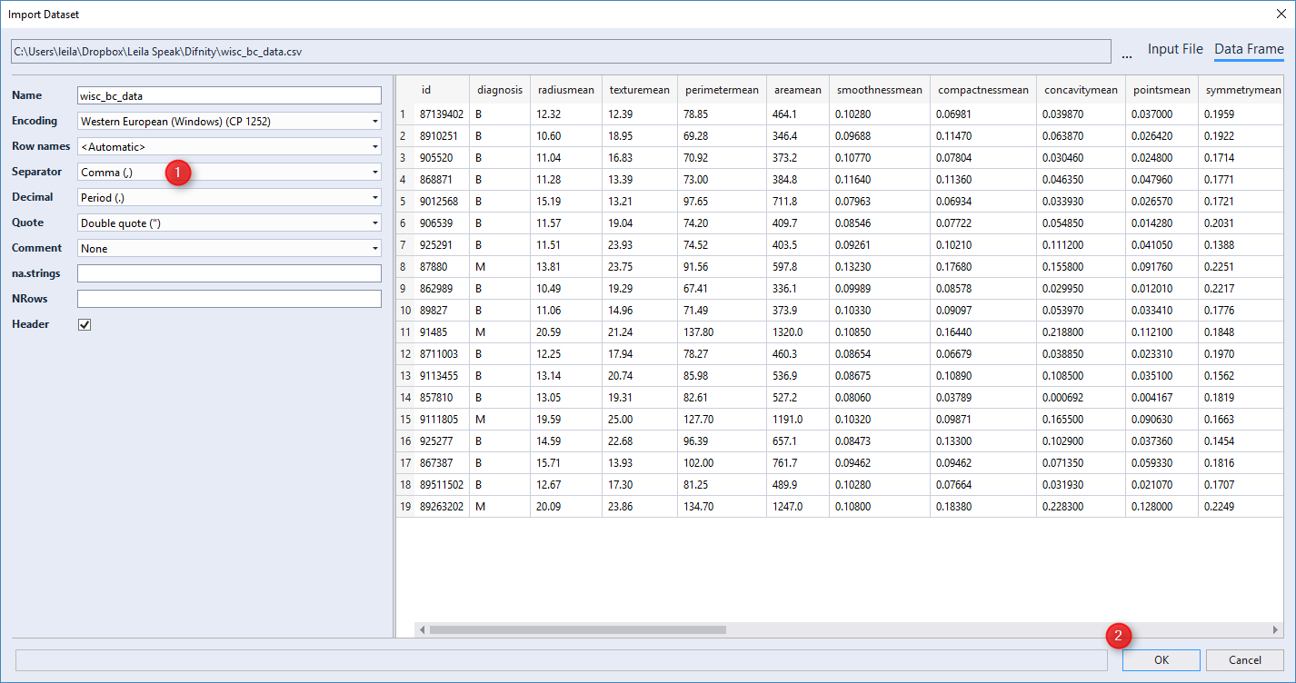
You will see below window. It shows all the columns and the sample of data. The SCV file that I am used for this post has been produced by [1]. It is a CSV file with delimiter (number 1) by Comma.
After importing the dataset, now we are going to see the summary of data by Function “STR”. this function shows the summary of column’s data and the data type of each column.
str(wisc_bc_data)
the result will be:
data.frame':	569 obs. of  32 variables:
 $ id               : int  87139402 8910251 905520 868871 9012568 906539 925291 87880 862989 89827 ...
 $ diagnosis        : Factor w/ 2 levels "B","M": 1 1 1 1 1 1 1 2 1 1 ...
 $ radius_mean      : num  12.3 10.6 11 11.3 15.2 ...
 $ texture_mean     : num  12.4 18.9 16.8 13.4 13.2 ...
 $ perimeter_mean   : num  78.8 69.3 70.9 73 97.7 ...
 $ area_mean        : num  464 346 373 385 712 ...
 $ smoothness_mean  : num  0.1028 0.0969 0.1077 0.1164 0.0796 ...
 $ compactness_mean : num  0.0698 0.1147 0.078 0.1136 0.0693 ...
 $ concavity_mean   : num  0.0399 0.0639 0.0305 0.0464 0.0339 ...
 $ points_mean      : num  0.037 0.0264 0.0248 0.048 0.0266 ...
 $ symmetry_mean    : num  0.196 0.192 0.171 0.177 0.172 ...
 $ dimension_mean   : num  0.0595 0.0649 0.0634 0.0607 0.0554 ...
 $ radius_se        : num  0.236 0.451 0.197 0.338 0.178 ...
 $ texture_se       : num  0.666 1.197 1.387 1.343 0.412 ...
 $ perimeter_se     : num  1.67 3.43 1.34 1.85 1.34 ...
 $ area_se          : num  17.4 27.1 13.5 26.3 17.7 ...
 $ smoothness_se    : num  0.00805 0.00747 0.00516 0.01127 0.00501 ...
 $ compactness_se   : num  0.0118 0.03581 0.00936 0.03498 0.01485 ...
 $ concavity_se     : num  0.0168 0.0335 0.0106 0.0219 0.0155 ...
 $ points_se        : num  0.01241 0.01365 0.00748 0.01965 0.00915 ...
 $ symmetry_se      : num  0.0192 0.035 0.0172 0.0158 0.0165 ...
 $ dimension_se     : num  0.00225 0.00332 0.0022 0.00344 0.00177 ...
 $ radius_worst     : num  13.5 11.9 12.4 11.9 16.2 ...
 $ texture_worst    : num  15.6 22.9 26.4 15.8 15.7 ...
 $ perimeter_worst  : num  87 78.3 79.9 76.5 104.5 ...
 $ area_worst       : num  549 425 471 434 819 ...
 $ smoothness_worst : num  0.139 0.121 0.137 0.137 0.113 ...
 $ compactness_worst: num  0.127 0.252 0.148 0.182 0.174 ...
 $ concavity_worst  : num  0.1242 0.1916 0.1067 0.0867 0.1362 ...
 $ points_worst     : num  0.0939 0.0793 0.0743 0.0861 0.0818 ...
 $ symmetry_worst   : num  0.283 0.294 0.3 0.21 0.249 ...
 $ dimension_worst  : num  0.0677 0.0759 0.0788 0.0678 0.0677 ...
>
Now we want to keep the original dataset, so we put data in a temp variable “wbcd”
wbcd <- wisc_bc_data
The first column of data “id” could not be that much important in prediction, so we eliminate the first column from dataset.
wbcd<-wbcd[-1]
We want to look at the statistical summary of each column: such as min, max, mid, mean value of each columns.
summary(wbcd)
The result of running the code will be as below, as you can see for first column (we already delete the id column), we have 357 cases that are Benign and 212 Malignant cases. also for all other laboratory measurement we can see the min, max, median, mean. 1st Qu, and 3rd Qu.
diagnosis  radius_mean      texture_mean   perimeter_mean     area_mean      smoothness_mean   compactness_mean  concavity_mean     points_mean      symmetry_mean    dimension_mean
 B:357     Min.   : 6.981   Min.   : 9.71   Min.   : 43.79   Min.   : 143.5   Min.   :0.05263   Min.   :0.01938   Min.   :0.00000   Min.   :0.00000   Min.   :0.1060   Min.   :0.04996
 M:212     1st Qu.:11.700   1st Qu.:16.17   1st Qu.: 75.17   1st Qu.: 420.3   1st Qu.:0.08637   1st Qu.:0.06492   1st Qu.:0.02956   1st Qu.:0.02031   1st Qu.:0.1619   1st Qu.:0.05770
           Median :13.370   Median :18.84   Median : 86.24   Median : 551.1   Median :0.09587   Median :0.09263   Median :0.06154   Median :0.03350   Median :0.1792   Median :0.06154
           Mean   :14.127   Mean   :19.29   Mean   : 91.97   Mean   : 654.9   Mean   :0.09636   Mean   :0.10434   Mean   :0.08880   Mean   :0.04892   Mean   :0.1812   Mean   :0.06280
           3rd Qu.:15.780   3rd Qu.:21.80   3rd Qu.:104.10   3rd Qu.: 782.7   3rd Qu.:0.10530   3rd Qu.:0.13040   3rd Qu.:0.13070   3rd Qu.:0.07400   3rd Qu.:0.1957   3rd Qu.:0.06612
           Max.   :28.110   Max.   :39.28   Max.   :188.50   Max.   :2501.0   Max.   :0.16340   Max.   :0.34540   Max.   :0.42680   Max.   :0.20120   Max.   :0.3040   Max.   :0.09744
   radius_se        texture_se      perimeter_se       area_se        smoothness_se      compactness_se      concavity_se       points_se         symmetry_se        dimension_se
 Min.   :0.1115   Min.   :0.3602   Min.   : 0.757   Min.   :  6.802   Min.   :0.001713   Min.   :0.002252   Min.   :0.00000   Min.   :0.000000   Min.   :0.007882   Min.   :0.0008948
 1st Qu.:0.2324   1st Qu.:0.8339   1st Qu.: 1.606   1st Qu.: 17.850   1st Qu.:0.005169   1st Qu.:0.013080   1st Qu.:0.01509   1st Qu.:0.007638   1st Qu.:0.015160   1st Qu.:0.0022480
 Median :0.3242   Median :1.1080   Median : 2.287   Median : 24.530   Median :0.006380   Median :0.020450   Median :0.02589   Median :0.010930   Median :0.018730   Median :0.0031870
 Mean   :0.4052   Mean   :1.2169   Mean   : 2.866   Mean   : 40.337   Mean   :0.007041   Mean   :0.025478   Mean   :0.03189   Mean   :0.011796   Mean   :0.020542   Mean   :0.0037949
 3rd Qu.:0.4789   3rd Qu.:1.4740   3rd Qu.: 3.357   3rd Qu.: 45.190   3rd Qu.:0.008146   3rd Qu.:0.032450   3rd Qu.:0.04205   3rd Qu.:0.014710   3rd Qu.:0.023480   3rd Qu.:0.0045580
 Max.   :2.8730   Max.   :4.8850   Max.   :21.980   Max.   :542.200   Max.   :0.031130   Max.   :0.135400   Max.   :0.39600   Max.   :0.052790   Max.   :0.078950   Max.   :0.0298400
  radius_worst   texture_worst   perimeter_worst    area_worst     smoothness_worst  compactness_worst concavity_worst   points_worst     symmetry_worst   dimension_worst
 Min.   : 7.93   Min.   :12.02   Min.   : 50.41   Min.   : 185.2   Min.   :0.07117   Min.   :0.02729   Min.   :0.0000   Min.   :0.00000   Min.   :0.1565   Min.   :0.05504
 1st Qu.:13.01   1st Qu.:21.08   1st Qu.: 84.11   1st Qu.: 515.3   1st Qu.:0.11660   1st Qu.:0.14720   1st Qu.:0.1145   1st Qu.:0.06493   1st Qu.:0.2504   1st Qu.:0.07146
 Median :14.97   Median :25.41   Median : 97.66   Median : 686.5   Median :0.13130   Median :0.21190   Median :0.2267   Median :0.09993   Median :0.2822   Median :0.08004
 Mean   :16.27   Mean   :25.68   Mean   :107.26   Mean   : 880.6   Mean   :0.13237   Mean   :0.25427   Mean   :0.2722   Mean   :0.11461   Mean   :0.2901   Mean   :0.08395
 3rd Qu.:18.79   3rd Qu.:29.72   3rd Qu.:125.40   3rd Qu.:1084.0   3rd Qu.:0.14600   3rd Qu.:0.33910   3rd Qu.:0.3829   3rd Qu.:0.16140   3rd Qu.:0.3179   3rd Qu.:0.09208
 Max.   :36.04   Max.   :49.54   Max.   :251.20   Max.   :4254.0   Max.   :0.22260   Max.   :1.05800   Max.   :1.2520   Max.   :0.29100   Max.   :0.6638   Max.   :0.20750
>
Data Wrangling
first of all, we want to have a dataset that is easy to read. the first data cleaning is about replacing the “B” value with Benign and “M” value with Malignant in diagnosis column. this replacement makes the data to be more informative. Hence we employ below code:
wbcd$diagnosis<- factor(wbcd$diagnosis, levels = c("B", "M"), labels = c("Benign", "Malignant"))
Factor is a function that gets the column name in a dataset, and we can identify the labels with out consuming memories)
there is another issue in data. the numbers are not normalized!
what is data normalization : that mean they are not in a same scale. for instance for radius mean all numbers between 6 to 29 while for column smoothness_mean is between 0.05 to 0.17. for performing the predict analysis using KNN, as we use distance calculation (Part 1), it is important all numbers should be in same range[1].
normalization can be done by below formula
normalize <- function(x) {
  return ((x - min(x)) / (max(x) - min(x))) }
now we are going to apply this function in all numeric columns in wbcd dataset. There is a function in R that apply a function over a dataset:
wbcd_n <- as.data.frame(lapply(wbcd[2:31], normalize))
“lapply” gets the dataset and function name, then apply the function on all dataset. in this example because the first column is text (diagnosis), we apply “normalize” function on columns 2 to 31.Now our data is ready for creating a KNN model.
from machine learning process we need a dataset for training model and another for testing model (from Market basket analysis post)
Hence, we should have two different dataset for train and test. in this example, we going to have row number 1 to 469 for training and creating model and from row number 470 to 569 for testing the model.
wbcd_train <- wbcd_n[1:469, ]
 wbcd_test <- wbcd_n[470:569, ]
so wbcd_train we have 469 rows of data and the rest in wbcd_test. also we need the prediction label for result
wbcd_train_labels <- wbcd[1:469, 1]
wbcd_test_labels <- wbcd[470:569, 1]
So data is ready, now we are going to train model and create KNN algorithm.
For using KNN there is a need to install package “Class”
install.packages("class")
Now we able to call function KNN to predict the patient diagnosis. KNN function accept the training dataset and test dataset as second arguments. moreover the prediction label also need for result. we want to use KNN based on the discussion on Part 1, to identify the number K (K nearest Neighbour), we should calculate the square root of observation. here for 469 observation the K is 21.
wbcd_test_pred <- knn(train = wbcd_train, test = wbcd_test,cl= wbcd_train_labels, k = 21)
the result is “wbcd_test_pred” holds the result of the KNN prediction.
[1] Benign    Benign    Benign    Benign    Malignant Benign    Malignant Benign    Malignant Benign    Malignant Benign    Malignant Malignant Benign    Benign    Malignant Benign
 [19] Malignant Benign    Malignant Malignant Malignant Malignant Benign    Benign    Benign    Benign    Malignant Malignant Malignant Benign    Malignant Malignant Benign    Benign
 [37] Benign    Benign    Benign    Malignant Malignant Benign    Malignant Malignant Benign    Malignant Malignant Malignant Malignant Malignant Benign    Benign    Benign    Benign
 [55] Benign    Benign    Benign    Benign    Malignant Benign    Benign    Benign    Benign    Benign    Malignant Malignant Benign    Benign    Benign    Benign    Benign    Malignant
 [73] Benign    Benign    Malignant Malignant Benign    Benign    Benign    Benign    Benign    Benign    Benign    Malignant Benign    Benign    Malignant Benign    Benign    Benign
 [91] Benign    Malignant Benign    Benign    Benign    Benign    Benign    Malignant Benign    Malignant
Levels: Benign Malignant
we want to evaluate the result of the model by installing “gmodels” a packages that shows the evaluation performance.
install.packages("gmodels")
require("gmodels")
library("gmodels")
we employ a function name “CrossTable”. it gets label as first input, the prediction result as second argument.
CrossTable(x = wbcd_test_labels, y = wbcd_test_pred,
prop.chisq = FALSE)
The result of “Cross table” will be as below. we have 100 observation. the tables show the result of evaluation and see how much the KNN prediction is accurate. the first row and first column shows the true positive (TP) cases, means the cases that already Benign and KNN predicts Benign. The first row and second column shows number of cases that already Benign and KNN predict they are Malignant (TN). The second row and first column is Malignant in real world but KNN predict they are Benign (FP). finally the last column and last row is False Negative (FN) that means cases that they Malignant and KNN predict as Malignant.
Total Observations in Table:  100


                 | wbcd_test_pred
wbcd_test_labels |    Benign | Malignant | Row Total |
-----------------|-----------|-----------|-----------|
          Benign |        61 |         0 |        61 |
                 |     1.000 |     0.000 |     0.610 |
                 |     0.968 |     0.000 |           |
                 |     0.610 |     0.000 |           |
-----------------|-----------|-----------|-----------|
       Malignant |         2 |        37 |        39 |
                 |     0.051 |     0.949 |     0.390 |
                 |     0.032 |     1.000 |           |
                 |     0.020 |     0.370 |           |
-----------------|-----------|-----------|-----------|
    Column Total |        63 |        37 |       100 |
                 |     0.630 |     0.370 |           |
-----------------|-----------|-----------|-----------|
so as much as TP and FN is higher the prediction is better. in our example TP is 61 and FN is 37, moreover the TN and TP is just 0 and 2 which is good.
to calculate the accuracy we should follow the below formula:
accuracy <- (tp + tn) / (tp + fn + fp + tn)
Accuracy will be (61+37)/(61+37+2+0)=98%
In the next post I will explained how to perform KNN in Power BI (data wrangling, modelling and visualization).
[1].Machine Learning with R,Brett Lantz, Packt Publishing,2015.
Published Date : March 22, 2017
K Nearest Neighbor (KNN ) is one of those algorithms that are very easy to understand and has a good accuracy in practice. KNN can be used in different fields from health, marketing, finance and so on [1]. KNN is easy to understand and also the code behind it in R also is too easy to write. In this post, I will explain the main concept behind KNN. Then in Part 2 I will show how to write R codes for KNN. Finally in the Part 3 the process of how run KNN in Power BI data will be explained.
To understand the KNN concepts, consider below example:
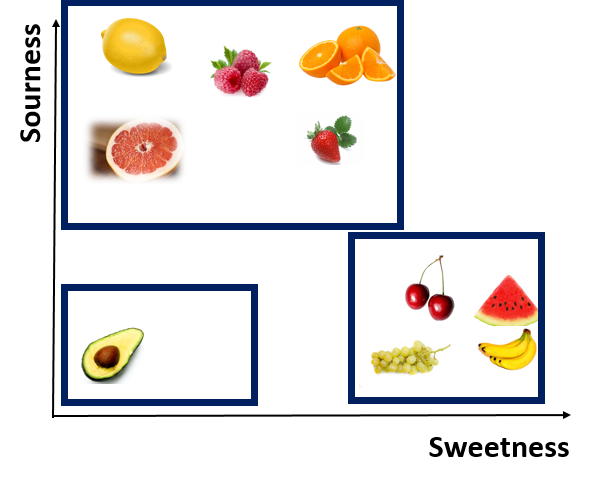
We are designing a game for children below 6 . First we asked them to close their eyes and then by tasting a fruit, identify is it sour or sweet. based on their answers, we have below diagram
as you can see we have three main groups based on the level of sweetness and sourness. we asked children to put a number of sweetness and sourness for each fruits in 10 scale. so we have below numbers. As you can see Lemon for example, has the high number in Sourness and low number in sweetness. Whist, Watermelon has high number (9) in sweetness and number 1 for sourness. (this is a example maybe the number is not correct, the aim of this example to show the concepts behind the KNN)
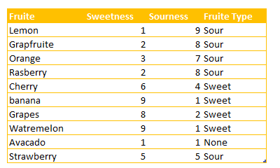
Imagine that we have a fruit that is not in above list, we want to identify the nearness of that fruit to others and then identify it is a sweet fruit or sour one. Consider figs as example. to identify it is a sweet or sour fruit, we have some number of its level of sourness and sweetness as below
as you can see for sweetness it is 7 and for sourness it is 3
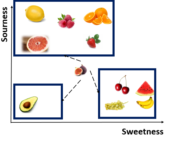
to find which fruit is near to this one, we should calculate the distance between Figs and other fruits.
from mathematics perspective, to find out distance between two points, we use the Euclidean distance formula as below:


For calculating the distance between Figs and Lemon, we first subtract their dimensions (above formula)
distance between Fig and Lemon is 8.2 now we are going to calculate this distance for all other fruits. as you can see in below table, the distance between Cherry and Grapes is so close to Figs (distance 1.41)
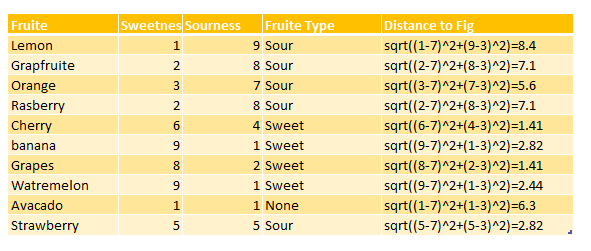
hence, Cherry and Grape are closet neighbor to Fig, we call them the first Nearest Neighbor. Watermelon with 2.44 is the Second Nearest Neighbor to Figs. the third nearest neighbor is strawberry and banana.
as you see in this example we calculate 8 nearest neighbor.
8 nearest neighbor for this example is Lemon with 8.4 distance. there is a lot distance between Lemon and Figs, so it is not correct to consider Lemon as nearest Neighbor. to find the best number for k(number of neighbors) we have consider the square root of the number of observations in our example. For instance,we have 10 observations which Square root is 3, so we have 3 nearest neighbors based on distance as first neighbor(Cherry and Grapes), second neighbor(Watermelon) and third is (Banana and Strawberry).
Because all of these are Sweet fruits, we consider Figs as a sweet one.
so in any example we calculate the distance of items to others categories. there other methods for calculating the distance.
KNN, has been used to predict a group for new items. for example:
1. predict that a customer will stay with us or not (new customer belong to with group: stay or leave)
2. image processing, if an uploaded picture of animal is related t birds, cats, and so on.
In the next post I will explain the related R codes for KNN .
[2].Machine Learning with R,Brett Lantz, Packt Publishing,2015.
Published Date : March 21, 2017
In the Part one I have explained the main concepts of Market basket analysis (associative Rules) and how to write the code in R studio. In this post I will explained the process of doing market basket analysis in Power BI.
for doing this post I have used the data set from [1].
Power BI Desktop, is a self service BI tool. you can download it from below link;
https://powerbi.microsoft.com/en-us/
to do the market basket analysis, I first create a new Power BI file
Power BI is a great tools for visualization and cleaning data, most of data wrangling can be happen there. most of data cleaning like remove missing variables, replace values, remove columns and so forth.
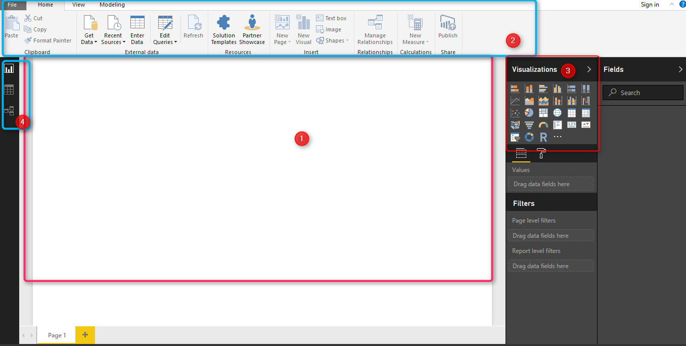
the middle area is for creating reports (Number 1). At the top, the main tools for creating reports, data wrangling, and so forth is located in number 2.
Moreover, the report elements like bar chart pie chart and so on has been shown in right side (number 3). finally, we able to see the relationship between tables and data in left side (number 4)
We get data from excel (local PC), so click on Get data in top menu and choose Excel from sources. as can be see in below picture.
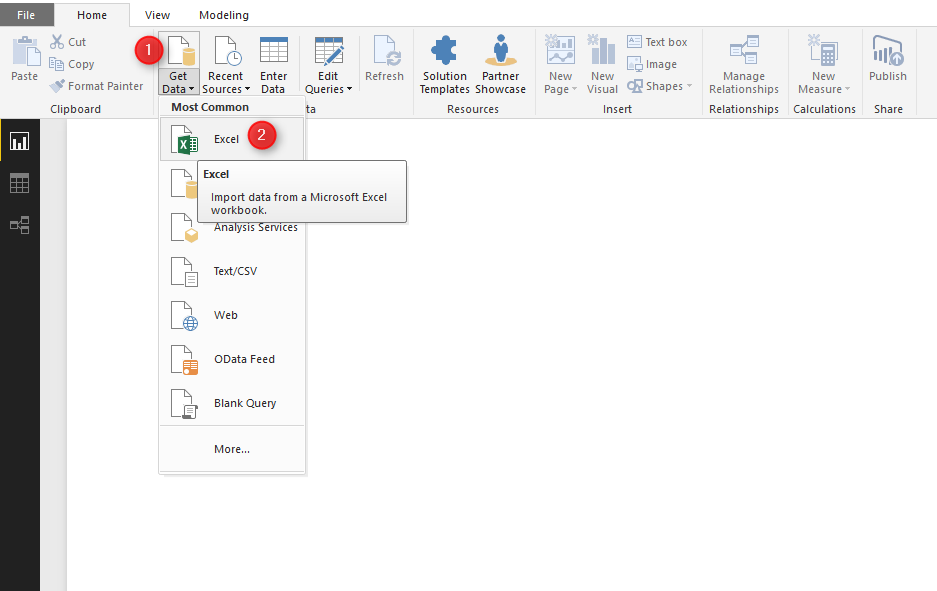
after loading the data set, now we can see the transaction shopping data for each customers (see below pictures).
so, we click on load option to get data from local pc into power bi.
then we want to do Market Basket analysis on data to get more insight out of it. In power bi, it possible to write R code!
first you should install a version of R in your pc. I already installed Microsoft R Open 3.3.2. from
https://mran.microsoft.com/open/
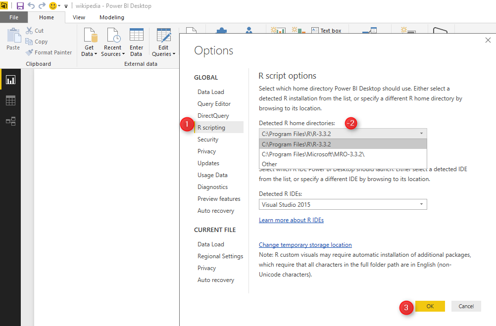
after installing R in your machine, in power BI you should specify the R version. to do that, in Power BI, click on “File”, then “Options” (below picture)

Then in “Global”, find he “R scripting”. In R scripting, Power Bi automatically detect the available R version in your PC. It is important that you select the R version that you already tested your R code there. as when we install a package in R, in Power BI that package is also become available, so there should be some connectivity between R version that you run your code and then one you select in power BI.
Now we want to write Market Basket analysis code in Power BI. To do this we have to click on “Edit Query” and then choose ” Edit Queries” from there.
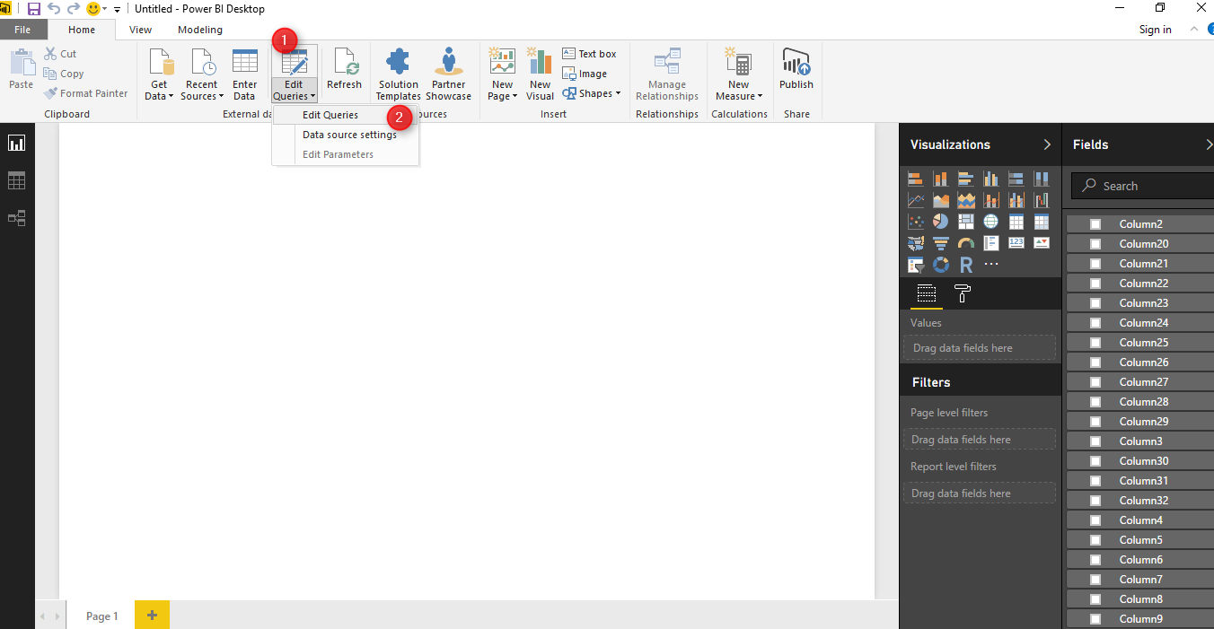
After selecting “edit query” , you will see the query editor environment. in top right, there is a “R transformation” icon.

By clicking on the “R transformation” a new windows will show up. This windows is a R editor that you can past your code here. however there are couple of things that you should consider.
1. there is a error message handling but always recommended to run and be sure your code work in R studio first (in our example we already tested it in Part 1).
2. the all data is holding in variable “dataset”.
3. you do not need to write “install.packages” to get packages here, but you should first install required packages into your R editor and here just call “library(package name)”
so we have below editor
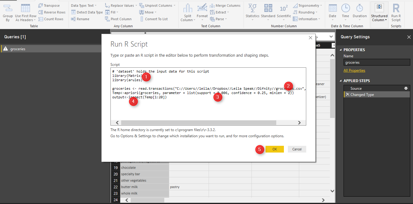
for doing market basket analysis I need two main libraries: “Matrix” and “arules”, hence I wrote two line code to have these libraries here:
library(Matrix)
library(arules)
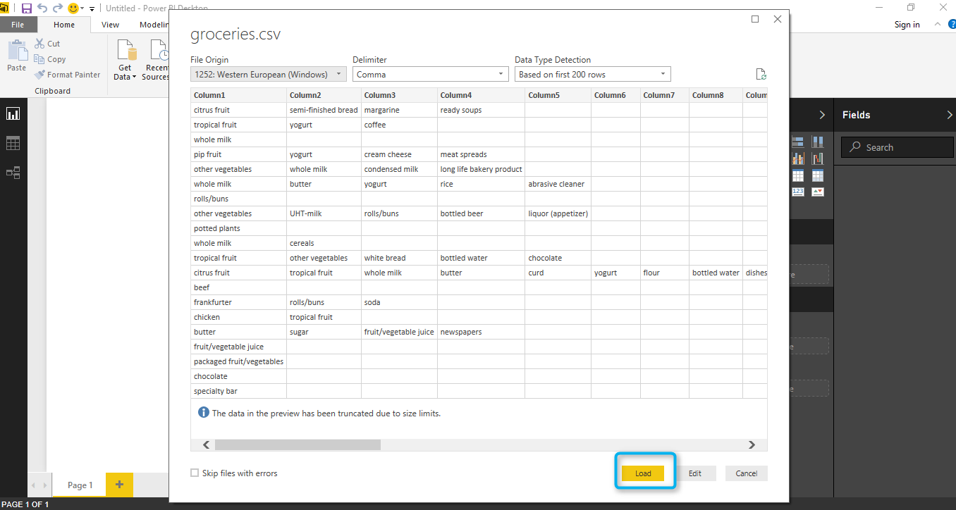
then as the data is not in format of transaction I have to reload the data from my PC again to make them as transaction type by writing below code
groceries <- read.transactions("C://Users//leila//Dropbox//Leila Speak//Difnity//groceries.csv", sep = ",")
then, call the “apriori” function to find the rules in customers shopping behaviour. apriori get the dataset “groceries” as input, also it accepts the parameters like support ,confidence , and minlen. the output of the function will be in “Temp” variable
Temp<-apriori(groceries, parameter = list(support = 0.006, confidence = 0.25, minlen = 2))
now we inspect the first 100 rules by calling the “inspect” function and put the output of function in “Output” variable.
output<-inspect(Temp[1:100])
output variable is the result of the query.
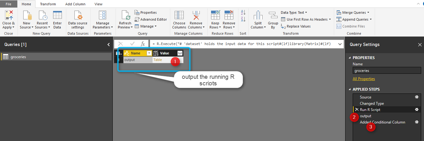
after clicking on the “Output” (above picture number 1), we will see the below results. the result of finding rules in customer behavior has been shown in below image. the first column (lhs) is the main item that people purchase the third column (rhs) is the related items to (lhs). the support, confidence, and lift measures has been show in column forth to sixth.
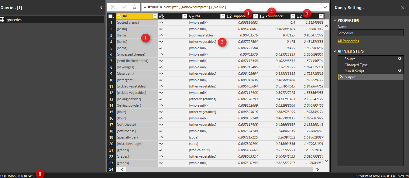
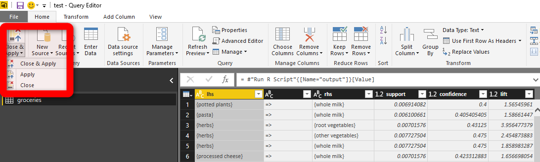
totally 100 rules has been shown (number 6). finally click on close and apply in top left side (see below picture)
now we can create a visualization for showing item and related items in Power BI visualization part.
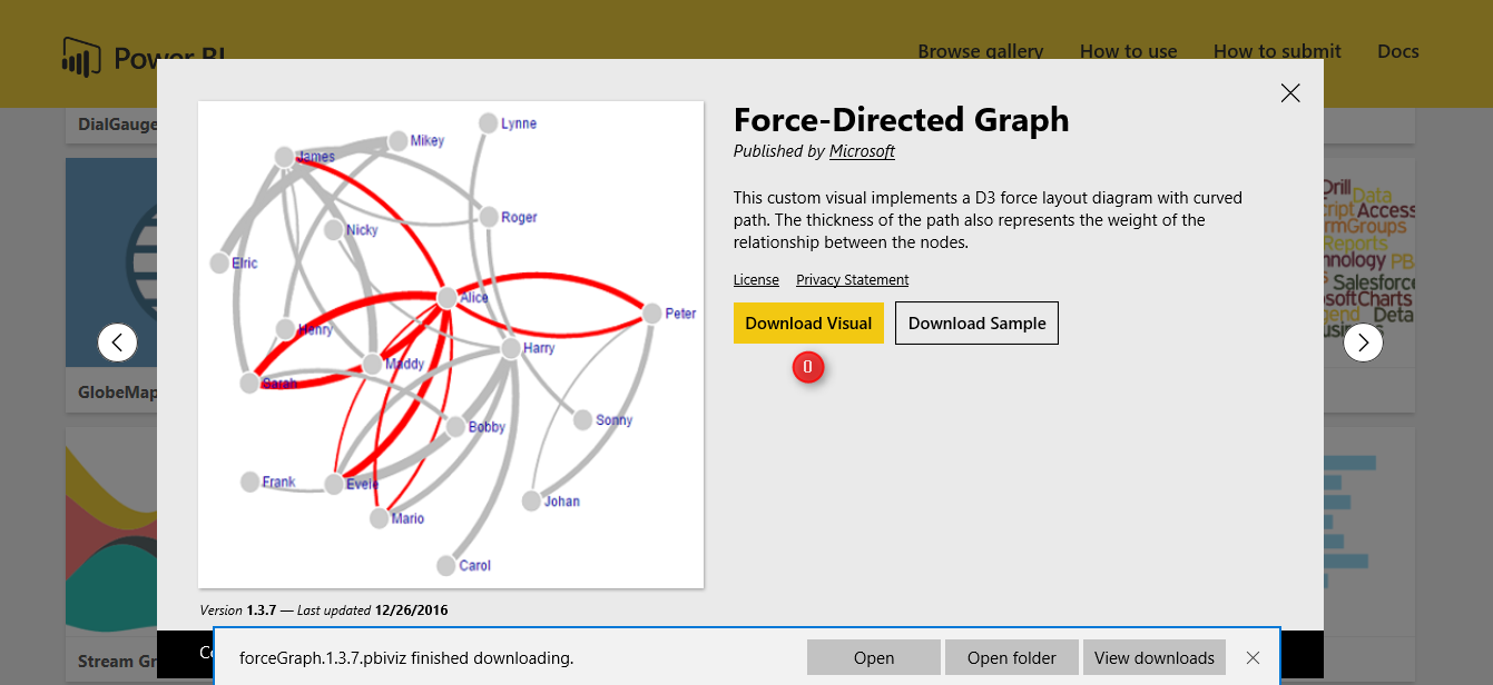
I have used the custom visualization from power BI website name as “Forced-Directed Graph” to show the relationships.
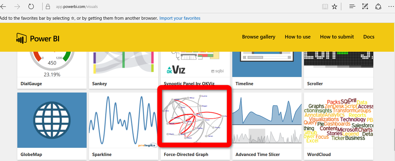
just click on the visualization and download it.
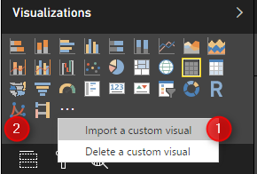
after downloading it, then import it to visualization part. first click on the 3 dots and select the “Import a customer visual” and import the downloaded one.
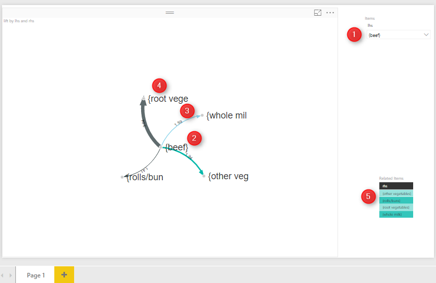
then in visualization first click on the right side and visualization part on the “Forced-Direct” chart (number 1) then in the right side in “Source” (number 3,4,5) bring the lhs, rhs and lift. this char shows the lhs (main items) as main node, the rhs ( the related items in shopping basket) as the related nodes. the thickness of the line between the nodes, show the lift value. the bigger value for lift the thicker line. and the product is much more importance. I had also a drop down list to items.
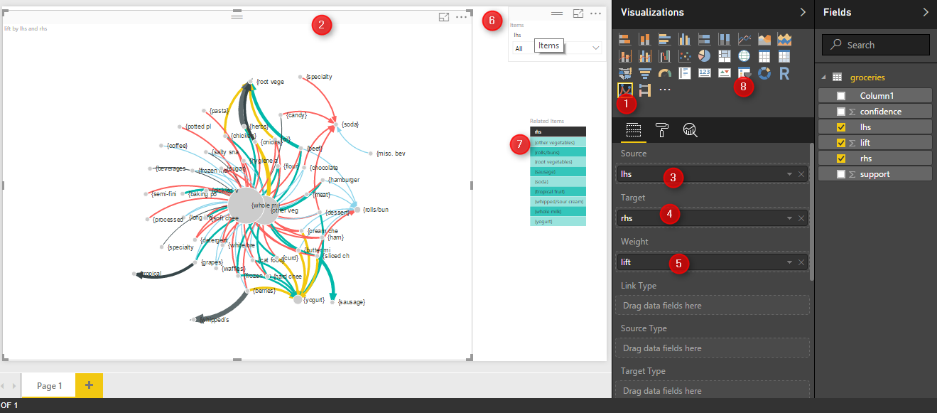
so by selecting for example “beef” from drop down the graphs show the related items to beefs. such as “root vege, whole mil, rolls, and Veg. the importance and possibility of purchasing these items has been shown by the thickness of the line so in this example “Root Veg” is main rules and has much more importance than the others.
there are some other useful visualization that can be used for showing the customer shopping behavior .
[1] Machine Learning with R,Brett Lantz, Packt Publishing,2015
Published Date : February 14, 2017

Market Basket analysis (Associative rules), has been used for finding the purchasing customer behavior in shop stores to show the related item that have been sold together. This approach is not just used for marketing related products, but also for finding rules in health care, policies, events management and so forth.
In this Post I will explain how Market Basket Analysis can be used, how to write it in R and come up with good rules.
In next post I will show how to write Associative Rules in Power BI using R scripts.
This analysis examine the customer purchased behavior. For instance, it able to say that customers often purchase shampoo and conditioner together. From perspective of the marketing, maybe promoting on Shampoo lead customers to purchase conditioner as well. From perspective of the sales, by putting Shampoo beside Conditioner in store shelf, there is a high chance that people purchase both.
Association rules is another name for Market Basket analysis. Association rules are of the form if X then Y. For example: 60% of those who buy life insurance also buy health insurance. In another example, 80% of those who buy books on-line also buy music on-line. Also, 50% of those who have high blood pressure and are overweight have high cholesterol [2]. Other examples such as;
You will see these rules are not just about the shopping, but also can be applied in health care, insurance, and so forth.
To create appropriate rules we should, it is important to identify the support and confidence measure. Support measure is: The support of an item set or rule measures how frequently it occurs in the data[2].
For instance, imagine we have below transaction items from a shopping store for last hours,
Customer 1: Salt, pepper, Blue cheese
Customer 2: Blue Cheese, Pasta, Pepper, tomato sauce
Customer 3: Salt, Blue Cheese, Pepperoni, Bacon, egg
Customer 4: water, Pepper, Egg, Salt
we want to know how many times customer purchase pepper and salt together
the support will be : from out four main transactions (4 customers), 2 of them purchased salt and pepper together. so the support will be 2 divided by 4 (all number of transaction.
2/4 (0.50).
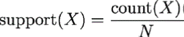
x: frequently item occurs
N: total Transaction
Another important measure is about the rule’s confidence that is a measurement of its predictive power or accuracy.
for example we want to know what is the probability that people purchase Salt then they purchase Pepper or wise versa.
Confidence (Salt–>Pepper), we have to calculate the frequency of purchasing Salt (Support (Salt))
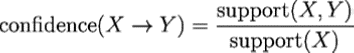
then it we calculate the purchase frequency(Support) of both Salt and Pepper (we already calculated it ).
then The Support (Salt, Peppers) should be divided by Support(Salt):
the Support for Purchasing Salt is 3 out of 4 (0.75)
Support for Purchasing Salt and Pepper is 0.5
by dividing these two number (0.5 Divide to 0.75) we will have: 0.6
So we can say in 60% of time (based on our dataset), if Customer purchase Sale, they will Purchase Pepper.
so we have a rule that “if Customer purchase Salt–>then with 60% of time they will purchase peppers”
However, this percentage is not valid for “Purchasing Pepper then Salt”
to calculate this, we should first calculate the Support for Pepper which is 0.75
then, Divide the Support (Pepper and Sale) to Support (Pepper)=1
So we have below Rules:
“People who purchase Pepper–> will purchase Salt in 100% of time”
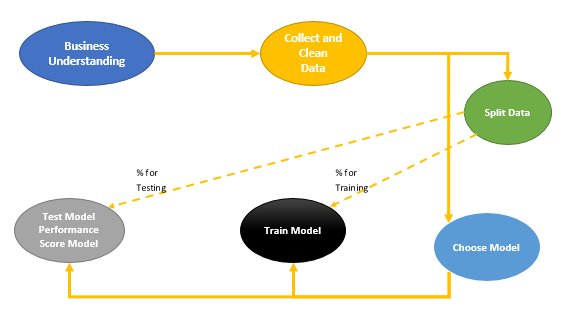
for doing the market basket analysis we follow below diagram:
First step- is to identity the business problem: in our case is identify the most shopping list items that have been purchased together by our customers.
Second Step- Gather data and find relevant attributes. we have a data set about 169 customers who purchased some item from grocery stores. The collected data should be formatted.
Third Step- is about selection of the machine learning algorithm regards the business problems and available data. In this model because we are going find the rules in customer shopping behavior that help us to marketing more on that items. Hence, we choose Associative Rules.
After selection of algorithm, we have to pass some percentage of data (more than 70%) for learning. algorithm will learns from current Data. The remaining part of data have been used for testing the accuracy of algorithms.
We have some data about the Groceries transaction in a shopping store
the first step to do machine learning in R is to import the data set into R.
Now we should brows our CSV file.
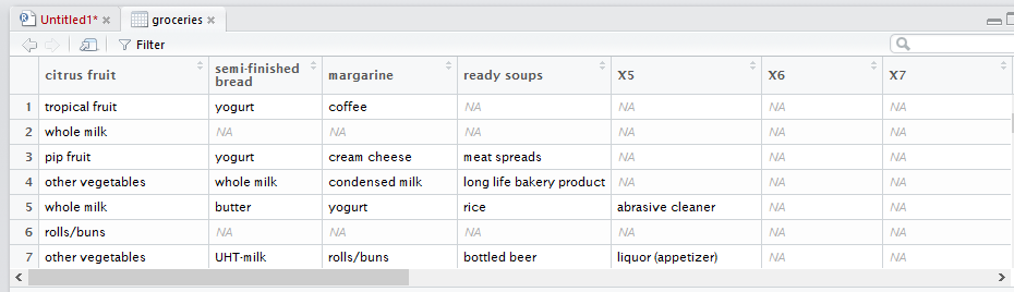
The first five rows of the raw grocery.csv file are as follows:
1-citrus fruit,semi-finished bread,margarine,ready soups
2-tropical fruit,yogurt,coffee
3-whole milk
4-pip fruit,yogurt,cream cheese,meat spreads
5- other vegetables,whole milk,condensed milk,long life bakery product
After importing Data, we will see that the imported dataset is not in form of tables, there is no column name
the first step is to create a sparse matrix from data in R (See the Sparse Matrix explanation in https://en.wikipedia.org/wiki/Sparse_matrix).
each row in the sparse matrix indicates a transaction. However, the sparse matrix has
a column (that is, feature) for every item that could possibly appear in someone’s
shopping bag. Since there are 169 different items in our grocery store data, our sparse
matrix will contain 169 columns [2].
to create a data set that able to do associative rules, we have install “arules”.
the below codes help us to that :
install.packages("arules")
library(arules)
groceries <- read.transactions("File address", sep = ",")
So to see the summary of data we run Summary(groceries)

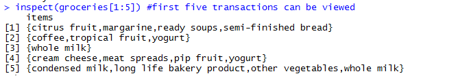
Now we are going to inspect the first five rows in groceries data frame. using “inspect” function to see the first customer’s transactions:
Now we want to draw a bar chart that depict the proportion of transactions containing certain items.
itemFrequencyPlot(groceries, support = 0.1)
itemfrequencyPlot is a function that draw a bar chrt based on the item frequency in transaction list. the first parameter is our dataset, the second on is support which is a numeric value. in this example we set the support as 0.1, which means only display items which have a support of at least 0.1.
The result is like below:
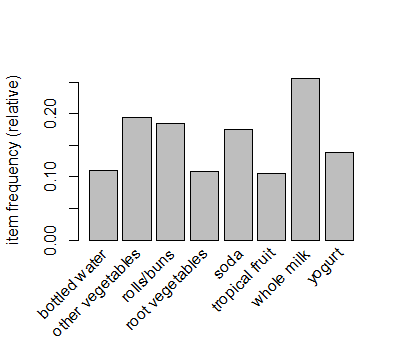
Also if we interested to just see the top 20 items that have been purchased more, we can used the same function but with different inputs as below:
itemFrequencyPlot(groceries, topN =20)
the topN arguments is set to 20 that means just main 20 items.

as you can see in above diagram, whole milk have been purchased more, then Vegetables and so forth.
We are going to use apriori algorithm in R.
install.packages("apriori")
now we able to call the
groceryrules <- apriori(groceries, parameter = list(support = 0.006, confidence = 0.25, minlen = 2))
we call function apriori()
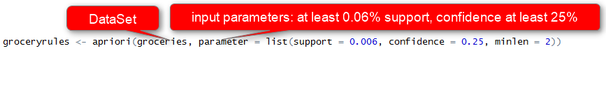
it gets groceries data set as first input, the list of parameters (such as minimum supports which is 0.06%, the confidence that is 25% and the minimum length of the rule 2) as second inputs.
the result of running this code will be
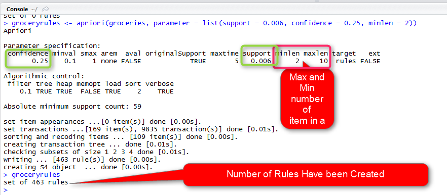
in above picture, we got about 463 rules
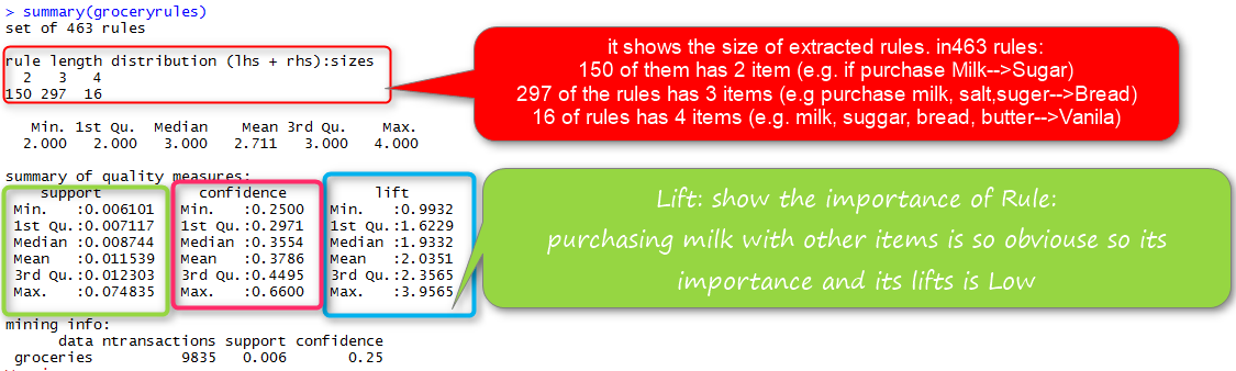
by applying summary function we will have summary of Support, Confidence and Lift.
Lift is another measure that shows the importance of the a rule, that means how much we should pay attention to a rule.
Now, we are going to fetch the 20 most important rules by using inspect() function
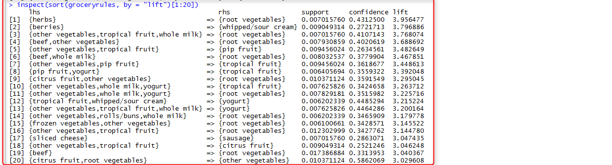
we employ inspect function to fetch the 20 most important rules. as you can see the most important rule is about people who purchasing Herbs—>will purchase Root Vegetable
as any machine Learning algorithm, the first step is to Train data.
[1]. http://www.ms.unimelb.edu.au/~odj/Teaching/dm/1%20Association%20Rules%2008.pdf
[2].Machine Learning with R,Brett Lantz, Packt Publishing,2015.
Stay Tuned for the Next Part.
Published Date : January 11, 2017

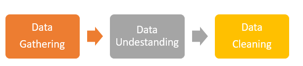
In previous post you’ve learned about data structures in R. In this post I’ll explain Data Gathering, Data Understanding, and Data Cleaning, which are the main tasks of data management that need to be done before any machine learning process. In this post I will explain how to fetch data from Spreadsheet and SQL Server. Gathering data from other resources help us to do some analysis inside R Studio.
In RStudio we can fetch data from different resources such as Excel, SQL Server, HTML, SAS and so forth.

 Import from Spreadsheet
There are two main approach to import Excel and CSV file into R:
For importing the excel file, from “File” menu, “Import dataset” should be selected, then “From Excel”.
Next, below windows will be shown up. We brows our desire Excel file from “File/Url “
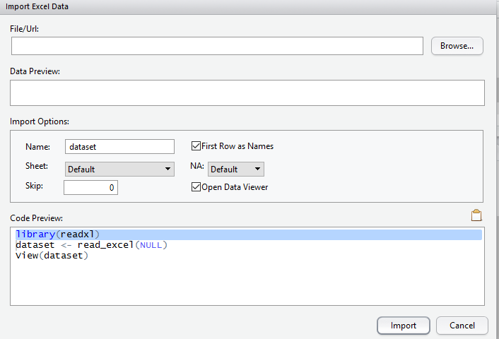
After we browse computer to import the required excel file, RStudio automatically detects the Excel headers data preview.
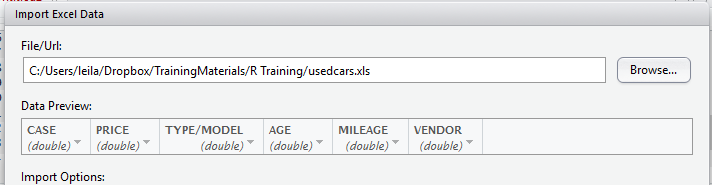
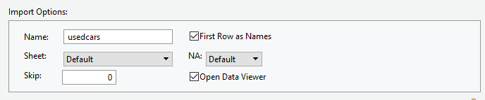
We also able to change importing options such as first row as header, sheet number, skip how many rows and so forth.
Moreover, the code behind the reading excel file, has been shown in Code Preview section.

Finally, by clicking on import option, all the dataset will be shown in Rstudio as below
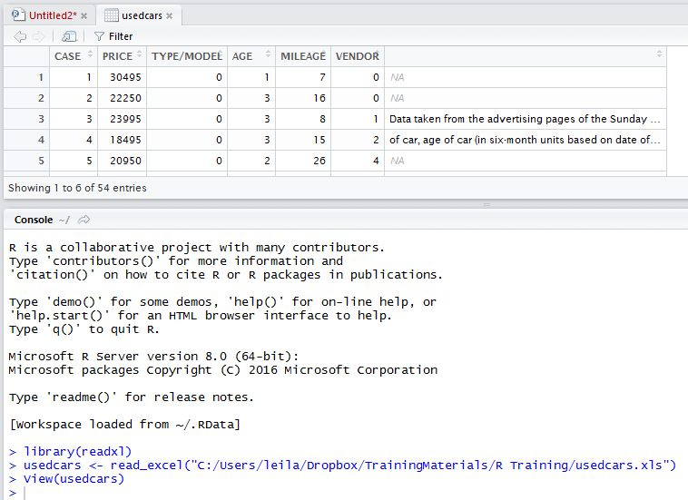
This process is equal to write the below codes in RStudio command editor:
R supports more than 6000 packages that each of them help the R users to have more functionality. For instance, to read the Excel file we need to call or install package “readxl”. If the package is already installed, we just call it via “library(readxl)”, if not we have to use command “install.packages(readxl)”.
Next, we call the function “read_excel()”. We should provide the path of the excel file as argument for his function. Finally, by calling the View() function, dataset will be shown to user.
We can follow the same process for CSV files .
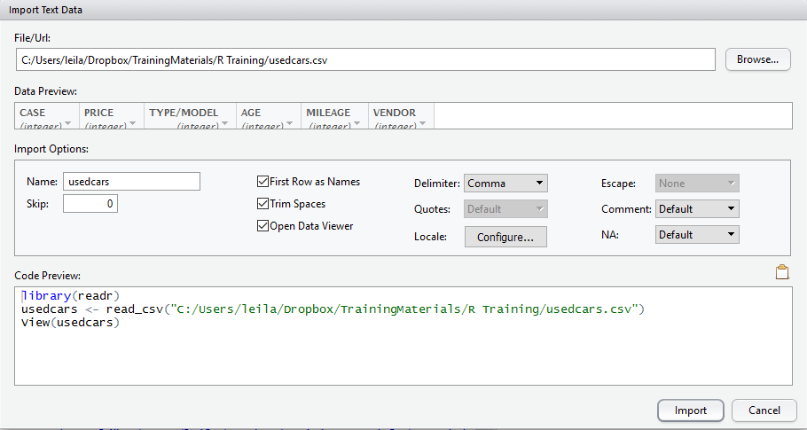
The only difference between importing Excel and CSV file is on setting up the import option as there are some more options to set. Such as “Delimiter”, “Trim Spaces” and so forth.
Moreover, the code behind the importing CSV file into RStudio is like:
![]()
We need to call “libraray(readr)” and call function “read_csv”.
In function “read_csv” we can specify that do not consider the character type as Factor by adding stringsAsFactors = FALSE to the function arguments.
usedcars <- read_excel(“C:/……….xls”,stringsAsFactors = FALSE)
 SQL Server 2016
we can fetch data from SQL Server and we want to do some analysis on it in RStudio. To get data from SQL Server 2016, first we should install a package named RODBC.
![]()
There is a function name odbcDriverConnect () that help us to connect to SQL Server database.
![]()
We should specify the Driver as “SQL Server”, server as “localhost”, DatabaseName as”DW”. The output of the odbcDriverConnect will be stored in a variable name dbhandle.
Then we can use sqlquery function to fetch data from SQL Server.in this function we pass the dbhandle as it contains the information about the database connection and the second argument should be SQL query to fetch data from tables.
For instance, we have a table name “usedcars” in “DW” database in SQL Sever 2016, we want to fetch all columns into a variable name “res”. The below query help us to do that.
![]()
We use View () commend to see the table inside the res variable
In Next post I will explain how to explore data to check the behaviour of data.
Save
Published Date : January 9, 2017
Every programming language has specific data structure. R language also has some predefined data structure that each of them can be useful for specific purposes. For doing machine learning in R, we normally use data structure such as Vector, List, Data Frame, factors, arrays and matrix. In this post I will explain some of them briefly.
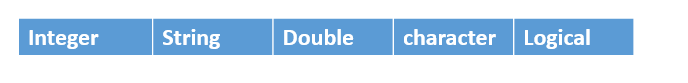
Vector stores the order set of values. All values have same data type. Each vector can have types like Integer (numbers without decimals), Double (numbers with decimals), Character (text data), and Logical (TRUE or FALSE values).

We use Function C () to define a vector to store people name.
![]()
Subject_name is a Vector that contains Character value (People name).
We can use the Typeof () to determine the type of Vector.
![]()
The output will be:
![]()
Now we are going to have another vector that stores the people age.
![]()
The Age vector stores Integer value. We create another vector to store a Boolean information about whether people married or single:
![]()
Using the Typeof () Function to see the Vector type:

We can select specific elements of the each vector, for example to extract the second name in Subject_Name vector, we write below code:
![]()
which the output will be:
![]()
Moreover, there is a possibility to get the range of value in a Vector. For example, we want to fetch the age second and third person we stored in Age vector, the code should be look like below:
![]()
The out put will be like:
![]()
Factor is specific type of Vector that stores the categorical or ordinal variables, for instance, instead of storing the female and male in a vector computer stores 1,2 that takes less space, for defining a Factor for storing gender we first should have a vector of gender as below
C(“Female”, “Male”)
then we use commend Factor() as below
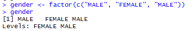
as you can see in above output, when I called the “gender” , it shows the gender of people that we stored in Vector plus a value called “Level”, Level show the possible value in gender vector.
for instance, currently we just have BA and Master students . However, in future there is a possibility that we have PhD or Diploma students. So we create a factor as below that can support future types as well:

we should specify the “Levels” like this :levels = c(“BA”,”Master”, “PhD”,”Diploma”)
List is so similar to vector. List able to have combination of data types whilst in Vector we just can have one data type.
For instance for storing the student’s information we can use list as below:
![]()
the out put of calling students list will be look like:
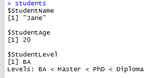
List helps us to have combination of the data type.
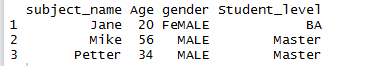
Data Frames are most important data structure in machine learning process. It similar to Table as it has both columns and rows.
To define a Frame we use data.frame syntax as below:
![]()
studentData is a data frame that contains some vectors like subject_name, Age, Gender and Student_Level.
R automatically convert every character vector to a factor, hence to avoid that we normally use StringAsfactor as parameter that specify character data type should not consider as factor.
the output of calling Studentdata will be look like:
As data frame is like a table we can access the cells, rows and columns separately
for instance, to fetch a specific column like age we use below code:
![]()
only the Age column as a Vector has been shown.
Moreover, we just want to see age and gender of students so we employ below code:
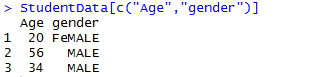
we can extract all the rows of the first column:
![]()
or extract all columns data of specific students using below code
![]()
in next post I will show how we can get data from different resources and how to visualize the data inside R.
Reference :L. Brents. Machine Learning with R, Pack Publishing, 2015
Save
Published Date : June 9, 2016

In previous videos you’ve learned that we can demonstrate R visualization in Power BI, In this video you will learn how R visualization is working interactively with other elements in Power BI report. In fact Power BI works with R charts as a regular visualization and highlighting and selecting items in other elements of report will effect on that. Here is a quick video about this functionality;
If you would like to learn more about Power BI read Power BI online book; from Rookie to Rock Star.
Published Date : May 30, 2016

You have seen previously how we can use output of Azure ML model in a Power BI and visualize it with SandDance. In this video you will learn how to use R script as a source in Power BI desktop. Watch the video below;