Visualizing Data Distribution in Power BI – Histogram and Norm Curve -Part
Published Date : May 29, 2017
 In the Part 1 I have explained some of the main statistics measure such as Minimum, Maximum, Median, Mean, First Quantile, and Third Quantile. Also, I have show how to draw them in Power BI, using R codes. (we have Boxplot as a custom visual in power BI see :https://powerbi.microsoft.com/en-us/blog/visual-awesomeness-unlocked-box-and-whisker-plots/ ). However, to see the data distribution another way is to draw a histogram or normal curve. The spread of the numeric variable can be check by the histogram chart. Histogram uses any number of bins of an identical width. Below picture shows the data distribution for my Fitbit data (Floors, Calories Burned, and Steps).
 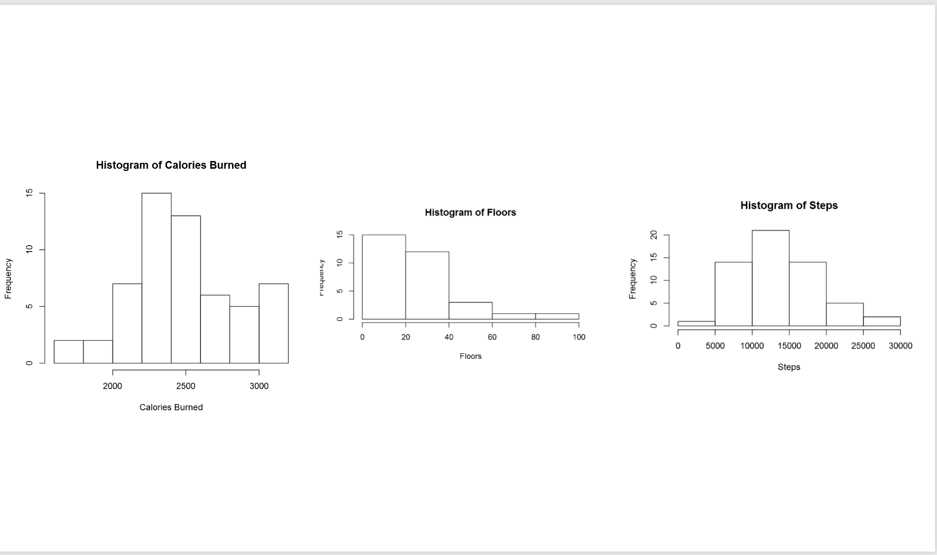 to create a histogram chart, I wrote blew R code.
hist(dataset$Floors, main = “Histogram of Floors”, xlab = “Floors”)
In the above picture, the first chart shows the data distribution for my calories burn during three mounths. as you can see, most of the time I burned around 2200 to 2500 calories, also less than 5 times I burned calories less than 2000 calories. If you look at the histogram charts you will see each of them has different shape. As you can see the number of floors stretch further to the right. while calories burn and number of floors tend to be evenly divided on both sides of the middle. this behaviour is called Skew. This help us to find the data distribution, as you can see the data distribution has a Bell Shape, which we call it Normal Distribution. Most of the world data follow the normal distribution trend. Data distribution can be identified by two parameters: Centre and Spread.  The centre of the data is measured by Mean value, which is the data average. Spread of data can be measured by Standard deviation.
So What is Standard Deviation! Standard deviation can be calculated from Variance. Variance is :”the average of the squared differences between each value and the mean value”[1] in other word to calculate the variance, for each point of data we call (Xi) we should find its distance from mean value (μ). to calculate distance we follow the formula as : 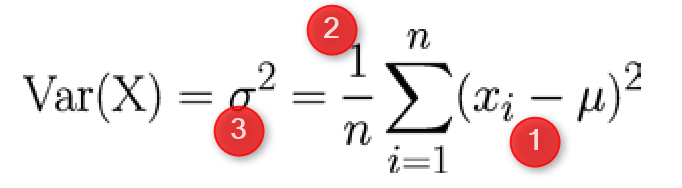
the distance between each element can be calculate by (Xi-μ)^2 (Number 1 in above Formula). Then for each point we have to calculate this distance and find the average. So we have summation of (Xi-μ)^2 for all the points and then divided by number of the points (n). σ^2 is variance of data. Variance or Var(X) is the distance of all point from the mean value. The Standard Deviation is sqrt of Var(X). that is σ. So if data is so distributed and has more distance from Mean value then we have bigger Standard Deviation.
To draw normal curve in Power BI I wrote the blow codes. First, I calculate the Average and Standard Deviation as
mean<-mean(dataset$CaloriesBurned)
sd<-sd(dataset$CaloriesBurned)
Then I used the “dnorm” function to create a norm curve as below:
y<-dnorm(dataset$CaloriesBurned,meanval,sdval)
Then I draw anorm curve using Plot function :
plot(dataset$CaloriesBurned, y, xlab=”x value”, ylab=”Density”, type=”l”,main=”Comparison of t Distributions”)
Then the following picture will be shown as below 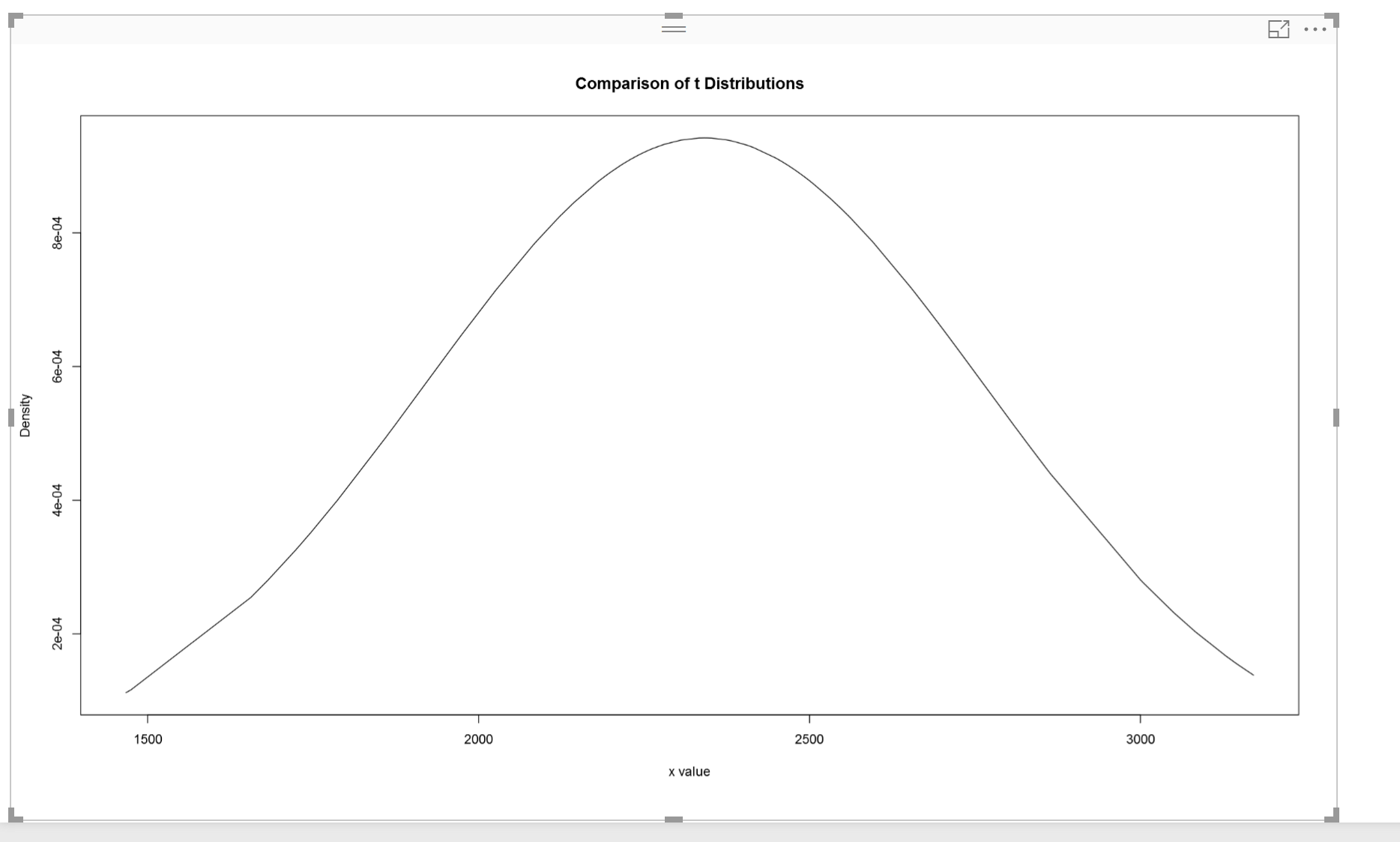 According to [1], the 68-95-99.7 rule states that 68 percent of the values in a normal distribution fall within one sd of the mean, while 95 percent and 99.7 percent of the values fall within two and three standard deviations, respectively[1].
 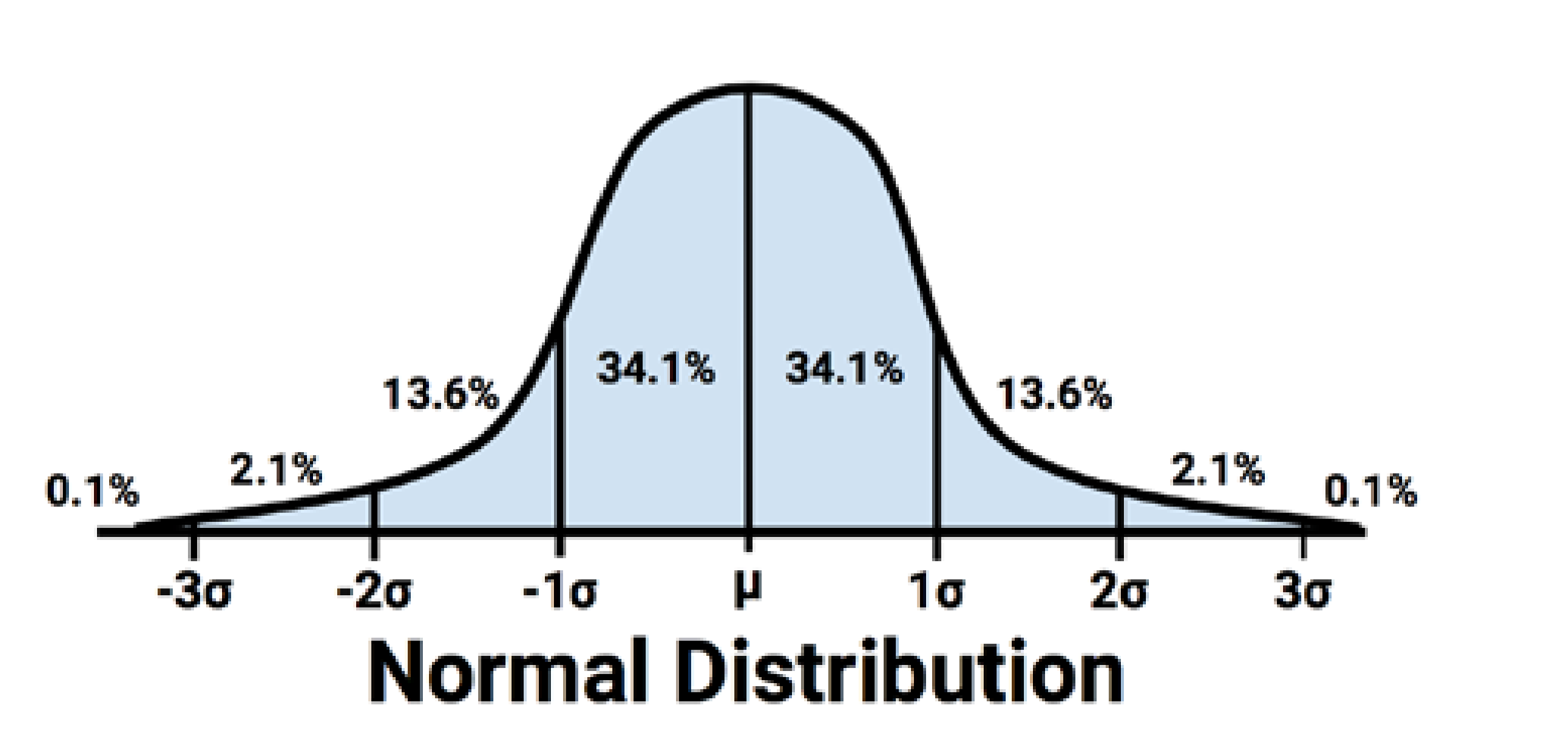 As you can see 68% of data is located between -sd and +sd. the 95% of data is located between -2sd and +2sd. Then, 99% of data has been located between -3sd and +3sd. to draw and identify the 68% of data I add other calculation to R code in Visualization as below: first I set a range of value for range (average-standard deviation, average +standard deviation) lower bound (lb) is average- standard deviation lb<-mean-sd for upper bound (ub) we calculate it as below ub<-mean+sd i <- x >= lb & x <= ub Then I draw a Polygon to show the 68% of data, so will be as below: polygon(c(lb,x[i],ub), c(0,hx[i],0), col=”red”) also we can specify the 98% of data distribution by writing the below code:
lb<-mean-1.5*sd ub<-mean+1.5*sd
the result will be as below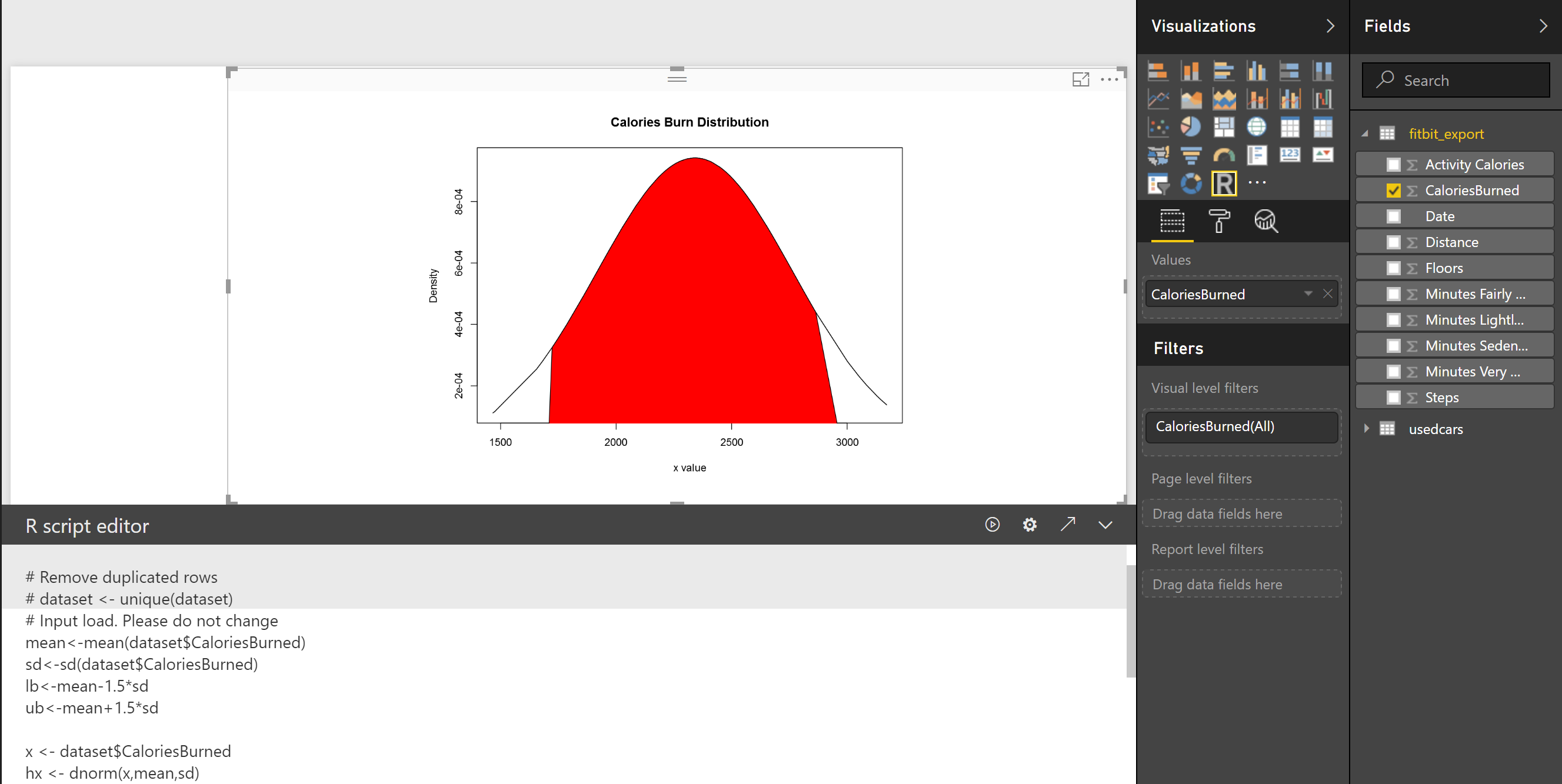
[1].Machine Learning with R,Brett Lantz, Packt Publishing,2015.
Visualizing numeric variables in Power BI – boxplots -Part
Published Date : May 27, 2017
In this post and next one, I am going to show how to see data distribution using some visuals like histogram, boxplot and normal distribution chart.
It always important to have a holistic perspective regarding the minimum, maximum, middle, outliers of our data in one picture.
One of the chart that helps us to have a perspective regard these values in “Box Plot” in R.
For example, I am going to check my Fitbit data to see what is data min, max, meadian, outlier, first and third quadrant data using Box-Plot chart.
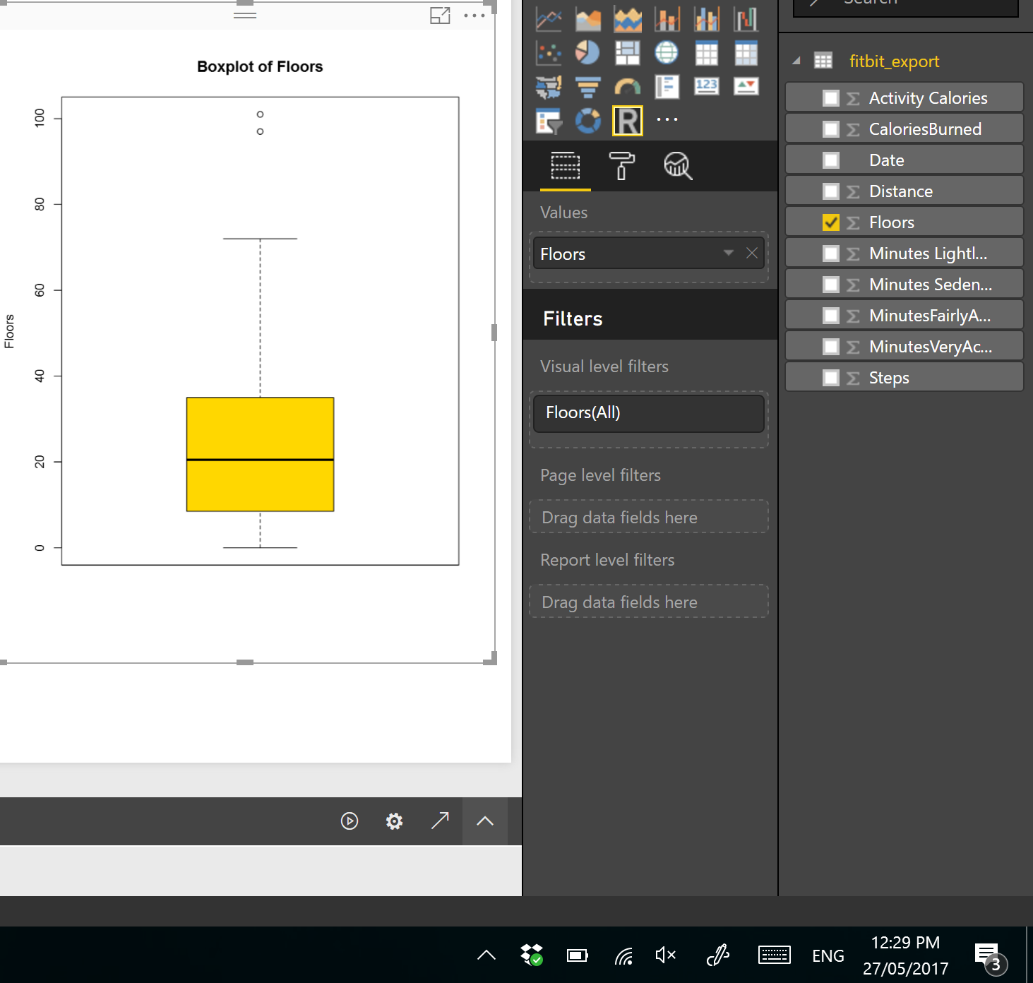
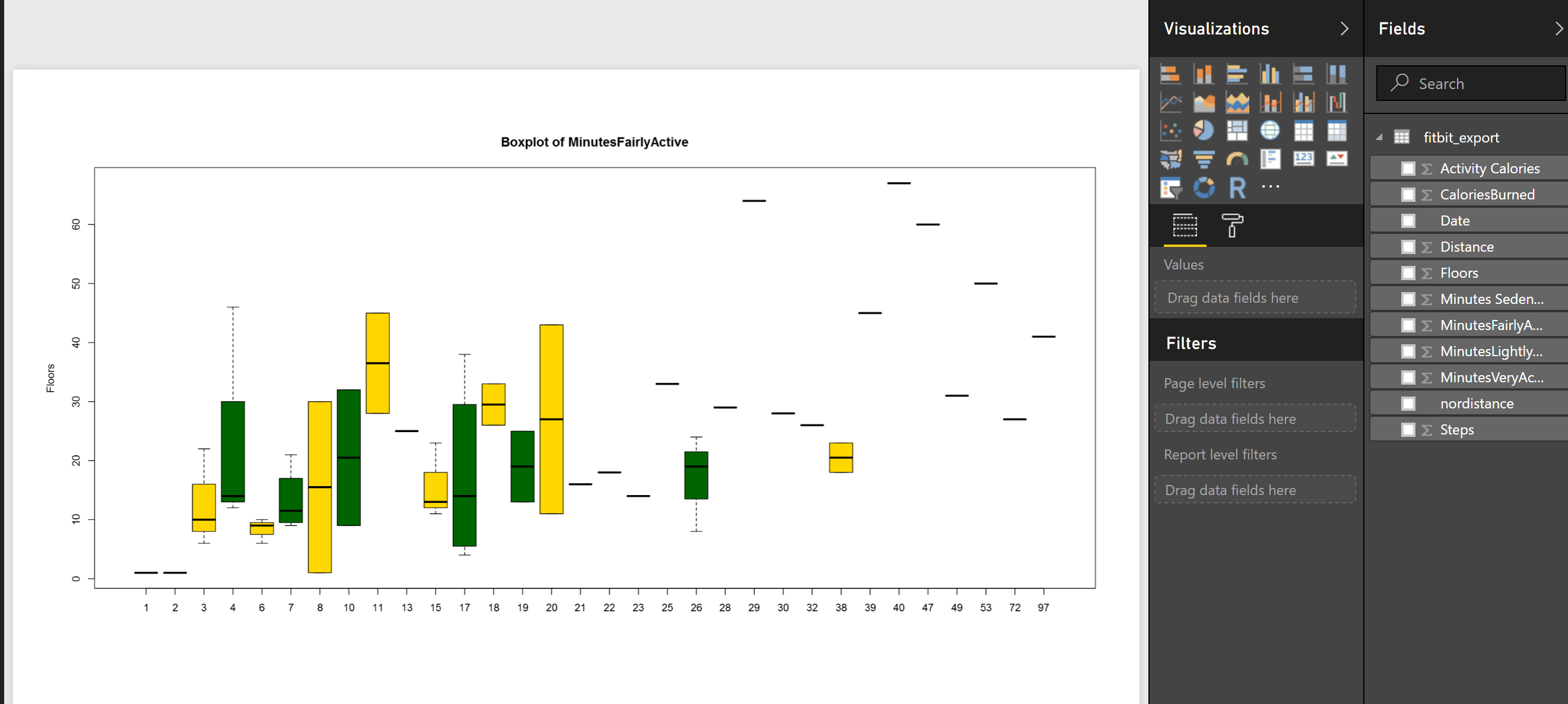
I drawa box-pot chart for checking the statistic measure number of floors I did in last 3 months, in PowerBI using R scripts.
The below codes can be used for drawing the box-plot chart. So, I choose the Floors field from power bi fields and then in R scripts I refer to ii.
boxplot(dataset$Floors, main=”Boxplot of Floors”, ylab=”Floors”)
As you can see in above code, there is a function name “boxplot” which help me to draws a box plot. It gets the (dataset$Floors) as the first argument. Then, it gets the named of the chart as the second argument and the y axis name as the third inputs.
I have run the code in Power BI and I the below chart appear in PowerBI.
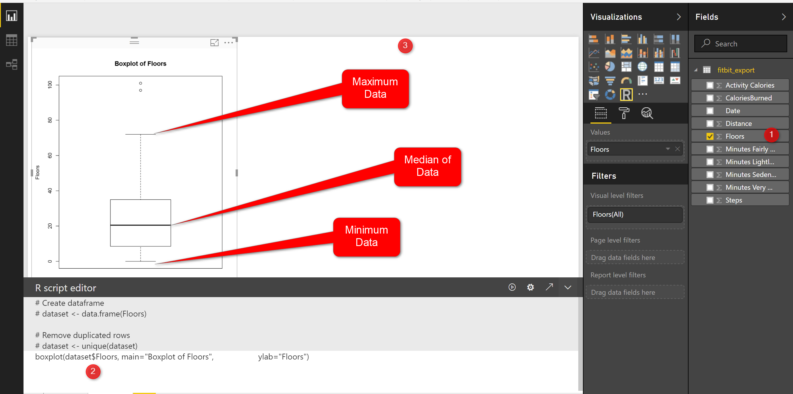
this chart shows the minimum and maximum of the number of floors I did in last three months. as you can see in the picture the minimum number of floors was “0” (the line at the bottom on the chart)and maximum is “70” (the line at the top of the chart). however I am able to see the median of data (middle value ) is around 20 (the bold line in middle of the chart).
What is median!
imagine we have a dataset as (1,4,7,9,16,22,34,45,67) it is a sorted dataset, find the number that physically placed in middle of the dataset, I think 16 is physically located in middle of the list, so the median of this dataset is 16. median is not the mean value. mean or average is summation of all data divided by number of data for the sample dataset is 22, so 22#16! that means mean is not equal to Median, lets change the dataset a bit :(1,4,7,9,16,22,25,30,35), median is still 16, but mean change:16.5. so in the second dataset I exclude the outlier (45,67) and it impacts on the mean not median!
Note: if we have lots of outlier in both side of our data range mean will be impact, more outlier at the upper range of our data (as above example) we have bigger mean than median, or if we have more lower outliers ourmean value will be lower than median.
In the boxplot we just able to see the median value.
We have two other measure name as first and third quantile. First quantile (see below picture), is the median value for the data range from minimum of data to median of data, so above example we just look at the data range from (1,4,7,9,16) and we find the median which is 7 so the first quantile is 7. third quantile is the median for data range from (median to maximum).
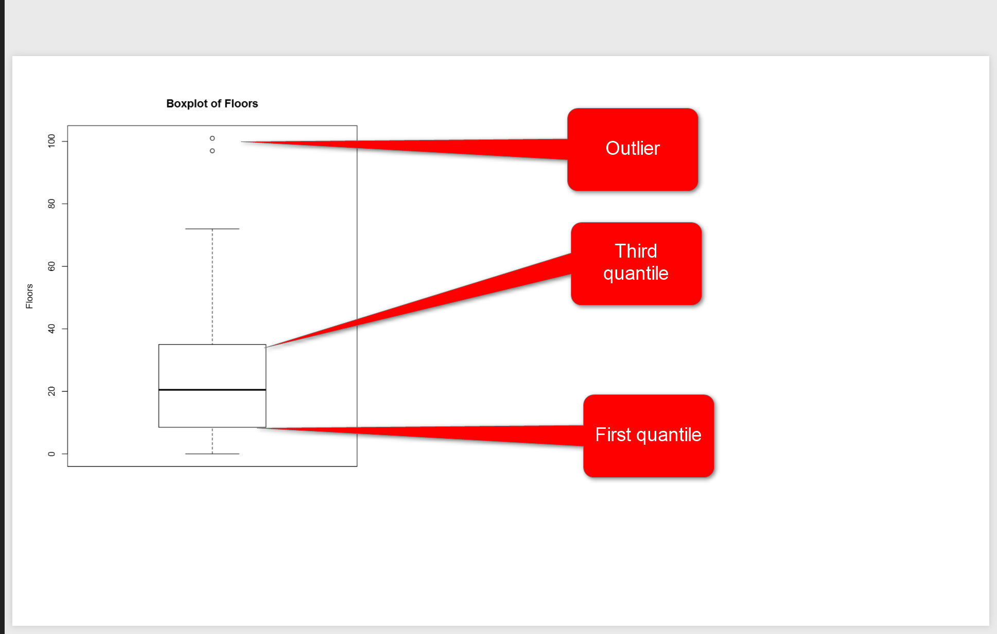
in above picture, you see two line in middle of the picture, they are first and third quantile. the bold line is median. So, for my Fitbit data and for number of floors I have 10 for First Quantile, and for the Third Quantile we have 35.
However you see, there are some “not filled dot” in above of the chart that shows the outliers for floors number, they will impact on the mean value but not on median value. In Fitbit dataset, occasionally, I did 100 floors, which is a shame! :D, sometimes it is good to remove outliers data from charts to make data more smooth, so for machine learning analysis to get a better result some times it is good to remove them.
if you need more color change the code as below
boxplot(dataset$Floors, main=”Boxplot of Floors”, ylab=”Floors”, col=(c(“gold”)))
or sometimes, you prefer to compare two attributes together then, for instance I am interested to see what is the median.
boxplot(MinutesFairlyActive~Floors, data=dataset,main=”Boxplot of MinutesFairlyActive”, ylab=”Floors”, col=(c(“gold”,”dark green“)))
So to compare the statistics of minutes that I was fairly active to number of Floors, I change the code a bit, and compare them against each other, also I add another color to show them as below
In next post, I will talk about histogram that also show the data distribution and normal curve in detail!
Identifying Number of Cluster in K-mean Algorithm in Power BI: Part
Published Date : May 17, 2017

I have explained the main concept behind the Clustering algorithm in Post 5 and also I have explained how to do cluster analysis in Power BI in Part 6.
In this post, I will explain how identify the best number of cluster for doing cluster analysis by looking on the “elbow chart”
K-Mean clusters the data into k clusters. we need some way to identify whether we using the right number of clusters.
elbow method is a way to validate the number of clusters to get higher performance. The idea of the elbow method is to run k-means clustering on the dataset for a range of K values.
The min concepts is to minimize the “sum of squared errors (SSE)” that is the distance of each object with the mean of each cluster. we try k from 1 to the number of observation and test the SSE.
Let’s have a look on a “Elbow Chart”.
as you can see in above picture, In Y axis we have SSE that is the distance of objects from the cluster mean. smaller SSE means that we have better cluster (see post part 5).
so as the number of cluster increase in X axis, SSE become smaller. But we need minimum number of cluster with the minimum SSE, so in above example, we choose the elbow of chart to ha.ve both minimum number of cluster and minimum SSE.
So, Back to example I have done in post part 6, I am going to show how to have Elbow chart in Power BI using R codes.
wss <- (nrow(dataset[,1:4])-1)*sum(apply(dataset[,1:4],2,var))
for (i in 2:15) wss[i] <- sum(kmeans(dataset[1:4], centers=i)$withinss)
plot(1:15, wss, type=”b”, xlab=”Number of Clusters”, ylab=”Within groups sum of squares”)
I write this code inside Power BI R editor visualization.
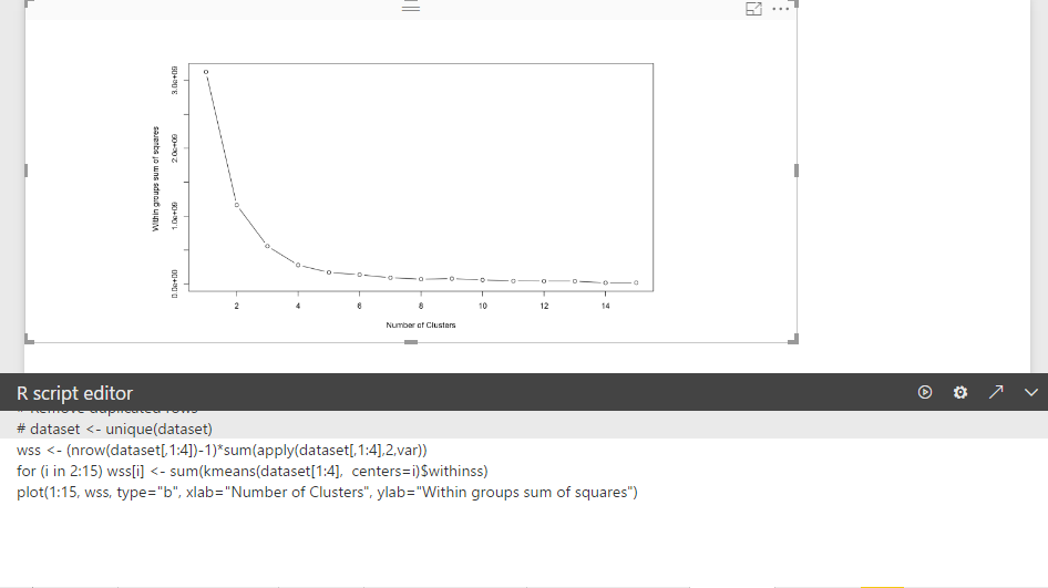
According to the explanation, for clustering Fitbit data we need 4 or 3 cluster. which is minimum SSE and minimum number of Cluster. by applying this number, w should have better clustering.
You able to download the power BI file for cluster analysis and evaluation from below
Download Demo File
[1]https://stats.stackexchange.com/questions/147741/k-means-clustering-why-sum-of-squared-errors-why-k-medoids-not
K-mean clustering In R, writing R codes inside Power BI: Part
Published Date : May 2, 2017
In the previous post,I have explained the main concepts and process behind the K-mean clustering algorithm. Now I am going to use this algorithm for classifying my Fitbit data in power BI.
as I have explained in part 5, I gathered theses data from Fitbit application and I am going to cluster them using k-mean clustering. My aim is to group data based on the calories burned, number of steps, floors and active minute. This will help me categories my groups to “Lazy days”, “Working Days”, “Some Activities”, “Active Days”, and “Extremely Active” days.
First, in power BI, I clicked on “Edit Query”. Then I choose the “Run R Script” icon.
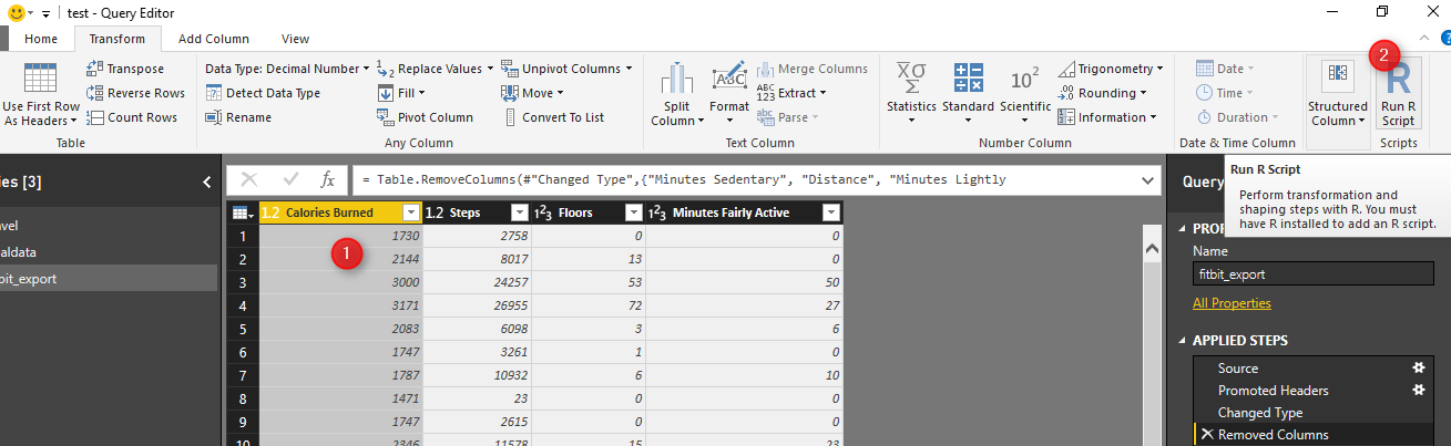
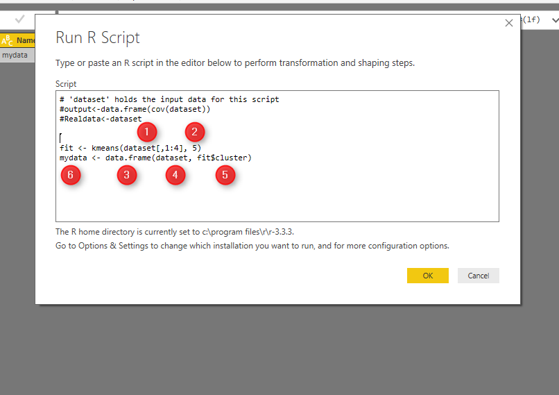
Next, write below codes in R editor (see below picture).
As you can see the data (fitbit data) is in variable “dataset”.
Kmeans function in R helps us to do k-mean clustering in R. The first argument which is passed to this function, is the dataset from Columns 1 to 4 (dataset[,1:4]). The second argument is the number of cluster or centroid, which I specify number 5. There is some approach to find the best number of cluster (which will be explain later).
Tow the result of clustering will be stored in “fit” variable. Moreover, to see the result in power BI I need to convert dataset to “data.frame” format. so I called the function “data.frame” which gets “dataset” as the first argument. Moreover, the fit$cluster (result of k-mean clustering) will be added as a new column to the original data. All of these data will be stored in “mydata” variable. If, I push the ok bottom, I will have the result of clustering as new dataset.
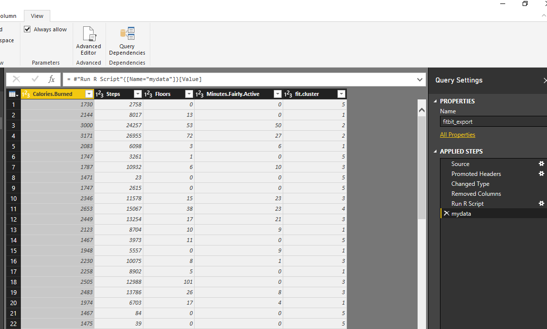
see below picture. In data now each row has been allocated to a specific cluster.
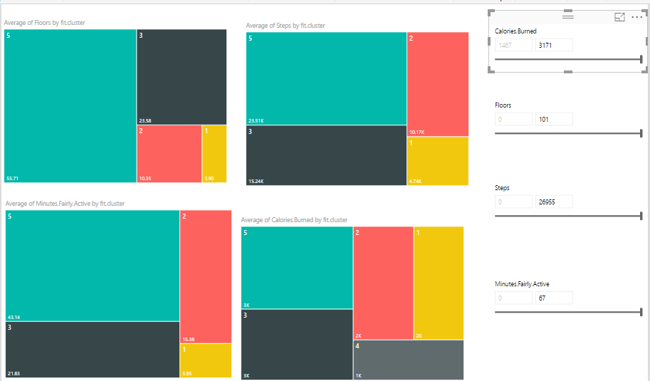
We have run clustering, I am going to show the results in power BI report, using power BI amazing visualization tools!
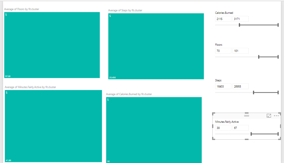
Created 4 different slicers to show “calories”, “floors”, “steps” and “activities”, I have four different heat map charts. Chart number 1 shows the average of” number of Floors” I did by different clusters, number 2 shows “average number of steps” by clusters, number 3 shows “average amount of active minutes” by clusters, and finally number 4 show the “average number of burned calories” by clusters.
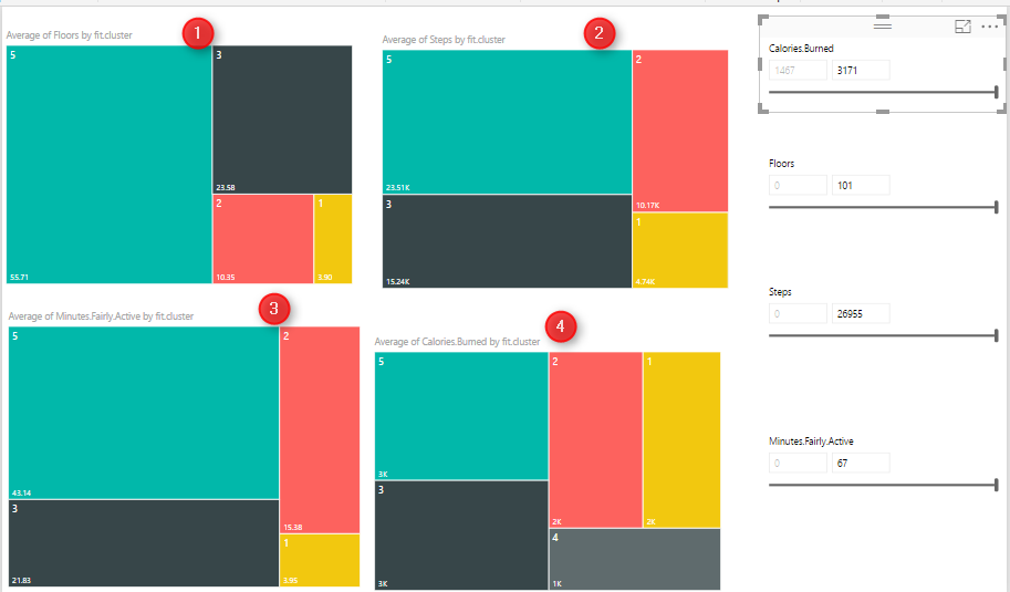
I am going to see if I burned between 2000 and 3200 calories, with 70 to 101 floors, and then with 16000 to 26000 steps and be active for 38 to 67 minutes I am belong to which cluster. as you can see it will be cluster 5.
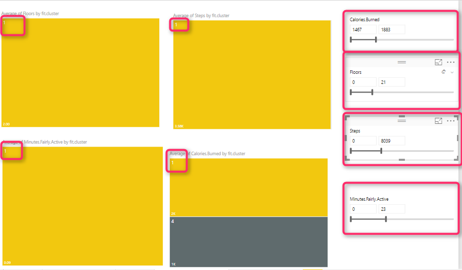
I did the same experiment and check different values to see the different cluster values as you can see below:
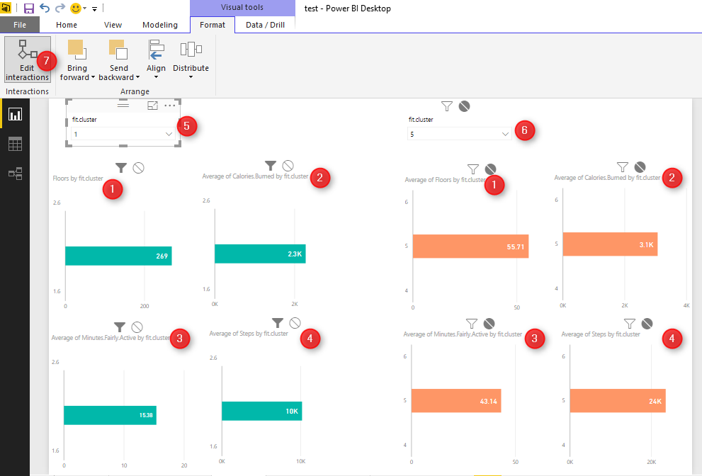
Another way of analysis can be done by comparing cluster 1 to cluster 2.
To do that, I have created the below reports for comparing these numbers. To create this report, I have two groups of charts (green and orange)
The first column chart (number 1) shows the “number of floors for each cluster”, charts number 2 in each group show the average “burned calorie” by cluster , chart number 3 show the “average active minutes”, and the last one shows the” average steps”. Then, I created two different slicers to select cluster numbers. Number 5 for first cluster and number 6 for second one. As you know selecting a number in each slicer will have impact on the other charts. To prevent the impact of slicer number 5 on orange chart, I click on “Format” tab in power BI, then I choose the “Edit Interaction” option, now I am able to select by clicking on each slicer which chart should change and which not. In the following example , for first slicer I chose cluster number 1, and for the other slicer I chose number 5. I am going to compare their result together.
The good thing about using R with Power BI is that you can benefit from the great interactive and nice looking charts in Power BI and hence better analyzing data with R algorithms. There are many other different ways that we can analysis these results to get better understanding of our data.
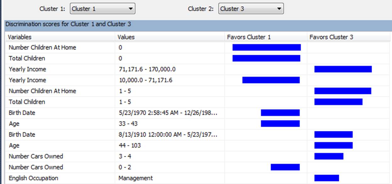
This visualization reminds me the “data mining” tools we have earlier in “Microsoft SSAS” see below:
Clustering Concepts , writing R codes inside Power BI: Part
Published Date : May 1, 2017
Sometimes we just need to see the natural trend and behaviour of data without doing any predictions. we just want to check how our business data can be naturally grouped.
According to the Wikipedia , Cluster analysis or clustering is the task of grouping a set of objects in such a way that objects in the same group (called a cluster) are more similar (in some sense or another) to each other than to those in other groups (clusters).
For instance, we are interested in grouping our customers based on their purchase behaviour, demographic information [1]. Or in science example, we want to cluster the number and severity of earth quick happened in New Zealand for the past 10 years, or for medical purpose, we want to classify our patients with cancer based on their laboratory results.
Clustering is non supervised learning that means we are not going to assign any label for algorithm.
In this post, I am going to explain the main concepts behind the k-mean clustering and then in next post I will show you how I am able to use clustering to classify my Fitbit data using Power BI report.

Fitbit is an activity tracker, wireless-enable wearable technology device that measures data such as: number of steps, heart rate, quality of sleep, steps climbed, calorie burned and so forth.
I have downloaded my history of my activities in Excel format from Fitbit website (see below page)
as you can see, information such as calories burned, number of steps, distance, Floors, minute activities and so forth have been recorded.
as you can see, information such as calories burned, number of steps, distance, Floors, minute activities and so forth were recorded.
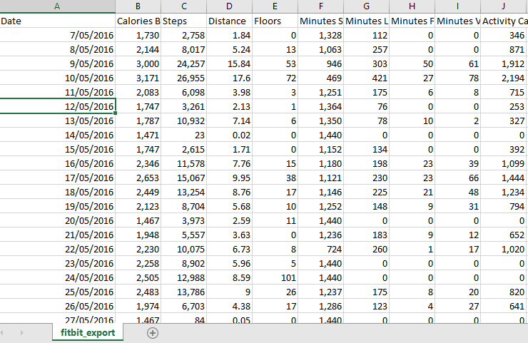
Now, I imported these data into the Power BI desktop to do some data transformation to remove unnecessary columns . Finally, I came up with the below table!
My aim is to see grouped data based on calories burn, step number, floors and active minute. This helps me to see while I have high calories burned, did I have also high number of steps or just because of number of activities have high calories burnt.
Before explaining how I am going to use k-mean clustering to group my Fitbit data, first in this post, let me show an example on how k-mean clustering works. I will explain the concepts by using the good example provided by this blog [2].
There are different clustering approaches that proposed by different researchers. One of the popular ones is k-mean clustering. In K-mean clustering, K stands for number of clusters that we want to have from data. Mean is the mean of the clusters (centroid). That means we classify the data based on their average distance to the centre of each cluster.
Imagining that we have a series of data as below, each individual with two set of value :A and B
| Individuals |
Value A |
Value B |
| 1 |
1 |
1 |
| 2 |
1.5 |
2 |
| 3 |
3 |
4 |
| 4 |
5 |
7 |
| 5 |
3.5 |
5 |
| 6 |
4.5 |
5 |
| 7 |
3.5 |
4.5 |
to cluster this dataset, we decided to have just two clusters, so it is a 2-mean (k-mean). first I created 2 clusters based on the smallest and largest values. The smallest value is individual 1 with A & B (1,1). and the largest one is individual 4 with (5 ,7). we consider individual one is cluster one and individual 4 is cluster 2.
Then, we have two clusters with the below specifications
| Cluster |
Individuals |
Mean Vector (centroid) |
| 1 |
1 |
(1,1) |
| 2 |
4 |
(5,7) |
Next step is to find the distance of other each individual from each of the two clusters. for example, for individual 2 we have to calculate its distance to cluster 1 (which currently just has individual one) and also calculate individual 2 distance value to cluster 2 (which has individual 4). I am using Euclidean distance to calculate distances.
| Cluster |
distance to cluster |
|
| 1 |
sqrt ((1-1.5)^2+(1-2)^2)=1.11 |
|
| 2 |
sqrt ((5-1.5)^2+(7-2)^2)=6.11 |
|
So we choose the cluster 1(1.11) because it has the closet distance to the individual 2 than cluster 2 (6.11). At the beginning, the mean of cluster 1 was (1,1) since it only included individual 1. Now by adding individual 2 to cluster 1 we need a new “mean value” for cluster 1. we call the mean value of cluster as “centroid”.
The mean (centroid) cluster 1 is the average of vectors for individual 1 and 2, so the new centroid for cluster 1 can be calculated via ( (1+1.5)/2, (1+2)/2)=(1.2,1.5).
We did all of the above processes for all individuals, and came up with the below table of results. If I want to explain the process, it will be as below:
In step one, subject 1 compared with subject 1 (itself), so the centroid is individual value (1 1) and we have just one element in cluster 1.
the same for subject 4 in step 1.the centroid in cluster 2 will be the individual 4 value.
in step 2 we found that subject 3 has closet distance with subject 1 than 4. so we updated the centroid for cluster 1 (mean of the subject 1 and 3), we came up with the new centroid as (1.2, 1.5). and in the cluster 1 we have 2 elements and in the cluster 2 just one.
We followed the steps till all subjects were allocated to a cluster. In the step 6, which is final step, we have 3 elements in the cluster 1, and 4 elements in the cluster 2.
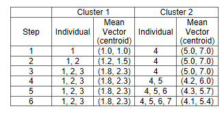
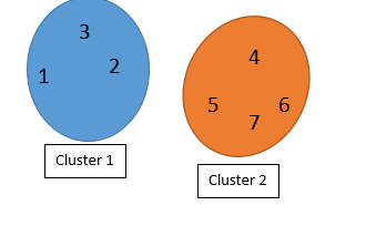
So we can say individuals 1,2, and 3 belong to cluster 1 and individuals 4,5,6,7 belongs to cluster 2.
The best clustering result is when each individual has the closet distance to its cluster’s mean (centroid). In our example the individual 1,2,3 should have the closet distance to their centroid which is (1.8,2.3). also they should have the longest distance to other cluster’s centroid.
However,
the clustering is not finished! We should find the distance between each element with its cluster centroid (step 6 in above table) and also with other cluster centroid. Maybe some elements belong to other clusters.
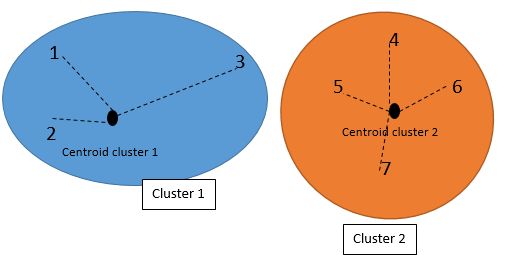
So first we check the distance with other Clusters (see first picture). Then we calculate the distance with other cluster centroid
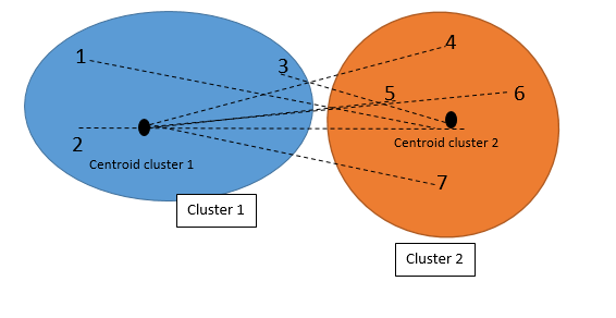
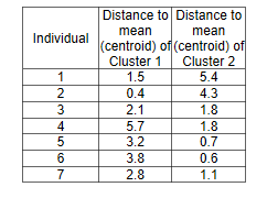
The below picture shows the distance of each individual to the centroid of the other clusters (not their own):
The below picture shows the distance of each individual with their own cluster’s centroid.
Finally we came out with the below numbers. as you can see in below tables, the individual 3 now has closet distance to the cluster 2 than Cluster 1.
So, now we have to rearrange the clustering as below.
Individual 1 and 2 belong to cluster 1, and individual 3,4,5,6,7 belongs to cluster 2.
This example tries to explain the overall process of clustering. So, Now I am able to show you how I applied clustering algorithm on my fit bit data in the Power BI in the next post.
[1] http://blogs.sas.com/content/subconsciousmusings/2016/05/26/data-mining-clustering/#prettyPhoto/0/
[2] http://mnemstudio.org/clustering-k-means-example-1.htm
Variable Width Column Chart, writing R codes inside Power BI: Part
Published Date : April 21, 2017
In the part 1, I have explained how to use R visualization inside Power BI. In the second part the process of visualization of five dimension in a single chart has been presented in Part 2, and finally in the part 3 the map visualization with embedded chart has been presented.
In current post and next ones I am going to show how you can do data comparison, variable relationship, composition and distribution in Power BI.

Comparison one of the main reasons of data visualization is about comparing data to see the changes and find out the difference between values. This comparison is manly about compare data Over time or by other Items.
for comparison purpose most of the charts can be available in Power BI Visualization, just two of them are not :Variable Width Column Chart and Table with Embedded Chart.
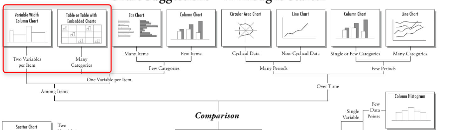
In this post I will talk about how to draw a “Variable Width Column Chart” inside Power BI using R scripts.
In the next Post I will show how to draw a Table with Embedded Chart” in the next post.
Variable Width Column Chart
you will able to have a column chart with different width inside Power BI by writing R codes inside R scripts editor.
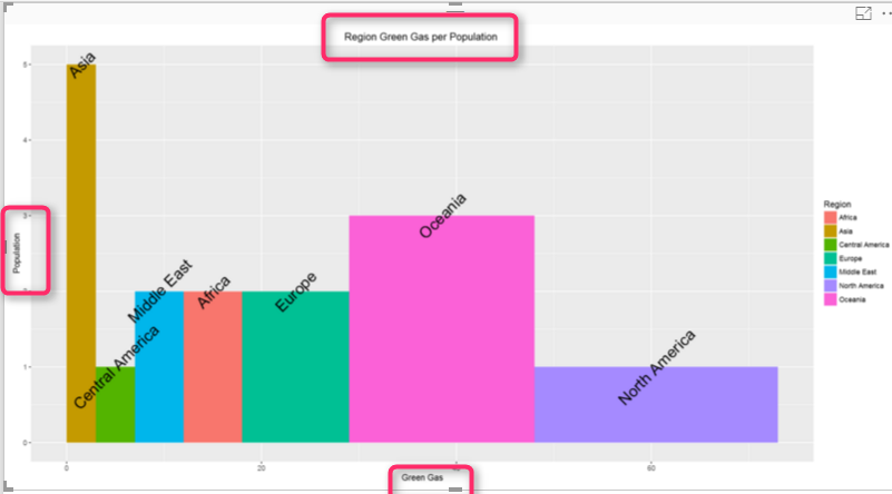
to start I have some dummy data about amount of green gas and population of each region .

in the above table, “Pop” stands for “Population” “Gas” stands for “Green Gas” amount.
to start, first click on the “R” visualization icon in the right side of the page in power bi desktop. Then, you will see a blank visualization frame in the middle of the report. Following, click on the required fields at the right side of the report to choose them for showing in the report. Click on the ” Gas”, “Pop” and “Region” fields.
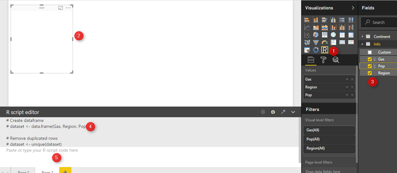
at the bottom of the page, you will see R scripts editor that allocate these three fields to a variable named “dataset”(number 4).
We define a new variable name “df” which will store a data frame (table) that contains information about region, population and gas amount.
df<-data.frame(Region=dataset$Region,Population= dataset$Pop,width=dataset$Gas)
as you can see in above code, I have used “$” to access the fields stored in “dataset” variable.
now, I am going to identify the width size of the each rectangle in my chart, using below codes
df$w <- cumsum(df$width) #cumulative sums.
df$wm <- df$w – df$width
df$GreenGas<- with(df, wm + (w – wm)/2)
the first step is to identify the start point and end point of each rectangle.
“cumsum” a cumulative sum function that calculate the width of each region in the graph from 0 to its width. This calculation give us the end point (width) of each bar in our column width bar chart (see below chart and table).
so I will have below numbers

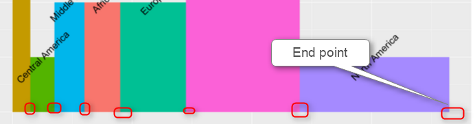
so we store this amount in df$w variable.
next, we have to calculate the start point of each bar chart (see below chart) using : df$wm <- df$w – df$width
Moreover, we also calculate the start point of width for each bar as below

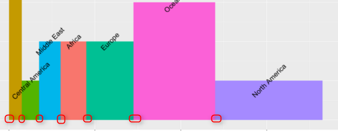
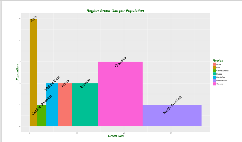
Another location that we should specify before hand is the rectangle lable. I prefer to put them in middle of the bar chart.
we want the label text located in the middle of each bar, so we calculate the middle of width (average) of each bar as above and put the value in df$GreenGas. This variable hols the location of each labels.
so we have all data ready to plot the chart. we need “ggplot2″ library for this purpose
library(ggplot2)
we call function “ggplot” and we pass the first argument to it as our dataset. the result of the function will be put in variable “P”
p <- ggplot(df, aes(ymin = 0))
Next, we call another function as below, this function draw a rectangle for us. this get the start point of each rectangle (bar) as “wm” and the end point of them “w” (we already calculated them in above and the third argument is the range of the “Population” number. The last argument if the colouring each rectangle based on their related region.
p1 <- p + geom_rect(aes(xmin = wm, xmax = w, ymax = Population, fill = Region))
p1
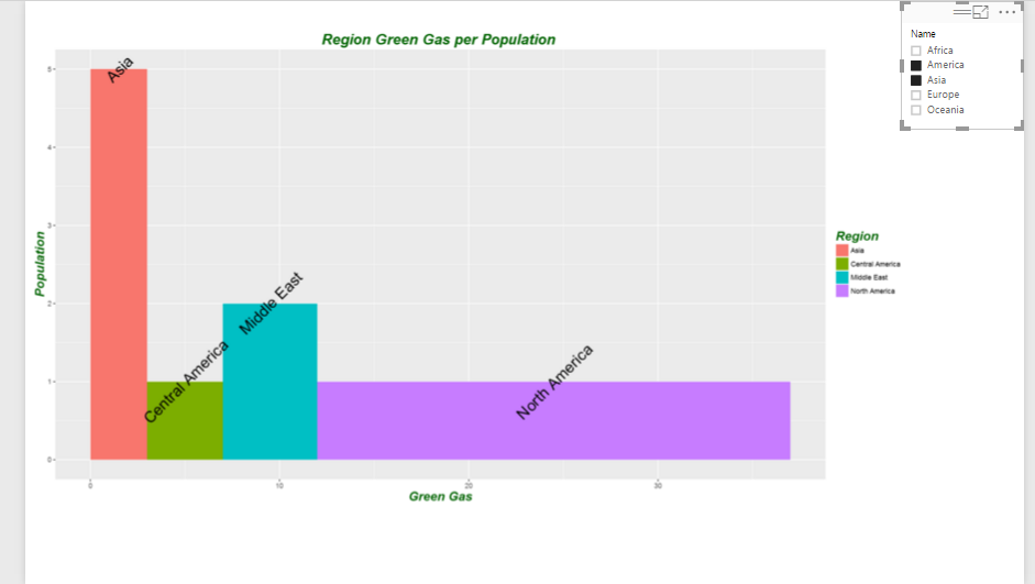
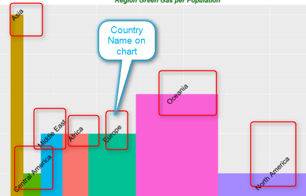
if we run the above codes we will have below chart

our chart does not have any label. so we need to add other layer to p1 as below .
p2<-p1 + geom_text(aes(x = GreenGas, y = Population, label = Region),size=7,angle = 45)
p2
geom_text function provides the title for x and y axis and also for the each rectangle using “aes” function aes(x = GreenGas, y = Population, label = Region).
however you able to change the size of the text label for each bar (rectangle) by adding a parameter ” size”. for instance I can change it to 10. or you can specify the angel of the label (rotate) it by another parameter as “angel” in this chart I put it to be “45” degree.

I am not still happy with chart, I want to change the title of x and y axis and also add a title to chart. To do this, I add another layer to what I have. I call a function name “labs” which able me to specify the chart title, x and y axis name as below
p3<-p2+labs(title = “Region Green Gas per Population “, x = “Green Gas”, y = “Population”)
p3
the problem with chart is that the title and text in x or y axis is not that much clear. as a result I define a them for each of them. to define a theme for chart title and the text I am going to use a function name ” element_text”.
this function able me to define some theme for my chart as below:
blue.bold.italic.10.text <- element_text(face = “bold.italic”, color = “dark green”, size = 10)
so I want the text (title chart , y and x text) be bold and italic. also the color be “dark green” and the text size be 10.
I have defined this theme. now, I have to allocate this theme to title of chart and axis text.
to do this, I call another function (Theme)and add this as another layer. Theme function I specify the axis title should follow the rules and theme I created in above code “blue.bold.italic.10.text” . the second argument in “theme” function allocated this created theme to the chart title as below
p4<-p3+theme(axis.title = blue.bold.italic.10.text, title =blue.bold.italic.10.text)
p4
There are other factor that you able to change them by adding more layers and function to make your chart better.
now I want to analysis the green gas per each continent. so I am going to add another slicer to my report to check it. so for example I just want to compare these numbers for “America” and “Asia” continent in my chart. the result is shown in below chart.
the overall code would be look like below :
df<-data.frame(Region=dataset$Region,Population= dataset$Pop,width=dataset$Gas)
df$w <- cumsum(df$width) #cumulative sums.
df$wm <- df$w – df$width
df$GreenGas<- with(df, wm + (w – wm)/2)
library(ggplot2)
p <- ggplot(df, aes(ymin = 0))
p1 <- p + geom_rect(aes(xmin = wm, xmax = w, ymax = Population, fill = Region))
p2<-p1 + geom_text(aes(x = GreenGas, y = Population, label = Region),size=7,angle = 45)
p3<-p2+labs(title = “Region Green Gas per Population “, x = “Green Gas”, y = “Population”)
blue.bold.italic.10.text <- element_text(face = “bold.italic”, color = “dark green”, size = 16)
p4<-p3+theme(axis.title = blue.bold.italic.10.text, title =blue.bold.italic.10.text)
p4
I will post the Power Bi file to download soon here.
Download Demo File
[1]https://i1.wp.com/www.tatvic.com/blog/wp-content/uploads/2016/12/Pic_2.png
[2]http://ggplot2.tidyverse.org/reference/geom_text.html
[3]http://stackoverflow.com/questions/14591167/variable-width-bar-plot
Over fitting and Under fitting in Machine Learning
Published Date : April 20, 2017


The main aim of machine learning is to learn from past data that able us to predict the future and upcoming data.
It is so important that chosen algorithm able to mimic the actual behaviour of data. in the all different machine learning algorithms, there is away to enhance the prediction by better learning from data behaviour.
However, in the most machine learning experiences, we will face two risks :Over fitting and under fitting.
I will explain these two concepts via an example below.
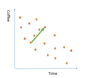
imagine that we have collected information about the number of coffees that have been purchased in a café from 8am to 5pm.
we spotted below chart
we what to employ a machine learning algorithm that learn from the current purchased data to predict what is the coffee consumption during a working day. This will help us to have a better prediction on how much coffee we will sell in each hour for other days.
For learning from past data there is three main ways .
1- Considering all purchased data. for instance:
12 cups at 8am
10 cups at 10am
5 cups at 10.30 am
10 cups in 13 pm
5 cups in 13.20 pm
3 cups in 13.40 pm
5 cups in 14 pm ?
you see the number of the selling coffee change and fluctuate, so if we consider all the coffee purchased points, it is very hard to find a pattern and we have lots of “if and else” condition that makes learning process hard. for example, number of purchased coffee dropped suddenly at 8.30 am, which is not that much make sense. Because , in the morning people are more in coffee. As a result, by considering all the points,we are going to have some noises in data. This approach, will be have bad impact on the learning process. and we not able to come up with a good training data.
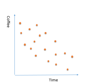
2- Considering a small portion of data. Sometimes we just consider a small portion of data that not able to explain all the data behaviour. Imagine that in the above example , we just look at the coffee consumption from 11am to 2pm. as you can see in the below picture, there is a increase in the coffee consumption. It this trend apply to other times? is it correct to say for future days, number of purchased coffee will be increase by time of the day ? absolutely not (at least our data not showing this)
this is an example of biased that we just consider a sample portion of data for explaining or learning from data. another name for this behaviour is “under fitting”. this behaviour also lead to a poor prediction.
3- so in reality, in our data set there is a decrease in consumption of coffee during day. a good prediction model will find below trend in data. not small portion that just focused on specific data point not all data that make lots of noises.
each algorithms provides some approach to avoid these two risks.
to see how to avoid over fitting or under fitting in the KNN algorithm, check the Post for k nearest neighbour, selection of variable “k” (number of neighbour).