
In this post and next one, I am going to show how to see data distribution using some visuals like histogram, boxplot and normal distribution chart.
It always important to have a holistic perspective regarding the minimum, maximum, middle, outliers of our data in one picture.
One of the chart that helps us to have a perspective regard these values in “Box Plot” in R.
For example, I am going to check my Fitbit data to see what is data min, max, meadian, outlier, first and third quadrant data using Box-Plot chart.
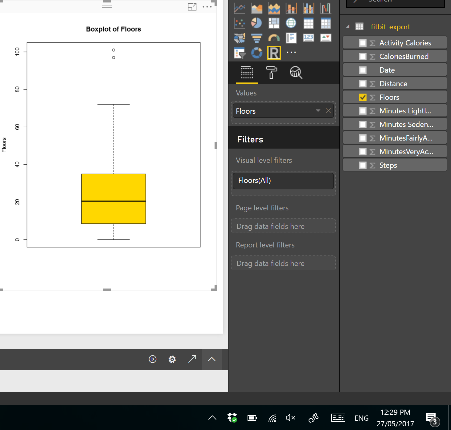
I drawa box-pot chart for checking the statistic measure number of floors I did in last 3 months, in PowerBI using R scripts.
The below codes can be used for drawing the box-plot chart. So, I choose the Floors field from power bi fields and then in R scripts I refer to ii.
boxplot(dataset$Floors, main=”Boxplot of Floors”, ylab=”Floors”)
As you can see in above code, there is a function name “boxplot” which help me to draws a box plot. It gets the (dataset$Floors) as the first argument. Then, it gets the named of the chart as the second argument and the y axis name as the third inputs.
I have run the code in Power BI and I the below chart appear in PowerBI.
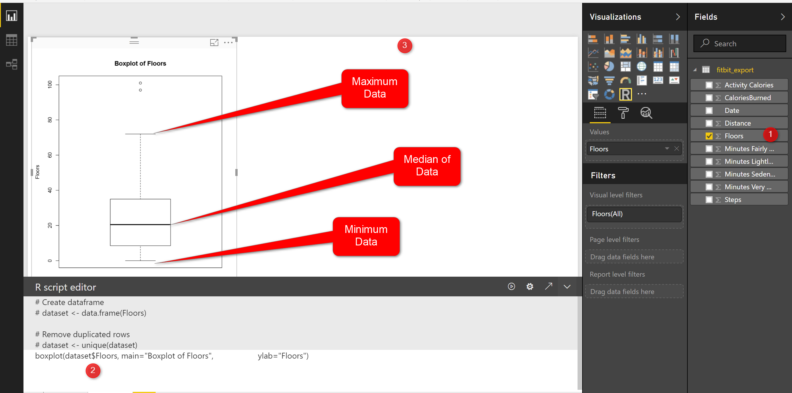
this chart shows the minimum and maximum of the number of floors I did in last three months. as you can see in the picture the minimum number of floors was “0” (the line at the bottom on the chart)and maximum is “70” (the line at the top of the chart). however I am able to see the median of data (middle value ) is around 20 (the bold line in middle of the chart).
What is median!
imagine we have a dataset as (1,4,7,9,16,22,34,45,67) it is a sorted dataset, find the number that physically placed in middle of the dataset, I think 16 is physically located in middle of the list, so the median of this dataset is 16. median is not the mean value. mean or average is summation of all data divided by number of data for the sample dataset is 22, so 22#16! that means mean is not equal to Median, lets change the dataset a bit :(1,4,7,9,16,22,25,30,35), median is still 16, but mean change:16.5. so in the second dataset I exclude the outlier (45,67) and it impacts on the mean not median!
Note: if we have lots of outlier in both side of our data range mean will be impact, more outlier at the upper range of our data (as above example) we have bigger mean than median, or if we have more lower outliers ourmean value will be lower than median.
In the boxplot we just able to see the median value.
We have two other measure name as first and third quantile. First quantile (see below picture), is the median value for the data range from minimum of data to median of data, so above example we just look at the data range from (1,4,7,9,16) and we find the median which is 7 so the first quantile is 7. third quantile is the median for data range from (median to maximum).
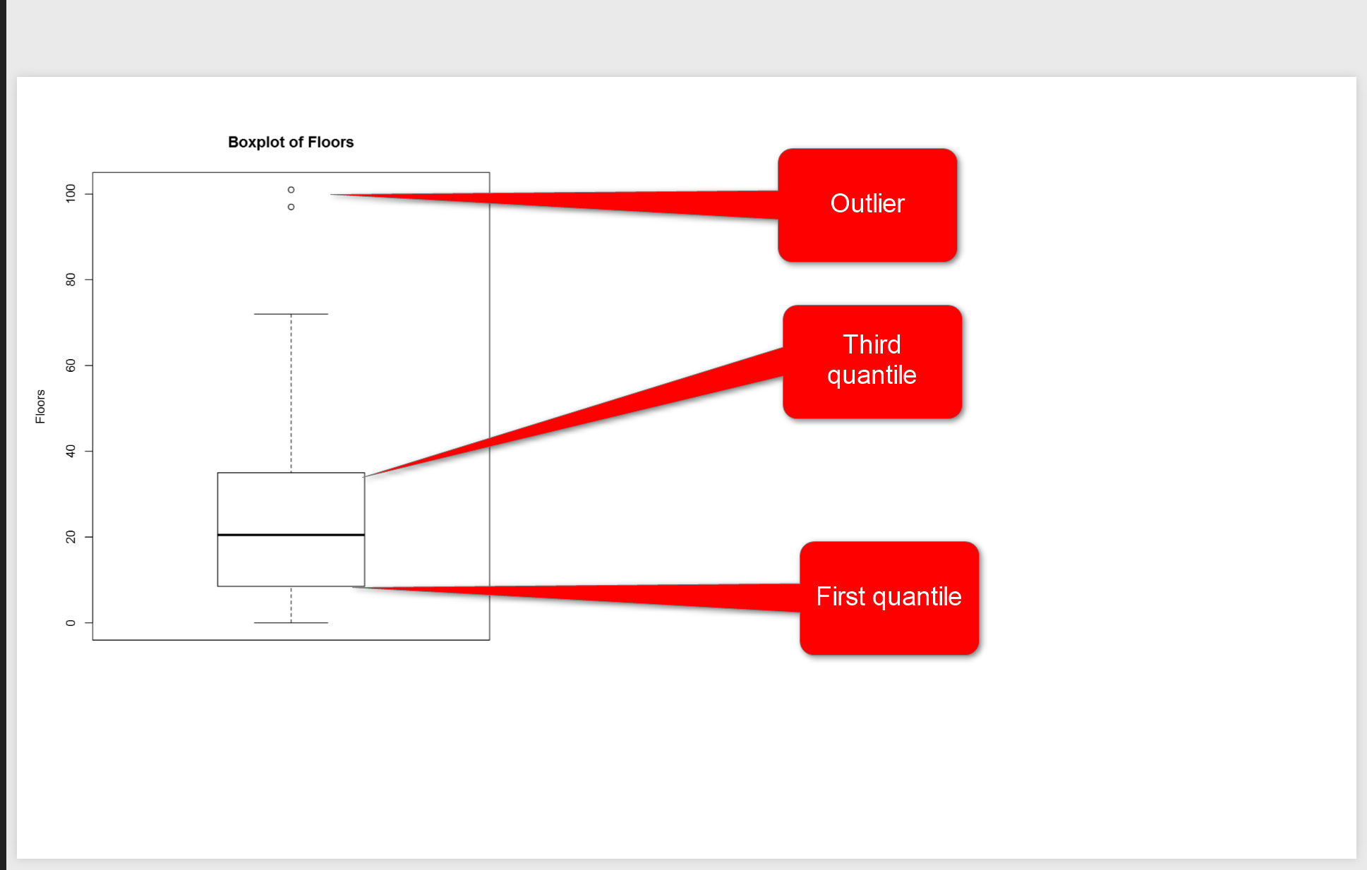
in above picture, you see two line in middle of the picture, they are first and third quantile. the bold line is median. So, for my Fitbit data and for number of floors I have 10 for First Quantile, and for the Third Quantile we have 35.
However you see, there are some “not filled dot” in above of the chart that shows the outliers for floors number, they will impact on the mean value but not on median value. In Fitbit dataset, occasionally, I did 100 floors, which is a shame! :D, sometimes it is good to remove outliers data from charts to make data more smooth, so for machine learning analysis to get a better result some times it is good to remove them.
if you need more color change the code as below
boxplot(dataset$Floors, main=”Boxplot of Floors”, ylab=”Floors”, col=(c(“gold”)))
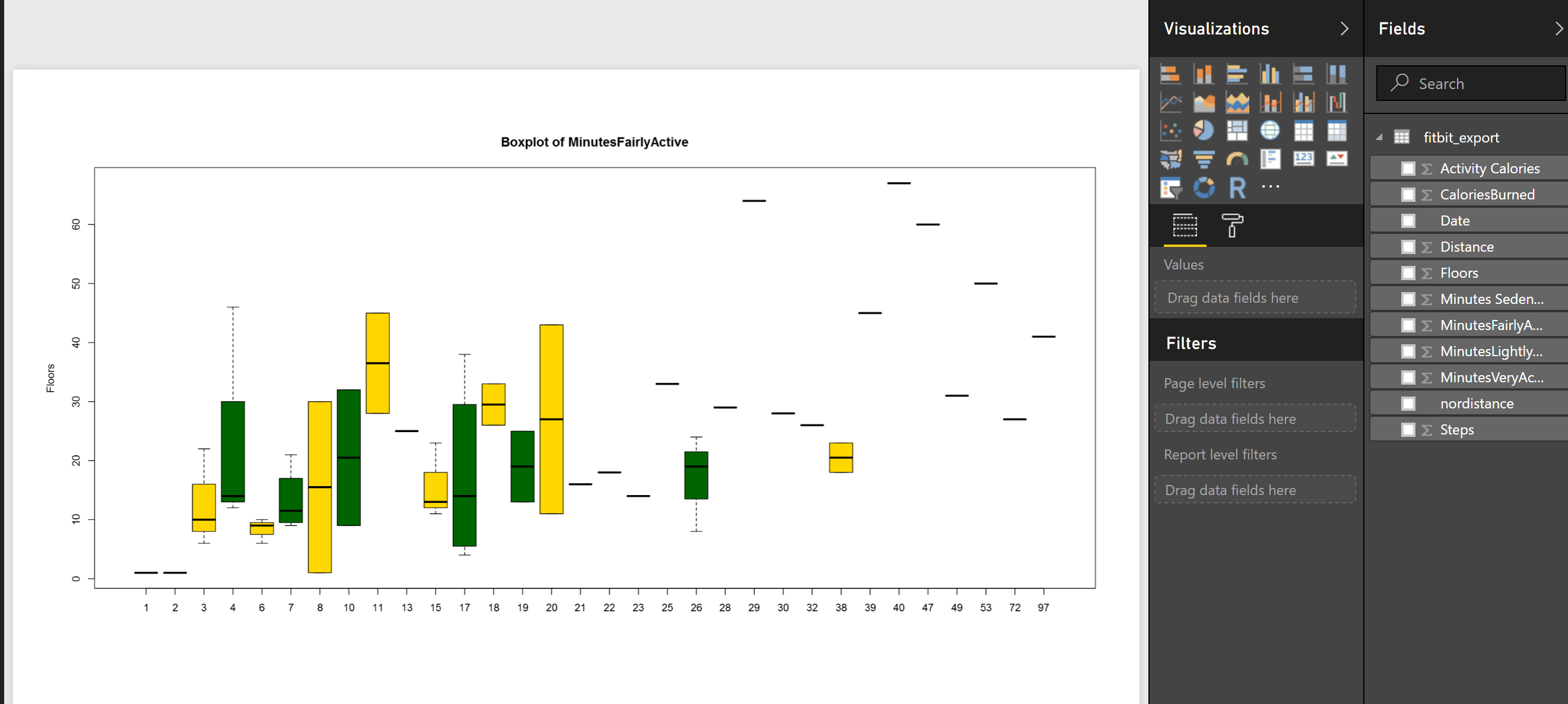
or sometimes, you prefer to compare two attributes together then, for instance I am interested to see what is the median.
boxplot(MinutesFairlyActive~Floors, data=dataset,main=”Boxplot of MinutesFairlyActive”, ylab=”Floors”, col=(c(“gold”,”dark green“)))
So to compare the statistics of minutes that I was fairly active to number of Floors, I change the code a bit, and compare them against each other, also I add another color to show them as below
In next post, I will talk about histogram that also show the data distribution and normal curve in detail!


