
Slope chart can be used for comparing data between two different time periods. it is a very easy way to depict the difference between to time, two elements or any other two attributes. The slope charts can be used to study the correlation between variables or to study the change in the same variable between two different time periods [1].
imagine we have GPD for Growth By Country as below [2]:

I am going to draw a “Slope Chart” to compare the GPD of 6 main countries together for 2014 and 2015. also, I have a second column that shows if the GPD is increasing regarding the 2014, so the status is green otherwise is red.
First I draw it on Power BI as a simple R visual then I will show how to have it as R custom Visual.
for drawing Slope Chart we need two main packages: “ggplot2” and “scales”
library(ggplot2)
library(scales)
then, I am using the ggplot2 function to draw the dataset that I have
so :
p<-ggplot(dataset)
in next step I am going to use function geom_segment
geom_segment()
geom_segment draws a straight line between points (x, y) and (xend, yend). it shows an area with X values range from 1 to 2 and Y which starts point for GPD2014 and y end point for GPD2015, after I run the code :
library(ggplot2)
library(scales)
theme_set(theme_classic())

p <- ggplot(dataset) + geom_segment(aes(x=1, xend=2, y=dataset$GPD2014, yend=dataset$GPD2015, col=dataset$Status), size=.75, show.legend=F)
I got below :

Still I need to refinethe chart.
Gemo_vline()
I am going to draw a line for start of X value at 1 and end of X value at 2 using geom_vline function, this function gets the start point of X as “xintercept” and its end. with the size of the line and its type as “dashed”
library(ggplot2)
library(scales)
theme_set(theme_classic())

p <- ggplot(dataset) + geom_segment(aes(x=1, xend=2, y=dataset$GPD2014, yend=dataset$GPD2015, col=dataset$Status), size=.75, show.legend=F) +
                  geom_vline(xintercept=1, linetype="dashed", size=.1) +
                  geom_vline(xintercept=2, linetype="dashed", size=.1)

however, there is a problem in above picture, the color is not reflect the increase or decrease of the GPD
I am going to use another function name “scale_color_msnusl() which able to recolr the lines for line who are in upward trend “green” and for lines who have “downward” trend “red” color. I need below code to address this need:
library(ggplot2)
library(scales)
theme_set(theme_classic())

p <- ggplot(dataset) + geom_segment(aes(x=1, xend=2, y=dataset$GPD2014, yend=dataset$GPD2015, col=dataset$Status), size=.75, show.legend=F) +
                  geom_vline(xintercept=1, linetype="dashed", size=.1) +
                  geom_vline(xintercept=2, linetype="dashed", size=.1) +
                  scale_color_manual(labels = c("Up", "Down"), values = c("#00ba38", "red"))
so I have below chart
The label that is located in y axis is not correct, so I am going to change it using below function:
labs()
labs(x="", y="GPD")
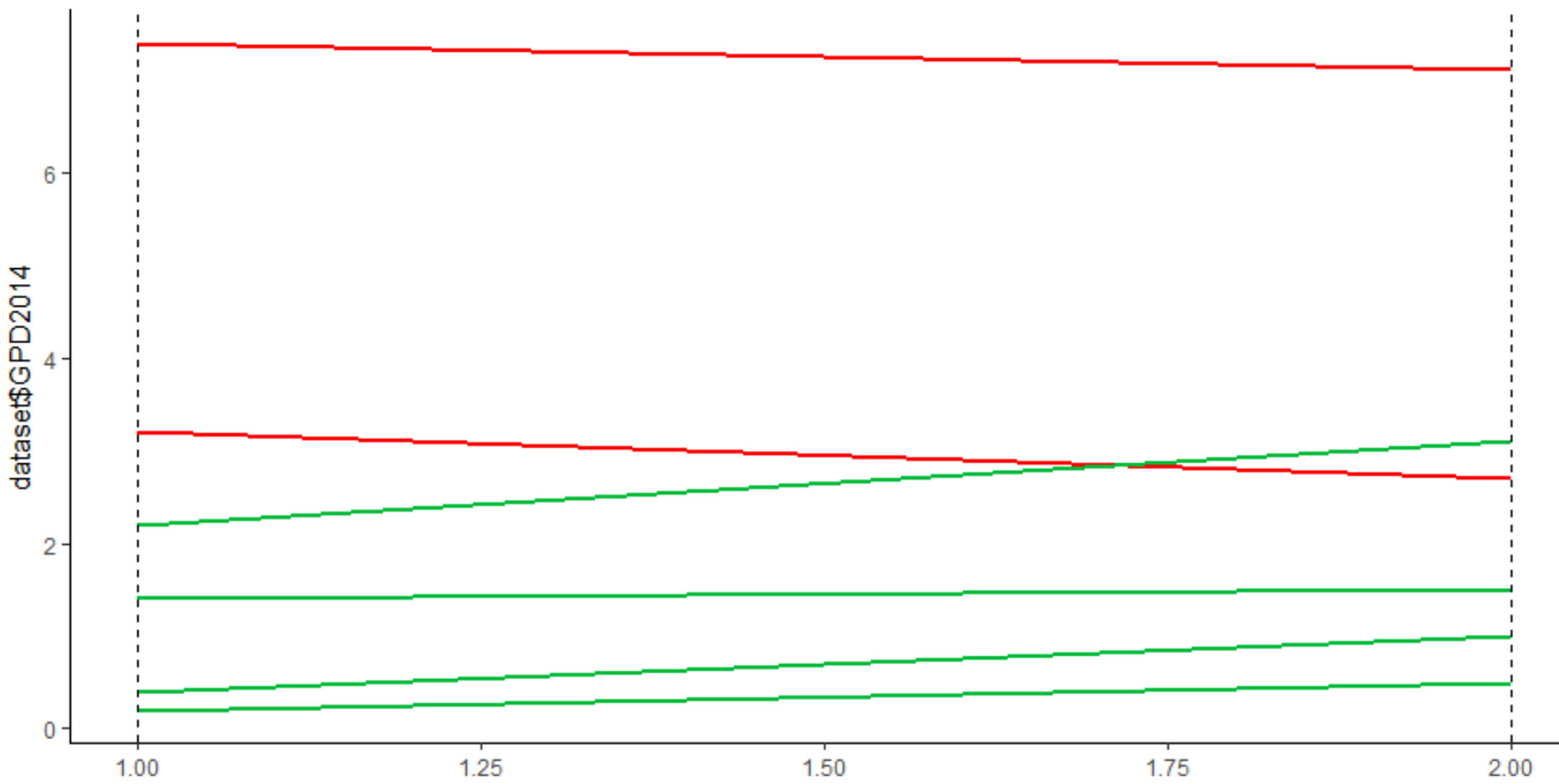
Now , I am going to refine the chart a bit more, by allocationscale to both X and Y axis
# Original Script. Please update your script content here and once completed copy below section back to the original editing window #
library(ggplot2)
library(scales)
theme_set(theme_classic())

p <- ggplot(dataset) + geom_segment(aes(x=1, xend=2, y=dataset$GPD2014, yend=dataset$GPD2015, col=dataset$Status), size=.75, show.legend=F) +
                  geom_vline(xintercept=1, linetype="dashed", size=.1) +
                  geom_vline(xintercept=2, linetype="dashed", size=.1) +
                  scale_color_manual(labels = c("Up", "Down"), values = c("#00ba38", "red"))+ labs(x="", y="GPD") +  # Axis labels
                  xlim(0.5, 2.5) + ylim(0,(1.1*(max(dataset$GPD2014, dataset$GPD2015))))
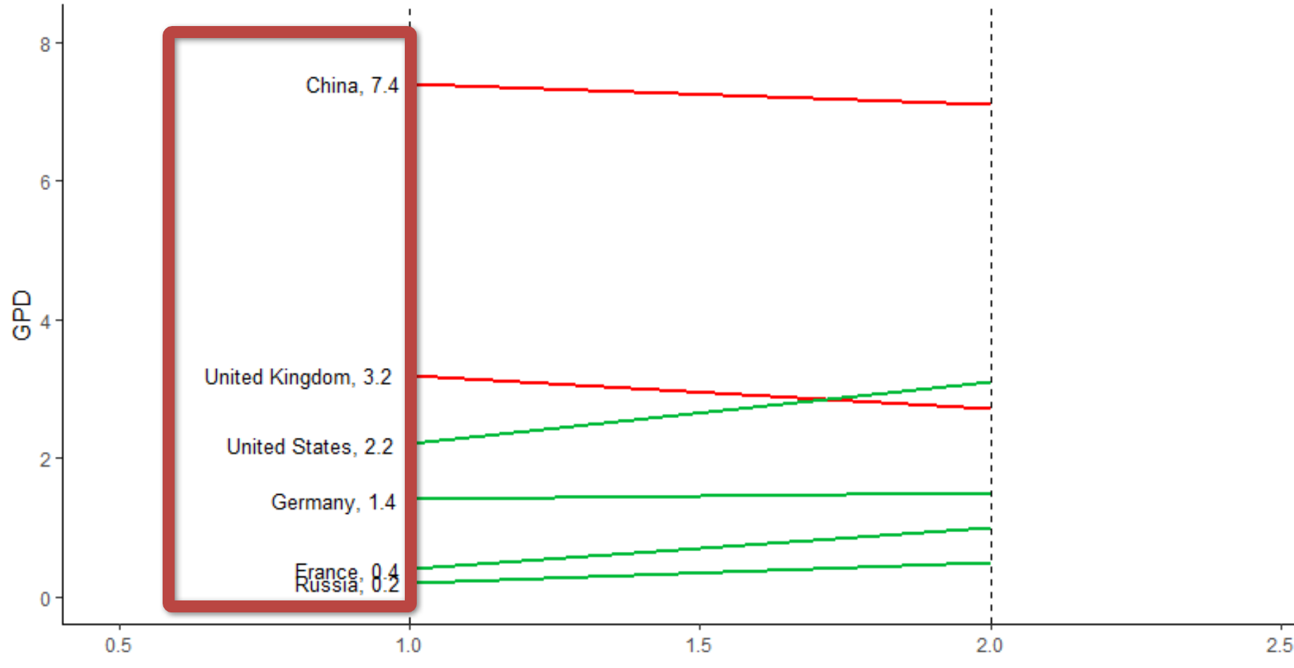
so the chart will be as below
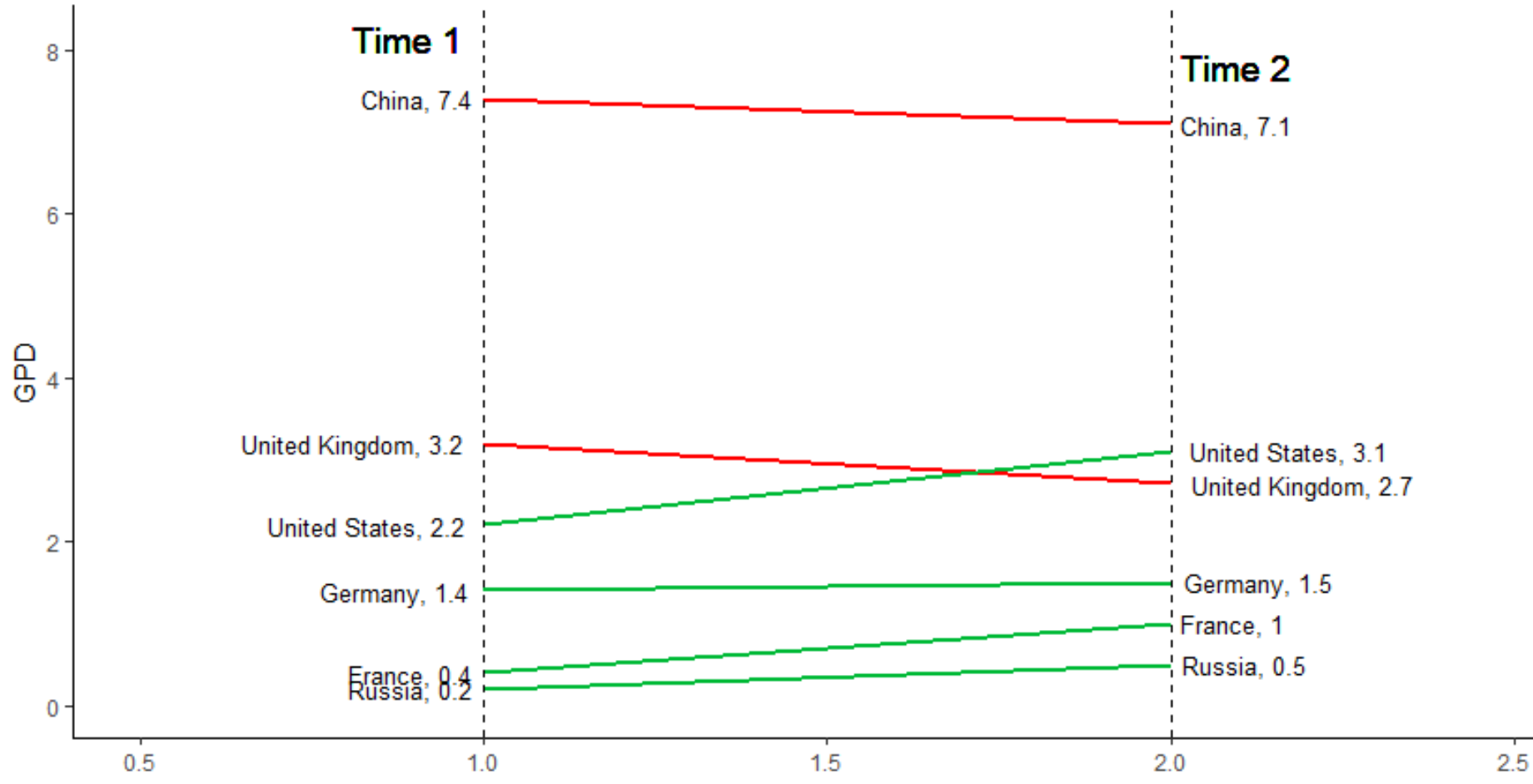
Now, chart look better, however, there is no data about the coutries and their GPD on chart and it is not clear which line related to which country.
so I am going to create a lable by concating the “countries name” and their related GPD number both for left and right side as below
left_label <- paste(dataset$Countries, dataset$GPD2014,sep=", ")
right_label <- paste(dataset$Countries, dataset$GPD2015,sep=", ")
for instance, the value for the left side would be as below :

geom_text()
geom_text is a function that able to put the label for y and X value in chart. so I am going to add the function to the rest of the chart. for instance for the left side we have the below code
p <- p + geom_text(label=left_label, y=dataset$GPD2014, x=rep(1, NROW(dataset)), hjust=1.1, size=3.5)
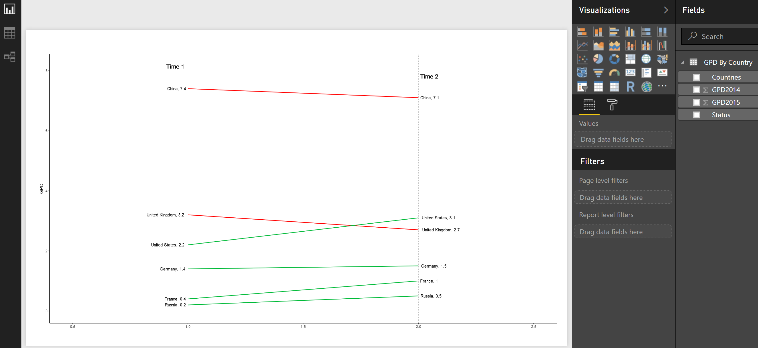
so after running the whole code till now we have below image:
I am going to add some more texts to the right side ofthechart as well as for x lables. So the whole code would be as below
library(ggplot2)
library(scales)
theme_set(theme_classic())

p <- ggplot(dataset) + geom_segment(aes(x=1, xend=2, y=dataset$GPD2014, yend=dataset$GPD2015, col=dataset$Status), size=.75, show.legend=F) +
                  geom_vline(xintercept=1, linetype="dashed", size=.1) +
                  geom_vline(xintercept=2, linetype="dashed", size=.1) +
                  scale_color_manual(labels = c("Up", "Down"), values = c("#00ba38", "red"))+ labs(x="", y="GPD") +  # Axis labels
                  xlim(0.5, 2.5) + ylim(0,(1.1*(max(dataset$GPD2014, dataset$GPD2015))))  # X and Y axis limits

left_label <- paste(dataset$Countries, dataset$GPD2014,sep=", ")
right_label <- paste(dataset$Countries, dataset$GPD2015,sep=", ")
# Add texts
p <- p + geom_text(label=left_label, y=dataset$GPD2014, x=rep(1, NROW(dataset)), hjust=1.1, size=3.5)
p <- p + geom_text(label=right_label, y=dataset$GPD2015, x=rep(2, NROW(dataset)), hjust=-0.1, size=3.5)
p <- p + geom_text(label="Time 1", x=1, y=1.1*(max(dataset$GPD2014, dataset$GPD2015)), hjust=1.2, size=5)  # title
p <- p + geom_text(label="Time 2", x=2, y=1.1*(max(dataset$GPD2015, dataset$GPD2015)), hjust=-0.1, size=5)  # title


p
and the final image would be
in next post I will explain the other chart that weable to draw ourself in Power BI.
[1]https://www.packtpub.com/mapt/book/big_data_and_business_intelligence/9781783989508/5/ch05lvl1sec58/generating-a-slope-chart
[2]https://www.gfmag.com/global-data/economic-data/countries-highest-gdp-growth
[3]http://r-statistics.co/Top50-Ggplot2-Visualizations-MasterList-R-Code.html


