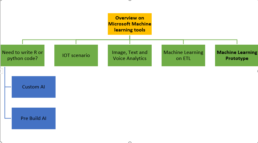
OVERVIEW ON MICROSOFT MACHINE LEARNING TOOLS
Microsoft Machine Learning Technologies Overview Artificial intelligence and specifically Machine learning can bring lots of benefit to the business owner. Many businesses using Microsoft data platform tools for many years. Microsoft employed machine learning in creating their products such as Xbox, Bing Search and so forth for a while. However, from 2014 they start to Read more about OVERVIEW ON MICROSOFT MACHINE LEARNING TOOLS[…]