
In the last two posts (Part 1 and 2), I have explained the main process of creating the R custom Visual Packages in Power BI. there are some parts that still need improvement which I will do in next posts. In this post, I am going to show different R charts that can be used in power BI and when we should used them for what type of data, these are Facet jitter chart, Pie chart, Polar Scatter Chart, Multiple Box Plot, and Column Width Chart. I follow the same process I did in Post 1 and Post 2. I just change the R scripts and will explain how to use these graphs
1-Jitter Chart
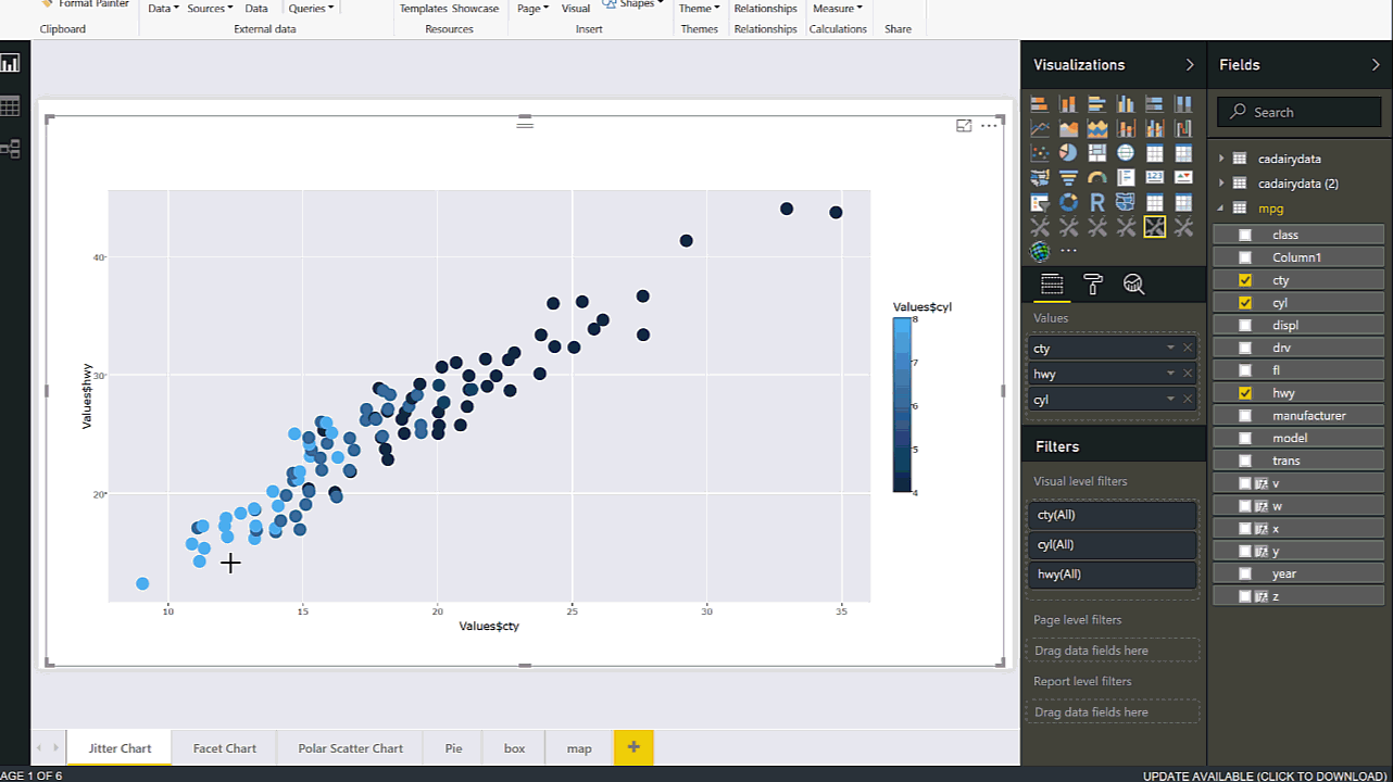
This chart has been used to show all data points. Also, it shows three variables in at the same time: two numeric variable for x and y axis and one factor variable with different colours. In the below picture you will see that I created a custom visual that shows the speed of the car in the city in x axis, the car’s speed in high way in Y axis and the number of cylinders as factor variable in chart legend.
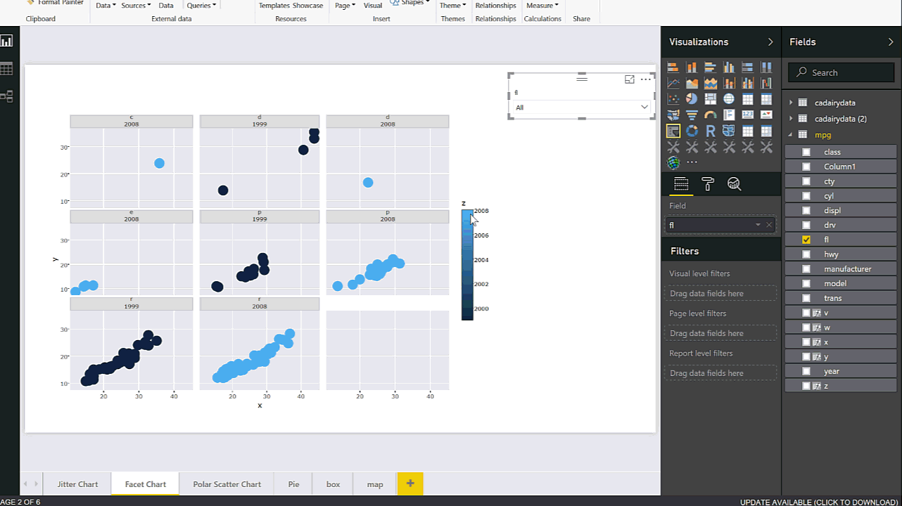
also there is a possibility to show 4 or 5 variable at the same time. One for x axis, y axis, the colour shade that should be factor, two factor variable for Facet and different tiles. in the below GIF you see that I show the speed of car in city and highway in x and y axises, also I put the year in to z variable. Moreover, for different tiles I need two variables one for year and another factor variable for Fl of cars. this custom visual get constant 5 variables as x,y,z,w, and v. I have a post on this chart before see http://radacad.com/have-more-charts-by-writing-r-codes-inside-power-bi-part-2
The code for generating the chart has been shown below
source('./r_files/flatten_HTML.r')

############### Library Declarations ###############
libraryRequireInstall("ggplot2");
libraryRequireInstall("plotly")
library("plotly")
library("ggplot2")
library("htmlwidgets")
####################################################
#g = plot_ly(mpg, x = mpg$cty, y = mpg$hwy, text = paste("Clarity: ", mpg$cyl),
#mode = "markers", color = mpg$cty, size = mpg$cty)
################### Actual code ####################
g=ggplot(Values, aes(x=x, y=y,color=z)) + geom_jitter(size=5)+facet_wrap(w~ v)
####################################################
#g =ggplot(mpg, aes(x=cty, y=hwy,color=cyl)) + geom_jitter(size=5)+facet_wrap(year~ drv)
############# Create and save widget ###############
p = ggplotly(g);
internalSaveWidget(p, 'out.html');
2-Pie Chart
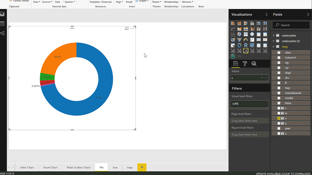
Pie chart able to shows the composition of data. In the below example, I have shown how to show the composition of the car’s speed in highway as a continues variable with grouping them based on FL of the car. this chart shows the labels inside the pie chart (in power bi it shows outside)
The code for generating the chart has been shown below
ource('./r_files/flatten_HTML.r')

############### Library Declarations ###############
libraryRequireInstall("ggplot2");
libraryRequireInstall("plotly")
library("plotly")
library("ggplot2")
library("htmlwidgets")
####################################################
#g = plot_ly(mpg, x = mpg$cty, y = mpg$hwy, text = paste("Clarity: ", mpg$cyl),
#mode = "markers", color = mpg$cty, size = mpg$cty)
#library(plotly)

# Get Manufacturer
g <- mpg %>%
  group_by(fl) %>%
  summarise(count = n()) %>%
  plot_ly(labels = ~fl, values = ~count) %>%
  add_pie(hole = 0.6)
  ############# Create and save widget ###############
p = ggplotly(g);
internalSaveWidget(p, 'out.html');
3-Polar Scatter Chart
this chart has been used to show two numeric variable, which one of the should have wider range for instance from 0 to 365 or 177 to -177 also another variable should be a limited range for instance from 0 to 10 or from 0 to 1. we need another factor variable to show the colour. in the below gif, you will see we have a variable that range from 0 to 1 and the other one from 0 to 270. also we have a factor variable that shows the lines in graph in different colours.

The code for generating the chart has been shown below
source('./r_files/flatten_HTML.r')

############### Library Declarations ###############
libraryRequireInstall("ggplot2");
libraryRequireInstall("plotly")
library("plotly")
library("ggplot2")
library("htmlwidgets")
####################################################

#g=ggplot(Values, aes(x=Values$cty, y=Values$hwy,colour = Values$cyl)) + geom_jitter(size=4)
################### Actual code ####################

#p = ggplotly(g);

p <- plot_ly( plotly::mic, r = ~r, t = ~t, color = ~nms, alpha = 0.5, type = "scatter")

layout(p, title = " ", orientation = -90);

internalSaveWidget(p, 'out.html');
4-Box Plot
It always important to have a holistic perspective regarding the minimum, maximum, middle, outliers of our data in one picture.
One of the chart that helps us to have a perspective regard these values in “Box Plot” in R. I have already a post on this concepts and how to have it see :
http://radacad.com/visualizing-numeric-variables-in-power-bi-boxplots-part-1
here I have shown how to make them more interactive via Plotly , having more plots in one chart regarding a factor variable.

The code for generating the chart has been shown below
source('./r_files/flatten_HTML.r')

############### Library Declarations ###############
libraryRequireInstall("ggplot2");
libraryRequireInstall("plotly")
library("plotly")
library("ggplot2")
library("htmlwidgets")
####################################################


g <- plot_ly(Values, x = ~x, color = ~w, type = "box")


p = ggplotly(g);
internalSaveWidget(p, 'out.html');
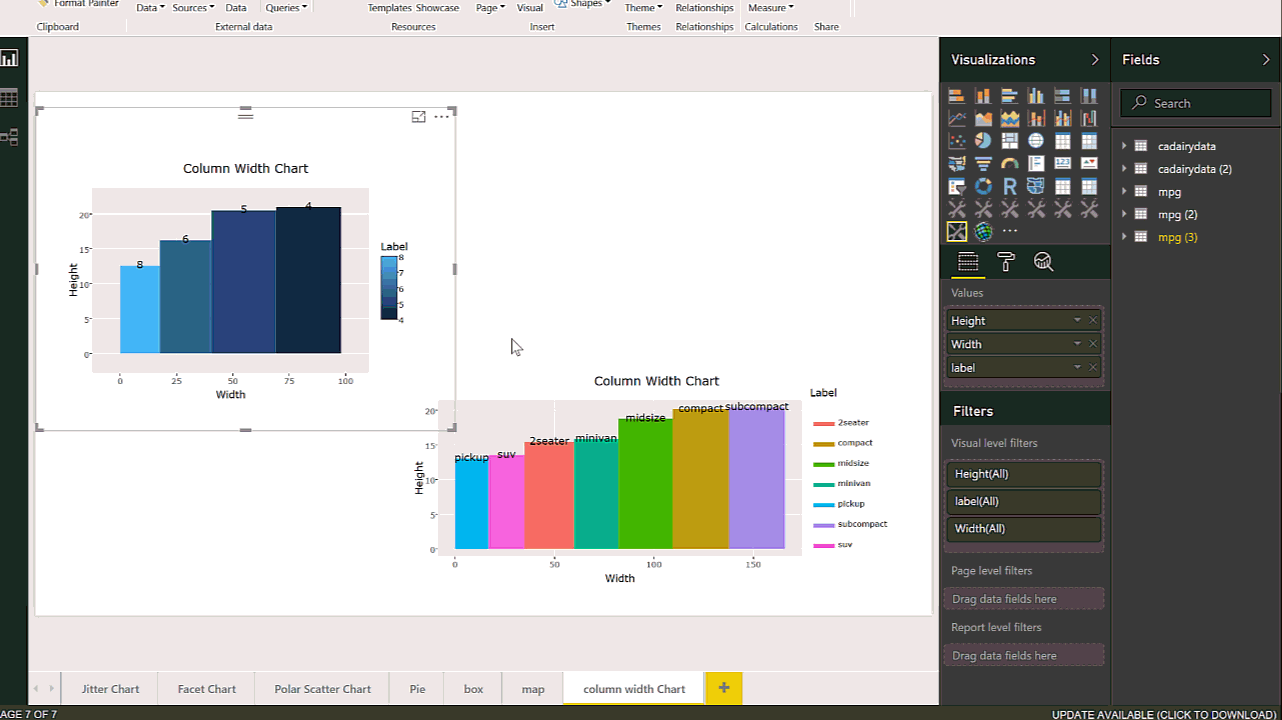
5- Column Width Chart
for comparison purpose most of the charts can be available in Power BI Visualization, just two of them are not :Variable Width Column Chart and table with table embedded chart (I will show it next post hopefully) . This chart help us to do compare two variable in a bar chart. we have height and width of the bar chart. in normal bar chart the bar width are same size the process of creating this chart has been explained in post : http://radacad.com/variable-width-column-chart-writing-r-codes-inside-power-bi-part-4
Here am going to create a custom visual to show how to have them. the dataset that I have has information about the car speed in city and highway plus the number of cylinder and their type of drive (four wheel drive, rear drive or front drive).
to do that first in power BI I create two separate dataset that has been group by :1- number of cylinder and 2- type of drive.
# Input load. Please do not change #
#`dataset` = read.csv('C:/Users/leila/AppData/Local/Radio/REditorWrapper_0ec2c1f1-83e7-46bd-95fa-49bcf787902d/input_df_c8eb4c44-0bdd-4d95-98bb-9694dae86d4c.csv', check.names = FALSE, encoding = "UTF-8", blank.lines.skip = FALSE);
# Original Script. Please update your script content here and once completed copy below section back to the original editing window #
source('./r_files/flatten_HTML.r')

############### Library Declarations ###############
libraryRequireInstall("ggplot2");
libraryRequireInstall("plotly")
library("plotly")
library("ggplot2")
library("htmlwidgets")
library("dplyr")
library("ggplot2")
df<-data.frame(Label=Values$label,Height= Values$Height,width=Values$Width)
df$w <- cumsum(df$width) #cumulative sums.
df$wm <- df$w - df$width
df$GreenGas<- with(df, wm + (w - wm)/2)

p  <- ggplot(df, aes(ymin = 0))
p1 <- p + geom_rect(aes(xmin = wm, xmax = w, ymax = Height, fill = Label))
p2<-p1 + geom_text(aes(x = GreenGas, y = Height, label = Label),size=4,angle = 45)
p3<-p2+labs(title = "Column Width Chart", x = "Width", y = "Height")
#blue.bold.italic.10.text <- element_text(face = "bold.italic", color = "dark green", size = 16)
#p4<-p3+theme(axis.title = blue.bold.italic.10.text, title =blue.bold.italic.10.text)
g=p3;
p = ggplotly(g);
internalSaveWidget(p, 'out.html');


Excellent series – thanks a lot !
hi,
Is it possible for this custom visual to interact with other visuals?
other charts can slice or dice the R chart but not vice versa