
In every reporting solution you might feel KPI as a requirement. KPI or Key Performance Indicator is a measure for business to understand how they are acting in specific area that is very import for their business. Power BI supports built-in visualization for KPI, and there are also some good custom visuals that can be used for this purpose. In this post you will learn how to create KPI visualizations with Power BI.
What is KPI?
Key Performance Indicator is a measure for business to understand how they perform in specific area that is important and many times critical for their business. For example they would like to see how the current year to date sales is going against what they estimated? Is it higher or lower? What is the trend? Is it going upward or downward? There are some visualization options to show KPIs, and from them the most commons are; Gauges, Charts with arrows that shows upward or downward, and color code of red, amber, or green (visualizing the status).
Fortunately Power BI has a built-in KPI visualization (released 29th of Feb 2016) which can be used for this purpose. There are also some great custom visualizations that I found really useful and like to share them with you here.
KPI Elements
KPIs measuring something and show trend and status. So they have components to work with as below:
- Value; The main measure which we want to evaluate
- Target; What we want to compre the Value with
- Trend; How Value perfoms in a time period, is it going upward, downward…?
- Status; What is the current status of Value against Target?
There might be other components as well, but let’s keep it simple. and work on these elements. In below example you’ll see how we apply attributes and configurations for each visualization element to visualize KPI there.
Prerequisite
For running examples of this post you need to install AdventureWorksDW like other examples of Power BI online book.
Built-in KPI
As I mentioned earlier KPI recently added to Power BI and you can find it in built-in visualization list in visualization pane.

Using this item is easy as it only has three data fields to configure:
- Indicator: This would be your KPI Value, or the measure to evaluate.
- Trend Axis; dimension attribute to calculate trend on it. for example Months of year to check the trend over a period of year.
- Target Goals; Your target value. something that KPI value will be compared with.
I’ve only used FactInternetSales and DimDate from AdventureWorksDW in this demo. For simplicity I got the target value as static value. I’ve created a measure in FactInternetSales called Target, and assigned the static value 1,000,000$.

As I said this is just for simplicity. Your target value in real world scenarios might come from a forecast table, or a budget table or something like that.
In the report area, create a slicer on Calendar Year. and then drag and drop a KPI element into the report. set Indicator as SalesAmount, Target goals to be the Target measure, and Trend Axis to be EnglishMonthName (Before doing that you have to Sort EnglishMonthName column by MonthNumberOfYear in the Data Tab). Then this is what you get:

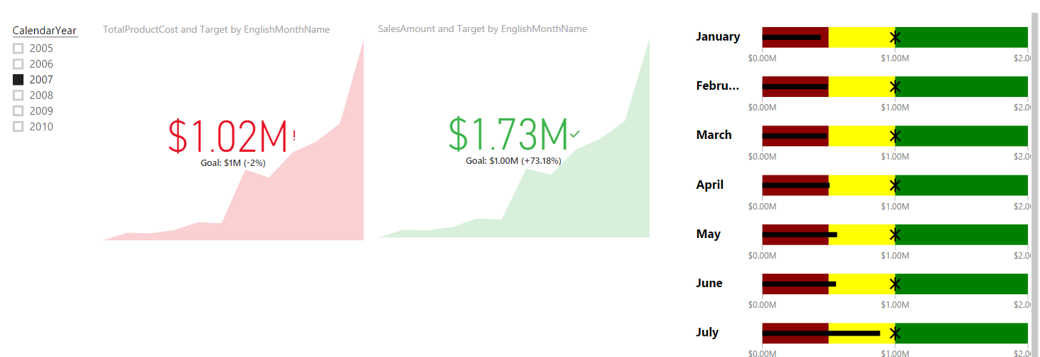
As you see the KPI now shows me the value or indicator (which is Sales Amount) in the middle with large font ($1.73M), and the Goal or target under that with smaller font ($1M), and the percentage of the value compared with goal besides it (+73.18%). You also see this colored green which means status is good or in the other words value is higher than expected. in the back ground you also see an area chart of value over period of months (Green area chart shows value over months). You can change the calendar year in slicer and see how the KPI change.
Now lets see another KPI and how to change Status on that. For the other KPI I want to see TotalProductCost as Indicator, and everything else exactly the same. For Costs usually the lower is better which is different from previous KPI. In the first KPI the higher value means the better result, the higher sales is desired. But for Costs I expect decrease. So I can simply change the Status in the Formatting area of KPI to have the direction as Low is good. and here would be the result;

Now you see that despite the fact that TotalProductCost is greater than the goal still it shows it as red, because low is good, and high is bad. The default behavior for Status is that High is good.
Bullet Chart
Bullet chart is a custom visualization published by Microsoft. You need to download it from Visuals Gallery and then import it into Power BI. This chart has many fields to configure, you can configure them all or part of them. Required fields are Value, Target Value. You need to also set Minimum and Maximum to appropriate values. There are also areas with red, amber, and green colors that can be assigned with Needs Improvement, Satisfactory, Good, and Very Good fields. For this chart I’ve used a sample table with single line as below:
![]()
And I configured Bullet chart with fields from this table combined with FactInternetSales, and DimDate as below;

As you can see in the above chart which is for calendar year 2007; that for some months like December the sales amount is in good range (from $1M to $2M). for some months it is in amber range like August and June (between $500K and $1M), and for some it is below $500K and are in red range such as January.
As you see in above configuration I haven’t used Satisfactory and Good range. Have a play with this chart and configure it to see what you get out of it.
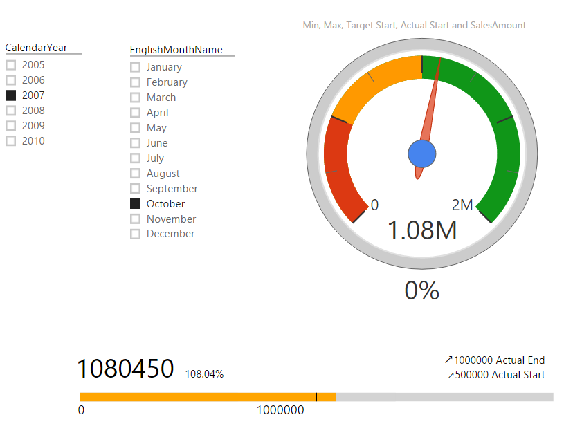
Dial Gauge
Another custom visualization which gives us the gauge visualization is DialGauge. This visual has been published by CloudFonts Technologies LLP. like the normal gauge for KPI this component gives you flexibility to define ranges for green, amber, and red. The Pointer Value is the value we want to evaluate. You can also set a percentage for this gauge. I’ve used this gauge with the sample table I’ve mentioned earlier in this post. and SalesAmount as the pointer value. For this chart I’ve used another slicer for the month in addition to the slicer for the year.

As you see the pointer value stays in green area because sales amount of October 2007 is $1.08M which is between $1M and $2M. You can check what you see if you change the month to August (expect pointer to fall into amber area).
Linear Gauge
LinearGauge is the custom visual published by MAQ Software. You can set minimum and maximum values, target value, and two trend values. As an example in below chart I’ve used SalesAmount as the value, and other information from the sample table above.

As you see the target value showed with a vertical line in $1M point. the orange filled section shows the value which is sales amount $1.08M for month October 2007. Percentage against target is 108.04% which is +8.04%. Trend values shows that sales amount is going upwards compared to each trend value.
Summary
In this post you’ve seen some visualization items that are useful to show KPIs. There will be definitely more charts and custom visuals in upcoming months. However this post gave you a better feeling about how to use them, or what items to look for and configure when you deal with KPIs. If you are interested to learn more about Power BI, please continue reading Power BI online book.


Reza is author of more than 14 books on Microsoft Business Intelligence, most of these books are published under Power BI category. Among these are books such as Power BI DAX Simplified, Pro Power BI Architecture, Power BI from Rookie to Rock Star, Power Query books series, Row-Level Security in Power BI and etc.
He is an International Speaker in Microsoft Ignite, Microsoft Business Applications Summit, Data Insight Summit, PASS Summit, SQL Saturday and SQL user groups. And He is a Microsoft Certified Trainer.
Reza’s passion is to help you find the best data solution, he is Data enthusiast.
His articles on different aspects of technologies, especially on MS BI, can be found on his blog: https://radacad.com/blog.
Was very helpful