

Column or Bar chart can be easily used for showing a single measure’s insight across a category. Mixed charts such as Line and Column chart can be used for showing two measure and comparing their values across a set of categories. However there are some charts that can be used to show values of three measures, such as Scatter Chart. Scatter chart not only shows values of three measure across different categories, it also has a special Play axis that helps you to tell the story behind the data. In this post you’ll learn how easy is to visualize something with Scatter chart and tell a story with that. If you like to learn more about Power BI, read Power BI online book; from Rookie to Rock Star.
Video
Prerequisite
For this example like many other examples in this Power BI book, I’ll be using AdventureWorksDW SQL Server database. If you don’t have this installed, you can easily download it from here and install it.
Scatter Chart
Scatter chart is a built-in chart in Power BI that you can show up to three measure with a categorization in it. Three measures can be visualized in position of X axis, Y axis, and size of bubbles for scatter chart. You can also set up a date field in play axis, and then scatter chart will animate how measure values are compared to each other in each point of a time. Let’s start building something simple with this chart and see how it is working in action. At the end of example you will see a summary chart as below;
| Visualization Item | Scatter Chart | Comments |
|---|---|---|
| Measure 1 | X Axis | |
| Measure 2 | Y Axis | |
| Measure 3 | Size of bubbles | |
| Category | Yes | As Legend |
| Detailed Category | Yes | As Details |
| Play Axis | Yes | |
| Color Formatting | Needs Improvement | Data Colors can’t be set |
| Text Formatting | Needs Improvement | Title for X/Y axis can’t be set |
| General Formatting | Needs Improvement | No Formatting option for Play Axis |
| Custom/Builtin | Builtin Chart |
Building Sample Report
Open Power BI Desktop, and start by Get Data from SQL Server AdventureWorksDW database. For this example you need to import data for 6 tables; FactInternetSales, FactResellerSales, DimDate, DimProduct, DimProductCategory, and DimProductSubCategory.

Just Load the data, don’t edit. Then go to Relationship tab to verify relationship. remove inactive relationships between DimDate and FactInternetSales/FactResellerSales. Only keep one relationship active based on ORDER DATE. to change a relationship to active double click on the relationship line and change it to active. You can only have one active relationship between two tables.

Your final relationship diagram should look like this;

You might notice that this is not a best practice start schema model to work with, but let’s make this example simple for now, and focus on the visualization side. Go to the Report, and create a Scatter Chart. expand it to cover the whole report page.

Add Sales Amount from FactInternetSales to X Axis, and then Sales Amount from FactResellerSales to Y Axis. Also bring TotalProductCost from FactInternetSales into Size. These are three measures that we want to visualize here;

Now Let’s see how each product sub category of Bike is for these measure. For that add a Visual Level Filter for EnglishProductCategoryName from DimProductCategory, and set it to be Bike.

Now bring the EnglishProductSubCategoryName from DimProductSubCategory into the Legend.

This simply shows the difference of categories for each measure. For example you can see that the total internet sales and reseller sales of road bikes (black) is greater than other two; Mountain bikes, and Touring bikes. Let’s see was this the case all the time? or just the total is different? Fortunately with this chart we can do that with Play Axis.
Drag and drop FullDateAlternateKey from DimDate to Play Axis. and you will see values in both axis change immediately. the reason is that now this chart will show value of one year at a time. and you can see the year title in the top right hand corner of scatter chart.

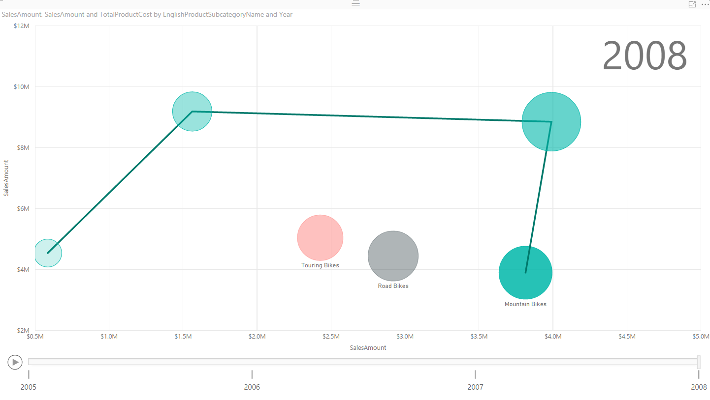
If you click on Play axis you can see that this the sub categories are moving around because their sales for each year is different. and easily you can see how their sales was during the period of these years. You can even move the player’s bar navigator to a year like 2007 and see values at that point of the time. Screenshot below for year 2007 simply shows that mountain bikes and road bikes at that year had almost same internet sales amount, however the reseller sales of road bikes was more.

And if you go a year before you can see that there was no Touring Bikes even exists at that time, and sales of Road bikes was much more than mountain bikes in both internet sales and reseller sales.

Also you will see that at the year 2008 the internet sales of road bikes is less that two other types of bike.

It is easy to compare year to year changes in this way. You can even click on each individual category and see how it worked through the time. Scatter chart shows you a line of all states for that category.
Even you can take one step further and select multiple items and simply compare them through the years. Click on Ctrl and choose Road and Mountain Bikes.

Now you can easily see that road bikes had better sales in years 2006 and 2007, but in 2008 it sold even less that mountain bikes for internet sales. the reseller sales of road bikes still is higher in year 2008. It is easy to compare all three measures through the time and based on different categories with Scatter chart. Scatter chart helps you to tell story behind the data easily.
You can also add more details to it. As an example let’s add Class from DimProduct to Details of this chart. Now you will see more bubbles, for each sub category we have bubbles with same color, but different bubbles based on each product class.

Scatter chart also has a field for Color saturation and Tooltips which I haven’t demonstrated here, feel free to play with it and enhance your visualization. Scatter chart is a powerful visualization that helps you to tell a story about a data of multiple measure and categories with their values through changes of time.
Formatting
Unfortunately will all power in this visualization, there isn’t enough formatting options for it at this time. You can apply general formatting like a title for the whole chart, but you cannot change the title for X or Y Axis, which seems necessary. In this example the field name we’ve used was Sales Amount identical name but from two different tables. It is a basic need that I can change the title of axis, but I can’t. The only work around for this is to change name of column in data tap of Power BI, or in Power Query.
Data colors can’t be set as well. This option exists in many other charts such as column/bar chart and I believe it will be available soon here for this chart.
There is no control on the speed of Play axis or any formatting on this axis at this stage.
Summary
In Summary Scatter chart is one of the most useful charts in Power BI which helps for storytelling with multiple measures, categories, and changes of values through the time. However this visualization item, still needs some improvements for formatting, which I believe with great efforts of Power BI team will be applied in the very near future. Here is a summary of features for this visualization item;
| Visualization Item | Scatter Chart | Comments |
|---|---|---|
| Measure 1 | X Axis | |
| Measure 2 | Y Axis | |
| Measure 3 | Size of bubbles | |
| Category | Yes | As Legend |
| Detailed Category | Yes | As Details |
| Play Axis | Yes | |
| Color Formatting | Needs Improvement | Data Colors can’t be set |
| Text Formatting | Needs Improvement | Title for X/Y axis can’t be set |
| General Formatting | Needs Improvement | No Formatting option for Play Axis |
| Custom/Builtin | Builtin Chart |


Reza is author of more than 14 books on Microsoft Business Intelligence, most of these books are published under Power BI category. Among these are books such as Power BI DAX Simplified, Pro Power BI Architecture, Power BI from Rookie to Rock Star, Power Query books series, Row-Level Security in Power BI and etc.
He is an International Speaker in Microsoft Ignite, Microsoft Business Applications Summit, Data Insight Summit, PASS Summit, SQL Saturday and SQL user groups. And He is a Microsoft Certified Trainer.
Reza’s passion is to help you find the best data solution, he is Data enthusiast.
His articles on different aspects of technologies, especially on MS BI, can be found on his blog: https://radacad.com/blog.
Can we select multiple items without clicking ctrl by selecting?
Hi Aakesh,
No unfortunately. You need to do Ctrl Click for selecting multiple items in scatter chart.