After a whirlwind 4 days in Seattle I finally have some time to think back over the Microsoft Data Insights Summit and digest what were probably some of the more interesting points to come out of the Summit. Most of these came from the keynote so if you would like more detail on any of these, I recommend taking the time to watch the opening keynote at the start of day one.
It was noted they only demonstrated features that will be shipping in the next 3 months.
In no particular order….
1. Story telling
There were a bunch of announcements introducing a stronger storytelling element to Power BI reports. The first of these is a new concept called bookmarks. With bookmarks we will be able save the state of filters and show/hide visuals to unravel a story of insights much in the same way you might in Power Point through animations.
This might not suit all reports but looks to me like it can be used for non story telling uses. It looks like it will be possible so show/hide visuals at the press of report page buttons meaning the potential to compress the same information down to fewer report pages..

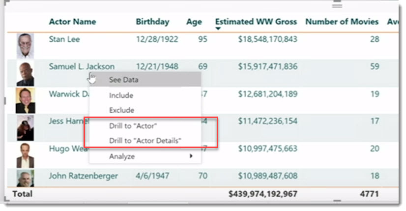
Another nice storytelling telling feature albeit less scripted, will allow users to jump across report pages by right-clicking a single entity direct from a visual.
This is being called Drill through and I see this as a much nicer navigation/exploration experience for users. A report-page will have to be configured as a “drill through” page but it looks pretty simple set-up. There is no limit to how many drill through pages you can have.
2. Write-back
That’s right. Write-back is here. Currently data generally only flows inwards to Power BI and that’s it. Users have to find another way to update data in the underlying data source if required. What we saw in the keynote was the ability to embed a Power App directly into a Power BI report page. This means we will soon have the ability to update source data directly from a report page.
I’m going to have to start building a few Power Apps in the next few weeks to get a better understanding of this capability. Content for for future blogs.
This was previously possibly using the Web-content tile on dashboards using iFrames, but I think what we saw in the keynote looks slicker.
3. Updates to AI on visuals
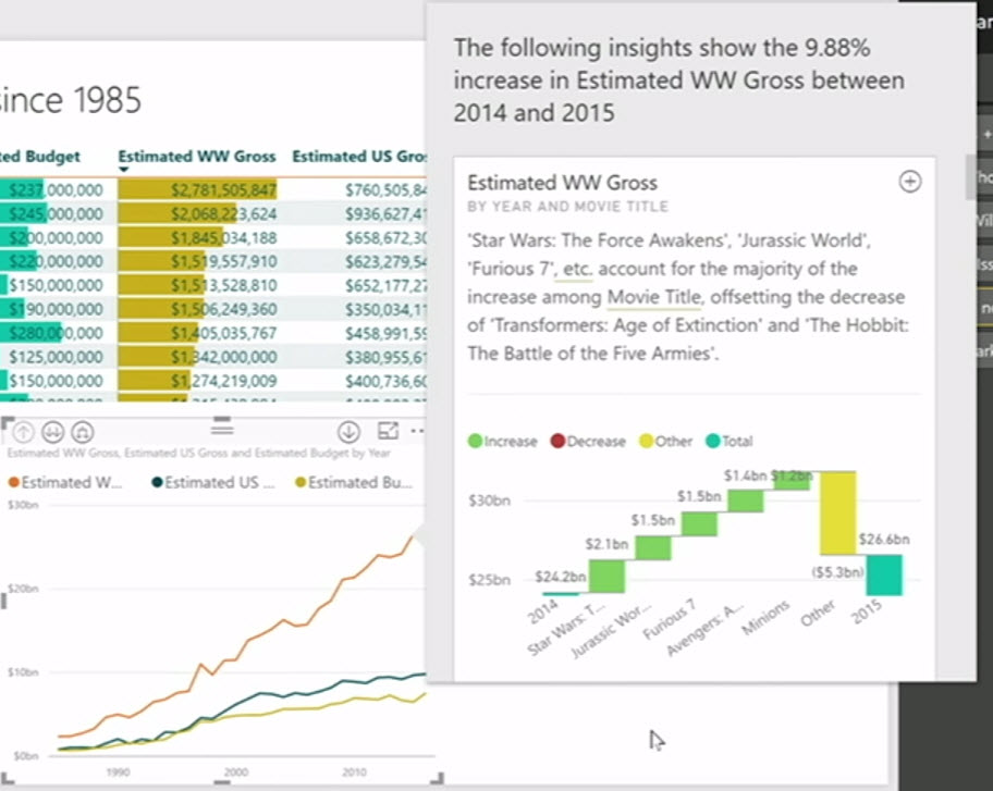
The quick insights feature is now finding it’s way inside visuals, which seemed pretty cool. We saw a demo showing a line chart that had a series moving up and down over time. Rather than hunting for the light-bulb icon to kick off the Quick Insight analysis, we can soon right-click various points on the line chart and ask Quick Insights to try and find a deeper reason in the data model that might explain the recent trend.
The resulting pop-up window showed an updated waterfall chart that only shows significant categories and groups everything else to “other” which seemed smarter.

4. New Time Line custom visual
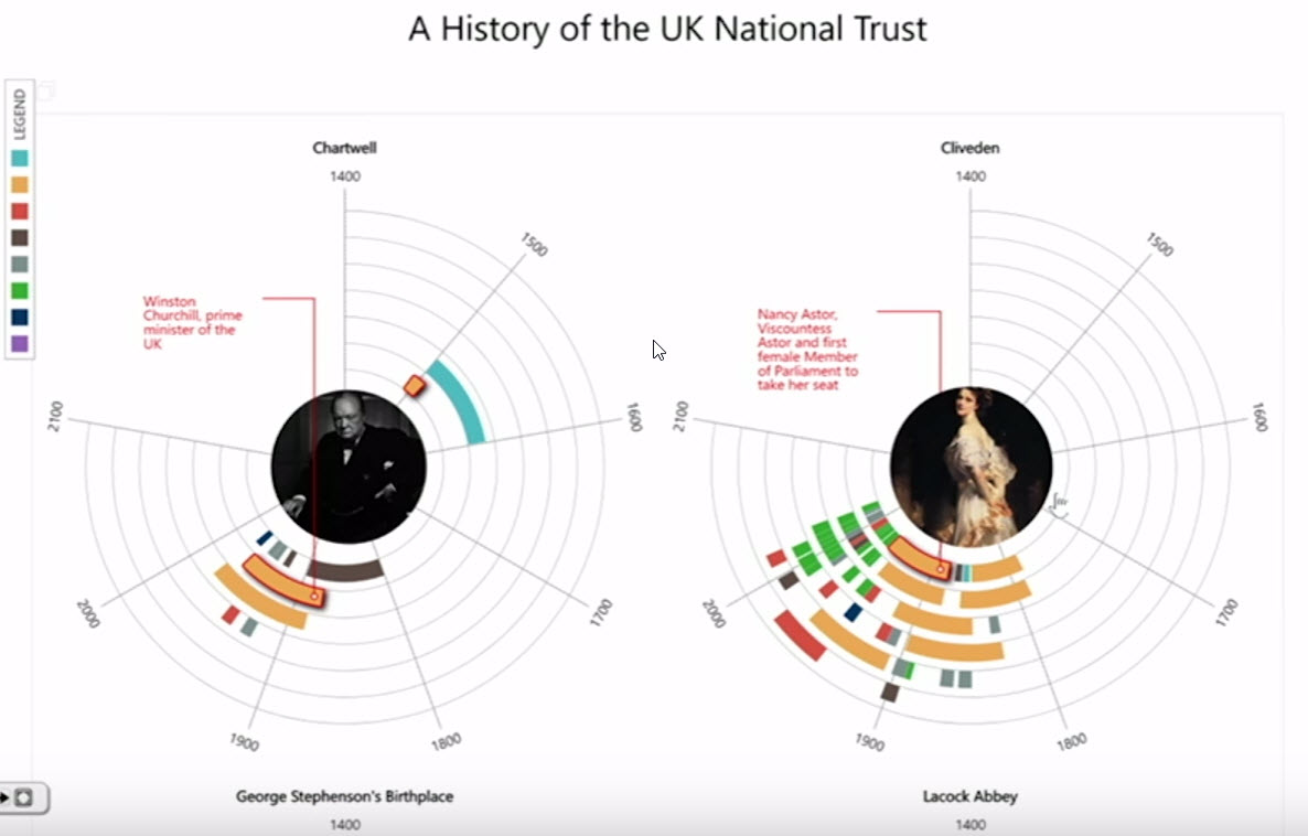
Microsoft have worked closely with the UK National Trust to develop a powerful (and beautiful) new custom visual that I’m really looking forward to getting my hands on. It falls into the storytelling camp and was demonstrated in a number of sessions at the Summit. It sounds like it might be available in the next few weeks from the office store.
It has a number of properties and settings you can configure to change the way data is displayed. The keynote demo showed it using data about the place Issac Newton famously discovered gravity. I understand the UK Trust will use the visual in public facing websites.
Last year they debuted the powerful Sand-dance custom visual so maybe they will dig deep and come up with something particularly special each year.
Interestingly we will soon be able to click a button in the ribbon to install custom visuals from the office store.

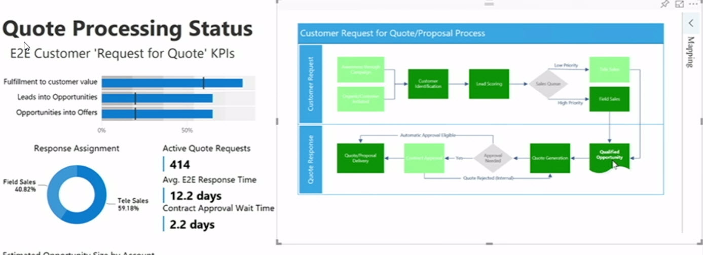
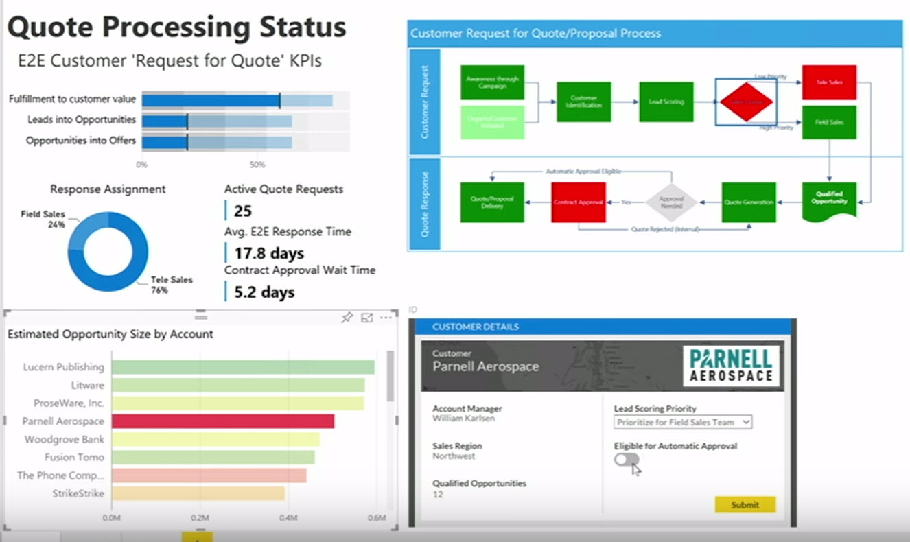
5. Ability to paste Visio diagrams as visuals
Finally another handy feature will be the ability to take a diagram from Visio and paste it to a Power BI report as a new Visio visual control. It appears when the item is pasted to the Power BI Report, it attempts to map to the Power BI Data model. If it misses something you have the ability to map Visio entities so that it will react when other visuals are cross-filtered. I haven’t used Visio in a while but I want to now.