
#1 Trusted Worldwide for Microsoft Fabric & Power BI Consulting and Training
RADACAD is the world's first and most comprehensive resource for Microsoft Fabric and Power BI. We build end-to-end analytics solutions for organisations globally and train thousands of professionals every year — led by Microsoft MVPs with 20+ years of real project experience.
From global banks and government agencies to universities and growing businesses — across 80+ countries. Hover to pause.


We build data analytics solutions that drive real decisions
Our consultants design, build and deploy end-to-end Power BI and Microsoft Fabric solutions for organisations across industries worldwide — from strategy through to live production systems.

Our consulting delivery process
Refined over 20+ years of analytics project delivery worldwide — structured, transparent, and built around your success.
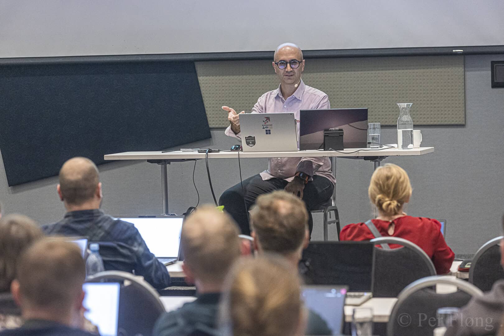
Power BI & Fabric training — from rookie to rock star
Public courses worldwide, bespoke corporate programmes, and self-paced online learning — all taught by Microsoft MVPs who build production solutions every day.
Power BI: Rookie to Rock Star
Intensive multi-day public course — data modelling, Power Query, DAX, report design, and deployment. All levels from beginner to advanced.
Microsoft Fabric: Rookie to Rock Star
The most comprehensive Fabric training available worldwide — Lakehouse, Warehouse, Data Factory, Spark notebooks, semantic models, and Power BI.
Corporate & bespoke training
Custom Power BI or Fabric training built around your team's data, tools, and skill gaps. On-site or remote. Any group size.
RADACAD Academy — online learning
Hundreds of self-paced courses on Power BI and AI by Reza Rad. Monthly subscription or one-off access. Learn at your own pace.
Remote coaching & consulting calls
1:1 expert sessions to solve your specific Power BI or Fabric challenges fast — book by the hour or as a retainer package.
Books, tools & free resources
10+ published books on Power BI, the Power BI Helper tool, and 1,000+ free articles — the world's largest free library on the topic.
World-class Power BI & Fabric training
Intensive courses delivered worldwide — public, corporate, and online. All taught by Microsoft MVPs with 20+ years of real project experience.
Can't find what you're looking for?
We run public training courses globally throughout the year, and offer bespoke corporate training for teams of any size. Get in touch and we'll find the right option for you.
The world's first and most complete resource
We started teaching Power BI before it launched publicly — and we've been building production analytics solutions ever since. Here's what makes RADACAD different.

Reza has authored 10+ books on Power BI, spoken at conferences across 6 continents, and personally trained thousands of data professionals worldwide. He is one of the world's most recognised voices on Power BI and Microsoft Fabric — combining deep technical expertise with a gift for making complex topics genuinely understandable.
Rated 5★ by professionals worldwide
From enterprise consulting clients to individual training attendees across 80+ countries — real results, real feedback.
"For anyone who wants clarity on the best Power BI architecture and how to effectively use it, I strongly recommend RADACAD. They gave us a real head start — the advice on architecture alone was worth it."
"Reza made my life so much easier in just under an hour. Any time spent speaking to Reza will be well worth it. Not only that but he is very patient and straightforward. Highly recommended!"
"Reza completely lived up to his hype. After the class, I was immediately able to pull and massage data, create useful reports and post them to dashboards. I would recommend RADACAD without hesitation."
"I highly recommend this course for Power BI starters. Instructors are already MVPs for Power BI and very detailed and patient in explaining."

"Reza explains things so well and easy to understand. He reads the room and adjusts so that it makes sense to everyone — regardless of their starting level."

"Easily the finest quality course I've ever attended in my life. Reza knows Power BI inside out. Well worth the money and time invested — Power BI is definitely the future of business reporting."
We run the world's leading Power BI conferences
Join thousands of data professionals at our annual conferences — globally recognised events in the Microsoft analytics community.
Latest from the RADACAD blog
1,000+ free articles on Power BI and Microsoft Fabric — written by Microsoft MVPs who practise what they write.
Ready to work with the world's #1 Power BI & Fabric experts?
Whether you need a team trained, a solution built, or just have a question — we respond within one business day.