In this post, I am going to demonstrate a new visualization that has been released by the AI team in Power BI in recent months.
Before showing off the nice features, there are some key points about this visual.
http://datascientistyuyuria.blogspot.com/2017/06/
- It can be used by Data sciences, Data engineer and End users.
- It is easy enough to use and interpret
- It consumes lots of algorithms behind the seen to identify the main factor
- It can be used to align with other customer visuals to create a better visualization
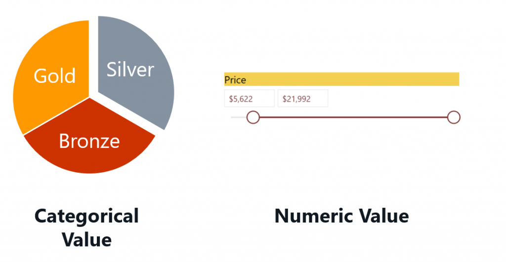
- Able to interpret both Categorical and Numeric variables
- Provide a great clustering approach: find the natural grouping on data, and then visualize the main top cluster (segment) and also, it shows how a combination of factors affects the metric that you’re analyzing.
- Interpret the results: the visual provides a brief description of how it works [1]
- As mentioned before this visual employs a combination of algorithms. In categorial and regression analysis different algorithms have been used.
In this post, I am going to use a dataset about the concrete!
Concrete has been used in building the bridge, building and so forth.
The main elements for creating concrete is
- Cement: A cement is a binder, a substance used for construction that sets, hardens, and adheres to other materials to bind them together.
- Blast Furnace Slag: stony waste matter separated from metals during the smelting or refining of ore.
- Fly Ash: Fly ash or flue ash, also known as pulverized fuel ash in the United Kingdom, is a coal combustion product that is composed of the particulates that are driven out of coal-fired boilers together with the flue gases.
- Water: The amount of water in concrete controls many fresh and hardened properties in concrete including workability, compressive strengths, permeability and water tightness, durability and weathering, drying shrinkage and potential for cracking [2].
- Superplasticizer: Superplasticizers, also known as high range water reducers, are chemical admixtures used where well-dispersed particle suspension is required. These polymers are used as dispersants to avoid particle segregation and to improve the flow characteristics of suspensions such as in concrete applications [3].
- Coarse Aggregate: Coarse aggregate is the portion of the concrete which is made up of the larger stones embedded in the mix. Concrete contains three ingredients; Water, cement, and aggregate. That aggregate is made of fine sand and coarse gravel.
- Fine Aggregate
- Age: how many days
- Concrete compressive strength
The dataset also available from here
So, let’s start to predict what will be the strength of the concrete regarding other elements such as ashes, water, and so forth.
Question:
I want to answer the following questions:
-
What factors have more impact on the strength of the concrete to decrease or increase and how much?
-
I am interested to see the natural classification of my data.
-
Also interested to see some rules like if the amount of Cement is … and age is … then what is the strength
Let’s Answer these three questions using a brand new visualization named Key Influencer
Get it!
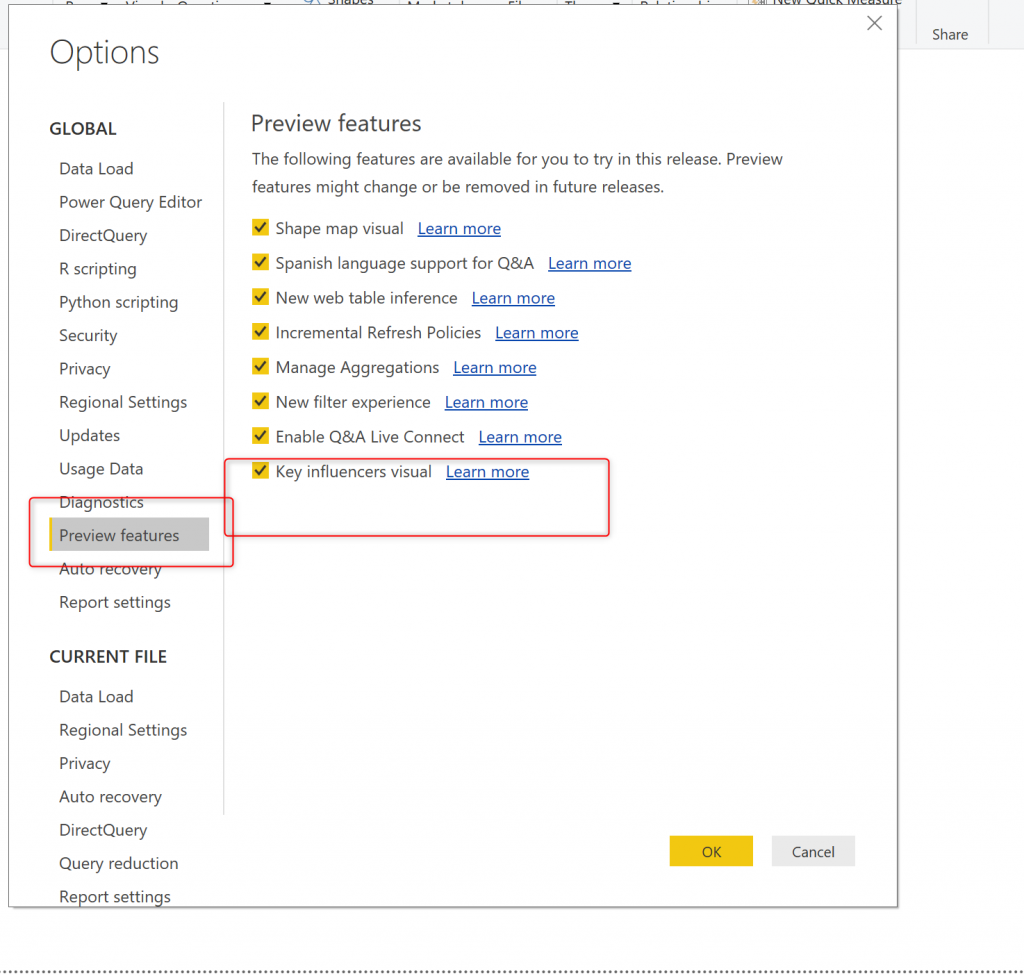
The key influencer is not as a preview feature, to access it you need to follow below steps
- Click on file –> Option and Settings –> then Options –> then click under the Global, click Preview Feature, and you should find the Key Influencer Visual at the bottom
- However, after all, steps you need to restart the Power BI ( close and open again)
- Just notice, it a preview feature, some enhancement will be applied on it soon
Use It!
Now you need to import the concert dataset into Power BI Desktop
Get Data –> CSV –> Load
Easy!
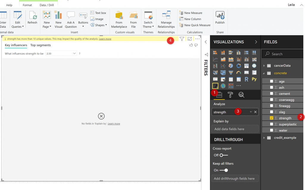
Now our plan is to analyze the strength of the concrete, hence click on visual that has been added to the Visualization panel, and for the analyse choose Strength field from Concrete dataset.
You can see in the below picture (number 1 to 4)
However, we see an error there!
Error! “Strenght has more than 10 Unique values!”
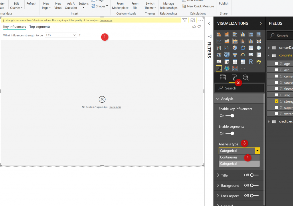
that means I need to change some part of the setting to make it works!
By default, the Key Influencer visual, set to be work for categorical variable up to 10 distinct values,
However, we can make it work for continues variable
To solve it:
Click on the visual –> then click on the format (number 2 in the picture) choose the Analyse type and select the Continues, here you are! The error will be gone, but we need to add some values to make it work.
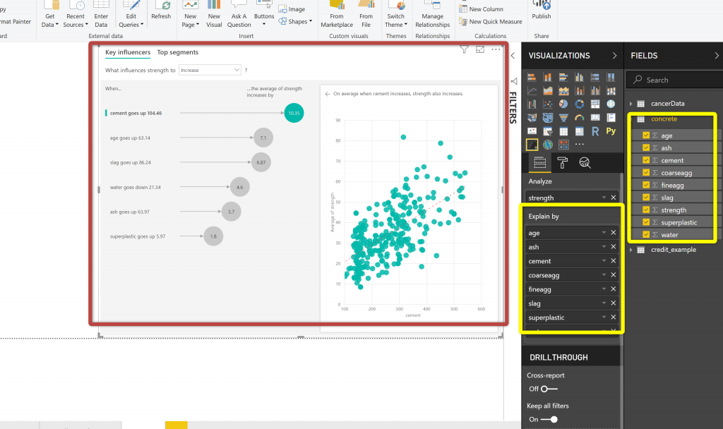
Now you able to see the analysis!
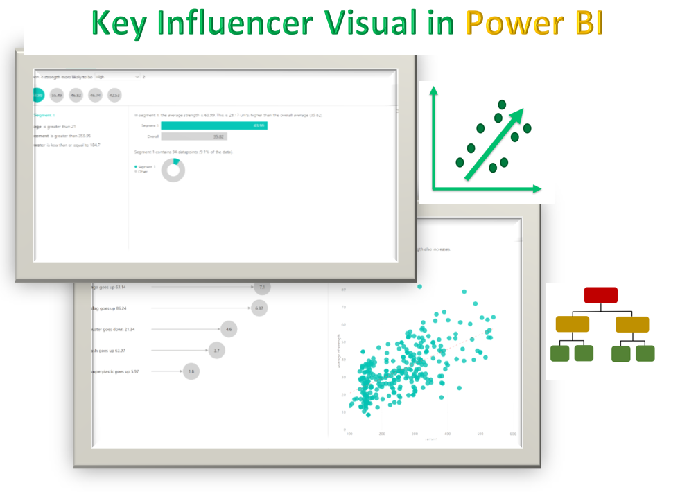
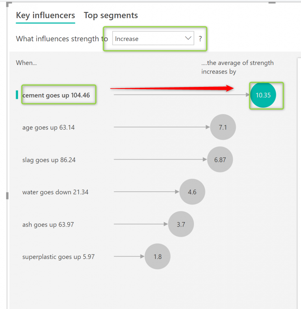
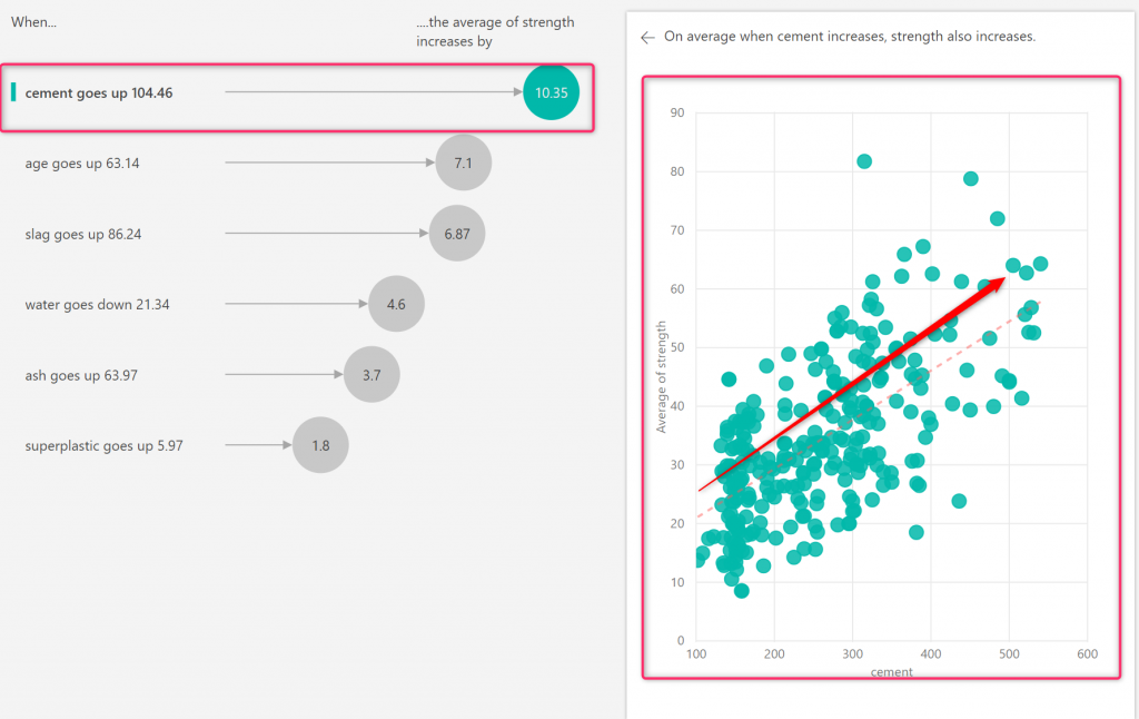
First, the list of the factor has been displayed in the order they have more impact on the strength
There is a number who up beside each factor, that shows if-then analysis for us
For instance, If the cement increases 104 then the strength will increase by 10 in another word it impacts by 10%
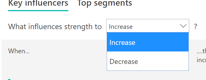
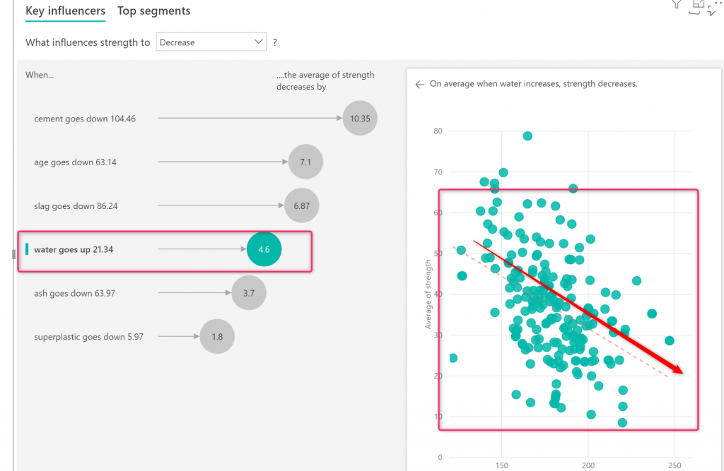
Just notice for continues values: we have increased and decrease
Next, You able to see a scatter chart that shows the relationship between cement and strength and a line that shows the positive impact of the cement on strength
Let’s click on the water and see how it impacts on the strength in a negative way, more water the strength going down.
Now we going to analyze the next tab Top Segment
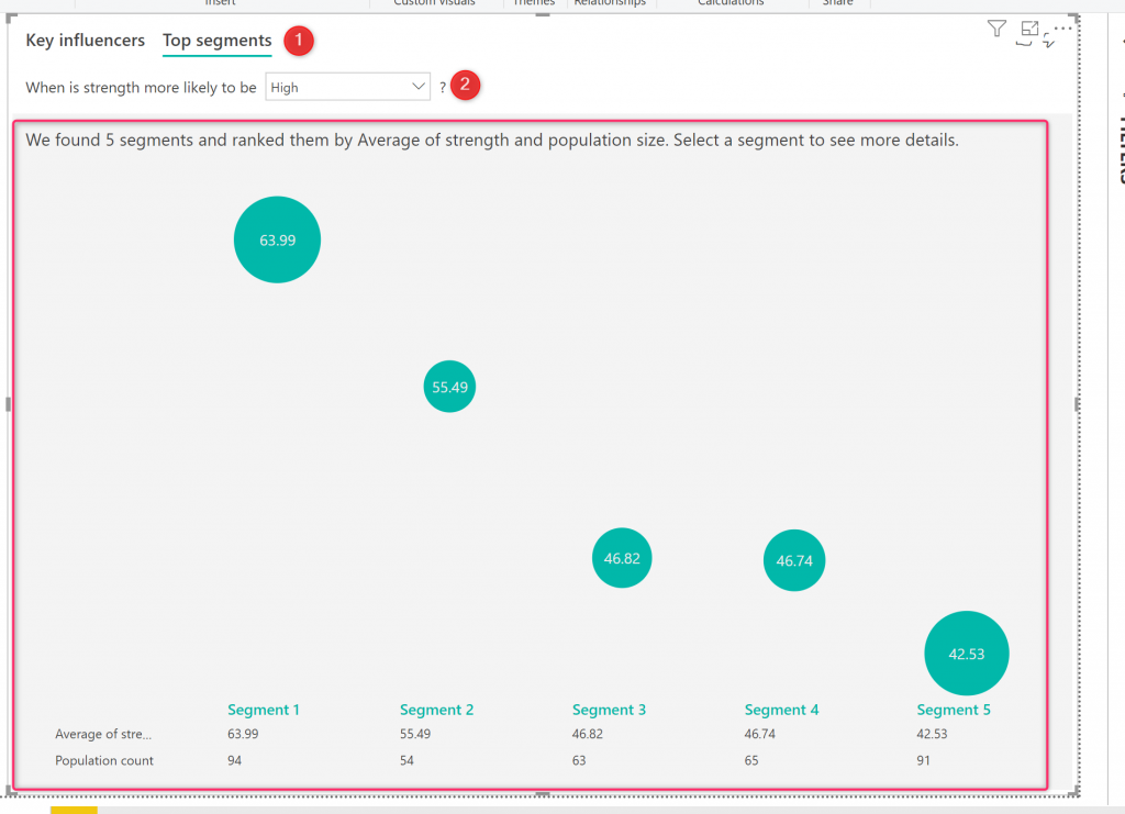
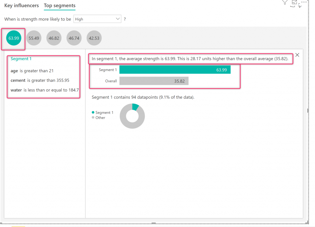
Click on the Top segment and you will see that strength is more likely to be High analysis you can change it to Low as well
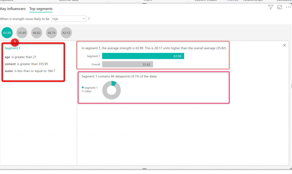
As you can see in the picture, is able to identify 5 top segments in data
In each of you able to see the average of each segment, and also in the bottom list number of the data point that has been located there
So back to the second question “I am interested to see the natural groping of my data.
“
We are able to see the natural grouping of data there!
If you need more detail, click on each segment and it navigates you to another interesting page!
In this new, you get more detail about the segmentation for each segment
For instance, click on the bigger segment which is the average of strength is 63.99
Then you able to see some explanation of this segment
Like what is the age range, how much cement and water is in this segment and so forth.
To back to the previous page just click on the Close bottom at the top right,
This visual can be used by other Visual in Power BI report and it is available for everyone
References
[1]. https://docs.microsoft.com/en-us/power-bi/visuals/power-bi-visualization-influencers
[2]. https://www.forconstructionpros.com/concrete/equipment-products/article/11359846/water-in-concrete
[3] https://en.wikipedia.org/wiki/Superplasticizer
[4] https://www.quora.com/What-is-a-coarse-aggregate
[5] http://archive.ics.uci.edu/ml/machine-learning-databases/concrete/compressive/Concrete_Data.xls
[6] https://www.iconfinder.com/icons/3254948/decision_tree_family_tree_hierarchy_organisational_chart_organizational_chart_icon






Thanks
Thanks for sharing LEILA ETAATI !!
you are welcome