I have written about 4 other types of map visual with Power BI before. In this post I want to explain how ArcGIS visual work as a map visual. There are some specific features in this visual which is simple to use, but will give you a lot of insight. With this type of map visual, you can add multiple layers of data, and use even some of existing geo location information from ArcGIS map directory. Let’s go through an example and see what are features with this visual. To learn more about Power BI, read Power BI book from Rookie to Rock Star.
Maps in Power BI
There are many ways to visualize something on Map in Power BI, some of it are as below;
- Map Visual
- Filled Map Visual
- Custom Visuals – Synoptic Panel by OKviz
- Custom Visuals – GlobeMap by Microsoft
- Shape Map Visual – Preview
- ArcGIS Map Visual – Preview
I have written about them all expect last one. This post focus is on ArcGIS Map visual. Hopefully at the end I will write a post about comparison.
Sample Data Set
For this example I will be using a sample data set which includes earthquakes in New Zealand in 2015! Not all of them, but part of earthquakes. Guess how many earthquakes listed in this file? 20,000! But don’t worry, it has listing of everything even earthquakes with magnitude of less than 1. To download the CSV data set file, use link below;
ArcGIS Map Visual
This visual is still preview at the time of writing this post, and for using it, you need to enable this preview feature. To enable it go through:
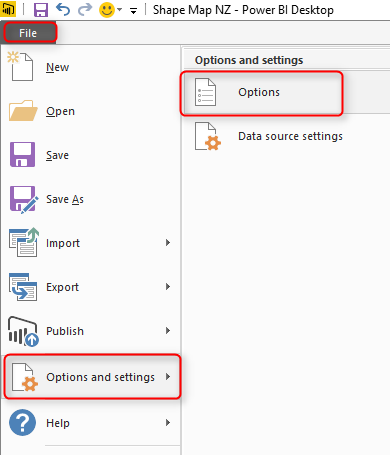
File Menu -> Options and Settings -> Options.
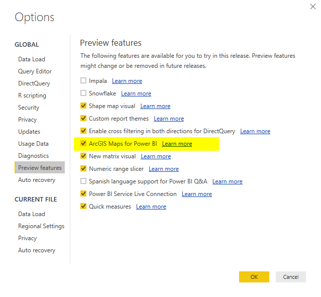
In preview features tab, select ArcGIS Maps for Power BI.
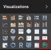
After clicking OK. you need to close your Power BI Desktop and re-open it again. You should be able to see ArcGIS Map visual in list of your visuals now.
Get Data
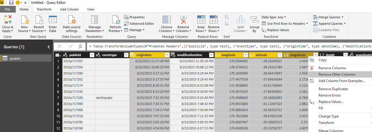
To start with the sample data set, Get Data from Text/CSV, and select the quakes.csv file (link above in this post), Click on Edit in Navigator window, and you will see the whole data set. Only keep these columns and remove the rest: Longitude, Latitude, Magnitude, and Origintime. That means; just select these columns, an from right click menu click on Remove Other Columns.
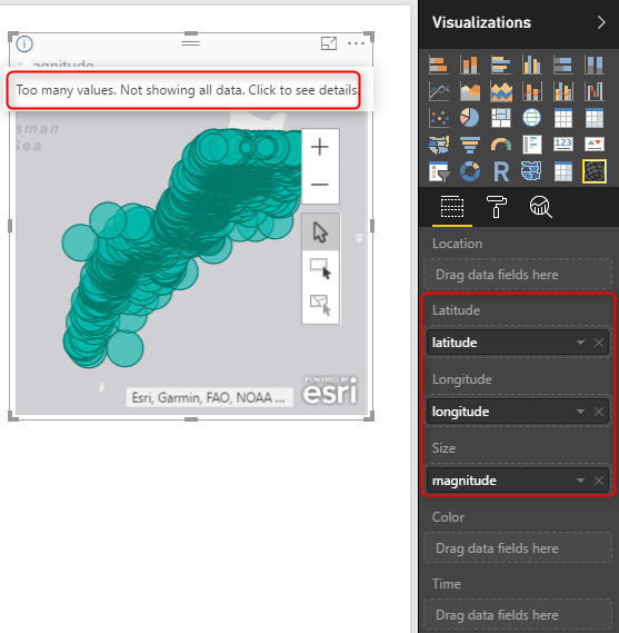
Close and Apply the Query Editor window. Drag and Drop a new ArcGIS map visual in the report, and assign values from latitude to latitude, longitude to longitude, and magnitude from fields list to the Size section of the visual.
This visual, like the basic map visual in Power BI, has a limitation on the number of data points to show. because we have 20K data points it cannot visualize them all. Let’s filter the data set, and only focus on everything with magnitude greater or equal to 6. For doing this in visual level filter expand the Magnitude filter and apply filtering. Remember to click on Apply Filter, otherwise nothing happens.
After applying filter, you would simply see only few numbers.
All of these earthquakes with magnitude more than 6 happened in 2015! can you imagine?!!!! anyway, let’s go back to ArcGIS map;
So far, the map is very similar to normal Power BI basic map visual with bubbles. Now let’s see what other options we have with ArcGIS visual;
ArcGIS Features
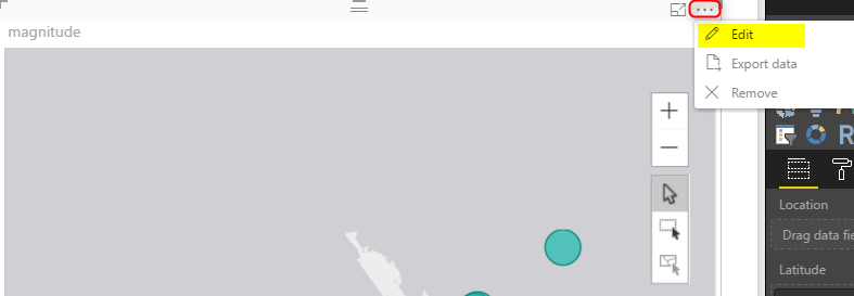
To go through features of this visual, you need to click on three dots icon on the top right corner of visual and click on Edit.
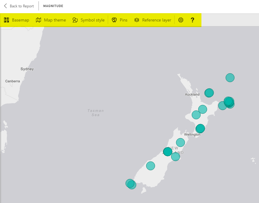
You will be redirected to an Edit mode, where you will see the map full screen, and number of menu options at the top;
Change Base Map
The first change you can make, it so change the base map, to be something different. You can choose from Dark Gray Canvas, Light Gray Canvas (Default), or Streets.
This feature is good to match the map with theme of your report, or even get some street information.
Map Theme
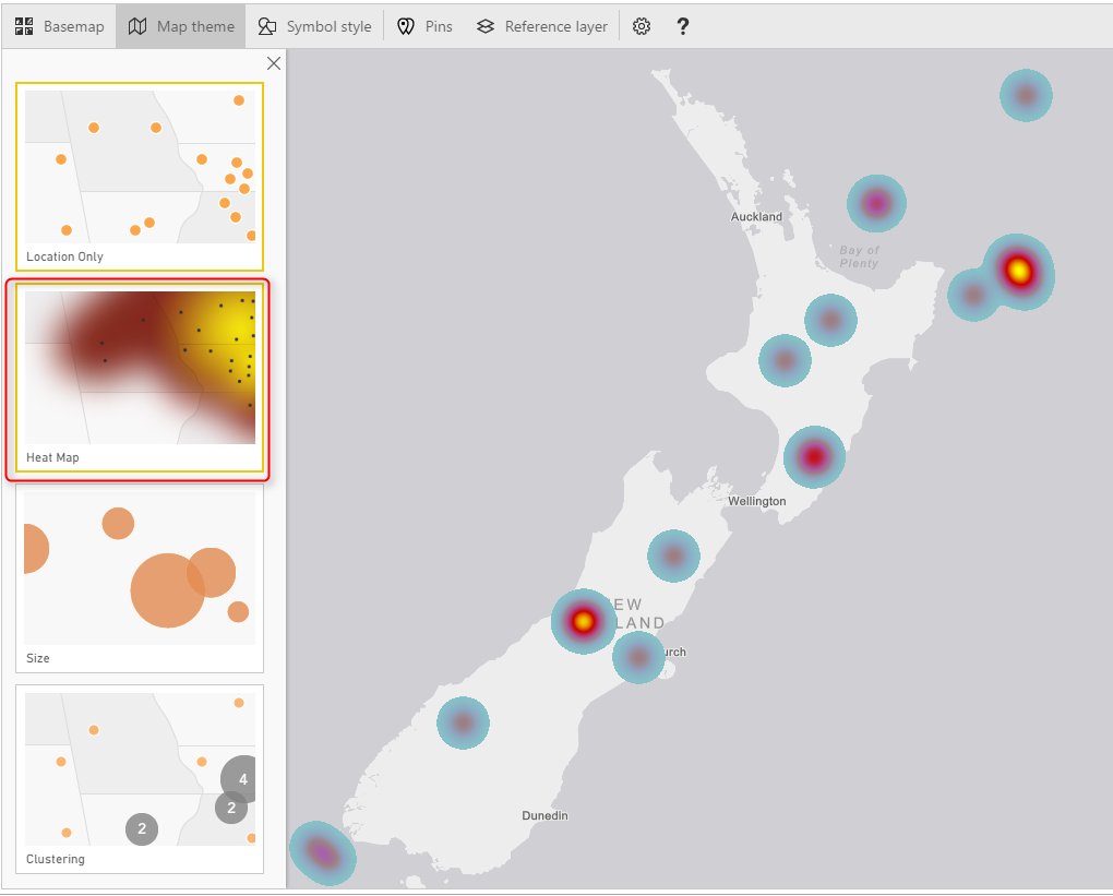
One of the interesting features of this visual, is to change theme of Map. This type of map can give you four themes;
- Location Only – no size difference between bubbles
- Heat Map
- Size – bubbles with different sizes based on measure’s value
- Clustering – Good option for drill down
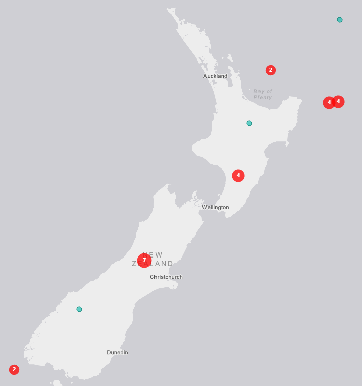
Clustering is good if you want to have high level view, and then ability to drill down into each region. Here is a view of clustering;
Each bubble shows you the total count of data point in that region (more you zoom out, bigger your region will be). and if you double click on a bubble you will drill down into that region;
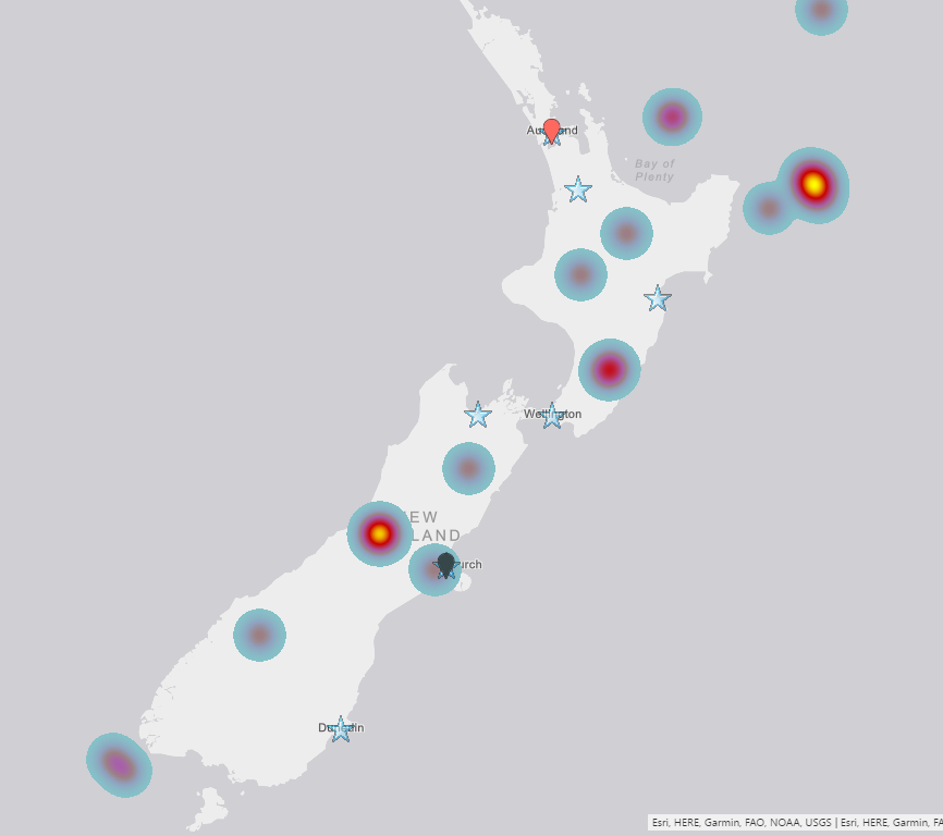
Heat map is a good visualization for showing the severity of earthquake in each area more graphically;
You can also use Location only or Size, which are simple to use.
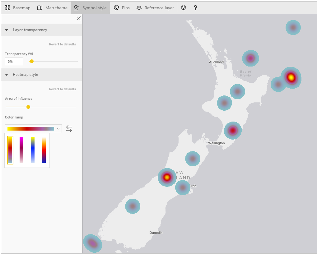
Symbol Style
Depends on what Map Theme, you’ve selected, you can do the details configuration of that in Symbol Style section. For example, if you have selected heat map, you can change the color. If you have selected size, you can change the bubble sizes and etc.
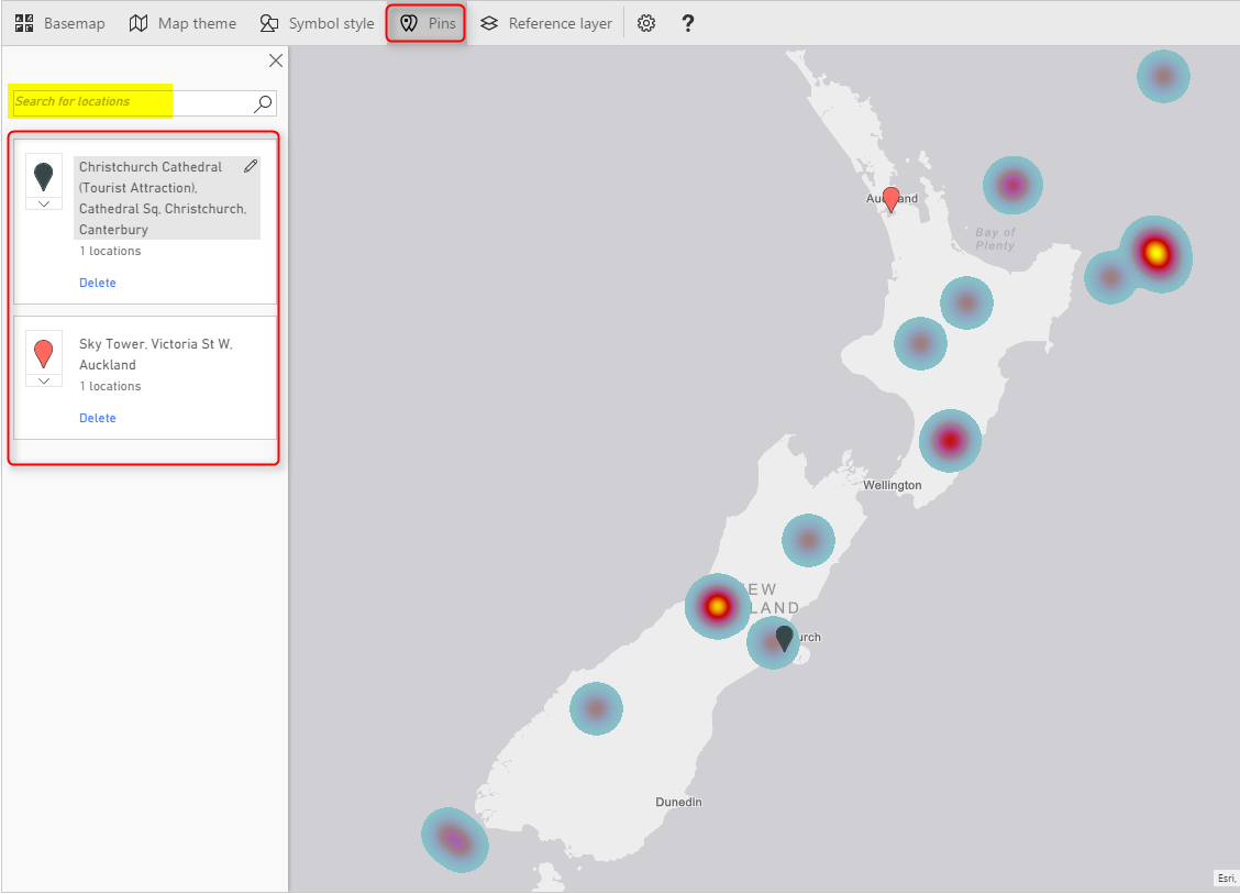
Pins
You can add your own pins. These pins can be locations of branches, hospitals, schools, or whatever else you want to use as a pin on the map.
Reference Layer
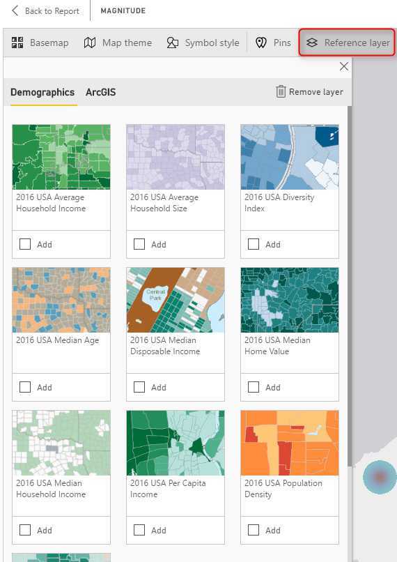
The last feature, but not least is adding reference layer. In my opinion this is one of the best features of this visual. You can add another layer of visualization based on a map in directory of ArcGIS maps. ArcGIS has many maps that you can use, almost map of everything! if you click on Reference Layer menu option, you can see some of existing maps for USA.
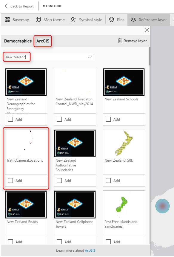
To access more maps, click on ArcGIS at the top, and there you can search for maps. For example below are some maps in New Zealand area;
There are maps for schools, pipelines, gas stations, almost everything. Even there is a map for Traffic Camera Locations, Very useful map!
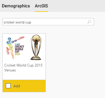
Because the current data set is for New Zealand 2015, and there was a cricket world cup in New Zealand and Australia at that time, so it might be good to bring a map of venues for that and realize are those cricket world cup venues close to the earthquake centers or not. Simply you can search for cricket world cup, and you will get the map very easily. Click on Add to add the layer to map;
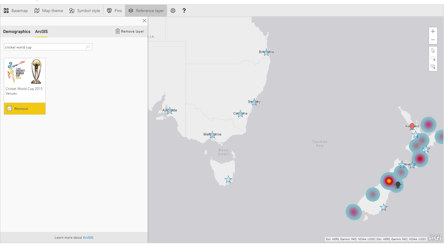
It will take few seconds for the layer to load, and now you will see locations with star mark on it. Wonderful, isn’t it?
Now if you zoom in more to the New Zealand part of the map, you will see how close are venues. The venue in Christchurch was pretty close to one of earthquakes actually.
Adding Time Dimension
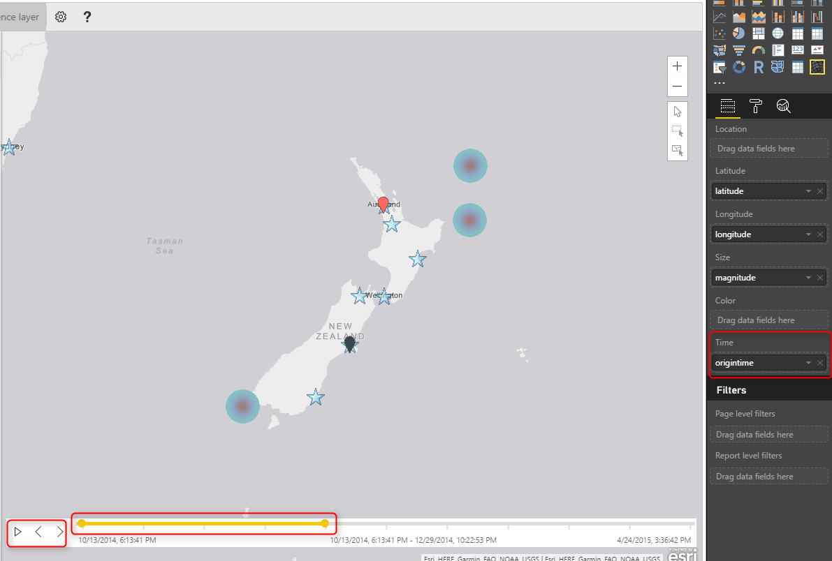
All of above features can be much more insightful with adding a time dimension, and understanding how measure values (in our case earthquakes) happened through the time. If you bring Origintime to the Time section of this visual you will see a new time bar under the map, which you can select the time range for it, and click on play to see how earthquakes happened through the time. Similar to the Play Axis feature in Scatter Chart, Very insightful dimension to add.
Summary
I hope demos of this post has been motivate enough to show you the power of this visual. ArcGIS map visual is not like other map visuals, it is the best of all I would say. There are obviously pros and cons (which I will cover in another post later). However this visual gives you many things; using different themes, adding reference layers from ArcGIS map directory, and adding time dimension. These features are not easy features to use with other types of maps. There is just one part which is not 100% clear, and that is the licensing part of this visual. This visual at the moment is preview and free. However, I’m not sure how long it will be available for free. Because this visual is still in preview mode, expect to see some errors and bugs in it. sometimes you get an error. and you need to close Power BI Desktop and open it, which will be fixed I believe in the general availability version.
Download Demo Files
Save
Save
Save







No download link found after entering my email address.
Hi Julian,
That normally takes few seconds to generate the download link. Let me know if it doesn’t work.
Cheers
Reza
Well done Reza. You are arguably doing a better job than Microsoft and Esri in explaining the power of maps in Power BI. I am currently writing my first article on Power BI, but will certainly get back to your blog for more practical learning.
Hi Willy,
Wow, thanks for your comment. I’m glad you liked it
Cheers
Reza
Is default zooming level is possible in ArcGIS Map? Everytime I open the report, Map is getting zoomed out.
Unfortunately not yet. In normal Power BI Map there is a Map Control Auto Zoom feature that you can turn off. but we don’t have that yet in ArcGIS visual.
Reza,
Can you export the reference layer data added?
unfortunately not. It might be something that you can get from ArcGIS website or APIs, I haven’t done it before, but they MAY give this information to the public.