

In the last post, I have explained how to work with Azure Databricks. In this post, I will show:
1- Upload data in Azure data Lake Store
2- get data from Azure Data Lake Store into Azure Data Bricks
3-clean Data with Scala language
4- visualizes with R language
5- Predictive Analysis with R
In the next post, I will explain how to show the result in Power BI as well.
Upload data into Azure data Lake Store
you need to create an Azure Data Lake Store module in Azure Portal.
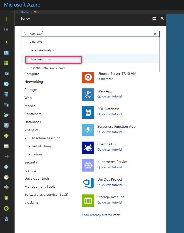
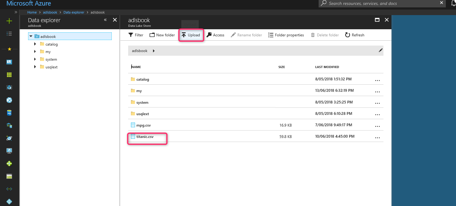
After creation, an Azure Data Lake Store upload the Titanic dataset. First, download it from [1]. Then, upload it into Azure Data Lake Store:

After creating Azure Data Lake store, upload dataset Titanic into Azure Data Lake Store.
Now we need to get authentication ID, client ID, and Tenant ID.
for Client ID, you need to create the application in Azure active directory first.

Then copy the application ID
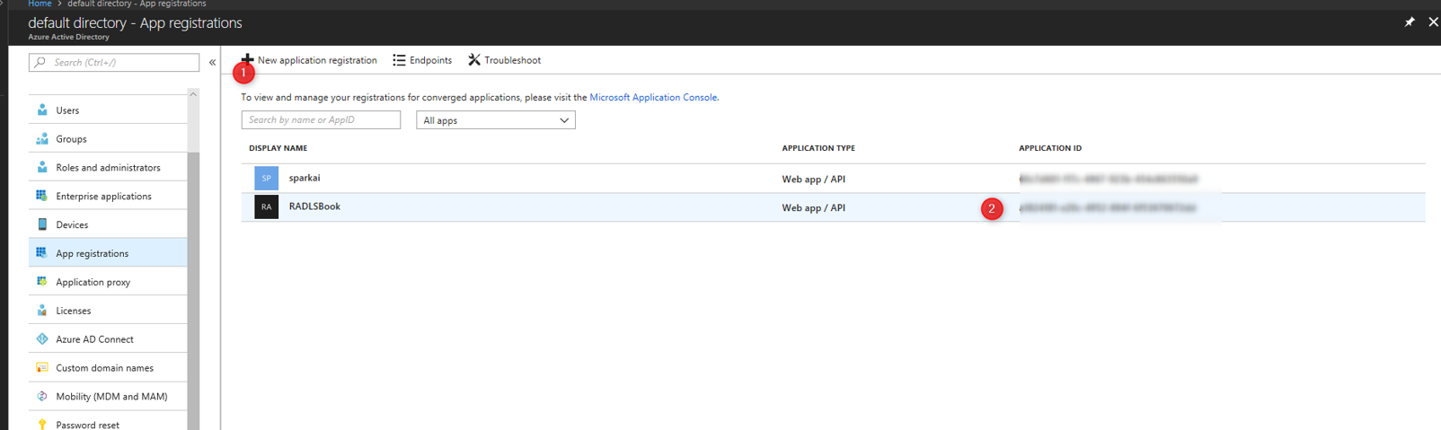
Then copy the application ID in Azure Active directory- app registration.
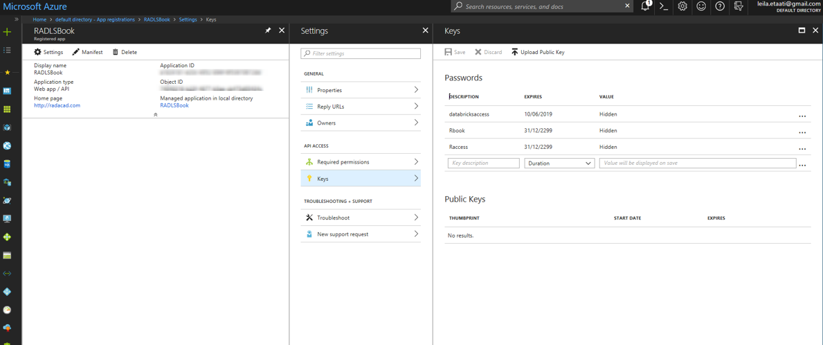
Then click on the created app registration, then click on the Keys and create a new key. Copy the key as authentication key.
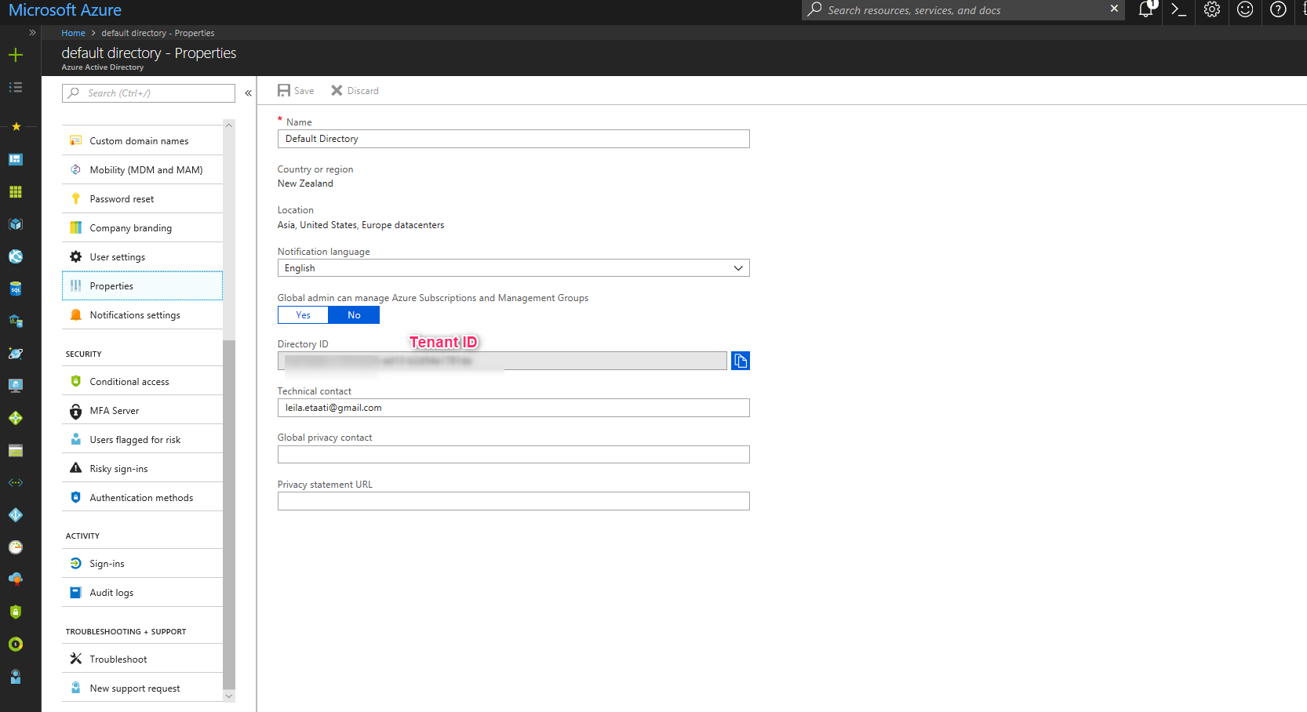
after creating the authentication key, you need to create a Tenant ID click on the properties in active directory ID as below picture.
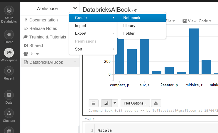
Now we need to create a new notebook in Azure Databricks portal with R language.
To read data from Azure Data Lake Store we need to set some credential as below
spark.conf.set(“dfs.adls.oauth2.access.token.provider.type”, “ClientCredential”)
spark.conf.set(“dfs.adls.oauth2.client.id”, “<Application ID>”)
spark.conf.set(“dfs.adls.oauth2.credential”, “<Authentication Token>”)
spark.conf.set(“dfs.adls.oauth2.refresh.url”, “https://login.microsoftonline.com/<Tenant ID>/oauth2/token”)
val df=spark.read.option(“header”, “true”).csv(“adl://adlsbook.azuredatalakestore.net/titanic.csv”)
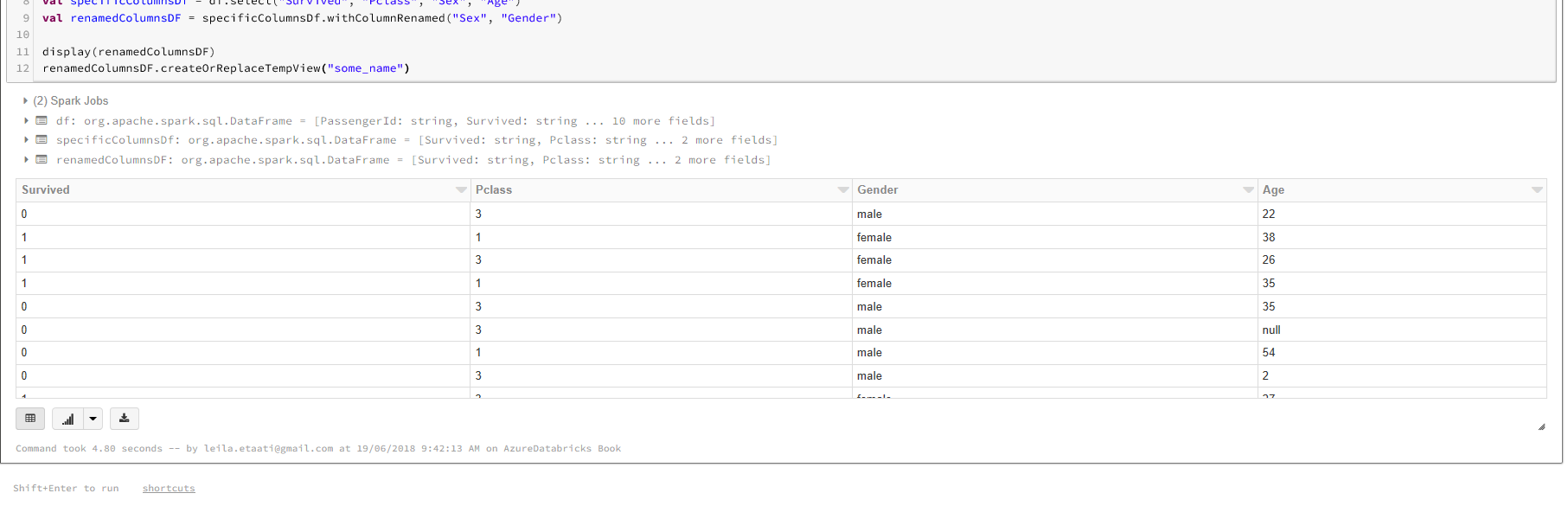
The dataset in Azure Data lake store will be stored in the variable df. To work with Titanic dataset we just need Survived, Sex,Age, and PClass columns to be selected.
val specificColumnsDf = df.select(“Survived”, “Pclass”, “Sex”, “Age”)
val renamedColumnsDF = specificColumnsDf.withColumnRenamed(“Sex”, “Gender”)
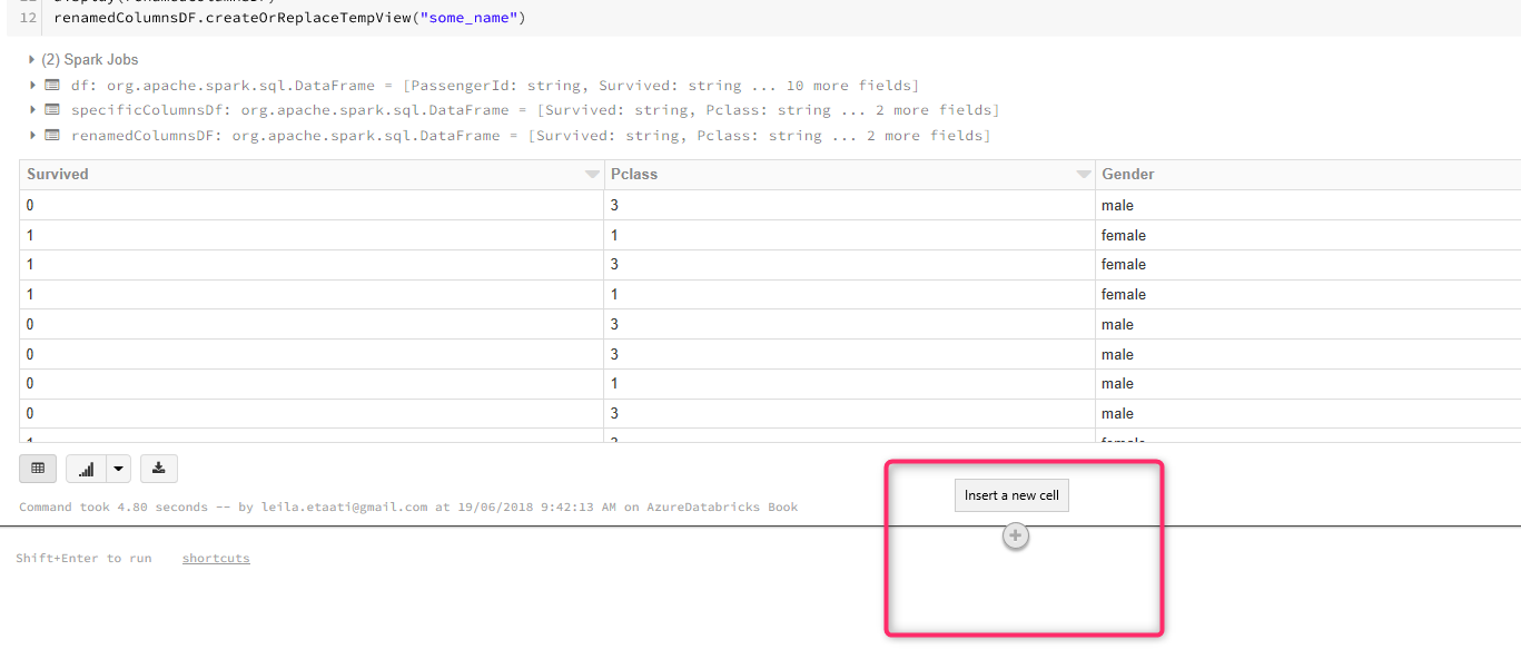
Now, we need to run the R codes to this data in another cell to create a model and predict a passenger with the specific age, gender, and passenger class will be survived or not. There is a need to pass the data from Scala to R. To do that we need to create a temporary table to give the table to the R code using below code:
renamedColumnsDF.createOrReplaceTempView(“some_name”)
Add a new cell by clicking on the plus sign under the latest cell.
In the new cell, we need to write R codes. As a result, we need to mention the language by putting %r at the start of the coding. Also, we are using some packages from SparkR. Then we use the function SQL to fetch data from last Scala cell. Finally, store the data in dataset variable.
%r
library(SparkR)
sql(“REFRESH TABLE some_name”)
df <- sql(“SELECT * FROM some_name”)
dataset<-as.data.frame(df)
display(df)
In the same cell or the new one, you able to write some codes for machine learning. In this example, we looking to check a passenger with specific passenger class, age and gender are going to survived or not. There is package rpart for decision tree. This package helps us to predict the probability to be survived or not.
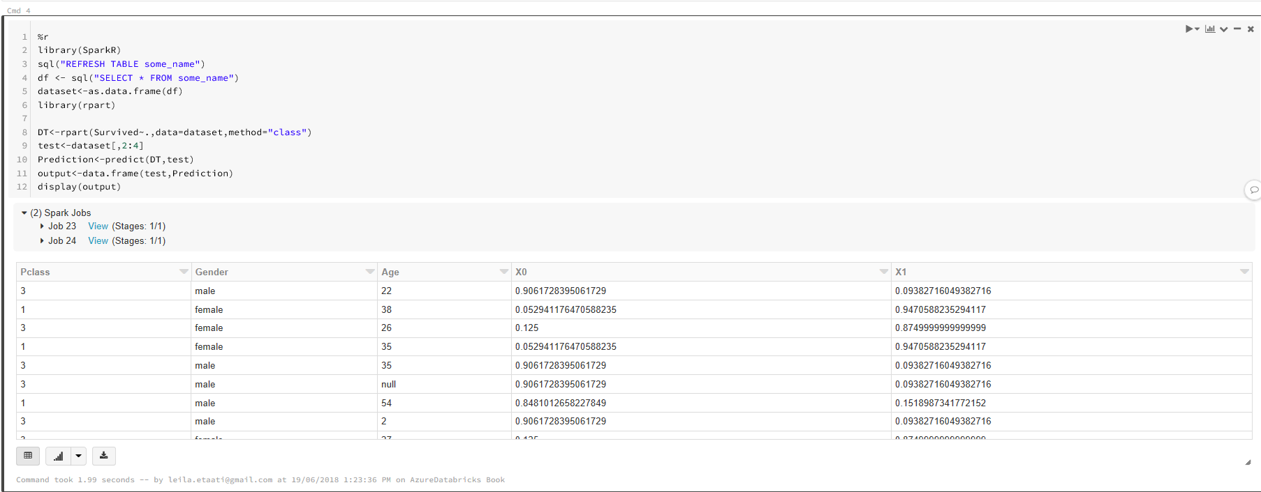
%r
library(SparkR)
sql(“REFRESH TABLE some_name”)
df <- sql(“SELECT * FROM some_name”)
dataset<-as.data.frame(df)
library(rpart)
DT<-rpart(Survived~.,data=dataset,method=”class”)
test<-dataset[,2:4]
Prediction<-predict(DT,test)
output<-data.frame(test,Prediction)
display(output)
By run the cell the output will be displayed
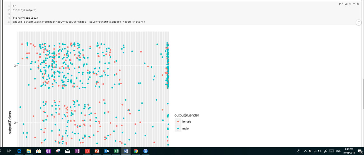
There is a possibility to draw some charts using R packages such as ggplot2 as well. For instance, if we want to see the Pclass, Age and Gender in a scatter chart with specific legend we able to leverage the below codes.
%r
display(output)
library(ggplot2)
ggplot(output,aes(x=output$Age,y=output$Pclass, color=output$Gender))+geom_jitter()
As you can see in below figure, a scatter chart the with legend for Gender will be shown up.
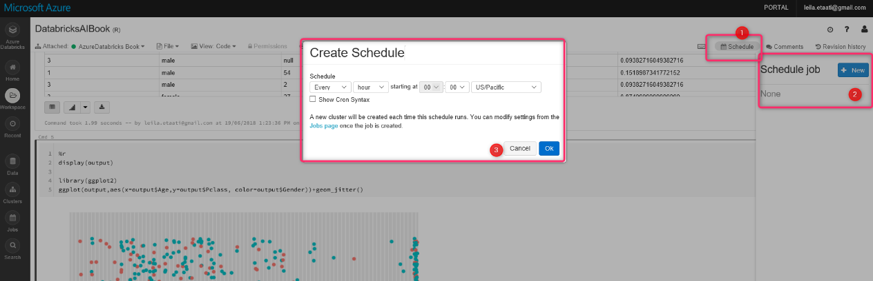
Azure Databricks is not only for machine learning, but there is also a possibility to get data from different resources to apply changes and then shows the result in some visualization tools such as Power BI. Moreover, there is a possibility to schedule the process
There are different ways to get data from SQL database, Azure services such as Azure Blob, Data Lake Store, Azure Cosmos and so forth.
In te next post I will show how to show the result in Power BI.
[1] https://www.google.co.nz/url?sa=t&rct=j&q=&esrc=s&source=web&cd=5&ved=0ahUKEwjNo73rmvDbAhUa7WEKHf5TBQkQFghbMAQ&url=http%3A%2F%2Fbiostat.mc.vanderbilt.edu%2Fwiki%2Fpub%2FMain%2FDataSets%2Ftitanic3.xls&usg=AOvVaw1j63KEb1daRf8kqotv9b7B


