
In previous steps you’ve learned how to extract and mash up the data from CSV and automate the process of looping through all CSV files in the source folder. In this step we are going to build visualizations based on the data set we’ve built so far. In this post you will see how easy is to build charts in Power BI desktop and how customize-able they are. You will also learn about using few DAX calculations to produce new measures that helps building visualization elements.
Adding Date Dimension
Before going to visualization part let’s add a date dimension to our queries. I have previously explained an example of date dimension with Power Query, so All you need to do is to use that as the source. The Date dimension query produces table below as result:

It is also configurable as it mentioned in the blog post, and it includes public holidays (New Zealand holidays actually, you have to change it a bit to cover your country holidays which is easy).
I have above query in an Excel file and I use that as a source in Power BI Desktop. So here is what I have in my Query Editor; A query for Date (which comes from date dimension query example explained above), and the Tracking Data query (which we have built it in previous step of this exercise);

As you see in the above table the FullDateAlternateKey is not showing the right date format. I just right click on it and change it to Date format so I have proper date field there;

A Touch to Modelling
Now Close the query editor and apply. This will load result of both queries into the memory and model for Power BI Power Pivot component. Go to Data tab, and expand the Date under fields section. You will see that many columns have a sigma icon beside them, the reason is that Power BI desktop based on their data type (whole number or decimal) decided that these are values that can be summarized. You can change this behavior by choosing any of those columns and change default stigmatization to Do Not Summarize.

Now go to Relationship tab and create relationship between two tables based on their full date columns which are; FullDateAlternateKey Column from Date, and Dated Column in Tracking Data table.

Adding Few Static Measures
Fitbit calculates based on my current weight and age (I assume) how much calories I have to spend each day. I don’t know that calculation, So I create a static measure with the value of 2989 for the amount of calories I have to spend each day. I also create StepsCap measure with 12000 value showing that I have to walk 12000 steps a day, and another one for FloorCap with the value of 10. I created a Calories HighEnd measure with 5000 calories as value (I will die if I burn more than that!). You can create all these measures easily in Data tab.

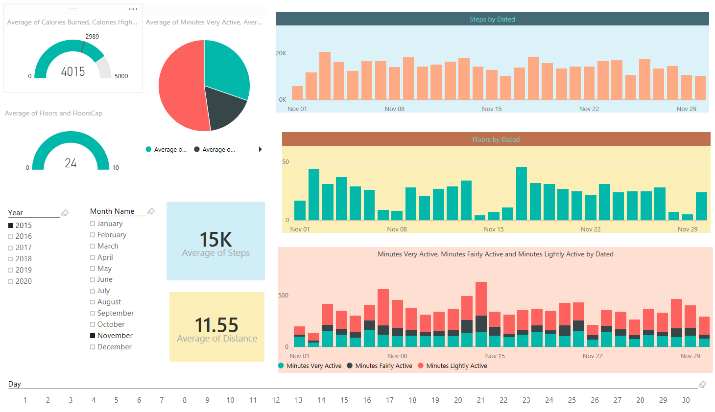
Let’s Visualize
It’s time to visualize what we have so far in the data set. Go to Report tab, and start with building a Gauge. Then drag and drop CaloriesCap as Target Value. You can also put Calories HighEnd measure as Maximum. and then drag and drop Calories measure into the value. change the aggregation from sum to Average as it showed in below image.

Easy! and lucky me who spent (in average) more than the calories I have to spend each day. Do the same for Floor with FloorCap and Floors measure. Now Add Three Slicers for; Year, Month Name, and Day. When you create slicer for Month Name you will see month names are ordered by their alphabetic order of names which is not right. Go to data tab, and click on Month Name Column of Date table. Then from the menu options of Modeling choose Sort By Column and then choose Month (which is the number of month in year);

Now that you’ve set ordering you will be able to see Month names in the correct order in the slicer as below;

Change the orientation of Day slicer to be horizontal rather than vertical in the formatting option of the slicer

Now let’s add two column charts; one for Steps as Value, and Dated column (from Tracking Data table) as axis. The other one with same axis, and Floors as value

Add a stacked column chart with Dated as axis, and three measures as value: Minutes Very Active, Minutes Fairly Active, and Minutes Lightly Active.

Add Also an average of all of three measure above in a pie chart to show the total average. and Add two Card visualization one for Average of steps, and another for average of distance.
Well, you can customize the visualization as you want in the formatting option of each chart or element. Have a play with it and create something remarkable. I’m sure you design it better than me, here is what I built in few minutes;
We are using the date dimension here, and one of the benefits of having date dimension is that I can analyze the data based on weekdays, and public holidays. and see which day of week usually I perform best in walking! Here we go;

Interesting! Isn’t it? I can get more insights out of this visualization than what I see in Fitbit dashboard. I can see that I’m terribly performing bad in taking floors in public holidays! Well our home is flat single floor. However I’m doing a little bit better in weekends. My best days for Floors is always weekdays and there isn’t really so much difference between them.

Now if I check my steps; I’m not doing that bad in public holidays, 7K in public holidays in comparison with 11K is other days is fine for me 😉 And I’m doing even very close in weekends and weekdays. If I look at each day’s average I can see that I’m a bit tired in Sundays and prefer to rest more, however Saturdays are good days for me! so my overall weekend average goes up because of that. and for some unknown reasons Tuesdays I walk less! That’s something I have to consider really why it happens.

In the spit of what I see in Floors and Steps, I’m still doing a bit closer to my steps results in my very active minutes average. and my best active minutes comes Fridays. There is an obvious reason for it. Fridays I play indoor soccer with some friends, and I really feel my heart is coming out of my chest at some minutes in the game! Here is the evidence; I got most active minutes in Fridays!

We can go on and on with building more visualizations on this data set. There is no limitation on the amount of insight you can get from it, so I leave it to you to use your own creativity and build dashboards and charts that gives you more insights. You’ve seen so far how easy is to be a BI developer if you use Power BI 😉


Reza is author of more than 14 books on Microsoft Business Intelligence, most of these books are published under Power BI category. Among these are books such as Power BI DAX Simplified, Pro Power BI Architecture, Power BI from Rookie to Rock Star, Power Query books series, Row-Level Security in Power BI and etc.
He is an International Speaker in Microsoft Ignite, Microsoft Business Applications Summit, Data Insight Summit, PASS Summit, SQL Saturday and SQL user groups. And He is a Microsoft Certified Trainer.
Reza’s passion is to help you find the best data solution, he is Data enthusiast.
His articles on different aspects of technologies, especially on MS BI, can be found on his blog: https://radacad.com/blog.