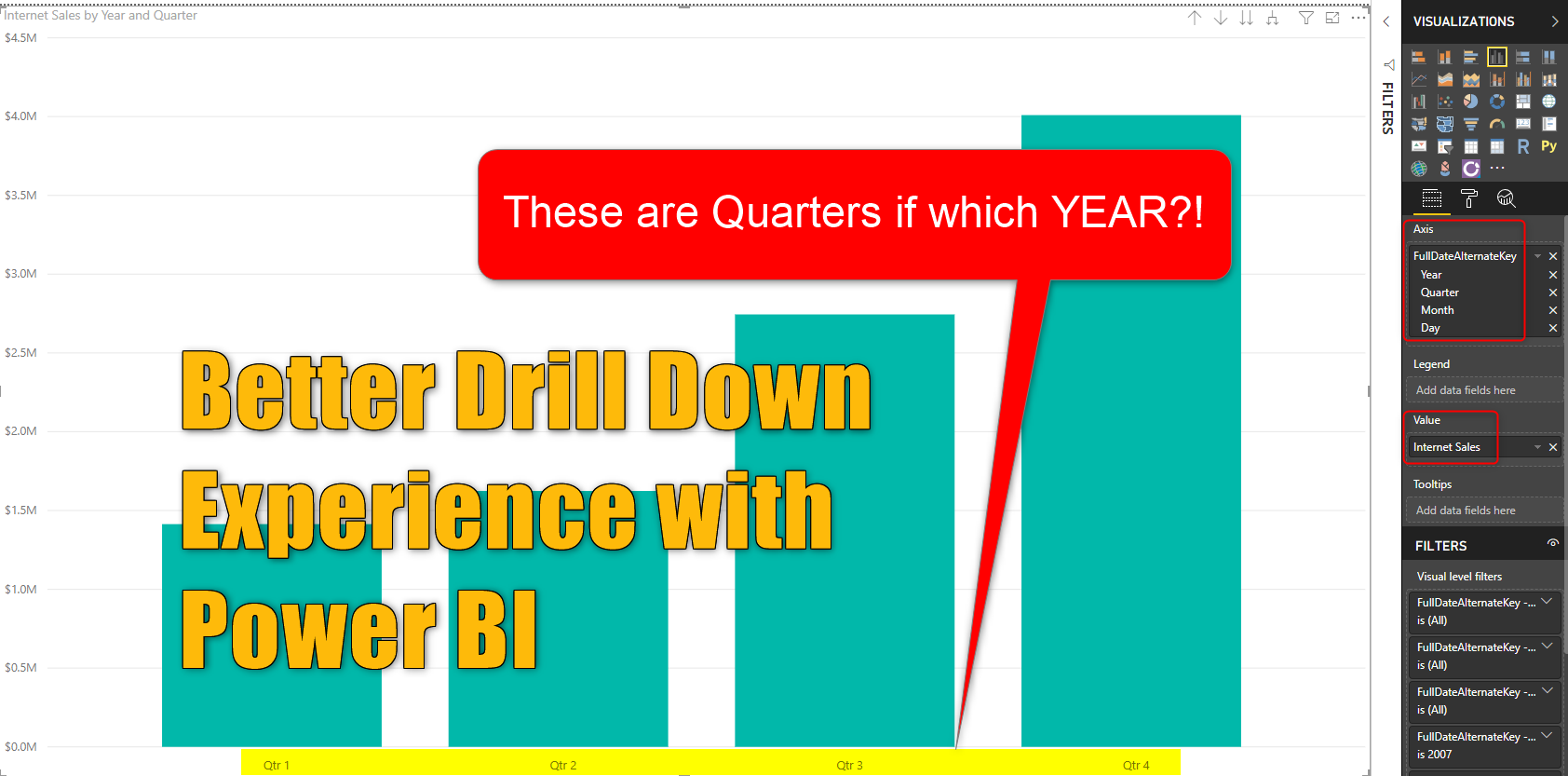
If you have used the drill down/up feature in Power BI, you know that it is a very powerful feature for exploring the data, you can expand a hierarchy to the next level, and go back. However, there is a little trick that can make your hierarchy exploration much better. Let’s check it out in this short blog post. If you like to learn more about Power BI, read Power BI book from Rookie to Rock Star.
Prerequisite
For examples of this post, you need the FactInternetSales table from AdventureWorksDW example.
Explaining the Problem
After loading FactInternetSales into a new Power BI Desktop file, and creating a chart by SalesAmount and OrderDate (a field in the FactInternetSales which is a date field), you will see a chart like this:

Because the OrderDate is a date field, it automatically brings the date hierarchy of the default date dimension (if you like to learn more about the default date dimension, read this article). It means that now, you can click on the Drill mode of the chart and then with each click you will navigate to the next level.

Well. that looks pretty amazing, that with a click on a column (let’s say the year 2007) you can navigate to all quarters of that year. But wait for a second! there is an issue here. How would you know that we are in the year 2007 if I didn’t tell you a sentence ago!? Correct, there is no way to see the year you are in it, in the screenshot above. The drill-down experience that you see above can be enhanced much more if you add the higher level of the hierarchy in the navigation. let’s see how this is possible.
Solution
Here I explain only one of the many solutions that can make this experience easier. let’s follow instructions to see how it works.
Step 1: Navigate to the highest level of the hierarchy in the visual. Use the drill up button as much as possible to get to the highest level of hierarchy (in this case; year)

Step 2: Go to the Format tab of the visual

Step 3: Go to the axis that has the hierarchy field in it (in our example; X-Axis) and change the type to Categorical (if it is not Categorical already)

Step 4: In the same axis, scroll further down, and change Concatenate labels to OFF.

All done now. let’s see how it works.
Testing the Result
If you start drilling down and up this time, you will see the difference that it will make. You can see the value from the higher level of the hierarchy through the navigation;

And further you go through the hierarchy you can still see this information coming through;

Here is the full experience now;


Again thank you for another very useful article!
Cheers, Sebastian
Thanks Sebastian 🙂
Great Help
Thanks Reaz
Hi,
I can’t see any field available in the ‘Format’ Panel for Axis where I can choose the type.
You need to select the visual first. Click somewhere in the visual and then try again.
Cheers
Reza
Hi, thanks a lot for your article!
I have one question though: does this somehow work with horizontal bar charts as well? I know that I can show the previous label in front of every label in “drilldown level 2”, but it would be great to see the first categorie in the header or the title of the Y-Axis. Do you if thats possible?´
Cheers, Josh
Hi Josh,
the same method should work there. however, the length of the text in the bar chart might be a problem to show that all.
Cheers
Reza
Hi. I tried this but I am not getting the results like you. Could you please tell me the reason. I am using Free Desktop Version.
It is not about the license you are using. please share a screenshot of what is not working here
Cheers
Reza