
In the previous post, I explained a usage of bookmarks and buttons in Power BI, which was for clearing all slicers. Buttons and bookmarks are the gold combination in Power BI. You can do wide range of creative activities with this combination. In this post, I will show you some other usages of buttons and bookmarks which is related to visual’s interactions. we are going to learn about;
- Changing the chart type dynamically
- Changing the axis of charts dynamically
- Changing font sizes of a chart dynamically
- Changing color of a chart dynamically
There are heaps of more examples can be done with buttons and bookmarks, but these few will take the entire full blog post here. If you want to learn more about Power BI, read the Power BI book; from Rookie to Rock Star.
Video
Key Components of the Design
The key components of designing examples below, are three settings; Bookmarks, Buttons, and Selection Pane.
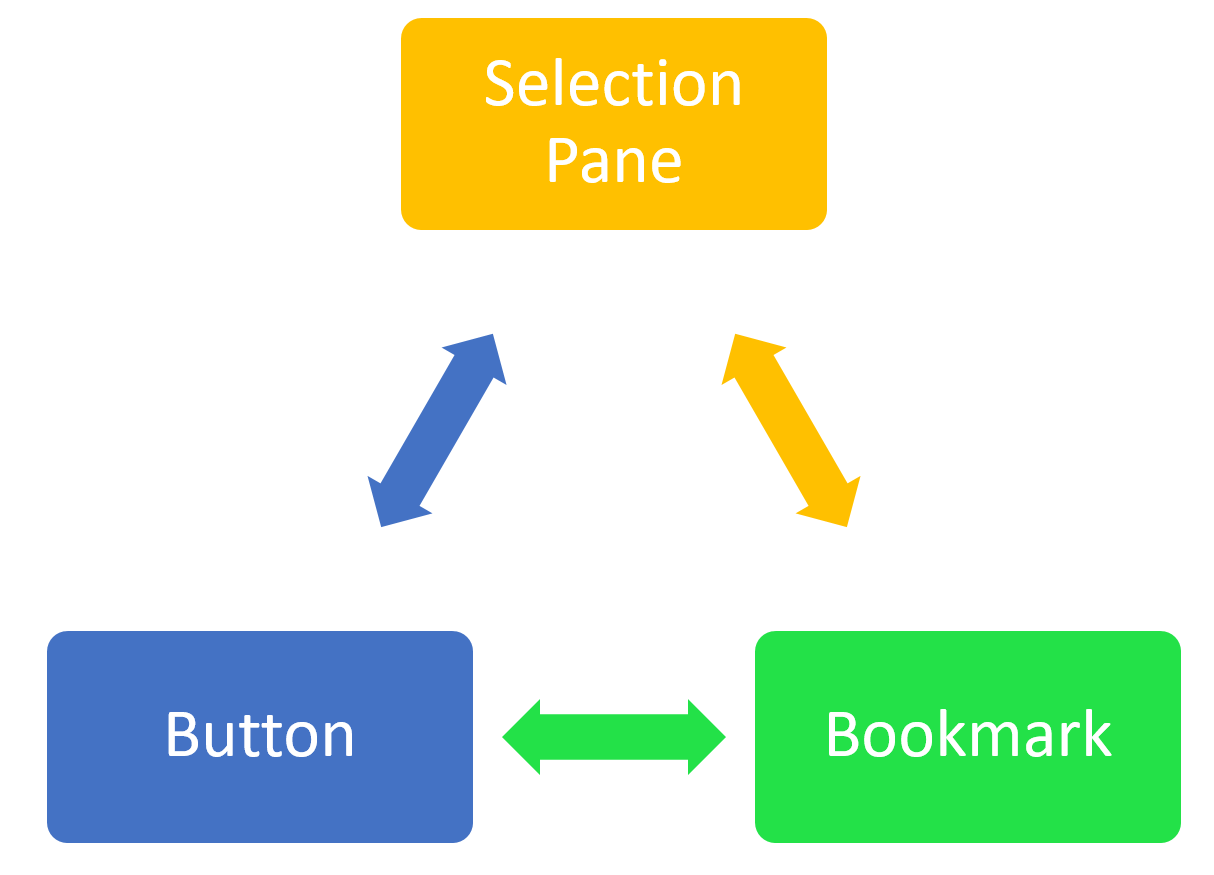
Bookmarks
Bookmark saves the state of the page, exactly as it is at the time of saving a bookmark. This means you can then select the bookmark and see the page with the state that you have saved it. Bookmark is not a screenshot, it will be an interactive Power BI report page, with a state saved as is.
Selection Pane
You can hide or unhide visuals in a Power BI report through the selection pane. there is an eye icon besides every visual, which gives you the control over visibility of that visual on the report page.
Buttons
Buttons are action objects in Power BI. You can create a button (or even an image or shape), and then set the action of that to be; back, Q&A, or bookmark. In this post, we are only talking about the bookmark action feature.
Combination of the three above; Magic
when you combine the three features above, you can make the magic happens! You can put visuals on top of each other, and then hide or unhide them, add a bookmark, and connect the action of button to that bookmark. examples below are just very few examples of the thousands of possibilities with this magic combination!
Changing the Chart Type Dynamically
Consider the report below;
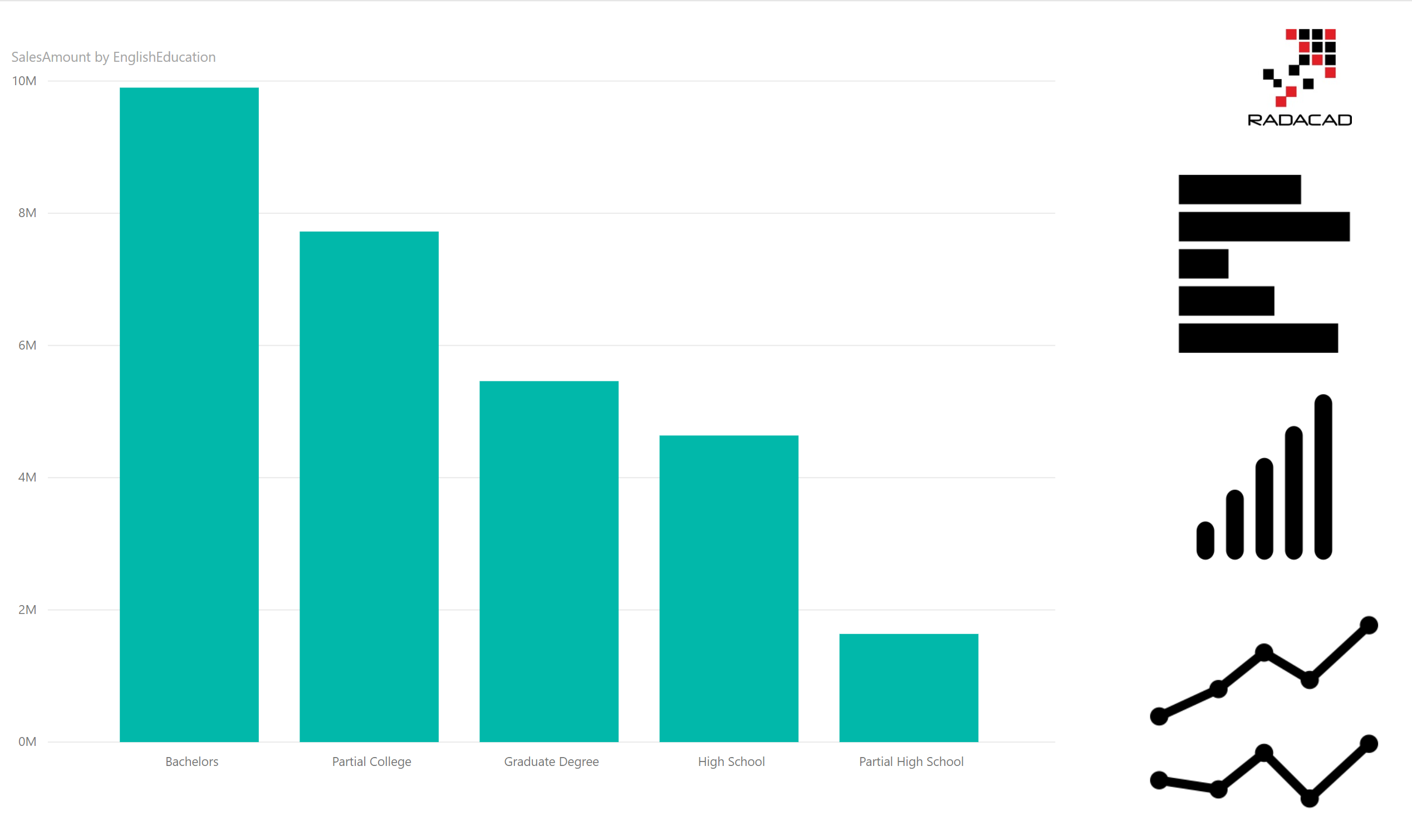
The chart in the left-hand side is a column chart. the three charts in the right-hand, are however, images (or logos). I want to select the image in the right-hand side and then change the chart type in the main section (left-hand) with that. let’s see how we can do that.
Step 1: Create multiple visuals
First step is to create multiple visuals on top of each other. create a copy of this chart, and convert it to Bar chart, then create another copy of this, and convert it to line chart. here are all charts on top of each other.
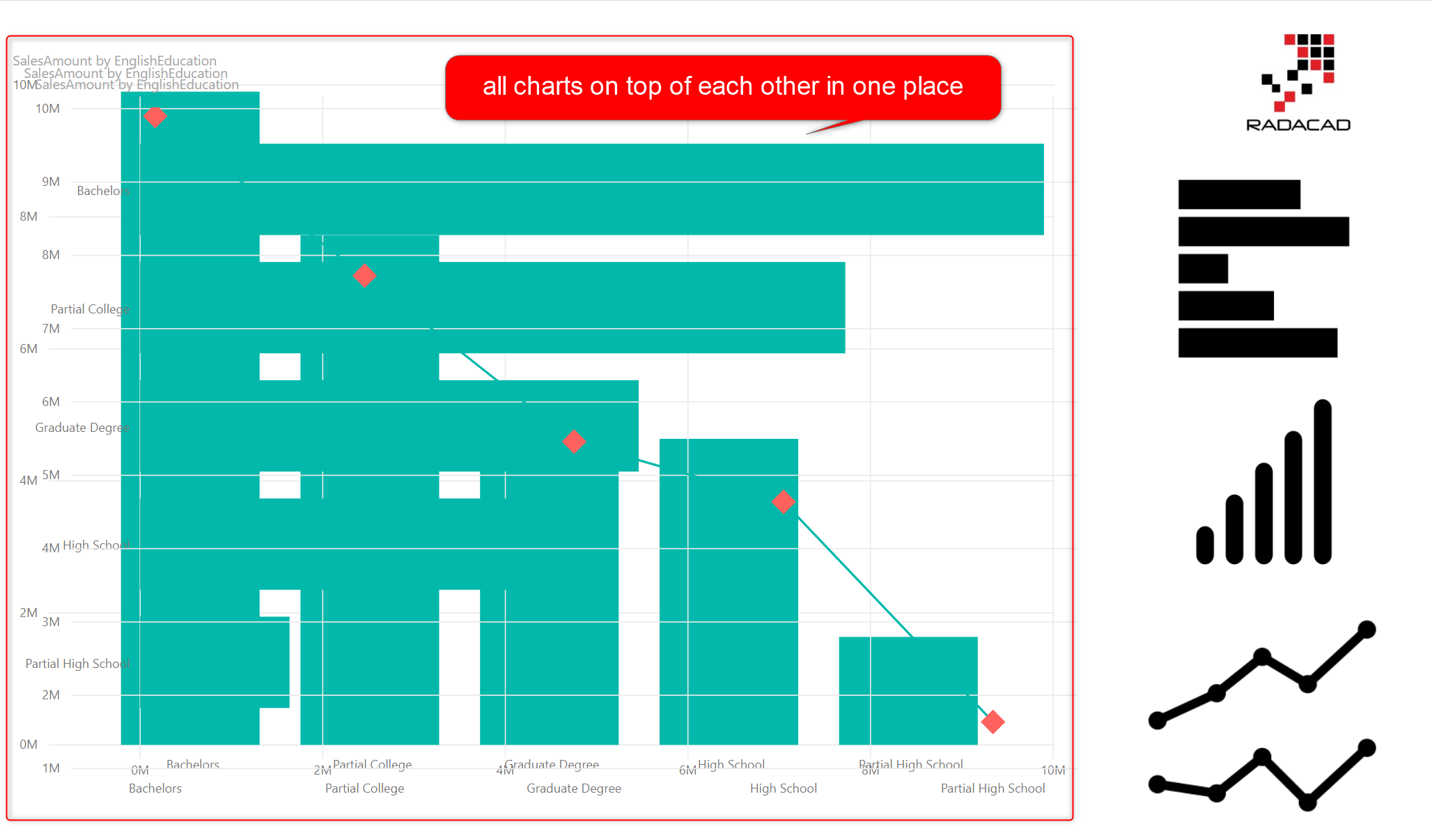
Step 2: Selection Pane
Now click on the selection Pane in the View tab.
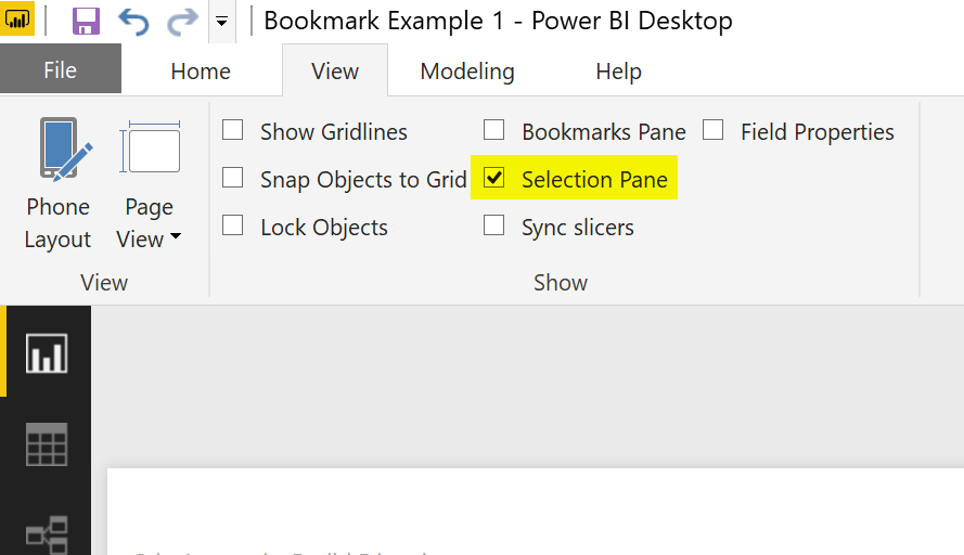
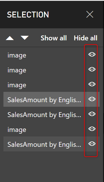
After selecting this item, you will see the selection pane, with list of all visuals. Notice that there is an eye icon besides every visual. that is the setting for hide/unhide the visual in the page.
Step 3: Unhide other visuals
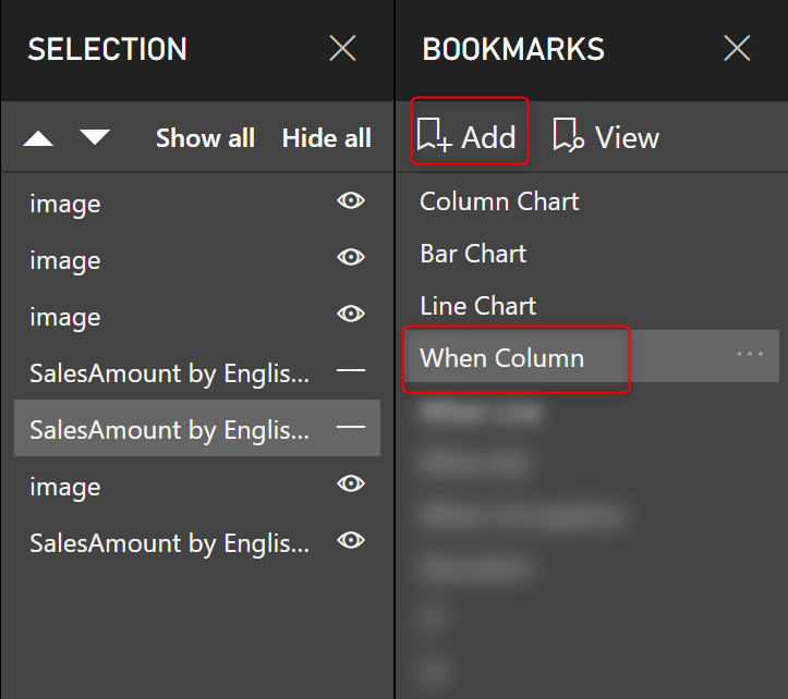
From the list of three charts on the page, unhide two of those. in the screenshot below, then one which is not hided, is the column chart.

Step 4: Create a bookmark
Now to save the state of the page as is, create a bookmark (you have to select the bookmark pane in the View tab first). I called this new bookmark as “When Column”
Step 5: Connect button to the bookmark
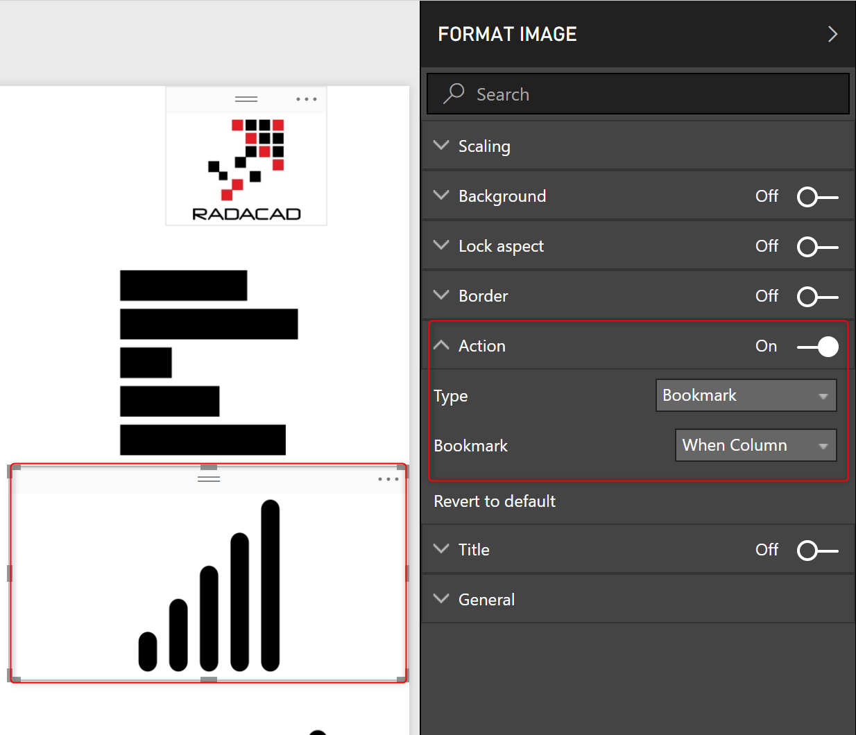
Now that you have created the bookmark. Click on the button (in this case image boxes of charts in the right-hand side), and set the action of those to bookmark, and choose the right bookmark for it.
Step 6: Repeat this process for the other two types of charts.
Create two other bookmarks when you have selected the other two charts individually, and then assign their buttons to those bookmarks.
Testing the result
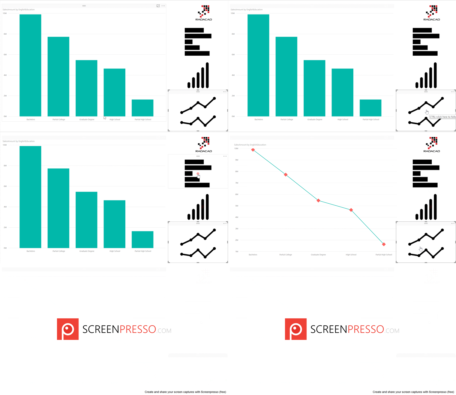
Now is the time to test the result, here you go; you can change the chart type dynamically in a Power BI report page.
Changing the Axis of Chart Dynamically
Another example of the magic combination (bookmarks, buttons, and selection pane); is to change the axis of chart dynamically. Here is the report below;
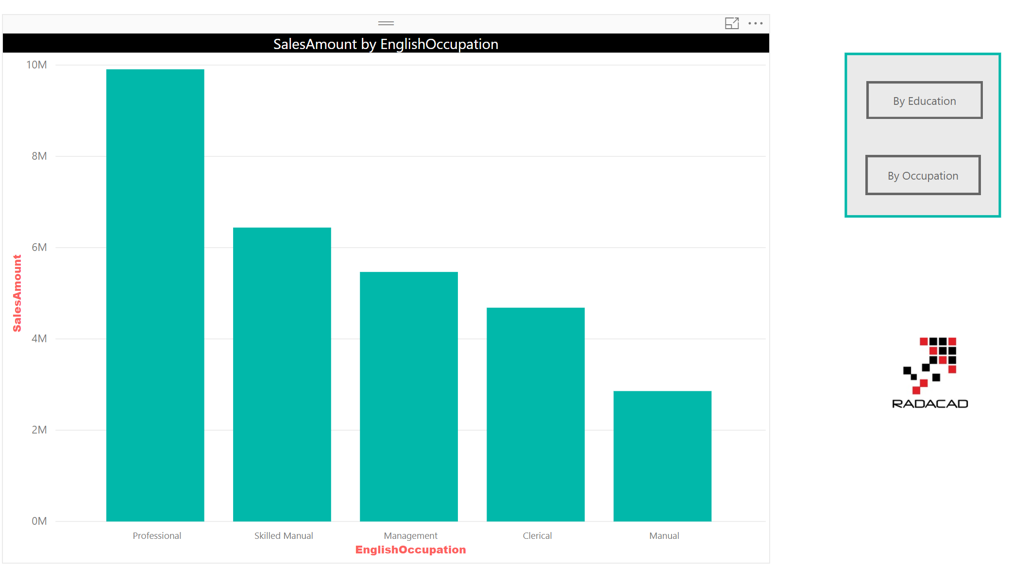
As you can see in the screenshot above, the buttons provided are for two fields; By Education, and By Occupation. I want to change the X Axis of the chart to the Education or Occupation field with choosing the buttons respectively.
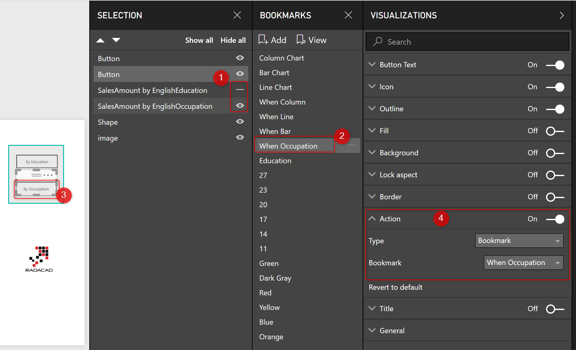
The way I implemented this feature, is by creating two charts overlayed on top of each other; first chart by Eduction, second chart by Occupation. then hiding one, creating bookmark, and doing the same for the other one. then mapping the action of buttons to these bookmarks. screenshot below shows how these steps are done.
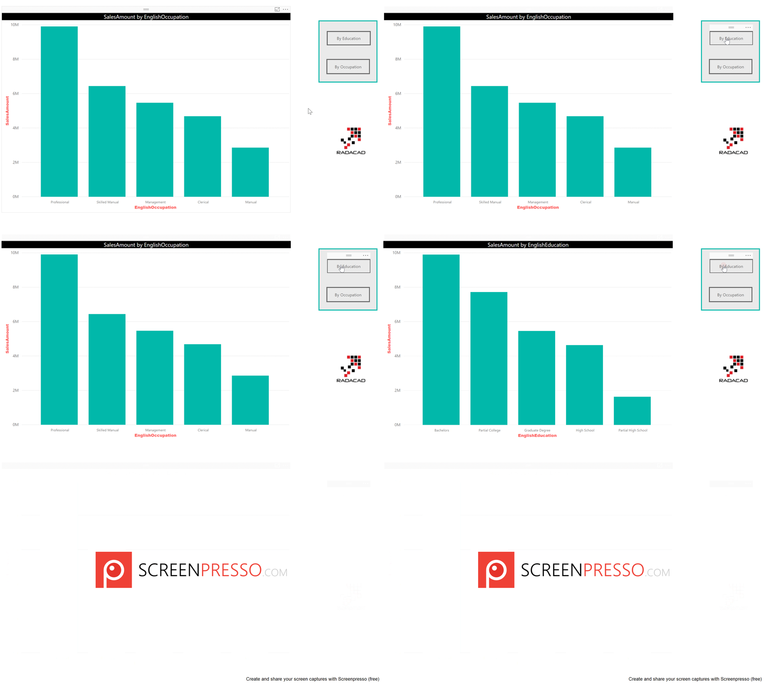
And here is the result;
Changing the Font Size Dynamically
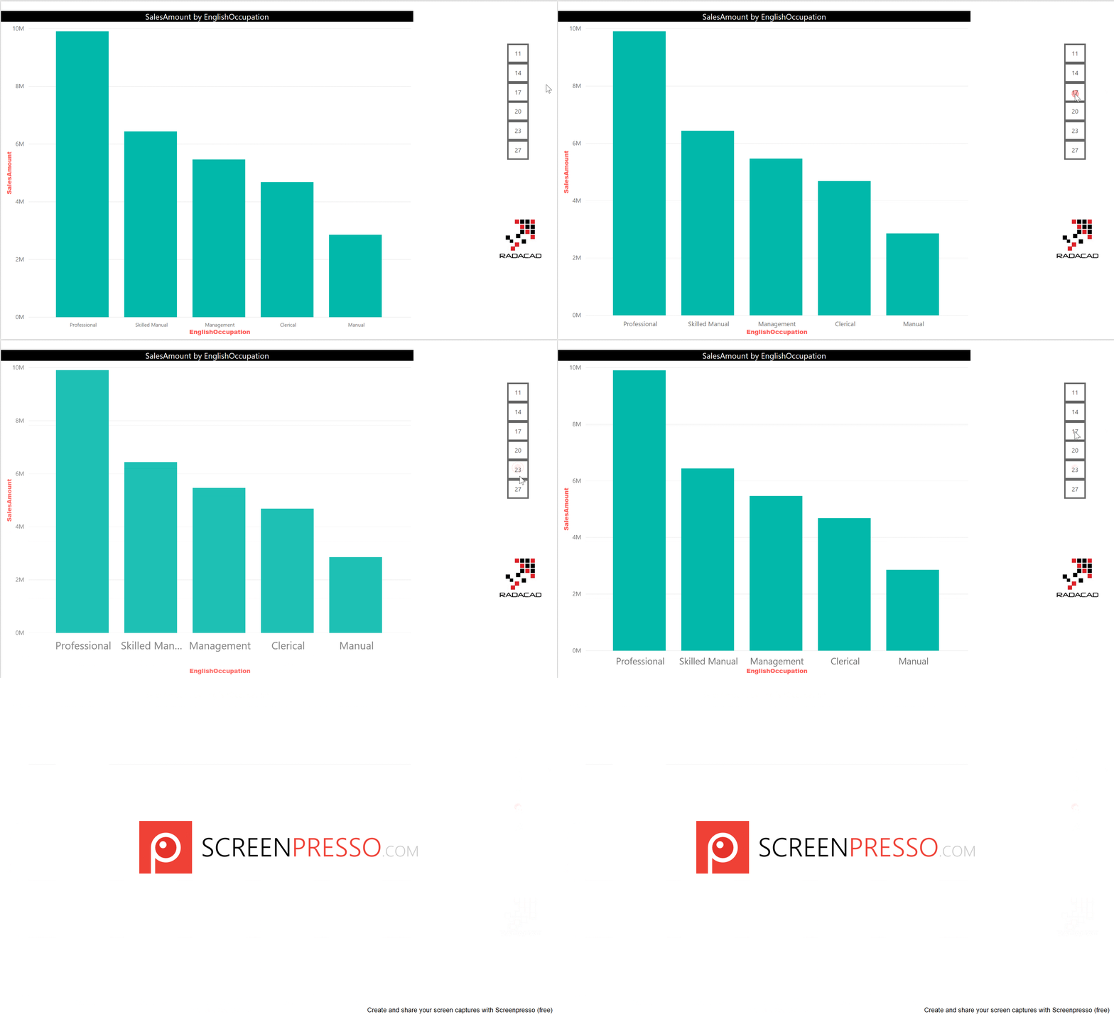
We can use the same approach to change the font size. This time you have to create one chart with each different font size you want, and create buttons and bookmarks repective to that. Here is an example video:
Changing the Color of Chart Dynamically
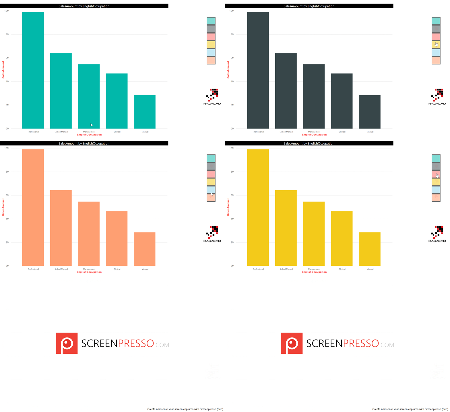
Another example is to change the data color in a chart dynamically. This time, buttons represent different colors, and you have the chart copied but with different color. each bookmark save the state of the chart when that color is selected in the button. result would be similar to below;
The Magic Three: Bookmark, Button, and Selection Pane
With the magic triangle of bookmarks, buttons, and the selection pane, you are only limited to your creativity. You can do many things that looks impossible in Power BI dynamically and give the power of extra features to the users. I have written another post, that explains how you can clear all slicers with bookmarks and buttons. There are heaps of other examples you can do with this magic triangle. Do you have a scenario that you have used these or want to use these? feel free to share it in the comments below.


Very Nice sir.thank you so mach.i am learned lot of power BI is your Blog..i am always follow your blogs.
i am plan to start learn Azure Machine learning.
Brilliant!
Thanks for sharing
Michael
Thanks for this. Did not realize the power of selection pane until I read this post.
Very good post.. I didn’t knew this feature set functionality .. but i am a bit disappointed that it needs kind of jugglery to make this work.. imagine the time spent on making redundant charts with minor changes and overlapping them to make user ‘feel’ as if we are doing the actions on the click of a button… even excel has better capabilities than current power bi interactions.
Hi.
The world of Excel is different. In the world of Excel, everyone is a developer, because they have access to the file simply using Excel.
In the world of Power BI, we have the developer who is using Power BI Desktop and end users who might not have Power BI Desktop at all. Of course, if you want to use Power BI Desktop to change the chart, it is just a click on the chart type. in this post, I showed how to build this function for end users.
Cheers
Reza
Thank you for this!
This is really helpful. One question: I have three images I set up to change the visualization to Matrix, Ribbon Chart, or Tassel Chart. I also have eight slicers on the canvas. Clicking on the bookmark (image) to change the displayed visual, the slicers reset. Is there a way to be able to keep the original slicer items checked when you click on a bookmark to change the visualization?
Hi Thomas
Yes, it is.
When you create a bookmark. there is an option to create a bookmark without Data. After creating it in the bookmark pane, click on the (…) and then uncheck the data.
Cheers
Reza
Hi,
Very nice explanation of using the Bookmark option in PowerBI. Could you please help us in one issue we are facing.
We have followed all the steps that are mentioned as above, but we are unable to redirect/enable the page/chart on click of a button. Do we need to publish the file to see the on click redirection events ? We are currently using Power BI desktop (Version – 2.72.5556.801)
Thanks in advance,
Venu Gopal K
Hi Venu
in the Power BI website, it would be normal click on the button. in the Power BI Desktop, it should be Ctrl+Click
Cheers
Reza
Very Nice article to dynamically chages charts but in my case i have 4 charts (each chart has 3 types like bar,pie,line charts to change dynamically that working fine) suppose i want to change the chart type pie chart in third widget working fine but in second widget chart also changed automatically any suggestion for that
Hi.
Not sure if I understand the question fully. can you share a photo and explain what you want to achieve?
Cheers
Reza
Is it possible to have two independent set of buttons + corresponding sets of visuals that react only to those buttons on same page?
Yes, You need to use the Selection Pane to hide/unhide the visuals you want, then create a bookmark from it. then use that bookmark in the action of the button.
Cheers
Reza
nicely written!