

The Button Slicer is one of the recent visuals that is very helpful in taking your report layout and visualization to the next level. Although this visual has been available for some time, many are still unfamiliar with its features. In this article and video, I’ll take you through this visual, its features, and how you can use them to have a better Power BI report layout.
Video
Button Slicer: Preview
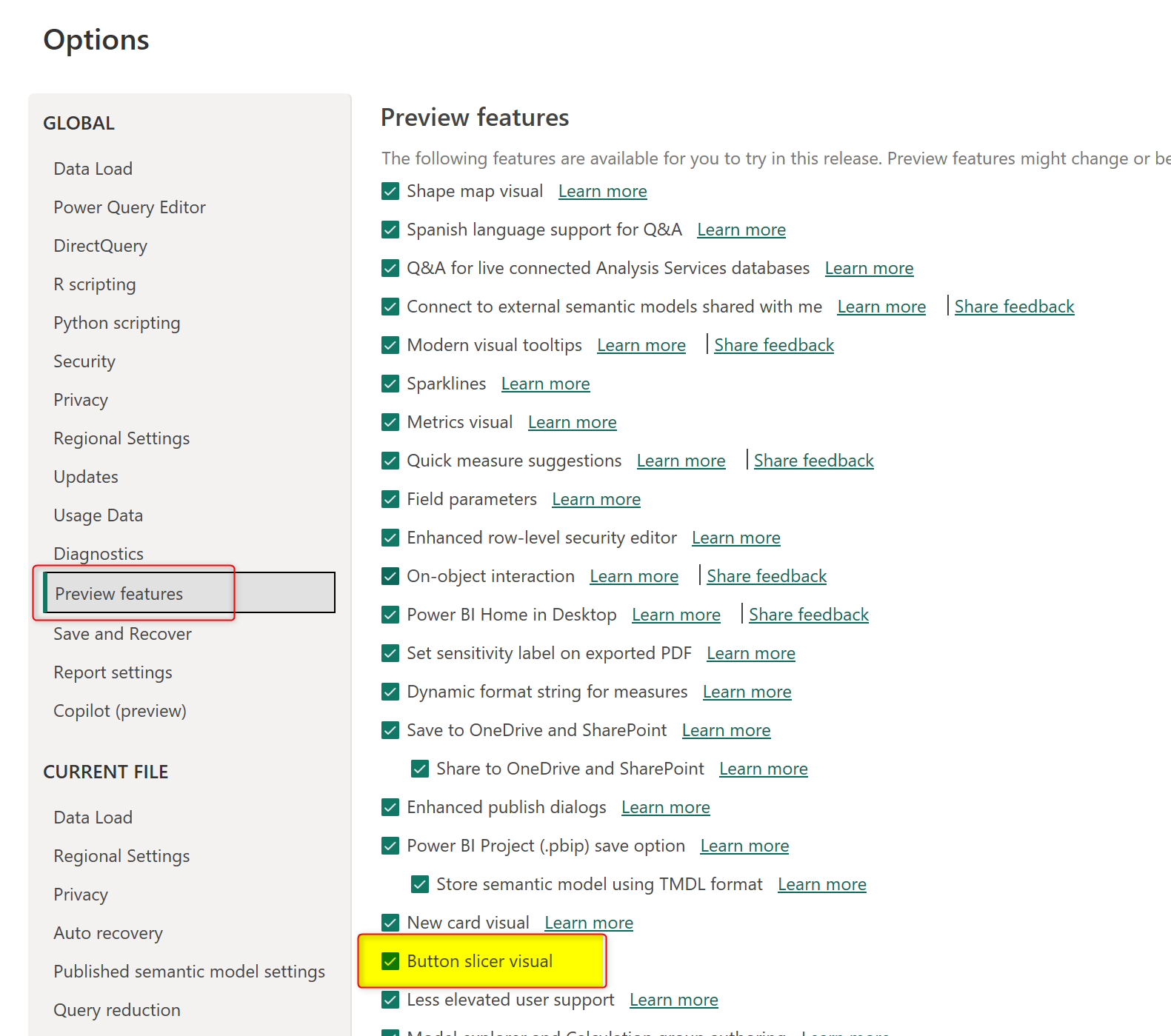
At the time of writing this article, this visual is still preview, which means you need to enable it using the process below;
In Power BI Desktop, go to Files > Options and Settings > Options.
From the Preview features, check the option for the Button slicer visual and click ok. Restart Power BI Desktop.
Tile layout and shape
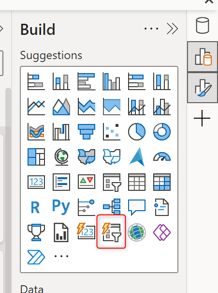
Add this new visual to the page
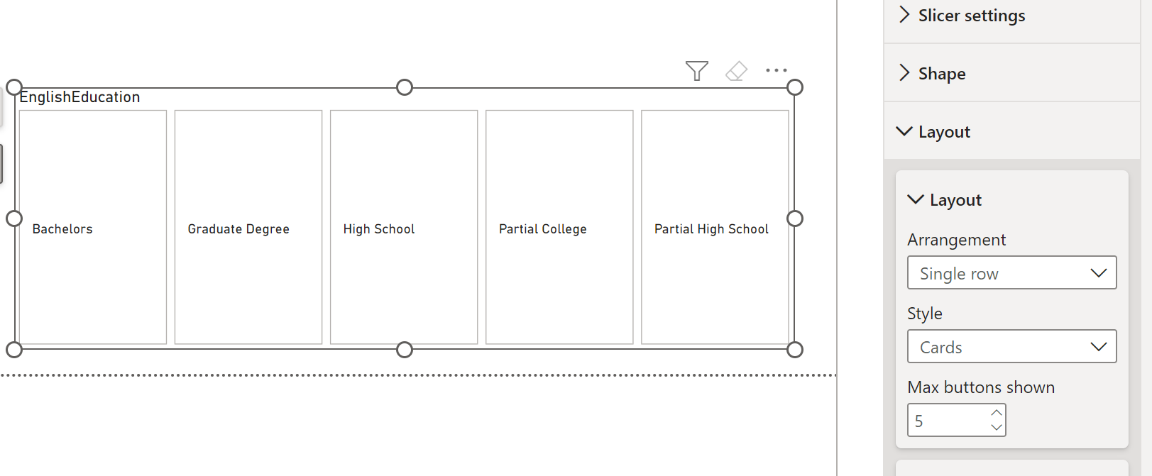
Then, drag and drop a data field there. I am using EnglishEducation here from my sample AdventureWorksDW Excel file.
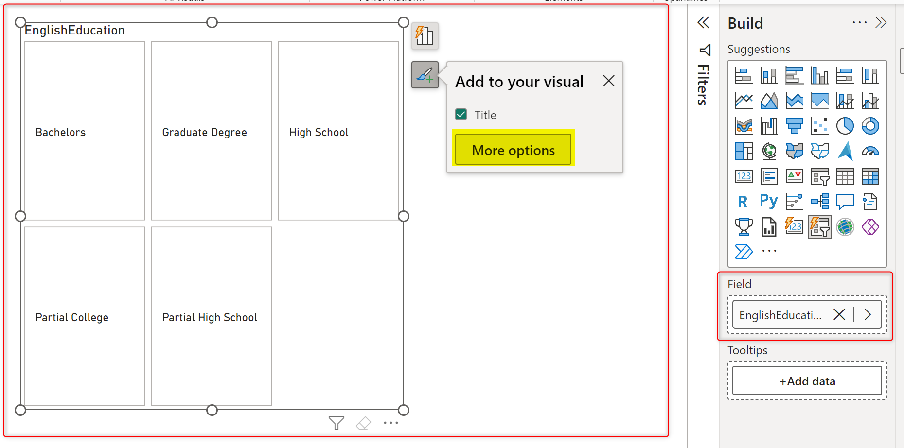
This automatically creates the slicer in a Tile format, each value is presented as a Tile in a grid view. You can change the grid layout to have less or more columns and rows. To do changes in the formatting, click on More Options as highlited in the screenshot above.
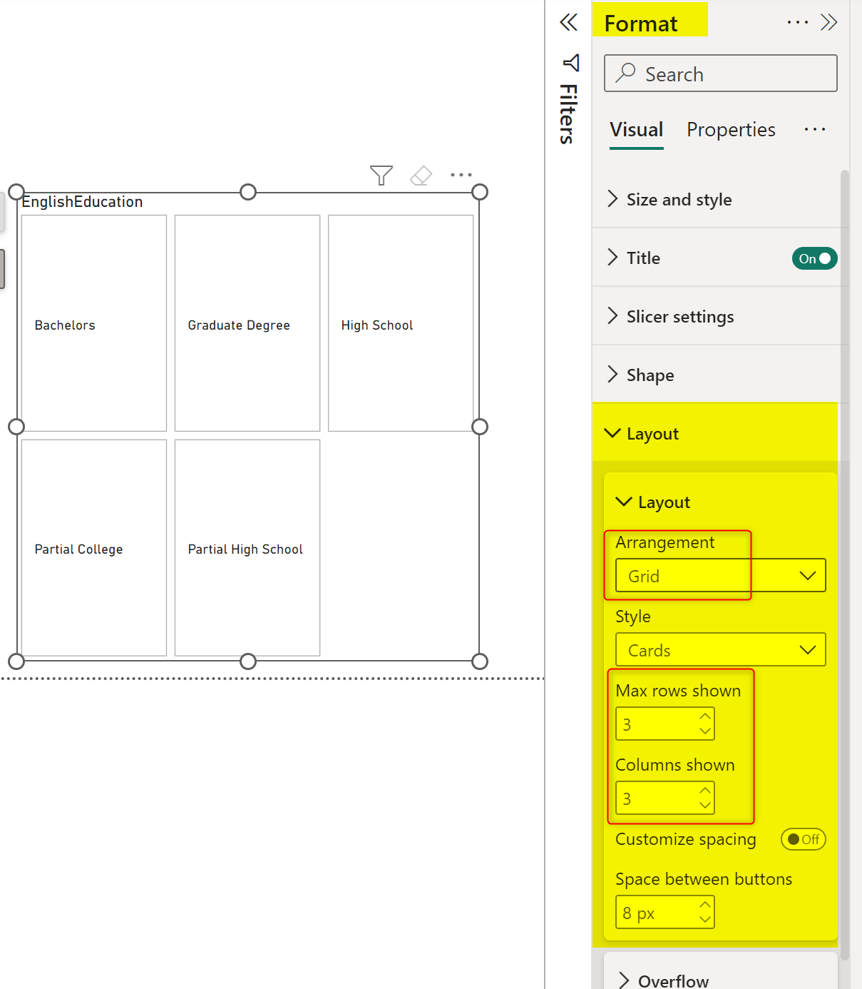
In the Format section, you can go to the Layout section, and change the arrangement if you want, and change the rows and columns setup.
Here is an example of what this looks like in a Row arrangement with five columns.
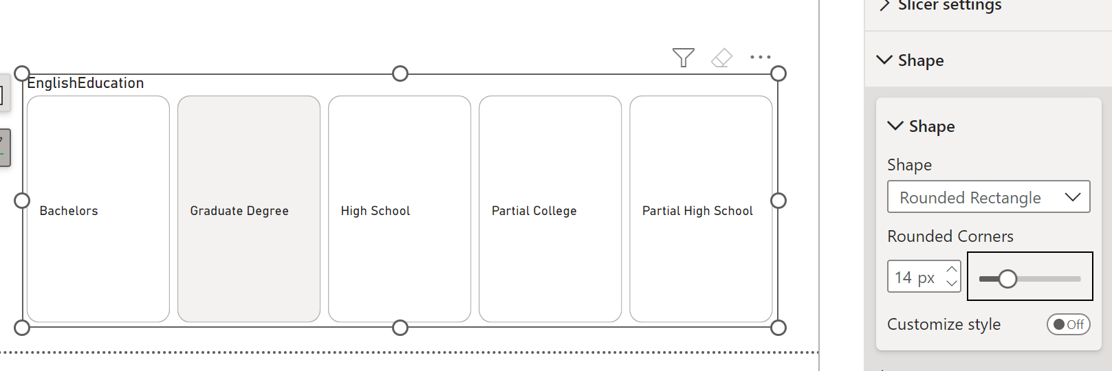
The Shape can also be changed to have rounded corners if you want or to a snipped tab corner;
Image
An exciting feature of this visual is that it accepts a data field as the image property. The data field needs to have the URL of the images.
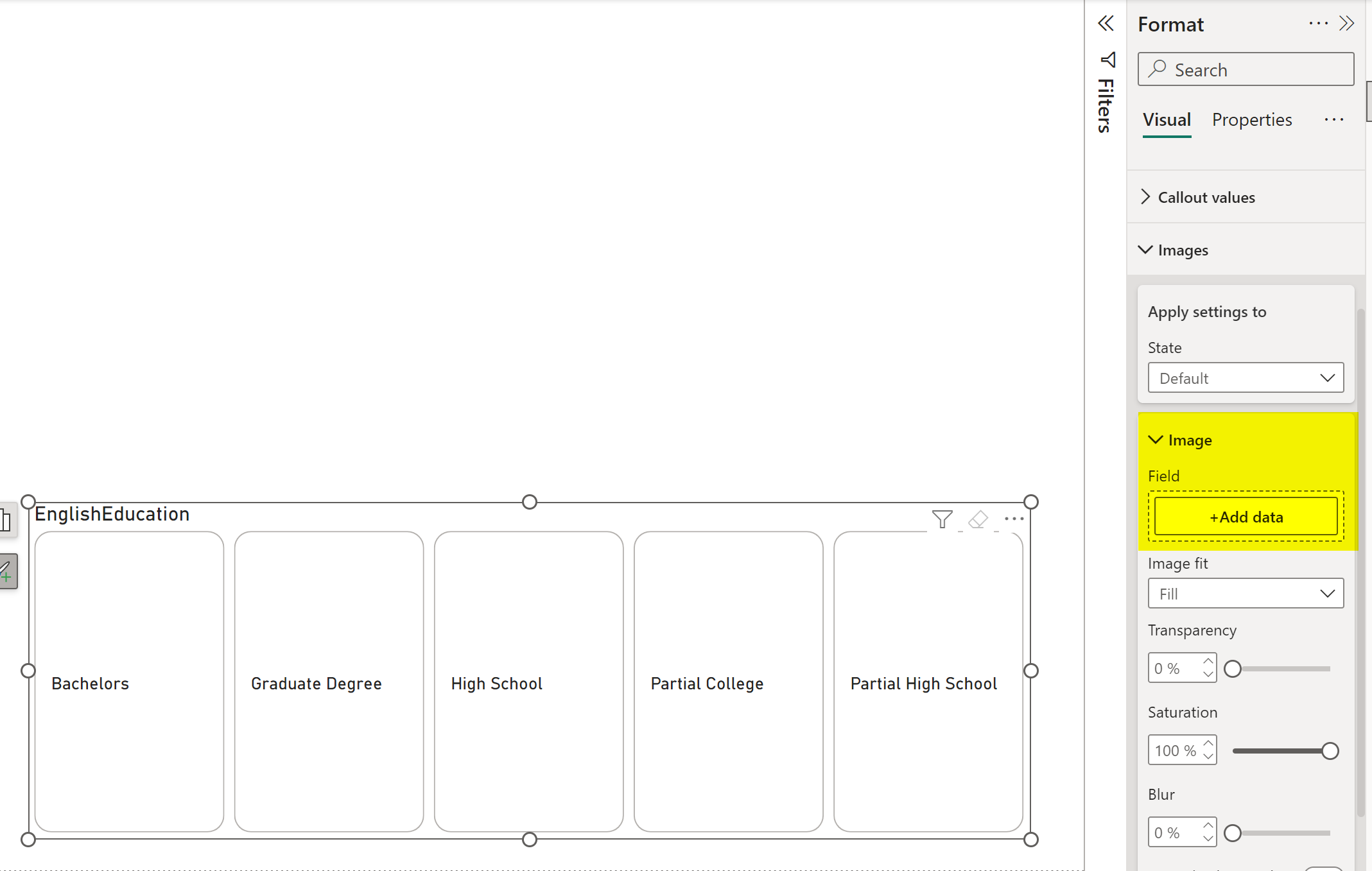
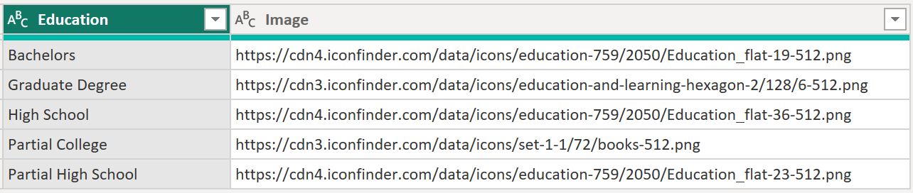
The field in the data table needs to have the URL of the images, such as the one I have below;
This field, then, can be added to the Button slicer, and the result will be like the below;
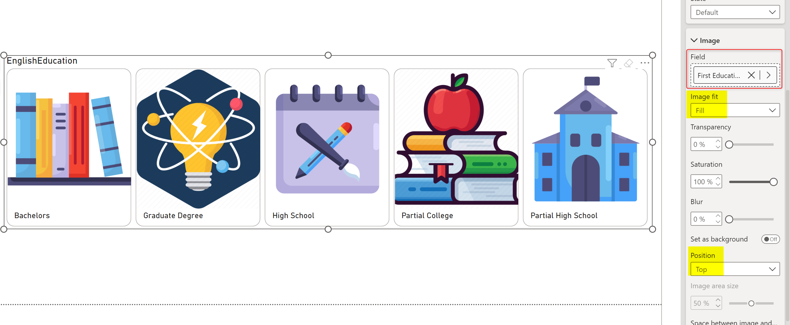
You can also change the image fit to fill, fit, or normal and change its position to below text or above, as shown in the screenshot above.
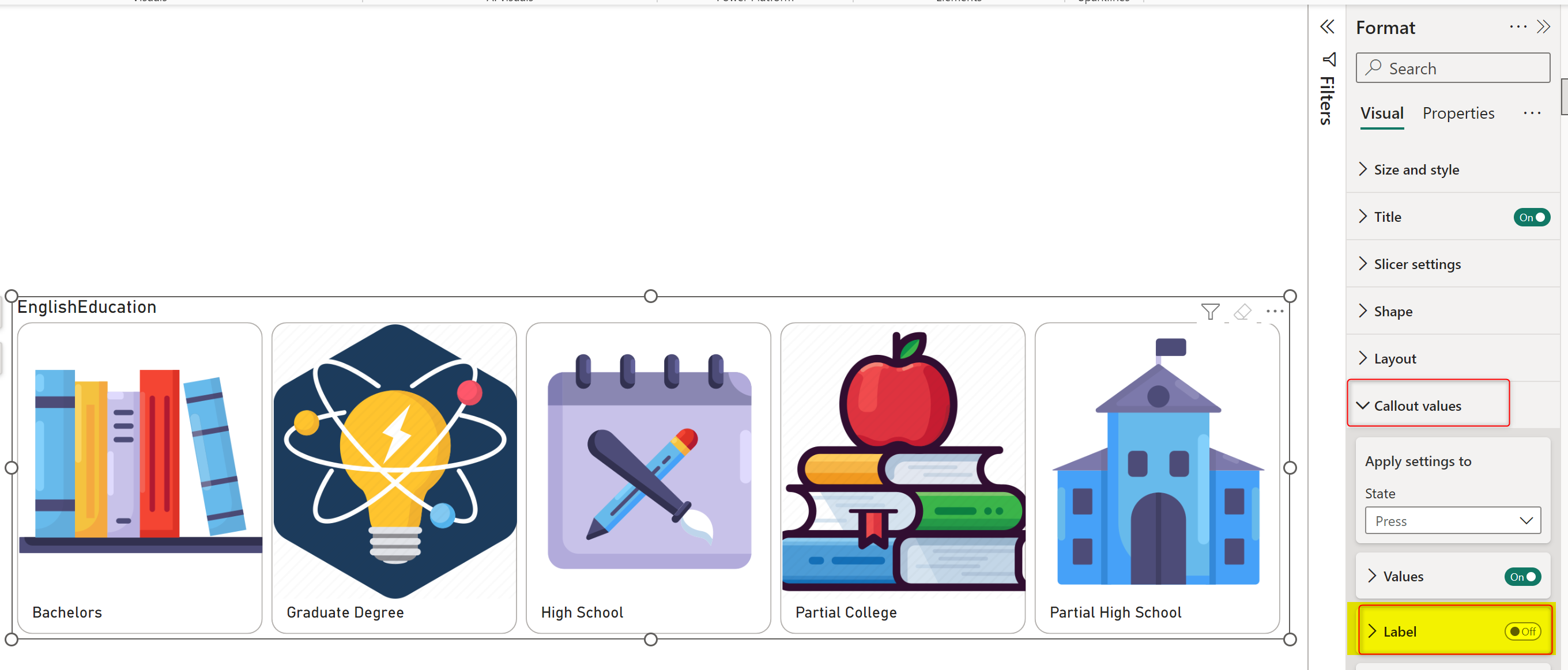
Label
Another interesting feature of this visual is that you can add another data field to be a label, which is like a subtitle under the actual name of the items shown. This setting is under Callout values > Label.
This can be a field that has a description of the main field, or it can be any other informational value. I have created a measure which shows Sales in a text format;
Sales Label = FORMAT(SUM(FactInternetSales[SalesAmount]),"$#,#")Then, I used the measure above in the visual’s Label field.
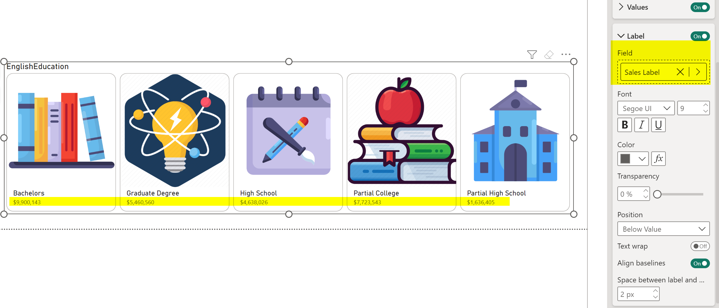
Please note that if you have a value field showing the amount, quantity, or date and time values, it is best to use the FORMAT function in DAX to get it in the format you want inside your measure.
State
There will be four States for the actions done on this visual; At first, you are setting the Default state, which means the default view of the items. If you want the items to have a different look and feel when you Hover with the mouse on them, or when you click on them and Press them, or when they are Selected, then choose that State, and apply the settings for it.

This setting can be applied to all the formatting options, such as the font and color of values and labels, the setting for images, etc.
Like any other visual
Apart from the unique features you saw in this visual, the visual works pretty much similar to any other visuals with the standard settings and formatting; you can set a Tooltip, for example, for the visual if you want, and you can set shadow and border for items, etc.
Last but not least, remember that this is a Slicer visual and comes with all the features a slicer offers, such as Sync Slicers, Selection Control, etc.

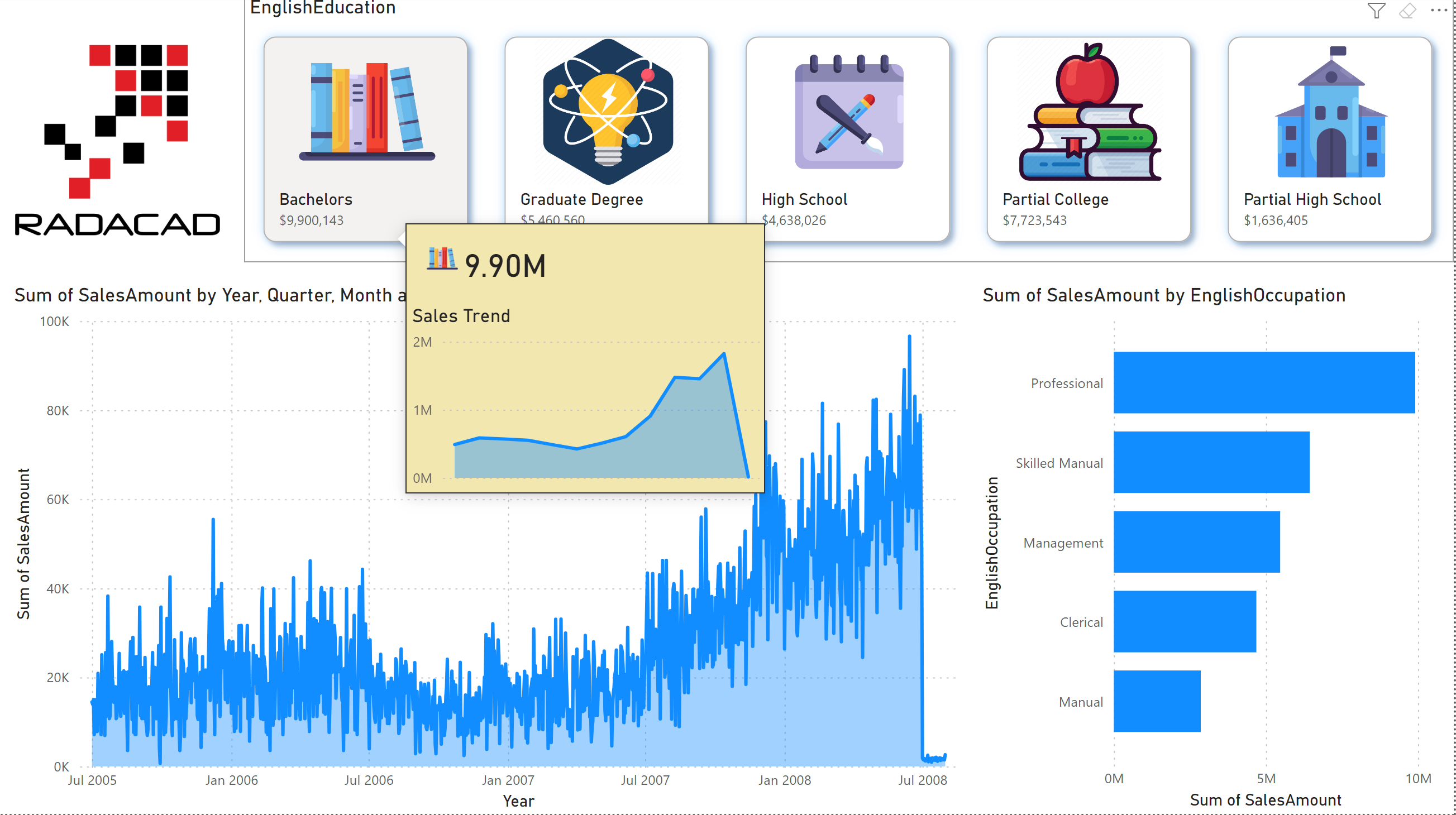
Example of it in action
Below is an example of this visual in action;
Summary
There are many interesting use cases where the features of this visual can be applied. The ability to add an image field and a label field in addition to the value field makes this visual an informative visual, plus the fact that this is still a fully functional slicer visual and has all the capabilities of the slicer visual, such as Sync slicers and selection control, etc.


Reza is author of more than 14 books on Microsoft Business Intelligence, most of these books are published under Power BI category. Among these are books such as Power BI DAX Simplified, Pro Power BI Architecture, Power BI from Rookie to Rock Star, Power Query books series, Row-Level Security in Power BI and etc.
He is an International Speaker in Microsoft Ignite, Microsoft Business Applications Summit, Data Insight Summit, PASS Summit, SQL Saturday and SQL user groups. And He is a Microsoft Certified Trainer.
Reza’s passion is to help you find the best data solution, he is Data enthusiast.
His articles on different aspects of technologies, especially on MS BI, can be found on his blog: https://radacad.com/blog.
OMG! A Power BI example that is in the Education Realm! That’s fabulous. Love it.