
Power BI reports are highly interactive, If you select a column in a column chart other charts will be highlighted. Selecting a slicer value will filter all other visuals in the report. This interactivity can be controlled easily. Despite the fact that this feature has been released in early phases of Power BI, there are still many clients who don’t know how to control the interaction of visuals in Power BI report. In this post you will learn how easy and useful is controlling the interaction between Power BI visual elements. If you want to learn more about Power BI; read Power BI online book from Rookie to Rock Star.
What is the Interactivity of Power BI Visuals?
Power BI visuals are interacting with each other. Selecting an item in a visual will effect on the display of another chart. sometimes this effect is highlighting items in another chart, and sometimes filtering values in the other visual. By default all visuals in a report page are interactive with each other, however this interactivity can be controlled and modified. This functionality is very easy to change, but because there are still many people not aware of it, I ended up writing this post about it.
Prerequisite
Let’s start by building a very simple report from AdventureWorksDW database with few visuals. For this example bring these tables into your model: FactInternetSales, DimCustomer, DimProductCategory, DimProductSubcategory, DimProduct.
Default Bahavior
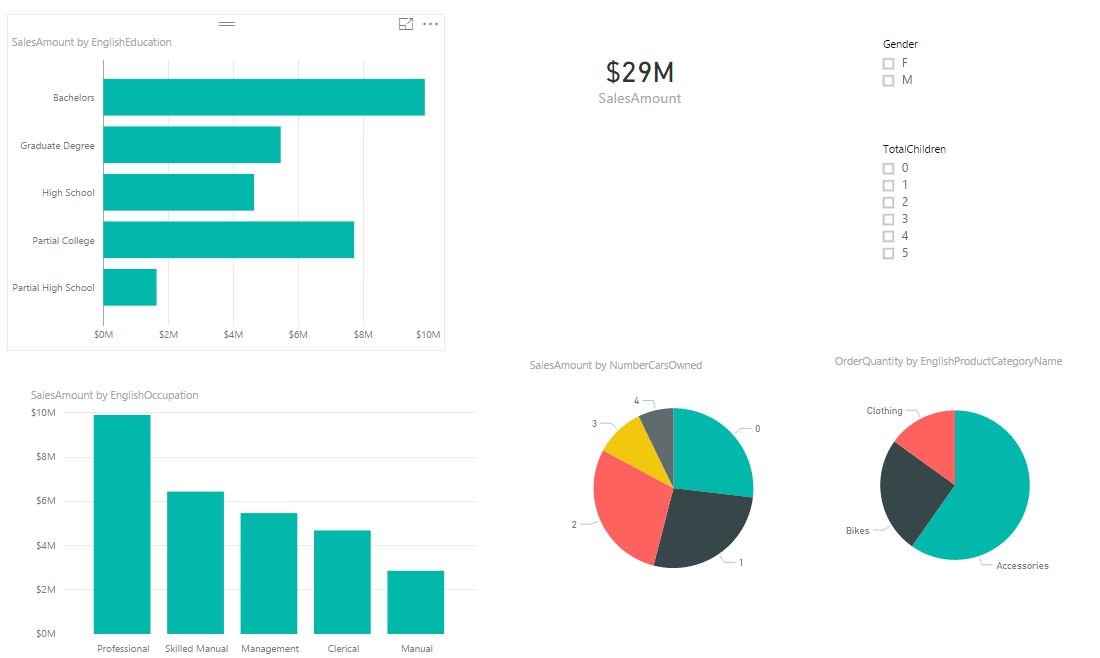
Build a sample report with a Bar Chart on EnglishEducation (from DimCustomer) as Axis, and SalesAmount (from FactInternetSales) as Values. Build a Column Chart with EnglishOccupation (from DimCustomer) as Axis, and SalesAmount (from FactInternetSales) as Values. Build a Card visual with a total of SalesAmount. Build a Pie Chart with NumberCarsOwned (from DimCustomer) as Legend and SalesAmount as the value. Another Pie Chart with EnglishProductCategoryName (from DimProductCategory) as Legend, and OrderQuantity (from FactInternetSales) as Value. Also create two filters; one with Gender (from DimCustomer), and another with TotalChildren (from DimCustomer). here is a view of the report;
As I mentioned earlier, All visuals on the Power BI report page are interactive with each other. If you click on a chart other charts will be highlighted:

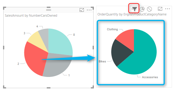
In the sample report above NumberCarsOwned, 2 is selected in the Pie Chart, and related values to it highlighted in column chart and bar chart respectively. Also the total Sales Amount in the card visual changed from $29 million to $8 million. However, if you look at the other Pie Chart (mentioned with the red area in screenshot above) the Pie chart for product category and quantities are highlighted, but it is not easy to find out exactly which one is bigger (is Clothing bigger or Bikes?). Despite the nature of the Pie Chart which makes things hard to visualize. There are still more things we can do here to make it more readable. If instead of highlighting this pie chart it was filtered (like the card visual) we would have better insight out of this visual.
Changing the Interaction
To change the interaction of a chart with other charts, simply select the main chart (the chart that you want to control the effect of that on other charts), and then from the Visual Tools menu, under Format, click on Edit Interactions.

You will now see all other visuals on the page with two or three buttons on the top right-hand side corner of each. These are controls of interaction.
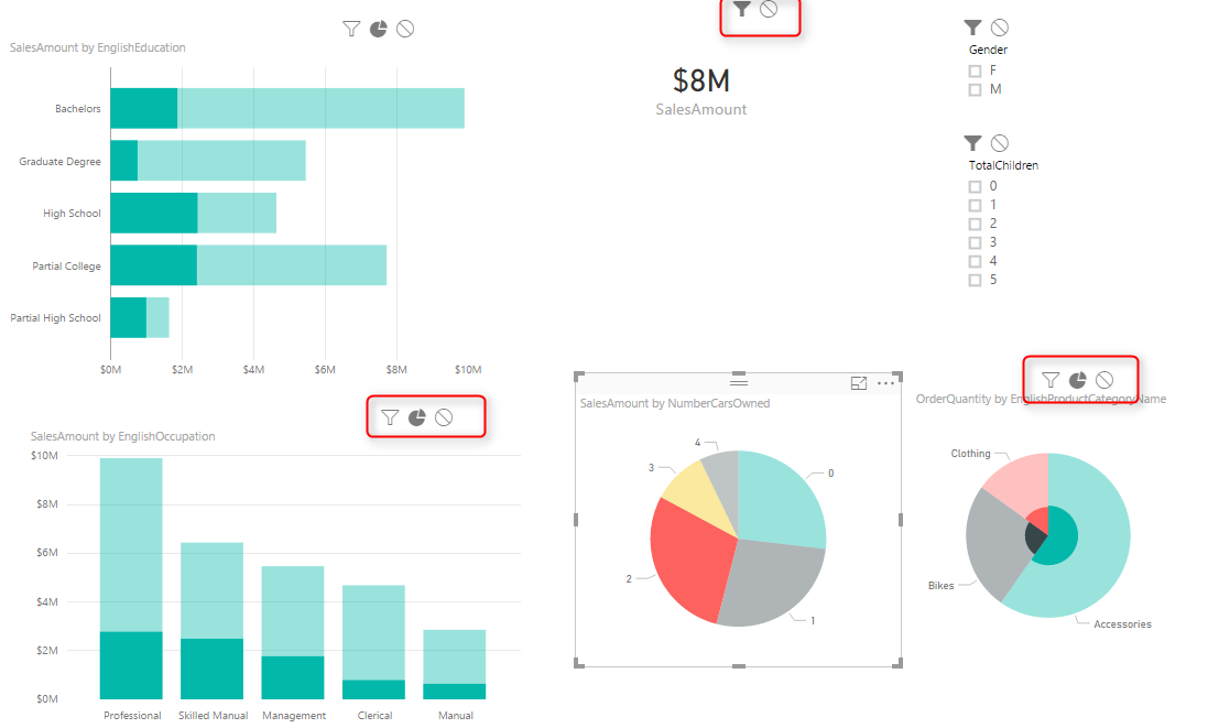
The darker color in this icon set shows which interaction will apply. For example for the interaction from NumberCarsOwned Pie Chart and the SalesAmount Card Visual, the selection is Filter. but for the ProductCategory Pie Chart is highlighting (the middle option). Now change this option to be Filter. and you will see immediately that the second pie chart (product category) shows a filtered view of the selected item in the NumberCarsOwned pie chart. Actually, the first pie chart is acting as a filter for the second pie chart.
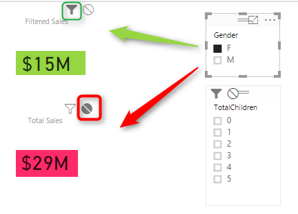
This behavior also can be set to None. For example, let’s say you want to have a total of sales amount regardless of gender selection, and then a total of sales amount for the selected gender in the slicer. To do this copy the SalesAmount Card Visual, and then click on Gender Slicer. click on Edit Interaction, and set one of the card visuals to None, the other one as default with Filter.
As you can see you can set interaction between every two individual elements on a page. This is extremely helpful when you are expecting to select an item to have a different impact on different visualization. Hope this simple tip helps to make your visualization better with Power BI.
Video


Reza is author of more than 14 books on Microsoft Business Intelligence, most of these books are published under Power BI category. Among these are books such as Power BI DAX Simplified, Pro Power BI Architecture, Power BI from Rookie to Rock Star, Power Query books series, Row-Level Security in Power BI and etc.
He is an International Speaker in Microsoft Ignite, Microsoft Business Applications Summit, Data Insight Summit, PASS Summit, SQL Saturday and SQL user groups. And He is a Microsoft Certified Trainer.
Reza’s passion is to help you find the best data solution, he is Data enthusiast.
His articles on different aspects of technologies, especially on MS BI, can be found on his blog: https://radacad.com/blog.
Nice post! If I am not wrong, couple of months ago ‘filtration”-behavior from one visual to another wasn’t available (if visual is not a Filter)… but maybe I didn’t notice.
Hi Ivan. Thanks for your nice words 🙂
As far as I remember filtering was available more than couple of months ago. at least from June/July I think. but not sure, with the fast pace of Power BI development hard to keep up differences between different versions 🙂
Cheers
Reza
Reza,
Is there a way to have a cascading behavior while filtering using report visuals?
If I click on SalesAmount by EnglishEducation.Bachelors, it highligths or filters the other charts.
If I now click on OrderQuantity by EnglishProductName.Clothing, it de-selects my previous selection (EnglishEducation.Bachelors).
Is there a way to freeze the filters, as I click through them?
On the case above, I wanted to see OrderQuantity.Clothing within the EnglishEducation.Bachelors group.
Do I have to always rely on slicers to do the above?
Thanks in advance for your help.
Hi Igor.
Unfortunately cascading interaction of visuals is not supported yet. As soon as you click on the second visual the first visual will loose the focus. At the moment the only way for doing that is through Slicers. You can have multiple slicers in a page, and select them in the order required.
Cheers
Reza
Hi Reza,
I just found your post – very helpful as I’m learning Power BI! Thanks!
One question – is there anyway to make the ‘highlighted’ area darker? I have made a map showing sold products. When I click on a state in the map, my funnel chart shows the products sold in that state in a darker color, but I would like it to be a bit more pronounced. Is there any way to do that?
Thanks so much and glad I found your site!
Hi Shair,
Thanks for your feedback.
You can change the highlight color in format section of the visual. Not all visuals has that feature yet though.
Cheers
Reza
Can we set these interaction visuals programmatically?
Do we have any equivalent feature in power bi similar to action filter feature in tableau?
If you want to set it programmatically, you can use DAX for this. I have written another blog post that explains how to do this in DAX.
I am not a Tableau expert, I don’t know what action filter does there unfortunately.
Cheers
Reza
This is one of the best posts I have seen in a while. It saved me a lot of time. Thank you:)