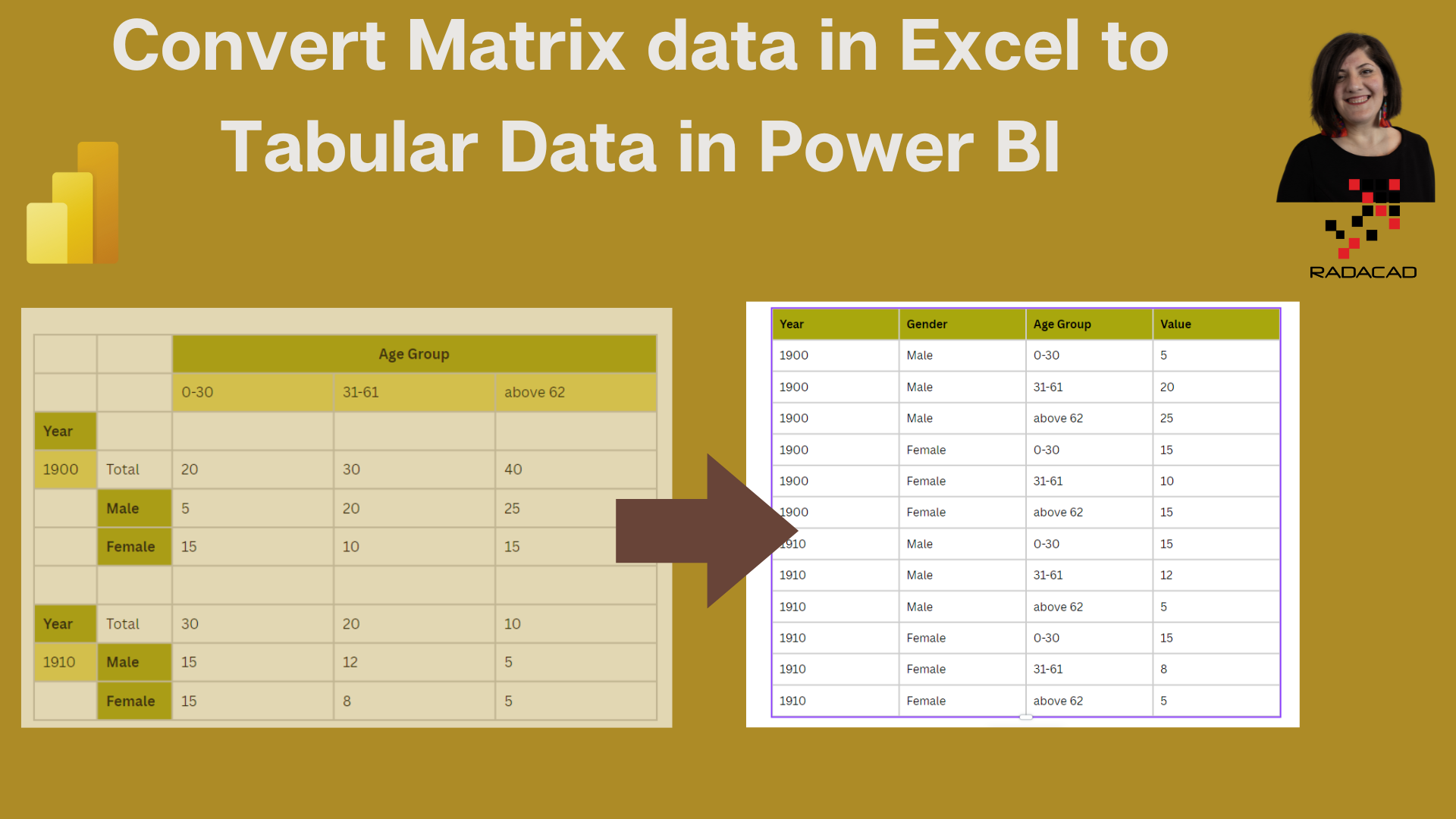
There is a common way of seeing data in Excel as a Matrix format; many data entries look like a matrix in many contexts, from accounting to health data. However, to better analyze data and add more calculations and charts and, in general, get more insight from data, we need to change the matrix data in Excel to a tabular format in Power BI.
For example, below table, we have data about the Deaths from Cancer of Lip, oral cavity, and pharynx by age, sex, and year.
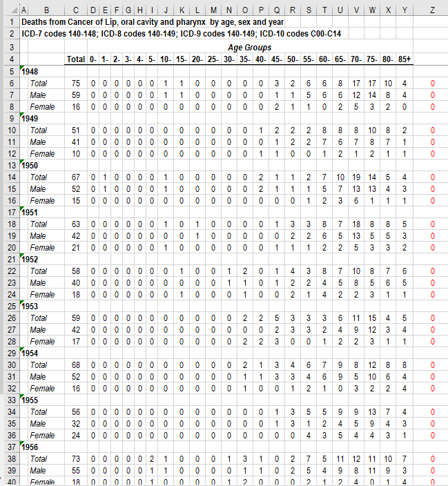
A simple look at the data can be seen below.
The above picture shows a simple design of the former table; as you can see, we have header data at the top of the table name Age Group. Then we have another one for the Year, and then we have Males and Females.
Analyzing the data in this format is impossible in Power BI, and it prevents us from creating proper visuals and calculations.
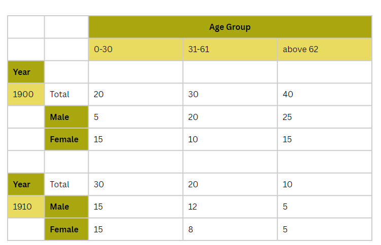
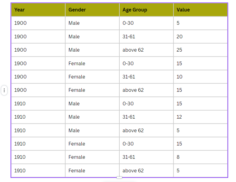
The best format to analyze data should look like the one below: all of these header data be in a separate column.
As you can see in the below table,
we have four different columns, and the year, gender, and Age group have been repeated for all rows.
This table :
- It does not have a Total value, as we can calculate it in the visualization easily
- each row contains one data
- data has repetition for better slice and dice ( Later, we can define a separate table for Year and Age group if needed)
Power Query
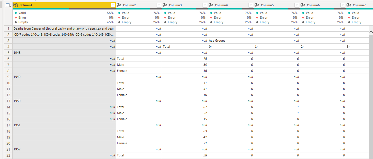
After importing the data into Powe Query
the first data look was as below
I removed some of the necessary rows of data and replaced some data value with the correct one so the data look like below.
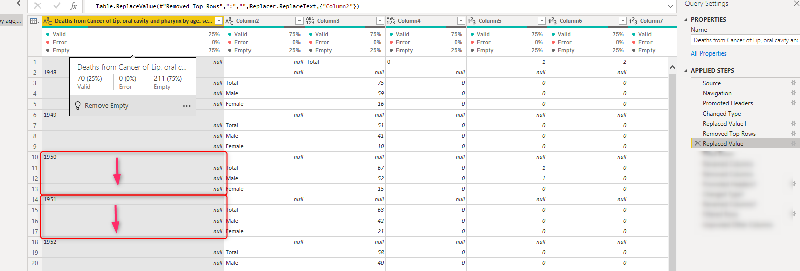
There is another data transformation needed before making a data stable style.
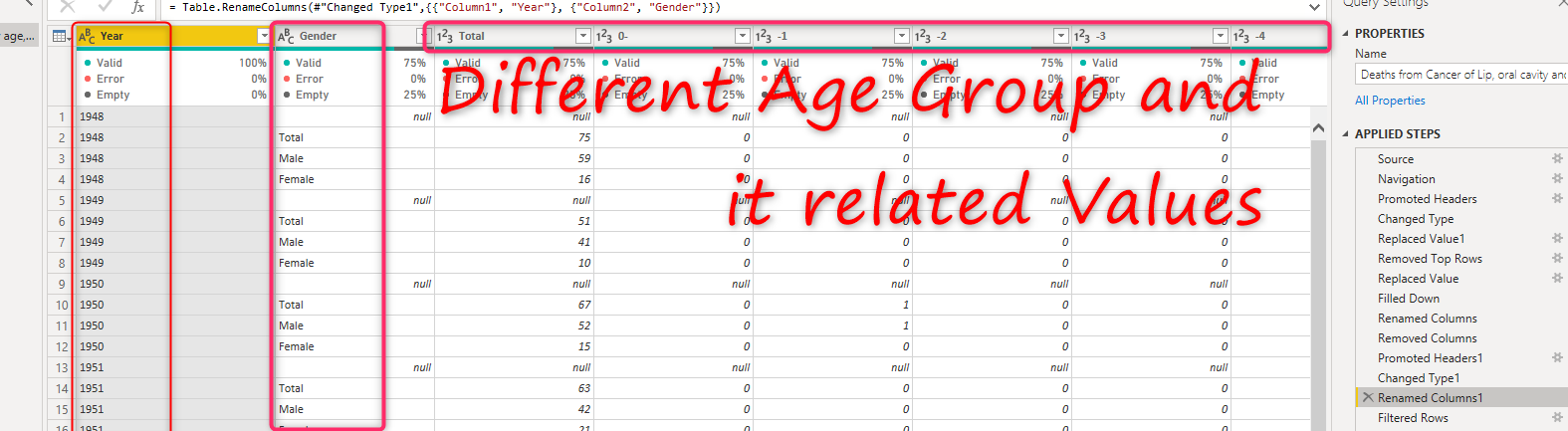
Each year has been repeated for three values (Total, female, and Male). I have to use Fill Down features to replace null for each of those three values.
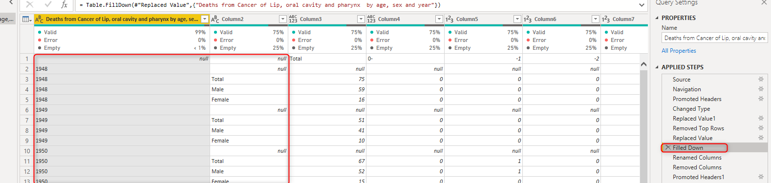
Next, I renamed the first column to Year second to Gender, and also I promoted the first row to be a header.
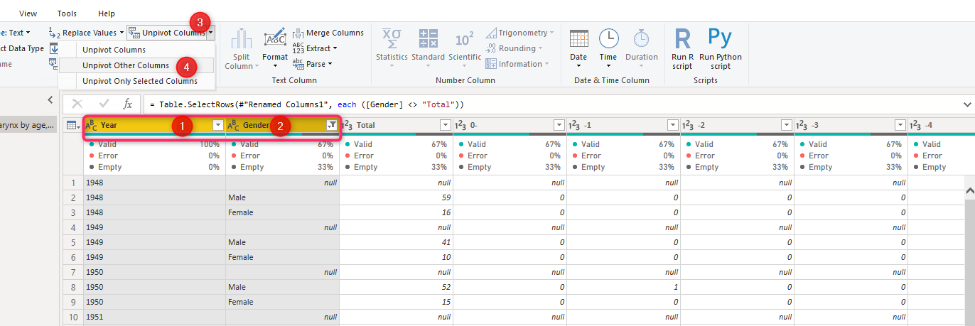
In next action I will remove total from Gender column as we able to calculate the total later in visualization and other calculations.
In the following action, I need to make the age group a single column as distributed as many columns at the top, and this means I need to use the Unpivote Other columns option by selecting the Year and Gender a
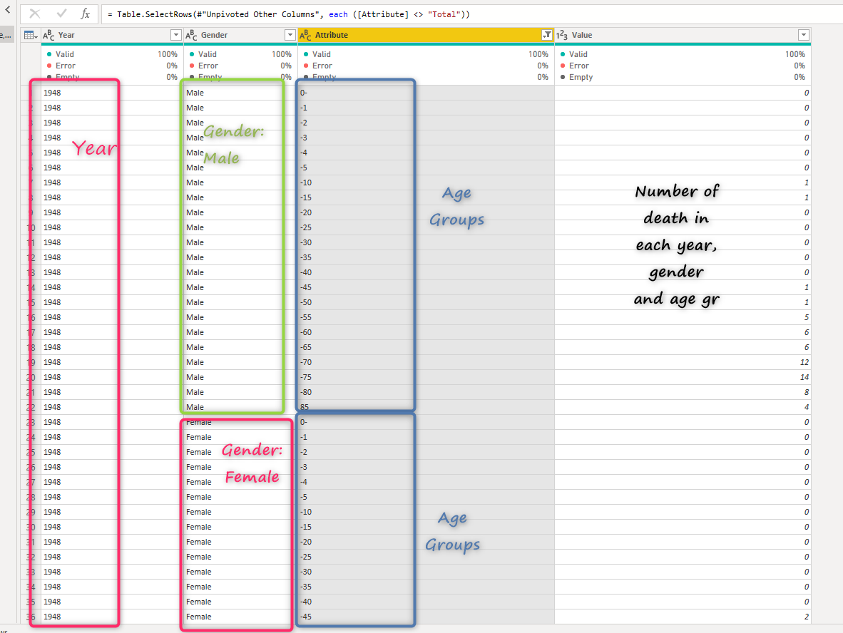
The final look would be as below
as we have a separate column for the Year which has many repetitions, we have a gender column, an attribute that is the age group, and the last column shows the number of death for the selected year, gender, and age group.
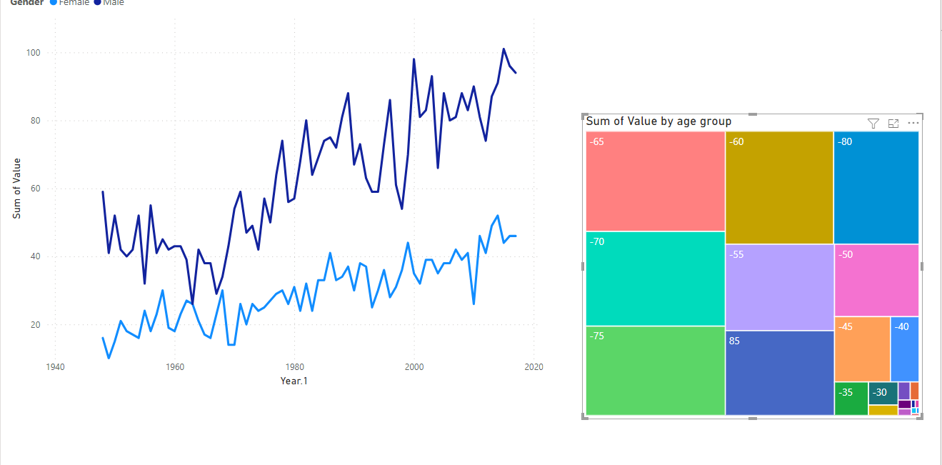
after loading data into visualization the slice snd dicing data is much easier and you can use variety of visuals and slicers