
In this post, I am going to show you how we can create most comprehensive Custom visual. In the last two posts published in July 2017 (post1 and Post 2).
Some notes before I am going to complete the last two posts.
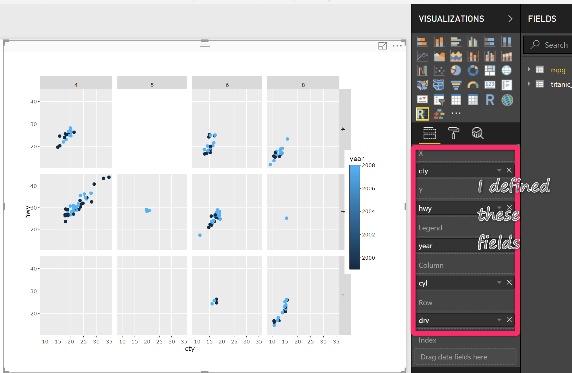
1- We able to declare some custom input like X, Y, Legen and so forth instead of having Value Custom visual with R and JSON
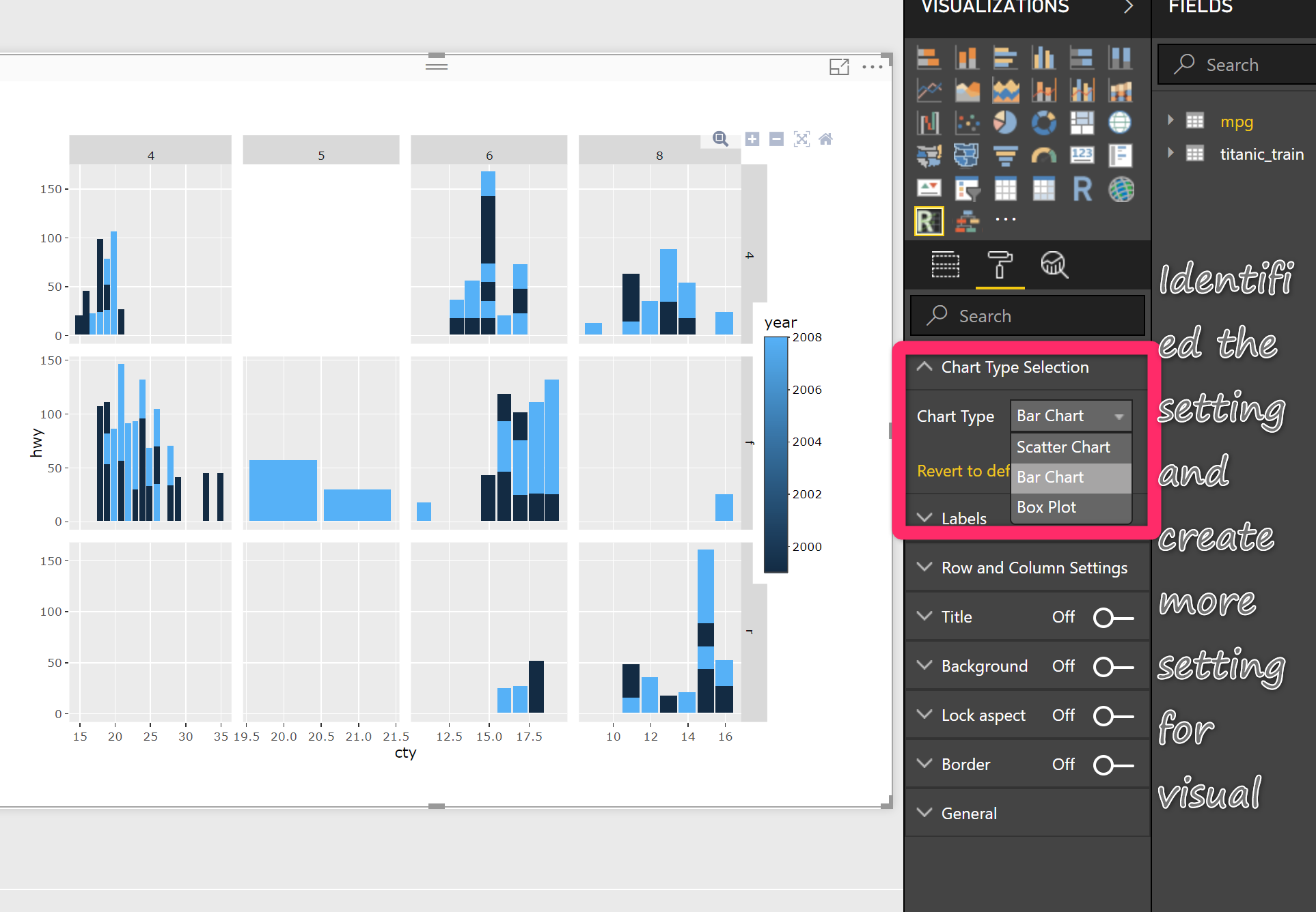
2- We able to identify some seetings in Visual
4- we able to put some condition on the number of fields
5- we able to manage the Plotly package interaction
6- we able to change the icon of Visual
I am going to cover these items in this and next posts (not sure it will take one or two more posts :)).
all of these learning happens when I am in process of creating an R custom visual for Microsoft Market Place. I experienced lots of challenge and get lots of help and learning from Boris Efraty (data science )from Microsoft Team.
Just an overview please first check the posts1 and post2 first.
an overview:
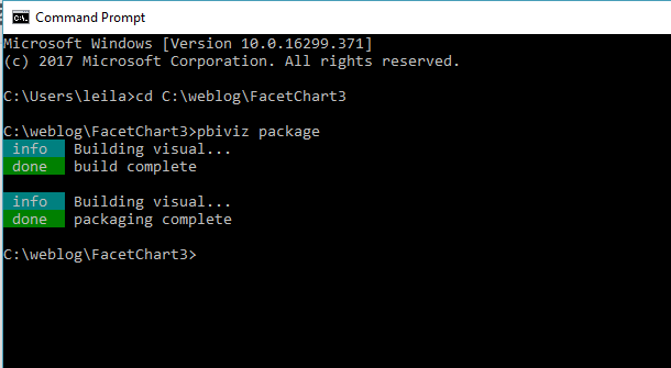
we need to download the node.js for windows, then in command prompt, we install “power bi tools”. Following, we use command “pbiviz” to make sure we already installed the Power BI tools. Then, we need to install a template “sampleRHTMLVisual“. Then write a command “pbiviz package” to create a folder name “dist” that holds the pbiviz file for custom visual. you need to back to the folder to change the R codes in “script.r”. totally recommended looking at the last posts (mentioned before).
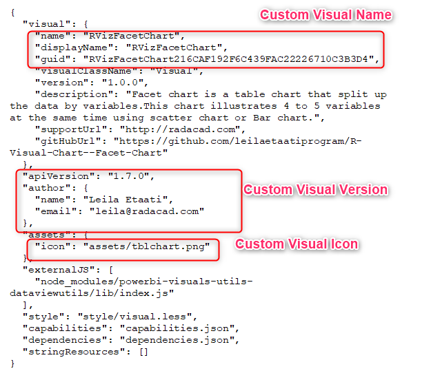
Change the Name and Icon of the Custom visual
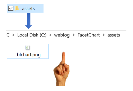
There is a possibility to change the icon, to change the icon for your custom visual first you need:
1-Create your desire icon with icon type.
2- the dimension should not be more than 20 x 20. I draw a chart I used some of the online icon creation website to create an icon from my jpg file
3- you need to go to the chart root under the “assets folder”
then you need yo compile the visual:
NOTE: every time you change anything about visual from R codes, Icon,…you need to go to comand prompt, to the folder and run “pbiviz package” command
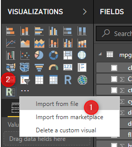
No just need to go and import the visual again from “dist” folder
as you cna see in the above picture the icon has been changed.
to change the name of the custom visula, you need to change the pbiviz.json. In JSON file, under the name, displayname, and guid, change the visual name. Later, you able to specify the version of your custom visual. As yo can see in theb elow picture, under the icon tag, there is a link to the icon location.
Apply the above changes, then save the file. You just need to compile the package again by run the “pbiviz package” command.
Add some Fields to Custom Visual
The other proble in custom visula that Presented in the lat two posts, was about the fields value and setting.
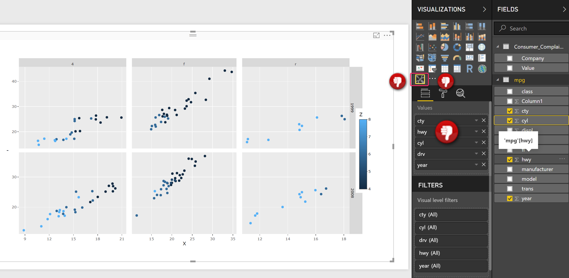
in the above picture, you can see that we have only one files” Values”, that why in the R code we have below codes
g=ggplot(Values, aes(x=c, y=Values$hwy,colour = Values$cyl)) + geom_jitter(size=4)
we you can see in the above code, all values has been related to dataset. so the first column in Values fields are related to x, the second to the y and so forth.
we want to chnage it as below
Values<-data.frame(X,Y,Legend,Row,Column)
names(Values)[4]<-paste(“W”)
names(Values)[5]<-paste(“M”)
g=ggplot(Values, aes(x=X, y=Y,colour = Legend)) + geom_jitter(size=4)+facet_gride(W~M).
However, we need separate data fields for them.
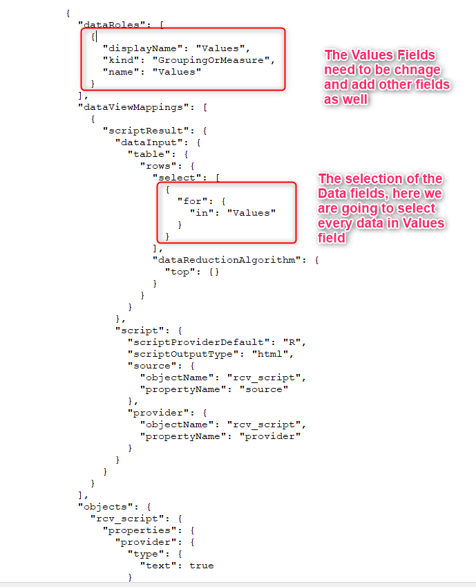
to change it, we need to alter the capabilities file. This JSOn file, is responsible for all the data fields in Power BI. to change this file I always recommend to use a JSON editor, to make sure you donot make any typo mistake.
![]()
So I have change the code in R studio and replace it with one that I mentioned, then I change the code as below
  "dataRoles": [
    {
      "displayName": "X",
      "description": "Field to place on the horizontal axis (X)",
      "kind": "GroupingOrMeasure",
      "name": "X"
    },
    {
      "displayName": "Y",
      "description": "Field to place on the vertical axis (Y)",
      "kind": "GroupingOrMeasure",
      "name": "Y"
    },
    {
      "displayName": "Legend",
      "description": "The categories of field to show in different color",
      "kind": "GroupingOrMeasure",
      "name": "Legend"
    },

    {
      "displayName": "Column",
      "description": "Categorical data to show on Column ",
      "kind": "GroupingOrMeasure",
      "name": "Column"
    },

    {
      "displayName": "Row",
      "description": "Categorical data to show on Row",
      "kind": "GroupingOrMeasure",
      "name": "Row"
    },
    {
      "displayName": "Index",
      "description": "Row Index, to keep duplicate rows",
      "kind": "GroupingOrMeasure",
      "name": "Index"
    }


  ]
also the selection part has been changed as below
"select": [


              {
                "for": {
                  "in": "X"
                }
              },
              {
                "for": {
                  "in": "Y"
                }
              },
              {
                "for": {
                  "in": "Legend"
                }
              },
              {
                "for": {
                  "in": "Column"
                }
              },
              {
                "for": {
                  "in": "Row"
                }
              },
              {
                "for": {
                  "in": "Index"
                }
              }


            ]
You just need to compile the code again and see the result.
In the next posts I will explain some other setting that we need to set it up.


Fantastic! Exactly what I needed to know, I kept seeing people use dataset as the import values and now I see why it is called values and how to change it!