
This question is one of the main questions that people ask when they are at the preliminary stages of building a Power BI solutions. There is a misconception that Report is a detailed tabular report, and dashboard is interactive visualizations with chart. However this definition isn’t what Power BI reports and dashboards stands for. There are differences in these two main components of a Power BI solution, Understanding differences will help you to leverage their power in a best way. In this post I’ll explain what are differences between these two and Where, When, Why, Which is best to use? If you are interested to learn more about Power BI; read Power BI online book from Rookie to Rock Star.
Video
Definition
Dashboard: General
Stephen Few‘s definition of Dashboard: A dashboard is a visual display of the most important information needed to achieve one or more objectives; consolidated and arranged on a single screen so the information can be monitored at a glance.
Report: General
A Report on the other hand is any informational work. This information can be at any format. Table, Chart, text, number or anything else.
Power BI Report
Power BI Report is combination of multiple visual elements (charts, texts, values…) on a page that can be inter-related with each other. Data visualized in the report can be sliced and diced with slicers. Power BI report is fully interactive from user. and It can be filtered based on some criteria.
Power BI Dashboard
Power BI Dashboard is a high level view of some of key KPIs of one or more reports. Dashboard is a day-to-day view of KPIs, and provide the navigation point to the detailed reports. Power BI Dashboard isn’t built for slicing and dicing.
You can see that definition of Power BI Dashboard and Report fits into the general definition of these two component we’ve had earlier. Now let’s look closer at these two.
Beyond the Definition
Power BI Report
Reports in Power BI can have multiple pages. In each page there might be multiple visualization elements. Slicing and dicing, hovering and highlighting is possible in the Report. We can drill down through a hierarchical data structure, or select a particular column in a column chart and see the related data to it in other visualization elements. All of these means Report in Power BI is for slicing and dicing. Report built for end users to play with different handles (slicers or visuals or filters), and achieve what they want. For example they might want to understand why Sales Amount in month August is lower than other month? or Which product is selling best, and how it is distributed through branches. Here is an example of Power BI report;
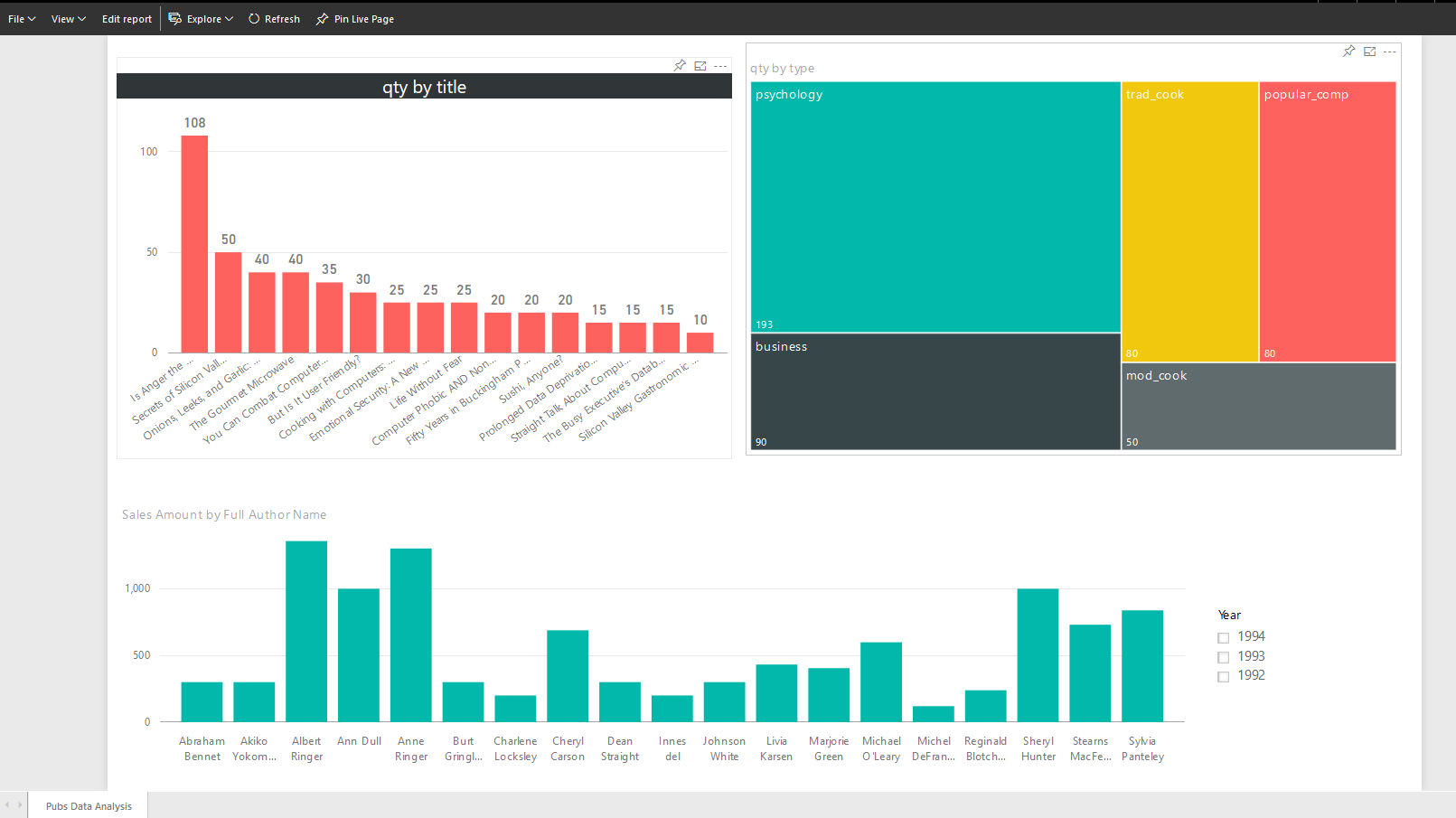
If you like to know how to create this report, please read this post.
Unique Features of a Power BI Report
- Slicers
- Multi-Pages
- Interactivity
- Drill Down/Up
- Publish to Web
- Explore Data
Power BI Dashboard
A Dashboard in Power BI is a navigation point to reports, and a very high level day-to-day view of main KPIs of business. For example for a particular business need some KPIs might be required from multiple reports. For example year to date revenue from sales report, stock in hand from inventory report, and something from production report. With a Dashboard visualization elements from multiple reports and pages can be pinned to one main place. This place then will work as a navigation point. with clicking on each of these visuals user will be redirected to the report and page that has this element. Here is an example of a dashboard;
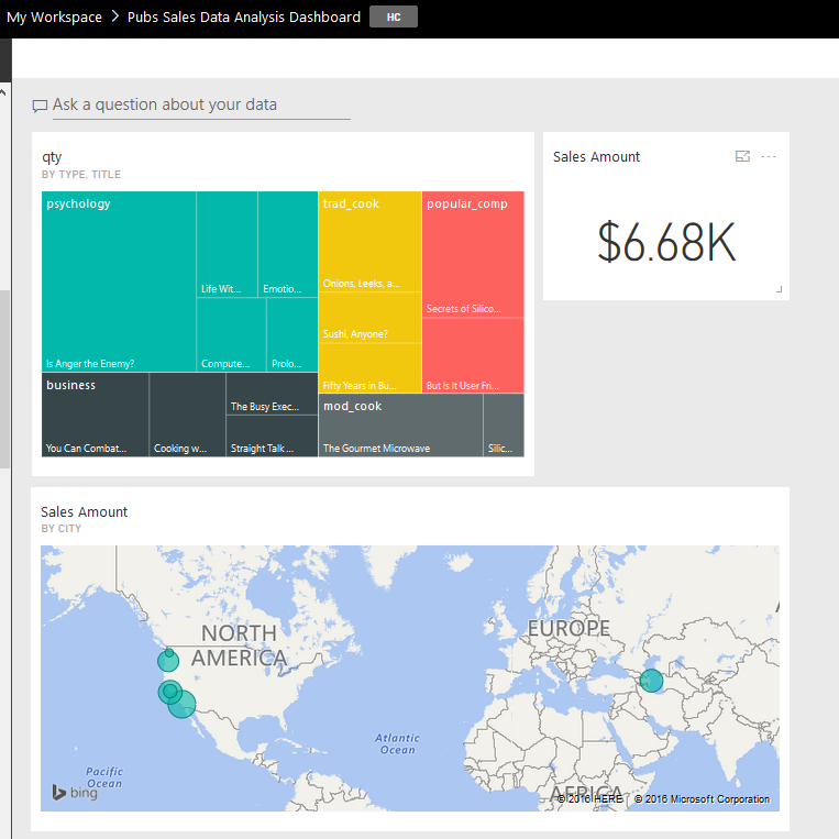
Unique Features of a Power BI Dashboard
- Automatic Refresh
- Sharing
- Customization by User is Easy
- Featured Dashboard
- Power Q&A
- Real-time Monitoring
- Alerts
- Related Insights
Unique Features of a Power BI Report
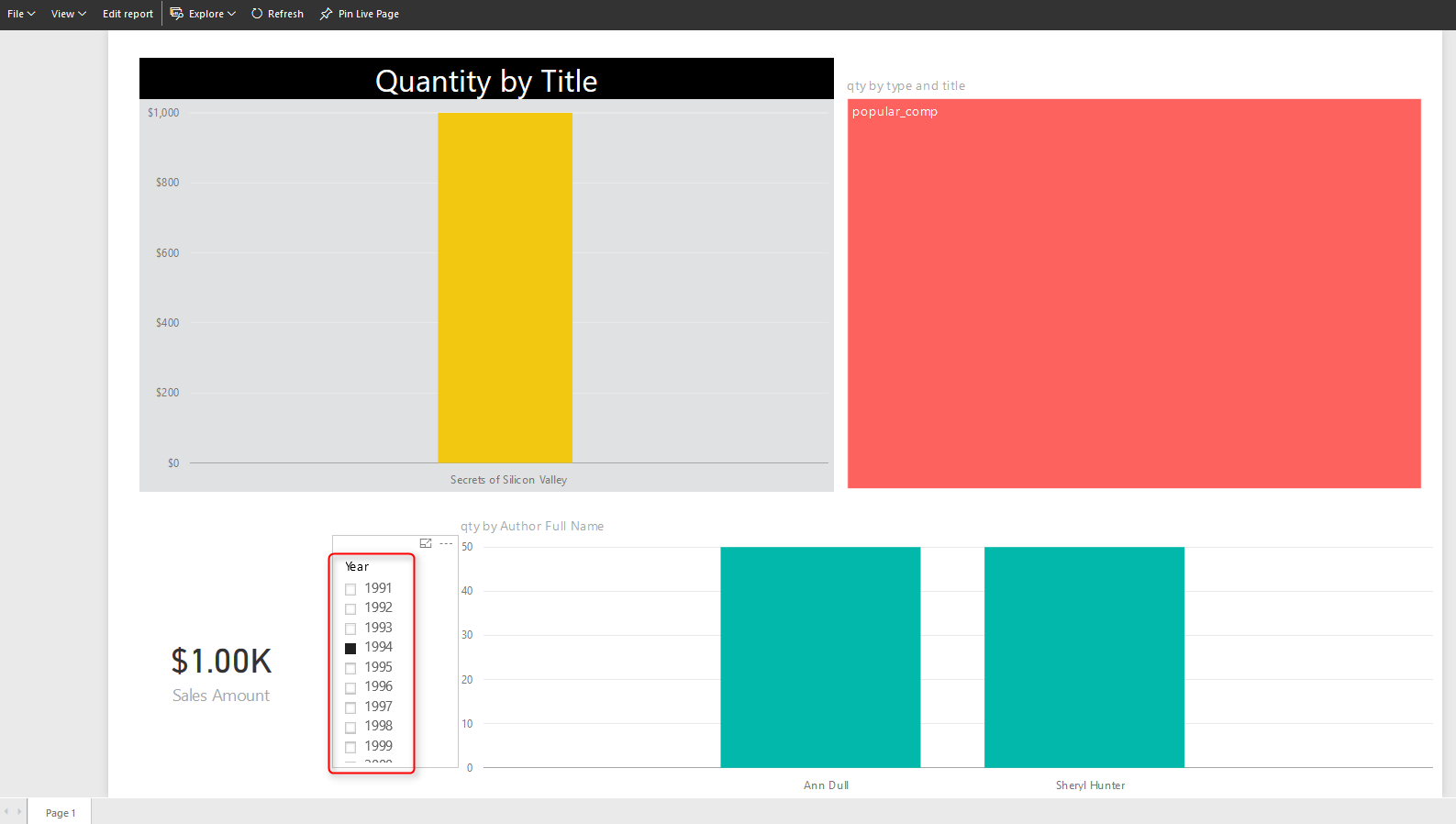
Slicers
You can simply slice and dice the data in the report with slicers. This is unique to reports, In dashboard there is no way of using slicers (Except using “Pin Live Page” option which will pin the whole page in the dashboard)
Multi-Pages
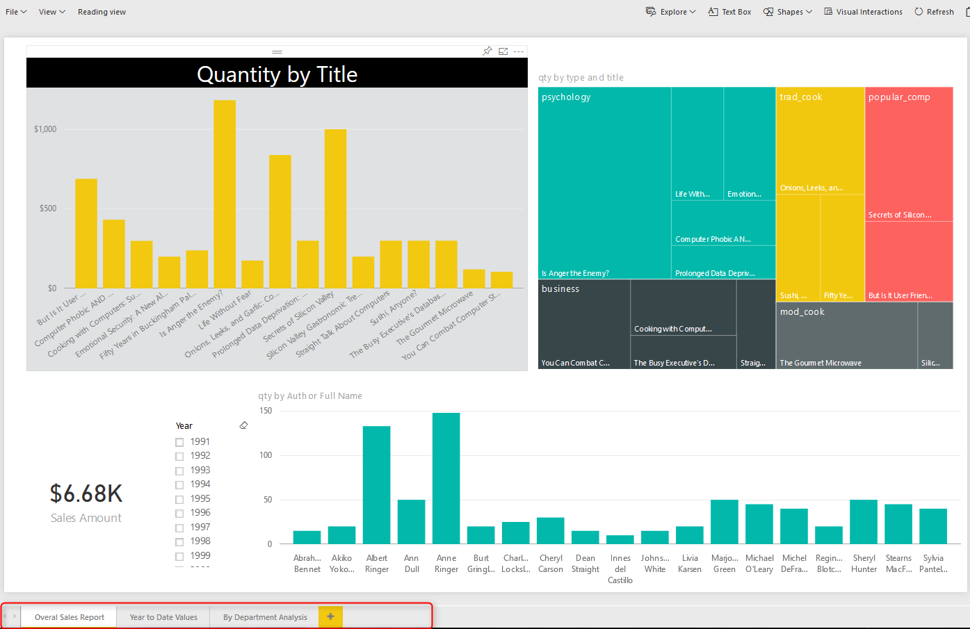
You can have multiple pages in a report. Navigation between pages is simply possible through the navigation pane at the bottom of report. In dashboard you can have as many as tiles you want. But there is no concept of pages. everything is in one page, If content doesn’t fit into one page scroll bars will appear (Which is not recommended)
Interactivity
In addition to slicers, you can select a particular element in a chart and it will highlight other elements. User can simply interact with report elements and get more insight from it. In dashboard with clicking on a tile you will be redirected to the report/page that built the element.

Drill Down/Up
In Power BI you can have hierarchies; such as Product Group, or Calendar. And you can drill down or up in different levels of hierarchy through some of visualization elements. However in Dashboard drill down/up is not possible, and with a click on the visual you will be redirected to the report/page that built the element.

Publish to Web
Publish to Web is a specific feature for a report. With Publish to web report can be published as a public web page, or can be embedded in a publicly available web page. Dashbarods at the time of writing this post, cannot be published publicly on the web. To read more about Publish to Web, read this blog post.

Explore Data
Users can explore the data of a particular visual element in the report with options in Explore Data or See Records. These options will help users to drill even down to the record level and see roots of a particular value in a chart. In dashboard only the data of dashboard (not data records) can be exported.

Unique Features of a Power BI Dashboard
Automatic Refresh
Automatic refresh is one of the main benefits of dashboards vs reports. A dashboard can be designed in this way that it be open for many hours and it will refresh automatically (depends on elements explained later). On the other hand if you open a report, and if data set of that report get refreshed, you need to manually refresh your report otherwise your report won’t be refreshed automatically.
Well when I get to this point, many students in my courses asks why this behaves like that?! Why it is not getting refreshed automatically like the dashboard. I believe the main reason for this is scenarios like this: Consider that an analyst has opened an inventory report, and is checking number of that with a static report that he/she has in Excel or even on paper. His/Her excel or paper report is static, and he/she is doing a sanity check to see if numbers match or not. if the report be dynamic then nothing can be checked. There might be other reasons as well, but this is I believe the main reason for it.
Power BI Dashboards refreshes whenever the data set refreshes. This is for when we import the data into Power BI. If the data set is scheduled to refresh, or if we refresh that manually, the dashboard will be refreshed automatically.
Power BI Dashboards for DirectQuery data sets refreshes every 15 minutes.
Sharing
Dashboards, Reports, and Data Sets in Power BI can be shared through different methods; such as Content Packs, and Power BI Work Groups. However Dashboards can be shared through a basic sharing method as well. This is an addition to the other methods of sharing. With this method person/people that this dashboard will be shared with them will receive an email with the dashboard link.

Customization by User is Easy
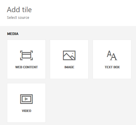
It is easy to change size of dashboard tiles, and change order of them, also to add new tiles (Image, Text, Web, and Video) in dashboard. That said it is also possible to make changes to a report as well. But that required clicking on Edit report, going to edit mode, applying changes, and saving. Dashboard is like user’s view of the world, so simply can be adjusted to what he/she wants to see.
Featured Dashboard
A dashboard can be set as a landing page with setting that as Featured Dashboard. There can be only one featured Dashboard. If you set another dashboard to be featured, the previous featured dashboard will be replaced with this new one.

Power Q&A
If you haven’t heard about Q&A I encourage you to read this blog post. Q&A is an engine of top of Power BI model which will respond to your natural English language questions. Q&A box is only available on top of dashboards (Not all types of dashboards, at the time of writing this post, Q&A on dashboards that has Row Level Security enabled, or data sets used DirectQuery is not possible).

Real-time Monitoring
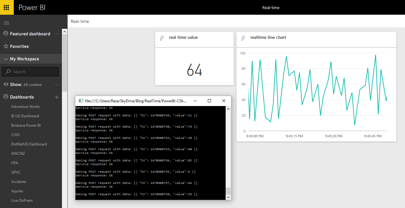
I’ve mentioned that dashboards refreshes automatically. However this doesn’t mean real-time monitoring. Real-time monitoring means using PUSH approach. That means anytime a new data in the source is available it should be monitored. It is possible to have real-time monitoring of events with Power BI Dashboards. The data set at the moment can be sourced from PubNub, Azure Stream Analytics, or REST API. To learn more about real-time monitoring with REST API read this post, and Azure stream Analytics read this post.
Alerts
You can define alerts for each data driven tile in the report. Alerts can be as simple as if number goes above or below something send an email to me.

Related Insights
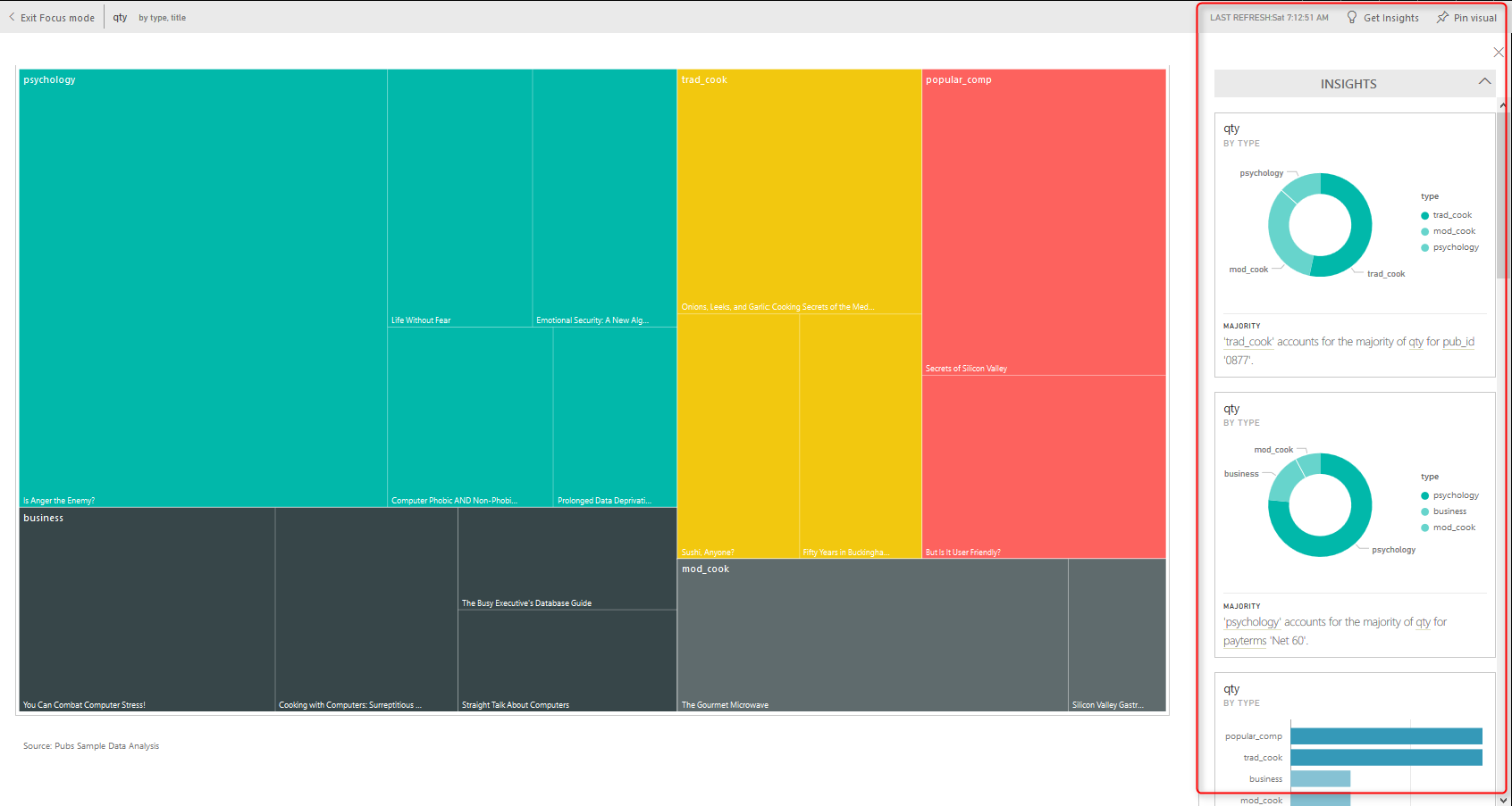
In dashboards you can get some more insight with selecting the Related Insights feature of the tile. This option will search through patterns in the data set and visualize them automatically.
Differences At a Glance
As you see dashboards and reports are not exactly the same. there are many major differences between these two. majority of the difference is that; Dashboard is day-to-day single page view of main KPIs, which can be refreshed automatically and can visualize real-time events. Dashboard can be used to navigate to reports. Reports are interactive data visualization elements that can be used by users to slice and dice, highlight and interact with to investigate numbers and insight more in details. For a great visualization solution with Power BI you would need both, these are complements of each other, not replacements.


Reza,
Excellent explanation of the differences between Power BI Dashboards vs Power BI Reports.
I had been a bit confused up until now. Your blog post clears things up.
Thank you.
Thanks For your kind words.
And I’m really glad my post helped you 🙂
Cheers
Reza
Hello — this is really helpful. Thanks, Sanj.
Thank you very much for taking the time to explain the differences between these two point to point. This is the most detailed explanation I found on internet so far. Keep up the good work!
Thanks San for your feedback 🙂
Cheers
Reza
nice information its really helfulfor me
good explanation sir…………
can you please explain import and direct query ,live connection difference
Hi Annapurna,
You can read my latest blog posts about it
http://radacad.com/directquery-connection-in-power-bi-how-does-it-work-limitations-and-advantages
http://radacad.com/connection-types-in-power-bi-import-data-or-scheduled-refresh-a-detailed-look-inside-and-out
Cheers
Reza
Excelent Reza
Excellent It is very clear and summarized information.
Excellent