
The latest update of Power BI Desktop (October 2016) has many features. Two of these features are grouping and binning. These features used to create groups of items and visualize them better in the report. Previously you could do that by Power Query or DAX calculated columns, now it is all possible simply through the graphical user interface of report editor. In this post I’ll show you how to create banding (binning) and grouping simply with these features. If you like to learn more about Power BI; read the Power BI online book from Rookie to Rock Star.
Video
Prerequisite
For running examples of this post you need to have AdvantureWorksDW SQL Server database sample installed. Or you can get the excel version of it.
Get Data; Start with Get Data from AdventureWorksDW, and choose tables: FactInternetSales, DimDate, and DimCustomer.
Set the relationship between DimDate and FactInternetSales to be only based on OrderDateKey as Active relationship, remove inactive relationships between these two tables.
Banding or Binning
Binning is grouping a numeric field based on a division. This type of grouping is called Banding as well. For example you might have customers with different yearlyIncome range from $10,000 to $100,000 and you want to create a banding by $25,000. This will generate 4 groups of yearly income for you. This is exactly what Binning in Power BI does. Let’s look at the example.
Create a Table in Power BI Report and visualize YearlyIncome (from DimCustomer), and SalesAmount (from FactInternetSales) in it. Change the aggregation of YearlyIncome from Sum to Do Not Summarize as below

This will visualize each yearlyIncome value with the sales amount associated to it.

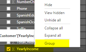
Now let’s create groups of people based on their yearly income categorized in buckets of $30,000. Right click on the YearlyIncome column in the fields section and select Group.
In the Groups window make sure Bin is selected as the group type (by default for numeric or date/time columns this will be the default). and set the size to 30000. This is the size that values of YearlyIncome will be split based on it.
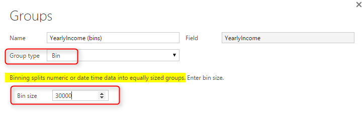
Press OK in the Group Window, and bring this new generated field (named YearlyIncome (bins)) to the table.
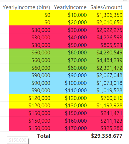
Color coding above shows that YearlyIncome values grouped by the division result of the value of yearly income by group size which is $30,000. If you want less groups you can increase the group size, or if you want more detailed groups you can decrease the group size.
Now you can remove the YearlyIncome from table view, change the table to be Column Chart to see which group generates the most revenue.

This binning can be applied to datetime values as well. For example if you want to see revenue based on half year’s banding, you can simply create a group with Bin size of 6 by Month. Let’s see the example; Right click on FullDateAlterneteKey column (from DimDate), and create the group;
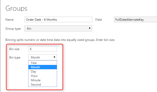
Now create a Bar chart with this new column (named Oder Date – 6 Months), and Sales Amount.
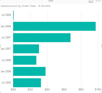
You can simply create other banding or binning for Years, Months, Days, Hours, and Minutes as well.
Grouping
You Can Create a group of multiple items in a visualization. This group can be simply created by Ctrl+Click and selecting items, then grouping them. As an example; create a Column Chart with English Education (from DimCustomer), and SalesAmount (from FactInternetSales).

Now Ctrl Click and select High School and Partial High School, then right click and select Group.

You will see now them grouped together with a legend on the top of chart showing this group, and an “other” group.

Now create another group for Bachelors and Graduate Degree in the same way.
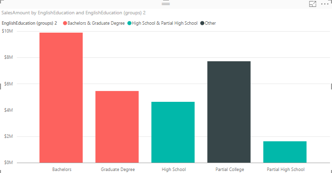
You have now three groups; higher education (Bachelors and Graduate Degree), College (Others), and High School (High School and Partial High School).
Once you have the grouping you can do many nice visualizations with that, an example can be creating a Stacked Column Chart with These Groups as the Axis, and the English Education as the Legend. To do so; Change these two in the chart and change it to be Stacked Column Chart.
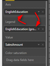
Now the chart will look like this;

This shows simply how much revenue each category generates in total, and also inside the category which sub category (English education) generates the most or least revenue.
Behind the Scene
What is happening behind the scene is that there is a DAX calculated column (calculation is not visible in Power BI) created for each binning. This was exactly the method of implementing such thing previously. There is also another method which is creating the banding through Power Query.
Grouping and Binning is part of your model. That means if you create another report or chart you can use the Group there. Even if you create calculated tables or any DAX calculations you can use these new Group columns there.
Summary
There are heaps of possibilities that these new grouping features bring to your visualization. Having these grouping as part of you model also is great to have unique experience in your reporting solution. However There are always complex grouping conditions that still need to write a bit of DAX code or Power Query M script.


Grouping and Binning are indeed powerful features. Unfortunately, this functionality is not available for any Analysis Services connection. From what I understand, this is because the “model” doesn’t exist in Power BI and all reporting/analysis is dependent on the model created within SSAS. This is not the only feature that we are blocked from accessing (for example, we can’t add calculated measures either). Are you working on providing support for your Power BI Grouping and BInning for SSAS connections in the future? Is there any kind of workaround that would let me use this feature directly within Power BI?
Hi Peter.
Thanks for your comment. As you mentioned these features are not available in LiveQuery to SSAS. I am not working for Microsoft, so definitely I am not working on providing this feature. But I believe Microsoft team would have many new features in their road map which will come at some stage ( I don’t know any dates unfortunately)
At the moment the work around is: When you use Power BI on top of LiveQuery SSAS, do all modeling inside SSAS. You can create grouping, binning there, but not through GUI, with DAX expressions with calculated columns and measures. And then you can use it in Power BI for visualization.
Cheers
Reza
How to Create a binned column where each bin has the same number of unique values as the others.
Hi Gaurav
You can create bins with saying that you want the size of bin to be something, or based on the bin total count. For example, let’s say values are from 10 to 100, incrementing 10 each time. You can say that you want 5 bins. this means each bin will have two of these values. or you can say you want the size of bin to be 50. for your scenario, binning based on the count would work better I believe.
Cheers
Reza