In the previous post (Part 1) I have explained how to write a simple scatter chart in the Power BI. Now in this post I am going to show how to present 5 different values in just one chart via writing R scripts.
I will continue the codes that I wrote in the previous post as below :
library(ggplot2)
t<-ggplot(dataset, aes(x=cty, y=hwy,size=cyl,fill='Red')) + geom_point(pch=24)+scale_size_continuous(range=c(1,5))
t
In previous post we just shown 3 variables : speed in city, speed in highway, and number of cylinder.
In this post, I am going to show variable “year” and type of “Drive” of each car plus what we have.
first, I have to change the above code as below:
t<-ggplot(dataset, aes(x=cty, y=hwy,colour = factor(cyl))) + geom_point(size=4)
Before that, I want to do some changes in the chart first. Hence, I changed the “aes” function argument. I replaced the “Size” argument with “Colour”. that means, I want to differentiate car’s cylinder values not just by Cycle size, but I am going to show them by allocating them different colours. so I changes the “aes” function as above.
so by changing the codes as below
library(ggplot2)

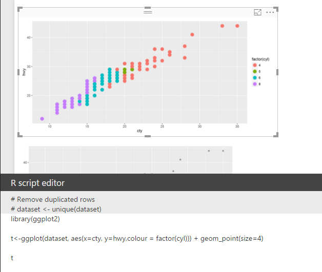
t<-ggplot(dataset, aes(x=cty, y=hwy,colour = factor(cyl))) + geom_point(size=4)

t
we will have below chart:
now I want to add other layer to this chart. by adding year and car drive option to the chart. To do that first choose year and drv from data field in power BI. As I have mentioned before, now the dataset variable will hold data about speed in city, speed in highway, number of cylinder, years of cars and type of drive.
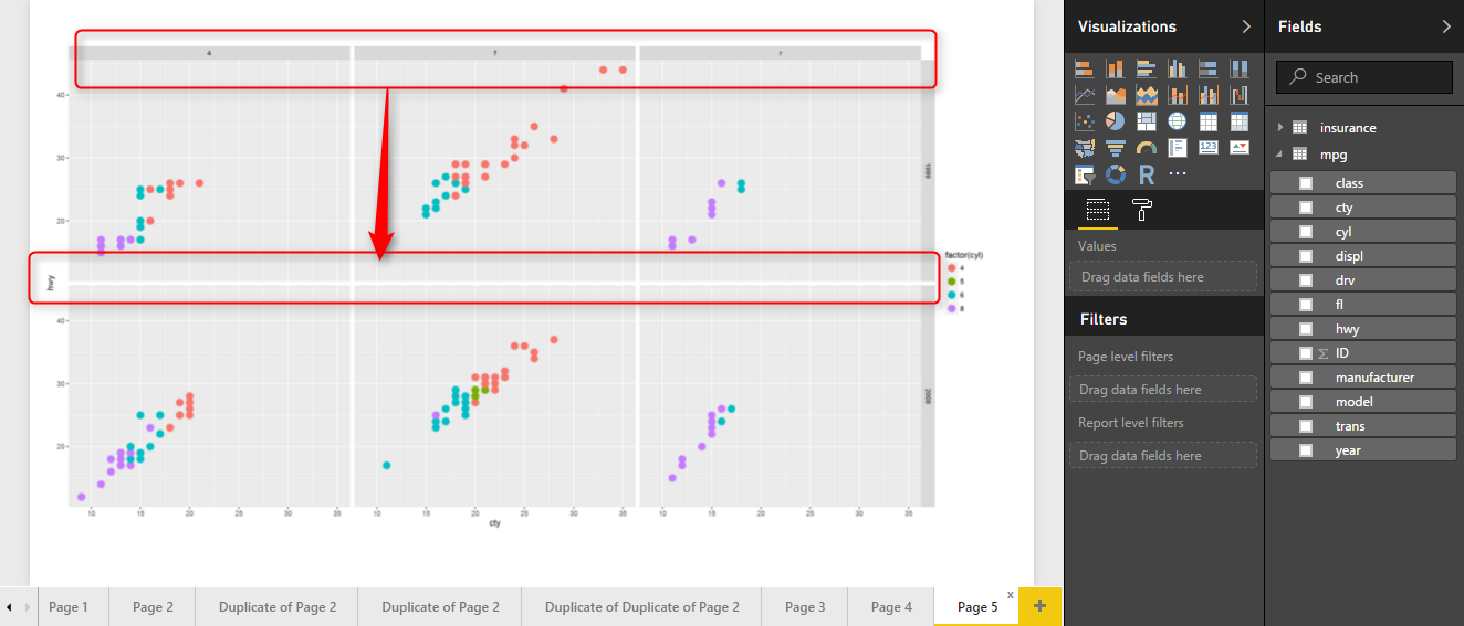
I am going to use another function in the ggplot packages name “facet_grid” that helps me to show the different facet in my scatter chart. in this function, year and drv (driver) will be shown against each other.
facet_grid(year ~ drv)
To do that, I am going to use above code to add another layer to my previous chart.
t<-ggplot(dataset, aes(x=cty, y=hwy,colour = factor(cyl))) + geom_point(size=4)

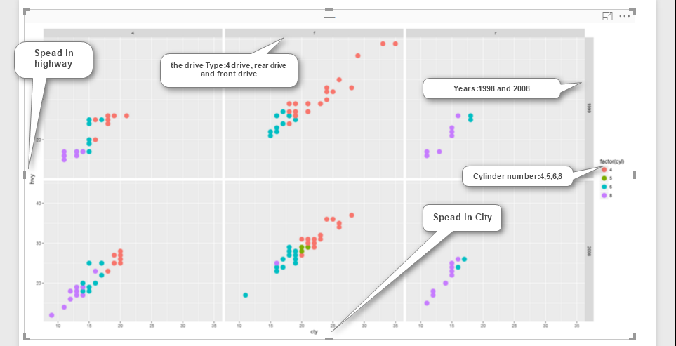
t<-t + facet_grid(year ~ drv)
t
so I add another layer to variable “t” as above.
now the visualization will be look like as below: as you can see the car’s speed in the highway and city in y and x axis. Also, we have cylinder as colour and drive and year as facet.
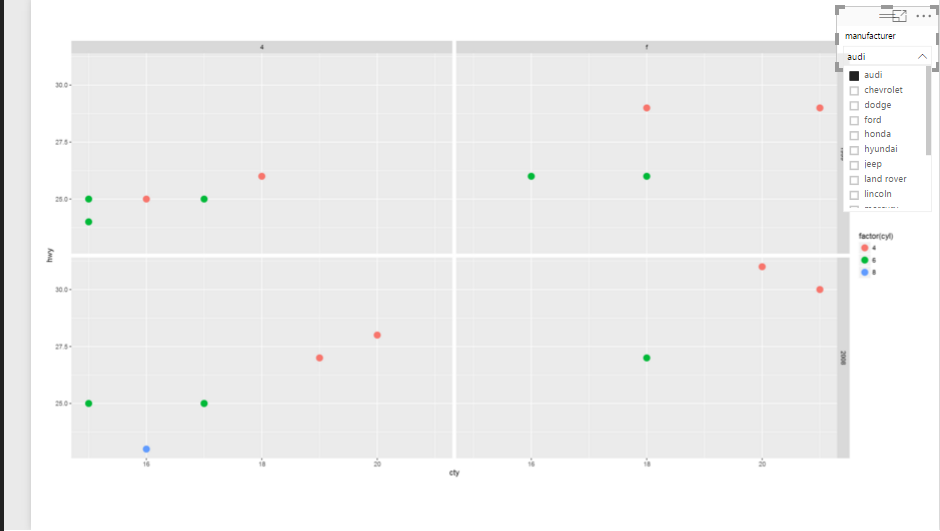
Now imagine, I am going to add a slicer to filter “car brands”, and also to see these five variables against each other in one chart.
So, we will have below chart:
I am going to have some more fun with chart, I need to show the drive type in all region not just the three above (see below image)
In this case I am able to use the another facet function instead of facet_grid(year ~ drv) I am going to use other function name facet_wrap(year~ drv) which help me to do that.
Hence, I change the codes as below:
t<-t + facet_wrap(year~ drv)
Moreover, I want to show the car’s cylinder type not just by different colour, but also with same colour just different shading. so I will replace the argument inside the aes function as below
aes(x=cty, y=hwy,color=cyl))
instead of aes(x=cty, y=hwy,colour = factor(cyl))
so finally the code will be look like as below
library(ggplot2)

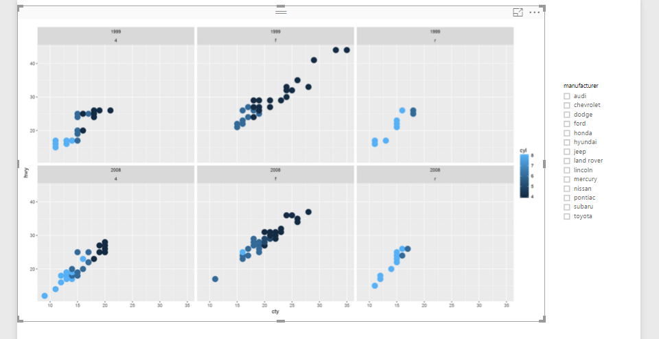
t<-ggplot(dataset, aes(x=cty, y=hwy,color=cyl)) + geom_point(size=5)

t<-t + facet_wrap(year~ drv)
t
Finally,I will have below picture, as you can see in the below image, we have title for each group as for the top left 1999 and 4drive, for top and middle we have 1999, and r drive and so forth.
In future posts, I will show some other visuals that we have in ggplot2 package, which help us to have more fun in power BI.
Download Demo Files
Save



It’s a wonderful journey walking along part 1 through part 2 even though the refresh time is quite slow in Power BI desktop. Thanks Leila!
Nice, I already put the Part 3
Thanks so Much
In power bi there is some graph equivalent to facet_grid, facet_wrap of ggplot2, R?
Hello Mario,
actually I see the exact visual like that, if I found I will put here
Love your work ! I have been wanting to use R in Power BI with real world examples and found your blog and your e book. It is exactly what I wanted. Thanks a lot for your efforts !
Thanks so much!