
In the previous parts (Part 1 and Part 2) , I have shown how to draw a chart in the power BI (Part 1) visualization. Also, in Part 2 I have shown how to present 5 different variables in just one single chart. In this post, I will show how to shows some sub plots in a map chart. showing pie chart already is possible in power BI map. In this post I am going to show how to show bar chart, pie chart and so other chart type in a map.
For this post, I have used the information and codes available in [1] and [2], which was so helpful!.
This may happen that we want to have some subplots in a map, in R you able to show different types of chart in a map as a subplot.
To start, first setup your power BI as part 1. We need below library first to be installed in R software. Then you should use them in Power BI by referring to them as below.
library(rworldmap)
library(sp)
library(methods)
library(TeachingDemos)
require(sp)
Next we need data to show on the map. I have a dataset about different countries as below :

I have 3 different random columns for each countries,as you can see in above picture (I just pick that data from reference number[1]). I am going to create a chart to show these 3 values (value1, value2, and value3) in map for each country.
in Power BI visualization, first select the dataset (country, value1, value2, and value3). This data will store in variable “Dataset” in R script editor as you can see in below image.


I put the “Dataset” content into new variable name “ddf” (see below)
ddf =dataset
The second step is about finding the latitude and longitude of each country using function “joincountrydata2map“. this function gets the dataset “ddf” in our case as first argument, then based on the name of the country “joincode=”NAME” and in ddf dataset “country column” (third argument) will find the country location specification (lat and lon)for showing in the map. We store the result of the function in the variable “sPDF”
sPDF <- joinCountryData2Map(ddf , joinCode = 'NAME' , nameJoinColumn = 'country' , verbose = TRUE)
Hence, I am going to draw an empty map first by below code
plot(getMap())

Now I have to merg the data to get the location information from “sPDF” into “ddf”. To do that I am going to use” merge” function. As you can see in below code, first argument is our first dataset “ddf” and the second one is the data on Lat and Lon of location (sPDF). the third and forth columns show the main variables for joining these two dataset as “ddf” (x) is “country” and in the second one “sPDF” is “Admin”. the result will be stored in “df” dataset
df <- merge(x=ddf, y=sPDF@data[sPDF@data$ADMIN, c('ADMIN', 'LON', 'LAT')], by.x='country', by.y='ADMIN', all.x=TRUE)
Also, we need the “TeachingDemos” library as well.
require(TeachingDemos)
I am going to draw a simple bar chart that show the value1, Value2, and Value 3 for each country. So I need a loop structure to draw barchart for each country as below. I wrote “for(I in 1:nrwo(df)) that means draw barchart for all countries we have in “df” then I called a subplot as main function that inside I defined the barplot().
for (i in 1:nrow(df))
  subplot(barplot(height=as.numeric(as.character(unlist(df[i, 2:4], use.names=F)
                                                 )
                                    ),
                    axes=F,
                  col=rainbow(3),
                   ylim=range(df[,2:4])
                  ),
          x=df[i, 'LON'], y=df[i, 'LAT'], size=c(.6, .6)
           )
barplot() get values for height of each bar chart as a number (as.number). also I fetch the data related to “df” dataset from row number “i”, for columns from 2 to 4 (value 1 to value 3). To stet the colouring of the bar chart we use (col=rainbow(3)). “Y” axis should range values from “df” dataset for dataset df[,2:4]. the “x” axis get the latitude and longitude. The size of the bar chart can be changed by function “size=c(,)”.
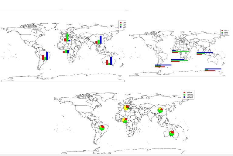
then we have below picture:
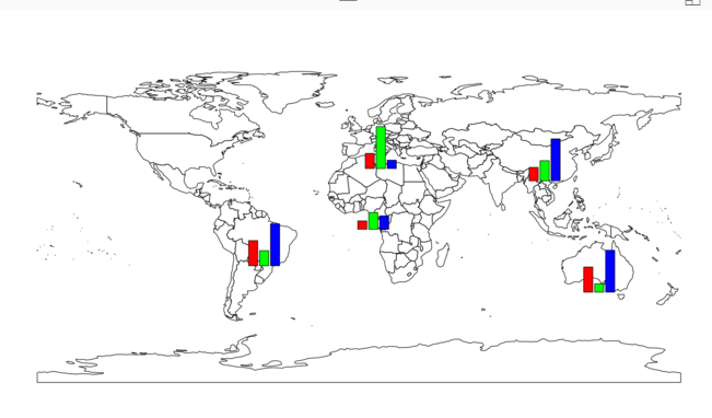
To have better map, we need a legend on beside of the map. To do that I am using a function named “legend” that the first argument is the name of the legend as “top right”. the legend values comes from “df” dataset. we using the same colouring we have for bar chart.
legend('topright', legend=names(df[, 2:4]), fill=rainbow(3))
so at the end we have below chart

Now imagine that we want to have another type of chart in map as pie char or horizontal bar chart.
to do this, I need just changed the chart in Subplot as below
subplot(pie(as.numeric(as.character(unlist(df[i, 2:4], use.names=F))),
just replaces the bar chart with pie chart (use above codes).
so we will have below char

Or if we want to have a horizontal bar chart we need to just add a filed to our code for bar chart as below
subplot(barplot(height=as.numeric(as.character(unlist(df[i, 2:4], use.names=F))), horiz = TRUE,
as”horiz=true”
and we have below chart

there are possibility to add other types of charts in the map as well!
[1] http://stackoverflow.com/questions/24231569/bars-to-be-plotted-over-map
[2]https://www.stat.auckland.ac.nz/~ihaka/120/Lectures/lecture16.pdf
Download Demo File
Save


Hi Leila,
In a hope to catch up each of your post, I’ve walked along all the subject sessions from part 1 through part 3. Herewith some highlights for your reference:
1. All the scripts for plotting bar, pie and horizontal bar charts in Rstudio could be run smoothly except the horizontal bar chart – even though I have added the argument “horiz = TRUE” inside the subplot function, it’s still a bar chart – vertically. I don’t know why? Besides, as the value1, value2, value3 are in the columns 3, 4, 5 of the dataset. so the vector numbers to be elected in df[, 2:4] should be changed to 3:5 accordingly.
2. The same scripts could not be worked properly in PowerBI desktop . Therefore, I’m looking forward to having your sample pbix file to dig out what’s exactly the problems. That’s it. Thanks.
Sure thing Julian, thanks do comments, I already put the download file there for part 2 and part 3, hope put for the rest 🙂
Hi Leila,
Thank you very much for all the efforts you’ve made. I do appreciate it.
Best regards,
Julian
your welcome 🙂