
In the last posts, I have explained the main process of creating R custom visuals.
In this post I am going to show how to:
1- Have more custom visuals
2- Different charts that we can have in Power BI
3- Explain some issues
Have more custom visuals
to have more R visuals, it is now possible to use Plotly Packages by following the Custom Visual Process.
In the last post, I have not explained how to create a custom visual for R and Plotly and how to have it inside the power BI.
I decided to try all Plotly charts that I used before, and Also I try to make some of my previous R visual as Interactive and as a custom Visual so every one able to use
I am going to create a Jitter chart to show three variable in a chart. I have shown the main R codes in my Post about having more charts in Power BI using R graphs.
I am going to show How to create two different R custom Visual one for Facet chart and the other for normal Jitter Chart
Jitter Chart
What I did: First I back to the main folder that we have from the sample Power BI package,
1- I copy the folder to create a new custom visual (as it was my first attempts I call it Test :D)
2-I change the “pbiviz.json” files content: as below code.
{
  "visual": {
    "name": "Test",
    "displayName": " Test ",
    "guid": "Testl216CAF192F6C439FAC22226710C3B3D4",
    "visualClassName": "Visual",
    "version": "1.0.0",
    "description": "",
    "supportUrl": "",
    "gitHubUrl": ""
  },
  "apiVersion": "1.7.0",
  "author": {
    "name": "",
    "email": ""
  },
  "assets": {
    "icon": "assets/icon.png"
  },
  "externalJS": [
    "node_modules/powerbi-visuals-utils-dataviewutils/lib/index.js"
  ],
  "style": "style/visual.less",
  "capabilities": "capabilities.json",
  "dependencies": "dependencies.json",
  "stringResources": []
}
3-Then I have to put my R scripts inside the existing file name “scripts.r” . I have change the content as below to draw a simple jitter chart
as you can see the orange colour I made some changes
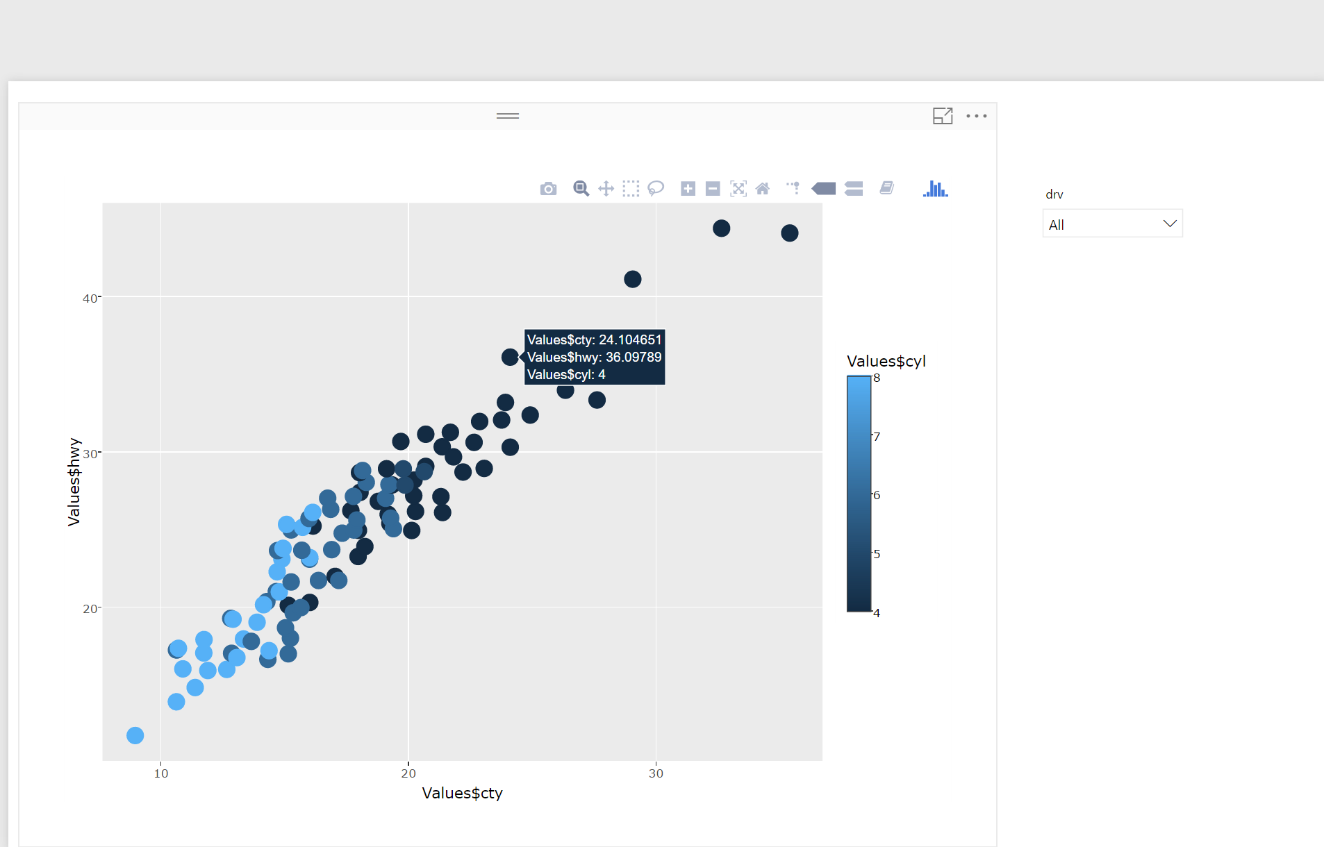
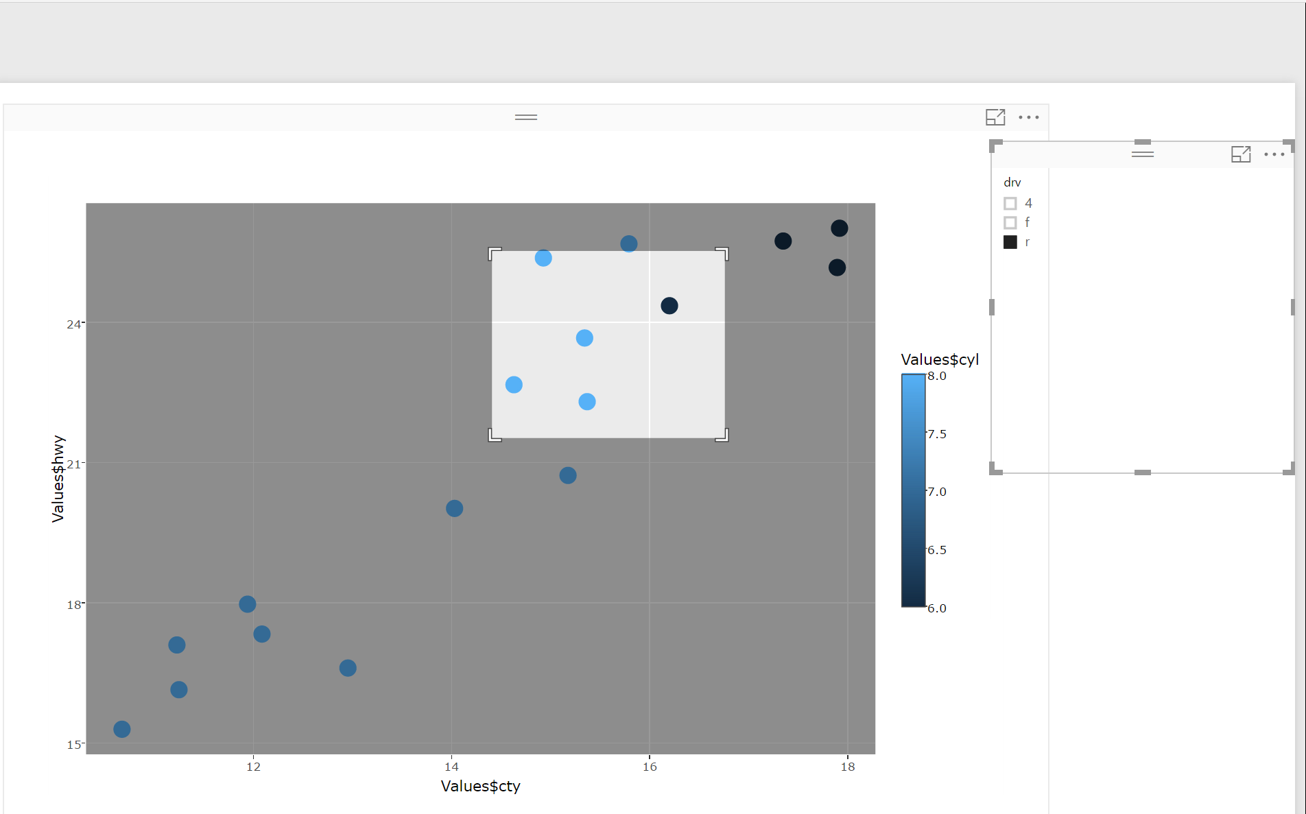
first: the main dataset will be stored inside the variable “Values” I put the value Values$hwy for the y axis and for x axis Values$cty. also I want to distinguish the number of cylinder of each car by different color colour = Values$cyl.
libraryRequireInstall(“ggplot2”);
libraryRequireInstall(“plotly”)
library(“plotly”)
library(“ggplot2”)
library(“htmlwidgets”)
##############################################
g=ggplot(Values, aes(x=Values$cty, y=Values$hwy,colour = Values$cyl)) + geom_jitter(size=4)
################### Actual code #################### #################################################### ############# Create and save widget ###############
p = ggplotly(g);
internalSaveWidget(p, ‘out.html’);
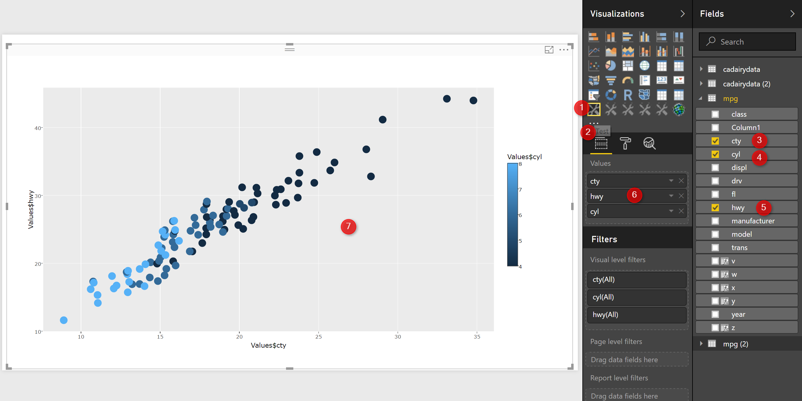
4-Now I can run the package and add it to power BI (as I have described in the last post). See the below picture. First, I have imported the custom visual into power BI (number 1 and 2 in the below picture).
to do: I will show later how to change the icon of the custom visual.
next to the custom visual just accepts the three main variable name as “cty, hwy, and cyl”. the variable should be named the same (number 3,4,5 and 6 in the below picture).
To do: in the next chart, I have replaced them with (x,y,z,w,v) so it can be applied to all other charts and different datasets.
Finally in number 7. you see the charts.
Now, just by hovering your mouse on charts you able to see the tooltips for speed in the city, high way and number of the cylinder(number 1).
moreover, there is a possibility to zoom in and zoom out and also to select a specific area of the charts.
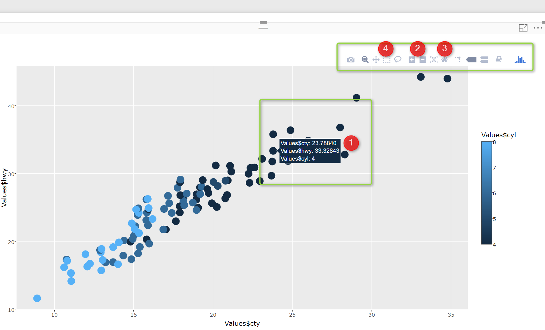
I am able to select a specific area of the chart and zoom in to see data, also this picture able to interact with Power BI slicer.
In the next post, I am going to show how to have more charts that we do not have normally in Power BI, make them as Custom Visual.
download the custom visual from below
Jitter chart (26547 downloads )


Nice article. How do you create a field well for each column so they don’t have to explicitly name the columns in the dataset?
Thanks,
Dan
My pleasure! I put “x,y,z” for values and I named the dataset as “Values”, however this is not efficient way may be , I still looking on the custom visual packages creationweblogs to find a better way for input variables and also change the icon, hopw I made a more complete post on it.
Hi Dan,
we can do it, I will wrote a blog post on that soon, using capabilities.json file
Hi Leila
This is really useful, many thanks!. I have a question with this line in the code:
g=ggplot(Values, aes(x=c, y=Values$hwy,colour = Values$cyl)) + geom_jitter(size=4)
Should it be: x= Values$cty?
Hi Jacqueline
I will show new approach to add x,y, legend instead of Value soon and for x= Values$cty yes 🙂