
Line chart is one of the most basic charts that you can see in every visualization tool. Power BI like other visualization tools has the line chart visualization which is good for showing one or two measure’s value across an axis which can be a category, time period and etc. Recently Power BI line chart added the feature to create dynamic reference lines and the Analytics pane which brings more power into this useful chart. In this post I’ll show you an example of using these features in Power BI line chart. If you are new to Power BI or you want to learn more make sure to read Power BI; from Rookie to Rock Star.
Prerequisite
For running the sample in this post you will need to download and install AdventureWorksDW sample Microsoft SQL Server database.
Introduction to line types in the line chart
Value Line
Line chart can show one or more measures as measures, such as Sales Amount, Total Costs, Quantity of the goods sold and etc.
Trend Line
Depends on the variety of values across a time period, Line chart can illustrate a straight line as a trend. This trend is good to understand how in overall products are selling, is revenue going up or down for example.
Reference Line
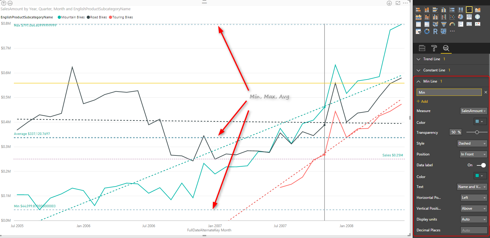
You might want to define minimum, maximum, average, or median values for your line chart as separate lines, and compare values lines with these lines. These are reference lines which can be dynamically created based on value of measures in the chart.
Building a Line Chart
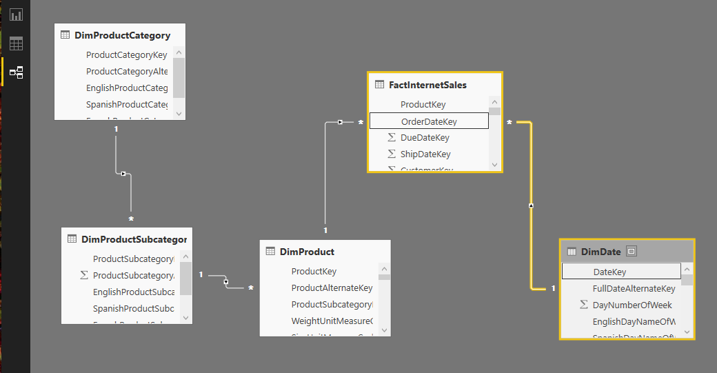
Create a new Power BI solution with Get Data from AdventureWorksDW SQL Server database, and choose tables as DimDate, DimProductCategory, DimProductSubCategory, DimProduct, and FactInternetSales. Click on Load, and in the relationship tab. remove extra relationships between FactInternetSales and DimDate to be only one active relationship based on OrderDateKey.
Go to Report tab, and add EnglishProductCategory to the Page Level Filters. Filter data to be only Bikes.
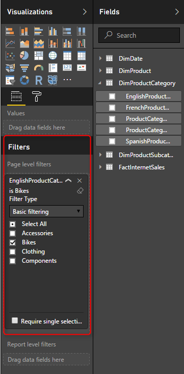
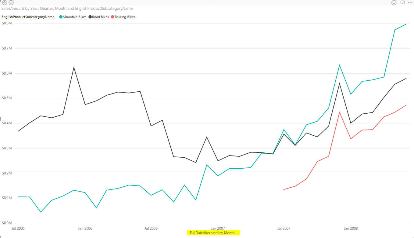
Page level filter will filter all visualizations in this page to only show Bikes information. Now add a Line Chart from visualization pane. Set the value to be SalesAmount (from FactInternetSales), Axis to be FullDateAlternateKey (from DimDate), and EnglishProductSubCategory (from DimProductSubCategory).
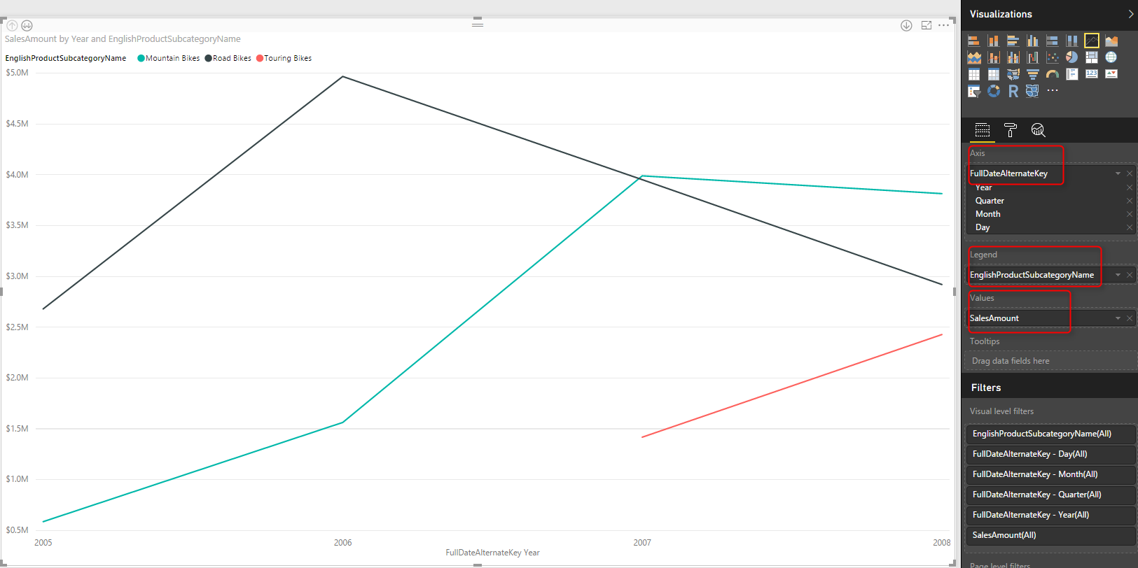
This line chart now simply shows three product sub categories of Bike; Mountain Bikes, Touring Bikes, and Road Bikes. FullDateAlternateKey is a full date column which in this view showed as a Year level. This behavior is because Power BI automatically add Date Hierarchy to date fields. If you want to change this behavior you can go to options and do so.
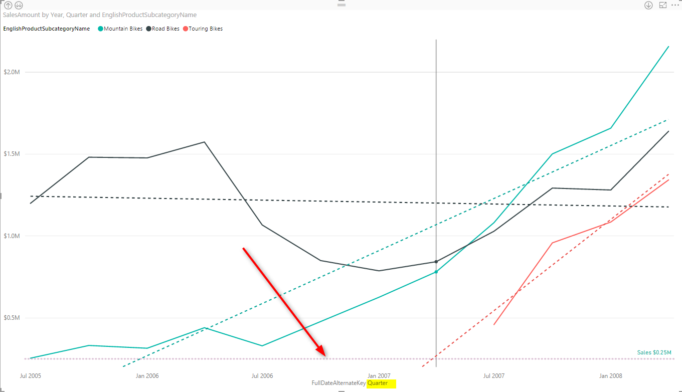
Let’s now drill down into Quarter by clicking on the Drill Down button on the top left hand side corner of the line chart. You can see after drill down in the button center of the chart it shows the level of drill down is on Quarter now.

Drill down into Month Level afterwards.
Month level view shows better visualization as a detailed view, and not as messy as Day view (you can drill down to day to see what I mean by messy).
Trend Line
As I explained earlier, Line chart can simply show a trend line to investigate overall behavior of the value over the period of time. For adding this trend line, simply go to Analytics Tab (when you have line chart selected), and under Trend Lines click on Add.
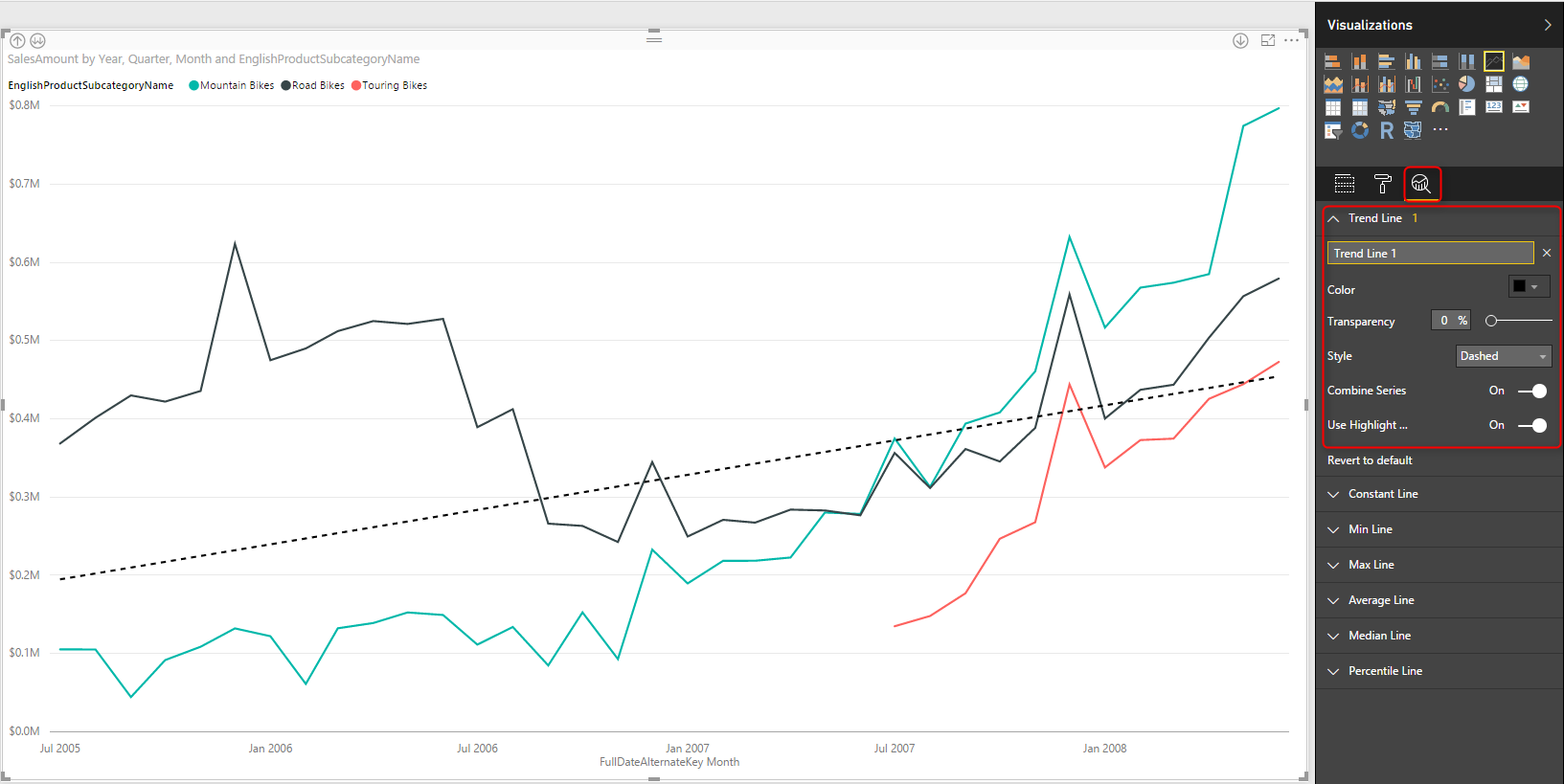
As you see in the screenshot above, this trend line simply show the trend of Total Sales Amount over the period, which is increasing. You can have this trend as total as is, or have a separate trend line per each product subcategory.
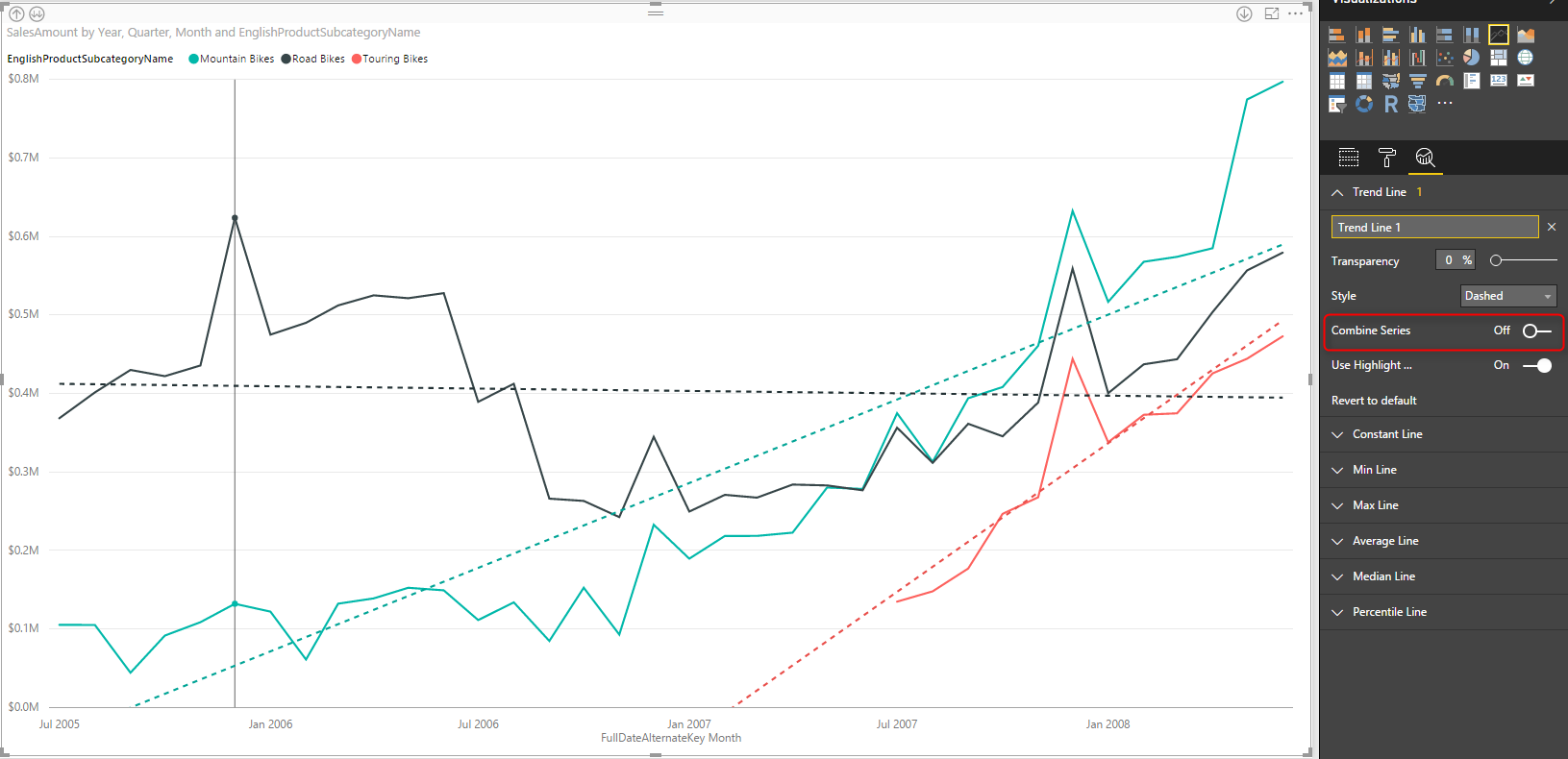
Trend Line by Category
Change the Combine Series option in the Trend Line setting to Off. You will see now a trend line per each subcategory. This is very useful visualization to see how each subcategory works. For example you can now simply see the sales amount for black solid line (road bikes) increased in last few months of the data, however it is still trending down (black dashed line). and the trend for other two subcategories is going upwards.
Analytics Tab
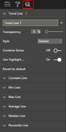
In Line chart (and few other charts) there is an Analytics tab that brings the power of adding extra insight, named Analytics Tab. In line chart we can have the extra insight as Trend Line, Constant Line(s), and Dynamic Reference Line(s). You have seen already how helpful a trend line is. next other lines are reference lines which can be useful to measure values in line chart and compare them to a reference value. Let’s dig more into it now.
Constant Line
A constant line is a constant value showed as a line. It is good for comparing the value line to a constant line. Here I have created a constant line for value $250000. and did some formatting for that and made it dotted.
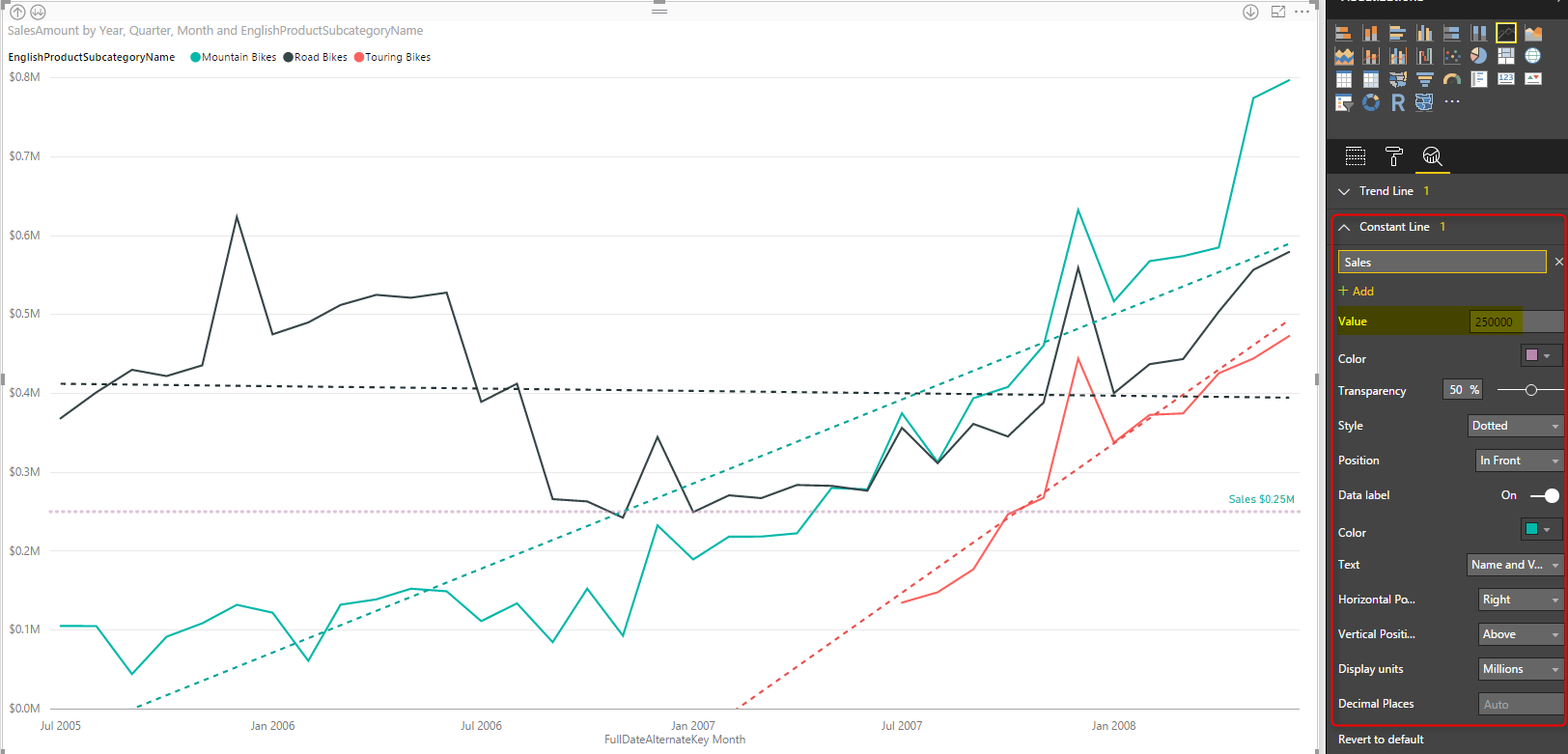
This is good to compare values with especially when we DO NOT want to drill down or up. The reason for that is that If I drill up one level, then because I am in quarter level most of values goes above this constant value. So normally constant line used when you have the main value as the Average, rather than sum or count.
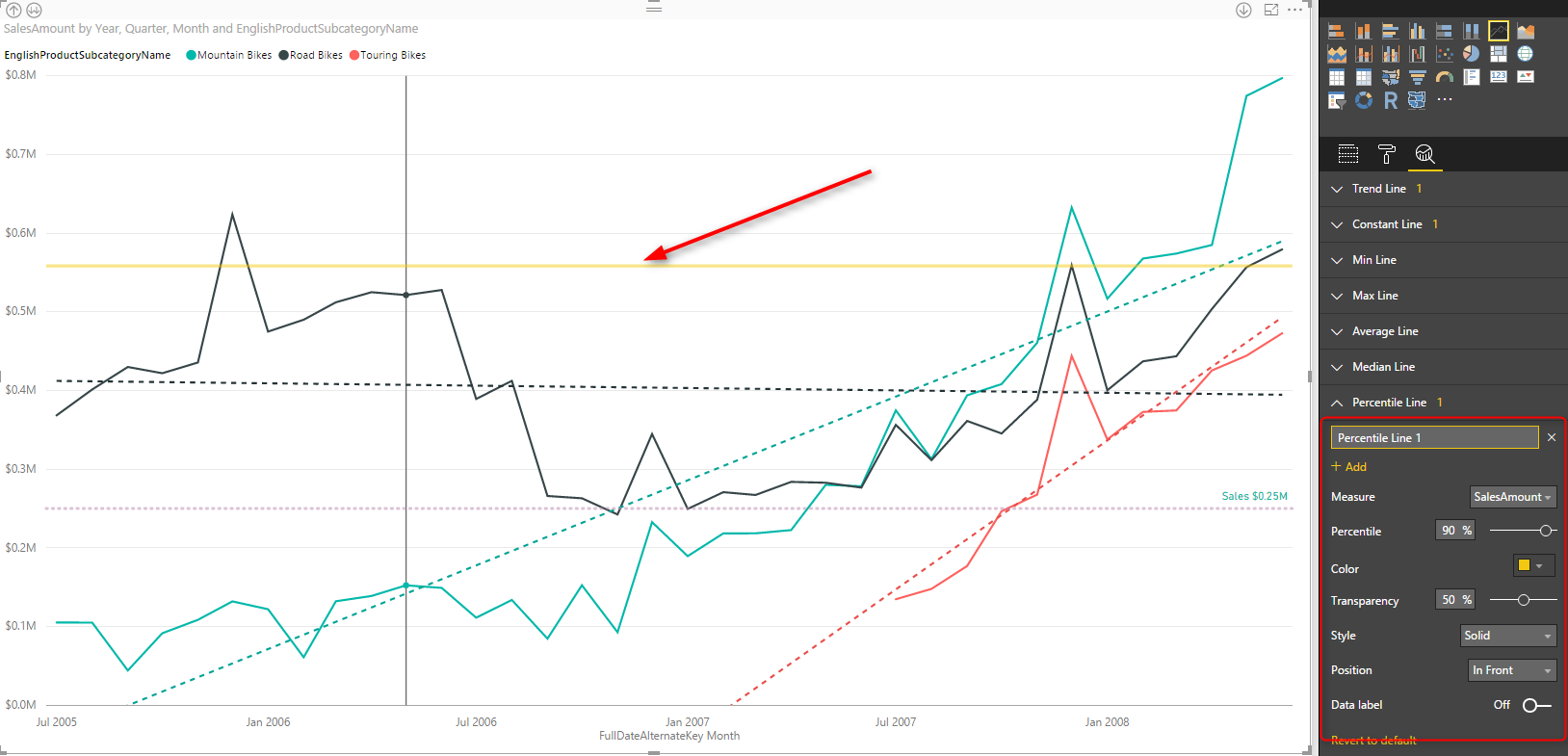
Dynamic Reference Lines
Constant line as you see above are not good when we drill down or up, because their value might not be close to compare with the value lines in that level. So dynamic reference lines are the substitute for such case. For example you can create an An average reference line, minimum, or maximum which works based on the level you are in, or filter applied, or what other slicers selected. This would be based on what data is showed in the value line. There are number of dynamic reference lines that you can create; Min, Max, Average, Median, and Percentile.
Percentile Line
You can simply add a percentage line, based on the percentage number you want. This can be percentage of one of measures viewed in the line chart.
Min, Max, Average, Median Lines
For adding any of these lines, just click add, set the formatting, name the line as something and then choose to show data labels with name and values or without it.
Do Not Overuse
Line Chart is a simple chart and there is a reason for this simplicity, to figure out values, trends, and analyze it with a quick glance. Adding more lines to it will add more insight obviously, but overusing it with adding all possible reference lines, trend lines, and multiple constant lines will make it a very busy line chart which then doesn’t convey the message as it should. Consider using this visualization in the best way, get benefit of reference and trend lines, but only when it adds value.


Reza is author of more than 14 books on Microsoft Business Intelligence, most of these books are published under Power BI category. Among these are books such as Power BI DAX Simplified, Pro Power BI Architecture, Power BI from Rookie to Rock Star, Power Query books series, Row-Level Security in Power BI and etc.
He is an International Speaker in Microsoft Ignite, Microsoft Business Applications Summit, Data Insight Summit, PASS Summit, SQL Saturday and SQL user groups. And He is a Microsoft Certified Trainer.
Reza’s passion is to help you find the best data solution, he is Data enthusiast.
His articles on different aspects of technologies, especially on MS BI, can be found on his blog: https://radacad.com/blog.
Power Bi is getting better every single month…But my suggestion to improve these new functionalities even more are:
1) Trend lines should have the option to define what type of regression we want to use – e.g. linear, exponential,etc.
2) The dynamic reference lines should have the option to define the # of periods for the calculation – So for instance we would be able to calculate moving averages of the last 3 periods….
Anyway, I love Power BI !!!
Thanks, Daniel
Hi Daniel,
Thanks for your suggestions, I suggest you put them under ideas.powerbi.com, when they get enough vote, MS Power BI team will start implementing them 🙂
at the moment these options are only possible through custom measures, which is not ideal for everyone.
Cheers,
Reza