
Power BI utilizes two built-in map charts; Map and Filled Map. Filled Map is a map that shows data points as Geo-spatial areas rather than points on map. Areas can be continent, country, region, state, city, or county. Working with Filled Map however isn’t as easy and convenient as the map chart is. You need to set the data category of fields in the data model appropriately to get the Filled Map working correctly. There are also some limitations in filled map with countries that address hierarchy is different from State, City, County. In this post I’ll get you through some tips of using filled map in your Power BI solution. I also show you some existing issues in the current version of filled map and things that you need to be aware of when you work with this visualization element.
The Good: How to Use Filled Map
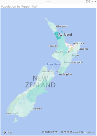
As I mentioned earlier working with filled map requires a bit more steps than the regular map. Let’s go through that with a real example; This Wikipedia page includes list of all regions in New Zealand with their population. So let’s create a filled map for this data to show areas with their population.

I can use Get Data -> From Web and use the URL of the Wikipedia page to explore the data set. I can remove some extra columns and rows in Query Editor window easily (If you don’t know how to work with Query Editor read the Power Query introduction part of this Power BI series). I also add a custom column called Full Region with the country name attached to the end of region name (because there might be another Auckland in another country which is not what I want to show in my map). So here is what I have at my query at the end:

Now if I directly use Region Full in a Filled Map, I’ll see an error message that says; More location data is required to create a filled map. Click to learn more.
Details: To create a filled map, the location data should include Bing Map-supported geographic data, such as country/region, state/province, or postal code.

Configuring a data field as a geographic field is easy; All I need to do is to go to Data Tab. click on my query, and then on my data field. Then from the Modeling tab under the Properties pane set Data Category to State or Province.

After the change when I get back to the Filled map I can see that it illustrates regions on the map nicely.
As you see in the Data Category options you can set the field to be Continent, Country/Region, State or Province, City, County, Post Code…. If you have the geographic values in your data set then you can easily map them to these data categories and filled map will draw them nicely for you.
The Ugly: When Geographic Structure is Different
I’m living in New Zealand (if you don’t know know it already ;)) and the geographic structure here is different from State, City, County. What we have is more like Country, Region, District, Suburb. for example: Country= New Zealand, Region= Auckland, District =Franklin, Suburb= Pukekohe. You’ve seen in example above that I used State or Province data category for Region and it worked fine. So I thought I can map District to the City data category as well, but Here is what I get when I map cities in Auckland to a City data category:

However when I change data category to County I get it working (not perfect though! there are some white spots in the map!);

and Here is the category I choose for it:

So as you see I have to play with to map my data fields to a data category which generates a result close to what it is. And as you see I don’t get a clean result. I see an area (Papakura) in the map above which is white (no data points) which should be drawn as part of one of Districts (Manukau City). I did a search on Google Map and Bing Map to see if they can show me boundaries of districts, and found out that they can’t. Here is what Google Map shows me:

And here is what the actual boundaries should be (from Wikipedia)

The orange area in map above is much bigger than the area mentioned in Google Map. So no wonder why Power BI shows some areas blank. So I can’t blame Power BI, because it seems to be related to the boundaries definition in Bing maps which is not up-to-date. However at the end of the day this won’t give me the result I’m looking for.
The Bad: When Data Category is Useless
Believe it or not, there are some situations that you can’t find any appropriate data categories to map to your geographic data field. This might not happen in USA geographic information, but I found it when I tried to go one level down to the Suburb level. The sad fact is that I couldn’t find a data category that maps to suburbs in some areas in New Zealand! Here is what I’ve done;

I’ve mapped suburbs to County because that was the lowest level I’ve found in data category for geographic information. (Place and Address cannot be used for Filled Map at the time or writing this post). and I got Nothing! Not event a small area on the map. I’ve tried then removing the district and putting suburb, region, country format with County as the data category which didn’t helped again.
I’ve found that I can map some locations based on Postal Code as you see below. However not Postal Code is not always good distinguishing field for a region, as multiple regions might have a postal code shared.

Then I tried to find Latitude and Longitude of each suburb in Bing Maps and use that for Filled Map, but I’ve found that Lat and Long fields in Filled Map isn’t working in the way they supposed to work!

There was no other method I could try to map suburbs with Filled Map unfortunately. So the sad end of this experiement is that with the current version of Filled Map I cannot show some suburbs with Filled Map.
Summary
Filled Map is good visualization element but it has some limitations. You can use it for areas which their boundaries are clear, such as Country, Region, States. However when geographic structure is different from built-in structure in Data Category types, then you might face some difficulties and won’t be able to generate the visualization you want. I hope Microsoft BI team fix issues related to this graph soon (And I believe they will, because they did a really good job in Power BI extensive improvement through past months). If you want to learn more about Power BI feel free to read rest of Power BI online book from Rookie to Rock Star.


Reza is author of more than 14 books on Microsoft Business Intelligence, most of these books are published under Power BI category. Among these are books such as Power BI DAX Simplified, Pro Power BI Architecture, Power BI from Rookie to Rock Star, Power Query books series, Row-Level Security in Power BI and etc.
He is an International Speaker in Microsoft Ignite, Microsoft Business Applications Summit, Data Insight Summit, PASS Summit, SQL Saturday and SQL user groups. And He is a Microsoft Certified Trainer.
Reza’s passion is to help you find the best data solution, he is Data enthusiast.
His articles on different aspects of technologies, especially on MS BI, can be found on his blog: https://radacad.com/blog.
Hi there, in the past when I was trying to map adresses when I used to live in South Africa I used to put in the full address in the format that bing maps would expect. Even though that might not be what it actually was.
I also would test the address in bing maps to make sure it would find the area as expected.
And then finally map the data category as suburb.
Maybe that could work.
Regards Gilbert
Hi Gilbert,
Thanks for your comment.
Yes, I’ve used Bing map as my source of truth for formatting. sometimes it works with city, state, country. sometimes only city, country…. however I did try those formatting and still couldn’t map some areas. It is perfectly fine when I do those with regular Map visualization. but filled map seems to be different.
Cheers,
Reza
Hopefully one day soon you’ll be able to import ShapeFiles into PowerBI
http://www.stats.govt.nz/browse_for_stats/Maps_and_geography/Geographic-areas/digital-boundary-files.aspx
May be it’s possible to use this shapes with “sinoptic panel”?
Hi Maxim,
Yes, Synoptic Panel can be very good substitute for filled map. Here is an example of that illustrated by Marco himself:
http://sqlblog.com/blogs/marco_russo/archive/2015/12/15/display-data-on-customized-maps-in-powerbi-also-offline-leveraging-svg-format.aspx
However creating SVG or finding it for all types of geo-location information such as suburb is not always easy.
Cheers,
Reza
Hi Reza,
I was running an example similar to your filled region map using my own data instead of the Wiki data and my NZ regions all populate fine except Bay of Plenty. I notice on your map that Bay of Plenty also isn’t coloured. PowerBI obviously recognizes that this area doesn’t belong to any of the other regions but it also doesn’t like BOP. Do you know what label might be used to get this filled in?
Thanks,
Uros
Hi Uros,
As you mentioned BOP area is not recognized in my Map. I didn’t found a way to name it somehow so map can recognize it, I haven’t actually tried much as well. So if you found something useful, please share here 🙂
Cheers,
Reza
Thanks for your reply Reza, I will keep you posted if I figure it out.
Finally figured it out! Label it as “Bay of Plenty Regional Council” and it will show up.
Great, Thanks Uros, Haven’t checked that yet. Will do as soon as I get some time. Thanks for sharing your valuable experience with community here 🙂
Cheers,
Reza
Hi there, re: BoP , I have an answer from Microsoft. It’s not great but it works.
It is known as “Bay of Plenty Region, NZ”. It works.
Note that “Bay of Plenty, New Zealand” does NOT work, nor will “Bay of Plenty, NZ”
Sorry and forgot to say “Bay of Plenty Region, New Zealand” will NOT work – YET.
Thanks Sam for the update. It seems Uros found a solution here, in comments section. I haven’t tried it yet, but it seems to work.
Cheers,
Reza
Great article. Thank you for share it!
Julián Castiblanco
Bogotá, Colombia
Having trouble understanding the article. Does you work around mean that we still need to provide the longitude and latitude columns ? Or are these functions the will download automatically. Also both formulas provided are slightly different.
Just want to be able to auto populate the columns based on the address so I can free up the location field to add more detail.
Thanks.
Hi Pedro,
What I meant at the end is not using Filled map especially with addresses that has different structure than USA. It sometime works, sometime doesn’t. I recommend using Shape Map instead. You can upload your own Shape file as JSON to it. Here are some information:
https://powerbi.microsoft.com/en-us/documentation/powerbi-desktop-shape-map/
Cheers,
Reza
Microsoft could decide to follow the international ISO-standard, incl. the sub-divisions
https://en.wikipedia.org/wiki/ISO_3166-2
2 Years later and it it now accepts Bay of Plenty Region after I set region to State or Province category. However, the filled map is horrible, it takes shortcuts across a lot of bays and do not follow the NZ coast line properly. These bays now appear as part of the NZ land mass
Thanks for the update Eugene,
Correct, I hardly use Filled Map for NZ mapping because of the same reasons. Shape map can be a much better replacement.
Cheers
Reza
Hi,
Given a set of coordinates (long and lat) representing a marine concession.
How can I successfully plot these in PBI?
The coordinates should be seen as a set of points connected with a line. Is this possible?
if you want to have a line drawn between points, you can use some of the custom visuals which have this ability. Route Map is one of those, and there are much more
Cheers
Reza