
In the last post, I have shown how you able to install an external package like ggplot2 in ML services and also you see how we can use data in SQL Server to create a chart in R studio.
In this post, I am going to show you how to create a chart in SQL Server an show in SSRS.
to create a chart
we need:
1-create a chart as var binary variable
exec sp_execute_external_script  @language =N'R',
@script=N'library("ggplot2")
fields<-inputDataSet
fields<-na.omit(fields)
image_file = tempfile();
jpeg(filename = image_file, width=1000, height=1000);
print(ggplot(fields,aes(x=fields$TaxAmt,y=fields$TaxAmt))+geom_boxplot()+facet_grid(fields$Color~.)
)
dev.off();
OutputDataset <- data.frame(data=readBin(file(image_file,"rb"),what=raw(),n=1e6))
',@input_data_1 =N'select Color,Size,class,TaxAmt,SalesAmount
from [dbo].[FactInternetSales] FIS inner join
[dbo].[DimProduct] DP on FIS.ProductKey=dp.ProductKey'
,@input_data_1_name = N'inputDataSet'
,@output_data_1_name = N'OutputDataset'
WITH RESULT SETS ((plot varbinary(max)));
1- run external scripts already mentioned in the last posts
2- @script=N’library(“ggplot2″)
fields<-inputDataSet
fields<-na.omit(fields)
image_file = tempfile();
jpeg(filename = image_file, width=1000, height=1000);
print(ggplot(fields,aes(x=fields$TaxAmt,y=fields$TaxAmt))+geom_boxplot()+facet_grid(fields$Color~.)
)
dev.off();
OutputDataset <- data.frame(data=readBin(file(image_file,”rb”),what=raw(),n=1e6))
‘,
ibrary(“ggplot2”) : refer to the package
fields<-inputDataSet: get the data
image_file = tempfile();
jpeg(filename = image_file, width=500, height=500); to create image file
ggplot(fields,aes(x=fields$TaxAmt,y=fields$TaxAmt))+geom_boxplot()+facet_grid(fields$Color~.)
: code has been explained in last posts.
dev.off(); OutputDataset <- data.frame(data=readBin(file(image_file,”rb”),what=raw(),n=1e6)) ‘, : for creating a var binary variable to convert the plot into a varibale with binary type.
3- @input_data_1 =N’select Color,Size,class,TaxAmt,SalesAmount from [dbo].[FactInternetSales] FIS inner join [dbo].[DimProduct] DP on FIS.ProductKey=dp.ProductKey’ ,@input_data_1_name = N’inputDataSet’ ,@output_data_1_name = N’OutputDataset’
input data collected from sql server adatbase “Adventureworks”
4- WITH RESULT SETS ((plot varbinary(max)));
return the plot as format of binary variable
after run the code we may get the bwlow result

after the run, you will see in the output, we have a binary result.
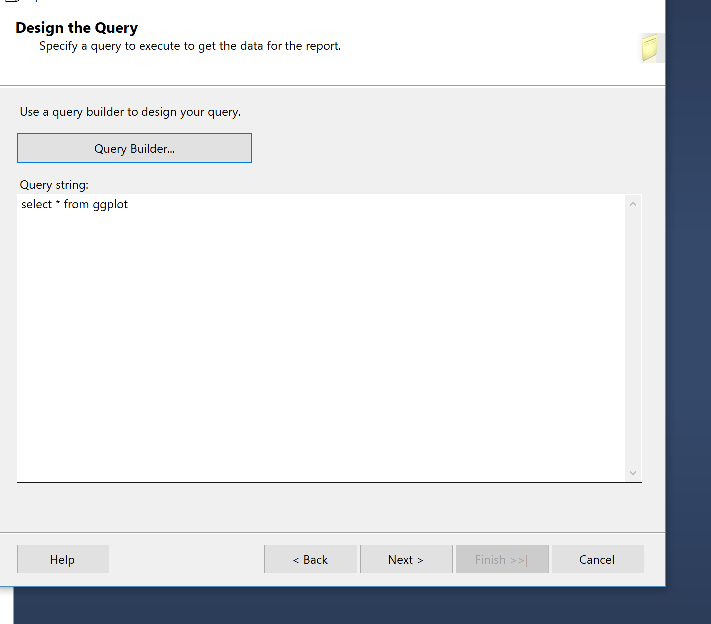
2- Store Plot in a table
just create a table with the name of ggplot
IF NOT EXISTS (SELECT 1 FROM sys.objects
				WHERE	object_id = OBJECT_ID(N'[dbo].[ggplot]')
					AND [type] IN (N'U'))
BEGIN
	alter TABLE [dbo].[ggplot](
		[plot] [varbinary](MAX) NULL
		);
END
now you able to put the plot into the table by insert command as below
insert into [dbo].[ggplot]
exec sp_execute_external_script  @language =N'R',
@script=N'library("ggplot2")
fields<-inputDataSet
fields<-na.omit(fields)
image_file = tempfile();
jpeg(filename = image_file, width=1000, height=1000);
print(ggplot(fields,aes(x=fields$TaxAmt,y=fields$TaxAmt))+geom_boxplot()+facet_grid(fields$Color~.)
)
dev.off();
OutputDataset <- data.frame(data=readBin(file(image_file,"rb"),what=raw(),n=1e6))
',
@input_data_1 =N'select Color,Size,class,TaxAmt,SalesAmount
from [dbo].[FactInternetSales] FIS inner join
[dbo].[DimProduct] DP on FIS.ProductKey=dp.ProductKey'
,@input_data_1_name = N'inputDataSet'
,@output_data_1_name = N'OutputDataset'
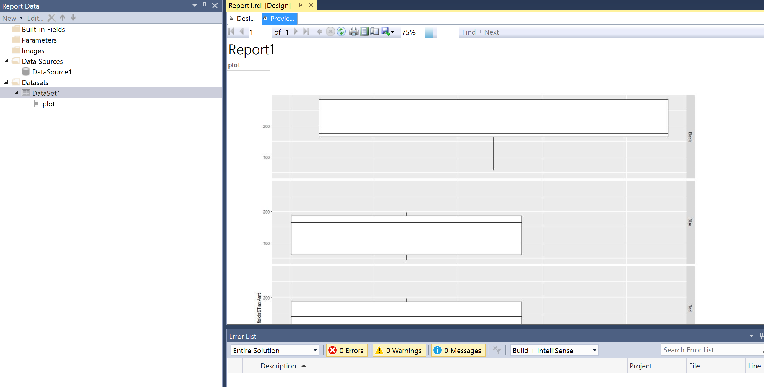
Now we able to show the chart in SSRS.
Show chart in SSRS
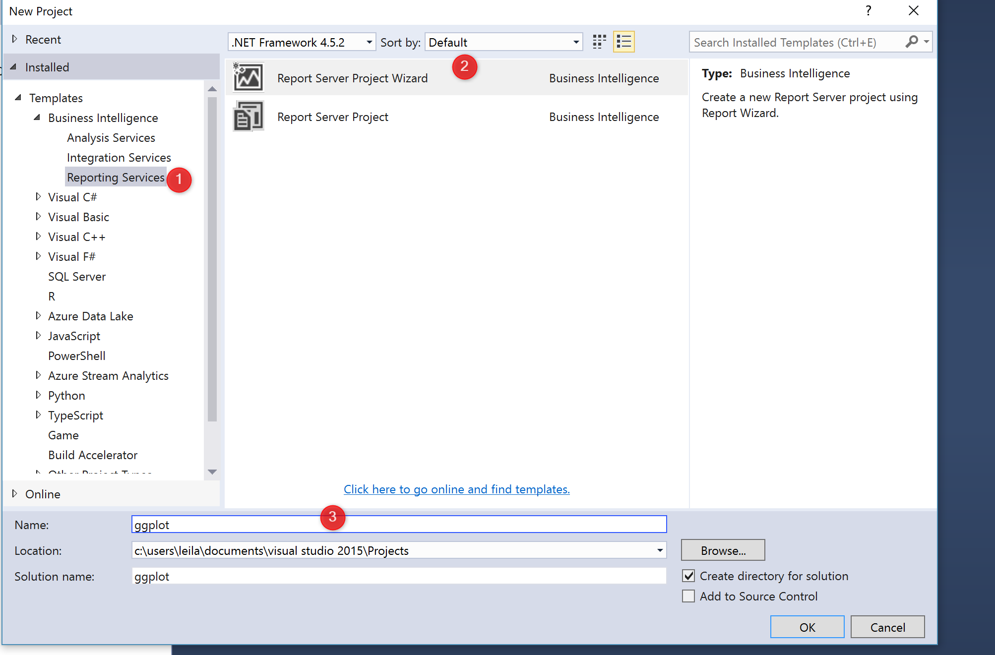
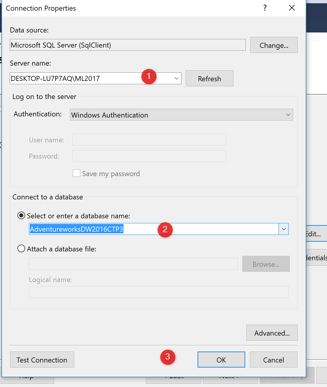
you need to have a SQL Server Data tools to create an SSRS report.
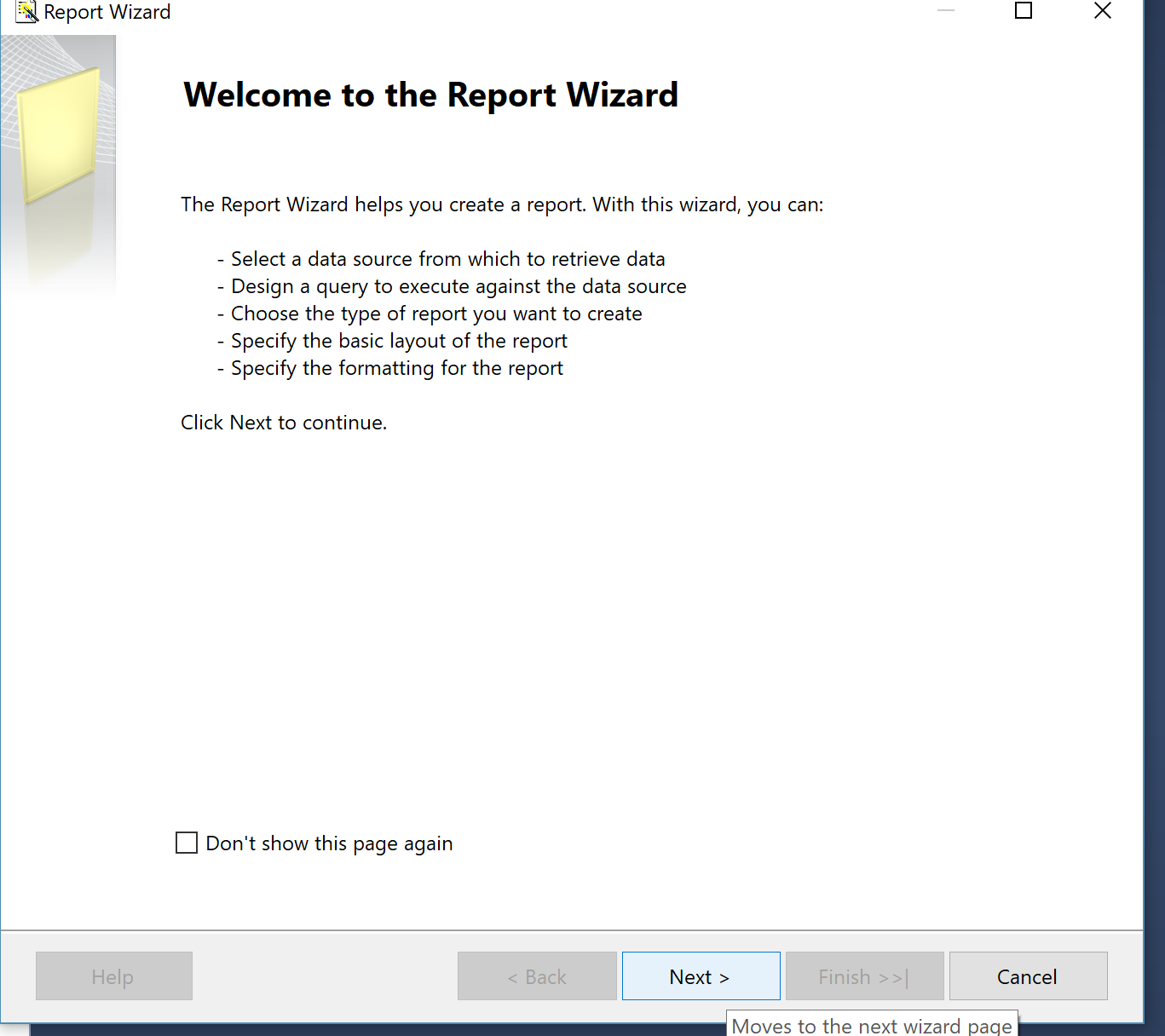
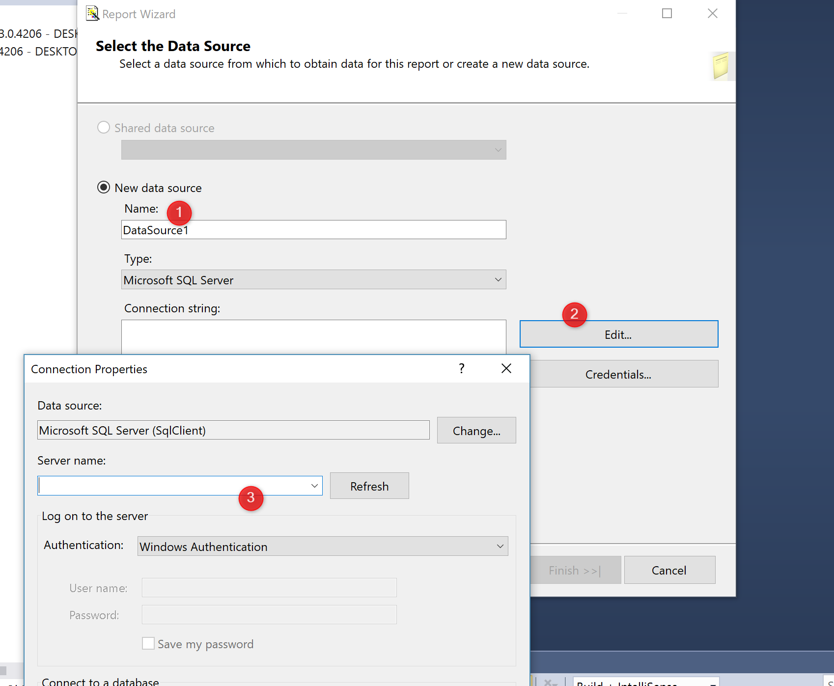
1- create SSRS project

then

after that just click on the desing area, and choose the image option

after inserting the image, the image menue needs to be set up by assigning the required fields.
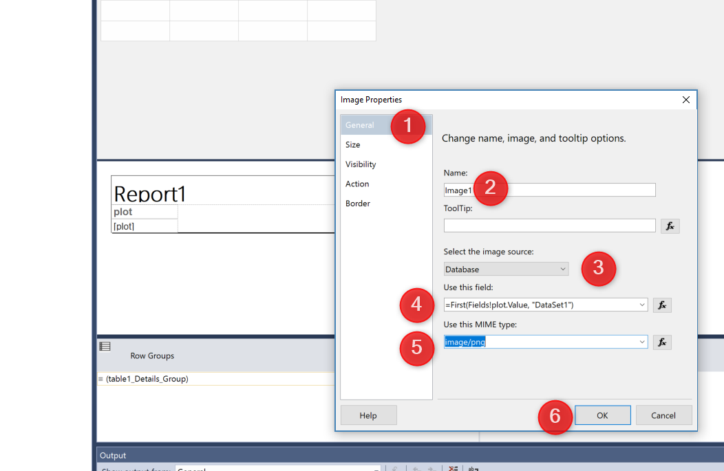
In the filds, we need to identify the source of the image (see above picture) that is from databse, the fileds and the type of the image (png, jpg so on). Finally just click on the “preview option tosee the image”
any pictures can be put in the SSRS report. from decision tree, clustering and so forth, moreover, this process can be seen as a way to extend the SSRS visualization capability.


