
If you have a visual in the Power BI, that based on some selections of a slicer it might return nothing, depends on the visual, you might get a blank visual, or some other types of improper view. In this blog, I share a simple trick that you can use to have an alternate message in those scenarios.
The problem
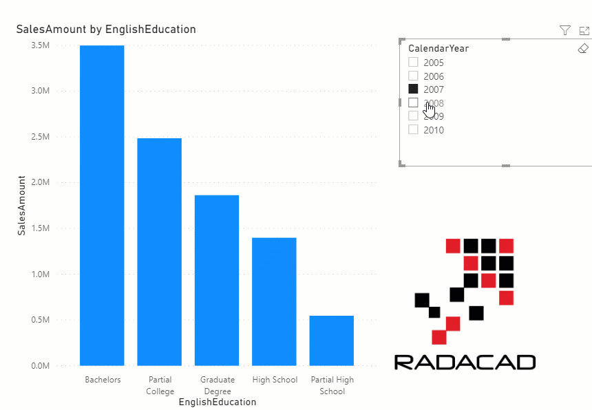
Assume that we have a column chart visual with a slicer besides it;
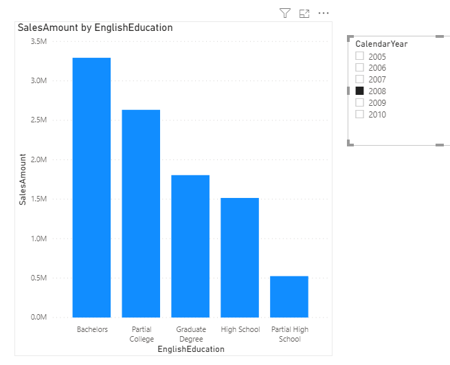
The normal behavior of a chart (column chart, bar chart, etc), when there is no data available, is more likely to not show anything, like below:
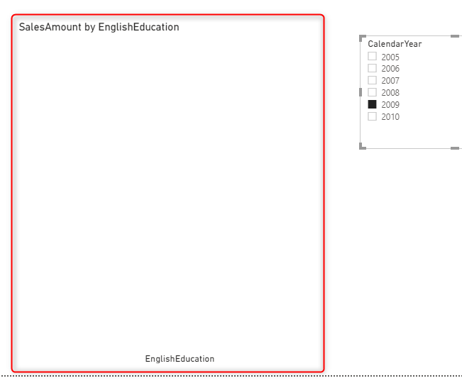
For some, this is not a great representation, and you might consider showing a proper message in that blank area. Something like this would be great;
Now let’s see how you can do that.
Create a measure for no data
The first step is to create a measure that checks if for the selection criteria is there a value or not, and based on that returns a message. This is the measure calculation I used;
No data = if(ISBLANK(SUM(FactInternetSales[SalesAmount])),"No data for the selected criteria","")
Create a card visual overlay
The next step is to create a card visual overlay on top of the column chart, and the card visual to show the measure’s value;
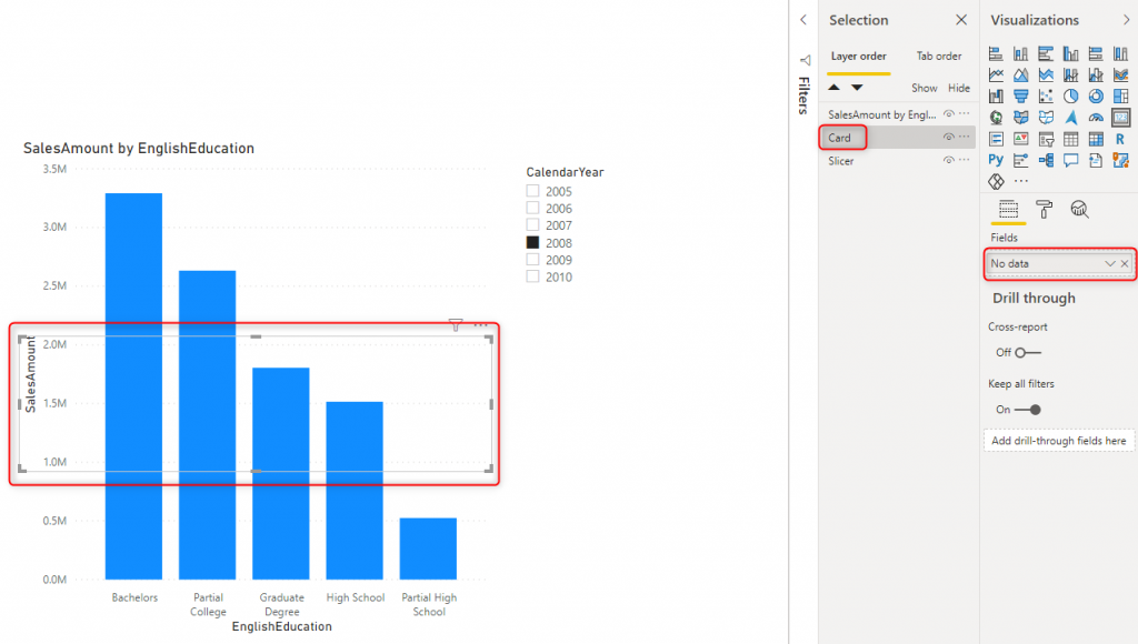
Because this card is the card that shows the error message, you might want to make the font color of that Red.
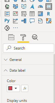
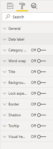
Turn off most of the visual properties
Turn off the category label, the background, visual headers, border etc. to make it just a pure text in the report.
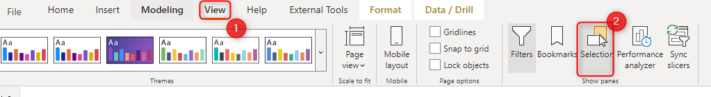
Selection pane
As you can see in the screenshots above, I have opened the Selection pane on the Power BI desktop. This pane is very helpful when you have visuals overlaying on top of each other. It helps easier selecting them. To open the selection pane, click on the Selection under the View tab;
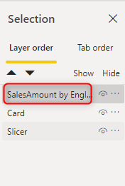
Set the Layout order
If the card is added on top of the column chart, then it is very likely that you get the card visual selected every time you want to click on a column, and this can be bothering the user a lot. You can change the order in the selection pane and bring the column chart at the top;
That’s it!
That’s all. now you can click on the slicer and see the impact in your report. I hope this simple solution helps you to have better visualizations.
Video


Reza is author of more than 14 books on Microsoft Business Intelligence, most of these books are published under Power BI category. Among these are books such as Power BI DAX Simplified, Pro Power BI Architecture, Power BI from Rookie to Rock Star, Power Query books series, Row-Level Security in Power BI and etc.
He is an International Speaker in Microsoft Ignite, Microsoft Business Applications Summit, Data Insight Summit, PASS Summit, SQL Saturday and SQL user groups. And He is a Microsoft Certified Trainer.
Reza’s passion is to help you find the best data solution, he is Data enthusiast.
His articles on different aspects of technologies, especially on MS BI, can be found on his blog: https://radacad.com/blog.
So easy to do and it works wonderfully. Thank you!