
Visualization is any kind of graphical representation that enable us to:
Exploration, it help us to get more deep insight through huge amount of data
Discovery, It also gives extra vision
Analysis, it can be used to find pattern
Communication, visualization help us to communicate better
A few years ago Dr. Andrew Abela published a good diagram helping to decide about which chart are a better fit for a given data and problem at hand.
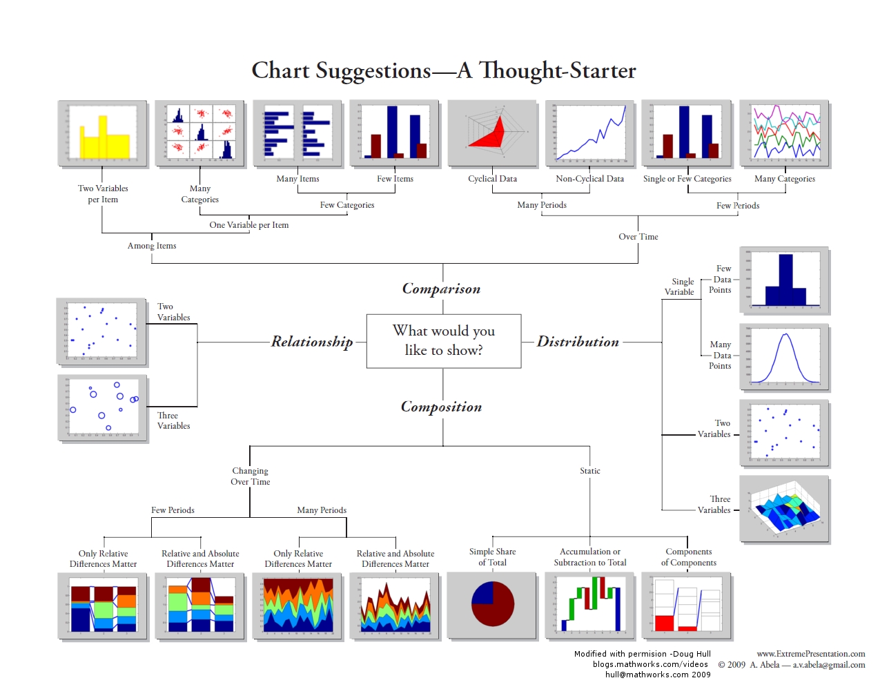
This chart manily focused on the main four purposes that we do visualization.
1-Comparison– is about comparision regarding the items or regarding the time.
2-Distribution-is about the finding distribution of single varibale, two-variable, and three variables.
3-Relationship-is about the finding relationship among items
4-Composition-finding data composition over time or static
Most of these charts are avilabe in Power BI, however some of them are not,
Comparison, can be comparing items overtime, or among items.
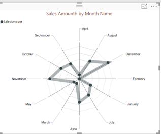
For comparision over time, sometimes we prefer to compare items for many periods. Power BI there is a chart name “Radar Chart”. Below picture shows the radar chart, we can see the Radar chart that shows the sales amounth by month name. and this sales amounth will repeated.
for comparing the non-cyclical data for many periods. we able to use “Line Chart”.

for comparison over time, and for few periods we able use “Clustered Column Chart” or “Line Chart”.
another type of comparison is comparison among items. for Two-Variable per items we can use columnwith chart that I have explained in Column Width Chart post.
For comparision, one-variable per items, we can use many categories or few categories. for few categories if there is lots of items we can use “Stacked Bar Chart”. or if there is few items we can use “Stacked Column Chart”.
However for comparing one variable per items and for different categories we need a chart that is not exist in Power BI yet the name is “Table with Embeded Chart “.
I am going to create a custom visual for this chart.
I followed the steps from Post, to create a custom visual, so in the “script.r” I have wrote the below codes
source('./r_files/flatten_HTML.r')

############### Library Declarations ###############
libraryRequireInstall("ggplot2");
libraryRequireInstall("plotly")
library("plotly")
library("ggplot2")
library("htmlwidgets")
library("reshape2")
####################################################
df<-data.frame(Values)
g<-ggplot(df,aes(z,x,fill=as.factor(y)),angle=45,size=16)+
  geom_bar(position="dodge",stat="identity") +facet_wrap(~z,nrow=3)


############# Create and save widget ###############
p = ggplotly(g);
internalSaveWidget(p, 'out.html');
as you see in above code I need to have two different libraries : “ggplot2” and “reshape2”.
however, there is a possibility to drwa it in R visual section in Power BI
by writting the below codes
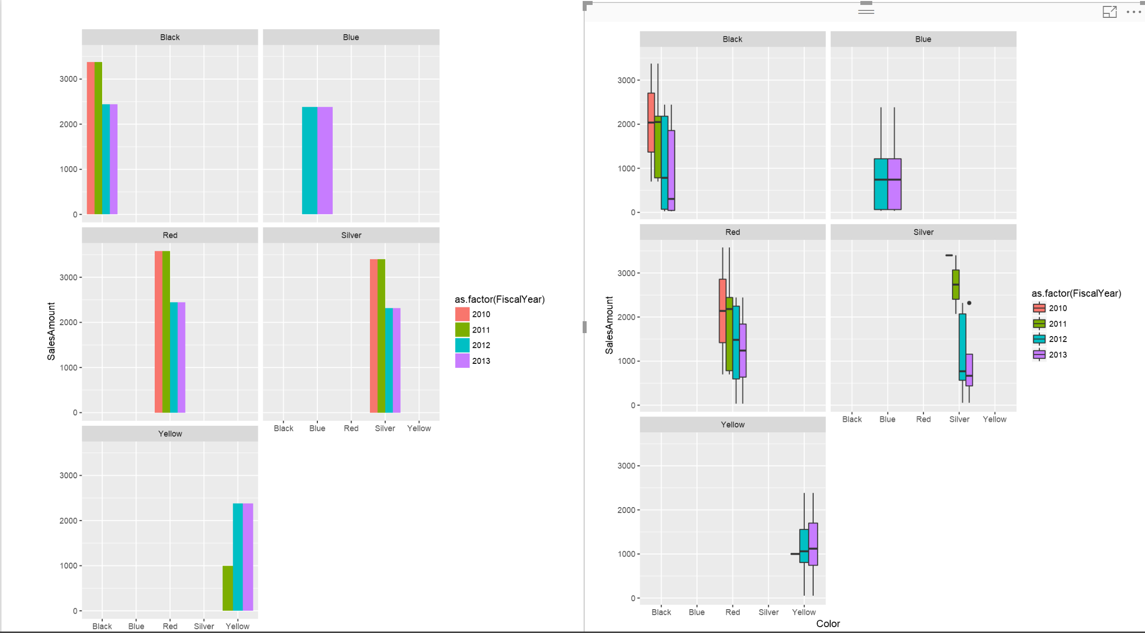
library(reshape2) library(ggplot2) df<-data.frame(dataset) ggplot(df,aes(Color,SalesAmount,fill=as.factor(FiscalYear)),angle=45,size=16)+ geom_bar(position="dodge",stat="identity") +facet_wrap(~Color,nrow=3)#+labs(title = âExpence on productsâ, x = âType of Productsâ, y = âValuesâ)
in this chart I am going to use the “Adventure works dataset” for showing the sales amonth for different products color and also for different year.
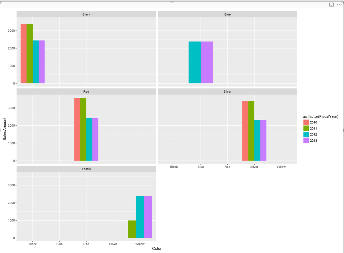
In the above chart. I have shown the product sales for different years and for different product colors.
I can change the type of the chart type to different one like “Box Plot” to show the data distributions.
library(reshape2)
library(ggplot2)
df<-data.frame(dataset)
ggplot(df,aes(Color,SalesAmount,fill=as.factor(FiscalYear)),angle=45,size=16)+
geom_boxplot()+facet_wrap(~Color,nrow=3)#+labs(title = âÂÂExpence on productsâÂÂ, x = âÂÂType of ProductsâÂÂ, y = âÂÂValuesâÂÂ)
then I have below picture
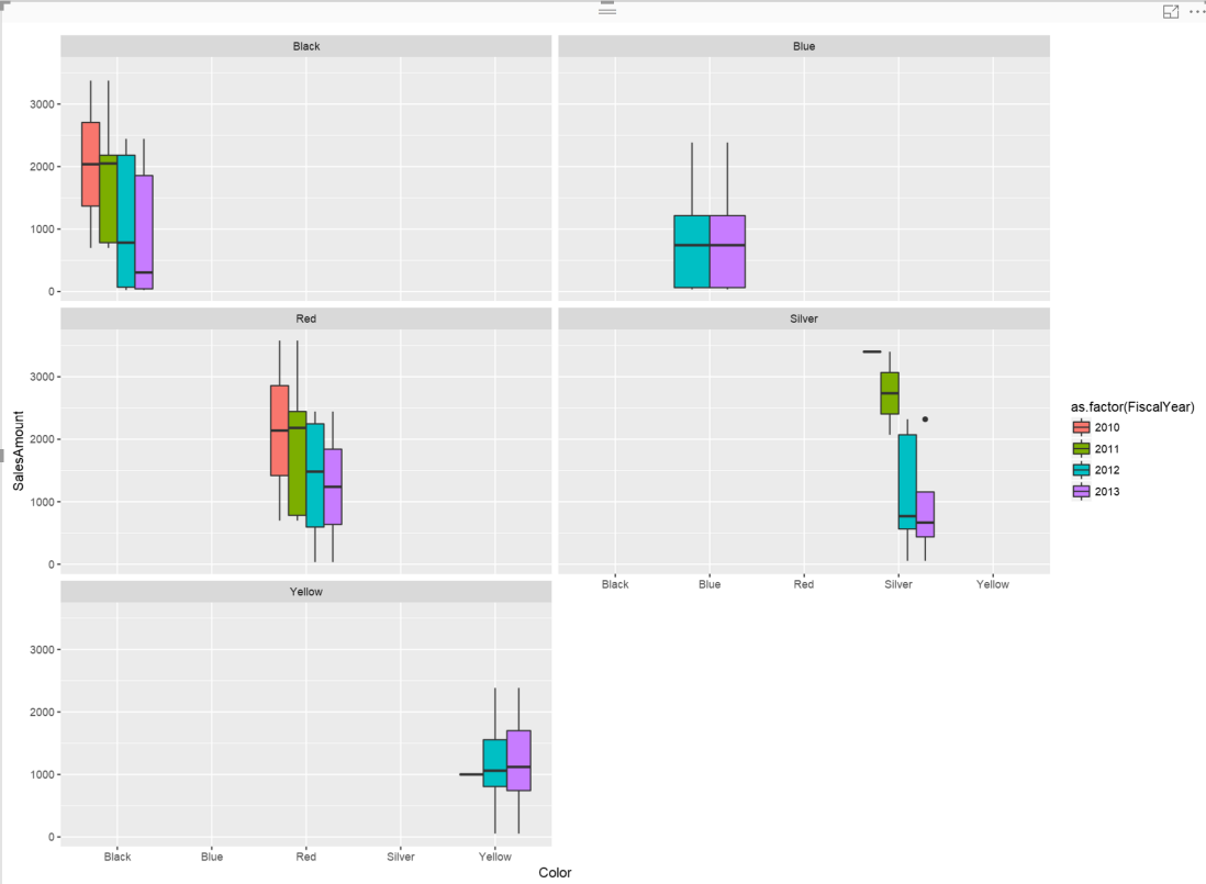
in above picture, as you can see, we have sales amounth distribution for different year (color) and different product colors.


