Interactive Charts using R and Power BI: Create Custom Visual Part 3

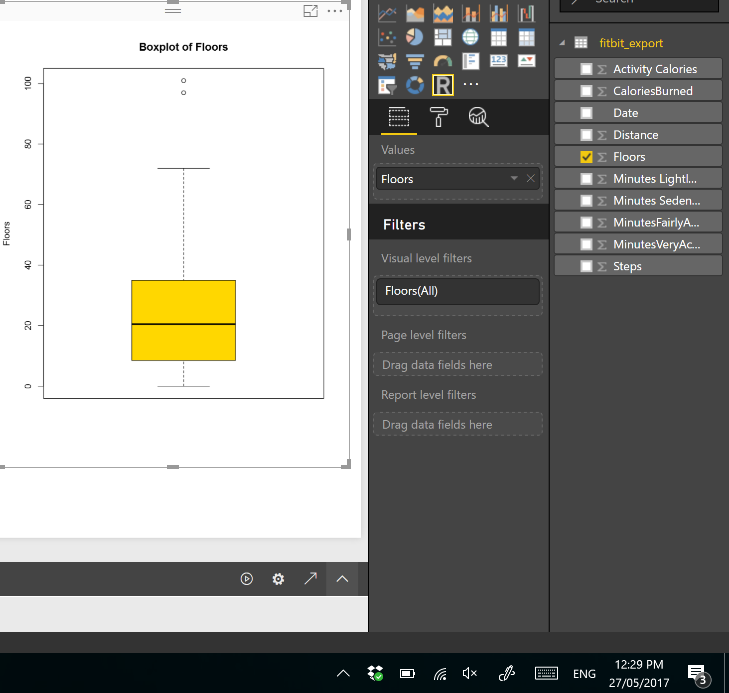
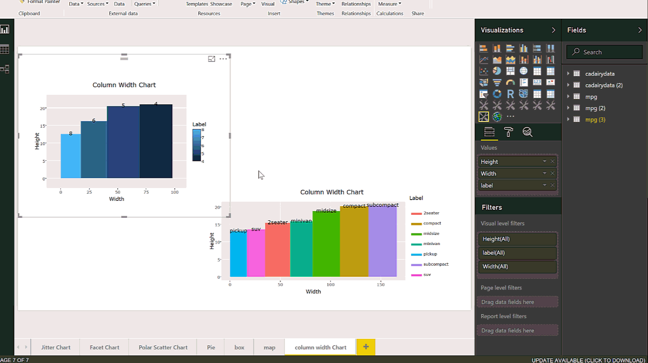
In the last two posts (Part 1 and 2), I have explained the main process of creating the R custom Visual Packages in Power BI. there are some parts that still need improvement which I will do in next posts. In this post, I am going to show different R charts that can be used Read more about Interactive Charts using R and Power BI: Create Custom Visual Part 3[…]

Visualizing numeric variables in Power BI – boxplots -Part 1

In this post and next one, I am going to show how to see data distribution using some visuals like histogram, boxplot and normal distribution chart. It always important to have a holistic perspective regarding the minimum, maximum, middle, outliers of our data in one picture. One of the chart that helps us to have a Read more about Visualizing numeric variables in Power BI – boxplots -Part 1[…]