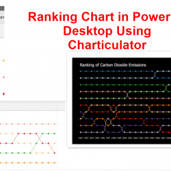
Ranking Chart in power BI Desktop Using Charticulator
Regarding using Charticulator for creating custom visuals, I come across one of the visuals in the Charticulator gallery and I decided to follow it up to see how it created. So I manage to create a dataset that has ranking, name and amount. https://charticulator.com/gallery/co2_emission_ranking.html In this example, I am using Carbon dioxide emission data for Read more about Ranking Chart in power BI Desktop Using Charticulator[…]