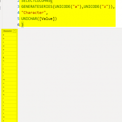
How to Resolve Publish to Web Error Message: Contact Your Admin to Enable Embed Code Creation

If you tried the option Publish to Web in Power BI recently, you might have seen the error saying “Contact Your Admin to Enable Embed Code Creation”. In this blog post, I am going to talk about why you see this error message, what is the reason behind it, and how to get it resolved. Read more about How to Resolve Publish to Web Error Message: Contact Your Admin to Enable Embed Code Creation[…]

Move Measures to Another Table in Power BI

The ability to move measures from one table to another table exists in Power BI, However, the process is not familiar for many users. Through my consulting and training work I have explained it to many of my clients. The process is simple and much better than re-creating the measure again and deleting the old Read more about Move Measures to Another Table in Power BI[…]

Replace BLANK with Zero in Power BI Visuals Such as Card

If you use a field in a visual and based on a combination of slicer selection, that field doesn’t have any value, you might see blank in the visual. If you want to replace that blank to zero, here is a trick for you. a very simple trick that you can use anywhere easily. Sample Read more about Replace BLANK with Zero in Power BI Visuals Such as Card[…]

Find a Text Term in a Field in Power BI Using DAX Functions

In Power BI, there are multiple ways of searching for a text term inside a text field, you can use Power Query for doing this operation or calculations in DAX. In this post, I’ll explain some functions in DAX that you can use to do this calculation. Most of these functions can be used inside Read more about Find a Text Term in a Field in Power BI Using DAX Functions[…]

Combine Multiple or All Sheets from an Excel File into a Power BI solution Using Power Query Dynamically

Combining multiple files from one folder is already supported built-in through the graphical interface of Power Query when use you Get Data from Folder. However, if you have one Excel file, with multiple sheets with the same structure but different data, you cannot use that option. There is a very little but useful trick that Read more about Combine Multiple or All Sheets from an Excel File into a Power BI solution Using Power Query Dynamically[…]

Say No to Export Data, Yes to Analyze in Excel: Power BI and Excel Can Talk!

Despite the fact that I have explained about the Analyze in Excel feature in Power BI before, still, I hear and see many users are using the Export data option in Power BI much more. In this post, I am explaining what is the difference and why it is better to use Analyze in Excel Read more about Say No to Export Data, Yes to Analyze in Excel: Power BI and Excel Can Talk![…]

Calculating Stock on Hand Using DAX: Power BI Inventory Model

You don’t have always the luxury of having a snapshot fact table that has the stock on hand value for every single day, at every single workshop, and for every single product. Even if you want to build such a table, it can get easily gigantic. In this blog post, I am going to show Read more about Calculating Stock on Hand Using DAX: Power BI Inventory Model[…]

Removing the Total Value for a Column in the Table Visual of Power BI Using ISFILTERED

Table visual is one of the most commonly used visuals. In Power BI, you can turn off the total row (when it won’t make sense to have the total) entirely. However, you cannot turn off the total for some columns and keep it working for the others. Using a DAX function, you can, however, do Read more about Removing the Total Value for a Column in the Table Visual of Power BI Using ISFILTERED[…]

Sentiment Colors for Gauge Visual in Power BI

Gauge Visual is a great visual for KPIs, however, the Gauge visual in Power BI doesn’t have the sentiment colors as an option. Sentiment colors make a gauge much more understandable, you can easily find out is the value high, low, or in the mid-range. Fortunately, there is conditional formatting that can help. In this Read more about Sentiment Colors for Gauge Visual in Power BI[…]

Compare Period Over Period Breakdown in Power BI Using the Waterfall Chart

The Waterfall chart is a good visualization to show you changes on value over a sequence, The sequence can be time, or date or workflow steps, etc. There is also an ability in this chart that may not be visible to everyone, and that is the breakdown option of this chart. You can use the Read more about Compare Period Over Period Breakdown in Power BI Using the Waterfall Chart[…]