Get the Day of the Week Name and Number in Power BI Using DAX
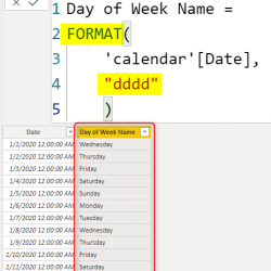
If you don’t have a date table with a column that represents the day of the week name (Saturday, Sunday, Monday etc) or number (from zero to six, or from one to seven), and you just have a date field, which you want to quickly get the day name of the week, here is a Read more about Get the Day of the Week Name and Number in Power BI Using DAX[…]