Generating Row Number in Power BI Visualization Using DAX

I have previously explained how to generate a row-number using Power Query. That method is good for pre-calculating row-numbers in the table. However, sometimes, you want to calculate the row number in a visual, based on something dynamic. That is where DAX comes handy. Let’s see how this is possible. Sample model I have a Read more about Generating Row Number in Power BI Visualization Using DAX[…]

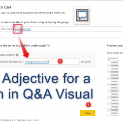
Q&A Visual – Define an Adjective for a Column

In the last post, I have explained how to work with Q&A visual . There is a way to define terms for the Q&N visual. There are two main terms Adjective Define an explanation for a column using a Measure. We able to define a measure as adjective for each columns of data. Columns Define Read more about Q&A Visual – Define an Adjective for a Column[…]

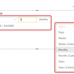
Relative Date Slicer in Power BI; Simple, yet Powerful

If you are using a date slicer in your Power BI report, a relative date slicer is one of the options to consider for sure. This is a very simple type of slicer to use, but very effective in terms of options that it provides for the user to slice and dice the data. Let’s Read more about Relative Date Slicer in Power BI; Simple, yet Powerful[…]

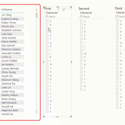
Search for All the Texts in Power BI Table Visual with the First Three Characters Selected in the Slicer

Yesterday, I published a post about having a slicer that filters the rows in a table visual in Power BI that contains the characters from that slicer. A friend asked me what if we want to search for the first few characters? that means selecting the first character, then seeing all the possible second characters, Read more about Search for All the Texts in Power BI Table Visual with the First Three Characters Selected in the Slicer[…]

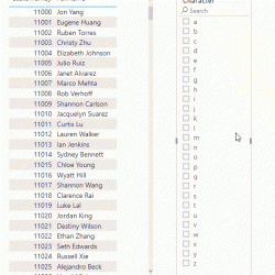
Search in Power BI Table Visual Using a Slicer For Contains Character Criteria

If you have a lot of text in a table visual in Power BI and want to search to find all texts with a specific character in it, I have a solution for you. You can have an alphabet slicer and use it to filter the table visual, the trick is to combine it with Read more about Search in Power BI Table Visual Using a Slicer For Contains Character Criteria[…]

Page Navigation Buttons in Power BI

Previously, to create page navigation in Power BI, you needed to create bookmarks, and buttons to action to that bookmark. However, recently, in the last version of Power BI Desktop, the ability to easily navigate to other pages using Buttons in announced. In this short article, I’ll explain how you can use this approach to Read more about Page Navigation Buttons in Power BI[…]

Change The Font Size or Color Across All Visuals and Pages in a Power BI File

You can change the font size of a visual easily by going to the format option of that. However, if you want to change it for multiple visuals, better to use Themes for it. Recently Power BI Desktop came up with some easy-to-use options to customize your theme. That means you can now easily increase Read more about Change The Font Size or Color Across All Visuals and Pages in a Power BI File[…]

Replace BLANK with Zero in Power BI Visuals Such as Card

If you use a field in a visual and based on a combination of slicer selection, that field doesn’t have any value, you might see blank in the visual. If you want to replace that blank to zero, here is a trick for you. a very simple trick that you can use anywhere easily. Sample Read more about Replace BLANK with Zero in Power BI Visuals Such as Card[…]

Removing the Total Value for a Column in the Table Visual of Power BI Using ISFILTERED

Table visual is one of the most commonly used visuals. In Power BI, you can turn off the total row (when it won’t make sense to have the total) entirely. However, you cannot turn off the total for some columns and keep it working for the others. Using a DAX function, you can, however, do Read more about Removing the Total Value for a Column in the Table Visual of Power BI Using ISFILTERED[…]

Sentiment Colors for Gauge Visual in Power BI

Gauge Visual is a great visual for KPIs, however, the Gauge visual in Power BI doesn’t have the sentiment colors as an option. Sentiment colors make a gauge much more understandable, you can easily find out is the value high, low, or in the mid-range. Fortunately, there is conditional formatting that can help. In this Read more about Sentiment Colors for Gauge Visual in Power BI[…]