
Small multiple is a relatively recent feature on some of the Power BI visuals. This feature enables you to have a much better visualization instead of trying to fit everything in one visual (over-complicate it) or create copies of the same visual (maintenance issue in the future). This is a simple feature to use, which was previously available on the Infographic designer visual, now available to use on column charts, line charts, area charts, bar charts, and combo charts. Let’s see how this can help you to have a better visualization.
Video
Requirement
To best understand how the small multiple works, let’s go through an example. Suppose that we have the visual below;
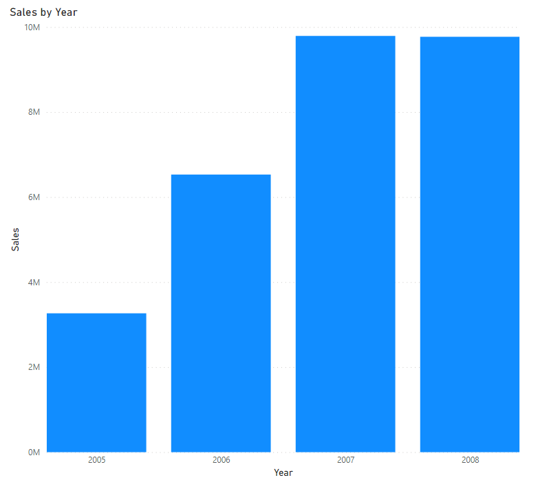
It shows the Sales by year, and obviously, you can see that the sales are growing from 2005 to 2007, but the sales value in 2007 and 2008 is almost the same. In the visual above, there is no mention of what type of customer. I’d like to know if the type of customers, or more specifically their education category, derives a different behavior through the years or not. In other words, I want to see how the sales pattern is through the years, but for all education categories. We have five education categories in the customer’s table.
Over-complicated visual
If I add that as a legend to this chart, it becomes very complicated like below;
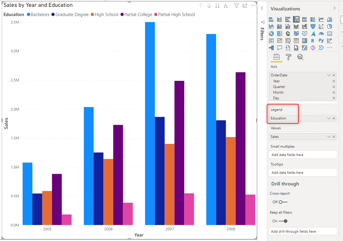
The visual above works fine, but it is not easy to understand, so many columns/bars and values. A golden rule to have a good visualization is to keep it simple but informative. This is not simple.
Hard-to-maintain copies
One other approach is creating five copies of the same visual and filtering each for one of the education categories.
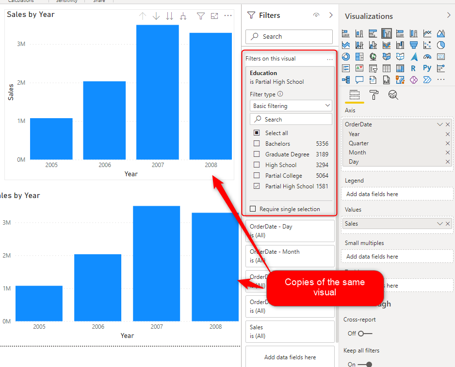
This method works, and it is much simpler to understand than the prior method. However, there is a high cost of maintaining this report. Every time I want to change something in the visual, I have to do it for all the five charts! This is not a maintainable solution.
This means creating a separate title or label for each visual, setting a separate filter on each visual, and much more settings. The maintenance cost of this second method is normally a blocker for many developers. They go back to using the first method, which means not having a good visualization and report for their users to understand.
Small Multiples
Small multiple is an answer to the requirement above. Small multiples will create copies of that chart by every value of the education column, but they are still part of one visual. This means if you change a property of the visual, it changes for all the copies (or, let’s say, multiples). And it is easy to understand at the same time.
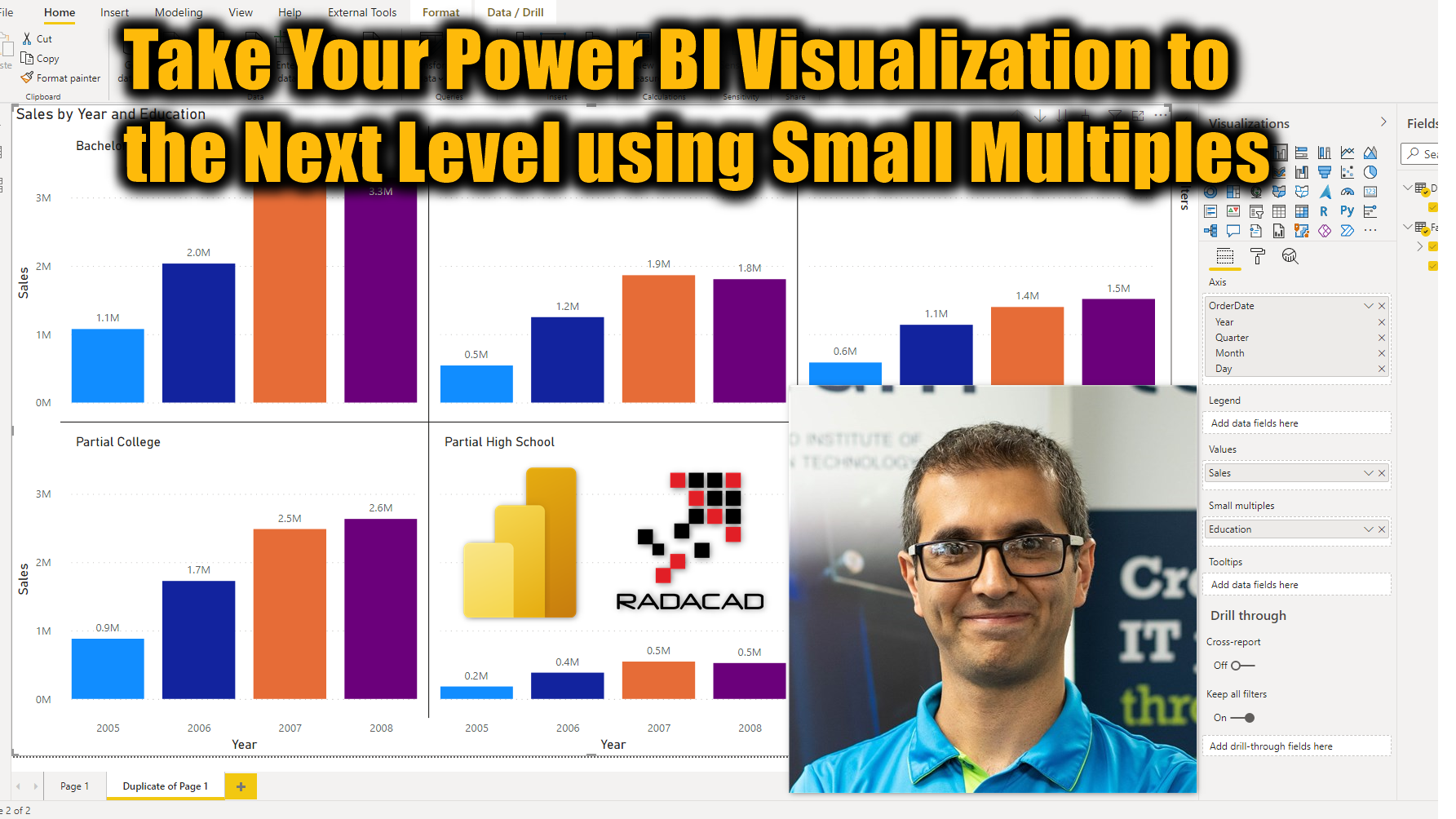
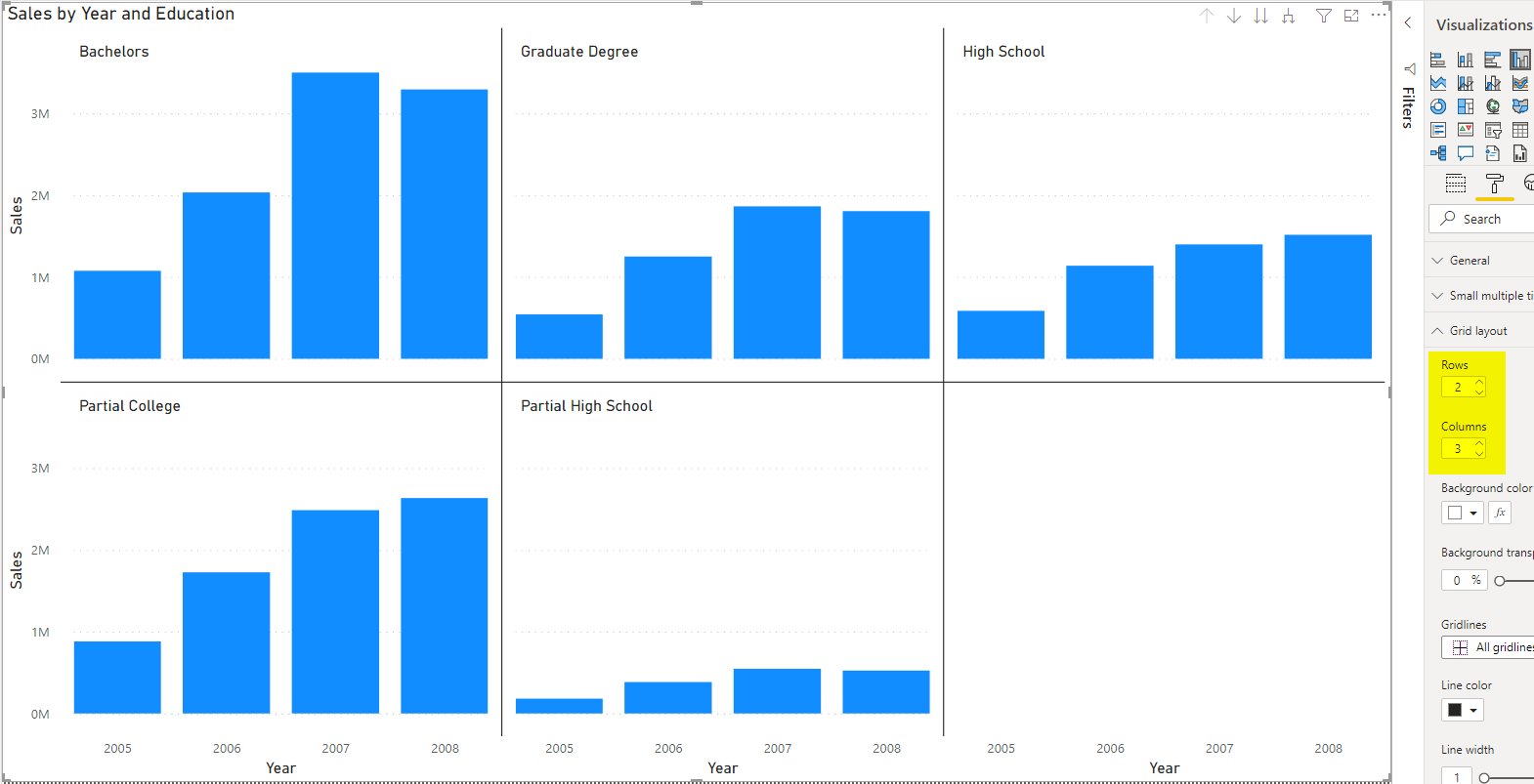
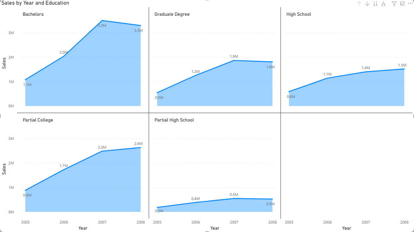
Let’s see how small multiples work. All you need to do is add the education field to the small multiples field of the visual (this is only available for the column chart, bar chart, line chart, area chart, and column/line combo charts).
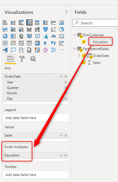
This will immediately create multiples for each value in the education column. In this case, five multiples of the same chart are created.
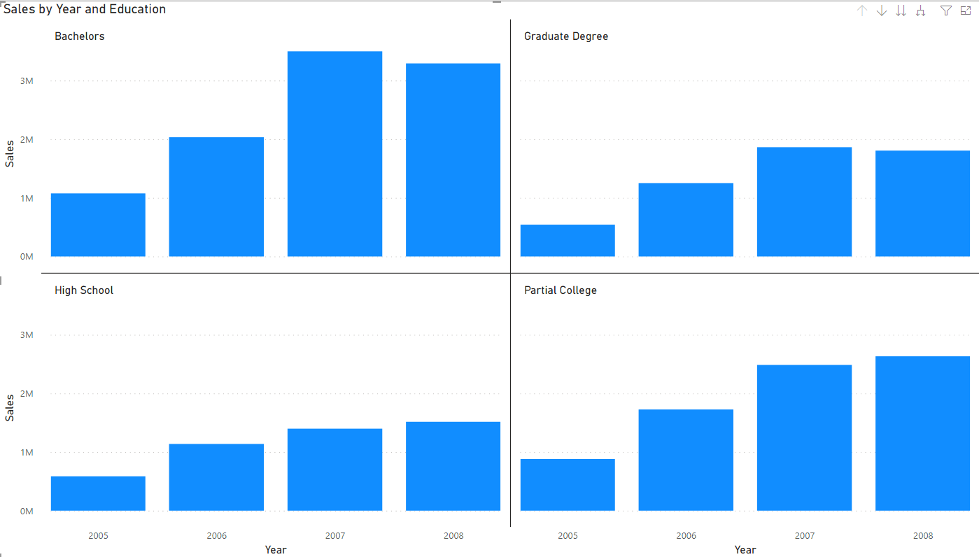
Small multiples create copies for you, but as part of the same visual. It multiplies the visual for you.
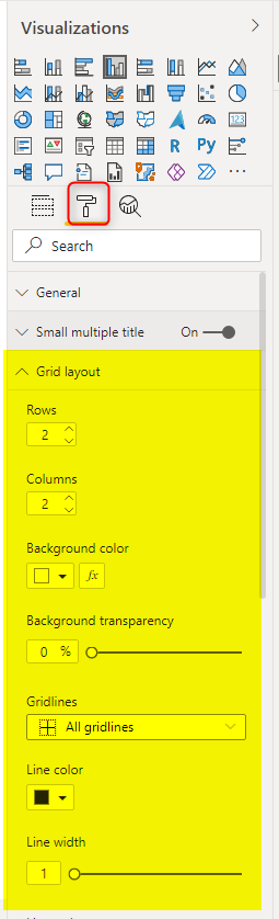
Grid Setting
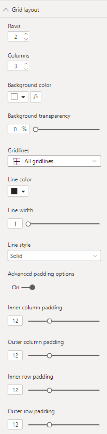
As you can see in the screenshot above, the multiples are spread in a grid of two columns and multiple rows. You can adjust it if you want. This configuration is in the Format setting of the visual under the Grid layout.
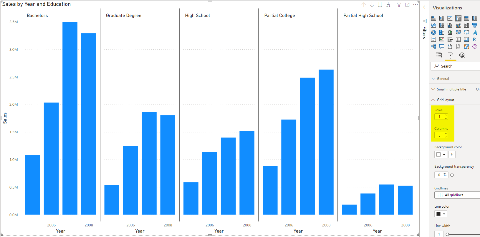
You can have them all in one row with increasing the columns;
Or you can have them in one column with decreasing the columns;
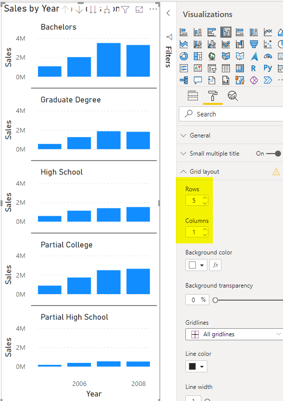
Or any combination of the columns and rows that works best for your report’s layout.
You also have the option to change other grid settings such as lines, their appearance, etc.
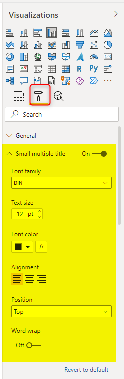
Small multiple titles formatting
You can also set the label format for each multiple (in this case, the education’s category name).
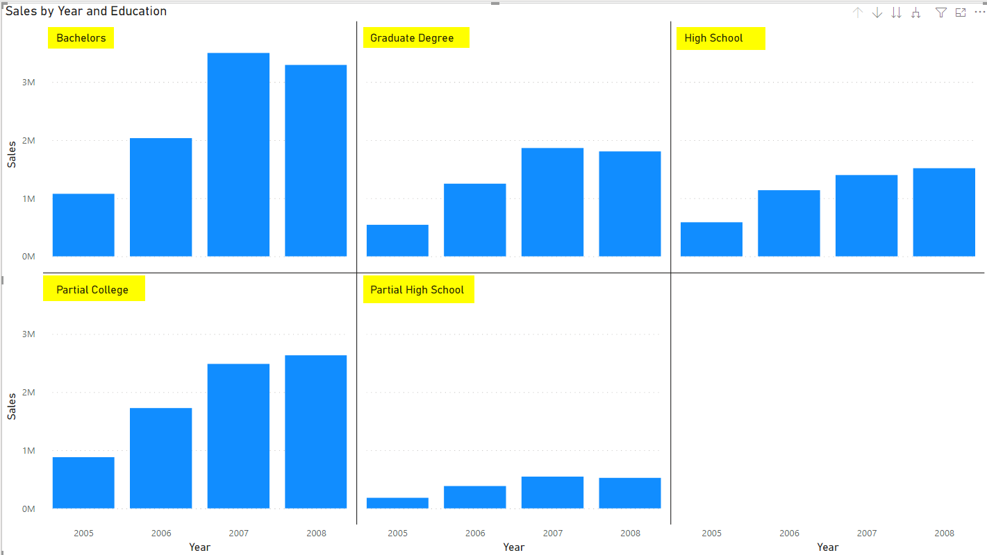
This setting is under the Format of the visual, Small multiple titles.
Easier to understand and low maintainance
If I want to sum up the value of small multiples in the Power BI visualization, it would be as; Small multiples enable you to analyze data by multiple dimension attributes in a simple-to-understand way, and they are easy to maintain because they are part of one visual.
Other Views
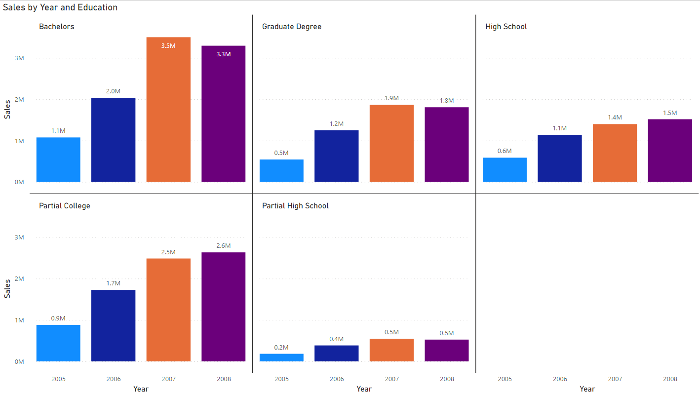
This feature (small multiples) is not only available for column charts. You can change the view to a few other charts too. That sometimes leads to even better visualization.
You can use colors and conditional formatting to have even a more understandable visual;
Limitations
Small multiples at the moment (the date of publishing this article) is only available in these built-in visuals in Power BI;
- Stacked bar chart
- Stacked column chart
- Clustered bar chart
- Clustered column chart
- 100% stacked bar chart
- 100% stacked column chart
- Line chart
- Area chart
- Stacked area chart
- Line and stacked column chart
- Line and clustered column chart
Another limitation I found in this visual is that we cannot scale the values, sometimes values in one multiple are much lower than the others, and if they are all at the same scale, it will make it hard to understand. This functionality is available on a custom visual such as infographic designer, which you can read more about it here.

Summary
In summary, Small multiples take your visualization to the next level. You can analyze data by multiple dimension attributes in an easy-to-understand and easy-to-maintain way. There are a few limitations, but since this feature is fairly new, we can expect more settings for this visual in the future.


Reza is author of more than 14 books on Microsoft Business Intelligence, most of these books are published under Power BI category. Among these are books such as Power BI DAX Simplified, Pro Power BI Architecture, Power BI from Rookie to Rock Star, Power Query books series, Row-Level Security in Power BI and etc.
He is an International Speaker in Microsoft Ignite, Microsoft Business Applications Summit, Data Insight Summit, PASS Summit, SQL Saturday and SQL user groups. And He is a Microsoft Certified Trainer.
Reza’s passion is to help you find the best data solution, he is Data enthusiast.
His articles on different aspects of technologies, especially on MS BI, can be found on his blog: https://radacad.com/blog.