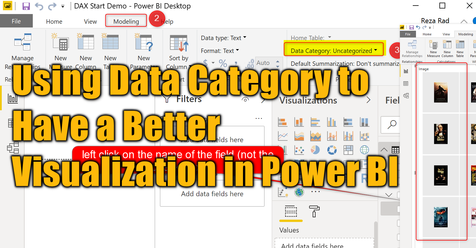
There are some field properties in Power BI such as formatting, which is obvious to use. However, some configurations on the field level, such as Data Category, is not very well known. Data Category is a configuration that can be helpful in multiple visualizations, In this short article, I’m explaining how to use this option to have a better visualization. If you want to learn more about Power BI, read Power BI book from Rookie to Rock Star.
What is Data Category
For each field in the Power BI data model, you can apply some formatting options. This formatting option mainly helps with the look and feel of that field in visuals in Power BI. Options such as thousands separator, adding currency sign, or percentage and etc. Data Category is an option that can affect the view of the field in some of the visuals.
Where to set the Data Category?
To find the Data Category option, there are two ways:
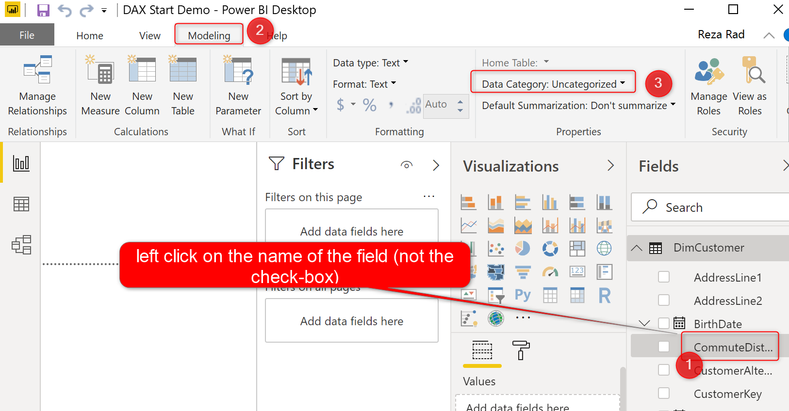
In the Modeling tab (In the Report View or Data View)
For using this option, first you have to click on the field’s name (not the checkbox), then go to the Modeling tab, and then you will find Data Category option under the Properties section.
In the Model Tab
If you go to the Model (relationship) tab of Power BI, after selecting the field, you can find the Data Category in the panel beside it, under Advanced Section.

What You Can Do with Data Category?
Data Category is important for visualization. Here are some examples of how this can be useful:
Showing Images: Image URL
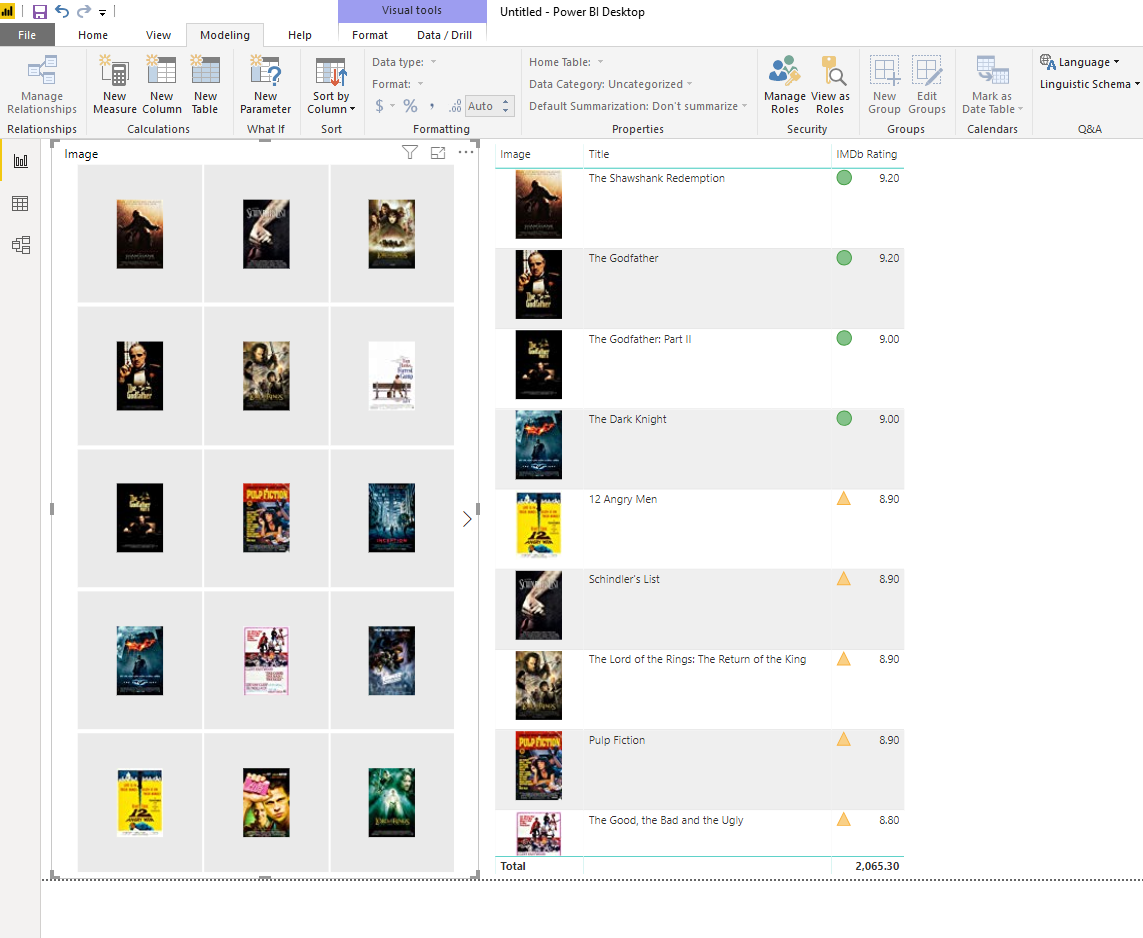
If you have the image URL in a field, and you want to visualize the image instead of the URL of that image, then you should set the Data Category to Image URL
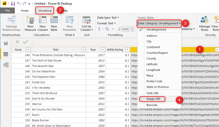
This means that if you use that field (the field that set as Image URL data category) in a visual (such as Slicer, or Table, or some other visuals), you will see images instead of URLs: (if you want to see a real example of that, read my article here)
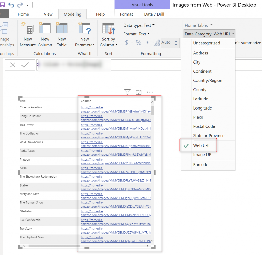
Links to URLs in the page: Web URL
If you want to have links to URLs in your Power BI report, you can use the Web URL option as Data Category.
Map Enhancement: Geo Codes
If you want a better map experience, it is a good idea to set the Data Category to a geo-related field respectively. For example, if the filed, contains city name info, set the data category of that to City
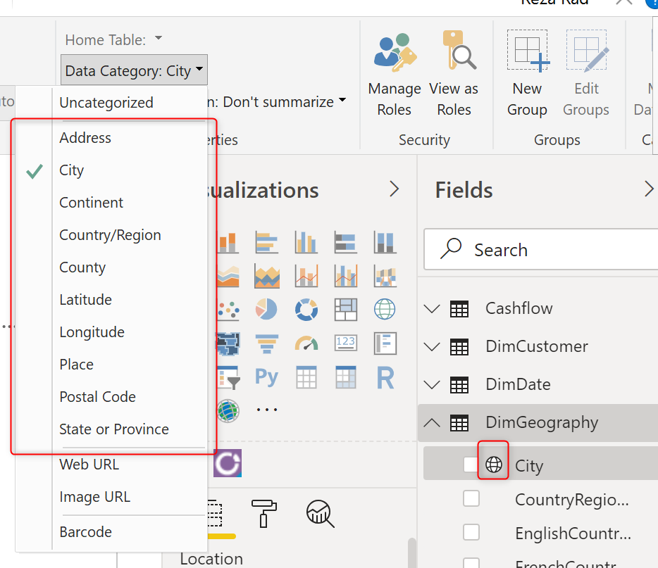
There are two benefits for doing this at least:
Q&A Enhancement
When you ask a question in Q&A about this field, Power BI default visualization would be map;
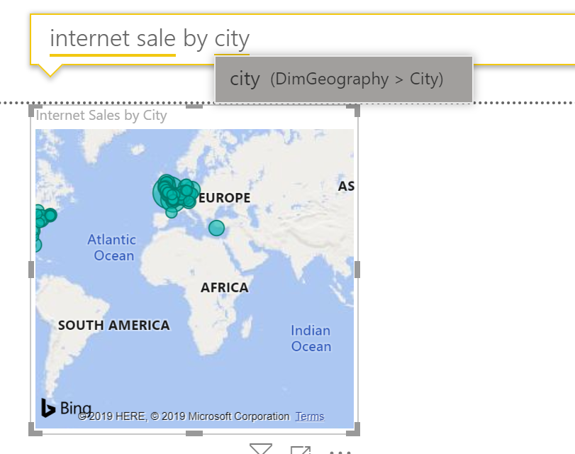
And The configuration also works for more accurate result in Filled Map. If you have read my article about the filled map, you can see that I mentioned it there too.
More Accurate Filled Map
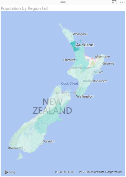
Here is an example: In some geo-location information, you will find the name of the city and region/state is the same! Here is an example: Auckland is the name of the city I am living at, and also the State/region name is Auckland! Of course, the boundaries are different. This is not just for Auckland. Here you can find some:
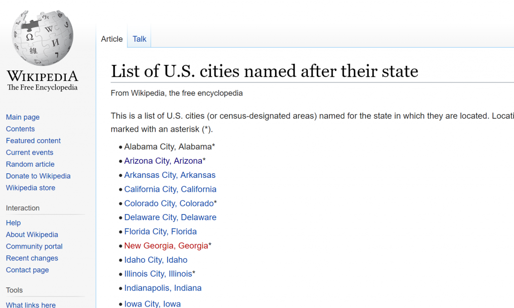
Arizona City vs Arizona State, Ohio city vs Ohio! and much more.
When you are using the normal map, you probably get the bubble showed up correctly. However, when you use a filled map, you want the boundaries to be shown correctly for the state or city or country. The data category is an essential part of getting that boundary correct.
Barcode
There is also a barcode option for Data Category, which I highly encourage you to try out. I did not have a barcode data to use, but I’m sure it would be fantastic.
Summary
Data Category is not just a fancy configuration for your data fields, It actually helps to have a better visualization. The enhancement in the Filled map, better Q&A, visualizing images in reports, and having links externally are just some of these samples. Have you used this feature? tell me about your experience in the comments below.



Yes, great read. Did you know that the Auto-generated Date Hierarchy also uses Data Categories to improve visualisations. Unfortunately those categories are not available in Power BI Desktop, but you can edit them in using Tabular Editor and consequently get the same improvements in your own Custom Data Dimension and Date Hierarchies. I used a DMV to take a look inside one of the auto-generated date tables in Power BI in order to work it out.