Azure ML Part 4: A Machine Learning Prediction scenario (1)

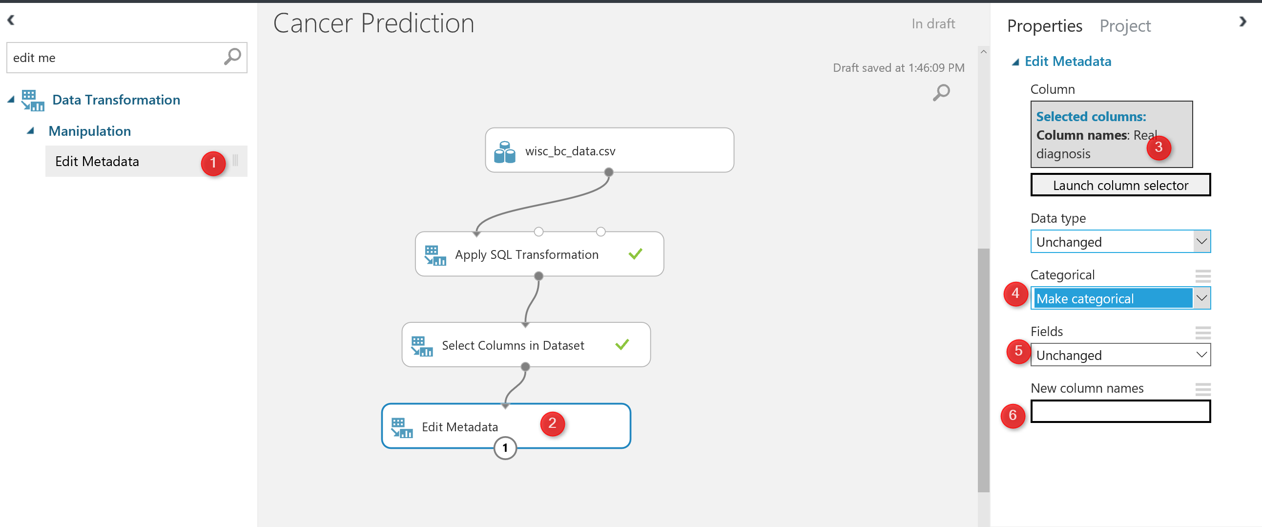
In previous Posts Part 1, Part 2 and Part3  I have explain some about the azure Ml environment, how to import data into it and finally how to do data transformation using Azure ML component. In this post and the next one I am going to show how to do a Machine Learning in Azure Read more about Azure ML Part 4: A Machine Learning Prediction scenario (1)[…]

Visualizing Data Distribution in Power BI – Histogram and Norm Curve -Part 2

In the Part 1 I have explained some of the main statistics measure such as Minimum, Maximum, Median, Mean, First Quantile, and Third Quantile. Also, I have show how to draw them in Power BI, using R codes. (we have Boxplot as a custom visual in power BI see :https://powerbi.microsoft.com/en-us/blog/visual-awesomeness-unlocked-box-and-whisker-plots/ ). However, to see the data Read more about Visualizing Data Distribution in Power BI – Histogram and Norm Curve -Part 2[…]

Visualizing numeric variables in Power BI – boxplots -Part 1

In this post and next one, I am going to show how to see data distribution using some visuals like histogram, boxplot and normal distribution chart. It always important to have a holistic perspective regarding the minimum, maximum, middle, outliers of our data in one picture. One of the chart that helps us to have a Read more about Visualizing numeric variables in Power BI – boxplots -Part 1[…]

K-mean clustering In R, writing R codes inside Power BI: Part 6

In the previous post,I have explained the main concepts and process behind the K-mean clustering algorithm. Now I am going to use this algorithm for classifying my Fitbit data in power BI.   as I have explained in part 5, I gathered theses data from Fitbit application and I am going to cluster them using Read more about K-mean clustering In R, writing R codes inside Power BI: Part 6[…]

Clustering Concepts , writing R codes inside Power BI: Part 5

Sometimes we just need to see the natural trend and behaviour of data without doing any predictions. we just want to check how our business data can be naturally grouped. According to the Wikipedia , Cluster analysis or clustering is the task of grouping a set of objects in such a way that objects in the same group (called a cluster) Read more about Clustering Concepts , writing R codes inside Power BI: Part 5[…]

Variable Width Column  Chart, writing R codes inside Power BI: Part 4

In the part 1, I have explained how to use R visualization inside Power BI. In the second part the process of visualization of five dimension in a single chart has been presented in Part 2, and finally in the part 3 the map visualization with embedded chart has been presented. In current post and next ones I Read more about Variable Width Column  Chart, writing R codes inside Power BI: Part 4[…]

Over fitting and Under fitting in Machine Learning

The main aim of machine learning is to learn from past data that able us to predict the future and upcoming data. It is so important that chosen algorithm able to mimic the actual behaviour of data. in the all different machine learning algorithms, there is away to enhance the prediction by better learning from Read more about Over fitting and Under fitting in Machine Learning[…]

Have more Charts by writing R codes inside Power BI: Part 3

In the previous parts (Part 1 and Part 2) , I have shown how to draw a chart in the power BI (Part 1) visualization. Also, in Part 2 I have shown how to present 5 different variables in just one single chart. In this post, I will show how to shows some sub plots in a Read more about Have more Charts by writing R codes inside Power BI: Part 3[…]

Have more Charts by writing R codes inside Power BI: Part 2

In the previous post (Part 1) I have explained how to write a simple scatter chart in the Power BI. Now in this post I am going to show how to present 5 different values in just one chart via writing R scripts. I will continue the codes that I wrote in the previous post  as below : Read more about Have more Charts by writing R codes inside Power BI: Part 2[…]

Have more Charts by writing R codes inside Power BI: Part 1

Power BI recently able users to embedded the R graphs in Power BI. There are some R visuals that it would be very nice to have them in Power BI. What is R ? Based on Wikipedia,  R is an open source programming language and software environment for statistical computing and graphics that is supported Read more about Have more Charts by writing R codes inside Power BI: Part 1[…]