
Thanks everyone to attend my session in Microsoft Data Insight Summit 2017 about Data Visualization. It was a pleasure to see you all. Here I put the session materials to download and links as reference to study more. Please feel free to ask your questions here. My session was over booked with 650 registrations, and the room size was only for 325! I appreciate everyone who was watching my session in the main theater through live streaming, and I apologize if room was not big enough to fit you all there. It was great session, I’ve received many awesome feedback, and humbled that you like the session.
Title: Take Power BI Visualization to the Next Level
Data Visualization is the front end of every BI system, and getting it right is one of the most important tasks in a BI application. Good visualization will benefit the decision making process, while bad visualization can lead to wrong decisions. In this session, you will learn how to create the right chart or visual, with examples ranging from line charts, bar/column charts, and some other useful chart styles in Power BI. You will also learn some tips and tricks to control interactivity of visuals in Power BI. Session is full of demos, and through that you will learn tips and tricks for choosing best colors and best visuals for your solution.
Session Recording
Demo Links
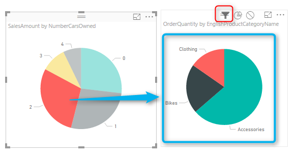
Interaction of Visuals in Power BI
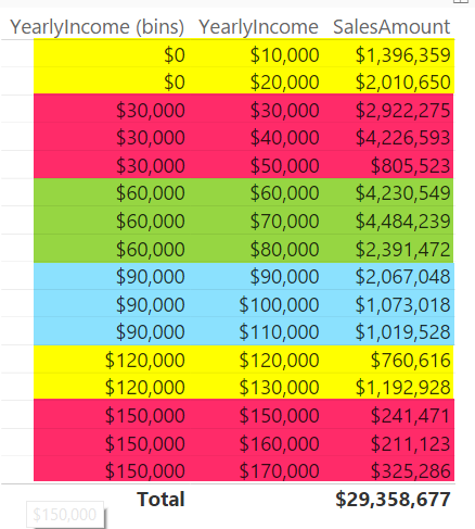
Grouping and Binning
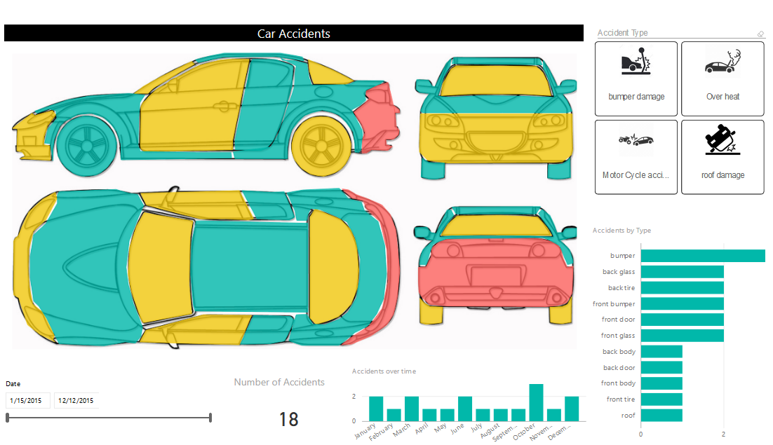
Custom Visuals
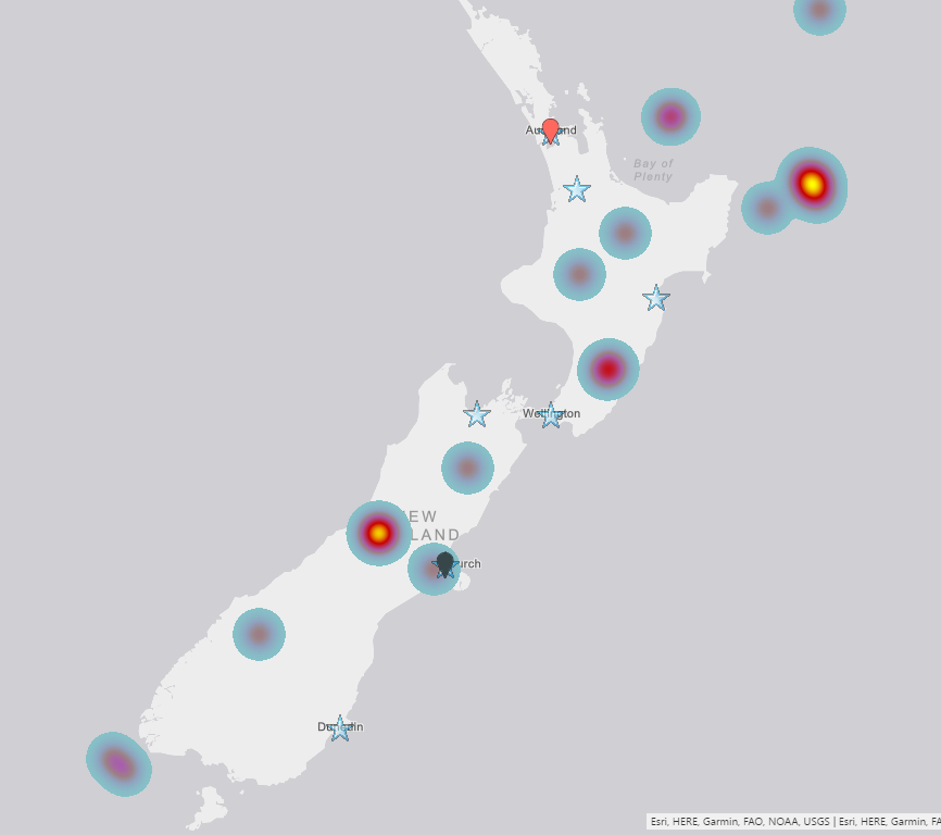
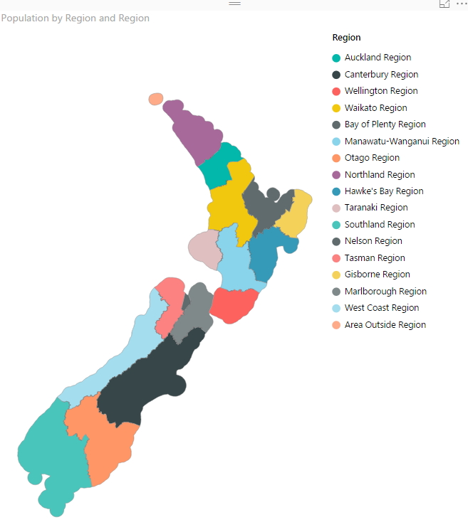
ArcGIS Map in Power BI
Shape Map Visual
Line Chart

Bar/Column Chart
Scatter Chart

Book: Power BI from Rookie to Rock Star
Power BI book from Rookie to Rock Star is absolutely free, download it and you will have full details of demos and much more materials to study through.
Download Session Slides
Download the slides from here:
Question?
Please don’t hesitate to ask questions in the comments area below.


Reza is author of more than 14 books on Microsoft Business Intelligence, most of these books are published under Power BI category. Among these are books such as Power BI DAX Simplified, Pro Power BI Architecture, Power BI from Rookie to Rock Star, Power Query books series, Row-Level Security in Power BI and etc.
He is an International Speaker in Microsoft Ignite, Microsoft Business Applications Summit, Data Insight Summit, PASS Summit, SQL Saturday and SQL user groups. And He is a Microsoft Certified Trainer.
Reza’s passion is to help you find the best data solution, he is Data enthusiast.
His articles on different aspects of technologies, especially on MS BI, can be found on his blog: https://radacad.com/blog.
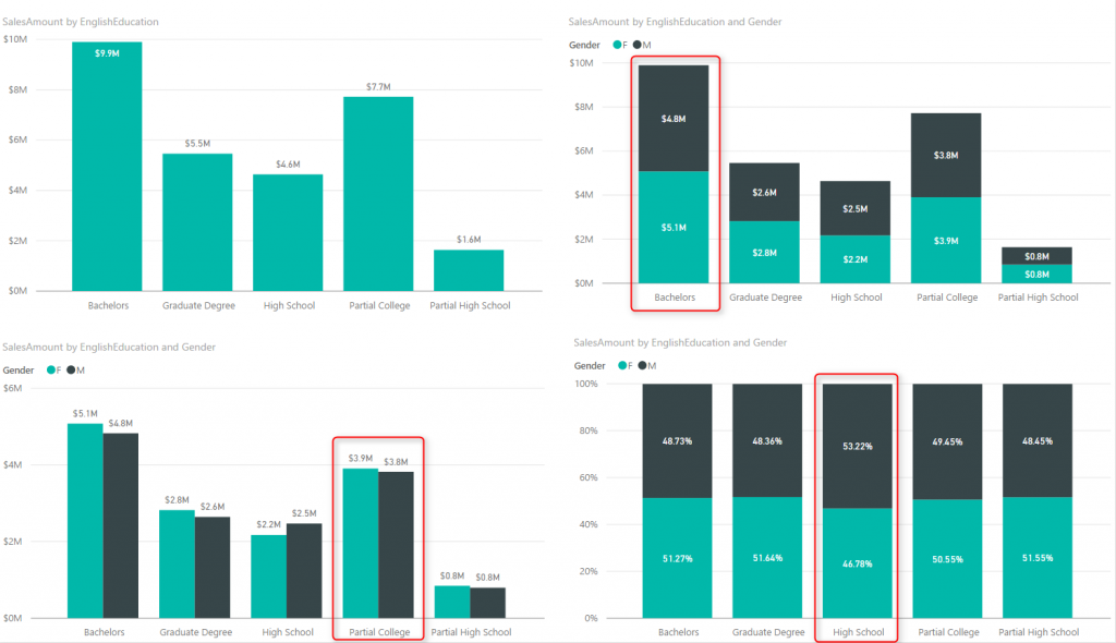
Hi Thanks for sharing the video of your session. Pretty insightful. Your slide had a stacked+clustered chart – but i did not see which visual allows for that. The closest a custom visual comes to that is a Mekko chart. Any suggestions on how we can have a stacked and clustered bar chart in Power BI (just as it can be done in MS Excel)? Thanks
Hi Mustafa,
Unfortunately we don’t have the Stacked+clustered chart available in Power BI yet. but you can use R visuals, and create a custom visual which have such feature. R visuals are pretty flexible in doing everything you want. Leila has written many blog posts about R visuals in Power BI.
Cheers
Reza