
 In the Part 1 I have explained some of the main statistics measure such as Minimum, Maximum, Median, Mean, First Quantile, and Third Quantile. Also, I have show how to draw them in Power BI, using R codes. (we have Boxplot as a custom visual in power BI see :https://powerbi.microsoft.com/en-us/blog/visual-awesomeness-unlocked-box-and-whisker-plots/ ). However, to see the data distribution another way is to draw a histogram or normal curve. The spread of the numeric variable can be check by the histogram chart. Histogram uses any number of bins of an identical width. Below picture shows the data distribution for my Fitbit data (Floors, Calories Burned, and Steps).
 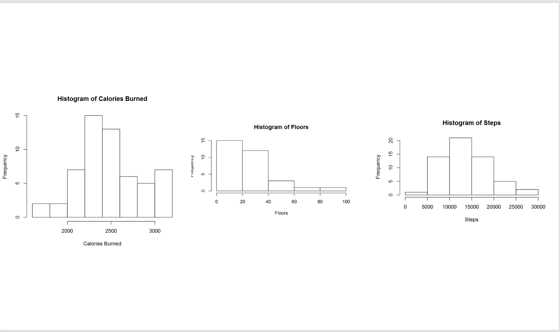 to create a histogram chart, I wrote blew R code.
hist(dataset$Floors, main = “Histogram of Floors”, xlab = “Floors”)
In the above picture, the first chart shows the data distribution for my calories burn during three mounths. as you can see, most of the time I burned around 2200 to 2500 calories, also less than 5 times I burned calories less than 2000 calories. If you look at the histogram charts you will see each of them has different shape. As you can see the number of floors stretch further to the right. while calories burn and number of floors tend to be evenly divided on both sides of the middle. this behaviour is called Skew. This help us to find the data distribution, as you can see the data distribution has a Bell Shape, which we call it Normal Distribution. Most of the world data follow the normal distribution trend. Data distribution can be identified by two parameters: Centre and Spread.  The centre of the data is measured by Mean value, which is the data average. Spread of data can be measured by Standard deviation.
So What is Standard Deviation! Standard deviation can be calculated from Variance. Variance is :”the average of the squared differences between each value and the mean value”[1] in other word to calculate the variance, for each point of data we call (Xi) we should find its distance from mean value (μ). to calculate distance we follow the formula as : 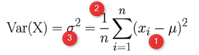
the distance between each element can be calculate by (Xi-μ)^2 (Number 1 in above Formula). Then for each point we have to calculate this distance and find the average. So we have summation of (Xi-μ)^2 for all the points and then divided by number of the points (n). σ^2 is variance of data. Variance or Var(X) is the distance of all point from the mean value. The Standard Deviation is sqrt of Var(X). that is σ. So if data is so distributed and has more distance from Mean value then we have bigger Standard Deviation.
To draw normal curve in Power BI I wrote the blow codes. First, I calculate the Average and Standard Deviation as
mean<-mean(dataset$CaloriesBurned)
sd<-sd(dataset$CaloriesBurned)
Then I used the “dnorm” function to create a norm curve as below:
y<-dnorm(dataset$CaloriesBurned,meanval,sdval)
Then I draw anorm curve using Plot function :
plot(dataset$CaloriesBurned, y, xlab=”x value”, ylab=”Density”, type=”l”,main=”Comparison of t Distributions”)
Then the following picture will be shown as below 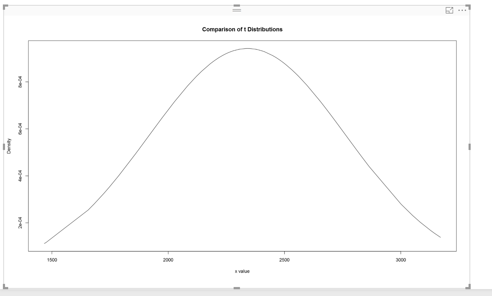 According to [1], the 68-95-99.7 rule states that 68 percent of the values in a normal distribution fall within one sd of the mean, while 95 percent and 99.7 percent of the values fall within two and three standard deviations, respectively[1].
 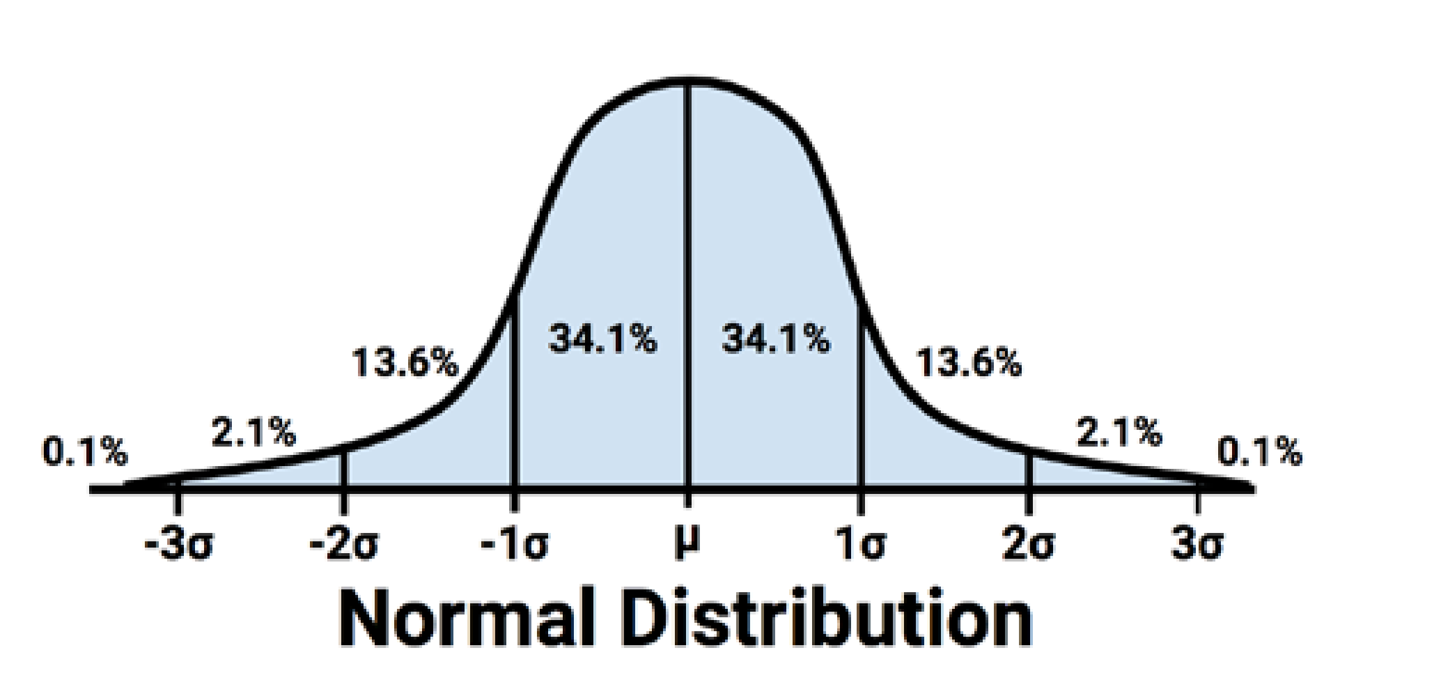 As you can see 68% of data is located between -sd and +sd. the 95% of data is located between -2sd and +2sd. Then, 99% of data has been located between -3sd and +3sd. to draw and identify the 68% of data I add other calculation to R code in Visualization as below: first I set a range of value for range (average-standard deviation, average +standard deviation) lower bound (lb) is average- standard deviation lb<-mean-sd for upper bound (ub) we calculate it as below ub<-mean+sd i <- x >= lb & x <= ub Then I draw a Polygon to show the 68% of data, so will be as below: polygon(c(lb,x[i],ub), c(0,hx[i],0), col=”red”) also we can specify the 98% of data distribution by writing the below code:
lb<-mean-1.5*sd ub<-mean+1.5*sd
the result will be as below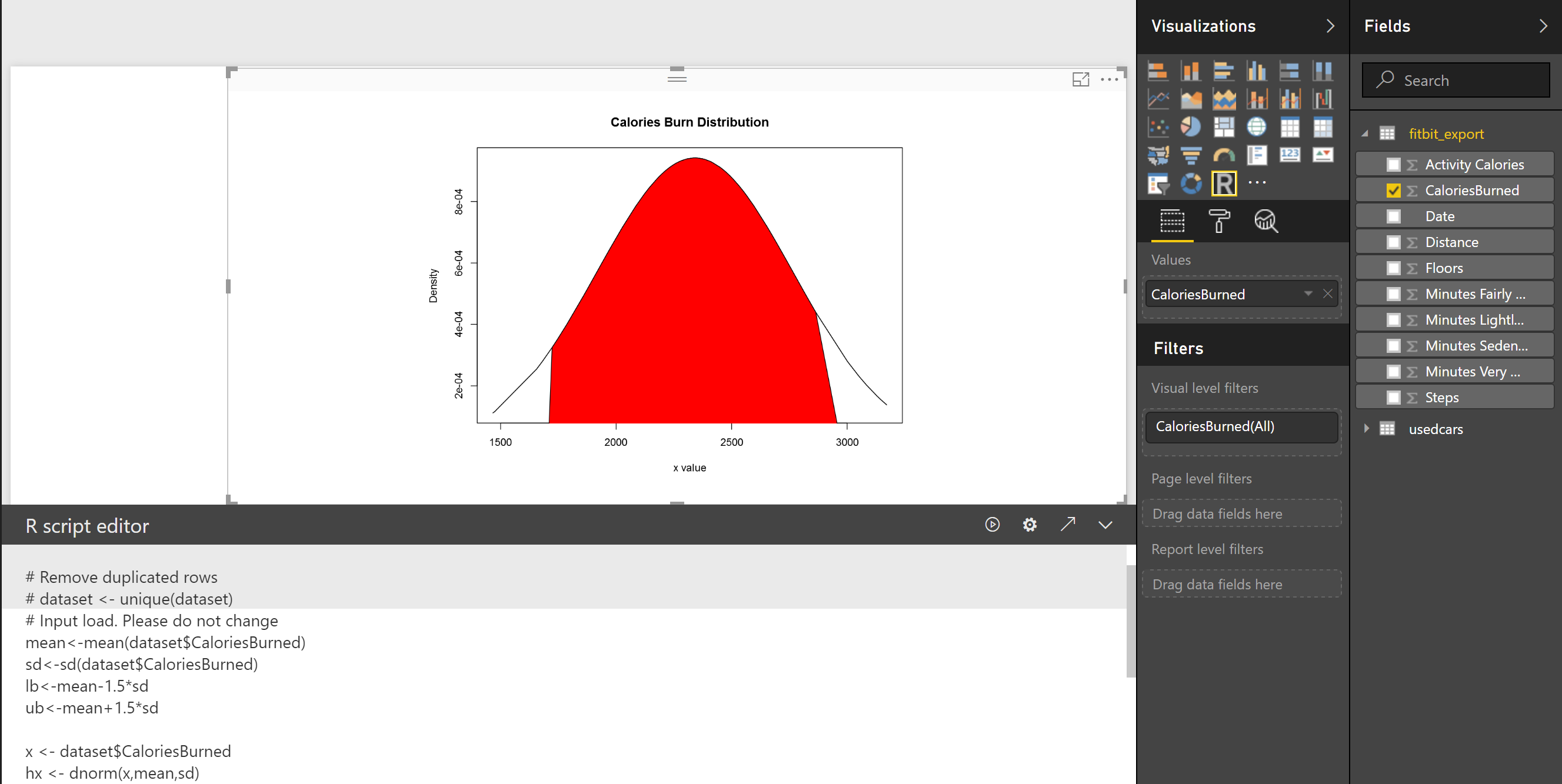
[1].Machine Learning with R,Brett Lantz, Packt Publishing,2015.


